


一、css渐变背景添加透明度opacity
css渐变背景经常会在项目开发中遇到,此时UI如果给出的是单一的渐变背景(没有背景透明度),这个我们会很快的写出代码,如下:
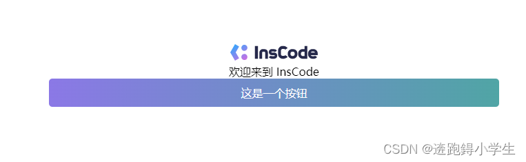
<div class="btn">这是一个按钮</div>.btn {
background: linear-gradient(to right, #8B78E6, #50A5A5);
color: #fff;
padding: 10px 20px;
font-size: 16px;
border-radius: 5px;
border: none;
cursor: pointer;
transition: background 0.3s ease;
}
.btn:hover {
background: linear-gradient(to right, #50A5A5, #8B78E6);
}但偶尔的时候UI会给煎饼的背景色添加一个透明度,但是使用opacity属性会导致文本也会有透明度,接下来给出我的解决办法
.btn {
  position: relative;
  color: #fff;
  padding: 10px 20px;
  font-size: 16px;
  border-radius: 5px;
  border: none;
  cursor: pointer;
  transition: background 0.3s ease;
  z-index: 0;
}

.btn:hover {
  background: linear-gradient(to right, #50A5A5, #8B78E6);
}

.btn::after{
  position: absolute;
  z-index: -1;
  top: 0;
  left: 0;
  width: 100%;
  height: 100%;
  content: "";
  opacity: 0.3;
  background: linear-gradient(to right, #8B78E6, #50A5A5);
}
二、css按钮添加渐变边框
1、使用border-image
.btn {
  border: 4px solid;
  border-image: linear-gradient(to right, #8f41e9, #578aef) 1;
}

/* 或者 */
.btn {
  border: 4px solid;
  border-image-source: linear-gradient(to right, #8f41e9, #578aef);
  border-image-slice: 1;
}
2、使用伪元素
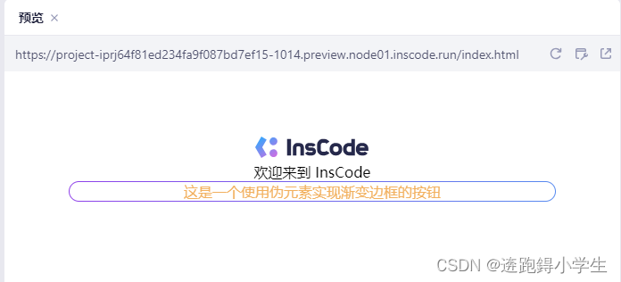
<div class="border-box">
   <div class="content">
        这是一个使用伪元素实现渐变边框的按钮
   </div>
</div>
.border-box {
border: 1px solid transparent;
border-radius: 16px;
position: relative;
color: #F2B05E;
background-color: #fff;
background-clip: padding-box; /*important*/
}
.border-box::before {
content: '';
position: absolute;
top: 0;
right: 0;
left: 0;
bottom: 0;
z-index: -1;
margin: -1px;
border-radius: inherit; /*important*/
background: linear-gradient(to right, #8F41E9, #578AEF);
}3、使用单个元素background-clip、background-origin、background-image
.border-box {
  border: 1px solid transparent;
  border-radius: 16px;
  color: #F2B05E;
  background-clip: padding-box, border-box;
  background-origin: padding-box, border-box;
  background-image: linear-gradient(to right, #fff,#fff), linear-gradient(90deg, #8F41E9, #578AEF);
}
background-clip 、background-origin属性添加了解释链接,没弄清的童鞋可以点击看下~
分享完毕~~


 3万+
3万+


 被折叠的 条评论
为什么被折叠?
被折叠的 条评论
为什么被折叠?
 到【灌水乐园】发言


