


子组件中components/Dialogs.vue中
<template>

  <div class="commydialog" v-if="visable">

    <div class="mask"></div>

    <div class="comdialog_box">

      <div class="comdialog_box_top">

        <slot name="headsolt"></slot>

        <span @click="$emit('comcancel')" class="cuo">×</span>

      </div>

      <div class="comdialog_box_center">

        {{ content }}

      </div>

      <div class="comdialog_box_bottom">

        <button @click="$emit('suredialog')" class="ok">确定</button>

        <button @click="$emit('cancel')" class="cancel">取消</button>

      </div>

    </div>

  </div>

</template>


<script>

export default {

  props: {

    visable: {

      default: true,

      type: Boolean,

    },

    content: {

      default: '提示',

      type: String,

    },

  },

  components: {},

  data() {

    return {}

  },

  created() {},

  mounted() {},

  methods: {},

}

</script>

<style scoped lang="scss">

.commydialog {

  width: 100%;

  height: 100vh;

  position: relative;

  .mask {

    width: 100%;

    height: 100%;

    background-color: rgba(0, 0, 0, 0.3);

    position: absolute;

    top: 0;

    left: 0;

  }

  .comdialog_box {

    width: 400px;

    height: 200px;

    background-color: #fff;

    position: absolute;

    left: 50%;

    top: 50%;

    transform: translate(-50%, -50%);

    padding: 10px;

    .comdialog_box_top {

      position: relative;

      .cuo {

        position: absolute;

        right: 20px;

        // top: 20px;

        font-size: 30px;

        color: #ccc;

      }

    }

    .comdialog_box_center {

      height: 100px;

      line-height: 100px;

      background-color: #ffffff;

      margin: 10px 0;

    }

    .comdialog_box_bottom {

      width: 100%;

      height: 70px;

      // padding-top: 12px;

      padding-left: 170px;

      box-sizing: border-box;

      button {

        width: 65px;

        height: 38px;

        font-size: 16px;

        margin-left: 20px;

        border-radius: 2px;

        border: none;

        outline: none;

        cursor: pointer;

        border-radius: 10px;

      }

      .ok {

        background-color: #409eff;

        color: #fff;

      }

    }

  }

}

</style>
在父组件中进行引用dialog.vue
<template>
<div>
<!--
实现思路
1.添加一个遮罩层,然后点击按钮显示我们的对话框
2.在父组件中引入我们的子组件
3.在子组件中设置一个插槽,然后在父组件中定义对话框的标题
4.在子组件中使用props接收父组件传递过来的数据
5.使用$emit给他设置一个点击事件然后 在父组件中进行接收
-->
<button @click="opendialog" v-if="!visable">点击显示对话框</button>
<myDialog
:visable="visable"
:content="content"
@comcancel="visable = false"
@cancel="visable = !visable"
@suredialog="visable = false"
>
<template slot="headsolt">
<span>提示</span>
</template>
</myDialog>
</div>
</template>
<script>
import myDialog from '@/components/Dialogs.vue'
export default {
components: {
myDialog,
},
data() {
return {
visable: false,
content: '主体部分默认值',
}
},
created() {},
mounted() {},
methods: {
opendialog() {
this.visable = true
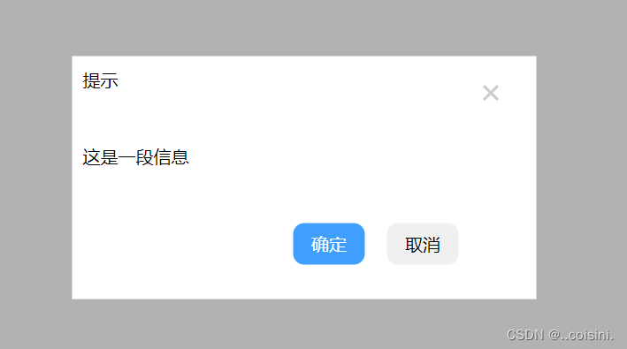
this.content = '这是一段信息'
},
},
}
</script>
<style scoped lang="scss"></style>


 915
915


 被折叠的 条评论
为什么被折叠?
被折叠的 条评论
为什么被折叠?
 到【灌水乐园】发言


