


布局的圆角边框效果图如下所示:
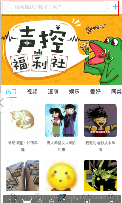
如上图红色标注的部分就是一个圆角边框效果的自定义搜索框。
实现起来很简单,让布局(Relativelayout或者LinearLayout)的background属性引用自定义的drawable资源即可。
android:background="@drawable/bg_shape"自定义drawable资源如下所示:
<?xml version="1.0" encoding="utf-8"?>
<shape xmlns:android="http://schemas.android.com/apk/res/android"
    android:shape="rectangle" >

    <!-- 表示shape的四个角的角度。只适用于矩形shape,这里的角度是指圆角的程度 -->
    <corners android:radius="50dp" />

    <!-- 这个标签表示纯色填充,通过android:color即可指定shape中填充的颜色 -->
    <solid android:color="@color/white" />

    <!-- Shape的描边,下面指定了描边的宽度和描边的颜色 -->
    <stroke
        android:width="1dp"
        android:color="@color/blue" />

</shape>
xml布局中的代码如下:
<LinearLayout xmlns:android="http://schemas.android.com/apk/res/android"
xmlns:tools="http://schemas.android.com/tools"
android:layout_width="match_parent"
android:layout_height="match_parent"
android:orientation="vertical"
android:padding="10dp"
tools:context="com.example.mysearchview.MainActivity" >
<LinearLayout
android:id="@+id/ll1"
android:layout_width="match_parent"
android:layout_height="100dp"
android:background="@drawable/bg_shape"
android:orientation="horizontal" >
</LinearLayout>
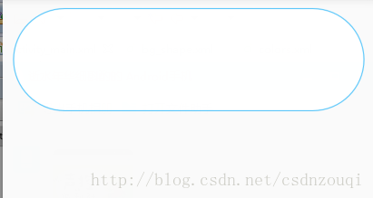
</LinearLayout>效果图如下所示:
其实上面的drawable资源确切点说应该叫做ShapeDrawable,它是一种很常见的Drawable,可以理解为通过颜色来构造的图形,它既可以是纯色的图形,也可以是具有渐变效果的图形。
需要注意的是标签创建的Drawable,其实体类实际上是GradientDrawable,下面说一下android:shape属性的含义。
android:shape
表示图形的形状,有四个选项:rectangle(矩形)、oval(椭圆)、line(横线)和ring(圆环)。它的默认值是矩形。
由于该属性的默认值是矩形,所以实现圆角效果的时候,该属性也可以不指定,因为默认就是矩形。


 扫一扫
扫一扫
 723
723

 被折叠的 条评论
为什么被折叠?
被折叠的 条评论
为什么被折叠?
 到【灌水乐园】发言


