


前言
今天我们聊一个CSS布局中一个老生常谈的问题就是元素的水平垂直居中。不管在面试还是平时写网页布局,都是经常需要使用的。
之前我也面试过别人或者被别人面试,这个问题的出现频率也是非常高的,面试官一般都会问:元素的水平垂直居中你能有几种实现方法?面试官想要你尽可能的多说实现几种方法,如果你只说一两种方法,可能就不能赢得面试官的倾心。
在实际写代码过程中,遇到各种场景的水平垂直居中,可能还要去网上百度,不能做到信手拈来,作为一个合格的“前端攻城狮”确实有点不应该。那么,这篇文章就教你在遇到这类问题时怎么征服面试官,怎么做到信手拈来
01绝对定位+负margin值
<div class="box1">
  <div class="box2"></div>
</div>
.box1 {
  width: 400px;
  height: 400px;
  background-color: red;
  position: relative;
}

.box2 {
  width: 200px;
  height: 100px;
  background-color: blue;
  position: absolute;
  left: 50%;
  top: 50%;
  /* 子容器box2宽的1/2的负值 */
  margin-left: -100px;
  /* 子容器box2高的1/2的负值 */
  margin-top: -50px;
}
效果图:
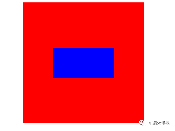
注意:此方法需要知道元素的宽和高。
这种在实际工作中用的最多,而且兼容性也好。
02绝对定位 + left/right/bottom/top + margin
.box1 {
  width: 400px;
  height: 400px;
  background-color: red;
  position: relative;
}

.box2 {
  width: 200px;
  height: 100px;
  background-color: blue;
  position: absolute;
  display: inline-block;
  top: 0;
  left: 0;
  right: 0;
  bottom: 0;
  margin: auto;
}
注意:此方法需要知道元素的宽和高。
上下左右均为 0 位置绝对定位且 margin: auto。
03绝对定位 + transform
.box1 {
  width: 400px;
  height: 400px;
  background-color: red;
  position: relative;
}

.box2 {
  width: 200px;
  height: 100px;
  background-color: blue;
  position: absolute;
  left: 50%;
  top: 50%;
   /*
    transform 属性向元素应用 2D 或 3D 转换。
    该属性允许我们对元素进行旋转、缩放、移动或倾斜。
  */
  /* translate(x,y) 定义 2D 转换。 */
  transform: translate(-50% , -50%);
}
CSS3新增动画效果中的 transform 变换属性,使这个问题有了更好的解决方法,就是使用 transform 代替 margin 。transform 中 translate 偏移的百分比是相对于自身大小而说的。
注意: 此方法知不知道元素的宽和高皆可适用。
04相对定位+transform
.box1{
  width: 400px;
  height: 400px;
  background: red;
}

.box2{
  width: 200px;
  height: 100px;
  background: blue;
  margin: 0 auto;
  position: relative;
  top: 50%;
  /*第一种:margin-top*/
  /*margin-top: -50px;*/
  /*第二种:transform:转换*/
  transform: translateY(-50%);
}
此方法不需要使用绝对定位,只需使用相对定位。第一种使用margin-top的方法需要知道元素的高度,第二种使用transform的方法不需要知道元素的高度即可。
05flex布局
.box1 {
  width: 400px;
  height: 400px;
  background-color: red;
  /* Webkit 内核的浏览器,必须加上-webkit前缀。 */
  display: -webkit-flex;/* Safari */
  display: flex;
  justify-content: center;
  align-items: center;
}

.box2 {
  width: 200px;
  height: 100px;
  background-color: blue;
}
弹性布局flex在不考虑兼容性时我认为是这种方法是最好用最方便的,不需要考虑元素的宽和高,只需要给父元素设置display: flex; justify-content: center; align-items: center;就可以了。
注意: 此方法知不知道元素的宽和高皆可适用。
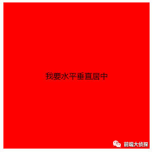
06display:table布局
<div class="box1">
  <div class="box2">我要水平垂直居中</div>
</div>
.box1{
width: 400px;
height: 400px;
background-color: yellow;
text-align: center;
display: table;
}
.box2{
background-color: red;
display: table-cell;
vertical-align: middle;
}
效果图:
07table-cell布局
.box1 {
  width: 400px;
  height: 400px;
  background-color: red;
  display: table-cell;
  text-align: center;
  vertical-align: middle;
}
/* 当元素定宽高时,display: inline-block;可以替换成margin: auto; */
.box2 {
  width: 200px;
  height: 100px;
  background-color: blue;
  /* 可以换成margin: auto; */
  display: inline-block;
}
/* 当元素不定宽高时,只能使用display: inline-block; */
.box2 {
  background-color: blue;
  display: inline-block;
}
注意: 此方法知不知道元素的宽和高皆可适用。
08flex变异布局
<div class="box1">
  <div class="box2">我要水平垂直居中</div>
</div>
.box1 {
  width: 400px;
  height: 400px;
  margin: 0 auto;
  background: red;
  /* Webkit 内核的浏览器,必须加上-webkit前缀。 */
  display: -webkit-flex;/* Safari */
  display: flex;
}

.box2 {
  /* width: 100px;
  height: 100px; */
  background: blue;
  margin: auto;
}
父元素设置 display: flex;子元素设置 margin: auto。
注意: 此方法知不知道元素的宽和高皆可适用。
09before伪类
.box {
  width: 400px;
  height: 400px;
  border: 1px solid red;
  text-align: center;
}

.box::before {
  content: '';
  display: inline-block;
  vertical-align: middle;
  width: 0;
  height: 100%;
}
效果图:
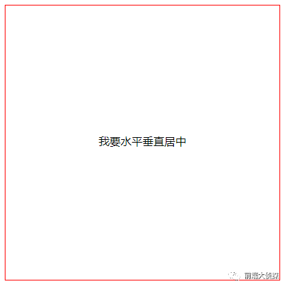
同理,伪类after也能实现同样效果。
10writing-mode属性布局
<div class="box1">
  <div class="box2">
    <p>我要水平垂直居中</p>
  </div>
</div>
.box1 {
  width: 200px;
  height: 200px;
  border: 1px solid red;
  writing-mode: vertical-lr;
  text-align: center;
}

.box1>.box2 {
  writing-mode: horizontal-tb;
  display: inline-block;
  text-align: center;
  width: 100%;
}

.box1>.box2>p {
  display: inline-block;
  margin: auto;
  text-align: left;
  background: yellow;
}
效果图:
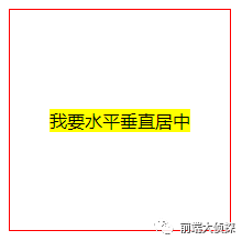
writing-mode 属性定义了文本在水平或垂直方向上如何排布。horizontal-tb:水平方向自上而下的书写方式。即 left-right-top-bottom。
writing-mode的具体用法可以去https://developer.mozilla.org/en-US/docs/Web/CSS/writing-mode学习。
11grid+flex布局
.box1 {
  width: 400px;
  height: 400px;
  background: red;
  display: grid;
}

.box2 {
  background: blue;
  align-self: center;
  justify-self: center;
}
css的网格布局,通过grid也可以实现水平垂直居中。代码量很少,但兼容性不如flex,不推荐使用。当做一个知识点学习了解一下。
12grid+margin布局
.box1 {
  width: 400px;
  height: 400px;
  background: red;
  display: grid;
}

.box2 {
  background: blue;
  margin: auto;
}
总结
对比各种的方法的优缺点,简单总结一下(仅代表个人观点)。
-
现在随着IE浏览器的慢慢消亡,PC端也可以大胆使用弹性布局Flex,如果要考虑兼容性的话,且宽高固定,可以使用绝对定位+负margin值(上面第一种方法);如果要考虑兼容性的话,且宽高不固定,可以使用table-cell布局(上面第七种方法);如果不考虑兼容性的话,首选Flex布局(上面第五种方法)。
-
移动端推荐使用flex。


 扫一扫
扫一扫
 1万+
1万+

 被折叠的 条评论
为什么被折叠?
被折叠的 条评论
为什么被折叠?
 到【灌水乐园】发言


