


vue显示日历插件
V日历 (V-Calendar)
V-Calendar is a clean and lightweight plugin for displaying simple, attributed calendars in Vue.js. It uses attributes to decorate the calendar with various visual indicators including highlighted date regions, dots, bars, content styles and popovers for simple tooltips and even custom slot content.
V-Calendar是一个干净而轻巧的插件,用于在Vue.js中显示简单的属性日历。 它使用属性以各种可视指示器装饰日历,包括突出显示的日期区域,点,条,内容样式和弹出框,以提供简单的工具提示,甚至自定义版位内容。
Animated calendar/datepicker that displays regions, indicators and day popovers for simple & recurring dates.
动画的日历/日期选择器,显示简单和重复日期的区域,指标和日弹出窗口。
Any single attribute may contain one of each object and can be displayed for single dates, date ranges and even complex date patterns like every other Friday, the 15th of every month or the last Friday of every other month.
任何单个属性都可以包含每个对象中的一个,并且可以显示单个日期,日期范围甚至是复杂的日期模式,例如每隔一个星期五,每月的15号或隔月的最后一个星期五。
It has date picker support out of the box with single date, multiple date and date range selection modes. Because v-date-picker is simply a wrapper for v-calendar, both can be extensively customized using props, slots and theme styling, just like v-calendar. And of course, V-Calendar is responsive and mobile friendly. For example, it supports touch swipes for month navigation.
它具有单一日期,多种日期和日期范围选择模式的开箱即用的日期选择器支持。 由于v-date-picker只是v-calendar的包装,因此可以像v-calendar一样使用道具,广告位和主题样式来广泛地定制两者。 当然,V-Calendar具有响应能力和移动友好性。 例如,它支持触摸滑动以进行月份导航。
日历 (Calendar)
v-calendar is the core component. By default, it has a neutral design that should blend nicely within any web application, with various options for configuring the basic layout:
v-calendar是核心组件。 默认情况下,它具有中性设计,应该可以在任何Web应用程序中很好地融合在一起,并具有用于配置基本布局的各种选项:
Single or double paned
单锅或双锅
Can be expanded to fill the width of its container
可以扩展以填充其容器的宽度
Header can be left, right or center-aligned
标题可以左对齐,右对齐或居中对齐
Slot support for custom headers and arrows
插槽支持自定义标题和箭头
Navigation transitions (horizontal slide, vertical slide, fade)
导航过渡(水平幻灯片,垂直幻灯片,淡入淡出)
Along with the calendar panes, v-calendar employs a semantic-inspired navigation pane when the header title is hovered or focused by the user.
当日历标题被用户悬停或聚焦时, v-calendar与日历窗格一起使用语义启发式导航窗格。

属性 (Attributes)
Attributes are the most important concept to understand. They provide a powerful way to communicate visual information to your users quickly and effectively. Fortunately, they are also easy to specify.
属性是最重要的概念。 它们提供了一种强大的方式来快速有效地向用户传达视觉信息。 幸运的是,它们也很容易指定。
显示什么 (What to display)
The first thing to understand about attributes is what they are capable of displaying.
了解属性的第一件事是它们能够显示什么。
Highlights
强调
Dot Indicators
点指示器
Bar Indicators
条形指示器
Popovers
约夏克布丁
Content Styles
内容样式
Content Hover Styles (applied on hover state)
内容悬停样式(应用于悬停状态)
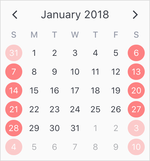
For now, let's just start by displaying a simple highlight on today's date.
现在,让我们从显示当前日期的简单亮点开始。
<template>
  <v-calendar :attributes='attrs'>
  </v-calendar>
</template>
export default {
data() {
return {
attrs: [
{
key: 'today',
highlight: {
backgroundColor: '#ff8080',
// Other properties are available too, like `height` & `borderRadius`
},
dates: new Date(2018, 0, 1)
}
],
};
},
};
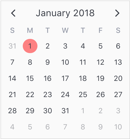
To add some contrast to the highlighted date, we can use a content style, which is simply a style object that gets applied to the day content text.
为了与突出显示的日期形成一些对比,我们可以使用内容样式,该样式只是应用于日期内容文本的样式对象。
export default {
  data() {
    return {
      attrs: [
        {
          key: 'today',
          highlight: {
            backgroundColor: '#ff8080',
          },
          // Just use a normal style
          contentStyle: {
            color: '#fafafa',
          },
          dates: new Date(2018, 0, 1)
        },
      ],
    };
  },
};

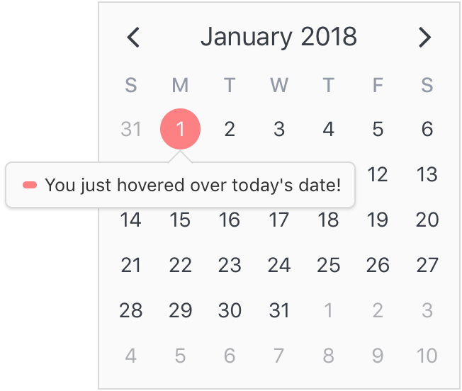
Finally, let's see how simple it is to add a popover label (or tooltip) to the calendar when this highlight is hovered over. To do that, we just need to add a popover section to our attribute.
最后,让我们看看将光标悬停在日历上时,在日历上添加弹出标签(或工具提示)有多么简单。 为此,我们只需要向属性添加一个popover部分。
export default {
  data() {
    return {
      attrs: [
        {
          key: 'today',
          dates: new Date(2018, 0, 1),
          highlight: {
            backgroundColor: '#ff8080',
          },
          // Just use a normal style
          contentStyle: {
            color: '#fafafa',
          },
          // Our new popover here
          popover: {
            label: 'You just hovered over today\'s date!',
          }
        },
      ],
    };
  },
};
在哪里展示 (Where to display)
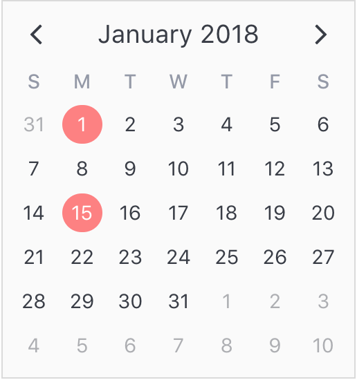
The second aspect of attributes is specifying where to display them. In the previous example, we saw that all we had to do was use a simple date object assigned to the dates property. Note that we aren't limited to using single date or date range objects. We can also use an array of dates.
属性的第二个方面是指定显示它们的位置。 在前面的示例中,我们看到要做的就是使用分配给dates属性的简单日期对象。 请注意,我们不仅限于使用单个日期或日期范围对象。 我们还可以使用日期数组。
...
  dates: [ new Date(2018, 0, 1), new Date(2018, 0, 15) ]
  ...
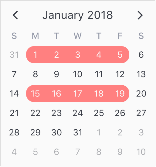
Or date ranges...
或日期范围...
...
  dates: [
    { start: new Date(2018, 0, 1), end: new Date(2018, 0, 5) },
    { start: new Date(2018, 0, 15), span: 5 } // Span is number of days
  ]
  ...
Or date patterns.
或日期模式。
...
  dates: { weekdays: [1, 7] } // On the weekends
  ...
日期选择器 (Date Picker)
The v-date-picker component is a flexible date picker component wrapper around v-calendar, which means it supports all props and events that v-calendar does. Using the mode prop, it is capable of 3 selection modes:
v-date-picker组件是围绕v-calendar的灵活的日期选择器组件包装,这意味着它支持v-calendar所做的所有道具和事件。 使用mode道具,它可以提供3种选择模式:
Single dates
单一日期
Multiple dates
多个日期
Date ranges
日期范围
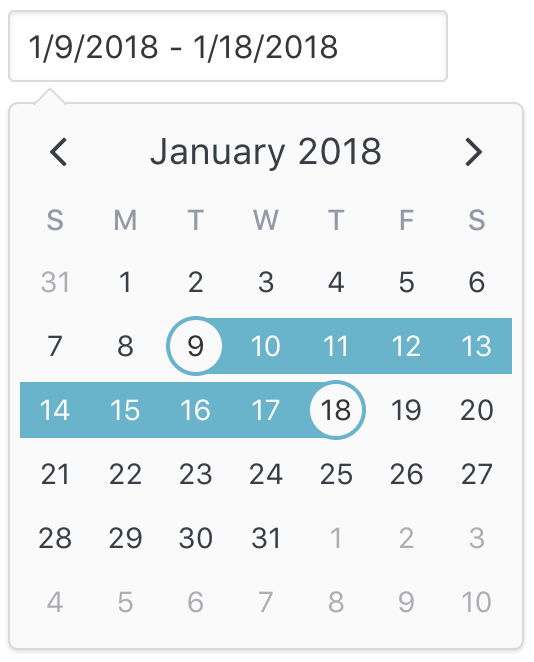
Date pickers can be displayed inline or as a popover for an input element which can be classed or styled.
日期选择器可以内联显示,也可以显示为输入元素的弹出框,可以对输入元素进行分类或设置样式。
<v-date-picker
  mode='range'
  v-model='selectedDate'
  show-caps>
</v-date-picker>
export default {
data() {
return {
selectedDate: {
start: new Date(2018, 0, 9),
end: new Date(2018, 0, 18)
}
};
},
};
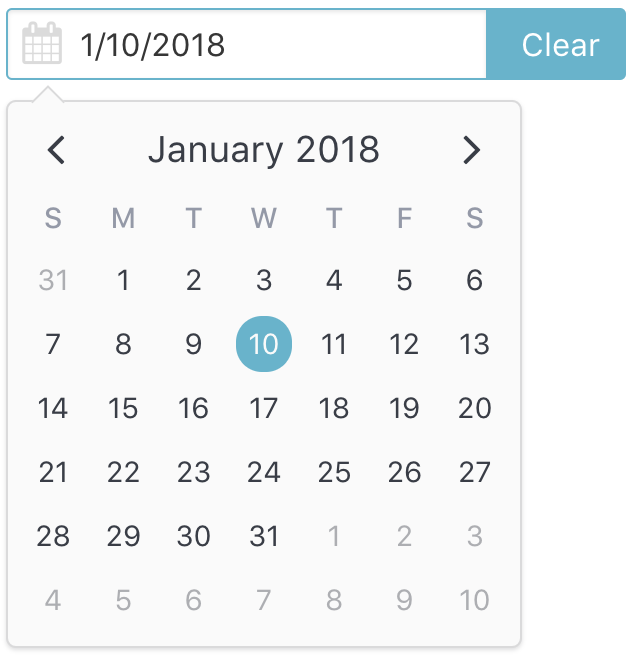
Also, a custom slot element can be used to display your own input element. This example uses Buefy for a custom styled input component.
此外,自定义插槽元素可用于显示您自己的输入元素。 本示例将Buefy用于自定义样式的输入组件。
<v-date-picker
  mode='single'
  v-model='selectedDate'>
  <b-field :type='inputState.type' slot-scope='props'>
    <b-input
      type='text'
      icon='calendar'
      :value='props.inputValue'
      :placeholder='inputState.message'
      @change.native='props.updateValue($event.target.value)'
      expanded>
    </b-input>
    <p
      class='control'
      v-if='selectedValue'>
      <a
        :class='["button", inputState.type]'
        @click='selectedValue = null'>
        Clear
      </a>
    </p>
  </b-field>
</v-date-picker>
export default {
data() {
return {
selectedDate: new Date(2018, 0, 10)
};
},
computed: {
inputState() {
if (!this.selectedValue) {
return {
type: 'is-danger',
message: 'Date required.',
};
}
return {
type: 'is-primary',
message: '',
};
},
},
};
You can disable dates, date ranges and date patterns using the following props:
您可以使用以下道具禁用日期,日期范围和日期格式:
Explicitly via
disabled-dates.明确地通过
disabled-dates。<!--Disable weekend selection--> <v-date-picker :mode='single' :disabled-dates='{ weekdays: [1, 7] }' v-model='selectedDate'> </v-date-picker>Implicitly via
available-dates. Any dates not included inavailable-datesare disabled.隐式地通过
available-dates。available-dates日期中未包括的available-dates均被禁用。<!--Today is the minimum date (null denotes infinite date)--> <v-date-picker :mode='single' :available-dates='{ start: new Date(), end: null }' v-model='selectedDate'> </v-date-picker>
安装 (Installation)
Vue.js version 2.5+ is required.
1通过npm安装 (1 Install via npm)
npm install v-calendar2导入和使用VCalendar (2 Import and use VCalendar)
import Vue from 'vue';
import VCalendar from 'v-calendar';
import 'v-calendar/lib/v-calendar.min.css';

// Use v-calendar, v-date-picker & v-popover components
Vue.use(VCalendar);
3组件模板中的参考 (3 Reference in your component templates)
<template>
  <v-calendar
    is-double-paned>
  </v-calendar>
  <v-date-picker
    mode='single'
    v-model='selectedValue'>
  </v-date-picker>
</template>
<script>
export default {
data() {
return {
selectedValue: new Date(),
};
},
};
</script>或使用CDN (Or use a CDN)
<html>
  <head>
    <meta charset='utf-8'>
    <meta name='viewport' content='width=device-width, initial-scale=1, shrink-to-fit=no'>
    <meta http-equiv='x-ua-compatible' content='ie=edge'>
    <!--1. Link VCalendar CSS-->
    <link rel='stylesheet' href='https://unpkg.com/v-calendar/lib/v-calendar.min.css'>
  </head>
  <body>
    <div id='app'>
      <v-calendar></v-calendar>
      <v-date-picker :mode='mode' v-model='selectedDate'></v-date-picker>
    </div>
    <!--2. Link Vue Javascript-->
    <script src='https://unpkg.com/vue/dist/vue.js'></script>
    <!--3. Link VCalendar Javascript (Plugin automatically installed)-->
    <script src='https://unpkg.com/v-calendar'></script>
    <!--4. Create the Vue instance-->
    <script>
      new Vue({
        el: '#app',
        data: {
          // Data used by the date picker
          mode: 'single',
          selectedDate: null,
        }
      })
    </script>
  </body>
</html>
翻译自: https://vuejsexamples.com/a-clean-and-lightweight-plugin-for-displaying-attributed-calendars/
vue显示日历插件


 2288
2288


 被折叠的 条评论
为什么被折叠?
被折叠的 条评论
为什么被折叠?
 到【灌水乐园】发言


