


vue移动端图片预览组件
视频图像输入 (vue-picture-input)
Mobile-friendly picture file input Vue.js component with image preview, drag and drop, EXIF orientation, and more.
适用于移动设备的图片文件输入Vue.js组件,带有图像预览,拖放,EXIF方向等。
安装 (Installation)
npm (npm)
npm install --save vue-picture-input纱 (yarn)
yarn add vue-picture-input用法 (Usage)
<template>
  <div class="hello">
    <picture-input
      ref="pictureInput"
      width="600"
      height="600"
      margin="16"
      accept="image/jpeg,image/png"
      size="10"
      button-class="btn"
      :custom-strings="{
        upload: '<h1>Bummer!</h1>',
        drag: 'Drag a 😺 GIF or GTFO'
      }"
      @change="onChange">
    </picture-input>
  </div>
</template>
<script>
import PictureInput from 'vue-picture-input'
export default {
name: 'app',
data () {
return {
}
},
components: {
PictureInput
},
methods: {
onChange (image) {
console.log('New picture selected!')
if (image) {
console.log('Picture loaded.')
this.image = image
} else {
console.log('FileReader API not supported: use the <form>, Luke!')
}
}
}
}
</script>You can also use it directly in the browser through unpkg's CDN (or jsDelivr):
您还可以通过unpkg的CDN (或jsDelivr )在浏览器中直接使用它:
<!DOCTYPE html>
<html>
<head>
  <script src="https://unpkg.com/vue"></script>
  <script src="https://unpkg.com/vue-picture-input"></script>
  <title>In the browser!</title>
</head>
<body>
  <div id="app">
    <p>{{ message }}</p>
    <picture-input></picture-input>
  </div>
  <script>
    var app = new Vue({
      el: '#app',
      data: {
        message: 'Hello Vue!'
      },
      components: {
        'picture-input': PictureInput
      }
    })
  </script>
</body>
</html>
示例项目 (Example project)
Try it on CodeSandbox: https://codesandbox.io/s/github/alessiomaffeis/vue-picture-input-example
在CodeSandbox上尝试: https ://codesandbox.io/s/github/alessiomaffeis/vue-picture-input-example
道具 (Props)
width, height: (pixels, optional) the maximum width and height of the preview container. The picture will be resized and centered to cover this area. If not specified, the preview container will expand to full width, 1:1 square ratio.
width,height :(像素,可选)预览容器的最大宽度和高度。 图片将被调整大小并居中以覆盖该区域。 如果未指定,则预览容器将扩展为1:1比例的全宽。
crop: (boolean, optional) set :crop="false" if you wish to disable cropping. The image will be resized and centered in order to be fully contained in the preview container. Default value: true.
crop :(布尔值,可选)如果要禁用裁剪,请设置:crop =“ false” 。 图像将被调整大小并居中,以完全包含在预览容器中。 默认值:true。
margin: (pixels, optional) the margin around the preview container. Default value: 0.
margin :(像素,可选)预览容器周围的边距。 默认值:0
radius: (percentage, optional) The border-radius value for the container. Set radius="50" to get a circular container. Default value: 0.
radius :(百分比,可选)容器的边界半径值。 设置radius =“ 50”以获得圆形容器。 默认值:0
plain: (boolean, optional) Set :plain="true" to remove the inner border and text. Default value: false.
plain :(布尔值,可选)设置:plain =“ true”删除内部边框和文本。 默认值:false。
accept: (media type, optional) the accepted image type(s), e.g. image/jpeg, image/gif, etc. Default value: 'image/*'.
accept :(媒体类型,可选)接受的图像类型,例如image / jpeg,image / gif等。默认值:“ image / *”。
size: (MB, optional) the maximum accepted file size in megabytes.
size :(MB,可选)可接受的最大文件大小(以兆字节为单位)。
removable: (boolean, optional) set :removable="true" if you want to display a "Remove Photo" button. Default value: false.
可移动 :(布尔值,可选)如果要显示“删除照片”按钮,请设置:removable =“ true” 。 默认值:false。
hideChangeButton: (boolean, optional) set :hideChangeButton="true" if you want to hide the "Change Photo" button. Default value: false.
hideChangeButton :(布尔值,可选)如果要隐藏“更改照片”按钮,请设置:hideChangeButton =“ true” 。 默认值:false。
id, name: (string, optional) the id and name attributes of the HTML input element.
id,name :(字符串,可选)HTML输入元素的id和name属性。
buttonClass: (string, optional) the class which will be applied to the 'Change Photo' button.
buttonClass :(字符串,可选)将应用于“更改照片”按钮的类。
Default value: 'btn btn-primary button'.
默认值:“ btn btn-主按钮”。removeButtonClass: (string, optional) the class which will be applied to the 'Remove Photo' button.
removeButtonClass :(字符串,可选)将应用于“删除照片”按钮的类。
Default value: 'btn btn-secondary button secondary'.
默认值:“ btn btn-secondary button secondary”。prefill: (image url or File object, optional) use this to specify the path to a default image (or a File object) to prefill the input with. Default value: empty.
prefill :(图像url或File对象,可选),使用它可以指定默认图像(或File对象)的路径,以使用输入来预填充输入。 默认值:空。
prefillOptions: (object, optional) use this if you prefill with a data uri scheme to specify a file name and a media or file type:
prefillOptions :(对象,可选)如果您使用数据uri方案预填充以指定文件名和媒体或文件类型,请使用此选项:
fileName: (string, optional) the file name
  fileType: (string, optional) the file type of the image, i.e. "png", or
mediaType: (string, optional) the media type of the image, i.e. "image/png"toggleAspectRatio: (boolean, optional) set :toggleAspectRatio="true" to show a button for toggling the canvas aspect ratio (Landscape/Portrait) on a non-square canvas. Default value: false.
toggleAspectRatio :(布尔值,可选)设置:toggleAspectRatio =“ true”,以显示用于切换非正方形画布上的画布纵横比(横向/纵向)的按钮。 默认值:false。
autoToggleAspectRatio: (boolean, optional) set :autoToggleAspectRatio="true" to enable automatic canvas aspect ratio change to match the selected picture's. Default value: false.
autoToggleAspectRatio :(布尔值,可选)设置:autoToggleAspectRatio =“ true”以启用自动画布纵横比更改以匹配所选图片。 默认值:false。
changeOnClick: (boolean, optional) set :changeOnClick="true" to open image selector when user click on the image. Default value: true.
changeOnClick :(布尔值,可选)设置:changeOnClick =“ true”以在用户单击图像时打开图像选择器。 默认值:true。
aspectButtonClass: (string, optional) the class which will be applied to the 'Landscape/Portrait' button.
AspectButtonClass :(字符串,可选)将应用于“横向/纵向”按钮的类。
Default value: 'btn btn-secondary button secondary'.
默认值:“ btn btn-secondary button secondary”。zIndex: (number, optional) The base z-index value. In case of issues with your layout, change :zIndex="..." to a value that suits you better. Default value: 10000.
zIndex :(数字,可选)基本z索引值。 如果布局出现问题,请将:zIndex =“ ...”更改为更适合您的值。 预设值:10000。
alertOnError: (boolean, optional) Set :alertOnError="false" to disable displaying alerts on attemps to select file with
alertOnError :(布尔值,可选)设置:alertOnError =“ false”,以禁止在尝试选择文件时尝试显示警报
wrong type or too big.
类型错误或太大。
Default value: true.
默认值:true。customStrings: (object, optional) use this to provide one or more custom strings (see the example above). Here are the available strings and their default values:
customStrings :(对象,可选)使用它来提供一个或多个自定义字符串(请参见上面的示例)。 以下是可用的字符串及其默认值:
{
upload: '<p>Your device does not support file uploading.</p>', // HTML allowed
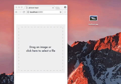
drag: 'Drag an image or <br>click here to select a file', // HTML allowed
tap: 'Tap here to select a photo <br>from your gallery', // HTML allowed
change: 'Change Photo', // Text only
remove: 'Remove Photo', // Text only
select: 'Select a Photo', // Text only
selected: '<p>Photo successfully selected!</p>', // HTML allowed
fileSize: 'The file size exceeds the limit', // Text only
fileType: 'This file type is not supported.', // Text only
aspect: 'Landscape/Portrait' // Text only
}大事记 (Events)
change: emitted on (successful) picture change (prefill excluded). The image is passed along with the event as a Base64 Data URI string. If you need to access the underlying image from the parent component, add a ref attribute to picture-input (see the example above). You may want to use this.$refs.pictureInput.image (Base64 Data URI string) or this.$refs.pictureInput.file (File Object)
更改 :在(成功)图片更改(不包括预填充)上发出。 图像与事件一起作为Base64数据URI字符串传递。 如果需要从父组件访问基础图像,则将ref属性添加到picture-input(请参见上面的示例)。 您可能要使用this。$ refs.pictureInput.image (Base64数据URI字符串)或this。$ refs.pictureInput.file (文件对象)
prefill: emitted on default image prefill.
预填充 :在默认图像预填充上发出。
remove: emitted on picture remove.
删除 :在图片上发出。
click: emitted on picture click.
click :在图片点击时发出。
error: emitted on error, along with an object with type, message, and optional additional parameters.
error :在错误时发出,并带有type , message和可选附加参数的对象。
待办事项 (TODOs)
Client-side resizing and cropping
客户端调整大小和裁剪
Add tests
添加测试
翻译自: https://vuejsexamples.com/mobile-friendly-picture-file-input-vue-js-component-with-image-preview/
vue移动端图片预览组件


 扫一扫
扫一扫
 684
684

 被折叠的 条评论
为什么被折叠?
被折叠的 条评论
为什么被折叠?
 到【灌水乐园】发言


