


flexbox布局
The following introduction to Flexbox is an extract from Tiffany’s new book, CSS Master, 2nd Edition.
以下对Flexbox的介绍摘自Tiffany的新书CSS Master,第二版 。
Before CSS Grid came along, there was Flexbox (which is officially known as the CSS Flexible Box Layout Module). Flexbox was designed to manage layout in one direction—a row (flex-direction: row or row-reverse) or a column (flex-direction: column or column-reverse). That’s in contrast to Grid, which accounts for rows and columns.
在CSS Grid出现之前,有Flexbox(正式称为CSS Flexible Box Layout Module )。 Flexbox旨在管理一个方向上的布局-行( flex-direction: row或row-reverse ) 或列( flex-direction: column或column-reverse )。 这与网格不同,网格占行和列。
A basic flexible box layout is simple to create: add display: flex or display: inline-flex to the containing element. These values for display will trigger a flex formatting context for that containing element’s children. As with Grid, both flex and inline-flex are inside display modes. We set these values on the container, which behaves like a block-level or inline-level box, respectively. The children of that container are then arranged according to the rules of flex layout.
基本的灵活框布局易于创建:将display: flex或display: inline-flex到包含元素。 这些用于display值将触发包含元素的子元素的flex格式化上下文 。 与Grid一样, flex和inline-flex都在显示模式内。 我们在容器上设置这些值,其行为分别类似于块级或嵌入式级框。 然后根据伸缩布局的规则安排该容器的子级。
Note: Older versions of Blink-based browsers such as Chrome (≤ 28), and WebKit-based browsers like Safari (≤ 8), require a vendor prefix. If your project still supports those browsers, you’ll need to use display: -webkit-flex or display: -webkit-inline-flex. Older versions of Firefox (≤ 21) also require a prefix. Use -moz-flex and -moz-inline-flex to support those browsers.
注意:较旧版本的基于Blink的浏览器,例如Chrome(≤28)和基于WebKit的浏览器,例如Safari(≤8),都需要供应商前缀。 如果您的项目仍支持这些浏览器,则需要使用display: -webkit-flex或display: -webkit-inline-flex 。 较早版本的Firefox(≤21)也需要前缀。 使用-moz-flex和-moz-inline-flex支持这些浏览器。
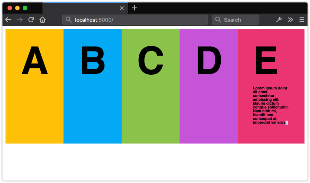
By adding display: flex or display: inline-flex to a containing element, its immediate children become flex items, as shown in the image below. Flex items may be element children or non-empty text nodes. For instance, the markup below generates three flex item boxes that each behave according to the rules of flex layout:
通过将display: flex或display: inline-flex到包含元素,其直接子元素将成为flex项目,如下图所示。 弹性项目可以是元素子项或非空文本节点。 例如,下面的标记会生成三个弹性项目框,每个弹性项目框都按照弹性布局的规则运行:
<div style="display: flex">
    <span>This text is contained by a SPAN element.</span>
    <b>This text is contained by a B element.</b>
    This text node is still a flex item.
</div>
If no other properties are set, each flex item will have the same height as its tallest element (as determined by content). It will also stack horizontally (or vertically when the document has a vertical writing mode) without wrapping, and with no space between the edges of each box. Flex items may overflow the container.
如果未设置其他属性,则每个flex项目将具有与其最高元素相同的高度(由内容确定)。 它还将水平堆叠(或在文档具有垂直书写模式时垂直堆叠),而无需包裹,并且每个框的边缘之间没有间距。 柔性物品可能会使容器溢出。
 A list with
display: flex applied to the
ul containing element
display: flex列表
display: flex应用于
ul包含元素
This may not seem like such a big deal, but it simplifies the code necessary for a range of user interface patterns. Let’s look at a couple of examples.
这似乎没什么大不了的,但是它简化了一系列用户界面模式所需的代码。 让我们看几个例子。
新的媒体对象组件 (A New Media Object Component)
Take the following media object code:
采取以下媒体对象代码:
<div class="media__object">
    <img src="video-thumb1.jpg">
    <div class="media__object__text">Lorem ipsum dolor sit amet, consectetur adipiscing elit, sed do eiusmod tempor incididunt ut labore et dolore magna aliqua.</div>
</div>
Before Flexbox, we might have paired the preceding markup with the following CSS:
在Flexbox之前,我们可能已将前面的标记与以下CSS配对:
.media__object img {
    float: left;
    height: auto;
    width: 150px;
}
.media__object__text {
    padding-left: 170px;
}
/* Let's use the clearfix hack! */
.media__object::after{
    content: ' ';
    display: block;
    clear: both;
}
This layout works, but it has one major drawback: it requires us to constrain the width of our images so that we know how much padding to use. That limits our ability to use this same component in multiple contexts. You may want an image 150px wide when this component is used for a “Related Stories” widget, and one that’s only 75px wide for comments.
这种布局是可行的,但是它有一个主要缺点:它要求我们限制图像的宽度,以便我们知道要使用多少填充。 这限制了我们在多种情况下使用相同组件的能力。 当此组件用于“相关故事”小部件时,您可能需要一张150像素宽的图像,而注释则只有75像素宽。
Let’s try this using Flexbox. Here’s our updated CSS:
让我们使用Flexbox尝试一下。 这是我们更新CSS:
.media__object {
    display: flex;
}
.media_object img {
    margin-right: 20px;
}
That’s a lot less CSS. An added bonus is that we don’t have to worry about how wide or tall our image is. Nor do we have to concern ourselves with clearing floats. Whether the image is 200px wide or 20px wide, .media__object__text will abut the margin box of our img element.
CSS少了很多。 另外一个好处是,我们不必担心图像的宽度或高度。 我们也不必担心清理浮子。 无论图像的宽度是.media__object__text像素还是20像素, .media__object__text都将紧靠img元素的空白框。
使用flex创建灵活的表单组件 (Creating Flexible Form Components with flex)
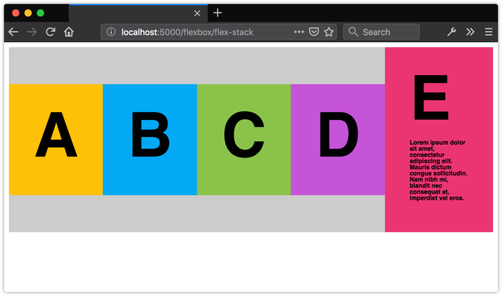
Another use case for Flexbox is creating flexible, vertically aligned form components. Consider the interface pattern shown in the image below.
Flexbox的另一个用例是创建灵活的,垂直对齐的表单组件。 考虑下图所示的接口模式。
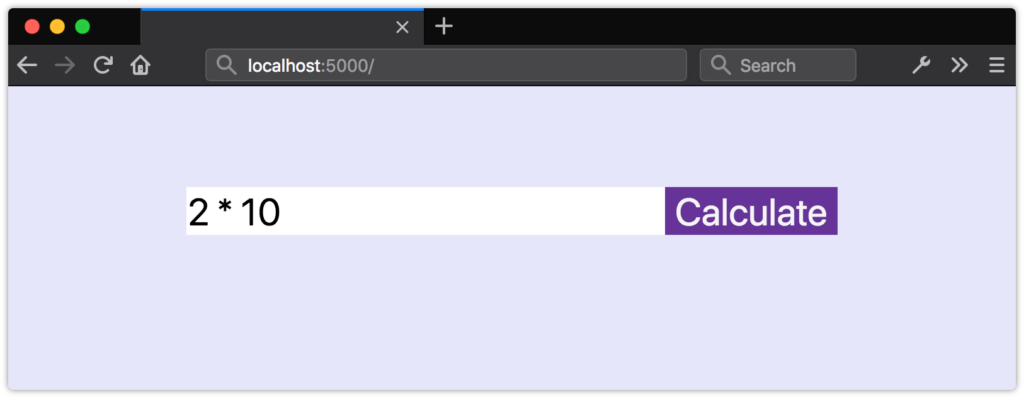 A form field with an adjacent button 带有相邻按钮的表单域
Here, we have a form input control and an adjacent button. Both are vertically aligned, and our button is 150px wide.
在这里,我们有一个表单输入控件和一个相邻的按钮。 两者都是垂直对齐的,我们的按钮为150px宽。
What if we want our input element to expand to fill the available space in its container? Without Flexbox, we’d need some JavaScript and hand-waving to update the width of input in response to changes in the width of its parent. With Flexbox, however, we can just use flex.
如果我们希望input元素扩展以填充其容器中的可用空间怎么办? 没有Flexbox,我们需要一些JavaScript和手工操作来更新input的宽度,以响应其父级宽度的变化。 但是,使用Flexbox,我们只能使用flex 。
The flex property is actually shorthand for three other properties.
flex属性实际上是其他三个属性的简写。
flex-growindicates that an element should grow if necessary and must be a positive integer. Its initial value is0.flex-grow表示元素在必要时应增长,并且必须为正整数。 其初始值为0。flex-shrinkindicates that an element should shrink if necessary and must be a positive integer. Its initial value is1.flex-shrink表示元素在必要时应缩小,并且必须为正整数。 其初始值为1。flex-basis:indicates the initial or minimum width (when the flex axis is horizontal) or the height of an element (when it’s vertical). It may be a length or percentage, orauto, and its initial value isauto.flex-basis:表示初始宽度或最小宽度(当弯曲轴为水平时)或元素的高度(当垂直时)。 它可以是长度或百分比,也可以是auto,其初始值为auto。
Though it’s possible to set each of these individually, the specification strongly recommends using the flex shorthand. Here’s an example:
尽管可以单独设置每个选项,但规范强烈建议使用flex速记。 这是一个例子:
div {
    display: flex;
}
input[type="text"], button {
    border: 0;
    font: inherit;
}
input[type="text"] {
    flex: 1 0 auto;
}
button {
    background: #003;
    color: whitesmoke;
    display: block;
    text-align: center;
    flex: 0 0 150px;
}
Here, we’ve used flex: 1 0 auto for our input element. Since its flex-grow value is 1, it will grow to fill the available space of its parent. For the button element, however, we’ve used flex: 0 0 150px. The 0 values for flex-grow and flex-shrink prevent the width of the button from increasing or decreasing, while the flex-basis value of 150px sets its width.
在这里,我们使用了flex: 1 0 auto作为input元素。 由于其flex-grow值为1 ,它将增长以填充其父级的可用空间。 但是,对于button元素,我们使用了flex: 0 0 150px 。 flex-grow和flex-shrink的0值阻止按钮的宽度增加或减少,而150px的flex-basis值设置按钮的宽度。
As you can see in the image below, our button remains the same size, but the width of input expands to fill the remaining space.
如您在下图中所看到的,我们的按钮保持不变,但是input的宽度会扩展以填充剩余的空间。
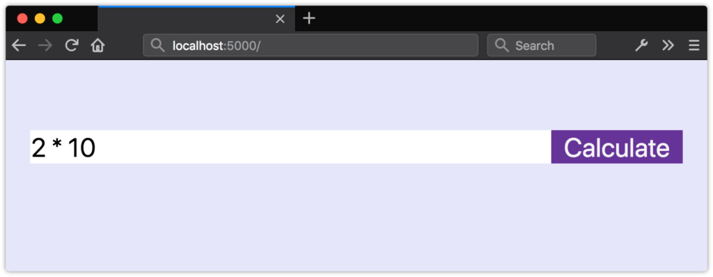 The effect of
flex: 0 0 150px
flex: 0 0 150px的效果
flex: 0 0 150px
The tricky bit about flex-grow and flex-shrink values is that they’re proportional. Yes, flex: 1 0 auto means our input element will be wider than our button. But changing the value of our button’s flex property to flex: 1 0 auto doesn’t necessarily mean that both elements will have the same size, as shown in the following image.
关于flex-grow和flex-shrink值的棘手问题是它们是成比例的。 是的, flex: 1 0 auto意味着我们的input元素将比我们的按钮宽。 但是将按钮的flex属性的值更改为flex: 1 0 auto并不一定意味着两个元素的大小都相同,如下图所示。
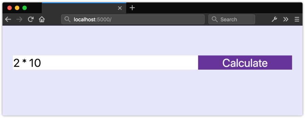 Both items have the same flex value but are still different sizes 这两个项目具有相同的柔韧性值,但尺寸仍然不同
Instead, flex items will be resized to fill the container, taking their used min-width and max-width values into account (which may be their initial values).
取而代之的是,将调整弹性项目的大小以填充容器,同时考虑其使用的min-width和max-width值(可能是它们的初始值)。
Unfortunately, we can’t use fr units with the flex or flex-basis properties. Use length or percentage values instead.
不幸的是,我们不能使用带有flex或flex-basis属性的fr单位。 请改用长度或百分比值。
Flexbox垂直居中 (Vertical Centering with Flexbox)
Finally, let’s take a look at how to vertically center content with Flexbox. Vertically centering elements is one of the more difficult tasks to achieve with CSS, particularly if the height of your content is unknown. But with Flexbox, we require just one additional line of CSS—align-items: center:
最后,让我们看一下如何使用Flexbox将内容垂直居中。 垂直居中元素是CSS难以完成的任务之一,尤其是在内容高度未知的情况下。 但是使用Flexbox,我们只需要增加一行CSS代码即可: align-items: center :
.flex-container {
    display: flex;
    align-items: center;
}
Now our flex items and their contents are vertically centered within the flex container, as shown in the image below.
现在,我们的伸缩项目及其内容在伸缩容器内垂直居中,如下图所示。
 Distributing flex items with
align-items: center
align-items: center分配弹性
align-items: center
使用Flexbox创建类似网格的布局 (Creating Grid-like Layouts with Flexbox)
In most cases, you’ll want to use Grid to create grid-like layouts. However, you may find yourself wanting boxes that align when there’s an even number of items, but expand to fill the available space when there’s an odd number.
在大多数情况下,您将希望使用Grid创建类似网格的布局。 但是,您可能会希望自己的框在有偶数个时对齐,而在有奇数个时会扩大以填充可用空间。
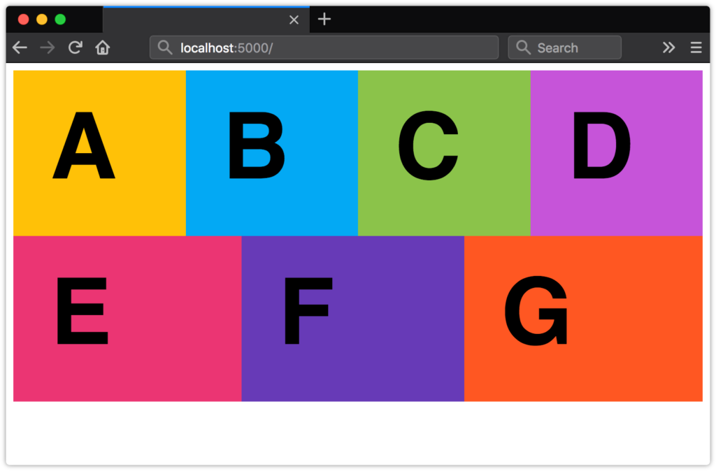 A grid-like layout with expanding cells 具有扩展单元格的网格状布局
Here’s the markup we’ll use:
这是我们将使用的标记:
<ul class="flex-aligned">
    <li>A</li>
    <li>B</li>
    <li>C</li>
    <li>D</li>
    <li>E</li>
    <li>F</li>
    <li>G</li>
</li>
By default, flex items don’t wrap. To achieve the layout above, we’ll need to make them wrap using the flex-wrap property. It accepts three values: nowrap (the inital value), wrap, and wrap-reverse. We’ll use wrap here:
默认情况下,弹性项目不包装。 为了实现上面的布局,我们需要使用flex-wrap属性将它们包装。 它接受三个值: nowrap (初始值), wrap和wrap-reverse 。 我们将在此处使用wrap :
.flex-aligned {
    display: flex;
    flex-wrap: wrap;
}
Now we just need to indicate how our flex items should behave, and what their maximum width should be. Since we want a maximum of four columns, we’ll set our flex-basis value to 25%. And since we want our flex items to expand to fill the available space, we’ll set flex-grow to 1. We’ll keep flex-shrink at 0 so that our boxes never occupy less than 25% of their container:
现在,我们只需要指出弹性项目的行为方式以及最大宽度即可。 由于我们最多需要四列,因此我们将flex-basis值设置为25% 。 并且由于我们希望伸缩项目扩展以填充可用空间,因此我们将flex-grow设置为1。我们将flex-shrink保持为0,以便我们的盒子永远不会占据其容器的25%以下:
.flex-aligned li {
    flex: 1 0 25%;
}
了解有关Flexbox的更多信息 (Learning More about Flexbox)
There’s a lot more to Flexbox than what we’ve covered here. CSS-Tricks’ “A Complete Guide to Flexbox” digs into all the properties and values. You can also check out Philip Walton’s “Solved by Flexbox”, which showcases UI patterns that are made easier with Flexbox.
除了我们在此介绍的内容以外,Flexbox还有很多其他功能。 CSS-Tricks的“ Flexbox完整指南 ”深入研究了所有属性和值。 您还可以查看Philip Walton的“ Flexbox解决的方法 ”,它展示了使用Flexbox变得更加容易的UI模式。
选择flex或grid (Choosing flex or grid)
As you develop page or component layouts, you may find yourself wondering when it’s better to use Flexbox and when to use Grid.
在开发页面或组件布局时,您可能会想知道何时使用Flexbox更好,何时使用Grid。
Use Grid when you want to arrange elements into rows and columns that align both horizontally and vertically.
当您要将元素排列成水平和垂直对齐的行和列时,请使用“网格”。
Use Flexbox when you want to arrange items in a row or a column, when you wish to align items vertically or horizontally, but not both.
当您想将项目排列成一行或一列,希望垂直或水平对齐项目时(而不是两者都对齐),请使用Flexbox。
Jen Simmons’ video “Flexbox vs. CSS Grid — Which is Better?” walks you through some things to consider when choosing between Grid and Flexbox. Rachel Andrew’s “Should I use Grid or Flexbox?” is another great resource for understanding both.
詹·西蒙斯(Jen Simmons)的视频“ Flexbox vs. CSS Grid —哪个更好? ”将引导您完成在Grid和Flexbox之间进行选择时要考虑的一些事项。 Rachel Andrew的“ 我应该使用Grid还是Flexbox? ”是了解两者的又一绝妙资源。
In practice, your projects will probably mix both of these techniques, as well as floats. For instance, you may use Grid to define the overall page layout, while using Flexbox for your navigation menu or search box, and floats to place tables or images.
实际上,您的项目可能会同时使用这两种技术以及浮动技术。 例如,您可以使用Grid定义整体页面布局,而将Flexbox用作导航菜单或搜索框,然后浮动以放置表格或图像。
翻译自: https://www.sitepoint.com/creating-flexible-layouts-with-flexbox/
flexbox布局


 3322
3322

 被折叠的 条评论
为什么被折叠?
被折叠的 条评论
为什么被折叠?
 到【灌水乐园】发言


