


In this article, I’ll show how to add another dimension to your web pages and applications with the new 3D transformation functions and properties in CSS. We’ll look at transform, translate, rotations, scaling, perspective and more, along with issues to do with z-index, browser gotchas, and the best use cases for these functions.
在本文中,我将展示如何使用CSS中的新3D转换功能和属性在网页和应用程序中添加另一个维度。 我们将研究变换,平移,旋转,缩放,透视图等等,以及与z-index,浏览器陷阱有关的问题以及这些功能的最佳用例。
HTML elements can be transformed in three dimensions:
HTML元素可以在三个维度上进行转换:
- the horizontal x-axis 水平x轴
- the vertical y-axis, and 垂直y轴,以及
- the depth z-axis 深度z轴
On a two-dimensional screen, it’s useful to think of the surface being at z co-ordinate zero. A positive z-value moves an object toward you (in front of the screen) while a negative z-value moves an object away (behind the screen). When perspective is added, a more distant z-value can cause the object to disappear entirely.
在二维屏幕上,考虑曲面在z坐标为零的位置很有用。 z值正向将对象移向您(在屏幕前面),z值负向将对象移开(在屏幕后面)。 添加透视图时,更远的z值可能导致对象完全消失。
There are some things to note here:
这里有一些事情要注意:
CSS can only transform two-dimensional HTML elements in three-dimensional space. The elements themselves remain flat and have zero depth. It’s possible to scale in the z-plane, but that will not extrude a square into a cube. You can still create a cube, but would need six elements to make each side.
CSS只能在三维空间中转换二维HTML元素。 元素本身保持平坦,深度为零。 这有可能在z平面规模,但不会挤压方成一个立方体。 您仍然可以创建一个多维数据集,但是每边需要六个元素。
CSS 3D transformations are great for page effects — but don’t expect that you’ll be able to create the next MineCraft or Call of Duty. Complex models are better implemented using a technology such as WebGL.
CSS 3D转换非常适合页面效果-但不要指望您将能够创建下一个MineCraft或《使命召唤》。 使用WebGL之类的技术可以更好地实现复杂的模型。
3D transformations are well-supported in all modern browsers (IE10+), but:
所有现代浏览器 (IE10 +)都很好地支持 3D转换,但是:
Internet Explorer doesn’t support
transform-style: preserve-3d, which makes it impossible to create a 3D scene.Internet Explorer不支持
transform-style: preserve-3d,这使得无法创建3D场景。All versions of Safari must use the vendor-prefixed
-webkit-backface-visibilityto hide rear faces. All other browsers supportbackface-visibility.Safari的所有版本都必须使用供应商前缀的
-webkit-backface-visibility隐藏背面。 所有其他浏览器都支持backface-visibility。
The following sections describe the 3D transformation properties and functions. The demonstration page illustrates how most are used.
以下各节描述了3D转换属性和功能。 演示页面说明了如何使用大多数内容。
transform属性 (The transform Property)
Any element can have a single transform property applied. It can be assigned a function with one or more parameters. For example:
任何元素都可以应用单个transform属性。 可以为其分配具有一个或多个参数的功能。 例如:
.element {
  transform: function1(parameter1, [...parameterN]);
}
If two or more transformations are required, any number of space-separated functions can be defined:
如果需要两个或多个转换,则可以定义任意数量的以空格分隔的函数:
.element {
  transform: function1(p1, [...pN]) function2(p1, [...pN]);
}
For example, to scale in the horizontal plane and transform vertically:
例如,要在水平面缩放并垂直转换:
.element {
  transform: scaleX(2) translateY(50px);
}
Finally, transform: none; removes all existing transforms.
最后, transform: none; 删除所有现有的变换。
平移(移动)功能 (Translation (Moving) Functions)
You have possibly used translate functions to move an element horizontally along the x axis or vertically along the y axis:
您可能已经使用了translate功能来使元素沿x轴水平移动或沿y轴垂直移动:
transform: translateX(50px);        /* 50px to right */
transform: translateY(-100%);       /* 100% up */
transform: translate(50px, -100%);  /* both together */
Any length unit can be used. Percentages reference the size of the transformed element so a 100px high block with translateY(80%) applied moves it down by 80 pixels.
可以使用任何长度单位。 百分比引用了转换后的元素的大小,因此,应用了transformY translateY(80%)的100px高的块将其向下移动了80个像素。
Moving into the third dimension, we can also use translateZ:
进入第三维,我们还可以使用translateZ :
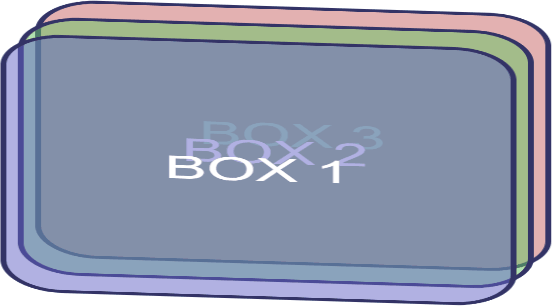
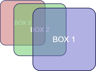
transform: translateZ(-200px); /* 200px 'into' the screen */Given three elements, #box1, #box2 and #box3, absolutely positioned in the same place, with translateZ(-200px) applied to #box2 and translateZ(-400px) applied to #box3. The result is fairly uninspiring:
给出三个元素, #box1 , #box2和#box3 ,绝对定位在同一地点,与translateZ(-200px)施加到#BOX2和translateZ(-400px)施加到#BOX3。 结果非常令人鼓舞:

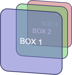
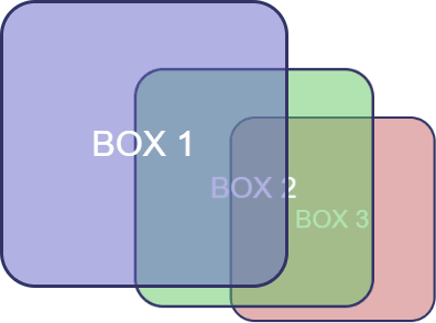
However, if we rotate the whole outer #scene container, the z-axis transformations become more evident:
但是,如果我们旋转整个外部#scene容器,则z轴变换将变得更加明显:
#scene {
  transform-style: preserve-3d;
  transform: rotateX(-10deg) rotateY(-10deg);
}
The shorthand translate3d function allows an element to be moved along all three axes accordingly:
简写的translate3d函数允许元素相应地沿所有三个轴移动:
transform: translate3d(50px, 100%, 7em); /* x, y, z axis */ transform-style属性 (transform-style Property)
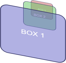
By default (and always in IE), transform-style is set to flat. This indicates that all transformed children of an element lie in the plane of the element itself. In other words, inner elements could have any transform applied but they would be squashed into the flat plane of the container:
默认情况下(始终在IE中), transform-style设置为flat 。 这表明元素的所有变形子元素都位于元素本身的平面中。 换句话说,内部元素可以应用任何转换,但是将被压缩到容器的平面中:

In most situations, transform-style: preserve-3d; must be used to indicate the child elements are positioned in 3D space and any transformation of the container will transform all accordingly.
在大多数情况下, transform-style: preserve-3d; 必须用于指示子元素位于3D空间中,并且容器的任何变换都将相应地进行变换。
旋转功能 (Rotation Functions)
The 2D rotate() function actually rotates elements around the z-axis and is identical to rotateZ(). For example:
二维rotate()函数实际上绕z轴的元素和是相同的rotateZ() 例如:
transform: rotateZ(45deg); /* or rotate(45deg) */
rotateX() rotates around the horizontal axis and rotateY() around the vertical.
rotateX()围绕水平轴并旋转rotateY()绕垂直。
Angles can be defined in:
角度可以定义为:
turn— e.g.0.5turnis half a turn clockwiseturn—例如0.5turn转顺时针旋转半圈deg— degrees, e.g.90degis one quarter turn clockwisedeg—度,例如90deg是顺时针旋转四分之一圈rad— radians, e.g.-3.1416radis half a turn counter-clockwiserad—弧度,例如-3.1416rad逆时针旋转半圈grad— gradians. One full turn is400grad, so-200gradis half a turn counter-clockwise.grad—格里安人。 一整圈是400grad,所以-200grad是逆时针半圈。
Three axes of rotation can be set with the rotate3d() function. Somewhat confusingly, it accepts four values, which describe a vector:
可以使用rotate3d()函数设置三个旋转轴。 令人困惑的是,它接受四个值,这些值描述了一个向量:
x— the x-coordinate of the vector denoting the axis of rotation (0 to 1).x—表示旋转轴(0到1)的向量的x坐标。y— the y-coordinate of the vector denoting the axis of rotation (0 to 1).y—表示旋转轴(0到1)的向量的y坐标。z— the z-coordinate of the vector denoting the axis of rotation (0 to 1).z—表示旋转轴(0到1)的向量的z坐标。a— the angle of rotation. A positive angle denotes clockwise rotation and negative is counter-clockwise.a-旋转的角度。 正角表示顺时针旋转,负角表示逆时针旋转。
Math masochists can read full details of rotate3d() at MDN.
数学受虐狂可以在MDN上阅读rotate3d()全部详细信息 。
缩放(大小)功能 (Scaling (Size) Functions)
The functions scaleX() and scaleY() stretch or shrink an element in the horizontal and vertical planes accordingly:
函数scaleX()和scaleY()在水平和垂直平面上拉伸或收缩元素:
transform: scaleX(2);   /* twice as wide */
transform: scaleY(0.5); /* half as tall */
scaleZ() does the same for the depth plane. In the example above, transform: scaleZ(0.5); therefore reduces the spacing between each element by half.
scaleZ()对深度平面执行相同的操作。 在上面的示例中, transform: scaleZ(0.5); 因此,每个元素之间的间距减少了一半。
The scale3d(x, y, z) function can apply scaling in all planes in one command. For example:
scale3d(x, y, z)函数可以在一个命令中在所有平面上应用缩放。 例如:
#scene {
  transform-style: preserve-3d;
  transform: scale3d(2, 1, 0.5) rotateX(-10deg) rotateY(-10deg);
}
转换原点 (Transform Origin)
By default, an element is rotated and scaled around its center point. This can be modified by setting transform-origin with up to three space-separated values:
默认情况下,元素绕其中心点旋转和缩放。 可以通过设置最多三个以空格分隔的值的transform-origin来修改此值:
one-value syntax: a length or percentage of the x origin. A single
left,center,right,toporbottomkeyword can also be used wheretopandbottomset the y origin with a center x origin.一值语法: x原点的长度或百分比。 在
top和bottom将y原点设置为中心x原点的情况bottom也可以使用单个left,center,right,top或bottom关键字。two-value syntax: the x and y origins. A length, percentage or keyword can be used.
二值语法: x和y的原点。 可以使用长度,百分比或关键字。
three-value syntax: the x, y and z origins. The z value may only be a length unit such as
pxorem.三值语法: x,y和z的原点。 z值只能是长度单位,例如
px或em。
Moving one origin affects the rotational plane of the others. For example, transform-origin: left center 0; moves the origin to the center of the left-hand edge. This will affect rotateY() and rotateZ() functions.
移动一个原点会影响另一个原点的旋转平面。 例如, transform-origin: left center 0; 将原点移动到左侧边缘的中心。 这将影响rotateY()和rotateZ()函数。
背面可见性 (Backface Visibility)
The rear of an element is shown when it’s rotated around the x or y axis by more than 90 but less than 270 degrees in either direction. The rear is effectively a mirror image and it’s visible by default.
当元素沿x或y轴在任一方向上旋转超过90度但小于270度时,将显示元素的背面。 背面实际上是一个镜像,默认情况下visible 。
The rear can be hidden by setting backface-visibility: hidden; — if it’s applied to #box2:
可以通过设置backface-visibility: hidden;来隐藏后部backface-visibility: hidden; —如果应用于#box2 :
#box2 {
  backface-visibility: hidden;
}

#scene {
  transform: rotateX(-10deg) rotateY(-135deg);
}
backface-visibility: hidden; is often used for card-flipping animations where two elements show the front and back of a card but only one can be visible at a time.
backface-visibility: hidden; 通常用于翻转卡片动画,其中两个元素显示卡片的正面和背面,但一次只能看到一个。
透视 (Perspective)
The examples shown above don’t apply perspective. An element moved deeper into the z plane remains the same size no matter how far away it is from the viewer. The perspective property defaults to none but it can be set to any positive length. For example:
上面显示的示例不适用于透视图。 移入z平面更深的元素将保持相同的大小,无论它距查看器有多远。 perspective属性默认为none但可以设置为任何正长度。 例如:
#scene {
  perspective: 1000px;
  transform: rotateX(-15deg) rotateY(-15deg);
}
The smaller the perspective length, the closer the vanishing point and the more pronounced the 3D effect:
perspective长度越小,消失点越近,3D效果越明显:
#scene {
  perspective: 200px;
  transform: rotateX(-15deg) rotateY(-45deg);
}
透视消失点 (Perspective Vanishing Point)
By default, the perspective vanishing point is at the center of the element being transformed. It can be modified by setting perspective-origin: x y;, where:
默认情况下,透视消失点位于要变换的元素的中心。 可以通过设置perspective-origin: xy;来修改它perspective-origin: xy; ,其中:
xis a keyword (left,center, orright) or a percentage relative to the width of the element (0%,50%and100%is equivalent to the keywords).x是关键字(left,center或right)或相对于元素宽度的百分比(0%,50%和100%等效于关键字)。yis a keyword (top,center, orbottom) or a percentage relative to the height of the element (0%,50%and100%is equivalent to the keywords).y是关键字(top,center或bottom)或相对于元素高度的百分比(0%,50%和100%等效于关键字)。
Top-left vanishing point:
左上消失点:
#scene {
  perspective-origin: left top; /* or 0% 0% */
  perspective: 1000px;
}
Bottom-right vanishing point:
右下消失点:
#scene {
  perspective-origin: right bottom; /* or 100% 100% */
  perspective: 1000px;
}
There’s also a perspective() function — for examle, transform: perspective(200px). However, it doesn’t appear to respect any perspective-origin.
还有一个perspective()函数-例如, transform: perspective(200px) 。 但是,似乎没有尊重任何perspective-origin 。
现在都在一起了 (All Together Now)
Finally, scaling, rotation, and translation can be defined in a single matrix3d() function which requires no less than 16 values for a three-dimensional affine transformation.
最后,缩放,旋转和平移可以在单个matrix3d()函数中定义,对于三维仿射变换 ,该函数需要不少于16个值。
This is probably best used in JavaScript and attempted by those with a degree in geometry! For CSS, a list of transformation functions is likely to be more readable and maintainable.
这可能是JavaScript中最好的用法,并且是那些具有几何学学位的人尝试的! 对于CSS,转换函数列表可能更具可读性和可维护性。
进一步阅读 (Further Reading)
Working in three dimensions can be conceptually difficult, but CSS transformations are an easier route to object manipulation. The demonstration page provides an interactive tool which will help you understand how the properties and functions work together.
从概念上讲,在三个维度上工作可能很困难,但是CSS转换是一种更容易进行对象操作的途径。 演示页面提供了一个交互式工具,该工具将帮助您了解属性和功能如何协同工作。
You can find stunning examples of CSS 3D transformations, including virtual reality viewers, first-person shooters, image galleries and Star Wars scrolling text. Many are proof-of-concept demonstrations which are unlikely to have use in typical projects. However, a few subtle, progressively-enhanced 3D effects can add another dimension to your web pages and applications.
您可以找到CSS 3D转换的惊人示例,包括虚拟现实查看器 , 第一人称射击 , 图像画廊和《星球大战》滚动文本 。 许多是概念验证的演示,不太可能在典型项目中使用。 但是,一些微妙的,逐渐增强的3D效果可以为您的网页和应用程序添加另一个维度。
翻译自: https://www.sitepoint.com/css-3d-transformation-functions/


 扫一扫
扫一扫
 614
614

 被折叠的 条评论
为什么被折叠?
被折叠的 条评论
为什么被折叠?
 到【灌水乐园】发言


