


css模板 bulma
In this tutorial, we’ll be getting started with Bulma, a modern CSS Framework built on Flexbox. For best results, follow along with the video at the end by OpenSource Craft. If you want to learn why you should care about Bulma, check out this video.
在本教程中,我们将开始使用Bulma,Bulma是基于Flexbox构建的现代CSS框架。 为了获得最佳效果,请紧随其后的是OpenSource Craft的视频。 如果您想了解为什么要关心布尔玛,请观看此视频 。
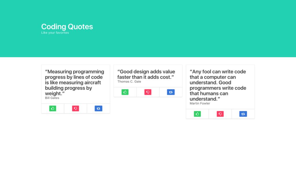
We’ll be building a Coding Quotes page, utilizing Bulma’s UI components including a Hero banner, Columns, Cards, Buttons and more.
我们将利用Bulma的UI组件(包括英雄横幅,栏目,卡片,按钮等)来构建“编码报价”页面。
First, let’s install Bulma. You can quickly do so from the command line with npm install Bulma, or you can import the project like I have, with the following lines of code. The first line imports the Font Awesome library so we can use their icons.
首先,让我们安装Bulma。 您可以使用npm install Bulma从命令行快速执行此操作,也可以使用以下代码行导入与我一样的项目。 第一行导入了Font Awesome库,因此我们可以使用它们的图标。
<link rel="stylesheet" href="https://maxcdn.bootstrapcdn.com/font-awesome/4.7.0/css/font-awesome.min.css"/>

<link rel="stylesheet" href="https://cdnjs.cloudflare.com/ajax/libs/bulma/0.5.1/css/bulma.min.css"/>
Next, we’ll create the Hero banner with a section element and the Bulma class hero and a div with the class of hero-body.
接下来,我们将创建一个带有section元素的Hero横幅 ,以及一个Bulma类的hero和一个类的hero-body的div。
<section class="hero">
   <div class="hero-body"></div>
</section>
Then we’ll add some modifier classes to give the banner the primary color of our design with is-primary, and we’ll adjust its size with is-medium. Bulma’s class names and modifiers are readable and quite literal.
然后,我们将添加一些修饰符类,以is-primary为横幅提供设计is-primary ,并通过is-medium调整其尺寸。 Bulma的类名和修饰符可读性很强。
<section class="hero is-primary is-medium">
  <div class="hero-body"></div>
</section>
Within our hero-body div, we’ll add a container div for our h1 and h2, which we’ll style as a title and subtitle, respectively. Giving the title an is-1 modifier will make it large.
在hero-body div中,我们将为h1和h2添加一个container div,分别将其hero-body为title和subtitle 。 给标题加上is-1修饰符会使它变大。
<div class="container">
     <h1 class="title is-1">
        Coding Quotes
     </h1>
     <h2 class="subtitle">
        Like your favorites
     </h2>
 </div>
That completes the top of our site, now let’s build some columns. First, we’ll section them off, then we’ll make a container for them.
这样就完成了我们网站的顶部,现在让我们建立一些专栏。 首先,我们将它们section开,然后为它们制作一个container 。
<section class="section">
    <div class="container"></div>
</section>
Inside our container, we’ll put our columns parent div.
在container ,我们将columns父div放置。
<section class="section">
    <div class="container">
        <div class="columns"></div>
    </div>
</section>
Then we’ll put three column divs within as children. They’ll automatically divide into thirds of their viewport, whether viewed horizontally or vertically (on mobile). Bulma is inherently fully responsive.
然后,我们将三个column div作为子元素放入其中。 无论是水平查看还是垂直查看(在移动设备上),他们都会自动将其视口分成三部分。 布尔玛天生就具有充分的React能力。
<section class="section">
    <div class="container">
        <div class="columns">
            <div class="column">1</div>
            <div class="column">2</div>
            <div class="column">3</div>
        </div>
   </div>
 </section>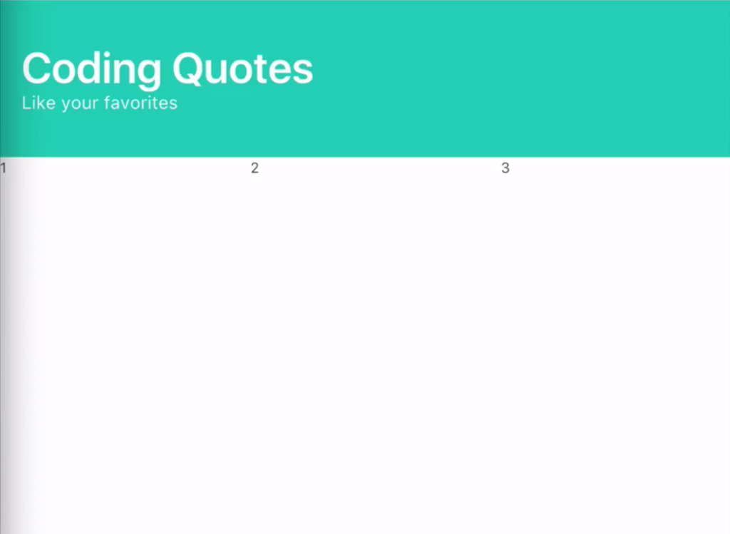
Within each column, we’ll insert a Bulma card, whose card-content will be a title and subtitle, for the quote and the programmer who said the quote.
在每一列中,我们将插入一张Bulma card ,该card-content将是title和subtitle ,以供引用,并由负责报价的程序员使用。
<div class="card">
    <div class="card-content">
        <h2 class="title">"Quote"</h2>
        <h3 class="subtitle">Programmer</h3>
    </div>
</div>
To make our like, dislike and share buttons, we’ll need a card-footer, then three card-footer-items, one for each button to live in. To color the buttons, we’ll add Bulma modifiers to turn them green (is-success), red (is-danger), and blue (is-info). Within the buttons, we’ll use Font Awesome’s classes to get a thumbs-up, thumbs-down and share icon.
为了使我们喜欢,不喜欢和共享按钮,我们需要一个card-footer ,然后需要三个card-footer-items ,每个button card-footer-items都必须存在一个。要给按钮着色,我们将添加Bulma修饰符以使其变为绿色( is-success ),红色( is-danger )和蓝色( is-info )。 在按钮内,我们将使用Font Awesome的类来获得大拇指,大拇指朝下和共享图标。
<div class="card">
    <div class="card-content">
        <h2 class="title">"Quote"</h2>
        <h3 class="subtitle">Programmer</h3>
    </div>
    <footer class="card-footer">
        <span class="card-footer-item">
            <a href="#" class="button is-success">
                <i class="fa fa-thumbs-o-up"></i>
            </a>
        </span>
        <span class="card-footer-item">
            <a href="#" class="button is-danger">
                <i class="fa fa-thumbs-o-down"></i>
            </a>
        </span>
        <span class="card-footer-item">
            <a href="#" class="button is-info">
                <i class="fa fa-retweet"></i>
            </a>
        </span>
    </footer>
</div>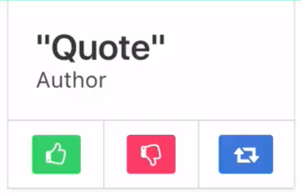
Now that we’ve successfully crafted one column, we can simply copy and paste that column’s code to make our three columns, and our site is ready.
现在,我们已经成功地制作了一个专栏,我们只需复制并粘贴该专栏的代码以创建三个专栏,我们的网站就可以使用了。
<section class="section">
    <div class="container">
        <div class="columns">

            <div class="column">
                <div class="card">
                    <div class="card-content">
                        <h2 class="title">"Quote"</h2>
                        <h3 class="subtitle">Programmer</h3>
                    </div>
                    <footer class="card-footer">
                        <span class="card-footer-item">
                            <a href="#" class="button is-success">
                                <i class="fa fa-thumbs-o-up"></i>
                            </a>
                        </span>
                        <span class="card-footer-item"> <!-- these will automatically resize just like columns -->
                            <a href="#" class="button is-danger">
                                <i class="fa fa-thumbs-o-down"></i>
                            </a>
                        </span>
                        <span class="card-footer-item">
                            <a href="#" class="button is-info">
                                <i class="fa fa-retweet"></i>
                            </a>
                        </span>
                    </footer>
                </div>
            </div>

            <div class="column">
                <div class="card">
                    <div class="card-content">
                        <h2 class="title">"Quote"</h2>
                        <h3 class="subtitle">Programmer</h3>
                    </div>
                    <footer class="card-footer">
                        <span class="card-footer-item">
                            <a href="#" class="button is-success">
                                <i class="fa fa-thumbs-o-up"></i>
                            </a>
                        </span>
                        <span class="card-footer-item">
                            <a href="#" class="button is-danger">
                                <i class="fa fa-thumbs-o-down"></i>
                            </a>
                        </span>
                        <span class="card-footer-item">
                            <a href="#" class="button is-info">
                                <i class="fa fa-retweet"></i>
                            </a>
                        </span>
                    </footer>
                </div>
            </div>

        </div>
    </div>
</section>
If you’re interested in learning more about Bulma, check out the example sites and documentation on Bulma.io. And for more content like this, visit Open SourceCraft.
如果您想了解有关Bulma的更多信息,请查看Bulma.io上的示例网站和文档 。 有关更多此类内容,请访问Open SourceCraft 。
翻译自: https://www.sitepoint.com/a-css-framework-in-6-minutes-with-bulma/
css模板 bulma


 1055
1055

 被折叠的 条评论
为什么被折叠?
被折叠的 条评论
为什么被折叠?
 到【灌水乐园】发言


