


css 响应式图片
Building custom responsive layouts is always exciting. This article examines a technique that we can use to take full control of the distance between grid columns. To demonstrate this, I’ll use the example of a responsive image gallery.
构建自定义响应式布局始终令人兴奋。 本文研究了一种可用于完全控制网格列之间距离的技术。 为了演示这一点,我将使用响应式图库的示例。
For more on responsive layouts. Watch our screencast Creating Multiple Column Layouts in Flexbox.
有关响应式布局的更多信息。 观看我们的截屏视频, 在Flexbox中创建多列布局 。
建立响应式布局 (Building a Responsive Layout)
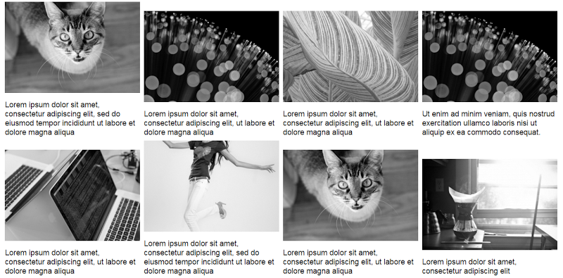
To begin with, let’s assume on large screens our gallery should look something like this:
首先,让我们假设在大屏幕上我们的画廊应该看起来像这样:
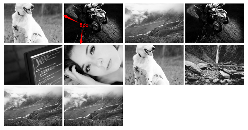
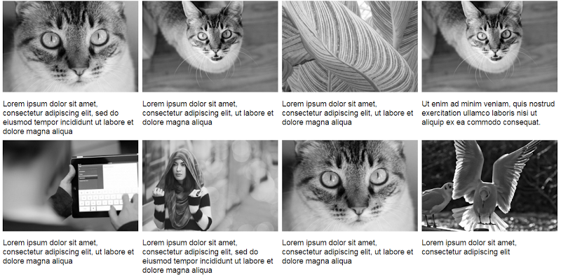
On smaller screens (i.e. <50em), it should have the following appearance:
在较小的屏幕(即<50em)上,它应具有以下外观:
The markup is simple:
标记很简单:
<div>
  <a href="path-to-the-image">
    <figure>
      <img src="path-to-the-image" alt="">
    </figure>
  </a>

  <!-- other anchors here ... -->

</div>
As you probably already know, we can take advantage of different layout methods for generating the desired result. Before I examine two of those possible methods, let’s take note of our initial requirements (see previous visualizations):
您可能已经知道,我们可以利用不同的布局方法来生成所需的结果。 在研究其中两种可能的方法之前,让我们注意一下我们的初始要求(请参阅以前的可视化效果):
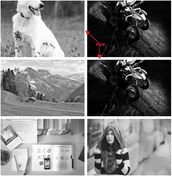
- I want a 2-column layout on medium screens and smaller (i.e. <50em), and a 4-column layout on large screens (50em or above). 我希望在中型屏幕和较小屏幕(即<50em)上使用2列布局,在大屏幕(50em或以上)上使用4列布局。
- The distance between columns should be 8px. 列之间的距离应为8px。
使用内联块 (Using inline-block)
I’ll first use the display:inline-block method to build our gallery. Consider the following CSS:
我将首先使用display:inline-block方法来构建我们的画廊。 考虑以下CSS:
div {
  font-size: 0;
}

a {
  font-size: 16px;
  display: inline-block;
  margin-bottom: 8px;
  width: calc(50% - 4px);
  margin-right: 8px;
}

a:nth-of-type(2n) {
  margin-right: 0;
}

@media screen and (min-width: 50em) {
  a {
    width: calc(25% - 6px);
  }

  a:nth-of-type(2n) {
    margin-right: 8px;
  }

  a:nth-of-type(4n) {
    margin-right: 0;
  }
}
Here’s an explanation of what I’ve done:
这是我所做的解释:
By default, there’s a space between inline-block elements. One way to override this is to set the font size of the parent element to zero. This might also require that we reset the font size of any child elements (not necessary in our case).
默认情况下, inline-block元素之间有一个空格 。 一种替代方法是将父元素的字体大小设置为零。 这可能还需要我们重置所有子元素的字体大小(在我们的情况下不是必需的)。
On small screens I have a 2-column layout and I specify 8px of space between columns.
在小屏幕上,我有2列的布局,并且在列之间指定8px的间距。
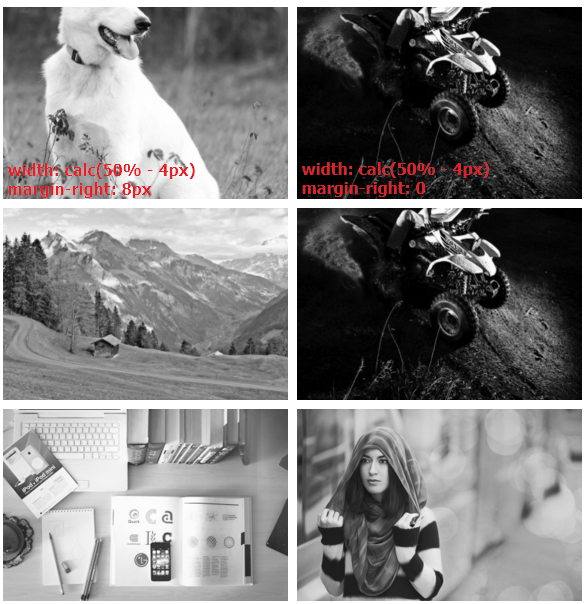
The width of our columns is calculated as follows:
我们的列的宽度计算如下:
- Total space between columns per row = 1 * 8px => 8px. The derived value is 8px and not 16px because I remove the right margin for every second column on small screens. 每行列之间的总空间= 1 * 8px => 8px。 导出的值是8px而不是16px,因为我在小屏幕上每隔一列都删除了右边距。
- The width of each column = calc(50% – 4px). The value 4px derived by calculating: Total space between columns per row / Number of columns per row (8px / 2 => 4px). 每列的宽度= calc(50%– 4px)。 通过计算得出4px值:每行列之间的总空间/每行列数(8px / 2 => 4px)。
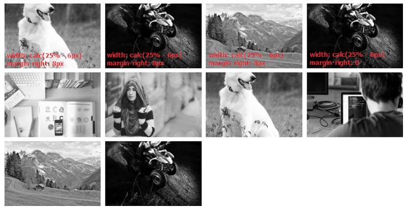
On large screens I have a 4-column layout and I specify 8px space between columns. So, the width of our columns is calculated as follows:
在大屏幕上,我具有4列的布局,并且在列之间指定8px的间距。 因此,我们的列的宽度计算如下:
- Total space between columns per row = 3 * 8px => 24px. Again, the derived value is 24px and not 32px because I remove the right margin for every fourth column. 每行列之间的总空间= 3 * 8px => 24px。 同样,派生值是24px而不是32px,因为我删除了每四列的右边距。
- For column widths, I’m using calc(25% – 6px). The value 6px derived by making this simple calculation: Total space between columns per row / Number of columns per row (24px / 4 => 6px). 对于列宽,我使用的是calc(25%– 6px)。 值6px是通过以下简单计算得出的:每行列之间的总空间/每行列数(24px / 4 => 6px)。
See the CodePen demo for the inline-block method here
使用Flexbox (Using Flexbox)
The solution above works pretty well, but there are some disadvantages. To demonstrate one disadvantage, let’s assume that each image contains a caption as well.
上面的解决方案效果很好,但是有一些缺点。 为了演示一个缺点,我们假设每个图像也包含一个标题。
Consider this slightly updated markup:
考虑一下这个稍微更新的标记:
<div>
<a href="path-to-the-image">
<figure>
<img src="path-to-the-image" alt="">
<figcaption>Some text here</figcaption>
</figure>
</a>
<!-- other anchors here ... -->
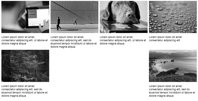
</div>Here’s the new version of our gallery on large screens:
这是大屏幕上我们画廊的新版本:
View the CodePen demo using inline-block with captions
The result isn’t so attractive because the grid items have different heights. We can fix this with flexbox, a modern layout method, which will allow us to overcome many common layout problems (e.g. default gap between inline-block elements). In order to activate this method, I simply have to update the CSS of the parent element (the flex container):
结果并不那么吸引人,因为网格项目的高度不同。 我们可以使用现代布局方法flexbox修复此问题,这将使我们能够克服许多常见的布局问题(例如, inline-block元素之间的默认间距)。 为了激活此方法,我只需要更新父元素(flex容器)CSS:
div {
display: flex;
flex-wrap: wrap;
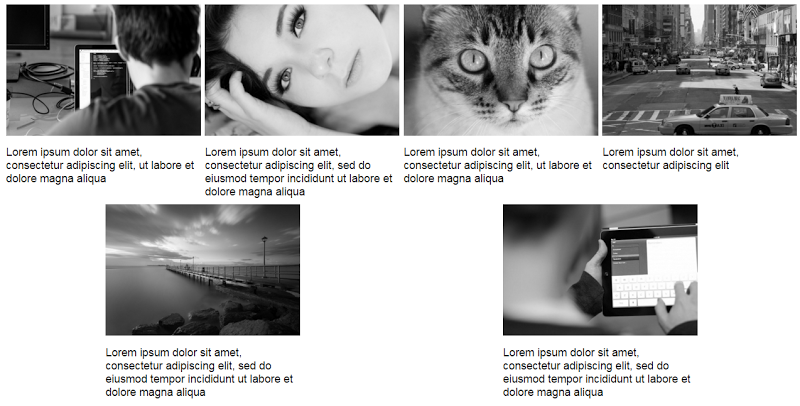
}Happily enough, if we now preview the gallery, we’ll get the expected result (i.e. equal height columns) across all screens. Here’s how it looks on large screens:
令人高兴的是,如果现在预览图库,我们将在所有屏幕上获得预期的结果(即相等高度的列)。 这是在大屏幕上的外观:
View the CodePen demo using flexbox with improved captions
At this point, there’s one last thing I have to clarify. Flexbox provides the justify-content property that aligns flex items along the main axis of the current line of the flex container. However, note that this property doesn’t define a value that will allow us to build the desired gallery layout. For example, the space-between value results in this layout:
在这一点上,我还要澄清最后一件事。 Flexbox提供了justify-content属性,该属性使flex项目沿着flex容器当前行的主轴对齐。 但是,请注意,此属性未定义允许我们构建所需画廊布局的值。 例如, space-between值导致以下布局:
While the space-around property results in this one:
尽管space-around属性导致以下结果:
In both cases, the last two items are distributed awkwardly on the final row. The CSS for this method would look like this:
在这两种情况下,最后两项都笨拙地分布在最后一行。 此方法CSS如下所示:
div {
  display: flex;
  flex-wrap: wrap;
  justify-content: space-between; /* or space-around */
}

a {
  display: inline-block;
  margin-bottom: 8px;
  width: calc(50% - 4px);
}

@media screen and (min-width: 50em) {
  a {
    width: calc(25% - 6px);
  }
}
In this case I didn’t assign a margin-right property to the flex items. This happens because, depending on the value of the justify-content property, the browser takes care of distributing the flex items across their container.
在这种情况下,我没有为flex项目分配margin-right属性。 发生这种情况的原因是,根据justify-content属性的值,浏览器会负责在其容器中分布flex项目。
View the CodePen demo using the justify-content property
使用justify-content属性查看CodePen演示
结论 (Conclusion)
This post has covered a couple of techniques for controlling the distance between grid columns in a responsive image grid. While the inline-block method is sufficient, flexbox makes it much easier and more convenient, especially when combined with the calc() function.
这篇文章介绍了一些用于控制响应图像网格中网格列之间距离的技术。 尽管inline-block方法已足够,但flexbox使其更加容易和方便,特别是与calc()函数结合使用时。
Get the most out Flexbox layouts and watch our screencast on Creating Multiple Column Layouts in Flexbox.
充分利用Flexbox布局,并观看有关在Flexbox中创建多列布局的截屏视频。
If you have another solution to this problem, feel free to mention it in the comments.
如果您对此问题有其他解决方案,请在评论中随意提及。
翻译自: https://www.sitepoint.com/using-modern-css-to-build-a-responsive-image-grid/
css 响应式图片


 1132
1132

 被折叠的 条评论
为什么被折叠?
被折叠的 条评论
为什么被折叠?
 到【灌水乐园】发言


