


 本文探讨了两种CSS命名方法:BEM(块元素修饰符)和原子CSS。BEM强调组件化,适合大型团队,而原子CSS使用简洁的类名库,便于快速开发。每种方法都有其适用场景,选择取决于项目需求和团队规模。
bem css
The following is a short extract from Tiffany’s new book, CSS Master, 2nd Edition.
以下是Tiffany的新书CSS Master第二版的摘录。
In this article, we’ll look at two methodologies for naming things in CSS. Both methods were created to improve the development process for large sites and large teams; however, they work just as well for teams of one. Whether you choose one or the other, neither, or a mix of both is up to you. The point of introducing them is to help you to think through approaches for writing your own CSS.
在本文中,我们将研究两种在CSS中命名的方法。 创建这两种方法都是为了改善大型站点和大型团队的开发过程。 但是,对于一个团队来说,它们也同样有效。 是否选择一个,另一个,还是两者结合,都取决于您。 引入它们的目的是帮助您思考编写自己CSS的方法。
块元素修饰符(BEM) (Block-Element-Modifier (BEM))
BEM, or Block-Element-Modifier, is a methodology, a naming system, and a suite of related tools. Created at Yandex, BEM was designed for rapid development by sizable development teams. In this section, we’ll focus on the concept and the naming system.
BEM或“块元素修饰符”是一种方法,命名系统和一组相关工具。 BEM由Yandex创建,旨在由规模庞大的开发团队进行快速开发。 在本节中,我们将重点介绍概念和命名系统。
BEM methodology encourages designers and developers to think of a website as a collection of reusable component blocks that can be mixed and matched to create interfaces. A block is simply a section of a document, such as a header, footer, or sidebar, illustrated below. Perhaps confusingly, “block” here refers to the segments of HTML that make up a page or application.
BEM方法论鼓励设计人员和开发人员将网站视为可重复使用的组件块的集合,这些组件可以混合并匹配以创建界面。 块只是文档的一部分,例如下面说明的页眉,页脚或侧边栏。 可能令人困惑的是,此处的“块”是指构成页面或应用程序HTML片段。

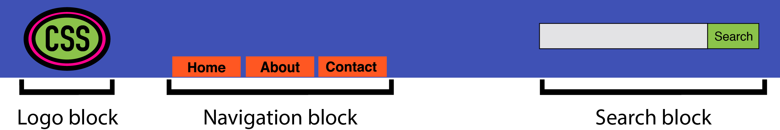
Blocks can contain other blocks. For example, a header block might also contain logo, navigation, and search form blocks, as seen in below. A footer block might contain a site map block.
块可以包含其他块。 例如,标题块可能还包含徽标,导航和搜索表单块,如下所示。 页脚块可能包含一个站点地图块。
More granular than a block is an element. As the BEM documentation explains:
比块更细致的是元素 。 如BEM文档所述 :
An element is a part of a block that performs a certain function. Elements are context-dependent: they only make sense in the context of the block they belong to.
元素是执行特定功能的块的一部分。 元素是上下文相关的:它们仅在所属块的上下文中才有意义。
A search form block, for example, contains a text input element and a submit button element, as evident in the image below. (To clarify, we’re using “element” in the design element sense rather than the HTML element sense.)
例如,搜索表单块包含一个文本输入元素和一个提交按钮元素,如下图所示。 (为澄清起见,我们在设计元素的意义上而不是在HTML元素的意义上使用“元素”。)

A main content block, on the other hand, might have an article-list block. This article-list block might contain a series of article promo blocks. And each article promo block might contain image, excerpt, and “Read more” elements, as presented below.
另一方面,主要内容块可能具有文章列表块。 该文章列表块可能包含一系列文章促销块。 每个文章促销区可能包含图片,摘录和“阅读更多”元素,如下所示。

Together, blocks and elements form the basis of the BEM naming convention. According to the rules of BEM:
块和元素一起构成BEM命名约定的基础。 根据BEM的规则:
- block names must be unique within a project 块名称在项目中必须唯一
- element names must be unique within a block 元素名称在一个块中必须唯一
- variations of a block—say, a search box with a dark background—should add a modifier to the class name 块的变体(例如,具有深色背景的搜索框)应为类名添加修饰符
Block names and element names are usually separated by a double underscore (.block__element). Block and element names are typically separated from modifier names by a double hyphen (for example, .block--modifier or .block__element--modifier).
块名称和元素名称通常由双下划线( .block__element )分隔。 块和元素名称通常与修饰符名称之间用双连字符分隔(例如, .block--modifier或.block__element--modifier )。
Here’s what BEM looks like using a search form example:
这是使用搜索表单示例的BEM外观:
<form class="search">
    <div class="search__wrapper">
        <label for="s" class="search__label">Search for: </label>
        <input type="text" id="s" class="search__input">
        <button type="submit" class="search__submit">Search</button>
    </div>
</form>
A variation of this form with a dark background might use the following markup:
这种形式的深色背景变体可以使用以下标记:
<form class="search search--inverse">
    <div class="search__wrapper search__wrapper--inverse">
        <label for="s" class="search__label search_label--inverse">Search for: </label>
        <input type="text"  id="s" class="search__input search__input--inverse">
        <button type="submit" class="search__submit search__submit--inverse">Search</button>
    </div>
</form>
Our CSS might look like this:
我们CSS可能如下所示:
.search {
    color: #333;
}
.search--inverse {
    color: #fff;
    background: #333;
}
.search__submit {
    background: #333;
    border: 0;
    color: #fff;
    height: 2rem;
    display: inline-block;
}
.search__submit--inverse {
    color: #333;
    background: #ccc;
}
In both our markup and CSS, search--inverse and search__label--inverse are additional class names. They’re not replacements for search and search__label. Class names are the only type of selector used in a BEM system. Child and descendant selectors may be used, but descendants should also be class names. Element and ID selectors are verboten. Enforcing block and element name uniqueness also prevents naming collisions, which can become a problem among teams.
在我们的标记和CSS中, search--inverse和search__label--inverse是附加的类名。 它们不能替代search和search__label 。 类名是BEM系统中使用的唯一选择器类型。 可以使用子选择器和子代选择器,但子代也应为类名。 元素和ID选择器是固定的。 强制块和元素名称的唯一性还可以防止命名冲突,这可能会在团队之间引起问题。
There are several advantages to this approach:
这种方法有几个优点:
- it’s easy for new team members to read the markup and CSS, and understand its behavior 新团队成员很容易阅读标记和CSS,并了解其行为
- adding more developers increases team productivity 增加更多开发人员可提高团队生产力
- consistent naming reduces the possibility of class-name collisions and side effects 一致的命名减少了类名冲突和副作用的可能性
- CSS is independent of markup CSS与标记无关
- CSS is highly reusable CSS是高度可重用的
There’s a lot more to BEM than can comfortably fit in a section of a chapter. The BEM site describes this methodology in much greater detail, and also features tools and tutorials to get you started. To learn more about the naming convention aspect of BEM, another fantastic resource is Get BEM.
对于BEM而言,还有很多内容不适合章节的一部分。 BEM站点对这种方法进行了更为详细的描述,并提供了工具和教程来帮助您入门。 要了解有关BEM的命名约定方面的更多信息,另一个很棒的资源是Get BEM 。
原子CSS (Atomic CSS)
If BEM is the industry darling, Atomic CSS is its rebellious maverick. Named and explained by Thierry Koblentz of Yahoo in his 2013 piece, “Challenging CSS Best Practices,” Atomic CSS uses a tight library of class names. These class names are often abbreviated and divorced from the content they affect. In an Atomic CSS system, you can tell what the class name does—but there’s no relationship between class names (at least, not those used in the stylesheet) and content types.
如果说BEM是行业宠儿,那么Atomic CSS就是它的反叛特立独行者。 由Yahoo的Thierry Koblentz在他的2013年论文“具有挑战性CSS最佳实践 ”中进行了命名和解释,Atomic CSS使用了紧密的类名库。 这些类名通常被缩写,并与它们影响的内容分开。 在Atomic CSS系统中,您可以分辨出类名的作用,但是类名(至少不是样式表中使用的类名)和内容类型之间没有关系。
Let’s illustrate with an example. Below is a set of rules in what we might call a conventional CSS architecture. These rulesets use class names that describe the content to which they apply—a global message box, and styles for “success,” “warning,” and “error” message boxes:
让我们用一个例子来说明。 以下是我们可以称为常规CSS体系结构的一组规则。 这些规则集使用描述其应用内容的类名-全局消息框以及“成功”,“警告”和“错误”消息框的样式:
.msg {
    background-color: #a6d5fa;
    border: 2px solid #2196f3;
    border-radius: 10px;
    font-family: sans-serif;
    padding: 10px;
}
.msg-success {
    background-color: #aedbaf;
    border: 2px solid #4caf50;
}
.msg-warning {
    background-color: #ffe8a5;
    border-color:  #ffc107;
}
.msg-error {
    background-color: #faaaa4;
    border-color: #f44336;
}
To create an error message box, we’d need to add both the msg and msg-error class names to the element’s class attribute:
要创建错误消息框,我们需要将msg和msg-error类名称都添加到元素的class属性中:
<p class="msg msg-error">An error occurred.</p>Let’s contrast this with an atomic system, where each declaration becomes its own class:
让我们将其与原子系统进行对比,在原子系统中,每个声明成为其自己的类:
.bg-a {
    background-color: #a6d5fa;
}
.bg-b {
    background-color: #aedbaf;
}
.bg-c {
    background-color: #ffe8a5;
}
.bg-d {
    background-color: #faaaa4;
}
.bc-a{
    border-color: #2196f3;
}
.bc-b {
    border-color: #4caf50;
}
.bc-c {
    border-color:  #ffc107;
}
.bc-d {
    border-color:  #f44336;
}
.br-1x {
    border-radius: 10px;
}
.bw-2x {
    border-width: 2px;
}
.bss {
    border-style: solid;
}
.sans {
    font-style: sans-serif;
}
.p-1x {
    padding: 10px;
}
That’s a lot more CSS. Let’s now recreate our error message component. Using Atomic CSS, our markup becomes:
还有很多CSS。 现在让我们重新创建错误消息组件。 使用Atomic CSS,我们的标记变为:
<p class="bw-2 bss p-1x sans br-1x bg-d bc-d">
    An error occurred.
</p>
Our markup is also more verbose. But what happens when we create a warning message component?
我们的标记也更详细。 但是,当我们创建警告消息组件时会发生什么?
<p class="bw-2 bss p-1x sans br-1x bg-c bc-c">
    Warning: The price for that item has changed.
</p>
Two class names changed: bg-d and bc-d were replaced with bg-c and bc-c. We’ve reused five rulesets. Now, let’s create a button:
更改了两个类名称: bg-d和bc-d分别替换为bg-c和bc-c 。 我们重用了五个规则集。 现在,让我们创建一个按钮:
<button type="button" class="p-1x sans bg-a br-1x">Save</button>Hey now! Here we’ve reused four rulesets and avoided adding any more rules to our stylesheet. In a robust atomic CSS architecture, adding a new HTML component such as an article sidebar won’t require adding more CSS (though, in reality, it might require adding a bit more).
嘿,现在! 在这里,我们重用了四个规则集,并避免在样式表中添加更多规则。 在健壮的原子CSS架构中,添加新HTML组件(如文章侧边栏)不需要添加更多CSS(尽管实际上,可能需要添加更多)。
Atomic CSS is a bit like using utility classes in your CSS, but taken to the extreme. Specifically, it:
原子CSS有点像在CSS中使用实用程序类,但是却达到了极限。 具体来说,它:
- keeps CSS trim by creating highly granular, highly reusable styles, instead of a ruleset for every component 通过创建高度细化,高度可重用的样式而不是每个组件的规则集来保持CSS修剪
- greatly reduces specificity conflicts by using a system of low-specificity selectors 通过使用低特异性选择器系统大大减少了特异性冲突
- allows for rapid HTML component development once the initial rulesets are defined 一旦定义了初始规则集,就可以快速开发HTML组件
However, Atomic CSS is not without controversy.
但是,原子CSS并非没有争议。
反对原子CSS的案例 (The Case Against Atomic CSS)
Atomic CSS runs counter to just about everything we’ve been taught on writing CSS. It feels almost as wrong as sticking style attributes everywhere. Indeed, one of the major criticisms of the Atomic CSS methodology is that it blurs the line between content and presentation. If class="fl m-1x" floats an element to the left and adds a ten-pixel margin, what do we do when we no longer want that element to float left?
原子CSS几乎与我们编写CSS的所有知识背道而驰。 感觉就像在各处粘贴style属性一样错误。 确实,对Atomic CSS方法的主要批评之一是它模糊了内容和表示之间的界限。 如果class="fl m-1x"将元素向左浮动并添加十像素边距,那么当我们不再希望该元素向左浮动时该怎么办?
One answer, of course, is to remove the fl class from our element. But now we’re changing HTML. The whole reason behind using CSS is so that markup is unaffected by presentation and vice versa. (We can also solve this problem by removing the .fl {float: left;} rule from our stylesheet, although that would affect every element with a class name of fl.) Still, updating the HTML may be a small price to pay for trimmer CSS.
一个答案,当然是从我们的元素中删除fl类。 但是现在我们正在更改HTML。 使用CSS的全部原因是,标记不受演示的影响,反之亦然。 (我们也可以通过从样式表中删除.fl {float: left;}规则来解决此问题,尽管这会影响类名称为fl每个元素。)不过,更新HTML可能需要付出很小的代价微调CSS。
In Koblentz’s original post, he used class names such as .M-10 for margin: 10px and .P-10 for padding: 10px. The problem with such a naming convention should be obvious. Changing to a margin of five or 20 pixels means we’d need to update our CSS and our HTML, or risk having class names that fail to accurately describe their effect.
在Koblentz的原始帖子中,他使用了诸如.M-10类名作为margin: 10px以及.P-10的padding: 10px 。 这种命名约定的问题应该很明显。 更改为5或20像素的边距意味着我们需要更新CSS 和 HTML,否则可能会有类名无法准确描述其效果的风险。
Using class names such as p-1x, as done in this section, resolves that issue. The 1x part of the class name indicates a ratio rather than a defined number of pixels. If the base padding is five pixels (that is, .p-1x { padding: 5px; }), then .p-2x would set ten pixels of padding. Yes, that’s less descriptive of what the class name does, but it also means that we can change our CSS without updating our HTML, and without creating a misleading class name.
如本节所述,使用诸如p-1x类的类名可以解决该问题。 类名称的1x部分表示比率,而不是定义的像素数。 如果基本填充为五个像素(即.p-1x { padding: 5px; } ),则.p-2x将设置十个填充像素。 是的,这并不能说明类名的作用,但这也意味着我们可以在不更新HTML的情况下更改CSS且不会产生误导性的类名。
An atomic CSS architecture doesn’t prevent us from using class names that describe the content in our markup. You can still add .button-close or .accordion-trigger to your code. Such class names are actually preferable for JavaScript and DOM manipulation.
原子CSS体系结构不会阻止我们使用描述标记中内容的类名。 您仍然可以在代码中添加.button-close或.button-close .accordion-trigger 。 实际上,此类类名称对于JavaScript和DOM操作更可取。
BEM与原子CSS (BEM versus Atomic CSS)
BEM works best when you have a large number of developers building CSS and HTML modules in parallel. It helps to prevent the kind of mistakes and bugs that are created by sizable teams. It scales well, in part, because the naming convention is descriptive and predictable. BEM isn’t only for large teams, but it works really well for large teams.
当您有大量的开发人员并行构建CSS和HTML模块时,BEM效果最佳。 它有助于防止由规模较大的团队造成的那种错误和错误。 它的扩展性很好,部分原因是命名约定具有描述性和可预测性。 BEM不仅适用于大型团队,而且对于大型团队确实非常有效 。
Atomic CSS works better when there’s a small team or a single engineer responsible for developing a set of CSS rules, with full HTML components built by a larger team. With Atomic CSS, developers can just look at a style guide—or the CSS source—to determine which set of class names they’ll need for a particular module.
如果有一个小组或一个工程师负责开发一组CSS规则,并由一个较大的团队构建完整HTML组件,则Atomic CSS会更好地工作。 使用Atomic CSS,开发人员只需查看样式指南(或CSS源代码),即可确定特定模块所需的类名称集。
知道什么时候该走自己的路 (Know when to go your own way)
In practice, your CSS may include a mix of approaches. You may have class names that describe content or components in addition to utility class names that affect layout. If you don’t have full control over the markup, as with a CMS, then neither of these approaches may be useful. You may even need to use long and specific selectors to achieve what you want.
实际上,您CSS可能包含多种方法。 除了可能影响布局的实用程序类名称之外,您可能还具有描述内容或组件的类名称。 如果您不像CMS那样完全控制标记,那么这两种方法都可能没有用。 您甚至可能需要使用较长且特定的选择器来实现所需的功能。
翻译自: https://www.sitepoint.com/css-architecture-block-element-modifier-bem-atomic-css/
bem css


 扫一扫
扫一扫
 1255
1255

 被折叠的 条评论
为什么被折叠?
被折叠的 条评论
为什么被折叠?
 到【灌水乐园】发言


