


Throughout this tutorial on CSS theming, we’ll be using CSS custom properties (also known as CSS variables) to implement dynamic themes for a simple HTML page. We’ll create dark and light example themes, then write JavaScript to switch between the two when the user clicks a button.
在整个CSS主题教程中,我们将使用CSS自定义属性(也称为CSS变量)为简单HTML页面实现动态主题。 我们将创建深色和浅色示例主题,然后编写JavaScript在用户单击按钮时在两者之间切换。
Just like in typical programming languages, variables are used to hold or store values. In CSS, they’re typically used to store colors, font names, font sizes, length units, etc. They can then be referenced and reused in multiple places in the stylesheet. Most developers refer to “CSS variables”, but the official name is custom properties.
就像典型的编程语言一样,变量用于保存或存储值。 在CSS中,它们通常用于存储颜色,字体名称,字体大小,长度单位等。然后可以在样式表中的多个位置引用和重用它们。 大多数开发人员都引用“ CSS变量”,但正式名称是“ 自定义属性” 。
CSS custom properties make it possible to modify variables that can be referenced throughout the stylesheet. Previously, this was only possible with CSS preprocessors such as Sass.
CSS自定义属性使修改可以在整个样式表中引用的变量成为可能。 以前,这仅在CSS预处理程序(例如Sass)中才可行。
了解:root和var() (Understanding :root and var())
Before creating our dynamic theming example, let’s understand the essential basics of custom properties.
在创建动态主题示例之前,让我们了解自定义属性的基本基础。
A custom property is a property whose name starts with two hyphens (—) like --foo. They define variables that can be referenced using var(). Let’s consider this example:
自定义属性是名称以两个连字符( — )开头的属性,例如--foo 。 它们定义了可以使用var()引用的变量。 让我们考虑这个例子:
:root {
  --bg-color: #000;
  --text-color: #fff;
}
Defining custom properties within the :root selector means they are available in the global document space to all elements. :root is a CSS pseudo class which matches the root element of the document — the <html> element. It’s similar to the html selector, but with higher specificity.
在:root选择器中定义自定义属性意味着它们在全局文档空间中可用于所有元素。 :root是一个CSS伪类,与文档的根元素( <html>元素)匹配。 它类似于html选择器,但具有更高的特异性 。
You can access the value of a :root custom property anywhere in the document:
您可以在文档中的任何位置访问:root定制属性的值:
div {
  color: var(--text-color);
  background-color: var(--bg-color);
}
You can also include a fallback value with your CSS variable. For example:
您还可以在CSS变量中包含后备值。 例如:
div {
  color: var(--text-color, #000);
  background-color: var(--bg-color, #fff);
}
If a custom property isn’t defined, their fallback value is used instead.
如果未定义自定义属性,则使用其后备值。
Defining custom properties inside a CSS selector other than the :root or html selector makes the variable available to matching elements and their children.
在:root或html选择器之外CSS选择器中定义自定义属性,可使变量可用于匹配的元素及其子元素。
CSS自定义属性与预处理器变量 (CSS Custom Properties vs Preprocessor Variables)
CSS pre-processors such as Sass are often used to aid front-end web development. Among the other useful features of preprocessors are variables. But what’s the difference between Sass variables and CSS custom properties?
CSS预处理程序(例如Sass)通常用于辅助前端Web开发。 预处理器的其他有用功能包括变量。 但是Sass变量和CSS自定义属性之间有什么区别?
- CSS custom properties are natively parsed in modern browsers. Preprocessor variables require compilation into a standard CSS file and all variables are converted to values. CSS自定义属性是在现代浏览器中本地解析的。 预处理程序变量需要编译成标准CSS文件,并且所有变量都将转换为值。
- Custom properties can be accessed and modified by JavaScript. Preprocessor variables are compiled once and only their final value is available on the client. 可以通过JavaScript访问和修改自定义属性。 预处理程序变量仅编译一次,并且客户端上仅可使用它们的最终值。
编写一个简单HTML页面 (Writing a Simple HTML Page)
Let’s start by creating a folder for our project:
让我们从为我们的项目创建一个文件夹开始:
$ mkdir css-variables-themingNext, add an index.html inside the project’s folder:
接下来,在项目文件夹中添加index.html :
$ cd css-variables-theming
$ touch index.html
And add the following content:
并添加以下内容:
<nav class="navbar">Title</nav>
<div class="container">
  <div>
    <input type="button" value="Light/Dark" id="toggle-theme" />
  </div>
    <h2 class="title">What is Lorem Ipsum?</h2>
    <p class="content">Lorem Ipsum is simply dummy text of the printing and typesetting industry...</p>
</div>
<footer>
  Copyright 2018
</footer>
We are adding a navigation bar using a <nav> tag, a footer, and a container <div> that contains a button (that will be used to switch between light and dark themes) and some dummy Lorem Ipsum text.
我们使用<nav>标签,页脚和容器<div>添加导航栏,该容器包含一个按钮(将用于在浅色和深色主题之间切换)和一些虚拟的Lorem Ipsum文本。
为我们HTML页面编写基本CSS (Writing Basic CSS for Our HTML Page)
Now let’s style our page. In the same file using an inline <style> tag in the <head> add the following CSS styles:
现在让我们设置页面样式。 在使用<head>的内联<style>标记的同一文件中,添加以下CSS样式:
<style>
* {
  margin: 0;
}
html{
  height: 100%;
}
body{
  height: 100%;
  font-family: -apple-system, BlinkMacSystemFont“Segoe UI”, “Roboto”, “Oxygen”, “Ubuntu”, “Cantarell”,
 “Fira Sans”, “Droid Sans”, “Helvetica Neue”,sans-serif;
  display: flex;
  flex-direction: column;
}
nav{
  background: hsl(350, 50%, 50%);
  padding: 1.3rem;
  color: hsl(350, 50%, 10%);
}
.container{
  flex: 1;
  background:hsl(350, 50%, 95%);
  padding: 1rem;
}
p.content{
  padding: 0.7rem;
  font-size: 0.7rem;
  color: hsl(350, 50%, 50%);
}
.container h2.title{
  padding: 1rem;
  color: hsl(350, 50%, 20%);
}
footer{
  background: hsl(350, 93%, 88%);
  padding: 1rem;
}
input[type=button] {
  color:hsl(350, 50%, 20%);
  padding: 0.3rem;
  font-size: 1rem;
}
</style>
CSS3 HSL (Hue, Saturation, Lightness) notation is used to define colors. The hue is the angle on a color circle and the example uses 350 for red. All page colors use differing variations by changing the saturation (percentage of color) and lightness (percentage).
CSS3 HSL(色调,饱和度,亮度)符号用于定义颜色。 色相是色环上的角度,本示例对红色使用350。 所有页面颜色都通过更改饱和度(颜色百分比)和亮度(百分比)使用不同的变化。
Using HSL allows us to easily try different main colors for the theme by only changing the hue value. We could also use a CSS variable for the hue value and switch the color theme by changing a single value in the stylesheet or dynamically altering it with JavaScript.
使用HSL,仅更改色相值就可以轻松尝试主题的不同主色。 我们还可以使用CSS变量作为色相值,并通过更改样式表中的单个值或使用JavaScript动态更改其颜色来切换颜色主题。
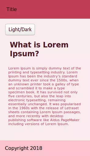
This is a screen shot of the page:
这是页面的屏幕截图:
Check out the related pen:
查看相关笔:
See the Pen CSS Theming 1 by SitePoint (@SitePoint) on CodePen.
请参阅CodePen上的SitePoint ( @SitePoint )的Pen CSS主题1 。
Let’s use a CSS variable for holding the value of the hue of all colors in the page. Add a global CSS variable in the :root selector at the top of the <style> tag:
让我们使用CSS变量来保存页面中所有颜色的色相值。 在<style>标签顶部的:root选择器中添加一个全局CSS变量:
:root{
  --main-hue : 350;
}
Next, we replace all hard-coded 350 values in hsl() colors with the --main-hue variable. For example, this is the nav selector:
接下来,我们用--main --main-hue变量替换hsl()颜色中的所有硬编码的350个值。 例如,这是导航选择器:
nav{
  background: hsl(var(--main-hue) , 50%, 50%);
  padding: 1.3rem;
  color: hsl(var(--main-hue), 50%, 10%);
}
Now if you want to specify any color other than red, you can just assign the corresponding value to --main-hue. These are some examples:
现在,如果您要指定红色以外的其他颜色,则只需将--main-hue分配相应的值即可。 这些是一些示例:
:root{
  --red-hue: 360;
  --blue-hue: 240;
  --green-hue: 120;
  --main-hue : var(--red-hue);
}
We are defining three custom properties for red, blue and green, then assigning the --red-hue variable to --main-hue.
我们为红色,蓝色和绿色定义了三个自定义属性,然后将--red-hue变量分配给--red-hue --main-hue 。
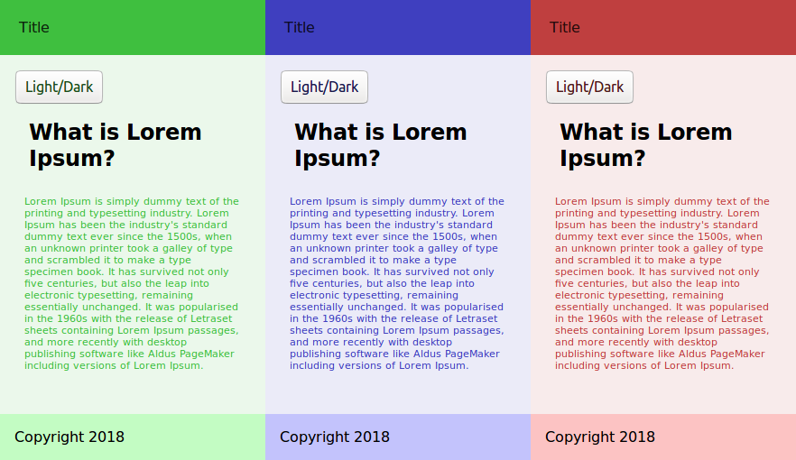
This a screen shot of pages with different values for --main-hue:
这是--main-hue具有不同值的页面的屏幕截图:
CSS custom properties offer a couple of benefits:
CSS定制属性提供了两个好处:
- A value can be defined in a single place. 可以在单个位置定义值。
- That value can be named appropriately to aid maintenance. 可以适当地命名该值以帮助维护。
The value can be dynamically altered using JavaScript. For example, the
--main-huecan be set to any value between 0 and 360.可以使用JavaScript动态更改该值。 例如,--
--main-hue可以设置为0到360之间的任何值。
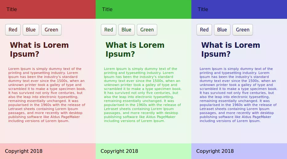
Using JavaScript to dynamically set the value of --main-hue from a set of predefined values or user submitted value for hue (it should be between 0 and 360) we can provide the user with many possibilities for colored themes.
使用JavaScript从一组预定义值或用户提交的色相值(应在0到360之间)中动态设置--main-hue的值,我们可以为用户提供多种彩色主题。
The following line of code will set the value of --main-hue to 240 (blue):
以下代码行将--main-hue的值设置为240(蓝色):
document.documentElement.style.setProperty('--main-hue', 240);Check out the following pen, which shows a full example that allows you to dynamically switch between red, blue and green colored themes:
查看以下笔,它显示了完整的示例,使您可以在红色,蓝色和绿色主题之间动态切换:
See the Pen CSS Theming 2 by SitePoint (@SitePoint) on CodePen.
请参阅CodePen上的SitePoint ( @SitePoint )的Pen CSS主题2 。
This is a screen shot of the page from the pen:
这是笔的页面的屏幕截图:
添加CSS Dark主题 (Adding a CSS Dark Theme)
Now let’s provide a dark theme for this page. For more control over the colors of different entities, we need to add more variables.
现在让我们为该页面提供深色主题。 为了更好地控制不同实体的颜色,我们需要添加更多变量。
Going through the page’s styles, we can replace all HSL colors in different selectors with variables after defining custom properties for the corresponding colors in :root:
浏览页面样式后,我们可以在:root为相应颜色定义自定义属性后,用变量替换不同选择器中的所有HSL颜色。
:root{
  /*...*/
  --nav-bg-color: hsl(var(--main-hue) , 50%, 50%);
  --nav-text-color: hsl(var(--main-hue), 50%, 10%);
  --container-bg-color: hsl(var(--main-hue) , 50%, 95%);
  --content-text-color: hsl(var(--main-hue) , 50%, 50%);
  --title-color: hsl(var(--main-hue) , 50%, 20%);
  --footer-bg-color: hsl(var(--main-hue) , 93%, 88%);
  --button-text-color: hsl(var(--main-hue), 50%, 20%);
}
Appropriate names for the custom properties have been used. For example, --nav-bg-color refers to the color of the nav background, while --nav-text-color refers to the color of nav foreground/text.
自定义属性的适当名称已被使用。 例如,-- --nav-bg-color 表示导航背景的颜色 ,而--nav-text-color color表示导航前景/文本的颜色 。
Now duplicate the :root selector with its content, but add a theme attribute with a dark value:
现在,复制:root选择器及其内容,但添加一个带有暗值的主题属性:
:root[theme='dark']{
  /*...*/
}
This theme will be activated if a theme attribute with a dark value is added to the <html> element.
如果将具有深色值的主题属性添加到<html>元素,则将激活该主题 。
We can now play with the values of these variables manually, by reducing the lightness value of the HSL colors to provide a dark theme, or we can use other techniques such as CSS filters like invert() and brightness(), which are commonly used to adjust the rendering of images but can also be used with any other element.
现在,我们可以通过减小HSL颜色的明暗度值以提供深色主题来手动处理这些变量的值,或者可以使用其他常用的技术,例如常用CSS过滤器,例如invert()和brightness() 。调整图像的渲染,但也可以与其他任何元素一起使用。
Add the following code to :root[theme='dark']:
将以下代码添加到:root[theme='dark'] :
:root[theme='dark'] {
  --red-hue: 360;
  --blue-hue: 240;
  --green-hue: 120;
  --main-hue: var(--blue-hue);
  --nav-bg-color: hsl(var(--main-hue), 50%, 90%);
  --nav-text-color: hsl(var(--main-hue), 50%, 10%);
  --container-bg-color: hsl(var(--main-hue), 50%, 95%);
  --content-text-color: hsl(var(--main-hue), 50%, 50%);
  --title-color: hsl(--main-hue, 50%, 20%);
  --footer-bg-color: hsl(var(--main-hue), 93%, 88%);
  --button-text-color: hsl(var(--main-hue), 50%, 20%);
  filter: invert(1) brightness(0.6);
}
The invert() filter inverts all the colors in the selected elements (every element in this case). The value of inversion can be specified in percentage or number. A value of 100% or 1 will completely invert the hue, saturation, and lightness values of the element.
invert()过滤器可反转所选元素(在这种情况下为每个元素)中的所有颜色。 反转值可以百分比或数字指定。 值为100%或1将完全反转元素的色相,饱和度和明度值。
The brightness() filter makes an element brighter or darker. A value of 0 results in a completely dark element.
brightness()滤镜使元素变亮或变暗。 值为0导致元素完全变暗。
The invert() filter makes some elements very bright. These are toned down by setting brightness(0.6).
invert()过滤器使某些元素非常明亮。 可以通过设置brightness(0.6)来降低这些brightness(0.6) 。
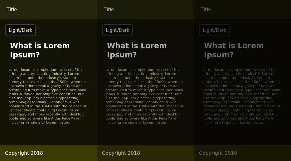
A dark theme with different degrees of darkness:
具有不同黑暗度的黑暗主题:
使用JavaScript切换主题 (Switching Themes with JavaScript)
Let’s now use JavaScript to switch between the dark and light themes when a user clicks the Dark/Light button. In index.html add an inline <script> before the closing </body> with the following code:
现在,让我们使用JavaScript在用户单击“ 暗/亮”按钮时在暗和亮主题之间切换。 在index.html ,使用以下代码在结束</body>之前添加一个内联<script> :
const toggleBtn = document.querySelector("#toggle-theme");
toggleBtn.addEventListener('click', e => {
  console.log("Switching theme");
  if(document.documentElement.hasAttribute('theme')){
    document.documentElement.removeAttribute('theme');
  }
  else{
    document.documentElement.setAttribute('theme', 'dark');
  }
});
Document.documentElement refers to the the root DOM Element of the document — that is, <html>. This code checks for the existence of a theme attribute using the .hasAttribute() method and adds the attribute with a dark value if it doesn’t exist, causing the switch to the dark theme. Otherwise, it removes the attribute, which results in switching to the light theme.
Document.documentElement引用文档的根DOM元素,即<html> 。 这段代码使用.hasAttribute()方法检查主题属性是否存在,如果属性不存在,则使用暗值添加该属性,从而切换到暗主题。 否则,它将删除该属性,从而导致切换到浅色主题。
使用JavaScript更改CSS自定义属性 (Changing CSS Custom Properties with JavaScript)
Using JavaScript, we can access custom properties and change their values dynamically. In our example, we hard-coded the brightness value, but it could be dynamically changed. First, add a slider input in the HTML page next to the dark/light button:
使用JavaScript,我们可以访问自定义属性并动态更改其值。 在我们的示例中,我们对亮度值进行了硬编码,但可以动态更改。 首先,在HTML页面中的暗/亮按钮旁边添加一个滑块输入:
<input type="range" id="darknessSlider" name="darkness" value="1" min="0.3" max="1" step="0.1" />The slider starts at 1 and allows the user to reduce it to 0.3 in steps of 0.1.
滑块从1开始,允许用户以0.1步长减小到0.3 。
Next, add a custom property for the darkness amount with an initial value of 1 in :root[theme='dark']:
接下来,在:root[theme='dark']为黑暗量添加一个自定义属性,其初始值为1 :
:root[theme='dark']{
  /*...*/
  --theme-darkness: 1;
}
Change the brightness filter to this custom property instead of the hard-coded value:
将brightness滤镜更改为此自定义属性,而不是硬编码值:
filter: invert(1) brightness(var(--theme-darkness));Finally, add the following code to synchronize the value of --theme-darkness with the slider value:
最后,添加以下代码以将--theme-darkness的值与滑块值同步:
const darknessSlider = document.querySelector("#darknessSlider");
darknessSlider.addEventListener('change', (e)=>{
  const val = darknessSlider.value
  document.documentElement.style.setProperty('--theme-darkness', val);
});
We’re listening for the change event of the slider and setting the value of --theme-darkness accordingly using the setProperty() method.
我们正在侦听滑块的change事件,并使用setProperty()方法相应地设置--theme-darkness的值。
We can also apply the brightness filter to the light theme. Add the --theme-darkness custom property in the top of the :root selector:
我们还可以将brightness滤镜应用于灯光主题。 在:root选择器的顶部添加--theme-darkness自定义属性:
:root{
  /*...*/
  --theme-darkness: 1;
}
Then add a brightness filter in the bottom of the same selector:
然后在同一选择器的底部添加一个brightness滤镜:
:root{
  /*...*/
  filter: brightness(var(--theme-darkness));
}
You can find the code of this example in the following pen:
您可以在以下笔中找到此示例的代码:
See the Pen CSS Theming by SitePoint (@SitePoint) on CodePen.
请参阅CodePen上的SitePoint ( @SitePoint )的Pen CSS主题 。
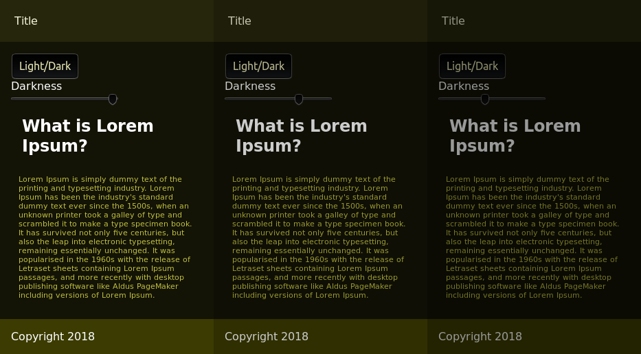
Here’s a screenshot of the dark theme of the final example:
这是最后一个示例的深色主题的屏幕截图:
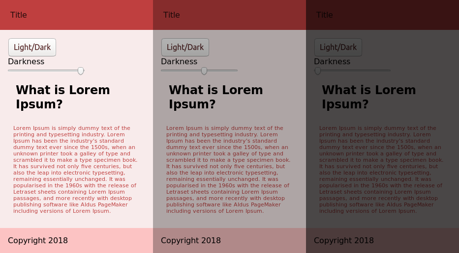
Here’s a screenshot of the light theme:
这是灯光主题的屏幕截图:
结论 (Conclusion)
In this tutorial, we’ve seen how to use CSS custom properties to create themes and switch dynamically between them. We’ve used the HSL color scheme, which allows us to specify colors with hue, saturation and lightness values and CSS filters (invert and brightness) to create a dark version of a light theme.
在本教程中,我们已经看到了如何使用CSS自定义属性来创建主题并在主题之间动态切换。 我们使用了HSL配色方案,该方案允许我们指定具有色相,饱和度和明度值的颜色以及CSS过滤器( invert和brightness )以创建深色主题的浅色主题。
Here are some links for further reading if you want to learn more about CSS theming:
如果您想了解有关CSS主题的更多信息,以下是一些链接,供您进一步阅读:
翻译自: https://www.sitepoint.com/css-theming-custom-properties-javascript/


 1296
1296

 被折叠的 条评论
为什么被折叠?
被折叠的 条评论
为什么被折叠?
 到【灌水乐园】发言


