


Editor note: the SitePoint homepage was re-launched soon after this article was published. Sorry Hugo!
编者注:在发布本文后不久,SitePoint主页被重新启动。 抱歉雨果!
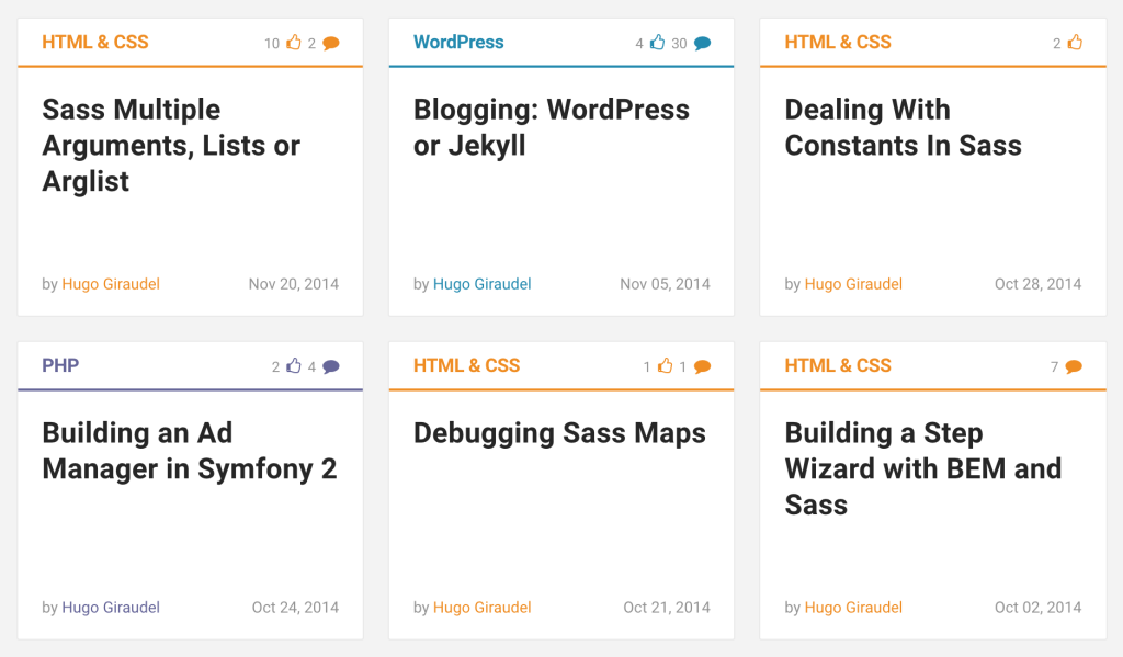
I have long been a writer for SitePoint, and I always found their article tiles quite appealing from a design perspective. They provide all the necessary information about articles: title, author, date, category and even community metrics (number of comments and likes).
我长期以来一直是SitePoint的作家,从设计的角度来看,我总是发现他们的文章砖颇具吸引力。 它们提供有关文章的所有必要信息:标题,作者,日期,类别,甚至社区指标(评论和喜欢的次数)。
I figured such a tile is probably an interesting component to build, both from the HTML and the CSS perspective. In this article, we will build this component step by step, trying to make it the best we can: accessible, maintenable, themable and SEO-friendly.
从HTML和CSS角度来看,我认为这样的图块可能是一个有趣的组件。 在本文中,我们将逐步构建此组件,力图使它成为我们能做到的最好:可访问,可维护,可访问且对SEO友好。
从内容开始 (Starting With Content)
A component should almost always be created following this order: content first, then markup, then styles, and finally JavaScript (if needed). We won’t depart from this rule and start with our content.
几乎应始终按以下顺序创建组件:首先是内容,然后是标记,然后是样式,最后是JavaScript(如果需要)。 我们不会背离此规则,而是从我们的内容开始。
HTML & CSS

8 comments

A Tale of CSS and Sass Precision

by Hugo Giraudel

May 12, 2016
From there, we can start wrapping our content with HTML. The whole container will be an <article> element as this seems to be a correct use case for it. Inside of it, we’ll have a container for the top part, a container for the title (although that is not entirely mandatory), and a footer for the metadata.
从那里,我们可以开始用HTML包装内容。 整个容器将是一个<article>元素,因为这似乎是一个正确的用例。 在其中,我们将有一个顶部容器,一个标题容器(尽管这不是完全强制性的)和一个用于元数据的页脚。
<article class="c-article-tile">
  <div class="c-article-tile__header">
    HTML & CSS

    8 comments
  </div>
  <div class="c-article-tile__body">
    A Tale of CSS and Sass Precision
  </div>
  <footer class="c-article-tile__footer">
    by Hugo Giraudel

    May 12, 2016
  </footer>
</article>
Note: we use a BEM-flavored convention for naming classes, with namespaces; feel free to use whatever you prefer.
注意:我们使用BEM风格的约定来命名类,并使用命名空间 ; 随时使用您喜欢的任何东西。
Next, we need sub-containers for our elements. One for the category, one for the comment count, a proper heading for the title, a container for the author, and one for the date. Let’s also add links.
接下来,我们需要元素子容器。 一个用于类别,一个用于评论计数,一个正确的标题标题,一个容器的作者,一个日期。 让我们也添加链接。
<article class="c-article-tile">
  <!-- Tile header -->
  <div class="c-article-tile__header">
    <a class="c-article-tile__category"
       href="https://www.sitepoint.com/html-css/">
      HTML & CSS
    </a>
    <a class="c-article-tile__comment-count"
       href="https://www.sitepoint.com/a-tale-of-css-and-sass-precision/#comments">
      8 comments
    </a>
  </div>

  <!-- Tile body -->
  <div class="c-article-tile__body">
    <h2 class="c-article-tile__title">
      <a href="https://www.sitepoint.com/a-tale-of-css-and-sass-precision/">
        A Tale of CSS and Sass Precision
      </a>
    </h2>
  </div>

  <!-- Tile footer -->
  <footer class="c-article-tile__footer">
    <span class="c-article-tile__author">
      by
      <a href="https://www.sitepoint.com/author/hgiraudel/">
        Hugo Giraudel
      </a>
    </span>
    <time class="c-article-tile__date"
          datetime="2016-05-12T12:00">
      May 12, 2016
    </time>
  </footer>
</article>
It’s looking good! A few interesting things to note:
看起来不错! 一些有趣的事情要注意:
We do not use a
<header>element for the top part as a header typically contains a heading, which is not the case here.我们不在顶部使用
<header>元素,因为标题通常包含标题,在此情况并非如此。We use
<span>elements rather than<p>elements as nothing here is a paragraph of content per sé.我们使用
<span>元素而不是<p>元素,因为此处没有内容是每段内容。We use a proper
<time>element and itsdatetimeattribute rather than a<span>to describe the date.我们使用适当的
<time>元素及其datetime属性,而不是使用<span>来描述日期。
Let’s replace the “comments” word with a proper accessible icon now. We won’t go too deep into explanations, feel free to read A Working SVG Workflow for Accessible Icons to learn more about this method.
现在让我们用适当的可访问图标替换“评论”一词。 我们将不做过多的解释,请随时阅读“可访问图标的SVG工作流程”以了解有关此方法的更多信息。
<svg style="display: none">
  <symbol id="icon-bubble" viewBox="0 0 32 32">
    <path class="path1" d="M16 2c8.837 0 16 5.82 16 13s-7.163 13-16 13c-0.849 0-1.682-0.054-2.495-0.158-3.437 3.437-7.539 4.053-11.505 4.144v-0.841c2.142-1.049 4-2.961 4-5.145 0-0.305-0.024-0.604-0.068-0.897-3.619-2.383-5.932-6.024-5.932-10.103 0-7.18 7.163-13 16-13z"></path>
  </symbol>
</svg>

<!-- … -->

<a class="c-article-tile__comment-count"
   href="https://www.sitepoint.com/a-tale-of-css-and-sass-precision/#comments">
  8
  <svg class="icon icon-bubble"
       aria-label="comments">
    <use xlink:href="#icon-bubble"></use>
  </svg>
</a>
Note how we use the aria-label attribute to make the icon accessible to assistive techology users.
请注意,我们如何使用aria-label属性使辅助技术用户可以访问该图标。
Finally, we can add microdata to our code to make it easier to crawl and index by search engines. Feel free to have a look at the Schema.org reference for articles.
最后,我们可以将微数据添加到代码中,以使搜索引擎更轻松地对其进行爬网和编制索引。 请随意查看Schema.org参考文章 。
<article class="c-article-tile"
         itemscope
         itemtype="http://schema.org/Article">
  <!-- Tile header -->
  <div class="c-article-tile__header">
    <a class="c-article-tile__category"
       href="https://www.sitepoint.com/html-css/"
       itemprop="keywords">
      HTML & CSS
    </a>
    <a class="c-c-article-tile__comment-count"
       href="https://www.sitepoint.com/a-tale-of-css-and-sass-precision/#comments"
       itemprop="commentCount">
      8
      <svg class="icon icon-bubble"
           aria-label="comments">
        <use xlink:href="#icon-bubble"></use>
      </svg>
    </a>
  </div>

  <!-- Tile body -->
  <div class="c-article-tile__body">
    <h2 class="c-article-tile__title"
        itemprop="headline">
      <a href="https://www.sitepoint.com/a-tale-of-css-and-sass-precision/">
        A Tale of CSS and Sass Precision
      </a>
    </h2>
  </div>

  <!-- Tile footer -->
  <footer class="c-article-tile__footer">
    <span class="c-article-tile__author">
      by
      <a href="https://www.sitepoint.com/author/hgiraudel/"
         itemprop="author">
        Hugo Giraudel
      </a>
    </span>
    <time class="c-article-tile__date"
          datetime="2016-05-12T12:00"
          itemprop="datePublished">
      May 12, 2016
    </time>
  </footer>
</article>
Before jumping into the styles, I would like to have a few words about component encapsulation and proper design implementation. A component, per definition, should be reusable. To be properly reusable in a responsive context, it is usually better for it not to have fixed dimensions and contextual spacing, and to let it spread naturally in its container.
在开始介绍样式之前,我想先介绍一下组件封装和适当的设计实现。 根据定义,组件应该是可重用的。 为了在响应上下文中适当地重用,通常最好不要具有固定的尺寸和上下文间距,并使其自然地在其容器中传播。
That implies that the container itself specifies some kind of boundaries for the encapsulated component. In our case, a container could be a list item, part of a list component dedicated to displaying tiles (or cards, or what else).
这意味着容器本身为封装的组件指定了某种边界。 在我们的情况下,容器可以是列表项,是专用于显示图块(或卡片或其他内容)的列表组件的一部分。
Here is how it could look like:
它看起来像这样:
<ul class="c-tile-list">
  <li class="c-tile-list__item">
    <article class="c-article-tile">…</article>
  </li>

  <li class="c-tile-list__item">
    <article class="c-article-tile">…</article>
  </li>

  <li class="c-tile-list__item">
    <article class="c-article-tile">…</article>
  </li>
</ul>
At this stage, we are entirely done with the markup. It is clean, accessible and SEO-friendly; not much more we can do. It’s time to style it!
在此阶段,标记已完全完成。 它干净,易于访问且对SEO友好; 我们所能做的还不多。 现在该为它造型!
应用某些样式 (Applying Some Styles)
For the CSS part, we will assume a proper box model for all elements. We will also heavily rely on flexbox, because y’know, why not?
对于CSS部分,我们将为所有元素假设一个合适的盒子模型 。 我们还将严重依赖flexbox,因为您知道,为什么不这样做呢?
列出容器组件 (List Container Component)
Our list component is very thin, so there is not much to style there. It has to provide a grid-like layout for tiles, handle spacing between tiles, and make sure that all tiles on the same line are the same height. This should not be too hard thanks to flexbox.
我们的列表组件很薄,因此样式不多。 它必须为图块提供类似网格的布局,处理图块之间的间距,并确保同一行上的所有图块具有相同的高度。 多亏了flexbox,这应该不会太难。
/**
 * 1. Reset default list styles
 * 2. Flexbox used for a grid-like layout for the tiles.
 */
.c-tile-list {
  list-style: none; /* 1 */
  margin: 0; /* 1 */
  padding: 0; /* 1 */
  display: flex; /* 2 */
  flex-wrap: wrap; /* 2 */
}
And now the list items:
现在列出项目:
/**
 * 1. Flexbox used for equal-height tiles on a same line.
 * 2. Make sure a time never looks distorded.
 * 3. Spacing between tiles.
 */
.c-tile-list__item {
  display: flex; /* 1 */
  flex-direction: column; /* 1 */
  flex: 0 0 300px; /* 2 */
  margin: 10px; /* 3 */
}
文章图块组件 (Article Tile Component)
Let’s move on to the actual beast: the article tile component. There are a lot of elements to style, starting with the tile itself.
让我们继续进行实际的野兽:文章图块组件。 从图块本身开始,要样式化的元素很多。
As mentioned earlier, the tile should not have fixed dimensions and relies on its parent container for sizing. We will also make the tile itself a flex container so that it is possible to align its footer at the bottom, no matter the computed height of the tile.
如前所述,磁贴不应具有固定的尺寸,并依赖其父容器进行大小调整。 我们还将使图块本身成为一个伸缩容器,以便无论图块的计算高度如何,都可以将其页脚在底部对齐。
/**
 * 1. Make it possible to bottom align the footer in a tile that has a minimum
 *    height.
 * 2. Make sure the tile spread across the full height of the parent if inside
 *    a flex container.
 */
.c-article-tile {
  display: flex; /* 1 */
  flex-direction: column; /* 1 */
  flex: 1 0 auto; /* 2 */
  border: 1px solid rgba(0, 0, 0, 0.1);
  background-color: rgb(255, 255, 255);
}
We can move one level deeper and style the sub-containers (header, body, footer) of the tile. They all are responsible for some horizontal padding, and to make further positioning easier, we can make each container a flex one.
我们可以更深一层,并设置图块的子容器(页眉,正文,页脚)的样式。 它们都负责一定程度的水平填充,并且为了使进一步的放置更容易,我们可以使每个容器都是可弯曲的。
.c-article-tile__header,
.c-article-tile__body,
.c-article-tile__footer {
  display: flex;
  padding-left: 20px;
  padding-right: 20px;
}
The content is slightly smaller in the header and the footer of the tile, essentially because it is meta information that should not take too much space visually speaking. We can safely decrease the font size of both containers.
内容在图块的页眉和页脚中稍小,主要是因为它是元信息,从视觉上讲不应占用太多空间。 我们可以安全地减小两个容器的字体大小。
.c-article-tile__header,
.c-article-tile__footer {
  font-size: 80%;
}
We have laid down the ground work for our containers. Let’s move to proper styling, starting with the header. It needs some vertical spacing and the emblematic bottom border that visually makes it look like a header.
我们已经为集装箱奠定了基础。 让我们从标题开始,转到正确的样式。 它需要一些垂直间距和标志性的底部边框,从视觉上使其看起来像标题。
/**
 * 1. Rely on the `color` property for the border color by not setting any color
 *    value, making it super convenient for theming.
 */
.c-article-tile__header {
  padding-top: 15px;
  padding-bottom: 10px;
  border-bottom: 2px solid; /* 1 */
}
The default direction for a flex container is row, which is why we did not explicitly specify it for our sub-containers. To align the comment count on the right of the header, there are 2 solutions. The first solution would be to set justify-content: space-between on the header to space our items out. The other solution, which we’ll use, is to set margin-left: auto on the counter, relying on flexbox’s best kept secret.
flex容器的默认方向是row ,这就是为什么我们没有为子容器明确指定它的原因。 要对齐标题右侧的注释计数,有2个解决方案。 第一种解决方案是在页眉上设置justify-content: space-between以将我们的项目间隔开。 我们将使用的另一种解决方案是将margin-left: auto设置margin-left: auto在柜台上,依靠flexbox的最佳机密 。
/**
 * 1. Right align the comment count container in the header.
 */
.c-article-tile__comment-count {
  margin-left: auto; /* 1 */
}
The header now works as expected. We can move on to the body and the article title. The body just needs a bit of vertical spacing, and the tile needs some typographic styles.
标头现在可以正常工作。 我们可以转到正文和文章标题。 主体只需要一些垂直间距,而图块则需要一些印刷样式。
.c-article-tile__body {
  padding-top: 20px;
  padding-bottom: 20px;
}

.c-article-tile__title {
  margin: 0;
  color: #333;
  font-size: 150%;
}
Lastly, we can sort out the footer, which is the most interesting part of the tile if you ask me. For starters, the footer should be aligned to the bottom of the tile.
最后,我们可以整理页脚,如果您问我,这是图块中最有趣的部分。 对于入门者,页脚应与图块的底部对齐。
Secondly, it should always be on a single line. Fortunately, we can force that behaviour with white-space: nowrap. However, we do not control the length of the author’s name, so we need to make sure that the layout doesn’t break when the name is too long. I am well aware that “truncation is not a content stra…”, but in this case, I think that’s the lesser of two evils.
其次,它应该始终在一行上。 幸运的是,我们可以使用white-space: nowrap强制此行为white-space: nowrap 。 但是,我们不控制作者姓名的长度,因此我们需要确保在姓名过长时布局不会中断。 我很清楚“截断不是内容策略……”,但是在这种情况下,我认为这是两种弊端中的较小者。
/**
 * 1. Bottom align the footer in the tile.
 * 2. Prevent any content from the footer from wrapping, effectively forcing it
 *    on a single line at all time.
 */
.c-article-tile__footer {
  padding-top: 10px;
  padding-bottom: 15px;
  margin-top: auto; /* 1 */
  white-space: nowrap; /* 2 */
  color: #949494;
}

/**
 * 1. Prevent the author and the date from overlapping in case they both don’t
 *    fit on the line; add an ellipsis to the author name.
 * 2. Visually no effect when both the author and the date fit; however make
 *    sure they are slightly spaced from each other if they meet on the line.
 */
.c-article-tile__author {
  text-overflow: ellipsis; /* 1 */
  overflow: hidden; /* 1 */
  margin-right: 5px; /* 2 */
}

/**
 * 1. Right align the date container in the footer.
 */
.c-article-tile__date {
  margin-left: auto; /* 1 */
}
That’s it for the tile layout! We have one last thing to complete before we are done.
瓷砖布局就是这样! 在完成之前,我们还有最后一件事要完成。
正确的主题 (Proper Theming)
You might have noticed that we did not tackle theming at all. The reason why is because I believe color schemes should be decoupled from component layout: they do not serve the same purpose and therefore cannot (and should not) be handled the same way.
您可能已经注意到我们根本没有解决主题问题。 原因是因为我认为配色方案应与组件布局分离:它们不能达到相同的目的,因此不能(也不应)以相同的方式处理。
When it comes to theming, I like to rely on component-agnostic t- namespaced classes. So let’s start by applying a theme class to our tile:
在主题化方面,我喜欢依赖于与组件无关的t-命名空间类 。 因此,让我们开始将主题类应用于图块:
<article class="c-article-tile t-sass"
         itemscope
         itemtype="http://schema.org/Article">
  …
</article>
From there, we can apply some styles to our tile based on this class. We apply a specific color to the tile and all its links. This will effectively have an impact on the border color from the header, but not on the footer text which has a specific color (#949494) already.
从那里,我们可以基于此类将某些样式应用于图块。 我们将特定颜色应用于图块及其所有链接。 这将有效地影响页眉的边框颜色,但不会影响已经具有特定颜色( #949494 )的页脚文本。
.c-article-tile.t-sass,
.c-article-tile.t-sass a {
  color: #c69;
}
Everything is fine but the headline, which ends up being pink when it should be black, only to turn pink when hovered or active. A solution would be to force the link to inherit the color of its parent (#333) when the latter is not hovered or active. To do that, we can use the :not() pseudo-class in a smart way:
一切都很好,但标题会变成粉红色,当标题应为黑色时,只有在悬停或活动时才变为粉红色。 一种解决方案是在链接未悬停或活动时强制链接继承其父链接( #333 )的颜色。 为此,我们可以以一种聪明的方式使用:not()伪类:
/**
 * 1. Make the title link inherit the color only when not active / hovered,
 *    effectively making it themed when active / hovered.
 */
.c-article-tile__title:not(:hover):not(:active) > a {
  color: inherit; /* 1 */
}
包装东西 (Wrapping Things Up)
That’s it! Phew, that was a long run, but I hope you enjoyed it. I feel like this small example is a perfect candidate for proper component encapsulation, theme management, and playing around with flexbox. Feel free to try it out, and if you find any way to make it even better, be sure to share!
而已! ew,这是一个长期的过程,但我希望您喜欢它。 我觉得这个小例子很适合用于适当的组件封装,主题管理以及使用flexbox。 随时尝试一下,如果您找到使它变得更好的任何方法,请务必分享!
See the Pen SitePoint Tile Concept Example by SitePoint (@SitePoint) on CodePen.
见笔SitePoint磁砖概念实施例由SitePoint( @SitePoint上) CodePen 。
翻译自: https://www.sitepoint.com/sitepoints-tiles-a-case-study/


 被折叠的 条评论
为什么被折叠?
被折叠的 条评论
为什么被折叠?
 到【灌水乐园】发言


