


You are starting a new web project and looking for a new CSS methodology that will help you scale your code. A growing set of techniques for writing modular CSS are available, including SMACSS, BEM, and a number of other similar methodologies, all based on Object-oriented CSS (OCSS). As you can see, there are lots of techniques to write and organize CSS.
您正在开始一个新的Web项目,并在寻找一种新CSS方法,以帮助您扩展代码。 可以使用越来越多的用于编写模块化CSS的技术,包括SMACSS , BEM和许多其他类似的方法,它们都基于面向对象CSS(OCSS)。 如您所见,有很多技巧可以编写和组织CSS。
Besides all these methodologies, there is something that can help us write DRY, less repetitive code: Helper classes (also called utility classes).
除了所有这些方法之外,还有一些可以帮助我们编写DRY的代码,这些代码较少重复:Helper类(也称为实用程序类)。
This concept was discussed some time ago in Thierry Koblentz’s article on Smashing Magazine, but I thought I would explain the method in my own words here.
Thierry Koblentz在Smashing Magazine上的文章中曾讨论过这个概念,但是我想我会用我自己的话来解释这个方法。
什么是助手类? (What Are Helper Classes?)
Helper classes can help remove repetition by creating a set of abstract classes that can be used over and over on HTML elements. Each helper class is responsible for doing one job and doing it well. Doing this will make your code more reusable and scalable for many features that will be added in the future. So whenever you want to create a new component, you’ll just need to combine some classes together to build it.
通过创建一组可以在HTML元素上反复使用的抽象类,Helper类可以帮助消除重复。 每个助手类都负责完成一项工作并将其做好。 这样做将使您的代码对将来将要添加的许多功能具有更高的可重用性和可伸缩性。 因此,无论何时要创建新组件,都只需要将一些类组合在一起即可构建它。
“Treat code like Lego. Break code into the smallest little blocks possible.” — @csswizardry (via @stubbornella) #btconf
“像乐高这样的代码。 将代码分成最小的小块。” - @csswizardry (通过@stubbornella ) #btconf
— Smashing Magazine (@smashingmag) May 27, 2013
— Smashing Magazine(@smashingmag) 2013年5月27日
Let’s see a simple example of what utility classes look like and how we can use them. Look at the following snippet of code:
让我们看一个简单的示例,说明实用程序类的外观以及如何使用它们。 查看以下代码片段:
.left        { float: left; }
.right       { float: right; }

.text-left   { text-align: left; }
.text-right  { text-align: right; }
.text-center { text-align: center; }
Here we’ve created a set of CSS rules that we can use later when building new components. For example if you want to align some content to the left you can use the text-left class. Likewise, you can use the left or right classes to float elements in the needed direction.
在这里,我们创建了一组CSS规则,供以后在构建新组件时使用。 例如,如果要将某些内容向左对齐,则可以使用text-left类。 同样,可以使用left或right类在所需的方向上浮动元素。
Let’s see another example of a box that needs to be on the left with its inner content centered.
让我们来看一个框的另一个示例,该框需要在左侧,其内部内容居中。
We usually do something like this:
我们通常这样做:
<div class="box">
</div>
With this CSS:
使用此CSS:
.box {
    float: left;
    text-align: center;
}
Instead, we can achieve the same thing using reusable and single-responsibility helper classes:
相反,我们可以使用可重用和单一职责的帮助程序类来实现相同的目的:
<div class="left text-center">
</div>
Notice how I removed the box class and instead added our predefined classes left and text-center.
请注意,我如何删除box类,而是添加了left和text-center预定义类。
If you want to change the float and align directions, instead of doing this on the non-reusable .box class, you can use other helper classes:
如果要更改浮动方向和对齐方向,而不是对不可重用的.box类执行此操作,则可以使用其他帮助程序类:
<div class="right text-right">
</div>
The grid system is a good example of helper classes in use. Here is an example from Foundation’s grid:
网格系统是正在使用的助手类的一个很好的例子。 这是Foundation网格的示例 :
<div class="row">
    <div class="small-2 large-4 columns"></div>
    <div class="small-4 large-4 columns"></div>
    <div class="small-6 large-4 columns"></div>
</div>
Foundation provides numerous classes that can be used and combined together to create a grid system with different widths for different screen sizes. This flexibility helps developers create new customized layouts faster, without editing any CSS for the grid itself. For example:
Foundation提供了许多类,可以使用这些类并将其组合在一起,以创建具有不同宽度,用于不同屏幕尺寸的网格系统。 这种灵活性可以帮助开发人员更快地创建新的自定义布局,而无需为网格本身编辑任何CSS。 例如:
.small-2and.large-4classes will set the width of an element based on the screen size..small-2和.large-4类将根据屏幕尺寸设置元素的宽度。The
.rowclass sets the width of the container that holds the columns..row类设置容纳列的容器的宽度。The
.columnsclass sets the padding and floats..columns类设置填充和浮点数。
Now that you understand what helper classes are, let’s take a look at some reusable classes we can add to our projects, presented below in different categories. Note also that the example will use some Sass variables, but naturally these are not necessary.
现在您已经了解了什么是帮助程序类,下面让我们看一下可以添加到我们的项目中的一些可重用类,下面以不同的类别进行介绍。 还要注意,该示例将使用一些Sass变量,但是自然地,这些变量不是必需的。
边距和填充 (Margins and Padding)
Margins and padding are probably the most used properties in our CSS. Adding some abstract classes that can handle this will DRY our code.
边距和填充可能是我们CSS中最常用的属性。 添加一些抽象类可以处理我们的代码。
We start by defining a variable (using Sass) for the base space unit for our design. Let’s start with 1em and on top of that we can create classes for different space sizes.
我们首先为设计的基础空间单元定义一个变量(使用Sass)。 让我们从1em开始,然后我们可以为不同的空间大小创建类。
$base-space-unit: 1em;

// Top margin
.margin-top-none    { margin-top: 0; }
.margin-top-quarter { margin-top: $base-space-unit / 4; }
.margin-top-half    { margin-top: $base-space-unit / 2; }
.margin-top-one     { margin-top: $base-space-unit; }
.margin-top-two     { margin-top: $base-space-unit * 2; }

// Top padding
.padding-top-none    { padding-top: 0; }
.padding-top-quarter { padding-top: $base-space-unit / 4; }
.padding-top-half    { padding-top: $base-space-unit / 2; }
.padding-top-one     { padding-top: $base-space-unit; }
.padding-top-two     { padding-top: $base-space-unit * 2; }
We can alternatively choose short class names, as in the example code below from Basscss
我们可以选择短类名称,如下面的Basscss示例代码所示
.m0  { margin:        0 }
.mt0 { margin-top:    0 }
.mr0 { margin-right:  0 }
.mb0 { margin-bottom: 0 }
.ml0 { margin-left:   0 }
Choose what works for you and your team. The long names will obviously make your HTML elements larger, but they are more readable in contrast to the short names, so you may need to look at your CSS to figure out how things work.
选择对您和您的团队有效的方法。 长名称显然会使您HTML元素更大,但与短名称相比,它们更具可读性,因此您可能需要查看CSS才能确定其工作方式。
宽度和高度 (Width and Height)
Imagine you want to set a section to be full height in different places on your website. The traditional way we did this was something like this:
假设您要在网站的不同位置将一个部分设置为全高。 我们执行此操作的传统方式是这样的:
<div class="contact-section">
    <!-- Content here... -->
</div>
And our CSS:
还有我们CSS:
.contact-section { height: 100%; }For other sections we would repeat the code:
对于其他部分,我们将重复代码:
<div class="services-section">
    <!-- Content here... -->
</div>
And the CSS:
和CSS:
.services-section { height: 100%; }But we can reduce all of this with one class called full-height:
但是我们可以用一个称为full-height类来减少所有这些:
<div class="full-height">
    <!-- Content here... -->
</div>
Below are some similar examples, including the full-height class used above:
下面是一些类似的示例,包括上面使用的full-height类:
.fit         { max-width: 100%; }
.half-width  { width: 50% }
.full-width  { width: 100%; }
.full-height { height: 100%; }
位置和Z索引 (Position and Z-index)
Position-related properties can be combined with other properties like z-index to create a complex layout. We can create a set of classes to set the exact position of any element in relation to the viewport or an ancestor element (right, left, top left, etc):
位置相关的属性可以与z-index等其他属性组合以创建复杂的布局。 我们可以创建一组类来设置任何元素相对于视口或祖先元素(右,左,左上等)的确切位置:
.fixed    { position: fixed; }
.relative { position: relative; }
.absolute { position: absolute; }
.static   { position: static; }

.zindex-1 { z-index: 1; }
.zindex-2 { z-index: 2; }
.zindex-3 { z-index: 3; }

.pin-top-right {
    top: 0;
    right: 0;
}

.pin-bottom-right {
    bottom: 0;
    right: 0;
}
The “pin” helper classes are inspired by Mapbox’s CSS.
“ pin”帮助程序类的灵感来自MapboxCSS 。
Let’s extend the full-height example to contain an element positioned at the bottom right.
让我们扩展全高示例,以包含一个位于右下角的元素。
<div class="full-height relative">
    <div class="absolute pin-bottom-right padding-one">
        Text to bottom right
    </div>
</div>By combining more than one class, we can get the required result in less code. If you want to position the inner element at the top right, you can use the pin-top-right instead of pin-bottom-right. You might have noticed in the above code I also added another helper class: The padding-one class ensures the element isn’t flush against the edge of the container or viewport.
通过组合多个类,我们可以用更少的代码获得所需的结果。 如果要将内部元素放在右上角,可以使用pin-top-right而不是pin-bottom-right 。 您可能已经在上面的代码中注意到了,我还添加了另一个帮助器类: padding-one类可确保元素不会与容器或视口的边缘齐平。
浮动元素 (Floated Elements)
Floating elements left or right can be done using left or right classes. The well-known clearfix class can be used on the parent element to clear floats, shown below using Sass’s parent selector:
可以使用left或right类完成left或right浮动元素。 可以在父元素上使用众所周知的clearfix类来清除浮点数,如下所示,使用Sass的父选择器 :
.left  { float: left; }
.right { float: right; }

.clearfix {
    &:before,
    &:after {
        content: "";
        display: table;
    }

    &:after { clear: both; }
}对齐元素 (Aligning Elements)
We can make text and other content align to any direction, using align-based helper classes:
我们可以使用基于对齐的帮助器类使文本和其他内容与任何方向对齐:
.text-left    { text-align: left; }
.text-right   { text-align: right; }
.text-center  { text-align: center; }
.text-just    { text-align: justify; }

.align-top    { vertical-align: top; }
.align-bottom { vertical-align: bottom; }
.align-middle { vertical-align: middle; }
可见性类别 (Visibility Classes)
Visibility classes control the visibility of elements, depending on the screen size, device orientation, touch screen, or other factors. These can come in handy in responsive designs.
可见性类控制元素的可见性,具体取决于屏幕大小,设备方向,触摸屏或其他因素。 这些可以在响应式设计中派上用场。
We could have the following classes inside of our media queries:
我们可以在媒体查询中包含以下类:
.hide-on-small { display: none; }
.show-in-large { display: block; }
And in our HTML:
在我们HTML中:
<div class="hide-on-small show-in-large">
    <!-- content here... -->
</div>
The above element will be hidden on small screens but will be visible on larger screens.
上面的元素将在小屏幕上隐藏,但在大屏幕上可见。
We can also use these classes to control elements on touch devices:
我们还可以使用这些类来控制触摸设备上的元素:
.touch .show-for-touch { display: none; }
.touch .hide-for-touch { display: inherit; }
In the example above, the .touch class would come from the classes added to the <html> element by Modernizr.
在上面的例子中, .touch类将来自加入的类<html>通过元件Modernizr的 。
A good example of visibility classes are the ones in Foundation and Bootstrap’s responsive-utilities.
可见性类的一个很好的例子是Foundation和Bootstrap的响应实用程序中的类 。
版式 (Typography)
In typography you can create classes for things like font weight and text manipulation, like ellipsis text.
在排版中,您可以为字体粗细和文本操作(如省略号文本)创建类。
.bold     { font-weight: bold; }
.regular  { font-weight: normal; }
.italic   { font-style: italic; }

.ell {
    white-space: nowrap;
    overflow: hidden;
    text-overflow: ellipsis;
}

.break-word { word-wrap: break-word; }
.no-wrap    { white-space: nowrap; }
色彩 (Colors)
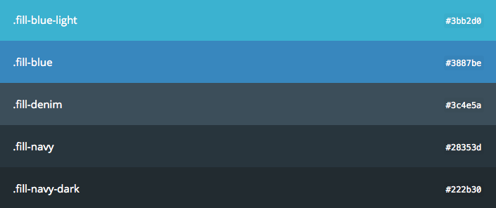
Every application has different guides and brand rules which we can define in classes that essentially ‘skin’ our interface. This would include text color, backgrounds, and more.
每个应用程序都有不同的指南和品牌规则,我们可以在本质上使界面“外观化”的类中进行定义。 这将包括文本颜色,背景等。
Lets see how this can be translated to code. First let’s define our variables with Sass:
让我们看看如何将其转换为代码。 首先,让我们用Sass定义变量:
$white     :   #fff;
$gray      :   #2c3e50;
$dark-gray :   #95a5a6;
$dark      :   #2c3e50;

$notice    :   #3498db;
$success   :   #1abc9c;
$alert     :   #e74c3c;
Then we define our helper classes, based on the variables:
然后,基于变量定义我们的助手类:
// Colors
.white            { color: $white; }
.gray             { color: $gray; }
.dark-gray        { color: $dark-gray; }

.notice           { color: $notice; }
.success          { color: $success; }
.alert            { color: $alert; }

// Backgrounds
.white-bg         { background-color: $white; }
.gray-bg          { background-color: $gray; }
.dark-gray-bg     { background-color: $darkgray; }

.notice-bg        { background-color: $notice; }
.success-bg       { background-color: $success; }
.alert-bg         { background-color: $alert; }
Two good examples of using color and background helper classes are found in the Mapbox and the Google Web Starter Kit projects.
在Mapbox和Google Web Starter Kit项目中找到了使用颜色和背景帮助程序类的两个很好的示例。
Another use case is the notification component. Let’s see how we can style this with background helper classes.
另一个用例是通知组件 。 让我们看看如何使用后台帮助程序类设置样式。
<div class="white p1 mb1 notice-bg">Info</div>
<div class="white p1 mb1 success-bg">Success</div>
<div class="white p1 mb1 alert-bg">Alert</div>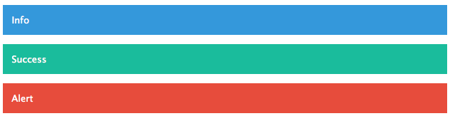
清单 (Lists)
How many times have you wanted to get rid of the bullets and padding from the ul element? A class called list-bare, as used in inuitcss, can do that for you.
您想摆脱ul元素的子弹和填充多少次? inuitcss中使用的名为list-bare类可以为您做到这一点。
.list-bare {
    padding: 0;
    list-style: none;
}
边框 (Borders)
Helper classes can be used to add borders to an element, whether for all sides or one side. So your CSS/Sass might look like this:
辅助类可用于向元素添加边框,无论是对所有边还是对一侧。 因此,您CSS / Sass可能如下所示:
$border-color: #f2f2f2;

.border-all    { border:        1px solid $border-color; }
.border-top    { border-top:    1px solid $border-color; }
.border-bottom { border-bottom: 1px solid $border-color; }
.border-right  { border-right:  1px solid $border-color; }
.border-left   { border-left:   1px solid $border-color; }
显示值 (Display Values)
The following helper classes give us the ability to use the different values for CSS’s display property:
以下帮助程序类使我们能够对CSS的display属性使用不同的值:
.inline       { display: inline; }
.block        { display: block; }
.inline-block { display: inline-block; }
.hide         { display: none; }
.flex         { display: flex; }
结论 (Conclusion)
Following this principle of abstraction might be a much different approach from what you are accustomed to when authoring CSS. But based on my experience, and that of others I can say this is a very good approach to consider on your next project.
遵循此抽象原理可能与您编写CSS时习惯的方法大不相同。 但是根据我的经验以及其他人的经验,我可以说这是考虑下一个项目的非常好的方法。
You can check out all the helper classes from this post in a new library I created called css-helpers.
您可以在我创建的名为css-helpers的新库中,从本文中检出所有帮助程序类。
相关图书馆链接 (Relevant Library Links)
You can learn from and explore the structure of the following projects:
您可以学习并探索以下项目的结构:
进一步阅读 (Further Reading)
翻译自: https://www.sitepoint.com/using-helper-classes-dry-scale-css/


 718
718

 被折叠的 条评论
为什么被折叠?
被折叠的 条评论
为什么被折叠?
 到【灌水乐园】发言


