


 本文详细介绍了CSS3中的属性,特别是如何使用斜杠语法设置元素的水平和垂直半径,提供了不同值的用法示例,并讨论了何时应该使用这种语法。文章还提及该语法在脚本交互和动画效果中的应用可能性。
css3中斜杠
What could I possibly say about the CSS3 border-radius property that hasn’t been said before? Well, I can’t claim that anything I’ll be saying in this article will be completely new to anyone who regularly reads articles covering front-end technologies.
关于以前没有说过的CSS3 border-radius属性 ,我可能怎么说? 好吧,我不能断言,对于那些经常阅读有关前端技术的文章的人,本文中要说的都是全新的。
Sometimes, however, the apparent simplicity of a particular CSS3 property might blind us to the fact that there can be a whole lot more going on than we think.
但是,有时,特定CSS3属性的明显简单性可能使我们无视这样一个事实,那就是,发生的事情可能比我们想象的要多得多。
That’s exactly what this short article will help to establish—specifically in relation to the border-radius property.
这正是这篇简短文章将有助于建立的内容,特别是关于border-radius属性的内容。
But don’t worry—I’ll go through this carefully, covering some border-radius basics first, to ease into the discussion.
但请放心,我将仔细研究此过程,首先介绍一些border-radius基础知识,以简化讨论。
Before I get into the meat of things, I’m happy to announce that I’ve recently had the privilege of co-authoring an exciting new book project published by SitePoint. It’s called HTML5 and CSS3 for the Real World and is scheduled for a late May launch. Naturally, border-radius will be covered in that upcoming book, but I thought it would be nice to expand on that topic here and provide a little extra for those interested in delving into some of the finer points associated with this property.
在深入探讨事物之前,我很高兴地宣布,我最近有幸与他人合着了SitePoint出版的令人兴奋的新书项目。 在现实世界中称为HTML5和CSS3,计划于5月下旬发布。 自然地, border-radius将在下一本书中讨论,但是我认为最好在这里扩展该主题,并为那些有兴趣研究与该属性相关的一些优点的人提供一些额外的信息。
border-radius基础 (Basics of border-radius)
border-radius is a pretty simple property to use, and has 100% support across all modern browsers, and is even supported in quite a few earlier browser versions. Here’s how the syntax looks in its most basic shorthand form:
border-radius是一个非常简单易用的属性,在所有现代浏览器中均提供100%支持,甚至在许多较早的浏览器版本中都支持。 这是最基本的简写形式的语法:
#element {
  border-radius: 10px;
}
That will put a 10px radius (i.e., a rounded edge) on each corner of the targeted element. If you want to specify a different value for each corner, you can do this:
这将在目标元素的每个角上放置10px半径(即,圆角的边缘)。 如果要为每个角指定不同的值,可以执行以下操作:
#element {
  border-radius: 10px 5px 20px 16px;
}
The values start with the top-left and move clockwise.
值从左上角开始,然后顺时针移动。
Just like the margin and padding properties you can, of course, omit one or two values and the existing values will be used to determine the omitted ones:
当然,就像margin和padding属性一样,您可以省略一个或两个值,而现有值将用于确定省略的值:
#element {
  border-radius: 10px 5px 20px;
}
In that last example, although I’ve omitted the value for the bottom-left corner, the bottom-left corner will inherit its radius value from the one specified for top-right (the second value). Similarly, if you omitted the third and fourth values, then the third value (bottom-right) would inherit from the first (top-left).
在最后一个示例中,尽管我省略了左下角的值,但是左下角将继承为右上角指定的半径值(第二个值)。 同样,如果省略了第三个和第四个值,则第三个值(右下)将从第一个值(左上)继承。
Finally, you can also declare each corner individually using longhand syntax, like this:
最后,您还可以使用长语法分别声明每个角,如下所示:
#element {
  border-top-left-radius: 10px;
  border-top-right-radius: 5px;
  border-bottom-right-radius: 20px;
  border-bottom-left-radius: 16px;
}
Pretty simple. And I’ll bet you already knew all of that, didn’t you?
很简单 我敢打赌,您已经知道所有这些了,不是吗?
Now, let’s bring in a little complexity so we can really get to know this CSS3 property.
现在,让我们带来一些复杂性,以便我们真正了解CSS3属性。
水平和垂直半径的不同值 (Different Values for Horizontal and Vertical Radii)
Because the standard way of declaring the border-radius values (discussed above) has become so widespread, you may not be aware of an alternative syntax for this property.
因为声明border-radius值的标准方法(如上所述)已经变得非常普遍,所以您可能不知道此属性的替代语法。
Take a look at the following code example:
看下面的代码示例:
#element {
  border-radius: 55px / 25px;
}
When I first saw that style of syntax, with the slash in between the two values, my first reaction was: That can’t be right! But it is. Here’s how the spec explains it:
当我第一次看到这种语法风格时,在两个值之间使用斜杠,我的第一个React是: 那不可能是对的! 但它是。 规格说明如下:
“If values are given before and after the slash, then the values before the slash set the horizontal radius and the values after the slash set the vertical radius. If there is no slash, then the values set both radii equally.”
“如果在斜线之前和之后给出值,那么斜线之前的值将设置水平半径,而斜线之后的值将设置垂直半径。 如果没有斜线,那么这些值将相等地设置两个半径。”
Below is an image of what the element looks like with the above syntax, and with dimensions of 200px by 200px and a gray background. Bear in mind, a CSS3-capable browser would be required to see the HTML rendition.
以下是使用上述语法,尺寸为200px x 200px和灰色背景的元素外观的图像。 请记住,要查看HTML格式,将需要具有CSS3功能的浏览器。

The slash-based syntax might be a difficult thing to wrap your mind around, so let’s examine how the syntax relates to what’s happening to the shape of the corners on that element.
基于斜杠的语法可能使您难以理解,因此让我们检查一下语法与该元素的拐角形状发生了什么关系。
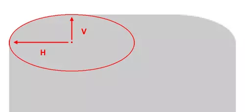
In the above image, I’ve blown up the element and placed an ellipse into the corner so that the upper curve of the ellipse overlaps the rounded corner as closely as possible. A “radius”, according to the dictionary definition is “a straight line extending from the center of a circle or sphere to the circumference or surface.”
在上图中,我炸开了元素并将椭圆形放置到拐角处,以使椭圆形的上曲线尽可能地与圆角重叠。 根据字典定义 ,“半径”是“从圆或球的中心延伸到圆周或表面的直线”。
According to the spec, the values you give the border-radius property “define the radii of a quarter ellipse that defines the shape of the corner of the outer border edge.” Thus, if you add the full ellipse (as I’ve done above), you’ll see exactly how the radii are calculated. In the image, I’ve drawn arrows indicating the horizontal and vertical radii (marked with “H” and “V”).
根据规范,您给border-radius属性提供的值“定义四分之一椭圆的半径,该半径定义外边界边缘的角的形状。” 因此,如果您添加完整的椭圆(如上所述),您将确切看到半径的计算方式。 在图像中,我绘制了指示水平和垂直半径(分别标记为“ H”和“ V”)的箭头。
Keep in mind that because of pixelation (in the original and the blown up version), this can’t be an exact science; that would be something more appropriate when dealing with vector-based shapes.
请记住,由于像素化(在原始版本和放大版本中),这并不是一门精确的科学; 在处理基于矢量的形状时,这会更合适。
其他水平/垂直半径选项 (Other Horizontal/Vertical Radii Options)
Of course, the slash-based syntax is not just limited to two values; if you wish, you can set specific vertical and horizontal radius values for each corner of the element.
当然,基于斜杠的语法不仅限于两个值。 如果需要,可以为元素的每个角设置特定的垂直和水平半径值。
The syntax from above can alternatively be expressed like this:
上面的语法也可以这样表示:
#element {
  border-radius: 55px 55px 55px 55px / 25px 25px 25px 25px;
}
The values before the slash represent the horizontal radii for the top-left, top-right, bottom-right, and bottom-left corners, respectively. The values after the slash represent the vertical radii for those same corners, in that order.
斜杠前的值分别表示左上角,右上角,右下角和左下角的水平半径。 斜线后的值按该顺序表示那些相同角的垂直半径。
And of course, similar to the traditional syntax, you can omit one or two values from before or after the slash, and the missing values will inherit from the existing ones.
当然,与传统语法类似,您可以在斜杠之前或之后省略一个或两个值,而丢失的值将从现有值中继承。
You also have the option to declare different vertical and horizontal radii using the longhand syntax for each corner. So if we wanted to use longhand syntax to create the same shape from above, we would do this:
您还可以选择使用每个角的手绘语法来声明不同的垂直和水平半径。 因此,如果我们想使用手写语法从上方创建相同的形状,则可以这样做:
#element {
  border-top-left-radius: 55px 25px;
  border-top-right-radius: 55px 25px;
  border-bottom-right-radius: 55px 25px;
  border-bottom-left-radius: 55px 25px;
}
Notice that this time there is no slash used. In this case, the two space-separated values on each line represent the horizontal and vertical radii, respectively, for the given corner.
注意,这次没有使用斜线。 在这种情况下,每条线上的两个以空格分隔的值分别代表给定角的水平半径和垂直半径。
何时应使用此语法? (When Should This Syntax Be Used?)
It should be noted that this syntax to target vertical and horizontal radius values for each corner would only be used if you want the vertical and horizontal radius values on a single corner to differ from one another. That means you would not need to use this syntax if you want equal horizontal and vertical radius values for each corner.
应当指出的是,这种语法的目标水平和垂直半径值为每个角落,如果你想在一个角落里垂直和水平半径值彼此不同只会被使用。 这意味着如果您希望每个角的水平和垂直半径值相等,则无需使用此语法。
Significantly, you could also employ this syntax when changing radius values via scripting. Thus, when used appropriately, this could open the door for some interesting animations using transitions or keyframe-based animations.
重要的是,通过脚本更改半径值时,也可以使用此语法。 因此,如果使用得当,这可以为使用过渡或基于关键帧的动画的一些有趣的动画打开大门。
So in most—if not all—cases, you can stick to the traditional syntax, and only use the syntax described here if you want one or more nonsymmetrical rounded corners.
因此,在大多数(如果不是全部)情况下,您可以坚持使用传统语法,并且仅在需要一个或多个非对称圆角时才使用此处描述的语法。
Even so, this information should be enough for you to want to experiment a little further with this otherwise well-known CSS3 property.
即使这样,此信息也应该足以让您想进一步尝试使用此众所周知CSS3属性。
Let me know what you come up with.
让我知道你的想法。
翻译自: https://www.sitepoint.com/setting-css3-border-radius-with-slash-syntax/
css3中斜杠


 扫一扫
扫一扫
 3974
3974

 被折叠的 条评论
为什么被折叠?
被折叠的 条评论
为什么被折叠?
 到【灌水乐园】发言


