


After looking at 5 Great Google Analytics Alternatives in a previous article, we thought it would be useful to look at services that allow you to enhance your existing Google Analytics data.
在看了上一篇文章的5种Google Analytics(分析)替代方法之后,我们认为查看有助于您增强现有Google Analytics(分析)数据的服务会很有用。
It is quite easy to connect your Analytics account to a third party app, and to look at your visitor data in a different way. This can be useful for SEO purposes, or for a deeper drill-down into your visitor data.
将您的Google Analytics(分析)帐户连接到第三方应用程序,并以不同的方式查看您的访问者数据非常容易。 这对于SEO用途或对访问者数据的更深入了解很有用。
To show you what can be done, I’ve selected 5 services that allow you to enhance your Google Analytics data — all you need is a working Google Analytics account.
为了向您展示可以做什么,我选择了5种服务来增强您的Google Analytics(分析)数据-您只需要一个有效的Google Analytics(分析)帐户即可。
Panguin工具2.0 (Panguin Tool 2.0)
The Panguin Tool (who’s name is inspired by Google’s Panda and Penguin updates) allows you to see what effect each Google algorithm update has had on your website traffic. Google has released many updates to their algorithm to improve their search result quality, and some of these changes can have a significant effect on your own rankings.
Panguin工具 (其名称的灵感来自Google的Panda和Penguin更新),可让您查看每次Google算法更新对您网站流量的影响。 Google已发布了许多算法更新,以提高搜索结果质量,其中一些更改可能会对您自己的排名产生重大影响。
But it can be difficult to find a correlation between an increase or decrease in traffic, and a specific update. And it can be difficult to keep track of all of them. This is where the Panguin Tool comes in, using a visual overlay on your stats with each of the Google updates.
但是,很难找到流量的增加或减少与特定更新之间的相关性。 并且很难跟踪所有这些信息。 这是Panguin工具的用处,它在统计数据上使用了直观的覆盖层以及每个Google更新。
The tool requires you to login to your Analytics account, and select the profile of the site you want to examine. I used Panguin Tool to find out why one of my sites, Heathrow-Jobs.com had lost almost all of its visitors in 2012. Turns out, I was hit by the Penguin update (twice actually).
该工具要求您登录到Google Analytics(分析)帐户,然后选择要检查的网站的配置文件。 我使用Panguin Tool找出为什么我的网站之一Heathrow-Jobs.com在2012年失去了几乎所有访问者。结果,我被Penguin更新所打动(实际上是两次)。

As you can see, there have been numerous updates and changes, but I can quickly define which one hit me the hardest. The Panguin Tool gives a nice insight into the second hit. Traffic was climbing steadily, and then Penguin hit again. Penguin was targeting sites that used bad link building tactics, and they weren’t exactly wrong with this site :-).
如您所见,已经进行了许多更新和更改,但是我可以快速定义哪一个对我的影响最大。 Panguin工具可以很好地洞察第二击。 流量稳定增长,然后企鹅再次遭遇袭击。 企鹅的目标是那些使用不良链接构建策略的网站,而该网站并不是完全错误的:-)。
As I mentioned, the Panguin Tool also gives you insight into each of the updates, and when you click on the word “Penguin” you get a nice pop-up with some background information.
正如我提到的,Panguin工具还可以让您深入了解每个更新,当您单击“ Penguin”一词时,您会看到一个漂亮的弹出窗口,其中包含一些背景信息。

The Panguin Tool gives you filters to focus even more, and some additional functionality for your landing pages and keyword strategy. Great tool, and it’s free to use.
Panguin工具为您提供了可以集中精力的过滤器,并为您的着陆页和关键字策略提供了一些其他功能。 很棒的工具,它是免费使用的。
Chartio (Chartio)
Chartio allows you to use all of the variables Google Analytics collects, and present them in any way you like. This is much easier and more detailed than how GA itself allows you present them, and you can make specific dashboards for different focus areas (e-commerce, SEO, and so on).
Chartio可让您使用Google Analytics(分析)收集的所有变量,并以您喜欢的任何方式显示它们。 这比Google Analytics(分析)本身允许您展示它们的方法要容易得多,也更加详细,您可以为不同的重点领域(电子商务,SEO等)创建特定的仪表板。
Connecting to your GA account is done in a few steps, after which you can be building for hours in your dashboards. I personally like pie charts a lot for a quick overview, but you can also use lines, bars, and focus areas. It works much like Microsoft Excel when building graphs, so if you’re already familiar with that, you should find it very easy to use. In around 5 minutes I whipped together this dashboard:
只需几个步骤,即可连接到您的GA帐户,然后您可以在信息中心中建立几个小时。 我个人非常喜欢饼形图,以便进行快速概述,但是您也可以使用线条,条形图和焦点区域。 构建图形时,它的工作原理类似于Microsoft Excel,因此,如果您已经熟悉它,则应该会发现它非常易于使用。 在大约5分钟的时间里,我将以下信息中心整合在一起:

(Note: I took away some of the visitor numbers).
( 注意:我带走了一些访客号码 )。
These are just some basic charts, but these can be very powerful in analyzing your traffic. Additionally, you can build complete formulas and make as many cross references as you want. You are in no way limited in displaying what you want, and this functionality goes far beyond what GA itself has to offer. You can also combine it with other sources like your database or cloud providers.
这些只是一些基本图表,但在分析流量方面可能非常强大。 此外,您可以构建完整的公式并根据需要进行任意多次交叉引用。 您绝不会显示自己想要的东西,并且此功能远远超出了GA本身所提供的功能。 您还可以将其与其他来源(如数据库或云提供商)结合使用。
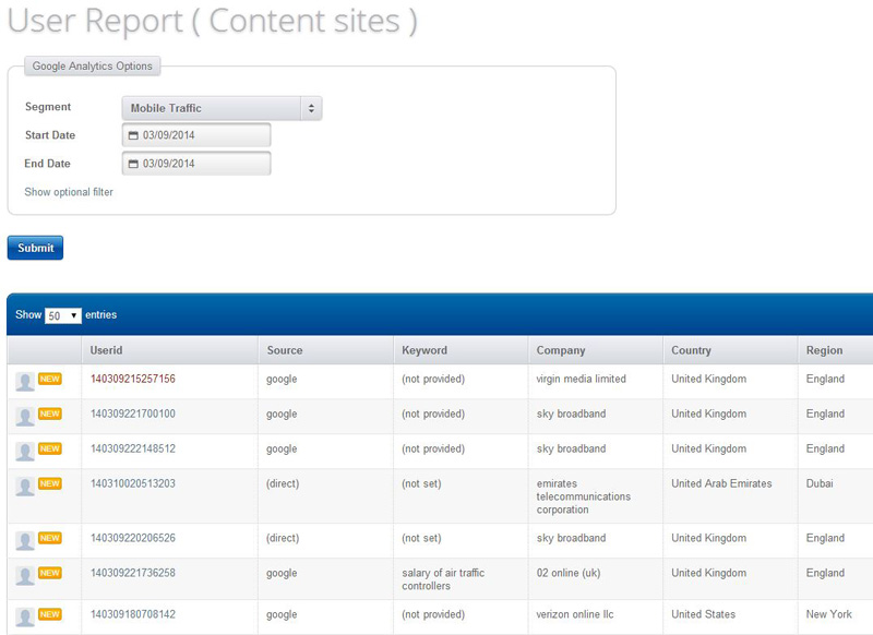
用户报告 (UserReport)
A different approach is taken by UserReport. It uses its own code and reporting along with Google Analytics. This allows you to gather data that GA itself isn’t collecting, and combine that with your GA data.
UserReport采用了不同的方法。 它使用自己的代码和报告以及Google Analytics(分析)。 这样,您就可以收集GA本身未收集的数据,并将其与您的GA数据结合起来。
For example, UserReport allows you to focus on different patterns between male and female visitors. By combining the data, you can see what part of your visitors is female for example, and track their behavior up to a purchase or configured event.
例如,UserReport使您可以专注于男性和女性访客之间的不同模式。 通过合并数据,您可以查看访问者的哪一部分例如是女性,并跟踪他们的行为直至购买或配置事件。
You can combine your data with click maps, but more importantly with surveys. So you can ask your visitors specific questions, combine this with your visitor data, and gain valuable information about purchase behavior or site engagement. It’s a pretty cool way to interact with your visitor and get to know them better, while still keeping track of their actions on your site. And, it also displays your Analytics data in a different way than GA does itself, making it easier to read.
您可以将数据与点击地图结合起来,但更重要的是与调查结合起来。 因此,您可以向访客询问特定的问题,并将其与访客数据结合起来,并获得有关购买行为或网站参与度的有价值的信息。 与访问者进行互动并更好地了解他们,同时仍然跟踪他们在您网站上的行为,这是一种非常酷的方式。 而且,它还以不同于GA本身的方式显示Google Analytics(分析)数据,从而更易于阅读。

天胶 (SkyGlue)
If you want to focus on event tracking on an individual basis, you will find SkyGlue helpful. I admit both their sales page and admin look a little bit outdated, but the tool itself is very powerful.
如果您想单独关注事件跟踪,则SkyGlue会有所帮助。 我承认他们的销售页面和管理员看起来都有些过时,但该工具本身功能非常强大。
You need to add a little extra code to your site, which hooks on events that can take place on your site (clicks, forms, Ajax elements, and so on). You can check to see it’s working by using an overlay for your site, which uses colors to indicate if an event is tracked or not. After that, you can drill down to visitor level, or look at specific events (like a purchase) and see how each visitor reached that event.
您需要在站点上添加一些额外的代码,以挂接可能在您的站点上发生的事件(单击,表单,Ajax元素等)。 您可以使用网站叠加层来检查它是否正常工作,该叠加层使用颜色指示事件是否被跟踪。 之后,您可以深入到访问者级别,或查看特定事件(例如购买),并查看每个访问者如何到达该事件。
While drilling down is useful, it doesn’t aggregate data. Unlike the other four tools discussed here, SkyGlue is mostly focused on enhancing Google Analytics data collection.
虽然向下钻取很有用,但它不会聚合数据。 与此处讨论的其他四个工具不同,SkyGlue主要致力于增强Google Analytics(分析)数据收集。
SkyGlue provides individual user reports, which is missing in GA. For aggregate data, clients can generate such reports inside GA or with 3rd party tools. It integrates with Google Analytics quite nicely, and uses your segments to start your drill down — so, for example, you can select all of your mobile visitors.
SkyGlue提供了单独的用户报告,而GA中缺少这些报告。 对于汇总数据,客户可以在Google Analytics(分析)内部或使用第三方工具生成此类报告。 它与Google Analytics(分析)很好地集成在一起,并使用您的细分来开始向下钻取-例如,您可以选择所有移动访问者。
It would be great if they could find a way to aggregate data inside SkyGlue itself, so you won’t need 3rd party tools tool for this. And if they could make it as excellent as their integration technique, SkyGlue would become a very interesting tool for data analysis based on Google Analytics.
如果他们能够找到一种在SkyGlue本身内部聚合数据的方式,那就太好了,因此您将不需要第三方工具。 而且,如果他们能够使其像集成技术一样出色,SkyGlue将成为基于Google Analytics(分析)的非常有趣的数据分析工具。
矮板 (Ducksboard)
To conclude this list, there’s Ducksboard. It’s an odd name for a tool that allows you to build dashboard. Once inside, you don’t mind the name, since this is a fantastic tool.
总结这个清单,有Ducksboard 。 这是一个允许您构建仪表板的工具的奇怪名称。 进入内部后,您不必在意这个名称,因为这是一个了不起的工具。
Google Analytics is one of the more prominent sources you can display, but you can also connect it to your Facebook page, SalesForce Desk, MailChimp, WordPress and many more. By using widgets, you can display all the relevant information in one place. And you can combine multiple sites if you like, which makes this a great way to have a quick look at all your important metrics within seconds.
Google Analytics(分析)是您可以显示的最重要的资源之一,但您也可以将其连接到Facebook页面,SalesForce Desk,MailChimp,WordPress等。 通过使用小部件,您可以在一个位置显示所有相关信息。 如果愿意,您可以合并多个站点,这是一种在几秒钟内快速查看所有重要指标的好方法。
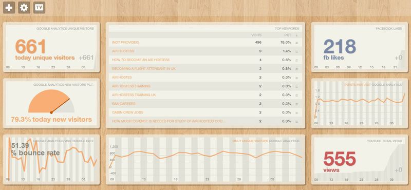
If you you really want to go all the way, they even have a “TV Mode”, which you can use to display your dashboard at full screen. Even on a Full HD TV this looks amazing and really clean.
如果您真的想一直走下去,它们甚至可以提供“电视模式”,您可以使用它以全屏显示仪表板。 即使在全高清电视上,它看起来也很棒而且非常干净。
Ducksboard is very easy to use and intuitive, and it’s real fun to build your own dashboard (or different dashboards for each customer in your service, for example). Of course there’s a lot of eye candy in it, but it’s a professional tool with extensive capabilities. Would be nice if they included Google Analytics real-time though, because that would look amazing on a TV!
Ducksboard非常易于使用和直观,构建自己的仪表板(或为服务中的每个客户使用不同的仪表板)非常有趣。 当然,其中有很多吸引人的地方,但这是具有广泛功能的专业工具。 但是,如果它们包括实时Google Analytics(分析),那就太好了,因为在电视上看起来真是太神奇了!
结论 (Conclusion)
All of these tools are either free or offer a free trial, so you can check them all out at no cost. It takes just a few seconds to set them up, and anywhere from a few minutes to many hours to play with.
所有这些工具都是免费的或提供免费试用版,因此您可以免费检查所有工具。 设置它们仅需几秒钟,而花费的时间则从几分钟到数小时不等。
All options give you an extra insight into your Google Analytics data, some with excellent presentation and others with extensive analysis features. Let me know which of these you prefer, and if you know of any others you’ve tried, we’d love to hear about them.
所有选项都可以让您对Google Analytics(分析)数据有更深入的了解,其中一些具有出色的演示效果,而其他则具有广泛的分析功能。 让我知道您更喜欢其中的哪一个,如果您知道您尝试过的其他任何方式,我们很乐意听到有关它们的信息。
翻译自: https://www.sitepoint.com/5-apps-enhance-google-analytics/


 1502
1502

 被折叠的 条评论
为什么被折叠?
被折叠的 条评论
为什么被折叠?
 到【灌水乐园】发言


