


bootstrap 选项卡
Bootstrap is one of the most widely adopted, open-source, front-end frameworks. Include Bootstrap in your project, and you’ll be able to whip up responsive web pages in no time. If you’ve tried using Masonry together with the Bootstrap Tabs widget, one of the many JavaScript components Bootstrap has to offer, chances are you’ve stumbled on some kind of annoying behavior.
Bootstrap是最广泛采用的开源前端框架之一。 将Bootstrap包含在您的项目中,您将能够立即生成响应式网页。 如果您尝试将Masonry与Bootstrap Tabs小部件(Bootstrap必须提供的众多JavaScript组件之一)一起使用,那么您可能会偶然发现了某种令人讨厌的行为。
On the Masonry website, we read that Masonry is …
在砌体网站上 ,我们看到砌体是……
a JavaScript grid layout library. It works by placing elements in optimal position based on available vertical space, sort of like a mason fitting stones in a wall.
JavaScript网格布局库。 它通过根据可用的垂直空间将元素放置在最佳位置来工作,就像砌墙的石匠一样。
I did, and this article highlights what the issue is and what you can do to solve it.
我做到了,本文重点介绍了问题所在以及解决该问题的方法。
引导选项卡介绍 (Bootstrap Tabs Explained)
The Bootstrap Tabs component includes two key, related pieces: a tabbed navigation element and a number of content panels. On page load, the first panel has the class .active applied to it. This enables the panel to be visible by default. This class is used via JavaScript to toggle the panel’s visibility via the events triggered by the tabbed navigation links: if .active is present the panel is visible, otherwise the panel is hidden.
Bootstrap选项卡组件包括两个关键的相关部分:一个选项卡式导航元素和多个内容面板。 在页面加载时,第一个面板上应用了.active类。 这使面板默认情况下可见。 通过JavaScript使用此类,可通过选项卡式导航链接触发的事件来切换面板的可见性:如果显示.active ,则面板可见,否则面板被隐藏。
If you have some web content that’s best presented in individual chunks, rather than crammed all in one spot, the Bootstrap tabs component might come in handy.
如果您有一些最好以单独的块呈现的Web内容,而不是一网打尽,Bootstrap选项卡组件可能会派上用场。
为什么要砌石? (Why Masonry?)
In some cases, the content inside each panel is suited to being displayed in a responsive grid layout. For instance, a range of products, services, and portfolio items are types of content that can be displayed in grid format.
在某些情况下,每个面板内的内容都适合在响应网格布局中显示。 例如,一系列产品,服务和投资组合项目是可以以网格格式显示的内容类型。
However, if grid cells are not of the same height, something like what you see below can happen.
但是,如果网格单元的高度不同,则可能会发生以下情况。
A wide gap separates the two rows of content and the layout appears broken.
较大的间隙将两行内容分隔开,并且布局似乎已损坏。
Nowadays, Bootstrap solves the equal-width issue with the brand new card component, which is based on Flexbox. Just adding the card-deck class to a group of card components is sufficient to achieve equal-width columns.
如今,Bootstrap通过基于Flexbox的全新卡组件解决了等宽问题。 仅将card-deck 类添加到一组卡组件中就足以实现等宽列。
If you like your cards to be of uneven length, you could use CSS3 Multi Column Layout. (After all, even though there are some browser support bugs, overall it’s quite good.) This underlies the new card columns option that comes packaged with the card component. However, if you still love the nice animation that the Masonry JavaScript library provides out of the box, and its wide browser compatibility, JavaScript is still a viable option in this case.
如果您希望卡片的长度不均匀,则可以使用CSS3多列布局 。 (毕竟,即使存在一些浏览器支持错误,总的来说还是不错的。)这是card组件随附的新card column选项的基础。 但是,如果您仍然喜欢Masonry JavaScript库提供的开箱即用的精美动画及其广泛的浏览器兼容性,那么在这种情况下,JavaScript仍然是可行的选择。
设置演示页面 (Setting Up a Demo Page)
Getting a demo page up and running helps to show how integrating Bootstrap Tabs with Masonry is not as straightforward as one might expect.
启动并运行演示页面有助于说明如何将Bootstrap Tabs与Masonry集成起来并不像人们期望的那么简单。
This article’s demo page is based on the starter template, available on the Bootstrap website.
本文的演示页面基于Bootstrap网站上提供的入门模板 。
Below is the skeleton of the markup for the Bootstrap tabs component:
以下是“引导程序”选项卡组件的标记的框架:
<ul class="nav nav-tabs" id="myTab" role="tablist">

  <!-- nav item 1 -->
  <li class="nav-item">
    <a class="nav-link active" id="home-tab" data-toggle="tab" href="#home" role="tab" aria-controls="home" aria-selected="true">Home</a>
  </li>

  <!-- nav item 2 -->
  <li class="nav-item">
    <a class="nav-link" id="profile-tab" data-toggle="tab" href="#profile" role="tab" aria-controls="profile" aria-selected="false">Profile</a>
  </li>

  <!-- nav item 3 -->
  <li class="nav-item">
    <a class="nav-link" id="contact-tab" data-toggle="tab" href="#contact" role="tab" aria-controls="contact" aria-selected="false">Contact</a>
  </li>
</ul>
The nav nav-tabs classes are responsible for giving the tabs their characteristic appearance. The value of the href attribute forms the relationship between a single tab and its corresponding tabbed content. For instance, an href value of #home creates a relationship with the tabbed content with id="home": clicking that particular tab reveals the contents inside the div with the id value of home.
nav nav-tabs类负责赋予选项卡其独特的外观。 href属性的值形成单个选项卡及其对应的选项卡式内容之间的关系。 例如, href值为#home会与带有id="home"的选项卡式内容创建关系:单击该特定选项卡将显示id为home的div的内容。
Also, notice how Bootstrap pays attention to accessibility attributes like role, aria-controls, etc.
另外,请注意Bootstrap如何注意可访问性属性,例如role , aria-controls等。
Here’s a code snippet to illustrate the tabbed content’s structure:
这是一个代码片段,用于说明选项卡式内容的结构:
<!-- content 1 -->
<div class="tab-pane fade show active" id="home" role="tabpanel" aria-labelledby="home-tab">
  <h3>Tab 1 Content</h3>
<div class="card-group">

  <!-- first card -->
  <div class="card">
    <img class="card-img-top" src="path/to/img" alt="Card image cap">
    <div class="card-body">
      <h5 class="card-title">Card title</h5>
      <p class="card-text">Card text here.</p>
      <p class="card-text"><small class="text-muted">Last updated 3 mins ago</small></p>
    </div>
  </div>

  <!-- second card -->
  <div class="card">
    <!-- card markup here -->
  </div&lgt;

  <!-- third card -->
  <div class="card">
    <!-- card markup here -->
  </div>

  </div>
</div>
Just add a similar structure for each tabbed content section corresponding to the tabs elements you coded above.
只需为每个选项卡式内容部分添加与您上面编码的选项卡元素相对应的类似结构即可。
For the full code, check out the CodePen demo.
有关完整代码,请查看CodePen演示 。
添加砌体库 (Adding the Masonry Library)
You can download Masonry from the official website by clicking on the Download masonry.pkgd.min.js button.
您可以通过单击下载masonry.pkgd.min.js按钮从官方网站下载Masonry 。
To avoid layout issues, the library’s author recommends using Masonry together with the imagesLoaded plugin.
为了避免布局问题,该库的作者建议将Masonry与imagesLoaded插件一起使用。
Masonry doesn’t need the jQuery library to work. However, because the Bootstrap JavaScript components already use jQuery, I’ll be making life easier for myself and initialize Masonry the jQuery way.
Masonry不需要jQuery库即可工作。 但是,由于Bootstrap JavaScript组件已经使用jQuery,因此我将为自己简化生活并以jQuery方式初始化Masonry。
Here’s the code snippet to initialize Masonry using jQuery and imagesLoaded:
这是使用jQuery和imagesLoaded初始化Masonry的代码片段:
var $container = $('.masonry-container');
$container.imagesLoaded( function () {
  $container.masonry({
    columnWidth: '.card',
    itemSelector: '.card'
  });
});
The code above caches the div that wraps all the card elements in a variable called $container.
上面的代码缓存div ,该div将所有卡元素包装在一个名为$container的变量$container 。
Next, Masonry is initialized on $container with a couple of recommended options. The columnWidth option indicates the width of a column of a horizontal grid. Here it’s set to the width of the single card item by using its class name. The itemSelector option indicates which child elements are to be used as item elements. Here, it’s also set to the single card item.
接下来,使用几个推荐的选项在$container上初始化Masonry。 columnWidth选项指示水平网格的列的宽度。 在这里,使用类别名称将其设置为单个卡片项目的宽度。 itemSelector选项指示哪些子元素将用作项目元素。 在这里,它也设置为单个卡片项目。
It’s now time to test the code.
现在该测试代码了。
糟糕! 隐藏面板怎么了? (Oops! What’s up with the Hidden Panels?)
On a web page that doesn’t use Bootstrap Tabs, the code above works like a charm. However, in this case, you soon realize a kind of funny behavior occurs.
在不使用“引导程序选项卡”的网页上,以上代码的工作原理就像一个超级按钮。 但是,在这种情况下,您很快就会意识到一种有趣的行为发生。
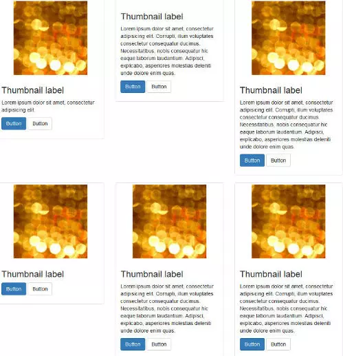
First, it seems fine because the grid inside the default active tab panel is displayed correctly:
首先,这看起来不错,因为正确显示了默认活动选项卡面板中的网格:
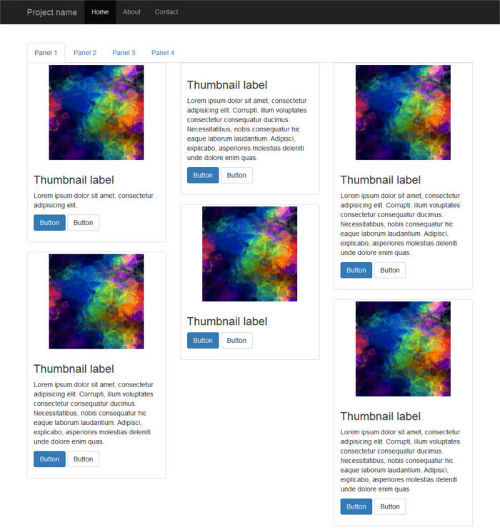
However, if you click on a tabbed navigation link to reveal the hidden panel’s content, here’s what happens:
但是,如果单击选项卡式导航链接以显示隐藏面板的内容,则会发生以下情况:
Peeking inside the source code reveals that Masonry has fired as expected, but the position of each item is not being calculated correctly: grid items are all stacked on top of each other like a pack of cards.
窥视源代码可以发现Masonry已经按预期进行了射击,但是每个项目的位置都无法正确计算:网格项目都像一堆纸牌一样彼此堆叠。
And that’s not all. Resizing the browser window causes the grid items to position themselves correctly.
不仅如此。 调整浏览器窗口的大小会使网格项目正确定位。
让我们修复布局错误 (Let’s Fix the Layout Bug)
Since the unexpected layout bug becomes apparent after clicking on a tabbed navigation link, let’s look into the events fired by Bootstrap Tabs a bit more closely.
由于单击选项卡式导航链接后会出现意外的布局错误,因此让我们更仔细地研究由Bootstrap选项卡触发的事件。
The events list is quite short. Here it is.
事件列表很短。 这里是。
show.bs.tab fires on tab show, but before the new tab has been shown
show.bs.tab在选项卡显示时触发,但在显示新选项卡之前
shown.bs.tab fires on tab show after a tab has been shown
显示标签后, bs.tab会在标签显示上触发
hide.bs.tab fires when a new tab is to be shown (and thus the previous active tab is to be hidden)
当显示一个新标签时, hide.bs.tab会触发(因此,前一个活动标签将被隐藏)
hidden.bs.tab fires after a new tab is shown (and thus the previous active tab is hidden).
显示新标签页后, hidden.bs.tab将触发(因此,先前的活动标签页将被隐藏)。
Because the Masonry layout gets messed up after a tab has been shown, go for the shown.bs.tab event. Here’s the code, which you can place just below the previous snippet:
由于在显示选项卡后砌体布局会混乱,因此请进入shown.bs.tab事件。 这是代码,您可以将其放置在上一个代码片段的正下方:
$('a[data-toggle=tab]').each(function () {
  var $this = $(this);

  $this.on('shown.bs.tab', function () {
    $container.imagesLoaded( function () {
      $container.masonry({
        columnWidth: '.card',
        itemSelector: '.card'
      });
    });
  });
});
Here’s what happens in the code above:
这是上面的代码中发生的事情:
The jQuery .each() function loops over each tabbed navigation link and listens for the shown.bs.tab event. As the event fires, the panel becomes visible and Masonry is re-initialized after all images have finished loading.
jQuery .each()函数在每个选项卡式导航链接上循环并侦听shown.bs.tab事件。 当事件触发时,面板将变为可见状态,并且在完成所有图像的加载后,将重新初始化石工。
测试代码 (Test the Code)
If you’ve been following along, launch your demo in the browser, or try out the CodePen demo below to check out the result:
如果您一直在遵循,请在浏览器中启动演示,或尝试下面的CodePen演示以查看结果:
See the Pen Bootstrap Tabs and Masonry by SitePoint (@SitePoint) on CodePen.
请参阅CodePen上的SitePoint ( @SitePoint )的笔引导选项卡和砌体 。
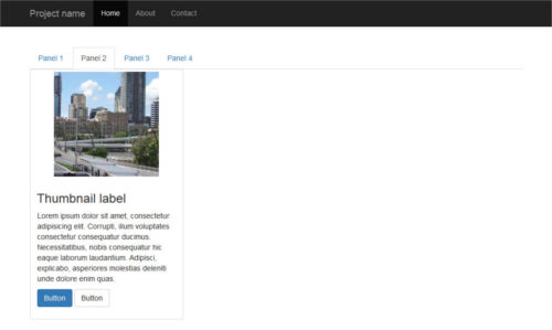
Click on a tabbed navigation link and notice how, this time, the grid items fit evenly inside each content panel. Resizing the browser causes the items to reposition themselves correctly with a nice animation effect.
单击选项卡式导航链接,然后注意这次网格项如何均匀地放入每个内容面板中。 调整浏览器的大小可以使项目正确地重新定位,并具有良好的动画效果。
That’s it, job done!
就是这样,工作完成了!
结论 (Conclusion)
In this article, I’ve shown how to integrate the Bootstrap Tabs component with the Masonry JavaScript library.
在本文中,我展示了如何将Bootstrap Tabs组件与Masonry JavaScript库集成在一起。
Both scripts are easy to use and quite powerful. However, put them together and you’ll face some annoying layout bugs affecting the hidden tabs. As shown above, the trick is to re-initialize the Masonry library after each panel becomes visible.
这两个脚本都易于使用且功能强大。 但是,将它们放在一起,您将面临一些讨厌的布局错误,这些错误会影响隐藏的选项卡。 如上所示,诀窍是在每个面板都可见后重新初始化Masonry库。
With this solution in your toolbox, achieving great tiled layouts will be a breeze.
使用工具箱中的此解决方案,轻松实现出色的平铺布局将非常容易。
Happy Bootstrapping!
引导愉快!
If you’ve got the basics of Bootstrap under your belt but are wondering how to take your Bootstrap skills to the next level, check out our Building Your First Website with Bootstrap 4 course for a quick and fun introduction to the power of Bootstrap.
如果您掌握了Bootstrap的基础知识,但又想知道如何将Bootstrap技能提高到一个新的水平,请查看我们的使用Bootstrap 4建立您的第一个网站课程,以快速,有趣地介绍Bootstrap的功能。
翻译自: https://www.sitepoint.com/bootstrap-tabs-play-nice-with-masonry/
bootstrap 选项卡


 扫一扫
扫一扫
 806
806

 被折叠的 条评论
为什么被折叠?
被折叠的 条评论
为什么被折叠?
 到【灌水乐园】发言


