


bootstrap网格
In this article, I’ll introduce you to the key Bootstrap CSS classes for building layouts with the Bootstrap grid system.
在本文中,我将向您介绍关键的Bootstrap CSS类,以使用Bootstrap网格系统构建布局。
Bootstrap 4 uses Flexbox as the basis for its grid system. I’ll explain the Flexbox CSS properties that underlie the new grid’s functionality, and define how the Bootstrap flex utility classes work to help you build awesome layouts quickly and painlessly.
Bootstrap 4使用Flexbox作为其网格系统的基础。 我将解释作为新网格功能基础的Flexbox CSS属性,并定义Bootstrap flex实用程序类如何工作,以帮助您快速而轻松地构建出色的布局。
什么是Flexbox? (What is Flexbox?)
Let’s first introduce Flexbox. It stands for flexible box, and it’s a cutting-edge CSS layout system that makes it easy to create layouts for dynamic or unknown screen sizes. (The flex container has the ability to adjust and control the size of its child elements to adapt to different viewports.)
让我们首先介绍Flexbox 。 它代表着柔性 IBLE 框 ,这是一个前沿CSS布局系统,可以很容易地创建动态的或未知的屏幕尺寸布局。 (flex容器具有调整和控制其子元素的大小以适应不同视口的能力。)
You can easily create a Flexbox layout using a set of CSS properties designed for this task.
您可以使用为此任务设计的一组CSS属性轻松创建Flexbox布局。
Bootstrap makes it even easier to create Flexbox-based layouts by providing a set of wrapper classes on top of Flexbox properties, which you can simply apply to your markup to achieve your desired result.
通过在Flexbox属性之上提供一组包装器类,Bootstrap使创建基于Flexbox的布局变得更加容易,您可以将其简单地应用于标记以实现所需的结果。
引导网格系统简介 (Introduction to the Bootstrap Grid System)
Grid systems are an important element of a CSS framework, since building complex layouts without a powerful and flexible grid system can be an intimidating task.
网格系统是CSS框架的重要元素,因为在没有强大而灵活的网格系统的情况下构建复杂的布局可能是一项艰巨的任务。
Among the new features of the latest Bootstrap grid system, you’ll find the xl (extra large) grid breakpoint, corresponding to an extra large screen size, and the use of Flexbox instead of floats as the underlying layout mechanism.
在最新的Bootstrap网格系统的新功能中,您会发现xl (超大)网格断点(对应于超大屏幕尺寸),并使用Flexbox而不是float作为底层布局机制。
引导网格系统的关键类 (Key Classes of the Bootstrap Grid System)
You can build a layout using Bootstrap’s grid system by applying a bunch of Bootstrap classes: .container, .row and .col-*-*. (The first * in .col-*-* needs to be replaced by the breakpoint specifier — such as xs, sm, md, lg, xl — and the second * needs to be filled with the column span size. The sum of all columns has to be equal to 12.)
您可以通过应用Bootstrap的网格系统来构建布局,方法是应用一堆Bootstrap类: .container , .row和.col-*-* 。 ( .col-*-*的第一个*需要用断点说明符替换-例如xs, sm, md, lg, xl第二个*需要用列跨度大小填充。所有值的总和列必须等于12。)
Let’s now look at the core components of the Bootstrap grid.
现在让我们看一下Bootstrap网格的核心组件。
容器 (Container)
The container is the outer wrapper for the grid layout. It’s a div that has either the class .container for fixed width or .container-fluid for a 100% full width.
容器是网格布局的外部包装。 这是一个div具有任一类.container固定宽度或.container-fluid为100%的全宽。
行 (Row)
A row serves as a logical container for columns.
行充当列的逻辑容器。
柱 (Column)
A column is what makes a block in the grid. It should be contained in a row.
列是构成网格中的块的原因。 它应该包含在一行中。
The Bootstrap grid system provides these additional column classes:
Bootstrap网格系统提供了以下其他列类:
.col-xs-*: designed for extra small screens of less than 576px width.col-xs-*:设计用于宽度小于576像素的超小屏幕.col-sm-*: designed for small screens with the width equals to or greater than 576px.col-sm-*:设计用于宽度等于或大于576px的小屏幕.col-md-*: designed for medium screens with the width >= 768px.col-md-*:设计用于宽度大于等于768px的中型屏幕.col-lg-*: designed for large screens with the width >= 992px.col-lg-*:设计用于宽度大于等于992px的大屏幕.col-xl-*: designed for extra large screens that have a width that equals to or is greater than 1200px..col-xl-*:设计用于宽度等于或大于1200px的超大屏幕。
You don’t need to add multiple classes if you want to specify the same width for different screen sizes; just add the class with the smallest breakpoint. So, for example, instead of .col-sm-6 and .col-md-6, you only need to apply .col-sm-6.
如果要为不同的屏幕尺寸指定相同的宽度,则无需添加多个类。 只需添加具有最小断点的类即可。 因此,例如,您只需应用.col-sm-6代替.col-sm-6和.col-md-6 .col-sm-6 。
Flexbox与Floats的自举网格布局 (Bootstrap Grid Layouts with Flexbox vs Floats)
Thanks to Flexbox, you can easily achieve things like same-height columns or same-width columns, which you could only accomplish with CSS hacks before.
多亏了Flexbox,您可以轻松地实现相同高度的列或相同宽度的列,而以前只能通过CSS hack才能完成。
CSS float and clearfix techniques to build layouts have been among such hacks, which made it hard to build and debug complex layouts.
CSS 浮动和clearfix技术来构建布局已成为此类黑客中的一种,这使构建和调试复杂的布局变得困难。
For example, consider a two-column layout. If you build this layout with Bootstrap 3, it will look like this:
例如,考虑一个两列布局。 如果您使用Bootstrap 3构建此布局,它将看起来像这样:
See the Pen Bootstrap 3 2-Column Layout by SitePoint (@SitePoint) on CodePen.
请参阅CodePen上的SitePoint ( @SitePoint )的Pen Bootstrap 3两列布局 。
If you build the same layout with Bootstrap 4, this is what you have:
如果您使用Bootstrap 4构建相同的布局,那么您将拥有:
See the Pen Bootstrap 4 2-Column Layout by SitePoint (@SitePoint) on CodePen.
请参阅CodePen上的SitePoint ( @SitePoint )的Pen Bootstrap 4 2列布局 。
With Bootstrap 4 and its flexbox-based grid, you achieve a more realistic column (just like in a table), as columns in the same row will take the same height.
使用Bootstrap 4及其基于flexbox的网格,您可以实现更逼真的列(就像在表中一样),因为同一行中的列将具有相同的高度。
Let’s tackle same-width column layouts. Thanks to Flexbox, you can easily divide the available space between multiple columns in the same row. If you create a grid layout with multiple columns without specifying the column width (i.e using the .col-* classes), the available space will automatically and equally be divided among those columns.
让我们解决等宽列的布局。 多亏了Flexbox,您可以轻松地在同一行的多列之间划分可用空间。 如果您创建具有多列的网格布局而未指定列宽(即使用.col-*类),则可用空间将自动平均分配给这些列。
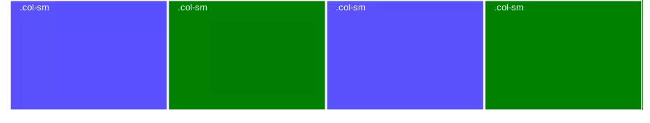
Here’s an easy and quick example:
这是一个简单快速的示例:
<div class="row">
  <div class="col-sm" style="min-height:200px;">
    .col
  </div>
  <div class="col-sm">
    .col
  </div>
  <div class="col-sm">
    .col
  </div>
  <div class="col-sm">
    .col
  </div>

</div>
The four instances of .col-sm will each automatically be 25% wide from the small breakpoint and up.
.col-sm的四个实例将从小断点起自动向上增加25%的宽度。
With some minimal styling, here’s what you get:
通过一些最小的样式,您将获得:
具有自动边距的Flexbox (Flexbox with Auto Margins)
Combining Flexbox with auto margins results in some cool tricks.
将Flexbox与自动边距结合使用会产生一些很酷的技巧。
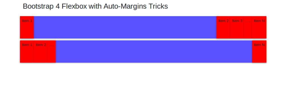
For example, look at the above layout: you can position elements to the right of an item by adding a Bootstrap .mr-auto class to the item, which stands formargin-right: auto; in regular CSS, or also position some elements to the left of a specified item by using the Bootstrap .ml-auto class (margin-left: auto; in regular CSS). You can see this as moving the item with the .mr-auto or .ml-auto classes to the right-most or left-most position respectively, and the other elements to the opposite direction.
例如,看一下上面的布局:您可以通过向项目添加Bootstrap .mr-auto类来将元素定位在项目的右侧,该类代表margin-right: auto; 在常规CSS中,或者通过使用Bootstrap .ml-auto类将某些元素放在指定项目margin-left: auto; ( margin-left: auto;在常规CSS中)。 您可以看到这是将具有.mr-auto或.ml-auto类的项目分别移到最右边或最左边的位置,而其他元素则向相反的方向移动。
See the Pen Bootstrap 4 Flexbox with Auto-Margins Tricks by SitePoint (@SitePoint) on CodePen.
请参阅CodePen上带有 SitePoint( @SitePoint )的自动边际技巧的Pen Bootstrap 4 Flexbox 。
You can accomplish this result either horizontally or vertically. To achieve the same behavior moving flex elements to the top or bottom (rather than to the right or to the left), you need to use mb-auto (margin-bottom: auto;) and mt-auto (margin-top: auto;), set flex-direction to column and apply the align-items-(start|end) class.
您可以水平或垂直完成此结果。 为了实现将flex元素移到顶部或底部(而不是向右或向左)的相同行为,您需要使用mb-auto ( margin-bottom: auto; )和mt-auto ( margin-top: auto; ),将flex-direction设置为column并应用align-items-(start|end)类。
See the Pen Bootstrap 4 Flexbox with Auto-Margins Tricks by SitePoint (@SitePoint) on CodePen.
请参阅CodePen上带有 SitePoint( @SitePoint )的自动边际技巧的Pen Bootstrap 4 Flexbox 。
有用的Flexbox概念来处理Bootstrap Flex实用程序类 (Useful Flexbox Concepts to Handle Bootstrap Flex Utility Classes)
Bootstrap 4 uses specific flex utility classes, which might seem somewhat esoteric to someone who’s never heard of Flexbox or doesn’t know how flex containers and flex items behave.
Bootstrap 4使用特定的flex实用程序类 ,这对于从未听说过Flexbox或不知道flex容器和flex项如何工作的人来说似乎有些深奥。
For instance, Bootstrap now applies the display:flex property to its grid container elements. Also, Bootstrap lets you turn any HTML container into a flex container by simply applying the .d-flex class to your chosen element.
例如,Bootstrap现在将display:flex属性应用于其网格容器元素。 另外,通过Bootstrap,您只需将.d-flex类应用于所选元素,即可将任何HTML容器转换为flex容器。
There are also available responsive classes such as .d-sm-flex and .d-md-flex, etc.
还有可用的响应类,例如.d-sm-flex和.d-md-flex等。
However, if you don’t know what a flex container is and how it affects its child elements, using Bootstrap flex utility classes could be a bit problematic. The same could be said of all the other flex utilities like .flex-row, .flex-row-reverse, .flex-column and .flex-column-reverse.
但是,如果您不知道什么是flex容器及其对子元素的影响,那么使用Bootstrap flex实用程序类可能会有些问题。 对于所有其他flex实用程序,如.flex-row , .flex-row-reverse , .flex-column和.flex-column-reverse 。
Let’s go over a quick review of how Flexbox works. It’s most likely you’ll find this useful when handling Bootstrap flex utility classes.
让我们快速回顾一下Flexbox的工作方式。 处理Bootstrap flex实用程序类时,很可能会发现这很有用。
弹性容器 (Flex Containers)
Flexbox defines a flex container by applying the display property with the flex or inline-flex values:
Flexbox通过将display属性与flex或inline-flex值一起应用来定义flex容器:
.mycontainer {
  display: flex;
}
The Bootstrap flex utility class for creating a flex container is d-flex.
用于创建flex容器的Bootstrap flex实用程序类是d-flex 。
弹性物品 (Flex Items)
Every direct child element of a flex container is turned into a flex item.
flex容器的每个直接子元素都将变成flex项目。
You can define the direction of flex items using the flex-direction CSS property with one of the following values: row, row-reverse, column and column-reverse.
您可以使用用于定义Flex项目的方向 flex-direction :CSS属性与以下值之一row , row-reverse , column和column-reverse 。
rowsets the horizontal direction from left to rightrow设置从左到右的水平方向row-reversesets the horizontal direction from right to leftrow-reverse设置从右到左的水平方向columnsets the vertical direction from top to bottomcolumn设置从上到下的垂直方向column-reversesets the vertical direction from bottom to top.column-reverse设置从下到上的垂直方向。
Bootstrap uses the classes flex-row, flex-row-reverse, flex-column, and flex-column-reverse to determine the direction of flex items.
Bootstrap使用flex-row , flex-row-reverse , flex-column和flex-column-reverse来确定flex项目的方向。
Also, Flexbox lets you explicitly alter the visual order of specific flex items by using the order property, which defaults to zero:
另外,Flexbox允许您使用order属性(默认为零)显式更改特定弹性项目的视觉顺序 :
.item {
  order: 1;
}
Bootstrap offers its own order utility classes for making a flex item first, last, or for resetting the order property to the default DOM order. For example, to make a flex item appear first with respect to its siblings, add order-1 to the markup.
Bootstrap提供了自己的order实用程序类,用于首先,最后创建弹性商品,或将order属性重置为默认DOM订单。 例如,要使弹性项目相对于其同级项首先出现,请将order-1添加到标记中。
弹性项目的对齐 (Alignment of Flex Items)
Flexbox makes it quick and easy to align flex items in any way you like.
Flexbox可让您以自己喜欢的任何方式快速轻松地对齐弹性项目。
For example, the justify-content property on the flex container lets you align flex items on the main axis (the x-axis by default, which you can change by setting the flex-direction to column). Available values are:
例如,flex容器上的justify-content属性使您可以在主轴(默认为x轴,可以通过将flex-direction设置为column进行更改)上对齐flex项目。 可用值为:
flex-start: this is the initial value, and will line up items at the start of the containerflex-start:这是初始值,它将在容器的开头排列项目flex-endaligns items to the end of the parent elementflex-end将项目对齐到父元素的末尾centeraligns items to the center of the containercenter将项目与容器的center对齐space-betweencreates a space in between flex items after they’ve been laid out弹性项目放置后,在弹性项目
space-between创建一个空格space-aroundcreates an equal amount of space to the right and left of each flex item.space-around左右在每个弹性项目的左侧和右侧创建相等的空间。
Bootstrap utility classes for applying justify-content values to elements are:
用于将justify-content值应用于元素的Bootstrap实用程序类为:
justify-content-startjustify-content-startjustify-content-endjustify-content-endjustify-content-centerjustify-content-centerjustify-content-betweenjustify-content-betweenjustify-content-aroundjustify-content-around
The Flexbox align-items property allows you to change the alignment of flex items in the cross axis. (If you set the main axis to be horizontal, the cross axis will be vertical, and vice versa.)
Flexbox align-items属性使您可以更改十字轴上的弹性项目的对齐方式。 (如果将主轴设置为水平,则交叉轴将为垂直,反之亦然。)
Possible values for align-items are:
align-items可能值为:
stretch: this is the initial value, which causes flex items to stretch to the height of their tallest sibling elementsstretch:这是初始值,它会使弹性项目拉伸到其最高同级元素的高度flex-startlines up the items at the start of the flex containerflex-start在flex容器flex-start排列项目flex-endlines up the items at the end of the flex containerflex-end在flex容器的末尾对齐项目centeris responsible for centering the flex item inside its container.center负责将flex项在其容器内居中。
You can quickly apply this behavior with the following Bootstrap classes:
您可以使用以下Bootstrap类快速应用此行为:
align-items-stretchalign-items-stretchalign-items-startalign-items-startalign-items-endalign-items-endalign-items-centeralign-items-center
Check out the code in this pen for an example of how you can apply Bootstrap flex utility classes:
查看此笔中的代码,以获取有关如何应用Bootstrap flex实用程序类的示例:
See the Pen Bootstrap 4 Vertical Alignment by SitePoint (@SitePoint) on CodePen.
请参见CodePen上的SitePoint ( @SitePoint )通过Pen Bootstrap 4进行的垂直对齐 。
You can find other available utilities in the Bootstrap flex docs.
您可以在Bootstrap flex docs中找到其他可用的实用程序。
结论 (Conclusion)
In this article, we looked at how Flexbox makes the Bootstrap grid system more versatile, with features such as automatic same-width layouts and same-height columns. We then looked at some Flexbox properties that are key to mastering Bootstrap flex utility classes and getting the most out of their powerful layout capabilities.
在本文中,我们研究了Flexbox如何使Bootstrap网格系统更具通用性,并具有自动等宽布局和等高列等功能。 然后,我们研究了一些Flexbox属性,这些属性对于掌握Bootstrap flex实用程序类并充分利用其强大的布局功能至关重要。
If you’ve heard about Bootstrap but have been putting off learning it because it seems too complicated, then play through our Introduction to Bootstrap 4 course for a quick and fun introduction to the power of Bootstrap.
如果您听说过Bootstrap但由于似乎过于复杂而推迟学习它,请浏览我们的Bootstrap 4入门课程,快速而有趣地介绍Bootstrap的功能。
翻译自: https://www.sitepoint.com/bootstrap-grid-mastering-flexbox/
bootstrap网格


 扫一扫
扫一扫
 3008
3008

 被折叠的 条评论
为什么被折叠?
被折叠的 条评论
为什么被折叠?
 到【灌水乐园】发言


