


It can be difficult to achieve complex yet flexible and responsive grid layouts. Various techniques have evolved over the years but most, such as faux columns, were hacks rather than robust design options.
实现复杂而灵活的响应式网格布局可能很困难。 这些年来,已经发展出了各种各样的技术,但大多数(例如人造色谱柱 )都是黑客,而不是可靠的设计选择。
Most of these hacks were built on top of the CSS float property. When the Flexbox layout module was introduced to the list of display property options, a new world of options became possible. Now you can not only define the direction the container is going to stack the items but also wrap, align (items and lines), order, shrink, etc. them in a container.
这些黑客中的大多数都建立在CSS float属性之上。 将Flexbox布局模块引入显示属性选项列表时,新的选项世界成为可能。 现在,您不仅可以定义容器堆叠项目的方向,还可以在容器中包装,对齐(项目和线条),排序,缩小等。
With all that power in their hands, developers started to create their own combinations of rules for all sorts of layouts. Flexibility reigned. However, Flexbox was designed to deal with one-dimensional layouts: either a row or a column. CSS Grid Layout, in contrast, permitted two-dimensional row and column layouts.
有了所有这些功能,开发人员开始为各种布局创建自己的规则组合。 灵活性占据统治地位。 但是,Flexbox旨在处理一维布局:行或列。 相反,CSS网格布局允许二维行和列布局 。
渐进增强与优雅降级 (Progressive Enhancement vs Graceful Degradation)
It’s difficult to create a website that supports every user’s browser. Two options are commonly used — “graceful degradation” and “progressive enhancement”.
创建一个支持每个用户浏览器的网站很困难。 通常使用两个选项-“平滑降级”和“渐进增强”。
Graceful degradation ensures a website continues to function even when something breaks. For example, float: right may fail if an element is too big for the screen but it wraps to the next empty space so the block remains usable.
正常降级可确保即使出现故障,网站仍可继续运行。 例如,如果元素对于屏幕而言太大,则float: right可能会失败,但它会缠绕到下一个空白空间,因此该块仍然可用。
Progressive enhancement takes the opposite approach. The page starts with minimum functionality and features are added when they’re supported. The example above could use a CSS media query to verify the screen is a minimum width before allowing an element to float.
渐进增强采用相反的方法。 该页面以最低功能开始,并在受支持时添加功能。 上面的示例可以使用CSS媒体查询在允许元素浮动之前验证屏幕是否为最小宽度。
When it comes to grid layouts, each browser determines the appearance of its components. In this article, you’re going to understand with some real samples how to evolve some web contents from an old strategy to a new one. More specifically, how to progressively enhance the model from a float-based layout to Flexbox, and then CSS Grid, respectively.
当涉及到网格布局时,每个浏览器都会确定其组件的外观。 在本文中,您将通过一些真实的示例来理解如何将某些Web内容从旧策略演变为新策略。 更具体地说,如何逐步将模型从基于浮动的布局逐步增强到Flexbox,然后分别增强到CSS Grid。
页面的旧浮动布局 (Your Old Float Layout for a Page)
Take a look at the following HTML page:
看一下以下HTML页面:
<main>
  <article>
    article content
  </article>

  <aside>
    aside content
  </aside>
</main>
It’s a small, common example of grid disposition you can have in a web page: two divs sharing the same container (body).
这是您可以在网页中使用的网格布局的一个较小的常见示例:两个div共享同一个容器( body )。

The following CSS can be used in all the examples we’ll create to set the body style:
以下CSS可以用于我们将创建的所有示例中,以设置主体样式:
body {
  font-family: Segoe UI;
  font-style: normal;
  font-weight: 400;
  font-size: 1rem;
}
Plus, the CSS snippet for each of our divs, enabling the floating effect:
另外,每个divCSS代码段都可以实现浮动效果:
main {
  width: 100%;
}

main, article, aside {
  border: 1px solid #fcddd1;
  padding: 5px;
  float: left;
}

article {
  background-color: #fff4dd;
  width: 74%;
}

aside {
  width: 24%;
}
You can see the example in action here:
您可以在此处查看示例:
See the Pen Float Layout Example by SitePoint (@SitePoint) on CodePen.
请参见CodePen上的SitePoint ( @SitePoint )的笔浮动布局示例 。
You can float as many elements as you want, one after another, in a way all of them suit the whole available width. However, this strategy has some downsides:
您可以根据需要浮动任意数量的元素,使它们都适合整个可用宽度。 但是,此策略有一些缺点:
- it’s hard to manage the heights of the container elements 很难管理容器元素的高度
- Vertical centering, if needed, can be painfully hard to manage 如果需要,垂直居中可能很难管理
- depending on the content you have inside the elements (along with each inner container’s CSS properties), the browser may wrap elements to the next free line and break the layout. 根据元素内部的内容(以及每个内部容器CSS属性),浏览器可能会将元素包装到下一个自由行并中断布局。
One solution is the display: table layout:
一种解决方案是display: table布局:
main {
  display: table;
}

main, article, aside {
  display: table-cell;
}
However, using display: table becomes less convenient as your layouts get more complex, and it can get messy to work with in responsive layouts. display: table works best with small sections of a page, rather than major layout sections.
但是,随着布局变得更加复杂,使用display: table变得不太方便,并且在响应式布局中使用它可能会变得混乱。 display: table最适合页面的小部分,而不是主要的布局部分。
弹性盒方法 (Flexbox Approach)
The flexible box module, known by the name of Flexbox, is a more recent layout model capable of distributing space and powerfully aligning items of a container (the box) in a one-dimensional way. Its one dimensional nature, though, does not impede you to design multidimensional layouts (rows and columns), but Flexbox may not result in reliable row stacking.
柔性箱模块(以Flexbox命名 )是一种较新的布局模型,能够以一维方式分配空间并有效地对齐容器(箱)的项目。 但是,它的一维性质并不妨碍您设计多维布局(行和列),但是Flexbox可能不会导致可靠的行堆栈。
Besides the float approach being very popular and broadly adopted by popular grid frameworks, Flexbox presents a series of benefits over float:
除了浮动方法非常流行并被流行的网格框架广泛采用外,Flexbox还提供了一系列优于浮动的好处:
- vertical alignment and height equality for the container’s items on each wrapped row 每个包装行上的容器项目的垂直对齐方式和高度相等
- the container (box) can increase/decrease based on the available space, and you determine whether it is a column or a row 容器(盒子)可以根据可用空间增加/减少,然后确定是列还是行
- source independence — meaning that the order of the items doesn’t matter, they just need to be inside the box. 源独立性-意味着项目的顺序无关紧要,它们只需要放在盒子里即可。
To initiate a Flexbox formatting strategy, all you need to do is set the CSS display property with a flex value:
要启动Flexbox格式化策略,您需要做的就是将CSS display属性设置为flex值:
main {
  width: 100%;
  display: flex;
}

main, article, aside {
  border: 1px solid #fcddd1;
  padding: 5px;
  float: left;
}

article {
  background-color: #fff4dd;
  width: 74%;
}

aside {
  width: 24%;
}
The following image shows the result:
下图显示了结果:

Here’s a live example:
这是一个实时示例:
See the Pen Flexbox Layout Example by SitePoint (@SitePoint) on CodePen.
见笔Flexbox的布局示例由SitePoint( @SitePoint上) CodePen 。
升级到CSS网格布局 (Progressing to CSS Grid Layout)
The CSS Grid layout follows up closely the Flexbox one, the big difference being that it works in two dimensions. That is, if you need to design a layout that deals with both rows and columns, the Grid layout will most likely suit better. It has the same aligning and space distribution factors of Flexbox, but now acting directly to the two dimensions of your container (box). In comparison to the float property, it has even more advantages: easy elements disposition, alignment, row/column/cell control, etc.
CSS Grid布局紧随Flexbox之后,最大的区别在于它在二维中起作用。 也就是说,如果您需要设计一个既处理行又处理列的布局,那么Grid布局很可能会更适合。 它具有与Flexbox相同的对齐和空间分布因子,但是现在直接作用于容器(盒子)的二维尺寸。 与float属性相比,它具有更多优点:易于元素放置,对齐,行/列/单元格控制等。
Working with CSS Grid is as simple as changing the display property of your container element to grid. Inside the container, you can also create columns and rows with divs, for example. Let’s consider an example of an HTML page with four inner container divs.
用CSS网格的工作很简单,只要改变你的容器元素的显示属性设置为grid 。 例如,在容器内,您还可以使用div创建列和行。 让我们考虑一个具有四个内部容器divHTML页面的示例。
Regarding the CSS definitions, let’s start with the grid container div:
关于CSS定义,让我们从网格container div开始:
div.container {
  display: grid;
  grid-template-columns: 24% 75%;
  grid-template-rows: 200px 300px;
  grid-column-gap: 15px;
  grid-row-gap: 15px;
}
The property grid-template-columns defines the same configuration you had before: two grid columns occupying 24% and 75% of the whole container width, respectively. The grid-template-rows do the same, applying 200px and 300px as height for the first and second rows, respectively.
属性grid-template-columns定义了与您之前相同的配置:两个网格列分别占整个容器宽度的24%和75%。 grid-template-rows执行相同的操作,分别为第一行和第二行应用200px和300px的高度。
Use the properties grid-column-gap and grid-row-gap to allocate space around the grid elements.
使用属性grid-column-gap和grid-row-gap在网格元素周围分配空间。
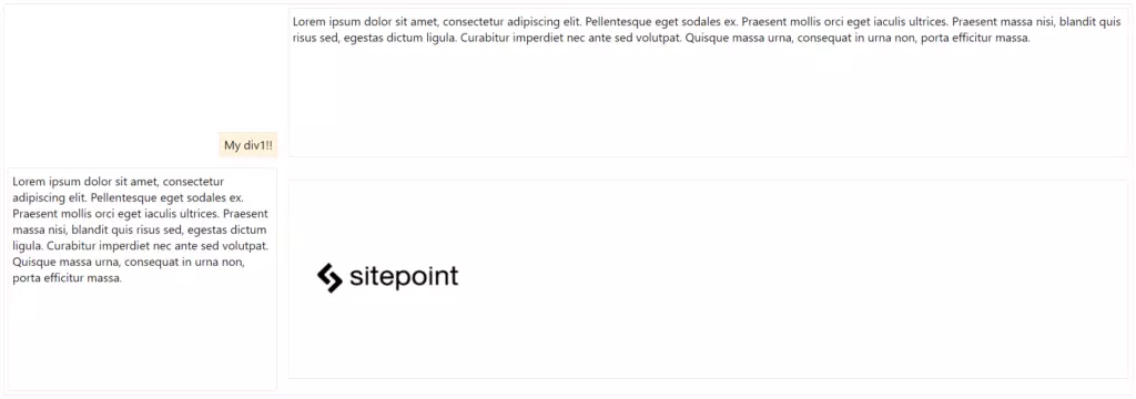
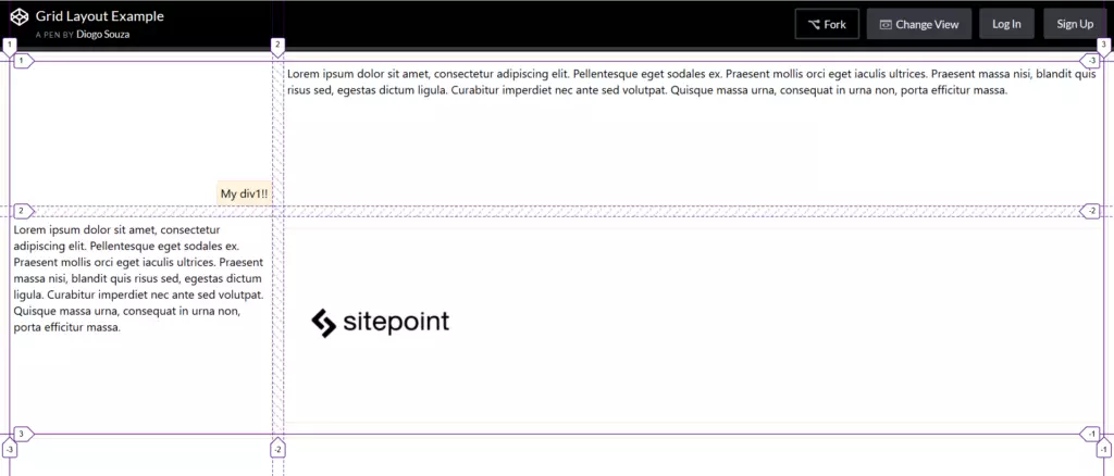
In regards to applying grid alignment properties to specific cells, let’s take a look:
关于将网格对齐属性应用于特定单元格,让我们看一下:
.div1 {
  background-color: #fff4dd;
  align-self: end;
  justify-self: end;
}

.div4 {
  align-self: center;
}
For the div of class div1, you’re aligning and justifying it at the end of the grid cell. The properties align-self and justify-self are valid for all flex items you have in the layout, including, in this case, the grid cells. div4 was set only the centered alignment, for you to check the difference between both.
对于div1类的div,您需要在网格单元格的末尾对齐并对齐它。 属性align-self和justify-self对您在布局中具有的所有弹性项目均有效,在这种情况下,包括网格单元。 div4仅设置了居中对齐,以便您检查两者之间的差异。
Here’s how the elements are positioned now:
现在是如何定位元素:
You can check out the final grid layout example here:
您可以在此处查看最终的网格布局示例:
See the Pen Grid Layout Example by SitePoint (@SitePoint) on CodePen.
请参见CodePen上的SitePoint ( @SitePoint )的笔网格布局示例 。
Most browsers also offer native support for Grid layout inspections, which is great for seeing how it handles the Grid mechanism internally. Let’s try our Grid example on Firefox with its Grid Inspector, available via Firefox DevTools. In order to open it, right-click the container element and, at the CSS pane’s Rules view, find and click the Grid icon right after the display: grid:
大多数浏览器还为Grid布局检查提供本机支持,这对于了解其如何内部处理Grid机制非常有用。 让我们在Firefox上使用Grid Inspector尝试Grid示例,该示例可通过Firefox DevTools获得。 为了将其打开,请右键单击容器元素,然后在CSS窗格的“规则”视图中,找到并单击display: grid后的Grid图标display: grid :
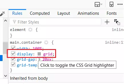
This will toggle the Grid highlighter. You can also control more display settings at the CSS pane’s Layout view like the line numbers or the area names exhibition:
这将切换网格荧光笔。 您还可以在CSS窗格的“ 布局”视图中控制更多显示设置,例如行号或区域名称展览:
逐步改善博客布局 (Progressively Enhancing a Blog Layout)
In this next example, we’re going to use a blog page as a reference to upgrade from a totally float-based page to a CSS Grid layout, exploring the way the old layout can be completely transformed to a layout that embraces both Flexbox and Grid.
在下一个示例中,我们将使用博客页面作为参考,将页面从完全基于浮动的页面升级到CSS Grid布局,探索将旧布局完全转换为既包含Flexbox又包含Flexbox的布局的方式。格。
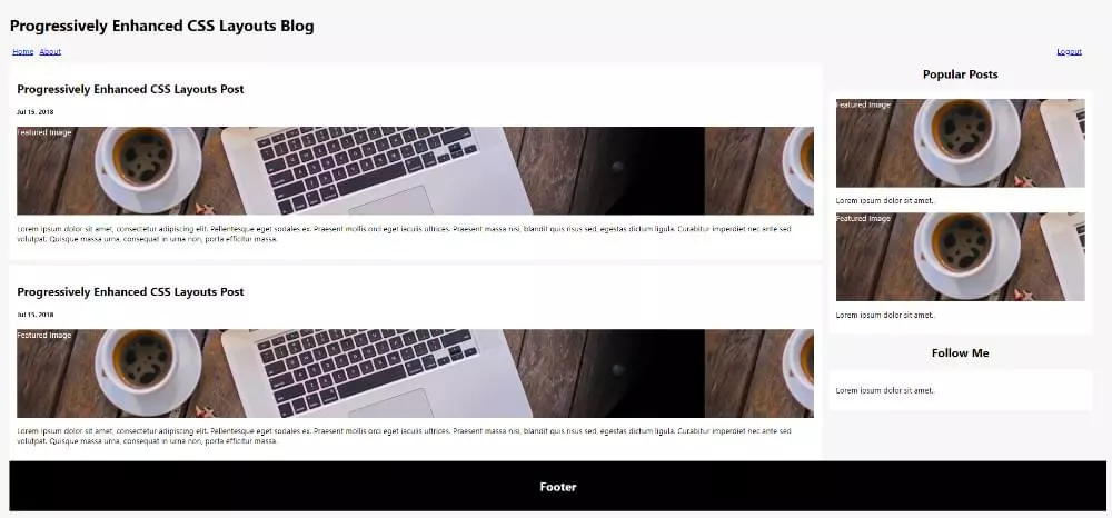
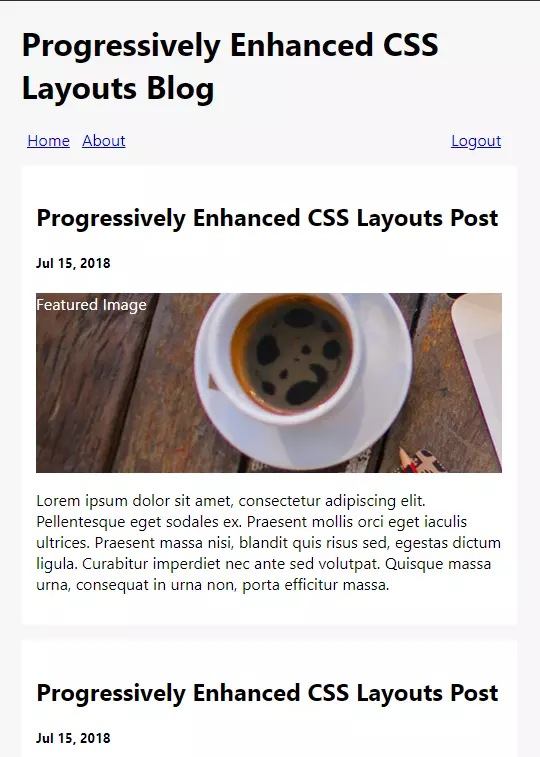
In the following updates, we’ll keep an eye on the old browsers that don’t support Flexbox or CSS Grid, as well as how the blog behaves on mobile versions. This is the look and feel of our blog page totally based on divs and CSS float property:
在以下更新中,我们将关注不支持Flexbox或CSS Grid的旧浏览器,以及博客在移动版本上的行为。 这是我们博客页面的外观,完全基于div和CSS float属性:
And this a pen of the example:
这是一个例子:
See the Pen Blog Layout with Float by SitePoint (@SitePoint) on CodePen.
请参阅CodePen上的SitePoint ( @SitePoint ) 浮动的Pen Blog布局 。
Note that the HTML structure is common for anyone already familiar with semantic tags: a div (the container) containing all the inner elements that’ll compose the final layout based on who’s floating who.
请注意,HTML结构对于已经熟悉语义标记的任何人都是通用的:div(容器),其中包含所有内部元素,这些元素将根据谁在浮动谁来构成最终的布局。
It’s basically made up of a simple header with a menu that defines how its items (links) will be displayed and aligned:
它基本上由一个简单的header和一个菜单组成,该菜单定义了如何显示和对齐其项目(链接):
nav.menu {
  width: 98%;
}

ul {
  list-style: none;
  padding: 0px;
  margin: 0px;
}

.left {
  float: left;
}

.right {
  float: right;
}

a {
  padding: 4px 6px;
}
The content of the page is divided into two parts, the section and aside elements:
该页面的内容分为两部分, section和aside元素:
main {
  float: left;
  width: 74%;
}

aside {
  float: left;
  width: 24%;
  margin-left: 15px;
  margin-bottom: 15px;
}

aside h2 {
  text-align: center;
}
Nothing exceptional, just left floating the divs and determining the maximum width of each one on top of the full width. Note also the need for clearing (clear) things whenever we need to disable the floating effect after a div:
没什么特别的,只需将div浮动并确定每个宽度的最大宽度即可。 还需要注意的是,每当需要在div之后禁用浮动效果时,都需要清除( clear )内容:
header:after {
  content: "";
  display: table;
  clear: both;
}
The end of the CSS brings an @media rule that’ll break the sidebar to the next column when the page is opened in small screen devices. The end of the HTML brings a simple footer with some simple text.
CSS的末尾带有@media规则,当在小屏幕设备中打开页面时,该规则将把侧栏@media下一列。 HTML的末尾带有一些简单文本的简单页脚。
Note: the beginning of the HTML includes the HTML5 Shiv script in order to enable the use of HTML5 sectioning elements in legacy Internet Explorer.
注意:HTML的开头包括HTML5 Shiv脚本 ,以便能够在旧版Internet Explorer中使用HTML5分段元素。
Flexbox的菜单增强功能 (Menu Enhancements with Flexbox)
As seen before, Flexbox works better with one-dimensional layouts like a horizontal menu. The same menu structure could be enhanced to this one:
如前所述,Flexbox在诸如水平菜单的一维布局中效果更好。 可以将相同的菜单结构增强为此:
nav.menu {
  width: 98%;
}

nav.menu ul {
  display: flex;
}

nav.menu ul > li:last-child {
  margin-left: auto;
}
The use of the Flexbox property automatically disables the float for newer browsers. However, since we preserved the old CSS configurations for the float property, the float will still apply when a browser doesn’t support Flexbox.
Flexbox属性的使用会自动为较新的浏览器禁用浮动功能。 但是,由于我们保留了float属性的旧CSS配置,因此当浏览器不支持Flexbox时,float仍然适用。
At the same time, the display: flex was added in order to lay out the menu using Flexbox along with the margin-left: auto to the last menu item. This will ensure that this item will be pushed to the right of the layout, separating them into distinct groups.
同时,添加了display: flex以便使用Flexbox布置菜单以及margin-left: auto到最后一个菜单项。 这将确保该项目将被推到布局的右侧,将它们分成不同的组。
增强网格区域 (Enhancing to Grid Areas)
CSS Grid gives us more flexibility when it comes to the placement of inner elements. Just as Flexbox is a perfect choice for a horizontal container (the menu), a grid would be perfect for a two-dimensional blog layout that basically divides into three parts:
CSS Grid在内部元素的放置方面为我们提供了更大的灵活性。 正如Flexbox是水平容器(菜单)的理想选择一样,网格对于二维博客布局(基本上分为三个部分)将是理想的:
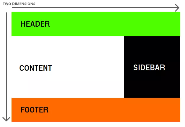
The Grid Area feature consists of the combination of two properties: grid-template-areas and grid-area. The first one defines how the whole layout height and width would be divided into groups by explicitly putting the names of each group as they’d be in the final layout:
网格区域功能由两个属性的组合组成: grid-template-areas和grid-area 。 第一个定义了如何通过将每个组的名称显式放置在最终布局中来将整个布局的高度和宽度分为几组:
div.container {
  width: 100%;
  display: grid;
  grid-gap: 20px;
  grid-template-areas:
    "header header header"
    "content content sidebar"
    "footer footer footer"
}
Here, we’re dividing the whole container space into three rows and three columns. The names of the areas repeated alongside the definition say how much space each of them will occupy vertically and horizontally.
在这里,我们将整个容器空间分为三行三列。 在定义旁边重复的区域名称表示每个区域在垂直和水平方向上将占据多少空间。
Then, we can use the second property by setting for each of the grid areas the respective grid-area value:
然后,我们可以通过为每个网格区域设置各自的grid-area值来使用第二个属性:
header {
  grid-area: header;
}

main {
  grid-area: content;
  /* other properties */
}

aside {
  grid-area: sidebar;
  /* other properties */
}

footer {
  grid-area: footer;
  /* other properties */
}
Just as with Flexbox, grid items automatically disable float declarations in browsers which support CSS Grid. The rest of the properties remain the same (the float will still apply when a browser doesn’t support Grid).
与Flexbox一样,网格项目会在支持CSS Grid的浏览器中自动禁用浮点声明。 其余属性保持不变(当浏览器不支持Grid时,浮点数仍然适用)。
You can see this example fully running here:
您可以看到此示例在此处完全运行:
See the Pen Blog Layout with CSS Grid Areas by SitePoint (@SitePoint) on CodePen.
请参阅CodePen上SitePoint ( @SitePoint )的带有CSS网格区域的Pen Blog布局 。
增强网格模板 (Enhancing Grid Templates)
The grid-template property is also very useful when we need to define a template that’ll follow a pattern for our grid’s definitions.
当我们需要定义一个将遵循网格定义模式的模板时, grid-template属性也非常有用。
Let’s take a look at the following .container CSS:
让我们看一下以下.container CSS:
div.container {
  width: 100%;
  display: grid;
  grid-gap: 20px;
  grid-template-columns: auto auto auto;
}
Here, we’re basically saying that the size of the columns is determined by the size of the container and the size of the content of the items in the column.
在这里,我们基本上是说,列的大小由容器的大小和列中项目的内容的大小确定。
Then, each of our grid areas will have to adapt:
然后,我们的每个网格区域都必须适应:
header {
  grid-column: 1/4;
}

section {
  grid-column: 1/3;
  /* other properties */
}

aside {
  grid-column: 3/4;
  /* other properties */
}

footer {
  grid-column: 1/4;
  /* other properties */
}
Here, grid-column: 1/4 instructs the browser to start a column at track one and end at track four. Tracks are the separators between each grid cell, so this element would occupy cells one to three:
在此, grid-column: 1/4指示浏览器在第一轨开始一列,在第四轨结束。 轨道是每个网格单元之间的分隔符,因此此元素将占据单元格一到三个:
The example can be tested here:
该示例可以在此处进行测试:
See the Pen Blog Layout with CSS Grid Templates by SitePoint (@SitePoint) on CodePen.
请参阅CodePen上的SitePoint ( @SitePoint )的带有CSS网格模板的Pen Blog布局 。
You can go now and test it in different browser versions as well as your mobile phone to check how the pages are progressively enhanced.
您现在就可以在不同的浏览器版本以及手机中对其进行测试,以检查页面如何逐步增强。
有关CSS网格布局的更多信息 (More About CSS Grid Layout)
For more information about CSS Grid, refer to SitePoint’s CSS Grid Layout Introduction, and also check out SitePoint’s CSS Flexbox Introduction.
有关CSS网格的更多信息,请参考SitePoint的CSS Grid Layout简介 ,并查看SitePoint的CSS Flexbox简介 。
Mozilla has also provided a great article about CSS Grid Layout and Progressive Enhancement that will certainly add a lot. Good studies!
Mozilla还提供了一篇有关CSS网格布局和渐进增强的出色文章,这肯定会增加很多。 好好学习!
翻译自: https://www.sitepoint.com/css-layouts-floats-flexbox-grid/


 175
175

 被折叠的 条评论
为什么被折叠?
被折叠的 条评论
为什么被折叠?
 到【灌水乐园】发言


