


css 2d转换
The following is a short extract from Tiffany’s new book, CSS Master, 2nd Edition.
以下是Tiffany的新书CSS Master第二版的摘录。
Transforms allow us to create effects and interactions that are otherwise impossible. When combined with transitions and animations, we can create elements and interfaces that rotate, dance, and zoom. Three-dimensional transforms, in particular, make it possible to mimic physical objects. In this piece, we’ll look at 2D transform functions (3D functions are covered here).
变换使我们能够创建原本不可能的效果和交互。 与过渡和动画结合使用时,我们可以创建旋转,跳舞和缩放的元素和界面。 尤其是三维变换,可以模拟物理对象。 在本文中,我们将研究2D变换函数( 此处介绍3D函数 )。
There are four primary two-dimensional transform functions: rotate, scale, skew, and translate. Six other functions let us transform an element in a single dimension: scaleX and scaleY; skewX and skewY; and translateX and translateY.
共有四个主要的二维转换函数: rotate , scale , skew和translate 。 其他六个函数使我们可以在一个维度上转换元素: scaleX和scaleY ; skewX和skewY ; 以及translateX和translateY 。
rotate() (rotate())
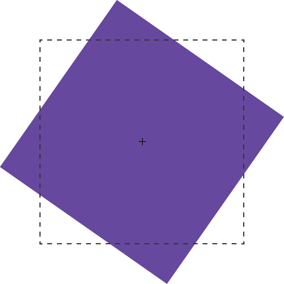
A rotation transform spins an element around its origin by the angle specified around the transform-origin point. Using rotate() tilts an element clockwise (positive angle values) or counter-clockwise (negative angle values). Its effect is much like a windmill or pinwheel, as seen below.
旋转变换将元素围绕其原点旋转一个围绕transform-origin指定的角度。 使用rotate()将元素顺时针(正角度值)或逆时针(负角度值)倾斜。 效果类似于风车或风车,如下所示。
The rotate() function accepts values in angle units. Angle units are defined by the CSS Values and Units Module Level 3. These may be deg (degrees), rad (radians), grad (gradians), or turn units. One complete rotation is equal to 360deg, 6.28rad, 400grad, or 1turn.
rotate()函数接受以角度为单位的值。 角度单位由CSS值和单位模块级别3定义 。 这些可以是deg (度), rad (弧度), grad (gradians),或turn单元。 一360deg 6.28rad等于360deg , 6.28rad , 400grad或1 1turn 。
Rotation values that exceed one rotation (say, 540deg or 1.5turn) are rendered according to their remaindered value, unless animated or transitioned. In other words, 540deg is rendered the same as 180deg (540 degrees minus 360 degrees) and 1.5turn is rendered the same as .5turn (1.5 – 1). But a transition or animation from 0deg to 540deg or 1turn to 1.5turn will rotate the element one-and-a-half times.
除非动画或过渡,否则超过一转的旋转值(例如540deg或1.5turn )将根据其剩余值进行渲染。 换句话说,将540deg呈现为与180deg (540度减去360度)相同,并且将1.5turn呈现为与.5turn (1.5 – 1)相同。 但过渡或动画从0deg到540deg或1turn ,以1.5turn将旋转的元件中一和半倍。
2D缩放功能: scale , scaleX和scaleY (2D Scaling Functions: scale, scaleX, and scaleY)
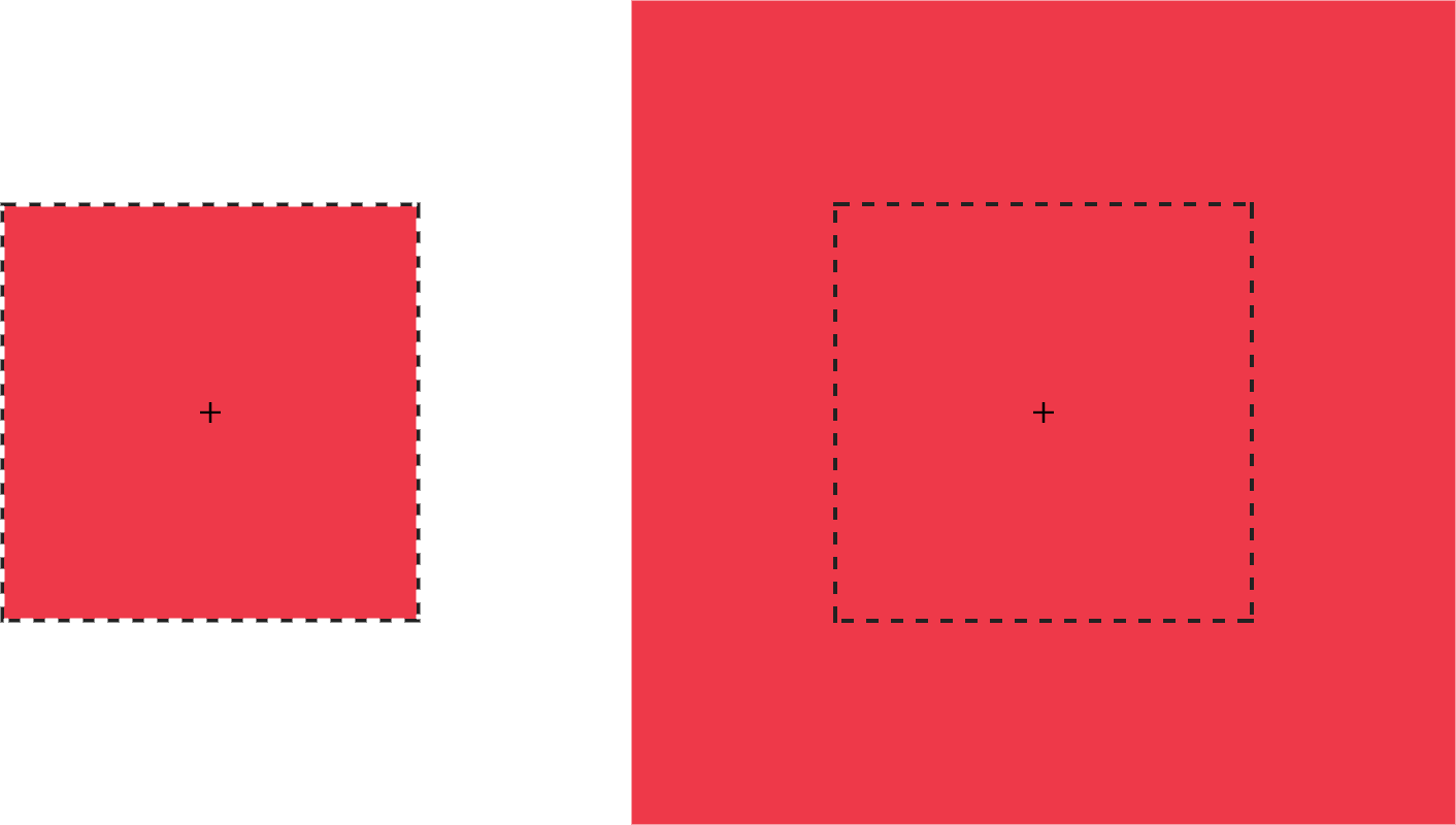
With scaling functions, we can increase or decrease the rendered size of an element in the X-dimension (scaleX), Y-dimension (scaleY), or both (scale). Scaling is illustrated below, where the border illustrates the original boundaries of the box, and the + marks its center point.
使用缩放功能,我们可以在X维度( scaleX ),Y维度( scaleY )或两者( scale )中增加或减少元素的渲染大小。 缩放比例如下图所示,其中边框说明了框的原始边界,而+表示框的中心点。
Each scale function accepts a multiplier or factor as its argument. This multiplier can be just about any positive or negative number. Percentage values aren’t supported. Positive multipliers greater than 1 increase the size of an element. For example, scale(1.5) increases the size of the element in the X and Y directions 1.5 times. Positive multipliers between 0 and 1 will reduce the size of an element.
每个小数位函数都接受一个乘数或因子作为参数。 该乘数几乎可以是任何正数或负数。 不支持百分比值。 大于1正乘数会增加元素的大小。 例如, scale(1.5)将元素在X和Y方向上的大小增加1.5倍。 0到1之间的正乘数将减小元素的大小。
Values less than 0 will also cause an element to scale up or down in size and create a reflection (flip) transform.
小于0值还将导致元素按比例放大或缩小,并创建反射(翻转)变换。
Warning: Using scale(0) will cause the element to disappear, because multiplying a number by zero results in a product of zero.
警告:使用scale(0)将导致元素消失,因为将数字乘以零会导致乘积为零。
Using scale(1) creates an identity transformation, which means it’s drawn to the screen as if no scaling transformation was applied. Using scale(-1) won’t change the drawn size of an element, but the negative value will cause the element to be reflected. Even though the element doesn’t appear transformed, it still triggers a new stacking context and containing block.
使用scale(1)创建一个标识转换 ,这意味着它像没有应用缩放转换一样被绘制到屏幕上。 使用scale(-1)不会更改元素的绘制大小,但是负值将导致元素被反射。 即使该元素未显示为已转换,它仍会触发新的堆叠上下文并包含块。
It’s possible to scale the X and Y dimensions separately using the scale function. Just pass it two arguments: scale(1.5, 2). The first argument scales the X-dimension; the second scales the Y-dimension. We could, for example, reflect an object along the X-axis alone using scale(-1, 1). Passing a single argument scales both dimensions by the same factor.
可以使用scale功能分别缩放X和Y尺寸。 只需传递两个参数即可: scale(1.5, 2) 。 第一个参数缩放X维度;第二个参数缩放X维度。 第二个缩放Y维度。 例如,我们可以仅使用scale(-1, 1)沿X轴反射对象。 传递单个参数将两个维度缩放相同的因子。
2D翻译功能: translateX , translateY和translate (2D Translation Functions: translateX, translateY, and translate)
Translating an element offsets its painted position from its layout position by the specified distance. As with other transforms, translating an element doesn’t change its offsetLeft or offsetTop positions. It does, however, affect where it’s visually positioned on screen.
平移元素会将其绘制位置从其布局位置偏移指定距离。 与其他转换一样,平移元素不会更改其offsetLeft或offsetTop位置。 但是,它确实会影响它在屏幕上的视觉位置。
Each 2D translation function—translateX, translateY, and translate—accepts lengths or percentages for arguments. Length units include pixels (px), em, rem, and viewport units (vw and vh).
每个2D转换函数( translateX , translateY和translate都接受参数的长度或百分比。 长度单位包括像素( px ), em , rem和视口单位( vw和vh )。
The translateX function changes the horizontal rendering position of an element. If an element is positioned zero pixels from the left, transform: transitionX(50px) shifts its rendered position 50 pixels to the right of its start position. Similarly, translateY changes the vertical rendering position of an element. A transform of transform: transitionY(50px) offsets the element vertically by 50 pixels.
translateX函数更改元素的水平渲染位置。 如果某个元素距离左侧零像素,则transform: transitionX(50px)将其渲染的位置向其起始位置右侧偏移50个像素。 类似地, translateY更改元素的垂直渲染位置。 转换的transform: transitionY(50px)将元素垂直偏移50个像素。
With translate(), we can shift an element vertically and horizontally using a single function. It accepts up to two arguments: the X translation value, and the Y translation value. The figure below shows the effect of an element with a transform value of translate(120%, -50px), where the left green square is in the original position, and the right green square is translated 120% horizontally and -50px vertically from its containing element (the dashed border).
使用translate() ,我们可以使用单个函数垂直和水平移动元素。 它最多接受两个参数:X转换值和Y转换值。 下图显示了元素transform效果为translate(120%, -50px) ,其中左侧的绿色方块处于原始位置,右侧的绿色方块从其水平方向平移了120%,垂直方向平移了-50px包含元素(虚线框)。

Passing a single argument to translate is the equivalent of using translateX; the Y translation value will be set to 0. Using translate() is the more concise option. Applying translate(100px, 200px) is the equivalent of translateX(100px) translateY(200px).
传递单个参数进行translate等同于使用translateX ; Y平移值将设置为0 。 使用translate()是更简洁的选项。 应用translate(100px, 200px)等效于translateX(100px) translateY(200px) 。
Positive translation values move an element to the right (for translateX) or downward (for translateY). Negative values move an element to the left (translateX) or upward (translateY).
正翻译值会将元素向右移动(对于translateX )或向下移动(对于translateY )。 负值可将元素向左移动( translateX )或向上移动( translateY )。
Translations are particularly great for moving items left, right, up, or down. Updating the value of the left, right, top, and bottom properties forces the browser to recalculate layout information for the entire document. But transforms are calculated after the layout has been calculated. They affect where the elements appear on screen, but not their actual dimensions. Yes, it’s weird to think about document layout and rendering as separate concepts, but in terms of browsers, they are.
翻译对于将项目向左,向右,向上或向下移动特别有用。 更新left , right , top和bottom属性的值会强制浏览器重新计算整个文档的布局信息。 但是,转换是在计算布局之后计算的。 它们影响元素在屏幕上出现的位置,但不影响其实际尺寸。 是的,将文档的布局和呈现视为单独的概念是很奇怪的,但就浏览器而言,它们却是。
转换属性可能正在您附近的浏览器中 (Transform Properties May Be Coming to a Browser near You)
The latest version of the CSS Transforms specification adds translate, rotate, and scale properties to CSS. Transform properties work much like their corresponding transform functions, but values are space-separated instead of comma-separated. We could, for example, express transform: rotate3d(1, 1, 1, 45deg) using the rotate property: rotate: 1 1 1 45deg. Similarly, translate: 15% 10% 300px is visually the same as transform: translate3d(15%, 10%, 300px) and scale: 1.5 1.5 3 is the same as transform: scale3d(1.5, 1.5, 3). With these properties we can manage rotation, translation or scale transformations separately from other transformations.
最新版本CSS Transforms规范向CSS添加了translate , rotate和scale 属性 。 转换属性的工作方式与其相应的转换函数非常相似,但是值是用空格分隔而不是逗号分隔。 例如,我们可以使用以下rotate属性来表达以下transform: rotate3d(1, 1, 1, 45deg) rotate: 1 1 1 45deg 。 类似地, translate: 15% 10% 300px在视觉上与transform: translate3d(15%, 10%, 300px)和scale: 1.5 1.5 3相同于transform: scale3d(1.5, 1.5, 3) 。 通过这些属性,我们可以与其他转换分开管理旋转,平移或缩放转换。
At the time of writing, browser support for transform properties is still pretty sparse. Chrome and Samsung Internet support them out of the box. In Firefox versions 60 and later, support is hidden behind a flag; visit about: config and set layout.css.individual-transform.enabled to true.
在撰写本文时,浏览器对转换属性的支持仍然很少。 Chrome和Samsung Internet开箱即用。 在Firefox 60及更高版本中,支持隐藏在标志的后面。 造访about: config ,并将layout.css.individual-transform.enabled设为true 。
skew , skewX和skewY (skew, skewX, and skewY)
Skew transformations shift the angles and distances between points while keeping them in the same plane. Skew transformations are also known as shear transformations, and they distort the shapes of elements, as seen below, where the dashed line represents the original bounding box of the element.
偏斜变换可移动点之间的角度和距离,同时将它们保持在同一平面上。 斜交变换也称为剪切变换 ,它们使元素的形状变形,如下所示,其中虚线表示元素的原始边界框。
The skew functions—skew, skewX, and skewY—accept most angle units as arguments. Degrees, gradians, and radians are valid angle units for the skew functions, while turn units, perhaps obviously, are not.
倾斜函数skew , skewX和skewY接受大多数角度单位作为参数。 度,度数和弧度是偏斜函数的有效角度单位,而转弯单位(也许显然)不是。
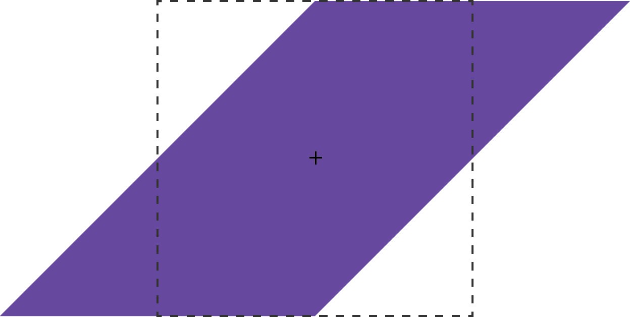
The skewX function shears an element in the X or horizontal direction (see teh image below). It accepts a single parameter, which again must be an angle unit. Positive values shift the element to the left, and negative values shift it towards the right.
skewX函数在X方向或水平方向上剪切一个元素(请参见下面的图像)。 它接受一个参数,该参数必须再次为角度单位。 正值将元素向左移动,负值将其向右移动。

Similarly, skewY shears an element in the Y or vertical direction. The image below shows the effect of transform: skewY(30deg). Points to the right of the origin are shifted downward with positive values. Negative values shift these points upward.
类似地, skewY在Y或垂直方向上剪切元素。 下图显示了transform: skewY(30deg)的效果transform: skewY(30deg) 。 原点右侧的点将以正值向下移动。 负值会将这些点向上移动。

This brings us to the skew function. The skew function requires one argument, but accepts up to two. The first argument skews an element in the X direction, and the second skews it in the Y direction. If only one argument is provided, the second value is assumed to be zero, making it the equivalent of skewing in the X direction alone. In other words, skew(45deg) renders the same as skewX(45deg).
这将我们带到skew函数。 skew函数需要一个参数,但最多接受两个参数。 第一个参数使元素在X方向上倾斜,第二个参数使它在Y方向上倾斜。 如果仅提供一个参数,则第二个值将假定为零,使其等效于仅在X方向上倾斜。 换句话说, skew(45deg)呈现与skewX(45deg)相同。
电流变换矩阵 (Current Transform Matrix)
So far, we’ve discussed transform functions separately, but they can also be combined. Want to scale and rotate an object? No problem: use a transform list. For example:
到目前为止,我们已经分别讨论了转换函数,但也可以将它们组合在一起。 是否要缩放和旋转对象? 没问题:使用转换列表 。 例如:
.rotatescale {
    transform: rotate(45deg) scale(2);
}
This produces the results you see below.
这将产生您在下面看到的结果。

Order matters when using transform functions. This is a point that’s better shown than talked about, so let’s look at an example to illustrate. The following CSS skews and rotates an element:
使用转换函数时顺序很重要。 这一点比讨论的要好得多,所以让我们看一个例子来说明。 以下CSS倾斜并旋转元素:
.transformEl {
    transform: skew(10deg, 15deg) rotate(45deg);
}
It gives us the result you see below.
它为我们提供了您在下面看到的结果。

What happens if you rotate an element first and then skew it?
如果先旋转一个元素然后使其倾斜,会发生什么?
.transformEl {
    transform:  rotate(45deg) skew(10deg, 15deg);
}
The effect, shown below, is quite different.
如下所示,效果是完全不同的。

Each of these transforms has a different current transform matrix created by the order of its transform functions. To fully understand why this is, we’ll need to learn a little bit of matrix multiplication. This will also help us understand the matrix and matrix3d functions.
这些变换中的每一个都有一个不同的当前变换矩阵 ,这些矩阵由其变换函数的顺序创建。 要完全理解为什么会这样,我们需要学习一点矩阵乘法 。 这也将帮助我们理解matrix和matrix3d函数。
矩阵乘法和矩阵函数 (Matrix Multiplication and the Matrix Functions)
A matrix is an array of numbers or expressions arranged in a rectangle of rows and columns. All transforms can be expressed using a 4×4 matrix as seen below.
矩阵是在行和列的矩形中排列的数字或表达式的数组。 可以使用4×4矩阵表示所有变换,如下所示。
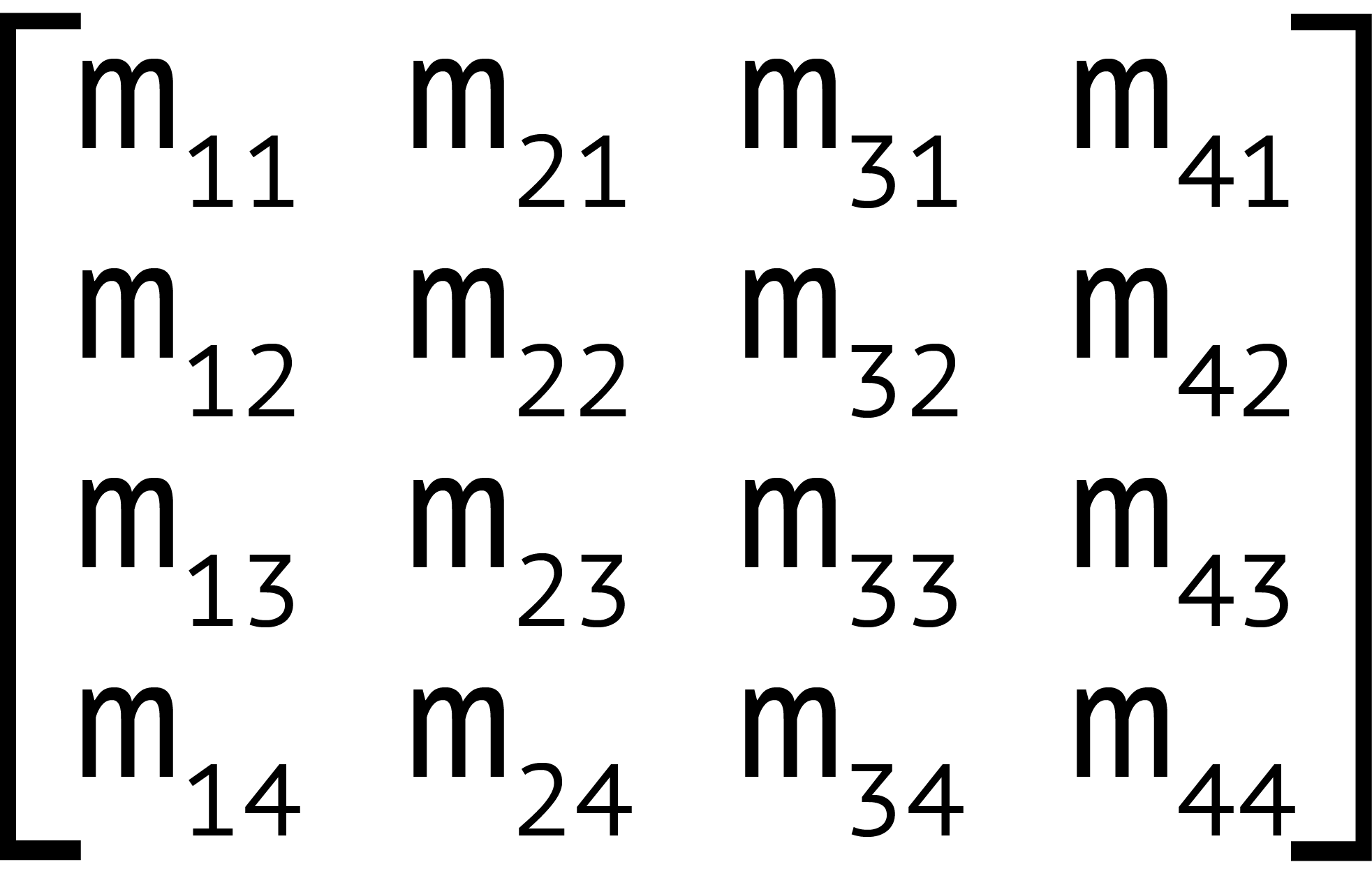
This matrix corresponds to the matrix3d function, which accepts 16 arguments, one for each value of the 4×4 matrix. Two-dimensional transforms can also be expressed using a 3×3 matrix, seen below.
该矩阵对应于matrix3d函数,该函数接受16个参数,每个参数对应4×4矩阵的一个值。 二维转换也可以使用3×3矩阵表示,如下所示。
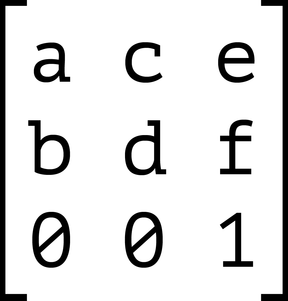
This 3×3 matrix corresponds to the matrix transform function. The matrix() function accepts six parameters, one each for values a through f.
该3×3矩阵对应于matrix变换函数。 matrix()函数接受六个参数,每个参数用于值a到f 。
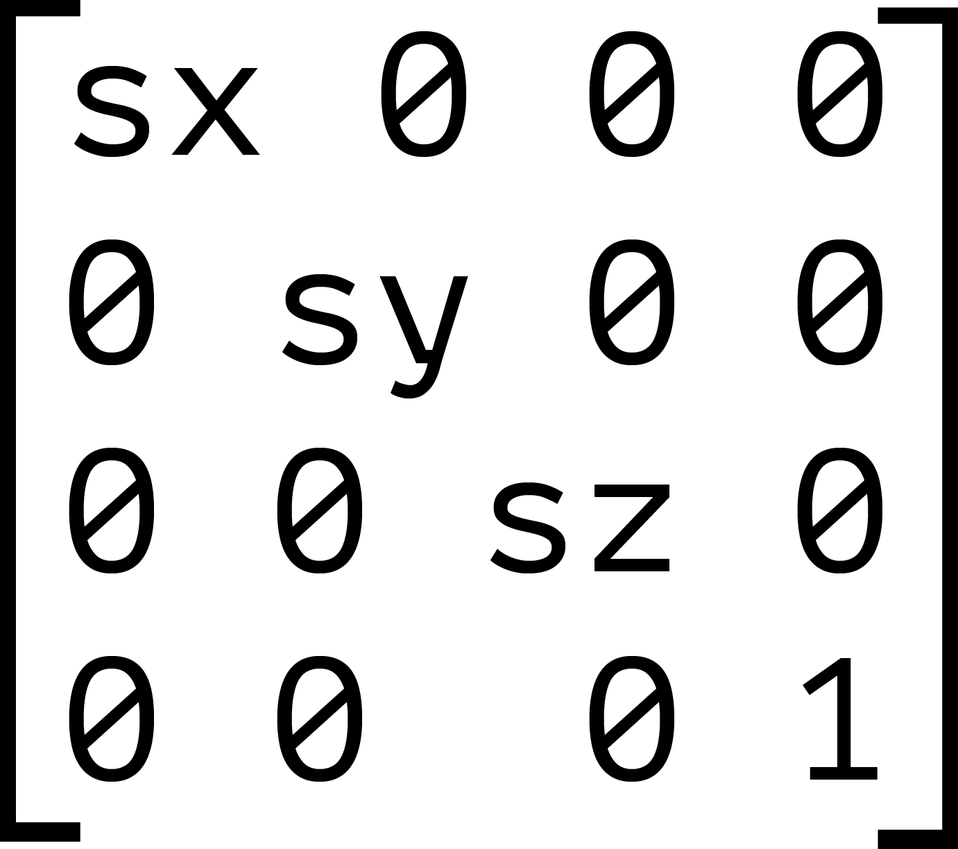
Each transform function can be described using a matrix and the matrix or matrix3d functions. The image below shows the 4×4 matrix for the scale3d function, where sx, sy, and sz are the scaling factors of the X, Y, and Z dimensions respectively.
可以使用矩阵和matrix或matrix3d函数描述每个变换函数。 下图显示了scale3d函数的4×4矩阵,其中sx , sy和sz分别是X,Y和Z维度的比例因子。
When we combine transforms—such as transform: scale(2) translate(30px, 50px)—the browser multiplies the matrices for each function to create a new matrix. This new matrix is what’s applied to the element.
当我们组合转换时,例如transform: scale(2) translate(30px, 50px) ,浏览器将每个函数的矩阵相乘以创建一个新的矩阵。 这个新矩阵就是应用于元素的元素。
But here’s the thing about matrix multiplication: it isn’t commutative. With simple values, the product of 3×2 is the same as 2×3. With matrices, however, the product of A×B is not necessarily the same as the product of B×A. Let’s look at an example. We’ll calculate the matrix product of transform: scale(2) translate(30px, 50px).
但是,这是关于矩阵乘法的事情:它不是可交换的。 对于简单的值,3×2的乘积与2×3相同。 但是,对于矩阵, A × B的乘积不一定与B × A的乘积相同。 让我们来看一个例子。 我们将计算transform: scale(2) translate(30px, 50px)的矩阵乘积transform: scale(2) translate(30px, 50px) 。
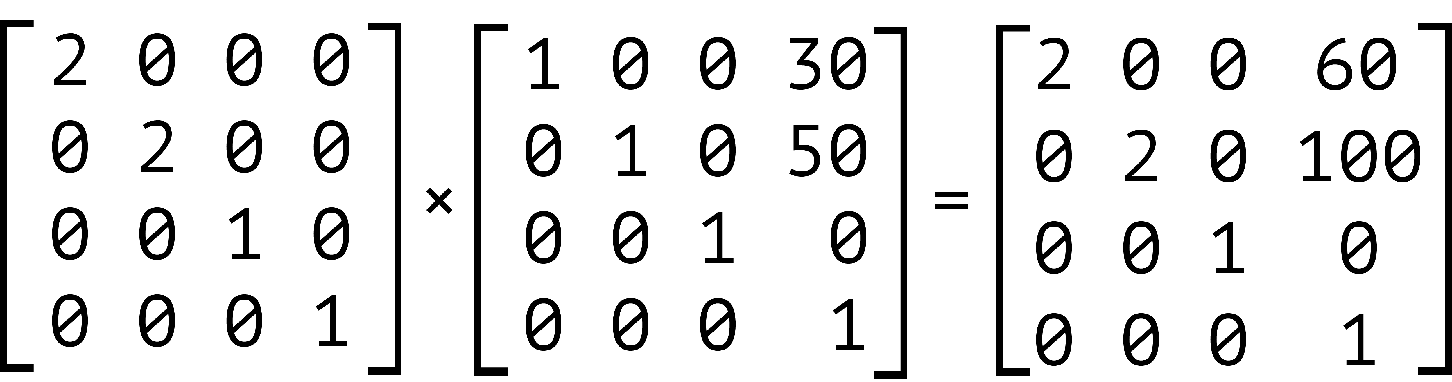
Our element has been scaled by a factor of two, and then translated 60 pixels horizontally and 100 pixels vertically. We can also express this product using the matrix function: transform: matrix(2, 0, 0, 2, 60, 100). Now let’s switch the order of these transforms—that is, transform: translate(30px, 50px) scale(2). The results are shown below.
我们的元素已缩放两倍,然后水平转换60像素,垂直转换100像素。 我们还可以使用matrix函数来表达该乘积: transform: matrix(2, 0, 0, 2, 60, 100) 。 现在,让我们切换这些转换的顺序-即: transform: translate(30px, 50px) scale(2) 。 结果如下所示。
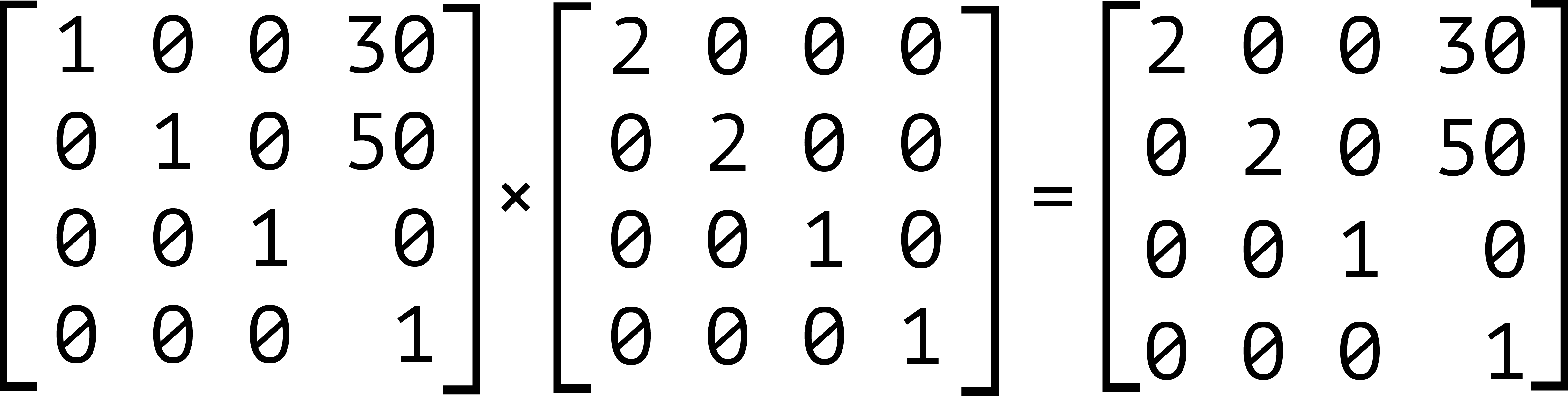
Notice that our object is still scaled by a factor of two, but here it’s translated by 30 pixels horizontally and 50 pixels vertically instead. Expressed using the matrix function, this is transform: matrix(2, 0, 0, 2, 30, 50).
请注意,我们的对象仍然按比例缩放了两倍,但是这里它是水平移动30像素,垂直移动50像素。 使用matrix函数表示,这是以下transform: matrix(2, 0, 0, 2, 30, 50) 。
It’s also worth noting that inherited transforms function similarly to transform lists. Each child transform is multiplied by any transform applied to its parent. For example, take the following code:
还值得注意的是,继承的转换功能与转换列表类似。 每个子变换都乘以应用于其父变换的任何变换。 例如,使用以下代码:
<div style="transform: skewX(25deg)">
    <p style="transform: rotate(-15deg)"></p>
</div>
This is rendered the same as the following:
这与以下内容相同:
<div>
    <p style="transform: skewX(25deg) rotate(-15deg)"></p>
</div>
The current transform matrix of the p element will be the same in both cases. Though we’ve focused on 2D transforms so far, the above also applies to 3D transforms. The third dimension adds the illusion of depth. It also brings some additional complexity in the form of new functions and properties.
在两种情况下, p元素的当前变换矩阵都将相同。 尽管到目前为止我们专注于2D变换,但以上内容也适用于3D变换。 第三维增加了深度的幻觉。 它还以新功能和新属性的形式带来了一些额外的复杂性。
翻译自: https://www.sitepoint.com/how-to-use-2d-transformation-functions-in-css/
css 2d转换


 1417
1417

 被折叠的 条评论
为什么被折叠?
被折叠的 条评论
为什么被折叠?
 到【灌水乐园】发言


