


css border 渐变
Not too long ago, adding decorative elements like fancy borders to a web page involved slicing images and patiently tweaking away at the CSS until it looked just right.
不久之前,在网页上添加装饰性元素(如花哨的边框)涉及到切片图像并耐心地调整CSS,直到看起来恰到好处。
CSS has changed all this. A few lines of code are all you need to decorate your website with quite sophisticated borders. This article will show you how you can do so.
CSS改变了这一切。 仅需几行代码,即可用非常复杂的边框装饰网站。 本文将向您展示如何做到这一点。
边框图像属性 (Border Image Properties)
A common way of styling borders is by using preset border-style rules. These are: dotted, dashed, solid, double, groove, ridge, inset, and outset.
边框样式的一种常见方法是使用预设的边框样式规则。 它们是: dotted , dashed , solid , double , groove , ridge , inset和outset 。
These styles already give you quite a bit of choice. But you can go a step further and add appealing background images to your borders with the following CSS properties.
这些样式已经给您很多选择。 但是,您可以更进一步,并使用以下CSS属性将吸引人的背景图像添加到边框中。
border-image-source属性 (The border-image-source Property)
With this property you assign a background image to an element’s border. The value is usually the image’s URL:
使用此属性,您可以将背景图像分配给元素的边框。 该值通常是图像的URL:
element {
  border-image-source: url('myimage.png');
}
You’ll find that a CSS gradient works just as well:
您会发现CSS渐变同样适用:
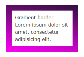
element {
  border-image-source: linear-gradient(10deg, #fe01f5 0%, #2e113d 100%);
}
In the browser it looks something like this:
在浏览器中看起来像这样:
If you set this property to the value none, or the image can’t be displayed, the browser will use the values set for the border-style property. Therefore, it’s a good idea to use border-style as a fallback.
如果将此属性设置为值none ,或者无法显示图像,则浏览器将使用为border-style属性设置的值。 因此,最好使用border-style作为后备。
The image you use doesn’t need to match the width and height of your border. The beauty of CSS border images is that a small image is all you need to decorate an element’s border of any width and height, including elements that responsively adapt to varying screen sizes.
您使用的图像不需要匹配边框的宽度和高度。 CSS边框图像的优点在于,只需一张小图像即可装饰任何宽度和高度的元素边框,包括响应性地适应各种屏幕尺寸的元素。
border-image-slice属性 (The border-image-slice Property)
After you select an image using the border-image-source property, you apply it to the border using the border-image-slice property.
使用border-image-source属性选择图像后,使用border-image-slice属性将其应用于边框。
element {
border-image-slice: 19;
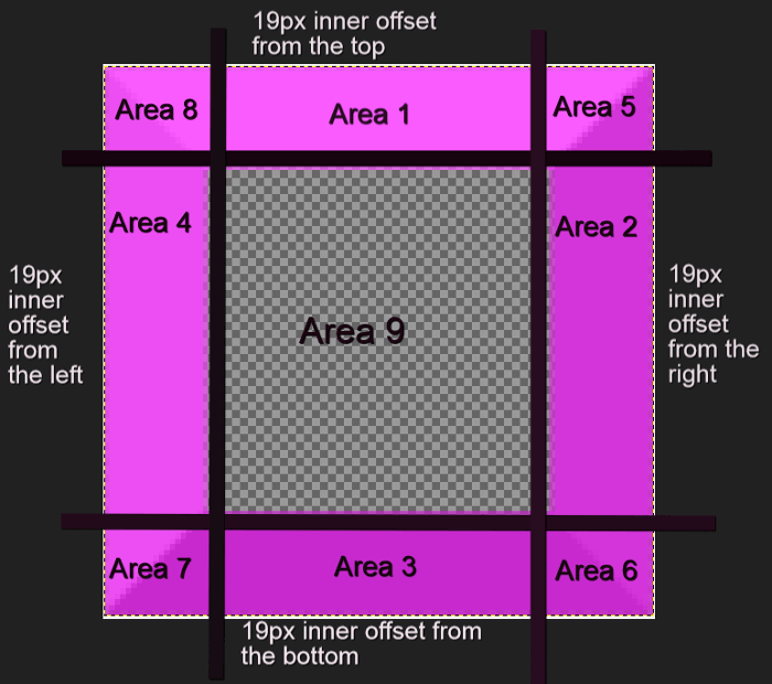
}Let’s get into a bit more details. This property designs inner offsets from the top, right, bottom, and left sides. The offsets end up slicing your small image into nine areas: four corners, four edges and a middle.
让我们进一步了解更多细节。 此属性设计从顶部 , 右侧 , 底部和左侧开始的 内部偏移量 。 偏移最终将您的小图像切成九个区域: 四个角 , 四个边缘和一个中间 。
You can specify one to four numbers or percentage values. When you specify four values, they apply to the top, right, bottom and left offsets. If you skip the left offset, this will be the same as the right. If you miss the bottom offset, this will be the same as the top one. Omitting the value for the right offset will make this the same as the top. If you only use one value, it will be used for all four offsets.
您可以指定一到四个数字或百分比值。 当您指定四个值时,它们将应用于顶部,右侧,底部和左侧偏移。 如果跳过左偏移量,则该偏移量将与右偏移量相同。 如果错过了底部偏移量,则该偏移量将与顶部偏移量相同。 省略右偏移量的值将使其与顶部相同。 如果仅使用一个值,则它将用于所有四个偏移。
Percentage values refer to percentages of the size of the image – the image width for horizontal offsets and the image height for vertical offsets.
百分比值是指图像尺寸的百分比-水平偏移的图像宽度和垂直偏移的图像高度。
Numbers stand for pixels in the image, or for coordinates in case of a vector image. One more thing, don’t add px after the number, it won’t work if you do!
数字代表图像中的像素 ,或者在矢量图像中代表坐标 。 还有一件事,请不要在数字后加上px ,否则就无法正常工作!
Here’s how you can use border-image-slice:
这是使用border-image-slice :
<div class="box">
  Border Image
  Lorem ipsum dolor sit amet, consectetur adipisicing elit.
</div>
.box {
border: 19px dotted #c905c6;
border-image-source: url(border-bg.png);
border-image-slice: 19;
}Using a 100 x 100px image for your border that looks like this:
为边框使用100 x 100像素的图像,如下所示:

We end up with something looking like this:
我们最终得到如下所示的内容:
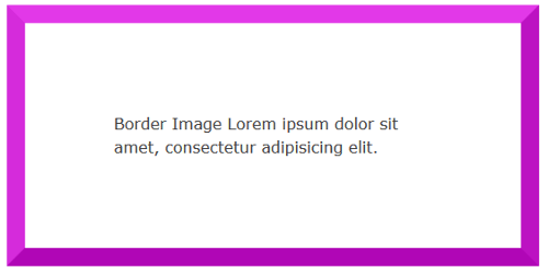
The middle region renders as fully transparent, therefore it’s not visible. If you’d like to make it visible, add the fill keyword.
中间区域呈现为完全透明,因此不可见。 如果您想使其可见,请添加fill关键字。
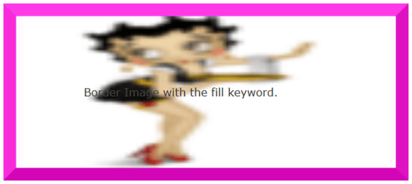
For instance, using an image with a fully opaque middle area, without adding the fill keyword, will display exactly like the example above. However, apply the fill keyword like so:
例如,使用具有完全不透明中间区域的图像,而无需添加fill关键字,将显示与上面的示例完全相同的显示。 但是,请像这样应用fill关键字:
.box {
  border: 19px dotted #c905c6;
  border-image-source: url(border-fill.png);
  border-image-slice: 19 fill;
}
With an image with a middle area containing details:
对于中间区域包含细节的图像:

We then will find the image’s middle area is fully visible on the page, albeit somewhat blurred and squashed:
然后,我们会发现图像的中间区域在页面上是完全可见的,尽管有些模糊和挤压:
border-image-width属性 (The border-image-width Property)
This property is drawn inside what’s called the border-image-area. By default, the boundaries of this area are those of the border box. Just like the border-image-slice property, the border-image-width designs inner offsets which divide the image into nine areas.
此属性绘制在所谓的border-image-area内部 。 默认情况下,此区域的边界是边框的边界。 就像border-image-slice属性一样, border-image-width设计内部偏移量,将图像分为九个区域。
This property accepts from one up to four values (top, right, bottom, left) either using a number or a percentage. Percentages are relative to the size of the border image area, i.e., the width of the area for horizontal offsets and the height of the area for vertical offsets. If you use numbers without the px unit, these will equate to multiples of the corresponding computed border-width. For instance, the code below:
此属性使用数字或百分比接受一个至四个值(上,右,下,左)。 百分比相对于边框图像区域的大小 ,即,水平偏移的区域的宽度和垂直偏移的区域的高度。 如果使用不带px单位的数字,则这些数字将等于相应的计算出的border-width倍数。 例如,以下代码:
.box {
  border: 19px dotted #c905c6;
  border-image-source: url(border-bg.png);
  border-image-slice: 19;
  border-image-width: 3;
}
… sets the width of the border image at 3 times the border-width value, which is 19px. This results in something looking like this:
…将边框图像的宽度设置为border-width值19px 3倍 。 结果是这样的:
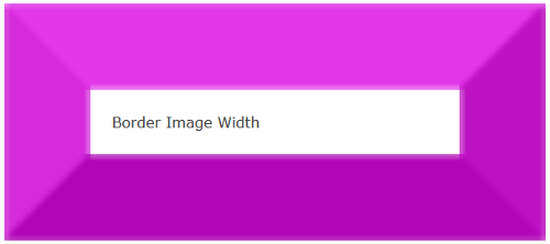
I’ve found that giving both the border-image-width and the border-image-slice properties the same value ensures that your border image displays at its best without undesired distortions.
我发现,将border-image-width和border-image-slice属性设置为相同的值可确保您的边框图像以最佳状态显示,而不会出现不希望的变形。
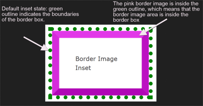
border-image-outset属性 (The border-image-outset Property)
So far all the properties I have used default to an inset border image area. However, you have the option to push the border image area outside of the border box. You can do so with the border-image-outset property.
到目前为止,我使用过的所有属性都默认为嵌入边框图像区域。 但是,您可以选择将边框图像区域推到边框之外。 您可以使用border-image-outset属性来执行此操作。
This property takes from one to four values (top, right, bottom, left) expressed either in a number or in length units like px, em, etc. In case you use a number, the result will be a border image pushed outside the border box by a multiple of the computed border-width.
此属性从一到四个值(顶部,右侧,底部,左侧)以数字或以px , em等长度单位表示。如果使用数字,结果将是边框图像被推到边框乘以计算出的border-width的倍数。
To clarify further, I’ve drawn a green dotted outline to represent the border box. The border image area contains a pink border image. In its default inset state, the border image is inside the green outline. This means that the border image area is inside the border box.
为了进一步说明,我绘制了一个绿色的虚线轮廓来表示边框。 边框图像区域包含粉红色边框图像。 在其默认插入状态下 ,边框图像在绿色轮廓内。 这意味着边框图像区域 在边框内 。
Adding border-image-outset: 19px; to the CSS rule set, pushes the pink border image outside the dotted green outline. This indicates that the border image area is drawn outside the border box:
添加border-image-outset: 19px; 到CSS规则集,将粉红色边框图像推到虚线绿色轮廓之外。 这表明边框图像区域绘制在边框框外部 :
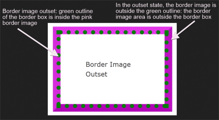
Be mindful of the fact that the portions of the border image lying outside the border box don’t trigger scrolling nor do they capture mouse events.
请注意以下事实:位于边框框外部的边框图像部分不会触发滚动,也不会捕获鼠标事件。
Check out all the examples discussed so far on CodePen:
查看到目前为止在CodePen上讨论的所有示例:
See the Pen CSS Border Image Examples by SitePoint (@SitePoint) on CodePen.
请参阅CodePen上SitePoint ( @SitePoint )提供的Pen CSS边框图像示例 。
border-image-repeat属性 (The border-image-repeat Property)
This property offers a few options on how to scale and tile the image slices on the sides and middle part of the border. The first value applies to the horizontal sides (top and bottom) and the second value to the vertical ones (right and left). If you set only one value, this applies to both horizontal and vertical sides.
此属性提供了一些有关如何缩放和平铺边框两侧和中间部分的图像切片的选项。 第一个值适用于水平边(顶部和底部),第二个值适用于垂直边(右侧和左侧)。 如果仅设置一个值,则该值将同时应用于水平和垂直侧。
Available values are:
可用值为:
stretch– The default if you don’t use theborder-image-repeatproperty. This keyword stretches the image to fill the available area.stretch–如果不使用border-image-repeat属性,则为默认值。 此关键字拉伸图像以填充可用区域。repeat– The image tiles repeated to fill the available area. The image can get cut off if the available area is not exactly divisible by the width of the tile.repeat–repeat图像拼贴以填充可用区域。 如果可用区域不能完全由图块的宽度整除,则图像可能会被剪切掉。round– The same asrepeat, but if the space is not sufficient to accommodate the tiles, these get scaled until they all fit. This ensures the tiles never get cut off, but the images may look a bit squashed.round–与repeat相同,但是如果空间不足以容纳这些图块,则将这些图块缩放,直到它们都适合为止。 这样可以确保瓷砖永远不会被切除,但是图像看起来可能会被压扁。space– The same asrepeat, but if the space is not an exact multiple of the tile’s width, the extra white space will be evenly distributed around each tile.space–与repeat相同,但是如果该空间不是图块宽度的精确倍数,则多余的白色空间将均匀分布在每个图块周围。
At the time of writing, it looks like Firefox renders space the same as stretch, while Chrome renders space the same as repeat.
在撰写本文时,看起来Firefox呈现的space与stretch相同,而Chrome呈现的space与repeat相同。
border-image速记属性 (The border-image Shorthand Property)
You can condense all individual properties discussed above into the border-image shorthand property as follows:
您可以按以下步骤将上面讨论的所有单个属性压缩为border-image速记属性:
border-image-sourceborder-image-sourceborder-image-sliceborder-image-sliceborder-image-widthborder-image-widthborder-image-outsetborder-image-outsetborder-image-repeatborder-image-repeat
Here’s the code snippet:
这是代码片段:
element {
  border-image: url(myimage.png) 19 / 19px / 0 round;
}
Get your hands on the sample code for border-image-repeat and the border-image shorthand property on the CodePen demos below.
在下面的CodePen演示中获得有关border-image-repeat的示例代码和border-image速记属性的示例。
See the Pen border-image-repeat values and border-image shorthand by SitePoint (@SitePoint) on CodePen.
请参阅CodePen上的SitePoint ( @SitePoint )的Pen 边框图像重复值和边框图像速记 。
如果要删除边框图像怎么办? (What if I Want to Remove the Border Image?)
The best way to reset a border is with the shorthand border property. With border you can quickly reset the same width, color and style for all four borders of an element. No need to specify a border-image:none rule, nor any need to override any of the individual border-image properties.
重置边框的最佳方法是使用简写的border属性。 使用border您可以为元素的所有四个边框快速重置相同的宽度,颜色和样式。 无需指定border-image:none规则,也无需覆盖任何单独的border-image属性。
浏览器支持 (Browser Support)
At the time of writing, border-image has almost full support in all major browsers. Only Firefox can’t stretch SVG images across an element, and Opera Mini supports the shorthand syntax with the -o- prefix, but not the individual properties.
在撰写本文时, border-image几乎已在所有主要浏览器中全面支持。 仅Firefox无法在元素上延伸SVG图像,Opera Mini支持带有-o-前缀的速记语法,但不支持单个属性。
结论 (Conclusion)
This article has been all about the border-image property: the values it accepts, how best to use it, and the level of browser support at the time of writing.
本文主要涉及border-image属性:它接受的值,如何最好地使用它以及在撰写本文时对浏览器的支持水平。
You can find more details in the CSS Backgrounds and Borders Level 3 specification document.
您可以在CSS Backgrounds and Borders Level 3规范文档中找到更多详细信息。
If you’ve used the border-image property in your project, why not share the end result with the community?
如果您在项目中使用border-image属性,为什么不与社区共享最终结果呢?
I’m waiting to hear from you!
我正等着您的来信!
翻译自: https://www.sitepoint.com/decorating-the-web-with-css-border-images/
css border 渐变


 2136
2136


 被折叠的 条评论
为什么被折叠?
被折叠的 条评论
为什么被折叠?
 到【灌水乐园】发言


