


This post was sponsored by Netbiscuits. Thank you for supporting the sponsors who make SitePoint possible!
该帖子由Netbiscuits赞助。 感谢您支持使SitePoint成为可能的赞助商!
On average, more than one in three visitors to your website is using a mobile device. In the past year alone, mobile usage has increased by more than 20%. So how do we cater for this market?
平均而言, 您网站的访问者中有三分之一以上使用移动设备 。 仅在过去的一年中,移动设备使用量就增加了20%以上。 那么我们如何迎合这个市场呢?
单独的移动网站 (Separate Mobile Websites)
If your time, budget and sanity aren’t important, you can build separate sites for mobile and desktop users. Content can be repackaged and streamlined for the device. Unfortunately…
如果您的时间,预算和理智程度不重要,则可以为移动和台式机用户构建单独的站点。 内容可以为设备重新打包和简化。 不幸…
- The days of either desktop or mobile are long gone. There is a huge variety of devices with differing screen sizes, pixel densities, processing speeds, network capabilities and HTML5 features. And few of us have even considered wearables yet! Brands would need to create numerous sites to cater for every eventuality? 台式机或移动设备的时代早已过去。 各种各样的设备具有不同的屏幕尺寸,像素密度,处理速度,网络功能和HTML5功能。 几乎没有人考虑过可穿戴设备! 品牌是否需要创建大量站点来应对各种情况?
- Identifying the user’s device is difficult. User-agent strings are notoriously tricky to parse and won’t tell you anything about the screen dimensions, network speed or other features. 识别用户的设备很困难。 众所周知,用户代理字符串很难解析,并且不会告诉您有关屏幕尺寸,网络速度或其他功能的任何信息。
- You normally require separate URLs for each site, e.g. www.site.com and m.site.com. Users can end up on the wrong site for their device and, if you’re not careful, search engines will penalize you for duplicate content. 通常,每个网站都需要单独的URL,例如www.site.com和m.site.com。 用户可能会在其设备的错误站点上找到您,如果您不注意,搜索引擎将对您重复的内容处以罚款。
- Managing one website is tough. You now need to build and deploy several sites and ensure they’re updated concurrently. Perhaps your developers will survive the ordeal but will content editors cope with multiple assets which target different views? 管理一个网站很难。 现在,您需要构建和部署多个站点,并确保同时更新它们。 也许您的开发人员将能度过难关,但是内容编辑者是否可以应对针对不同观点的多种资产?
That said, separate sites remains an attractive option for companies such as Amazon and eBay since it offers a targeted experience.
也就是说,对于像Amazon和eBay这样的公司来说,单独的站点仍然是一个有吸引力的选择,因为它提供了有针对性的体验。
响应式网页设计 (Responsive Web Design)
Alternatively, designers and developers can use designs which respond to the browser’s viewport dimensions (typically, the whole screen on smaller devices). Using a mobile-first approach, the site implements a default linear layout perhaps with smaller text and menus accessed from hamburger icons. As the dimensions increase, the design can be re-flowed to show additional columns, larger fonts, more spacing, always-visible menus etc.
另外,设计人员和开发人员可以使用能够响应浏览器视口尺寸(通常是较小设备上的整个屏幕)的设计。 该网站采用移动优先方式,实现了默认的线性布局,可能会使用较小的文本和从汉堡包图标访问的菜单。 随着尺寸的增加,可以重新设计该设计以显示其他列,更大的字体,更多的间距,始终可见的菜单等。
RWD solves many issues encountered with separate views. We have a single site with one set of content which can respond to an infinite variety of screen sizes. Unfortunately…
RWD解决了使用单独视图遇到的许多问题。 我们只有一个站点,其中包含一组内容,可以响应各种屏幕尺寸。 不幸…
- Screen size is a crude indication of the device’s capabilities and tells us nothing about the processor speed, network bandwidth or level of HTML5 support. A user with a large monitor could still be using a twenty year-old PC on a dial-up connection. 屏幕尺寸只是设备功能的粗略指标,对处理器速度,网络带宽或HTML5支持级别没有任何帮助。 配备大型显示器的用户可能仍会通过拨号连接使用使用了20年的PC。
The same page and assets are (mostly) delivered to all devices. It’s possible to limit image loading using CSS background images within media queries, the
<picture>element andsrcsetattribute but support remains patchy and it doesn’t solve every problem. Client-side adaption techniques can slow down page rendering too, and this needs to be addressed. For example, a large image could be delivered to a high-density Retina screen even though the user is on a slow connection.相同的页面和资产(大部分)将交付给所有设备。 可以在媒体查询,
<picture>元素和srcset属性中使用CSS背景图像来限制图像加载,但是支持仍然是零散的,并且不能解决所有问题。 客户端适配技术也会减慢页面渲染速度,这需要解决。 例如,即使用户的连接速度较慢,也可以将大图像传送到高密度的视网膜屏幕上。- Some options are not easy to implement on the client alone. It’s difficult to re-factor content, e.g. split a long article over several pages. All devices receive the same page even if it’s impractical to read on a small screen. 某些选项很难仅在客户端上实现。 重构内容很困难,例如将一篇长文章分成几页。 即使在小屏幕上阅读不可行,所有设备也会收到相同的页面。
The average web page exceeds 2MB. Many use a Responsive Web Design but it doesn’t follow that the site is responsive on a low-powered device. Creating a fast, responsive website has become more imperative now Google rate sites based on performance.
平均网页超过2MB 。 许多人使用响应式Web设计,但是并不能因此而认为网站在低功耗设备上具有响应能力 。 现在,Google必须根据效果对网站进行评级,因此,创建一个快速响应的网站变得越来越重要。
So separate websites is difficult and responsive designs cannot solve all the problems. Is there are third way we could consider?
因此,单独的网站很困难,响应式设计无法解决所有问题。 有第三种方法可以考虑吗?
RESS:响应式Web设计+服务器端组件 (RESS: Responsive Web Design + Server-Side Components)
RESS was proposed by Luke Wroblewski in 2011. The concept uses Responsive Web Design but supplements it with feature detection to serve modified content when required. For example, you could:
RESS 由Luke Wroblewski于2011年提出 。该概念使用响应式Web设计,但在功能检测的基础上对其进行了补充,以在需要时提供修改后的内容。 例如,您可以:
Serve smaller images on smaller screens or when bandwidth is limited.
在较小的屏幕上或带宽有限的情况下提供较小的图像。
- Only serve a video element when the device has HTML5 support on a fast connection. 仅当设备在快速连接上具有HTML5支持时才提供视频元素。
- Avoid serving Flash games or adverts on iOS and increasingly Android devices. 避免在iOS和越来越多的Android设备上投放Flash游戏或广告。
- Switch to grayscale images on eBook readers. 在电子书阅读器上切换为灰度图像。
- Reduce the frequency of Ajax poll requests on slower connections. 在较慢的连接上减少Ajax轮询请求的频率。
- Remove unnecessary CSS3 effects when the device does not support animations. 当设备不支持动画时,删除不必要CSS3效果。
- Fall-back to PNG images when SVG is not available. 当SVG不可用时,回退到PNG图像。
- Provide additional information when the user is in a specific location or country. 当用户位于特定位置或国家/地区时,请提供其他信息。
RESS never became a widely-used technique because feature detection is difficult — especially on the server. Your detection code must be verified, updated and maintained every time a new browser or feature is released. Fortunately, there are third-party services such as Netbiscuits which do the hard work for you and are constantly updated with the latest device information.
RESS从未成为一种广泛使用的技术,因为特征检测很困难-尤其是在服务器上。 每次发布新的浏览器或功能时,都必须验证,更新和维护您的检测代码。 幸运的是,有第三方服务(例如Netbiscuits)为您完成了辛苦的工作,并会不断更新最新的设备信息。
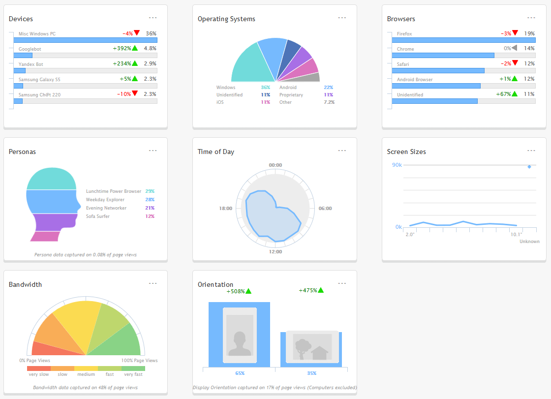
The first step: sign-up for a Netbiscuits account — there is a 30-day free trial to assess the service. Paste the Netbiscuits tracking code into your website template, wait a few seconds, and view the attractive device and visitor flow analytics charts:
第一步: 注册Netbiscuits帐户 -有30天的免费试用以评估服务。 将Netbiscuits跟踪代码粘贴到您的网站模板中,等待几秒钟,然后查看有吸引力的设备和访问者流量分析图表:
客户端设备检测API (Client-Side Device Detection API)
The tracking code also defines a global JavaScript object named dcs which exposes more than 650 hardware, browser, operating system and network detection parameters. Examples:
跟踪代码还定义了一个名为dcs的全局JavaScript对象,该对象公开了650多种硬件,浏览器,操作系统和网络检测参数。 例子:
Assess the bandwidth score — a rank from zero (very slow) to 20 (typically EDGE/HSPA) to 60 (3G) to 120+ (4G/wifi):
评估带宽得分-等级从零(非常慢)到20(通常为EDGE / HSPA)到60(3G)到120+(4G / wifi):
var bandwidthScore = dcs.get('bandwidth.score'); // integerIdentify whether the device has a touch screen:
识别设备是否具有触摸屏:
var touchScreen = dcs.get('browser.cantouch'); // booleanwith a high-density pixel ratio:
高密度像素比:
var pixelRatio = dcs.get('internal.browserpixelratio'); // realDoes the device have telephone calling facilities?
设备是否具有电话呼叫设施?
var canCall = dcs.get('browser.cantelmakecall'); // booleanIs SVG supported? Are SMIL animations available?
支持SVG吗? 有SMIL动画吗?
var svg = dcs.get('browser.css.cansvg'); // boolean
var svgSmil = dcs.get('browser.css.cansvgsmil'); // boolean
Find out where the user is located:
找出用户所在的位置:
var county = dcs.get('internal.countrycode'); // 2-character string, e.g. "US"Suggest a compatible HTML5 video format:
建议兼容HTML5视频格式:
var videoFormat = dcs.get('video.suggestvideoformat'); // objectDetect which browser is being used:
检测正在使用的浏览器:
var browser = dcs.get('browser.model'); // string, e.g. "Firefox 38"and whether it’s the latest release:
以及它是否是最新版本:
var latest = dcs.get('browser.islatestrelease'); // boolean服务器端设备检测API (Server-Side Device Detection API)
Device detection is most useful on the server where you can modify the response before it’s sent. Code is provided for PHP, Java and .NET. PHP examples…
设备检测在服务器上最有用,您可以在服务器上修改响应然后将其发送。 提供了针对PHP,Java和.NET的代码。 PHP范例…
Does the device support H264 HTML5 video and has a reasonable connection?
设备是否支持H264 HTML5视频并且连接合理?
<?php
if ($dcs->video->canhh264 && $dcs->internal->bandwidthscore > 150) {
	echo '<video src="video.mp4" controls></video>';
}
?>
Does the device support Ajax and have JavaScript performance better than the iPhone 5 (a reference device with a score of 100)?
该设备是否支持Ajax并具有比iPhone 5(得分为100的参考设备)更好JavaScript性能?
<?php
if ($dcs->browser->canajax && $dcs->hardware->performance->js > 100) {
	echo '<script src="moderndevice.js"></script>';
}
?>
We may never have a solution which is easy to develop and works perfectly on all devices but RESS offers a good compromise which solves many of the performance problems encountered with Responsive Web Design. A good device detection service is all you need.
我们可能永远不会有一个易于开发且可以在所有设备上完美运行的解决方案,但是RESS提供了一个很好的折衷方案,可以解决响应式Web设计遇到的许多性能问题。 您只需要优质的设备检测服务 。
翻译自: https://www.sitepoint.com/improving-responsive-web-design-ress/


 223
223

 被折叠的 条评论
为什么被折叠?
被折叠的 条评论
为什么被折叠?
 到【灌水乐园】发言


