


响应式网页设计
This article is part of a web development series from Microsoft. Thank you for supporting the partners who make SitePoint possible.
本文是Microsoft的Web开发系列的一部分。 感谢您支持使SitePoint成为可能的合作伙伴。
I had the great pleasure of delivering the closing keynote at Responsive Day Out 3: The Final Breakpoint. Held in Brighton, UK on 19 June 2015, the conference is a gathering of designers and developers sharing their workflow strategies, techniques, and experiences with responsive web design.
我很高兴在“ 响应之日3:最终的断点”上 发表闭幕主题演讲 。 该会议于2015年6月19日在英国布莱顿举行,是设计师和开发人员的聚会,他们分享了他们的响应式Web设计的工作流策略,技术和经验。
Here’s what I had to say.
这就是我要说的。
Today has provided an amazing tour of the world of responsive design. We’ve seen how to level-up our workflows and processes. We’ve learned new ways to improve the accessibility of our products. We’ve grappled with modern CSS and HTML capabilities that help us embrace the hugely variable display sizes that swirl and whirl around us.
今天提供了一个令人惊叹的响应式设计世界之旅。 我们已经看到了如何升级我们的工作流程和流程。 我们已经学习了改善产品可访问性的新方法。 我们已经努力解决了现代CSS和HTML功能的问题,这些功能可以帮助我们适应在我们周围旋转和旋转的巨大变化的显示尺寸。
We’ve explored the future of modular code and browsers’ capacity for working without network connectivity. And we’ve even taken a trip into the possible future of where the web might go.
我们探索了模块化代码的未来,以及浏览器无需网络连接即可工作的能力。 我们甚至还探访了网络可能走向的未来。
We’ve come a long way since Ethan’s article, fluid grids, flexible media, and media queries. Those three tenets sowed a seed that has grown and flourished as we have come to better understand the implications of device proliferation. We’ve seen that the web is capable of going anywhere and doing pretty much anything.
自从Ethan的文章 ,流体网格,灵活的媒体和媒体查询以来,我们已经走了很长一段路。 当我们逐渐了解设备扩散的含义时,这三个原则播下了成长与繁荣的种子。 我们已经看到,网络能够在任何地方运行并且几乎可以执行任何操作。
I would argue that “Responsive Web Design” was the first article that really managed to capture the concepts that John Allsopp had discussed so many years before in “A Dao of Web Design” and distilled them into something the design and development community could really sink their teeth into. It provided a concrete example of the web’s ability to flex and mold itself into whatever shape it needed to take on.
我认为“响应式Web设计”是第一篇真正捕捉到约翰·奥尔索普多年以来在“ Web设计之道”中讨论过的概念并将其提炼为设计和开发社区可以真正沉浸的东西的文章。他们的牙齿。 它提供了一个具体的示例,说明了网将其弯曲和成型为所需形状的能力。
It was the first time many designers had come to terms with the idea that “experience” was not some monolithic thing.
这是许多设计师第一次接受“体验”不是一成不变的东西的想法。
Sure, many of us in the web standards community had been talking the talk and walking the walk with regard to progressive enhancement. And we were gaining converts, but progress was slow. Ethan demonstrated—directly and succinctly—what the progressive enhancement of visual design could look like.
当然,我们在Web标准社区中的许多人都在谈论逐步增强的话题。 我们正在获得convert依,但进展缓慢。 Ethan直接且简洁地演示了视觉设计的逐步增强会是什么样子。
Providing an identical experience for each and every human being that tries to access our sites would be impossible. There are simply far too many factors to consider. We’ve got screen size, display density, CPU speed, amount of RAM, sensor availability, feature availability, interface methods … breathe … operating system type, operating system version, browser type, browser version, plug-ins installed, network speed, network latency, network congestion, firewalls, proxies, routers, and probably a dozen other factors my mind is incapable of plucking amid the whirlwind of technical considerations.
为试图访问我们网站的每个人提供相同的体验将是不可能的。 有太多因素需要考虑。 我们已经得到了屏幕尺寸,显示密度,CPU速度,RAM数量,传感器可用性,功能可用性,接口方法…… 呼吸 ……操作系统类型,操作系统版本,浏览器类型,浏览器版本,安装的插件,网络速度,网络延迟,网络拥塞,防火墙,代理,路由器以及可能是我想到的许多其他因素在技术考虑因素的影响下都无法解决。
And that doesn’t even consider our users.
甚至不考虑我们的用户。
When it comes to the people we need to reach for our work to actually matter, we have to consider literacy level, reading acumen, level of domain knowledge, cognitive impairments like learning disabilities and dyslexia, attention deficit issues, environmental distractions, vision impairment, hearing impairment, motor impairment, how much they understand how to use their device, how much they understand how to use their browser, how well-versed in common web conventions they are, and a ton of other “human factors”.
当涉及到我们需要让我们的工作真正重要的人时,我们必须考虑识字水平,阅读敏锐度,领域知识水平,认知障碍(例如学习障碍和阅读障碍),注意力不足问题,环境干扰,视力障碍,听力障碍,运动障碍,他们对使用设备的了解程度,对浏览器的使用了解程度,对通用网络习惯的熟悉程度以及许多其他“人为因素”。
Every person is different and everyone comes to the web with their own set of special needs. Some are always with them, blindness for example. Others are transient, like breaking your mousing arm. Still others are purely situational and dependent on the device you are using at the time and its technical capabilities or constraints.
每个人都是不同的,每个人都有自己的特殊需求进入网络。 有些总是和他们在一起,例如失明。 其他人则是短暂的,例如折断鼠标臂。 还有一些纯粹是视情况而定,取决于您当时使用的设备及其技术能力或限制。
Trying to devise one monolithic experience for each and every person to have in every context that considers every factor would be impossible. And yet, Sir Tim Berners Lee had a vision for a web that was capable of going anywhere. Was he insane?
试图为每个人在考虑每种因素的每种情况下设计一种整体体验是不可能的。 但是,蒂姆·伯纳斯·李爵士(Tim Berners Lee)先生对建立一个可以在任何地方访问的网络都抱有远见。 他疯了吗?
Sir Tim’s vision for the web was that content could be created once and accessed from anywhere. Disparate but related pieces of “hypermedia” scattered across the globe could be connected to one another via links. Moreover, they would be retrievable by anyone on any device capable of reading HTML. For free.
蒂姆爵士对网络的愿景是,内容只能创建一次并可以从任何地方访问。 遍布全球的不同但相关的“超媒体”片段可以通过链接相互连接。 而且,任何能够读取HTML的设备上的任何人都可以检索它们。 免费。
Ultimately, Sir Tim envisioned universal accessibility.
最终,蒂姆爵士设想了普遍可及性。
For a great many of us, ensuring our websites are accessible is an afterthought. We talk a good game when it comes to “user centered” this or that, but often treat the word “accessibility” as a synonym for “screen reader”. It’s so much more than that. “Accessibility” is about people. People consume content and use interfaces in many different ways, some similar and some quite dissimilar to how we do it.
对于我们大多数人来说,确保我们的网站可访问性是事后的想法。 当谈到“以用户为中心”时,我们谈论的是一款出色的游戏,但通常将“可访问性”一词视为“屏幕阅读器”的同义词。 不仅如此。 “可访问性”是关于人的。 人们使用内容并以许多不同的方式使用界面,其中有些与我们的操作方式相似,但有些完全不同。
Sure, people with visual impairments often use a screen reader to consume content. But they might also use a braille touch feedback device or a braille printer. They probably also use a keyboard. Or they may use a touchscreen in concert with audio cues. Or they may even use a camera to allow them to “read” content via OCR and text-to-speech. And yes, visual impairment affects a decent percentage of the populace (especially as we age), but it is only part of the “accessibility” puzzle.
当然,有视觉障碍的人经常使用屏幕阅读器来消费内容。 但是他们也可能使用盲文触摸反馈设备或盲文打印机。 他们可能还使用键盘。 或者他们可能将触摸屏与音频提示配合使用。 或者他们甚至可以使用摄像头来允许他们通过OCR和文本转语音“读取”内容。 是的,视觉障碍影响着相当一部分人口(尤其是随着年龄的增长),但这只是“可及性”难题的一部分。
The contrast between text and the background is an important factor in ensuring content remains readable in different lighting situations. Color choice is an accessibility concern.
文本和背景之间的对比度是确保内容在不同照明情况下仍可读的重要因素。 颜色选择是可访问性问题。
The language we use on our sites and in our interfaces directly affects how easy it is for our users to understand what we do, the products we are offering, and why it matters. It also affects how we make our users feel about themselves, their experience, and our companies. Language is an accessibility concern.
我们在网站和界面上使用的语言直接影响用户了解我们的工作,所提供的产品以及重要性的难易程度。 它还会影响我们如何使用户对自己,他们的经历和我们的公司有感觉。 语言是可访问性问题。
The size of our web pages has a direct effect on how long our pages take to download, how much it costs our customers to access them, and (sometimes) even whether or not the content can be reached. Performance is an accessibility concern.
网页的大小直接影响到网页的下载时间,客户访问这些网页的成本以及(有时)是否可以访问内容(直接)。 性能是可访问性问题。
I could keep going, but I’m sure you get the point.
我可以继续前进,但是我敢肯定,你明白了。
Accessibility is about providing good experiences for everyone, regardless of physical or mental abilities, gender, race, or language. It recognizes that we all have special needs—physical limitations, bandwidth limitations, device limitations—that may require us to experience the same interface in different ways.
无障碍获取是指为每个人提供良好的体验,无论其身体或心理能力,性别,种族或语言如何。 它认识到我们都有特殊的需求-物理限制,带宽限制,设备限制-可能需要我们以不同的方式体验相同的界面。
When I visit a website on my phone, for example, I am visually limited by my screen resolution (especially if I am using a browser that encourages zooming) and I am limited in my ability to interact with buttons and links because I am browsing with my fingertips, which are larger and far less accurate than a mouse cursor.
例如,当我通过手机访问网站时,我的屏幕分辨率会受到视觉上的限制(特别是如果我使用的是鼓励缩放的浏览器),并且我与按钮和链接进行交互的能力也受到限制,因为我正在浏览我的指尖,它的大小比鼠标光标大,但准确度却远不如。
On a touchscreen, I may need the experience to be slightly different, but I still need to be able to do whatever it is I came to the site to do. I need an experience, but moreover I need the appropriate experience.
在触摸屏上,我可能需要稍有不同的体验,但是我仍然需要能够做我来到网站上所做的任何事情。 我需要一个经验,但我而且需要相应的经验。
Embracing the reality that experience doesn’t need to be just one thing will help us reach more people with fewer headaches. Experience can—and should—be crafted as a continuum. This is progressive enhancement: We start with a baseline experience that works for everyone—content, real links, first generation form controls, and forms that actually submit to the server. Then we build up the experience from there.
拥抱经验并不仅仅是一件事,这将帮助我们以更少的头痛吸引更多的人。 经验可以而且应该被设计成连续的。 这是逐步的增强:我们从对所有人都适用的基准体验开始,包括内容,真实链接,第一代表单控件以及实际提交给服务器的表单。 然后,我们从那里积累经验。
Your browser supports HTML5 form controls? Great! You’ll get a better virtual keyboard when you go to type your email address. You can use CSS? Awesome, let me make that reading experience better for you. Oh, you can handle media queries! Let me adjust the layout so those line lengths are a little more comfortable. Wow, your browser supports Ajax?! Here let me load in some teasers for related content you might find interesting.
您的浏览器支持HTML5表单控件吗? 大! 当您键入电子邮件地址时,您将获得更好的虚拟键盘。 可以使用CSS吗? 太好了,让我为您带来更好的阅读体验。 哦,您可以处理媒体查询! 让我调整布局,使这些行长更舒适。 哇,您的浏览器支持Ajax吗? 在这里,让我载入一些预告片,寻找您可能会感兴趣的相关内容。
Imagine sitting down in a restaurant only to have the waiter immediately bring you a steak. But you’re a vegetarian. You ask if they offer something you can eat and they politely reply Oh I’m sorry, meat is a requirement. Why don’t you just eat meat? It’s easy! You’re really missing out on some tasty food. No waiter who actually cares about your experience would do that.
想象一下,坐在餐厅里只是让服务员立即为您带来一块牛排。 但是你是素食主义者。 您问他们是否提供您可以吃的东西,他们礼貌地回答哦,很抱歉,肉是必需的。 你为什么不只吃肉? 这很容易! 您真的错过了一些美味的食物。 真正关心您的经历的服务员不会这样做。
And yet we—as an industry—don’t seem to have any problem telling someone they need to change their browser to accommodate us. That’s just wrong. Our work is meaningless without users. We should be bending over backwards to attract and retain them. This is customer service 101.
但是,作为一个行业,我们告诉别人他们需要更改浏览器以适应我们的情况似乎没有任何问题。 那是错误的。 没有用户,我们的工作毫无意义。 我们应该向后弯腰以吸引和保留它们。 这是客户服务101。
This comes back to Postel’s law, which Jeremy often recounts:
这又回到了Postel的法律,Jeremy经常提到:
Be conservative in what you do, be liberal in what you accept from others.
对自己的工作要保守一些,对别人接受的事情要开放一些。
We need to be lax when it comes to browser support and not make too many (or better yet any) assumptions about what we can send.
在浏览器支持方面,我们需要放松,不要对我们可以发送的内容做出太多(或更好的是)假设。
Of course this is not an approach everyone in our industry is ready to embrace, so I’ll offer another quote I come back to time and time again…
当然,这并不是我们行业中每个人都愿意接受的方法,因此,我会不时地再提一次报价……
When something happens, the only thing in your power is your attitude toward it; you can either accept it or resent it.
当某件事发生时,您唯一的力量就是您对它的态度。 您可以接受或重新发送它。
We can’t control the world, we can only control our reaction to it.
我们无法控制世界,我们只能控制我们对世界的React。
Now those of you who’ve gathered for this final Responsive Day Out (or who are following along at home) probably understand this more than most. We feel the constant bombardment of new devices, screen sizes, and capabilities. The only way I’ve found to deal with all of this is to accept it, embrace the diversity, and view device and browser proliferation as a feature, not a bug.
现在,那些为这次最后的响应日聚会而聚集的人(或在家中追随者)可能比大多数人了解得更多。 我们感到新设备,屏幕尺寸和功能不断受到轰炸。 我发现处理所有这些问题的唯一方法是接受它,拥抱多样性,并将设备和浏览器的普及视为功能,而不是错误。
It’s up to us to educate those around us who have—either by accident or intent—not accepted that diversity is the reality we live in and things are only going to get crazier. Burying our heads in the sand is not an option.
我们必须教育我们周围的人,无论是出于偶然还是出于故意,都没有接受多样性是我们生活的现实,而事情只会变得更加疯狂。 把头埋在沙子里是没有选择的。
When I am trying to help folks understand and embrace diversity, I often reach for one of my favorite thought exercises from John Rawls.
当我试图帮助人们理解和拥抱多样性时,我经常从John Rawls那里获得我最喜欢的思想练习之一。
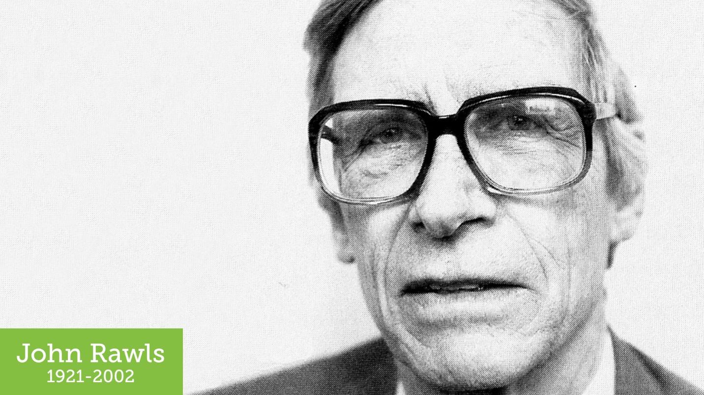
Rawls was a philosopher who used to run a social experiment with students, church groups, and the like.
罗尔斯是一位哲学家,曾与学生,教会团体等进行社会实验。
In the experiment, participants were allowed to create their ideal society. It could follow any philosophy: It could be a monarchy or democracy or anarchy. It could be capitalist or socialist. The people in this experiment had free rein to control absolutely every facet of the society… but then he’d add the twist: They could not control what position they occupied in that society.
在实验中,允许参与者创建理想的社会。 它可以遵循任何哲学:它可以是君主制,民主或无政府状态。 它可能是资本主义的或社会主义的。 这个实验中的人可以自由地控制整个社会的各个方面……但随后他又添加了一个转折点:他们无法控制自己在那个社会中所处的位置。
This twist is what John Harsanyi—an early game theorist—refers to as the “Veil of Ignorance” and what Rawls found, time and time again, was that individuals participating in the experiment would gravitate toward creating the most egalitarian societies.
这种扭曲被早期的游戏理论家约翰·哈桑尼(John Harsanyi)称为“无知的面纱”,而罗尔斯一次又一次发现,参加该实验的个人将倾向于建立最平等的社会。
It makes sense: what rational, self-interested human being would treat the elderly, the sick, people of a particular gender, race, creed, or color poorly if they could find themselves in that very same position when the veil is pulled away?
这是有道理的:如果在揭开面纱时发现自己处于同一位置,有什么理性的,自私的人会不好地对待老年人,病人,具有特定性别,种族,信仰或肤色的人?
The things we do to accommodate special needs now pay dividends in the future. Look at ramps.
我们为满足特殊需求而做的事情现在会在将来获得回报。 看坡道。
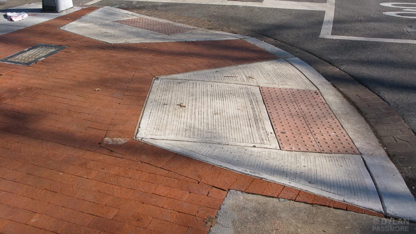
They’re a classic example of an accessibility feature for people in wheelchairs that also benefit people who aren’t in them: People toting luggage, delivery services hauling heavy things on dollies, parents pushing children (or their dressed up dogs) in strollers, a commuter walking her bike, and that guy who just prefers walking up a gentle incline to expending the effort required to mount a step.
对于轮椅上的人来说,这是无障碍功能的经典示例,这也使不在轮椅上的人受益:人们托着行李,送货服务将重物拖到小推车上,父母推着孩子(或他们的打扮的狗)在婴儿车中,一个通勤的人,她骑着自行车,而那个只喜欢平缓地走着,而不是花一个台阶的人。
When we create alternative paths to get from Point A to Point B, people can take the one most appropriate for them, whether by choice or necessity. And everyone can accomplish their goals.
当我们创建从A点到B点的替代路径时,人们可以选择最适合他们的路径,无论是选择还是必要。 每个人都可以实现自己的目标。
We all have special needs. Some we’re born with. Some we develop. Some are temporary. Some have nothing to do with us personally, but are situational or purely dependent on the hardware we are using, the interaction methods we have available to us, or even the speed at which we can access the Internet or process data.
我们都有特殊的需求。 一些我们天生的。 我们开发了一些。 有些是临时的。 有些人与我们个人无关,但在某些情况下或纯粹取决于我们所使用的硬件,我们可以使用的交互方法,甚至我们可以访问Internet或处理数据的速度。
What is responsive web design about if not accessibility? Yes, its fundamental tenets are concerned with visual design, but in terms of the big picture, they’re all about providing the best possible reading experience.
如果没有可访问性,响应式网页设计是什么? 是的,它的基本原则与视觉设计有关,但就大图而言,它们都是为了提供最佳的阅读体验。
As practitioners of responsive design, we understand the benefits of adapting our interfaces. We understand fallbacks. We understand how to design robust experiences that work under a wide variety of conditions. Every day we broaden the accessibility of our products.
作为响应式设计的实践者,我们了解调整界面的好处。 我们了解后备。 我们了解如何设计可在各种条件下工作的可靠体验。 每天,我们扩大产品的可及性。
These skills will make us invaluable as technology continues to offer novel ways of consuming and interacting with our websites.
随着技术继续提供新颖的方式来使用和与我们的网站互动,这些技能将使我们变得无价。
We’re just starting to dip or toes—er, hands—into the world of motion-based gestural controls. Sure, we’ve had them in two dimensions on touch screens for a while now but three dimensional motion-based controls are only beginning to appear.
我们才刚刚开始涉足基于动作的手势控制世界。 当然,我们已经在触摸屏上将它们二维化了一段时间,但是基于三维运动的控件才刚刚开始出现。
The first big leap in this direction was Kinect on the Xbox 360 (and later, Windows). With Kinect, we interact with the computer using body movements like raising a hand (which gets Kinect to pay attention), pushing our hand forward to click/tap, and grasping to drag the canvas in a particular direction.
朝这个方向的第一个重大飞跃是Xbox 360(以及后来的Windows)上的Kinect 。 使用Kinect,我们可以使用身体动作与计算机进行交互,例如举起手(这会引起Kinect的注意),将手向前推动以进行单击/点击,以及抓握以在特定方向上拖动画布。
The Kinect ushered in a major revolution in terms of interfacing with computers, but from an interaction perspective, it presents similar challenges to those of the Wii controller and Sony’s PlayStation Move. Large body gestures like raising your hand (or a wand controller) can be tiring.
Kinect在与计算机的接口方面迎来了一场重大革命,但是从交互的角度来看,它提出了与Wii控制器和Sony的PlayStation Move相似的挑战。 举起手(或魔杖控制器)等大手势可能会很累。
They’re also not terribly accurate. If you thought that touchscreen accuracy was an issue, hand gestures like those for the Kinect or LEAP Motion pose even more of a challenge.
它们也不是很准确。 如果您认为触摸屏的准确性是个问题,那么类似Kinect或LEAP Motion的手势将构成更大的挑战。
To accommodate interactions like this (which we currently have no way of detecting) we need to be aware of how easy it is to click on interactive controls. We need to determine if our buttons and links are large enough and whether there is enough space between them to ensure our user’s intent is accurately conveyed to the browser. Two specs which can help address this are Media Queries Level 4 and Pointer Events.
为了适应这样的交互(我们目前无法检测到这种交互),我们需要知道单击交互控件有多么容易。 我们需要确定按钮和链接是否足够大,以及它们之间是否有足够的空间以确保将用户的意图准确地传达给浏览器。 可以帮助解决此问题的两个规范是媒体查询级别4和指针事件。
In Media Queries Level 4, we became able to apply style rules to particular interaction contexts. For instance, when we have very accurate control over our cursor (as in the case of a stylus or mouse) or less accurate control (as in the case of a touch screen or physical gesture):
在“ 媒体查询级别4”中 ,我们能够将样式规则应用于特定的交互上下文。 例如,当我们对光标的控制非常精确(如手写笔或鼠标)或较不精确的控制(如触摸屏或手势)时:
@media (pointer:fine) {
  /* Smaller links and buttons are ok */
}
@media (pointer:coarse) {
  /* Larger links and buttons are probably a good idea */
}
view raw mq4-pointer.css | view raw
Embeddable GitHub code samples included in this article available here: https://gist.github.com/aarongustafson/372271534c78cf11d4a6#file-mq4-pointer-css
本文中包含的可嵌入GitHub代码示例可在此处获得: https : //gist.github.com/aarongustafson/372271534c78cf11d4a6#file-mq4-pointer-css
Of course, we want to offer a sensible default in terms of size and spacing as a fallback for older browsers and devices.
当然,我们希望在大小和间距方面提供合理的默认设置,以作为较旧的浏览器和设备的后备。
We also have the ability to determine whether the device is capable of hovering over an element and can adjust the interface accordingly.
我们还具有确定设备是否能够将鼠标悬停在某个元素上并能够相应调整界面的能力。
@media (hover:hover) {
  /* hover-related interactions are A-OK */
}

@media (hover:on-demand) {
  /* hover-related interactions are potentially difficult,
     maybe do something else instead */
}

@media (hover:none) {
	/* No hover possible :-( */
}
view raw mq4-hover.css | view raw
We still need to figure out how well all of this ends up working on multimodal devices like the Surface tablet, however. Will the design change as the user switches between input modes? Should it? To that end, the spec also provides any-pointer and any-hoverto allow you to query for whether any supported interaction method meets your requirements, but here’s a word of warning from the spec:
但是,我们仍然需要弄清楚所有这些最终在多模式设备(例如Surface平板电脑)上的运行效果如何。 当用户在输入模式之间切换时,设计会改变吗? 应该是? 为此,规范还提供了任意指针和任意悬停,以允许您查询是否有任何支持的交互方法满足您的要求,但这是规范的警告:
Designing a page that relies on hovering or accurate pointing only because _any-hover or_ any-pointer_ _indicate that an input mechanism with these capabilities is available, is likely to result in a poor experience.
设计仅依靠悬停或准确指向的页面是因为_any-hover或 _ any-pointer_ _表明具有这些功能的输入机制可用,这可能会导致较差的体验。
These media query options are starting to roll out in Chrome, Mobile Safari, and Microsoft Edge, so it’s worth taking a look at them.
这些媒体查询选项已开始在Chrome,Mobile Safari和Microsoft Edge中推出,因此值得一看。
Pointer Events is another spec that is beginning to gain some traction. It generalizes interaction to a single event rather than forcing us to silo experience into mouse-driven, touch-driven, pen-driven, (sigh) force-driven, and so on.
指针事件是另一个开始受到关注的规范。 它将交互作用推广到单个事件,而不是迫使我们将筒仓体验分为鼠标驱动,触摸驱动,笔驱动,(叹气)力驱动等等。
We can unobtrusively detect support for Pointer Events…
我们可以毫不客气地检测到对指针事件的支持…
if (window.PointerEvent) {
  window.addEventListener("pointerdown", detectType, false);
}
view raw pointer-test.js | view raw
…and then handle them all in the same way or create branches based on the pointerType:
…然后以相同的方式处理它们,或根据pointerType创建分支:
function detectType( event ) {

  switch( event.pointerType ) {
    case "mouse:
      /* mouse input detected */
      break;
    case "pen":
      /* pen/stylus input detected */
      break;
    case "touch:
      /* touch input detected */
      break;
    default:
      /* pointerType is empty (could not be detected) or UA-specific custom type */
  }
}
}
}
view raw pointer-event.js | view raw
Of course, in addition to considering the level of accuracy our users have while interacting with our screens, we also need to consider the potentially increased distance at which our users are reading our content.
当然,除了考虑用户与屏幕交互时所具有的准确性水平外,我们还需要考虑用户阅读内容的潜在距离增加。
To that end, I’ve been experimenting with the viewport width (vw) unit.
为此,我一直在尝试使用视口宽度(vw)单位。
For a long time, I’ve used ems for the layout’s max-width (so the line length is proportional to the font size). I also use relative font sizes. With that as the foundation, I can use a media query that matches the maximum width and set the base font size at the vw equivalent at the max width.
长期以来,我一直使用ems作为布局的最大宽度(因此行长与字体大小成正比)。 我也使用相对字体大小。 以此为基础,我可以使用与最大宽度匹配的媒体查询,并将基本字体大小设置为与最大宽度相等的vw。
body {
  max-width: 64em;
}

@media screen and (min-width: 64em) {
  body {
    font-size: 1.5625vw; /* ( 1em / 64em ) * 100 */
  }
}
view raw vw-scaling.css | view raw
Then the whole design will simply zoom the layout when viewed beyond that size.
然后,整个设计将在超出该尺寸时仅放大布局。
If you don’t want to turn something like that on automatically, you can enable it to be toggled on and off with JavaScript.
如果您不想自动打开类似功能,可以使用JavaScript启用和禁用它。
Things get even crazier when you start to factor in devices like the HoloLens. And no, I have not gotten to play with one yet.
当您开始考虑诸如HoloLens之类的设备时,事情变得更加疯狂。 而且,我还没有开始玩。
But the idea of being able to drop a resizable virtual screen on any surface presents some interesting possibilities as a user and some unique challenges as a designer. HoloLens, of course, brings with it gesture controls as well, so accounting for a variety of input types should get us pretty far.
但是,能够在任何表面上放置可调整大小的虚拟屏幕的想法给用户带来了一些有趣的可能性,而给设计师带来了一些独特的挑战。 当然,HoloLens也带来了手势控制,因此考虑多种输入类型应该可以使我们走得更远。
In a similar vein, we should begin to think about what experiences can and should look like when we are browsing solely with our gaze. Gaze tracking has its origins in the accessibility space as a means of providing interface control to folks with limited or no use of their hands. Traditionally, gaze tracking hardware has been several thousand dollars, putting it out of the reach of many people, but that is starting to change.
同样,我们应该开始考虑仅通过凝视进行浏览时可以体验到什么样的体验。 注视跟踪起源于可访问性空间,它是为手部活动受限或不使用手的人提供界面控制的一种方法。 传统上,凝视跟踪硬件已经花费了数千美元,这使许多人望而却步,但这已经开始改变。
In the last few years, the computational power of our devices has increased as the hardware costs associated with supporting gaze tracking have dropped dramatically. Looking around, you can see gaze tracking beginning to move into the public sphere: Many smartphones and smartwatches can recognize when you are looking at them (or at least they do sometimes). This is only a short step away from knowing where on the screen you are looking. And nearly every high-end smartphone is now equipped with a front-facing camera which makes them perfect candidates to provide this interaction method.
在过去的几年中,我们的设备的计算能力得到了提高,因为与支持凝视跟踪相关的硬件成本已大大降低。 环顾四周,您会看到凝视跟踪开始进入公共领域:许多智能手机和智能手表在您看时都可以识别(或者至少有时可以识别)。 这距知道屏幕上的位置仅几步之遥。 现在,几乎所有高端智能手机都配备了前置摄像头,使其成为提供这种交互方法的理想之选。
The Sesame Phone was designed to allow people to use a smartphone without using their hands. It uses facial tracking to move a virtual cursor around the screen, allowing users to interact with the underlying operating system as well as individual applications. It supports tap, swipe, and other gestures (via a context menu) and is pretty impressive in my experience. Technology like this enables people suffering from MS, arthritis, Muscular Dystrophy, and more to use a smartphone and—more importantly to us—browse the web.
芝麻电话旨在让人们无需用手就能使用智能手机。 它使用面部跟踪在屏幕上移动虚拟光标,从而允许用户与底层操作系统以及各个应用程序进行交互。 它支持轻击,滑动和其他手势(通过上下文菜单),以我的经验而言非常令人印象深刻。 像这样的技术使患有MS,关节炎,肌营养不良等疾病的人们能够使用智能手机,并且对我们来说更重要的是浏览网络。
The Eye Tribe and Fixational are similarly working to bring eye tracking to smartphones and tablets. Eye tracking is similar to face tracking, but the cursor follows your focus. Micro gestures—blink, wink, etc.—allow you to interact with the device.
Eye Tribe和Fixational同样致力于将眼动追踪带入智能手机和平板电脑。 眼睛跟踪与面部跟踪类似,但是光标会跟随您的焦点。 微手势(闪烁,眨眼等)使您可以与设备进行交互。
Even though most gaze tracking software mimics a mouse and has adjustable sensitivity, the accuracy of it as a pointer device is not fantastic. When I’ve used the Sesame Phone, for instance, I’ve have a hard time controlling the position of my head in order to hold the cursor still to hover and click a button. I’m sure this would improve with practice, but it’s safe to say that in a gaze interaction, larger, well-spaced, and more easily targeted links and buttons would be a godsend.
尽管大多数凝视跟踪软件都模仿鼠标并具有可调的灵敏度,但作为指针设备的准确性并不理想。 例如,当我使用芝麻电话时,很难控制头部的位置,以使光标保持悬停并单击一个按钮。 我敢肯定,随着实践的发展,这种情况会有所改善,但是可以肯定地说,在凝视的互动中,更大,间距更远,更容易定位的链接和按钮将是天赐之物。
So far, I’ve focused on interaction methods that facilitate navigation and consuming content. But what about filling out a form? I can tell you that typing an email letter-by-letter on a virtual keyboard using your face, sucks…
到目前为止,我一直致力于促进导航和使用内容的交互方法。 但是填写表格呢? 我可以告诉你,用你的脸在虚拟键盘上逐个字母地输入电子邮件,真是糟糕透顶……
Thankfully, most of these gestural implementations are coupled with some form of voice recognition. The Kinect, for instance, will accept verbal commands to navigate and accomplish tasks like filling in forms. The Sesame Phone also supports voice commands for certain basic actions, dictating email, and the like.
幸运的是,大多数这些手势实现都与某种形式的语音识别结合在一起。 例如,Kinect将接受口头命令来导航和完成诸如填写表格之类的任务。 芝麻电话还支持用于某些基本操作,口述电子邮件等的语音命令。
Coupled with voice, the alternative interaction methods of Kinect and Sesame Phone work really well. But voice interaction can stand on its own too.
结合语音,Kinect和Sesame Phone的替代交互方法非常有效。 但是语音交互也可以独立存在。
Most of us are familiar with Apple’s Siri, Google Now, and Microsoft’s Cortana. These digital assistants are great at retrieving information from select sources and doing other assistant-y things like calculating a tip and setting a reminder. As far as interacting with the web, however, they don’t… yet. We can engage with them, but they can’t (necessarily) engage with a web page.
我们大多数人都熟悉Apple的Siri , Google Now和Microsoft的Cortana 。 这些数字助理非常擅长从选定的来源中检索信息,并可以执行其他助理操作,例如计算小费和设置提醒。 至于与网络交互,他们还没有……。 我们可以与他们互动,但他们不能(有必要)与网页互动。
Exposing the information stored in our webpages via semantic HTML and structured syntaxes like microformats, microdata, and RDFa should eventually make our content available to these assistants, but we don’t really know. Their various makers haven’t really given us any clue as to how to do that and, as it stands right now, none of them can look up a web page and read it to you. For that you need to invoke a screen reader.
揭露存储在通过语义HTML和语法结构就像我们的网页上的信息微格式 , 微数据和RDFa的最终应使我们的内容提供给这些助手,但我们真的不知道。 他们的各个制造商并没有真正向我们提供任何有关如何执行此操作的线索,并且就目前而言,没有人可以查找网页并将其阅读给您。 为此,您需要调用屏幕阅读器。
Each company offers a first-party screen reader. And all are capable of helping you interact with a page, including helping you fill in forms, without having to see the page. And yet, these technologies have not been coupled with their corresponding assistants. It probably won’t be long before we see that happen.
每个公司都提供第一方屏幕阅读器。 所有这些功能都可以帮助您与页面进行交互,包括帮助您填写表格,而无需查看页面。 但是,这些技术尚未与相应的助手结合在一起。 我们很快就会看到这种情况发生。
When we start to consider how our websites will be experienced in a voice context, the readability of our web pages becomes crucial. Clear well-written prose and a logical source order will be an absolute necessity. If our pages don’t make sense when read, what’s the point?
当我们开始考虑如何在语音环境中体验我们的网站时,我们网页的可读性就变得至关重要。 明确的散文和合理的原始顺序将是绝对必要的。 如果我们的页面在阅读时没有意义,那有什么意义?
Content strategist Steph Hay views interface as an opportunity to have a conversation with our users. Soon it literally will be.
内容策略师Steph Hay认为界面是与我们的用户进行对话的机会。 很快就会如愿以偿。
Interestingly, Microsoft has given us a peek at what it might be like to design custom voice commands for our websites beyond what the OS natively supports with Cortana. In other words, they let us teach their assistant.
有趣的是,除了OS本身对Cortana的支持之外,Microsoft还使我们了解了为我们的网站设计自定义语音命令的感觉。 换句话说,他们让我们教他们的助手。
In Windows 10, installable web apps can include a Voice Command Definition (VCD) file in the head of the page to enable custom commands:
在Windows 10中,可安装的Web应用程序可以在页面顶部包含语音命令定义(VCD)文件 ,以启用自定义命令:
<meta name=“msapplication-cortanavcd" content="http://myapp.io/vcd.xml"/>The referenced VCD file is simply an XML file defining the keyword for the web app and commands that can be issued.
引用的VCD文件只是一个XML文件,定义了Web应用程序的关键字和可以发布的命令。
Using very basic syntax, The VCD identifies optional pieces of a given phrase and variables Cortana should extract:
VCD使用非常基本的语法,标识给定短语的可选部分,Cortana应该提取变量:
Group Post
Group Post add note
This particular app passes the captured information over to JavaScript for processing. That’s right, Cortana has a JavaScript API too. Pretty neat.
这个特定的应用程序将捕获的信息传递给JavaScript进行处理。 没错, Cortana也有JavaScript API 。 漂亮整齐。
But traditional computers and smart mobile devices aren’t the only place we’re starting to see voice based experiences. We also have disembodied voices like Amazon’s Echo and the Ubi which are completely headless.
但是传统计算机和智能移动设备并不是我们开始看到基于语音的体验的唯一场所。 我们还体现了无形的声音,例如亚马逊的Echo和Ubi 。
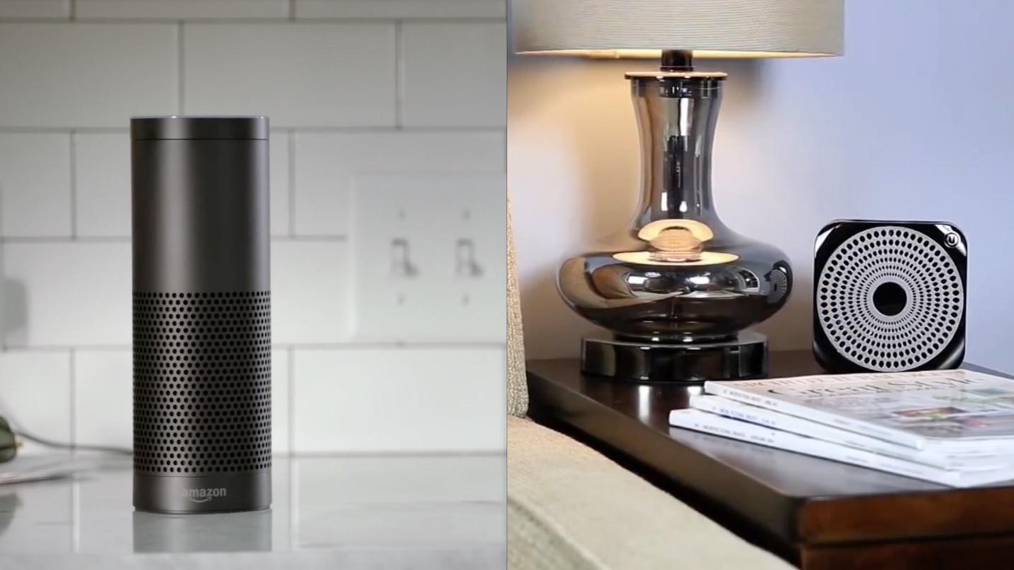
Right now, they both seem squarely focused on helping your house become “smarter”—streaming music, adjusting the thermostat, etc.—but it isn’t hard to imagine these devices becoming coupled with the ability to browse and interact with the web.
目前,它们似乎都专注于帮助您的房子变得“更智能”(流音乐,调节恒温器等),但是不难想象这些设备将具有浏览和与网络交互的能力。
In the near future, voice-based interactions with the web will be entirely possible. They will likely suck a bit at first, but they’ll get better.
在不久的将来,基于语音的与网络的交互将完全可能。 他们一开始可能会吮吸一点,但是会变得更好。
I’m going to make a somewhat bold prediction: while touch has been revolutionary in many ways toward improving digital access, voice is going to be even more significant. Voice-based interfaces will create new opportunities for people to interact with and participate in the digital world.
我将做出一个大胆的预测:尽管触摸在改善数字访问方面在许多方面都具有革命性意义,但语音将变得更加重要。 基于语音的界面将为人们与数字世界互动和参与创造新的机会。
Because we’ve been thinking about how the experiences we create are consumable across a variety of devices, we’ve got the jump on other folks working on the web when it comes to voice. We see experience as a continuum, starting with text.
因为我们一直在考虑如何在各种设备上消费我们创造的体验,所以涉及语音的其他人都在网上工作。 从文本开始,我们将体验视为一个连续体。
As voice technology matures, we will be the ones people look to as the experts. We will empower the next generation of websites and applications to become voice-enabled and in so doing, we will improve the lives of billions. Because “accessibility” is not about disabilities, it’s about access and it’s about people. Sure, we’ll make it easier to look up movie times and purchase tickets to see the latest Transformers debacle, but we will also empower the nearly 900 million people globally—over 60% of whom are women—that are illiterate. And that’s a population that has been largely ignored on our dominantly textual web.
随着语音技术的成熟,我们将成为人们期待的专家。 我们将授权下一代网站和应用程序启用语音功能,并以此改善数十亿人的生活。 因为“可访问性”与残疾无关,所以与访问有关,而与人有关。 当然,我们将使查找电影时间和购买票证更容易地查看最新的《变形金刚》(Transformers)崩溃的情况,但同时,我们还将为全球近9亿人(其中60%以上为女性)提供文盲服务。 在我们占主导地位的文字网络上,这一人群已被很大程度上忽略。
We will create new opportunities for the poor and disadvantaged to participate in a world that has excluded them. You may not be aware, but 80% of Fortune 500 companies—think Target, Walmart—only accept job applications online or via computers. We will enable people who have limited computer skills or who struggle with reading to apply for jobs with these companies.
我们将为穷人和处境不利的人创造新的机会,使其参与一个排斥他们的世界。 您可能没有意识到,但是80%的财富500强公司(例如Target,沃尔玛)仅在线或通过计算机接受求职申请。 我们将使那些计算机技能有限或阅读困难的人申请这些公司的工作。
We can help bridge the digital divide and the literacy gap. We can create opportunities for people to better their lives and the lives of their families. We have the power to create more equity in this world than most of us have ever dreamed.
我们可以帮助弥合数字鸿沟和扫盲差距。 我们可以为人们创造改善其生活和家庭生活的机会。 我们有能力在这个世界上创造比我们大多数人梦dream以求的更多的平等。
This is an incredibly exciting time, not just for the responsive design community, not just the web, but for the world! The future is coming and I can’t wait to see how awesome you make it!
这是一个令人兴奋的时刻,不仅对于响应式设计社区,不仅对于网络,对于整个世界! 未来将至,我迫不及待想看到您的成就!
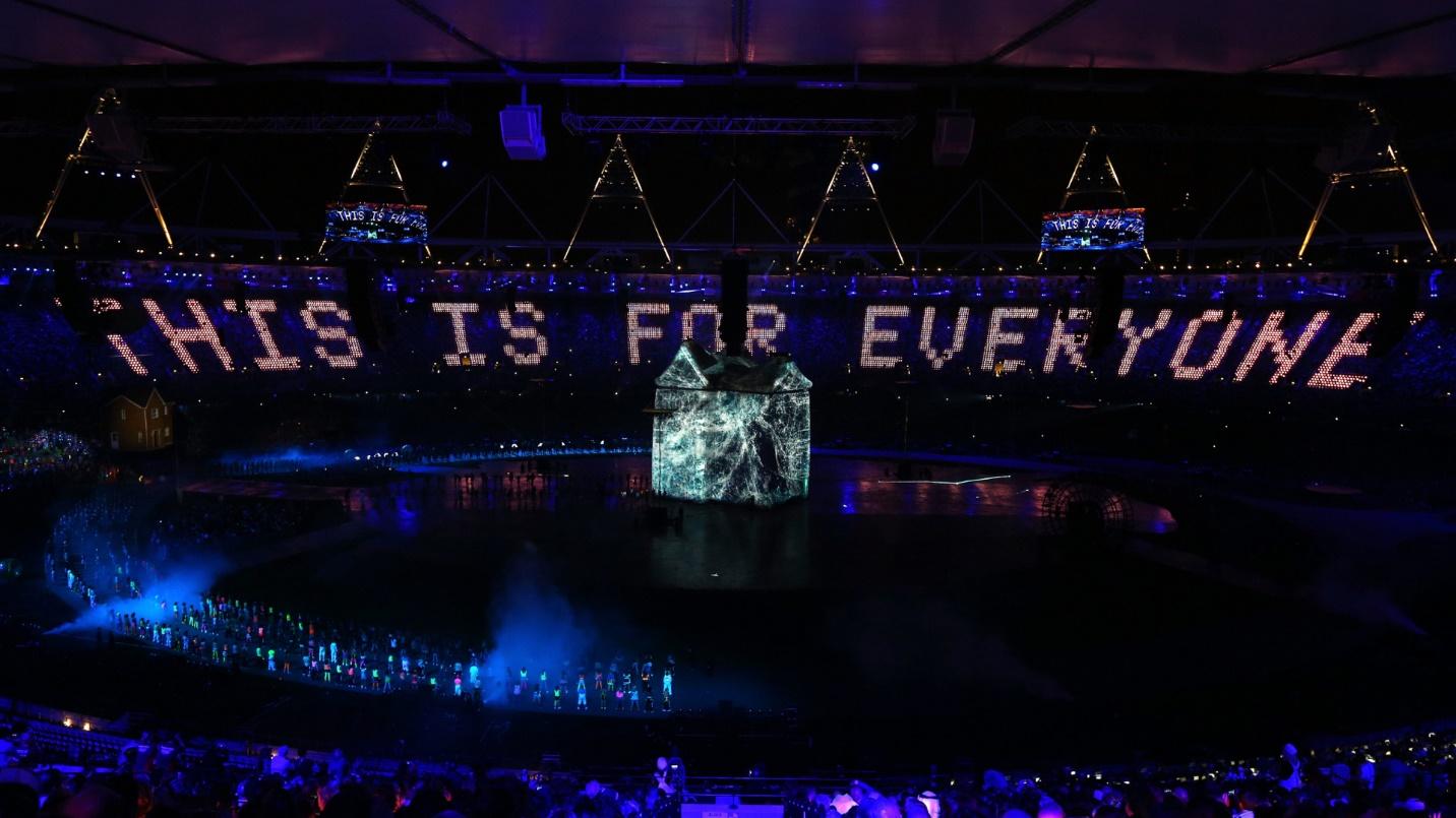
Responsive Day Out 3: The Final Breakpoint was held in Brighton, UK on 19 June 2015.
第3天响应时间:最终断点于2015年6月19日在英国布莱顿举行。
If you’re interesting in learning more about Responsive Web Design, check out our new book, Jump Start Responsive Web Design, written by Chris Ward.
如果您有兴趣学习有关响应式Web设计的更多信息,请查看克里斯·沃德(Chris Ward)撰写的新书《快速入门响应式Web设计》 。
Web开发更多动手 (More hands-on with Web Development)
This article is part of the web development series from Microsoft tech evangelists on practical JavaScript learning, open source projects, and interoperability best practices including Microsoft Edge browser and the new EdgeHTML rendering engine.
本文是Microsoft技术传播者开发的Web开发系列文章的一部分,内容涉及实用JavaScript学习,开源项目以及互操作性最佳实践,包括Microsoft Edge浏览器和新的EdgeHTML呈现引擎 。
We encourage you to test across browsers and devices including Microsoft Edge – the default browser for Windows 10 – with free tools on dev.modern.IE:
我们鼓励您使用dev.modern.IE上的免费工具跨浏览器和设备进行测试,包括Microsoft Edge(Windows 10的默认浏览器):
Scan your site for out-of-date libraries, layout issues, and accessibility
Coding Lab on GitHub: Cross-browser testing and best practices
我们的工程师和宣传人员在Microsoft Edge和Web平台上进行了深入的技术学习: (In-depth tech learning on Microsoft Edge and the Web Platform from our engineers and evangelists:)
Microsoft Edge Web Summit 2015 (what to expect with the new browser, new supported web platform standards, and guest speakers from the JavaScript community)
Microsoft Edge Web Summit 2015 (新浏览器,新支持的网络平台标准以及来自JavaScript社区的嘉宾演讲者会期待什么)
Woah, I can test Edge & IE on a Mac & Linux! (from Rey Bango)
哇,我可以在Mac和Linux上测试Edge和IE! (来自Rey Bango)
Advancing JavaScript without Breaking the Web (from Christian Heilmann)
在不中断网络的情况下推进JavaScript (来自Christian Heilmann)
The Edge Rendering Engine that makes the Web just work (from Jacob Rossi)
使Web正常工作的Edge渲染引擎 (来自Jacob Rossi)
Unleash 3D rendering with WebGL (from David Catuhe including the vorlon.JS and babylonJS projects)
使用WebGL释放3D渲染 (来自David Catuhe,包括vorlon.JS和babylonJS项目)
Hosted web apps and web platform innovations (from Kevin Hill and Kiril Seksenov including the manifold.JS project)
托管的Web应用程序和Web平台创新 (来自Kevin Hill和Kiril Seksenov,包括歧管 .JS项目)
Web平台的更多免费跨平台工具和资源: (More free cross-platform tools & resources for the Web Platform:)
翻译自: https://www.sitepoint.com/responsive-web-design-where-do-we-go-from-here/
响应式网页设计


 952
952


 被折叠的 条评论
为什么被折叠?
被折叠的 条评论
为什么被折叠?
 到【灌水乐园】发言


