


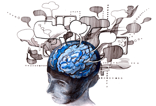
Communication is the basis for interaction, and we don't need to remind you how important language is to communication.
交流是互动的基础,我们无需提醒您语言对交流的重要性。
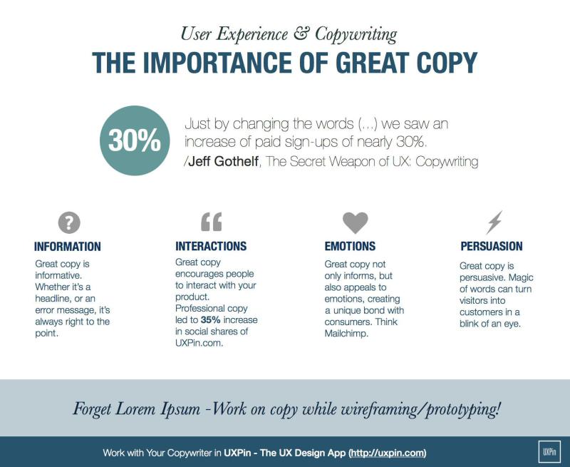
Copy may not seem like an immediate priority (especially if you have a larger team with content strategists and copywriters), but you must understand that writing is affected by (and also affects) the design.
复制似乎不是当务之急(尤其是如果您有一个由内容策略师和撰稿人组成的更大的团队),但是您必须了解写作受设计的影响(并影响)。
After all, if a visual designer only leaves enough space for 10 characters in a headline, that can disrupt the flow of the entire page.
毕竟,如果视觉设计师仅在标题中留出足够的空间来容纳10个字符,则可能会扰乱整个页面的流程。
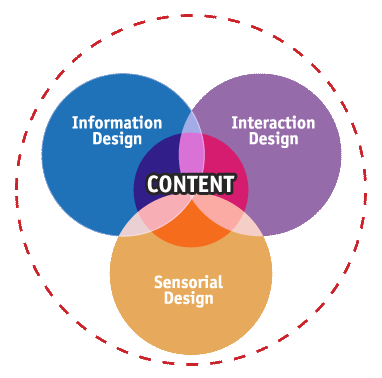
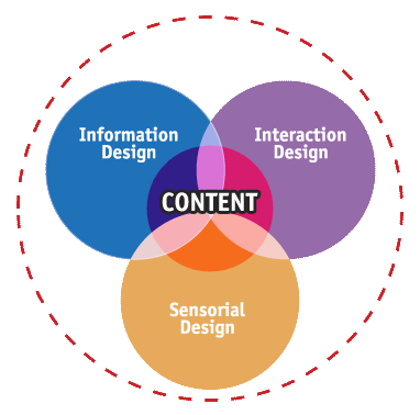
The words you choose, and how you put them together, will greatly influence your product's overall message – and we'll explain how using some words of our own. Below we'll show you why words are the base of interaction design and how to know the context of the copy.
您选择的字词以及如何将它们组合在一起,将极大地影响产品的整体信息-我们将说明如何使用我们自己的字词。 下面我们将向您展示为什么单词是交互设计的基础,以及如何知道副本的上下文。
交互设计中复制的目的 (The Purpose of Copy in Interaction Design)
As technology advances and new modes of communication become commonplace, on-site and in-app copy may be given less attention than impressive graphics, animations, and touch-screen gestures.
随着技术的进步和新的通信方式变得司空见惯,与令人印象深刻的图形,动画和触摸屏手势相比,对现场和应用内复制的关注可能会减少。
Not to downplay the new possibilities opened up by technology, but it's important to ensure that the written word doesn't get left behind. Just as a finger swipe can accomplish things that written copy cannot, words, also serve functions that can't be replaced – no matter how far technology advances.
不要低估技术带来的新可能性,但重要的是要确保书面文字不被遗忘。 就像手指滑动可以完成书面复制无法完成的任务一样,单词也可以提供无法替代的功能-无论技术进步了多少。
Source: Shedrof
资料来源: Shedrof
Words complement the other dimensions instead of competing with them.
言语是对其他维度的补充,而不是与之竞争。
Since they are one of the first meaningful interactions that users seek out on-screen, words help frame our experience with the other elements of interaction design. In her piece Copy As Interface, Erika Hall, Co-founder of Mule Design Studio, cites the specific roles writing fulfills in a product's interaction design.
由于它们是用户在屏幕上寻找的第一个有意义的交互方式之一,因此文字有助于将我们的体验与交互设计的其他元素结合起来。 Mule Design Studio的共同创始人Erika Hall 在她的作品“ 复制为界面”中引用了写作在产品交互设计中所扮演的特定角色。
Let's examine the 4 main duties of your copy.
让我们检查一下副本的4个主要职责。
1.问候语 (1. Words as a Greeting)
More than just a friendly "Hello!" your product's copy explains what the site is and recommends a good first step, whether suggesting signing up or directing to content that's likely to hook your user. As we mentioned in the previous chapter, interaction design should be treated as a conversation, so this is your first opportunity at creating a sense of humanity.
不仅仅是友好的“你好!” 产品的副本说明了网站的含义,并建议您迈出良好的第一步,无论是建议注册还是定向到可能吸引用户的内容。 正如我们在上一章中提到的那样,交互设计应被视为对话,因此这是您创造人性感的第一个机会。

Source: AirBnB
资料来源: AirBnB
You can see in the above example that AirBnB uses copy in a minimalistic yet effective manner. The titles Just for the Weekend and Explore the World help users visualize the benefits of AirBnB before diving into specific locations. The interaction is subtle, but it frames the experience as one step closer to a dream vacation.
您可以在上面的示例中看到,AirBnB以一种简约而有效的方式使用副本。 标题为“周末”和“探索世界”标题可帮助用户在深入特定地点之前形象化AirBnB的优势。 互动是微妙的,但它使体验更接近梦想假期。
2.单词作为导航 (2. Words as Navigation)
Copy tells users where they are and suggest new or lesser-known options to deepen the user's experience. Any advertiser knows how word choice can make a difference in promotion, and an enticing description can "sell" a specific webpage as well as tell users what content is contained within.
复制会告诉用户他们在哪里,并建议新的或鲜为人知的选项,以加深用户的体验。 任何广告商都知道选词如何在促销中有所作为,诱人的描述可以“出售”特定的网页并告诉用户其中包含什么内容。

When you look at FitBit's homepage above, you can see the multiple functions of the site copy.
当您查看上面的FitBit主页时,可以看到站点副本的多个功能。
Firstly, it serves the immediate purpose of navigation with clear copy on the dropdown menus. Secondly, it helps explain the different products available (with smartly placed subcopy next to each product).
首先,它通过下拉菜单上的清晰副本来实现导航的直接目的。 其次,它有助于解释可用的不同产品(每个产品旁边都有精巧的子副本)。
Thirdly, it entices on-the-fence users to dive deeper in the site with a section titled "There's a Fitbit product for everyone," which drives users to a page featuring products categorized by level of use.
第三,它通过标题为“每个人都有一个Fitbit产品”的部分,诱使现场用户更深入地浏览网站,从而将用户带到一个按使用级别分类产品的页面。
3.建议采取行动的词语 (3. Words That Suggest An Action)
Words in menus, on buttons, and within instructions are all necessary to the usability of your product – without them the user would grow frustrated figuring out the mechanisms on their own.
菜单,按钮上以及说明内的文字对于产品的可用性都是必不可少的–如果没有这些文字,则用户会很沮丧地自行弄清楚这些机制。
Simple writing saves time, and with the right word choice you can increase the chances of a sign-up, sale, etc. Users are coming to your site to do something to achieve their goals, so create copy that encourages interaction.
简单的书写可以节省时间,并且通过正确的单词选择,您可以增加注册,出售等的机会。用户来您的网站来实现自己的目标,从而创建鼓励互动的副本。

Source: Square
资料来源: 广场
Payment processor Square 's homepage is an excellent example of action-oriented copy because it connects the site pages to user motivation without cluttering the interface. As a user, I only need to know that I want to get started; the interface handles the rest by pointing me to the right action. Of course, if I want more control, I can simply scroll down for more options.
付款处理器Square的主页是面向操作的复制的一个很好的示例,因为它可以将网站页面与用户的动机联系在一起,而不会使界面混乱。 作为用户,我只需要知道我想开始就可以了。 界面通过指示我正确的操作来处理其余的事情。 当然,如果我想要更多的控制权,我可以简单地向下滚动以获得更多选项。
4.提供服务的话 (4. Words Providing Service)
Along the same lines as the actionable functions, wording also plays a vital role in certain services. In addition to explaining clearly a problem and/or resolution, wording influences the users' mood – which can help take the edge off when things go wrong (whether it's your fault or not).
与可执行功能相同,措词在某些服务中也起着至关重要的作用。 除了清楚地说明问题和/或解决方案外,措辞还会影响用户的心情-这可以在出现问题(无论是否是您的错)时帮助您脱颖而出。

Source: 7 of the Best Error Messages
来源: 7条最佳错误消息
Github's 404 error page is a perfect example of great customer service during a frustrating experience. The copy is funny, syncing with the visuals to distract the user with a Star Wars reference. But functionally, the copy at the bottom of the page also tells users how to get back on track.
Github的404错误页面是在令人沮丧的体验期间出色的客户服务的完美示例。 该副本很有趣,可以与视觉效果同步,以“星球大战”参考吸引用户注意力。 但是从功能上讲,页面底部的副本还告诉用户如何重回正轨。
This is most important to call out, because personality will only get you so far until users remember that they still aren't where they need to be.
这一点非常重要,因为个性只会让您走得很远,直到用户记住他们仍然不在他们需要的地方。
Just as a color scheme, graphics, or layout will show a product's personality, so too will the style of writing affect the "big picture." For example, a no-nonsense banker may appreciate by-the-book language on a investment website, but the same language wouldn't suit a new social media outlet for younger users.
就像配色方案,图形或布局会显示产品的个性一样,书写风格也会影响“大图景”。 例如,一个无所不包的银行家可能会在投资网站上欣赏按书预订的语言,但是对于年轻用户而言,相同的语言将不适合新的社交媒体渠道。
Remember that understanding context is the first step to fulfilling the 4 purposes of interface copy.
请记住,理解上下文是实现接口复制的4个目的的第一步。
情境为王 (Context Is King)
It doesn't matter how funny you think Larry the Cable Guy is, he'd probably bomb with the audience at the Metropolitan Opera House. Copywriting for interfaces is a mostly subjective process, but the context is always fixed.
不管您认为电缆人拉里(Larry the Cable Guy)多么有趣,他都可能会在大都会歌剧院与观众发生轰动。 接口的文案写作是一个主要的主观过程,但是上下文始终是固定的。
That's why the first step to any writing endeavor is to know both your audience (your target users) and your medium (web page content, sidebar, pop-up, etc.).
这就是为什么进行任何写作努力的第一步是要了解您的受众群体(您的目标用户)和您的媒介(网页内容,侧边栏,弹出窗口等)。

Source: Competitive Analysis: Understanding the Market Contex t
资料来源: 竞争分析:了解市场形势
As we recommended in our free ebook Interaction Design Best Practices Vol.1, if you've developed personas, now would be a good time to dig them out. They can help you determine your writing tone just as readily as they help with layout and system choices.
正如我们在免费的电子书《 交互设计最佳实践第1卷》中所建议的那样,如果您已经开发了角色,那么现在正是挖掘它们的好时机。 它们可以帮助您确定书写音调,就像帮助布局和系统选择一样。
But there's more to it than just knowing whom you're writing for. In a piece on writing for interaction design, Des Traynor, Co-founder of Intercom, presents some helpful questions to ask yourself. Use the below checklist to identify the specific context for the interface copy:
但是,不仅知道您为谁而写,还有更多的东西。 Intercom联合创始人Des Traynor 在一篇有关交互设计的文章中 ,提出了一些有用的问题要问自己。 使用以下清单确定接口副本的特定上下文:
谁会读? (Who will read it?)
More than simply knowing who your target users are, you need to know what category they fall into: new users, old users, account-holders, free users, etc. For example, new users require more direct language.
您不仅要知道目标用户是谁,还需要知道他们属于什么类别:新用户,旧用户,帐户持有人,免费用户等。例如,新用户需要更直接的语言。
他们什么时候读? (When will they read it?)
Does a message appear out-of-the-blue, or as a response to a user action? Will they expect it, or should it grab their attention? These timing details can help smooth over otherwise jarring interactions.
消息是不是突然出现或作为对用户操作的响应? 他们会期望它,还是应该引起他们的注意? 这些时序细节可以帮助缓解否则会引起交互作用的问题。
他们需要知道什么? (What do they need to know?)
Make sure your wording conveys exactly what you want to say, in the best way possible. We'll discuss how to communicate clearly in the following chapter.
确保您的措词以最佳方式准确传达您想说的话。 在下一章中,我们将讨论如何清楚地进行交流。
下一步是什么? (What's the next step?)
Is the task completed, or are further actions required? Like the Github example earlier, every interaction needs to get the user at least one step closer to achieving their goal.
任务完成了吗,还是需要采取进一步的措施? 就像前面的Github示例一样,每次交互都需要使用户至少距离实现目标至少一步。
格式是什么? (What is the format?)
By format, we mean the medium of the interface (website, app, email, etc). Will you use pop-ups or an alert on the top of the screen? Each different format has its benefits and shortcomings
所谓格式,是指界面的媒介(网站,应用程序,电子邮件等)。 您会在屏幕顶部使用弹出窗口还是警报? 每种格式都有其优点和缺点
For example, a pop-up alert needs to be more concise than a modal window. Pay attention to subtleties since 250ms might make the difference between annoyance and delight.
例如,弹出警报需要比模式窗口更简洁。 注意细节,因为250ms可能会使烦恼和愉悦感有所不同 。
最好的音调是什么? (What's the best tone?)
A product's tone should be the voice of the brand, so it's a stylistic choice that needs to be taken seriously. A fun tone or a serious tone are not inherently good or bad, but in the wrong environment they can be downright atrocious.
产品的语气应该是品牌的代言人,因此这是一种样式选择,需要认真对待。 有趣的语气或严肃的语气并不是天生的好坏,但在错误的环境中,它们可能会彻头彻尾地残暴。
With the "characters" (your users) and the 'setting' (user scenarios) in place, you're able to move forward and create the best 'story' possible for your site or app.
随着“字符”(您的用户)和“设置”? (用户场景),您就可以继续前进并创建最佳的“故事”? 适用于您的网站或应用。
外卖 (The Takeaway)
Interaction design succeeds or fails based on how well you can communicate with your user – or more accurately, how well you can design your automated system to communicate with your users. Don't underestimate the power of words in your communication, especially because the "speaker" is using prewritten text.
交互设计的成功与否取决于您与用户进行交流的程度,或更准确地说,是您可以设计自动化系统与用户进行交流的程度。 不要低估交流中单词的力量,尤其是因为“说话者”使用的是预先编写的文本。
For detail on what we’ve covered today, grab the free e-book Interaction Design Best Practices: Words, Visuals, Space . Visual case studies are included from 30+ companies including Google, AirBnB, Facebook, Yahoo. Expert advice is included from Stephen P. Anderson, Jared Spool, and many more.
有关我们今天讨论的内容的详细信息,请获取免费的电子书《 交互设计最佳实践:单词,视觉,空间》 。 视觉案例研究来自30多家公司,包括Google,AirBnB,Facebook和Yahoo。 斯蒂芬·安德森(Stephen P.Anderson),杰里德·史普(Jared Spool)等人都提供了专家建议。


 被折叠的 条评论
为什么被折叠?
被折叠的 条评论
为什么被折叠?
 到【灌水乐园】发言


