


bootstrap实用例子
Bootstrap 4 was released as stable version (at last!) and brought many new cool features for us. One of them is a set of upgraded Bootstrap utility classes that we’ll focus on in this article.
Bootstrap 4作为稳定版本发布(最后!),并为我们带来了许多新功能。 其中一个是一组升级的Bootstrap 实用程序类 ,我们将在本文中重点介绍这些类。
介绍Bootstrap实用程序类 (Introducing Bootstrap Utility Classes)
Bootstrap utility classes are meant to be applied to various elements on the page to quickly style them in some manner without the need to write custom CSS rules. In many cases, you just provide a class for your element and observe the result right away. If you’ve never employed utility classes before, fear not: in most cases they are quite simple, yet powerful. They are very convenient because you don’t need to reinvent the wheel and can concentrate on more complex tasks when creating a web application.
Bootstrap实用程序类旨在应用于页面上的各种元素,以某种方式快速设置其样式,而无需编写自定义CSS规则。 在许多情况下,您只需为元素提供一个类并立即观察结果。 如果您以前从未使用过实用程序类,请不要担心:在大多数情况下,它们很简单,但是功能强大。 它们非常方便,因为您不需要重新发明轮子,并且在创建Web应用程序时可以专注于更复杂的任务。
There are lots of Bootstrap utility classes available that set the element’s position, tweak its display and float properties, adjust margins and paddings, color the text and background, and more. A full list of these classes can be found on the getbootstrap.com official website, and in this article I’ll cover some interesting Bootstrap utility classes that may greatly simplify your life as a developer. So, shall we start?
有许多Bootstrap实用程序类可用于设置元素的位置,调整其显示和浮动属性,调整边距和填充,为文本和背景上色等。 这些类的完整列表可以在getbootstrap.com官方网站上找到,在本文中,我将介绍一些有趣的Bootstrap实用程序类,这些类可以极大地简化您作为开发人员的生活。 那么,我们开始吧?
柔性 (Flex)
Flex is a new and much-anticipated feature of Bootstrap 4. It allows us to easily manage an element’s layout and alignment with a bunch of classes. Note, however, that this feature relies on the display: flex property, which may not be supported by older browsers. Interestingly, Bootstrap’s grid system now also relies on flexbox.
Flex是Bootstrap 4的一项新功能,是人们期待已久的功能。它使我们能够轻松管理元素的布局以及与一堆类的对齐。 但是请注意, 此功能依赖于display: flex属性,较早的浏览器可能不支持。 有趣的是, Bootstrap的网格系统现在也依赖于flexbox。
Flex is quite a big topic on its own and we won’t discuss it thoroughly in this article. Let me just quickly show some results that you may achieve with this feature.
就其本身而言,Flex是一个很大的话题,在本文中我们将不进行全面讨论。 让我快速展示一下使用此功能可以实现的一些结果。
First, it’s possible to easily control the direction of your elements (that is, whether they’ll be displayed left to right or right to left). For instance:
首先,可以轻松控制元素的方向 (即,是从左到右还是从右到左显示)。 例如:
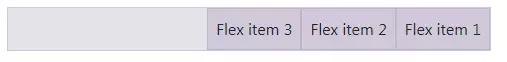
<div class="d-flex flex-row-reverse">
  <div class="p-2">Flex item 1</div>
  <div class="p-2">Flex item 2</div>
  <div class="p-2">Flex item 3</div>
</div>
This will render three elements aligned to the right, with the first element located on the right-most position:
这将使三个元素向右对齐,第一个元素位于最右边的位置:
The order of the elements may be further controlled with the classes like order-N where N is the position’s number:
元素的顺序可以用诸如order-N之类的类进一步控制,其中N是位置的数字:
<div class="d-flex flex-nowrap">
  <div class="order-3 p-2">First flex item</div>
  <div class="order-2 p-2">Second flex item</div>
  <div class="order-1 p-2">Third flex item</div>
</div>
Note that this feature supports responsiveness with the classes like order-sm-1.
请注意,此功能支持诸如order-sm-1之类的响应。
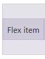
The elements can be also aligned in a specific manner on the X or Y axis. For example:
这些元件也可以排列在X轴或Y轴的特定方式。 例如:
<div class="d-flex align-items-center bd-highlight mb-3">
  <div>Flex item</div>
</div>
This will center the item on the Y axis:
这将使该项在Y轴上居中:
浮动 (Float)
Float is a new utility that replaces good old “pulls”. In Bootstrap 3 you would write:
Float是一种新实用程序,可以代替旧的“拉” 。 在Bootstrap 3中,您将编写:
<div class="pull-left">Pull to the left!</div>In Bootstrap 4:
在Bootstrap 4中:
<div class="float-left">Float to the left!</div>A cool enhancement is that floats have become responsive too, meaning you don’t need to craft your own styles to take care of various breakpoints. For instance, the following element will float to the right only on medium (or larger) screens:
一个很酷的增强是,浮点数也变得响应Swift,这意味着您无需制作自己的样式即可处理各种断点。 例如,以下元素将仅在中等(或更大)屏幕上向右浮动:
<div class="float-md-right"></div>显示 (Display)
The display property has also been fully reworked in Bootstrap 4. It now supports all display values (from none to flex) and is fully responsive. The corresponding classes look like .d-{breakpoint}-{value}:
在Bootstrap 4中, display属性也已被完全改写。它现在支持所有显示值( none到flex ),并且具有完全响应性。 相应的类看起来像.d-{breakpoint}-{value} :
breakpointmay have values ofsm,md,lg, orxl. If this value is skipped, thenxsis used by default, which effectively means the display will have the same value on all viewports.breakpoint可能具有sm,md,lg或xl。 如果跳过此值,则默认情况下使用xs,这实际上意味着显示在所有视口上将具有相同的值。The
{value}is any of those supported by thedisplayproperty.{value}是display属性支持的任何{value}。
This means that you may hide an element for chosen viewports like this:
这意味着您可以为选定的视口隐藏元素,如下所示:
<div class="d-lg-none">Hide on screens wider than lg</div>What’s more, this utility works with print layouts too. For instance, an element may be hidden for printing:
而且,该实用程序也适用于打印布局 。 例如,可以隐藏元素以进行打印:
<div class="d-print-none">Screen Only (Hide on print only)</div>浆纱 (Sizing)
With Bootstrap 4 you may also control the sizing of your elements with ease. Suppose we want to display a div that occupies 25% of the parent’s width:
使用Bootstrap 4,您还可以轻松控制元素的大小 。 假设我们要显示一个占父级宽度25%的div :
<div class="w-25">Width 25%</div>What about the height? That’s possible too:
高度呢? 这也是可能的:
<div class="h-25">Height 25%</div>Want to provide max-height or max-width? Utilize either mh-100 or mw-100 classes. As you see, nothing complex!
是否要提供max-height或max-width ? 使用mh-100或mw-100类。 如您所见,没有什么复杂的!
间距 (Spacing)
The Spacing feature presents a wide range of small but handy utilities that can be used to quickly set margins and paddings for any element. Lazy developers like me will surely love this addition!
间距功能提供了各种小型但方便的实用程序,可用于快速设置任何元素的边距和填充。 像我这样的懒惰开发人员一定会喜欢这个功能!
The corresponding classes look like {property}{sides}-{size}:
相应的类类似于{property}{sides}-{size} :
{property}is eitherm(margin) orp(padding).{property}是m(边距)或p(填充)。{sides}can have values liket(top) orl(left). If it has a blank value, the sizing will be applied to all four sides of the element.{sides}可以具有t(顶部)或l(左侧)之类的值。 如果其值为空白,则将大小调整应用于元素的所有四个侧面。{size}is an integer from0to5, orauto. This integer specifies a multiplier passed to the formula that calculates the resulting sizing($spacer * MULTIPLIER). The default value of$spaceris1 rem. For example1corresponds to the0.25multiplier,2corresponds to the0.5multiplier,3to the value of$spaceralone,4corresponds to the1.5multiplier, and finally5corresponds to the3multiplier.{size}是0到5的整数,或者是auto。 此整数指定传递给公式的乘数,该乘数用于计算所得的大小($spacer * MULTIPLIER)。$spacer的默认值为1 rem。 例如1对应于0.25乘数,2对应于0.5乘数,3对应于$spacer的值,4对应于1.5乘数,最后5对应于3乘数。
The following code means that the element will have left and right margins with the value of 1rem (x means “X axis”):
以下代码表示元素将具有值为1rem左右边距( x表示“ X轴”):
<div class="mx-3"></div>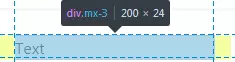
文本 (Text)
Text utilities were available in Bootstrap 3, but in the new version they’ve become even more powerful and convenient.
文本实用程序在Bootstrap 3中可用,但是在新版本中,它们变得更加强大和便捷。
对准 (Alignment)
As before, you can specify the alignment of text and, for example, make it centered:
和以前一样,您可以指定文本的对齐方式 ,例如,使其居中:
<p class="text-center">Text is centered!</p>But, what’s more, these utility classes are also responsive now, which means we can make this text centered only on extra-large viewports:
但是,此外,这些实用程序类现在也可以响应,这意味着我们可以使此文本仅集中在超大视口上:
<p class="text-xl-center">Text is centered only on very large screens!</p>转变 (Transform)
Transform is a new, small feature that may change the text to lowercase, uppercase or capitalize it. For instance:
变换是一个新的小功能,可以将文本更改为小写,大写或大写。 例如:
<p class="text-capitalize">capiTaliZed</p>This will display our text as “CapiTaliZed” (only the first “c” letter is uppercased):
这会将我们的文本显示为“ CapiTaliZed”(只有第一个“ c”字母大写):

字体粗细 (Font Weights)
Changing a font’s weight is now as simple as it can be:
现在,更改字体的粗细变得非常简单:
<p class="font-weight-bold">Bold text.</p>
<p class="font-weight-light">Light weight text.</p>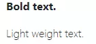
色彩 (Colors)
You can now make your website brighter with a collection of Bootstrap utility classes for color! This feature was already available in the previous version of Bootstrap, but now it provides some new classes and options. For instance, we may now combine the color and background in the following way:
现在,您可以使用一系列用于颜色的Bootstrap实用程序类来使您的网站更加明亮! 该功能在以前的Bootstrap版本中已经可用 ,但是现在它提供了一些新的类和选项。 例如,我们现在可以通过以下方式组合颜色和背景:
<p class="text-danger bg-dark">Text</p>This will display red text on a black background:
这将在黑色背景上显示红色文本:
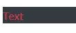
All in all, classes that change the text’s color itself look like text-{color}. Background can be changed with classes like bg-{color}.
总而言之,更改文本颜色本身的类看起来像text-{color} 。 可以使用bg-{color}类的类来更改背景。
There is also support for background gradients, but it must be enabled by explicitly setting the $enable-gradients Sass variable to true.
还支持背景渐变 ,但必须通过将$enable-gradients Sass变量显式设置为true来启用它。
边框 (Borders)
This is a new and quite cool feature of Bootstrap 4 that allows you to quickly style borders of any element (and even each border individually!).
这是Bootstrap 4的一项新功能,非常酷,可让您快速设置任何元素的边框的样式 (甚至单独设置每个边框!)。
For example, the following code will add a grey border for the element:
例如,以下代码将为元素添加灰色边框:
<div class="border"></div>
If, for some reason, you’re interested only in the top border, then write this:
如果由于某种原因,您只对顶部边框感兴趣,请编写以下代码:
<div class="border-top"></div>
The classes look like border-{side}, where side can have the following values:
这些类看起来像border-{side} ,其中side可以具有以下值:
leftleftrightrightbottombottomtoptop- no value (in this case border will be set for all sides) 没有值(在这种情况下,将为所有边设置边框)
We can be even more specific by utilizing so-called subtractive border classes. These classes look pretty much the same as the ones listed above, but must end with a -0 postfix: border-{side}-0. So, if we say:
通过利用所谓的减性边界类,我们可以更加具体。 这些类看起来与上面列出的类几乎相同,但必须以-0后缀结尾: border-{side}-0 。 因此,如果我们说:
<div class="border-top-0"></div>our element will have all borders except for the top one. You can further combine these classes and, for instance, display only the left and bottom borders:
我们的元素将具有除顶部边框以外的所有边框。 您可以进一步组合这些类,例如,仅显示左边界和底边界:
<div class="border-top-0 border-right-0"></div>
Quite neat, huh?
相当整洁,是吗?
全彩! (Color ’Em All!)
What’s more, the border color can also be changed with the help of Bootstrap utility classes. The available colors correspond to the ones listed on the colors page.
此外,还可以在Bootstrap实用程序类的帮助下更改边框颜色 。 可用的颜色与颜色页面上列出的颜色相对应。
So, for instance, we may say the following to make the element’s text appear in red:
因此,例如,我们可以说以下使元素的文本显示为红色:
<div class="border border-danger"></div>
调整半径 (Tweak the Radius)
Lastly, the radius of any element can be modified as well with the help of the following classes:
最后,借助以下类别,还可以修改任何元素的半径 :
roundedroundedrounded-toprounded-toprounded-leftrounded-leftrounded-rightrounded-rightrounded-bottomrounded-bottomrounded-circlerounded-circlerounded-0rounded-0
rounded-circle sets border-radius of an element to 50%, whereas rounded-0 cancels all the rounding. Other classes make the corresponding border slightly rounded by setting the value to 0.25rem:
rounded-circle将元素的border-radius设置为50% ,而rounded-0取消所有舍入。 其他类通过将值设置为0.25rem来使相应的边界稍微变圆:
嵌入 (Embeds)
Embeds is yet another new Bootstrap utility classes feature that might greatly simplify things for you. As the name implies, it allows you to create responsive embeds that have specific ratio scaling on various devices.
Embeds是Bootstrap实用程序类的另一个新功能,可能会大大简化您的工作。 顾名思义,它允许您在各种设备上创建具有特定比例缩放的响应式嵌入。
What does that mean? Suppose you’d like to display a YouTube video on your website. You can do it like this:
那是什么意思? 假设您要在网站上显示YouTube视频。 您可以这样做:
<div class="embed-responsive embed-responsive-16by9">
  <iframe class="embed-responsive-item" src="SOME_URL_HERE"></iframe>
</div>
This will make sure that the video’s ratio is always 16:9 and it will scale properly! There are other ratios available:
这样可以确保视频的比例始终为16:9,并且可以正确缩放! 还有其他比率可用:
embed-responsive-21by9embed-responsive-21by9embed-responsive-16by9embed-responsive-16by9embed-responsive-4by3embed-responsive-4by3embed-responsive-1by1embed-responsive-1by1
关闭图示 (Close Icon)
Last but not the least is this tiny utility that does what it says: displays a close icon. One thing to remember is to specify some text for screen readers in the following way:
最后但并非最不重要的是这个微型实用程序,其功能是:显示关闭图标 。 要记住的一件事是以下列方式为屏幕阅读器指定一些文本:
<button type="button" class="close" aria-label="Close">
<span aria-hidden="true">×</span>
</button>It looks like this:
看起来像这样:

结论 (Conclusion)
In this article, we’ve discussed Bootstrap utility classes that simplify styling of various elements on the web page. We’ve covered utilities like flex, display, border, and seen some examples of their usage. Of course, there’s more to these classes, so be sure to browse the official documentation, where you’ll find even more useful examples.
在本文中,我们讨论了Bootstrap实用程序类,这些类简化了网页上各种元素的样式。 我们介绍了flex,display,border等实用程序,并查看了一些用法示例。 当然,这些类还有更多内容,因此请确保浏览官方文档 ,您会在其中找到更多有用的示例。
Do you like the new features of Bootstrap 4? Are there any specific Bootstrap utility classes that you’ve found particularly useful or interesting? Share your opinion in the comments, and don’t hesitate to post your questions as well!
您是否喜欢Bootstrap 4的新功能? 您是否发现任何特定的Bootstrap实用程序类特别有用或有趣? 在评论中分享您的观点,不要犹豫,也发表您的问题!
If you’ve heard about Bootstrap but have been putting off learning it because it seems too complicated, then play through our Introduction to Bootstrap 4 course for a quick and fun introduction to the power of Bootstrap.
如果您听说过Bootstrap但由于似乎过于复杂而推迟学习它,请浏览我们的Bootstrap 4入门课程,快速而有趣地介绍Bootstrap的功能。
bootstrap实用例子


 扫一扫
扫一扫
 86
86

 被折叠的 条评论
为什么被折叠?
被折叠的 条评论
为什么被折叠?
 到【灌水乐园】发言


