


The first stable release of Bootstrap 4 is here. And it’s pretty cool. This article looks at some of its best features.
Bootstrap 4的第一个稳定版本在这里。 而且非常酷。 本文着眼于它的一些最佳功能。
It was on 19th August, 2015, that Bootstrap 4 alpha was finally out. This was after months of anticipation, anxious tweets asking for the disclosure of a release date, and a few scattered scraps of news by Mark Otto and Jacob Thornton, having the effect of intensifying rather than quenching our curiosity. More than two years later, the wait for the first stable release is finally over.
在2015年8月19日, Bootstrap 4 alpha终于发布了。 这是在数月的预期之后,急切的推特要求披露发布日期,以及马克·奥托和雅各布·桑顿的一些零星新闻 ,增强了而不是消除了我们的好奇心。 两年多之后,等待第一个稳定版本的等待终于结束了。
As a designer, I love crafting my own CSS. However, I confess that I find Bootstrap a well thought out and strongly supported front-end framework that I’ve immensely enjoyed using — both for building my projects and for learning more about writing better, modular CSS.
作为设计师,我喜欢制作自己CSS。 但是,我承认,我发现Bootstrap是一个经过深思熟虑并且得到了我非常喜欢的前端框架的大力支持-用于构建项目和学习有关编写更好的模块化CSS的更多知识。
As soon as news of the latest release was out, I downloaded the source files for Bootstrap 4 and spent some time going back and forth between reading the docs and digging into the code to find out more.
最新版本的消息一出,我就下载了Bootstrap 4的源文件,并花了一些时间在阅读文档和深入研究代码之间来回查找。
Here are the latest Bootstrap features I like the most. I hope you find them awesome too!
这是我最喜欢的最新Bootstrap功能。 希望您也觉得它们很棒!
#1新的交互式文档 (#1 New Interactive Documentation)
The Bootstrap documentation has been exemplary since the framework’s early days. It’s always had the crucial role of being a living document — that is, a tool in sync with the collaborative effort of building the framework and communicating it to others:
自框架成立以来,Bootstrap文档一直是模范。 它始终是成为活动文档的关键角色-也就是说,该工具与构建框架并将其与他人进行沟通的协作工作同步:
Abstracting and documenting components became part of our process for building this one tool and Bootstrap in tandem. — Mark Otto in 2012
抽象和记录组件已成为我们串联构建此工具和Bootstrap的过程的一部分。 — 2012年, 马克·奥托 ( Mark Otto)
Mark himself is quite a fan of great documentation. His Code Guide by @mdo is evidence of his attitude that high-quality documentation is part and parcel of writing high-quality code.
马克本人非常喜欢大量的文档。 @mdo的《代码指南》证明了他的态度,即高质量文档是编写高质量代码的一部分。
The documentation for version 4 has been rewritten from scratch using Markdown, and its appearance has been revamped with a new layout, color palette, and the use of system fonts.
版本4的文档已使用Markdown从头开始进行了重写,并且其外观已通过新的布局,调色板和系统字体的使用进行了修改。
The Bootstrap docs:
Bootstrap文档:
are a pleasure to navigate, both using the traditional sidebar navigation and the brand new search form
使用传统的侧边栏导航和全新的搜索表单 ,都可以导航
- structure information in a logical manner; content is never overwhelming or confusing 以逻辑方式构造信息; 内容永远不会让人感到困惑或困惑
- include instructions and how-tos covering all areas of the framework, from different ways of installing Bootstrap to using each component and dealing with browser quirks. 包括说明和涵盖框架所有区域的方法,从安装Bootstrap的不同方法到使用每个组件以及处理浏览器怪癖的方法。
Finally, if you’d like to run the Bootstrap docs locally on your computer, follow these instructions.
最后,如果您想在计算机上本地运行Bootstrap文档,请按照以下说明进行操作 。
#2一流的模块化架构 (#2 Top-notch Modular Architecture)
Bootstrap has often been the target of complaints about code bloat, too opinionated CSS styling, and a profuse quantity of components. The good news is that Bootstrap 4 has both simplified and further modularized its structure.
Bootstrap经常成为抱怨代码膨胀,过分审慎CSS样式以及大量组件的目标。 好消息是,Bootstrap 4已简化并进一步模块化了其结构。
To begin with, some components have been eliminated altogether. The Glyphicons icon library is not bundled with the framework any more. Panels, wells, and thumbnails are replaced by the Cards component. Also, all CSS reset/normalize code and basic styling are now dealt with in a single brand new module called Reboot.
首先,已经完全消除了某些组件。 Glyphicons图标库不再与框架捆绑在一起。 面板,Kong和缩略图由“ 卡片”组件代替。 而且,所有CSS重置/规范化代码和基本样式现在都在一个称为Reboot的全新模块中处理。
It’s safe to say that, now more than ever before, using Bootstrap feels like assembling and arranging Lego blocks in different ways. Here are some examples to clarify what I mean.
可以肯定地说,使用Bootstrap的感觉比以往任何时候都要多,就像以不同的方式组装和排列Lego块一样。 这里有一些例子来阐明我的意思。
易于覆盖的变量 (Easy-to-Override Variables)
Bootstrap’s Sass variables use the !default flag, which makes it easy for you to override their values. Grab a copy of the latest release of Bootstrap source files and open _variables.scss in a code editor. Here are just three of the first variables you’ll come across:
Bootstrap的Sass变量使用!default标志,这使您轻松覆盖它们的值。 获取最新版本的Bootstrap 源文件的副本, _variables.scss在代码编辑器中打开_variables.scss 。 这只是您会遇到的第一个变量中的三个:
$white:    #fff !default;
$gray-100: #f8f9fa !default;
$gray-200: #e9ecef !default;
$gray-300: #dee2e6 !default;
These are color variables, which you can override by simply copying and pasting the variables to your own Sass file, changing the default value, and removing the !default flag. No need to mess with the original Bootstrap source code.
这些是颜色变量,您可以通过简单地将变量复制并粘贴到自己的Sass文件中,更改默认值并删除!default标志来覆盖它们。 无需弄乱原始的Bootstrap源代码。
现成的轻量级版本 (Ready-made, Light-weight Versions)
Besides bootstrap.scss, which includes the entire framework, you’ll also find bootstrap-grid.scss and bootstrap-reboot.scss.
除了包含整个框架的bootstrap.scss之外,您还将找到bootstrap-grid.scss和bootstrap-reboot.scss 。
Each of these files includes only selected portions of Bootstrap. If you don’t need the full-blown framework in your project, this is a great head-start: just compile one of the light-weight options and you’re good to go.
这些文件中的每一个仅包括Bootstrap的选定部分 。 如果您的项目中不需要完整的框架,那么这是一个很好的起点:只需编译其中一个轻量级的选项,就可以了。
Corresponding cut-down compiled packages are available for download from the Bootstrap 4 docs page.
可从Bootstrap 4文档页面下载相应的压缩编译包。
可重复使用的组件 (Reusable Components)
You can skin and modify components by mixing and matching a few classes. For instance, the brand new cards component is a great example of this versatility in action.
您可以通过混合和匹配几个类来设置外观和修改组件。 例如,全新的卡片组件就是这种多功能性的一个很好的例子。
Here’s all the HTML you need for the simplest instance of this component:
这是此组件最简单实例所需的所有HTML:
<div class="card">
  <div class="card-body">
    This is some text within a card body.
  </div>
</div>
This flexible component easily adapts to a variety of content types and layouts. For instance, you can also arrange cards in touching equal width and height columns by wrapping them in a .card-group container:
这种灵活的组件可轻松适应各种内容类型和布局。 例如,您还可以将卡片包装在.card-group容器中,以使其在宽度和高度相等的列中.card-group :
<div class="card-group">
  <div class="card">
    <!-- card code here -->
  </div>
  <div class="card">
    <!-- card code here -->
  </div>
  <div class="card">
    <!-- card code here -->
  </div>
</div>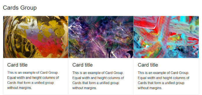
Alternatively, you can group cards having equal width and height columns with margins, using the .card-deck class as follows:
另外,您可以使用.card-deck类将宽度和高度相等的列与边距 .card-deck ,如下所示:
<div class="card-deck">
  <div class="card">
    <!-- card code here -->
  </div>
  <div class="card">
    <!-- card code here -->
  </div>
  <div class="card">
    <!-- card code here -->
  </div>
</div>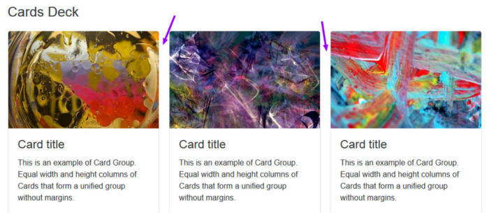
Another cool thing you can do with cards is build a Masonry-like layout. Just wrap the cards in a container with the .card-columns class and leave the rest to Bootstrap:
您可以用卡片做的另一件很酷的事情是构建类似于砌体的布局。 只需将卡片包装在.card-columns类的容器中 ,然后将其余的留给Bootstrap:
<div class="card-columns">
  <div class="card">
    <!-- card code here -->
  </div>
</div>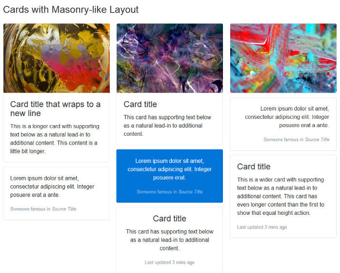
Here I’ve offered only a few examples of Bootstrap’s modular architecture. I think these suffice to show how flexibility and extensibility are built into the framework as a whole, which makes it fun and convenient to use.
在这里,我仅提供了一些Bootstrap模块化体系结构的示例。 我认为这些足以说明如何在整个框架中构建灵活性和可扩展性,从而使其变得有趣且易于使用。
#3轻松缩放整个屏幕尺寸 (#3 Easier Scaling Across Screen Sizes)
Since version 3, Bootstrap has introduced a mobile-first approach to web design. That is, start developing for smaller screens first and progressively add or adjust features as you target larger screens.
从版本3开始,Bootstrap引入了移动设备优先的网页设计方法。 也就是说,首先要针对较小的屏幕进行开发,然后在定位较大的屏幕时逐步添加或调整功能。
Version 4 makes further improvements towards adaptive web design by taking the following steps.
通过采取以下步骤,第4版对自适应Web设计进行了进一步的改进。
基于Flexbox的网格系统的介绍 (The Introduction of a Flexbox-based Grid System)
Bootstrap now uses Flexbox to build its grid system.
Since Flexbox is natively flexible, coding a responsive page layout is going to require fewer classes. For instance, to achieve a layout with three columns side by side on larger screens and stacked on top of each other on small screens, just add the col-sm class to each column div:
由于Flexbox本身具有灵活性 ,因此编写响应式页面布局将需要较少的类。 例如,要实现在大屏幕上并排放置三列并在小屏幕上彼此堆叠的布局,只需将col-sm类添加到每个列div中:
<div class="container">
  <div class="row">
    <div class="col-sm">
      One of three columns
    </div>
    <div class="col-sm">
      One of three columns
    </div>
    <div class="col-sm">
      One of three columns
    </div>
  </div>
</div>
rem (The Move to rem)
Where earlier versions of Bootstrap set px as the absolute unit of measurement, version 4 mostly uses the relative units rem and em. The goal is to have all elements on a web page harmoniously scale with the screen size.
在早期版本的Bootstrap中,将px设置为绝对度量单位,而第4版则主要使用相对单位rem和em 。 目的是使网页上的所有元素与屏幕尺寸保持一致。
For instance, if you dig into _variables.scss, you’ll see that $font-size-base is set to 1rem, which assumes the browser’s default font-size (usually equivalent to 16px). Bootstrap uses this variable’s value to set the font-size for the document’s <body> (see _reboot.scss).
例如,如果您深入研究_variables.scss ,则会看到$font-size-base设置为1rem ,它假定浏览器为默认font-size (通常等效于16px )。 Bootstrap使用此变量的值设置文档<body>的font-size (请参见_reboot.scss)。
This means that it’s easier to build web pages where all elements proportionally scale up or down with the screen size without messing up your design.
这意味着在不干扰设计的情况下,构建所有元素都随屏幕尺寸按比例缩放的网页变得更容易。
特大断点来了 (Here Comes the Extra-large Breakpoint)
The introduction of the new extra large breakpoint for the grid system further helps building layouts that scale well across different screen sizes.
网格系统新的超大断点的引入进一步有助于构建可在不同屏幕尺寸上很好地缩放的布局。
This breakpoint is applied using the .col-xl- class and is triggered on screen sizes from 1200px upwards.
此断点是使用.col-xl-类应用的,并在1200px以上的屏幕尺寸上触发。
全局边距重置和实用程序间隔符类 (Global Margins Reset and Utility Spacer Classes)
Forcing consistent spacing between elements in a design is something most front-end developers, including myself, obsess over. It’s a tricky task and the plethora of screen resolutions available doesn’t make the job easier.
大多数前端开发人员(包括我自己)都在强迫设计中元素之间保持一致的间距。 这是一项棘手的任务,并且可用的屏幕分辨率过多并不能使工作变得容易。
To help keep both vertical and horizontal spacing between elements under tight control, Bootstrap 4 resets margin-top to 0 while keeping a consistent margin-bottom value on all elements.
为了帮助严格控制元素之间的垂直和水平间距,Bootstrap 4将margin-top重置为0同时在所有元素上保持一致的margin-bottom值。
Further, the framework offers an impressive number of utility classes to make it easier for you to adjust margins and paddings at a more granular level across varying screen sizes.
此外,该框架提供了大量实用程序类 ,使您可以更轻松地在不同的屏幕尺寸上更精细地调整边距和填充。
结论 (Conclusion)
I’ve introduced three broad features that in my view make Bootstrap really stand out:
我介绍了三个使Bootstrap真正脱颖而出的主要功能:
- great documentation 出色的文档
- Mega Lego–type architecture 超级乐高式建筑
- easier scaling across devices 跨设备扩展更容易
Did you notice I didn’t mention Bootstrap’s move from Less to Sass? Or the rewrite of all JavaScript plugins in ES6?
您是否注意到我没有提到Bootstrap从Less转变为Sass的举动? 还是重写ES6中的所有JavaScript插件?
I consider these to be more like indications of Bootstrap staying current and taking advantage of the latest tools, rather than features integral to the framework itself. But perhaps you disagree with me.
我认为这些更像是表明Bootstrap保持最新状态并利用最新工具的迹象,而不是框架本身不可或缺的功能。 但是也许您不同意我的看法。
Have you looked into the latest release of Bootstrap? What are your favorite features? Let us know in the comments!
您是否看过最新版的Bootstrap? 您最喜欢的功能是什么? 让我们在评论中知道!
翻译自: https://www.sitepoint.com/bootstrap-super-smart-features-to-win-you-over/


 85
85

 被折叠的 条评论
为什么被折叠?
被折叠的 条评论
为什么被折叠?
 到【灌水乐园】发言


