


vs中css样式转换
( )
In this article, we’ll learn how CSS transforms can be used in the real world to solve various tasks and achieve interesting results. Specifically, you’ll learn how to adjust elements vertically, create nice-looking arrows, build loading animations and create flip animations.
在本文中,我们将学习如何在现实世界中使用CSS转换来解决各种任务并获得有趣的结果。 具体来说,您将学习如何垂直调整元素,创建漂亮的箭头,构建加载动画以及创建翻转动画。
Transformations of HTML elements became a CSS3 standard in 2012 and were available in some browsers before then. Transformations allow you to transform elements on a web page — as explained in our 101 article on CSS transforms. You can rotate, scale, or skew your elements easily with just one line of code, which was difficult before. Both 2D and 3D transformations are available.
HTML元素的转换在2012年成为CSS3标准,此后才在某些浏览器中可用。 转换允许您转换网页上的元素-如我们在CSS转换方面的101条文章中所述 。 您仅需一行代码即可轻松旋转,缩放或倾斜元素,这在以前是很难的。 2D和3D转换都可用。
As for browser support, 2D transforms are supported by all major browsers — including Internet Explorer, which has had support since version 9. As for 3D transformations, IE has only partial support since version 10.
至于浏览器支持, 所有主要浏览器都支持 2D转换-包括Internet Explorer(自版本9开始提供支持)。对于3D转换,IE自10版以来仅部分支持 。
This article won’t focus on the basics of transformations. If you don’t feel very confident with transformations, I recommend reading about 2D and 3D transforms first.
本文将不专注于转换的基础。 如果您对转换不太满意,建议您先阅读2D和3D转换 。
垂直对齐的孩子 (Vertically Aligning Children)
Any web designer knows how tedious it can be to vertically align elements. This task may sound very simple to a person who’s not familiar with CSS, but in reality there’s a jumble of techniques that are carefully preserved between generations of developers. Some suggest using display: inline with vertical-align: middle, some vote for display: table and accompanying styles, whereas true old school coders are still designing their sites with tables (just joking, don’t do that!). Also, it’s possible to solve this task with Flexbox or Grids, but for smaller components, transforms may be a simpler option.
任何网页设计师都知道垂直对齐元素是多么乏味。 对于不熟悉CSS的人来说,这项任务听起来很简单,但实际上,世世代代之间精心保留了许多技术。 有些人建议使用display: inline with vertical-align: middle ,有些人赞成display: table和伴随的样式,而真正的老派编码人员仍在用表设计站点(只是在开玩笑,不要那样做)。 同样,可以使用Flexbox或Grids解决此任务,但是对于较小的组件,变换可能是一个更简单的选择。
Vertical alignment can be more complex when element heights are variable. However, CSS transformations provide one way to solve the problem. Let’s see a very simple example with two nested divs:
当元素高度可变时,垂直对齐会更加复杂。 但是,CSS转换提供了一种解决问题的方法。 让我们看一个带有两个嵌套div的非常简单的示例:
<div class="parent">
  <div class="child">
    Lorem ipsum dolor sit amet, consectetur adipiscing elit, sed do eiusmod tempor incididunt ut labore et dolore magna aliqua. Ut enim ad minim veniam, quis nostrud exercitation ullamco laboris nisi ut aliquip ex ea commodo consequat. Duis aute irure dolor in reprehenderit in voluptate velit esse cillum dolore
  </div>
</div>

<div class="parent">
  <div class="child">
    Lorem ipsum dolor sit amet, consectetur adipiscing elit, sed do eiusmod tempor incididunt ut labore et dolore magna aliqua. Ut enim ad minim veniam
  </div>
</div>
Nothing complex: just two nested blocks with a Lorem Ipsum text of different length.
没什么复杂的:只有两个嵌套块,它们具有不同长度的Lorem Ipsum文本 。
Let’s set width, height, and border for the parent, as well as some spacing to make it look nicer:
让我们为父级设置宽度,高度和边框,并设置一些间距使其看起来更好:
.parent {
  height: 300px;
  width: 600px;
  padding: 0 1em;
  margin: 1em;
  border: 1px solid red;
}
Also, enlarge the children font size a bit:
另外,稍微扩大子字体的大小:
.child {
font-size: 1.2rem;
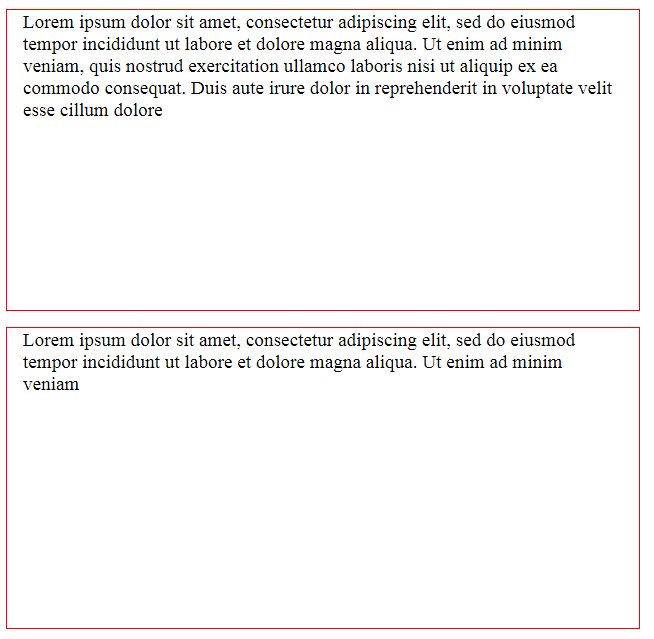
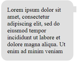
}As a result, you’ll see something like this:
结果,您将看到以下内容:
And now your customer says: “Please align the text vertically so that it appears in the middle of these red boxes”. Nooo!. But fear not: we’re armed with transformations! The first step is to position our children relatively and move them 50% to the bottom:
现在您的客户说:“请垂直对齐文本,使其出现在这些红色框的中间”。 不! 。 但是请不要担心:我们已经有了变革! 第一步是相对地定位我们的孩子,并将他们的位置降低50%:
.child {
  font-size: 1.2rem;
  position: relative;
  top: 50%;
}
After that, apply a secret ingredient — the translateY function — which will reposition the elements vertically:
之后,应用一个秘密成分translateY函数-它将在垂直方向上重新定位元素:
.child {
font-size: 1.2rem;
position: relative;
top: 50%;
transform: translateY(-50%);
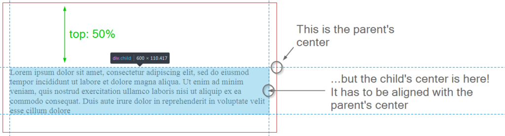
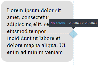
}So, what’s happening here? top: 50% moves the top of the child element to the center of the parent:
那么,这里发生了什么? top: 50%将子元素的顶部移动到父元素的中心:
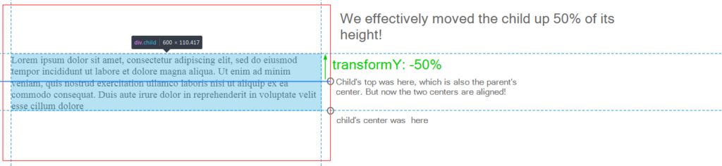
But this is not enough, because we want the child’s center to be aligned with the parent’s center. Therefore, by applying the translateY we move the child up 50% of its height:
但这还不够,因为我们希望孩子的中心与父母的中心对齐。 因此,通过应用translateY我们可以将孩子的身高提高50%:
Some developers have reported that this approach can cause the children to become blurry due to the element being placed on a “half pixel”. A solution for this is to set the perspective of the element:
一些开发人员报告说 ,由于将元素放置在“半像素”上,因此这种方法可能导致子代变得模糊。 一个解决方案是设置元素的角度:
.child {
  // ...
  transform: perspective(1px) translateY(-50%);
}
This is it! Your children are now aligned properly even with variable text, which is really nice. Of course, this solution is a little hacky, but it works in older browsers in contrast to CSS Grid. The final result can be seen on CodePen:
就是这个! 现在,即使使用可变文本,您的孩子也可以正确对齐,这非常好。 当然,此解决方案有点笨拙,但与CSS Grid相比,它在较旧的浏览器中可以工作。 最终结果可以在CodePen上看到:
See the Pen CSS Transforms: Vertical-Align by SitePoint (@SitePoint) on CodePen.
见笔CSS变换:垂直对齐由SitePoint( @SitePoint上) CodePen 。
创建箭头 (Creating Arrows)
Another very interesting use case for transformations is creating speech bubble arrows that scale properly. I mean, you can definitely create arrows with a graphical editor, but that’s a bit tedious, and also they may not scale well if you use a bitmap image.
转换的另一个非常有趣的用例是创建正确缩放的语音气泡箭头。 我的意思是,您绝对可以使用图形编辑器来创建箭头,但这有点乏味,而且如果您使用位图图像,它们可能无法很好地缩放。
Instead, let’s try to stick with a pure CSS solution. Suppose we have a box of text:
相反,让我们尝试使用纯CSS解决方案。 假设我们有一个文本框:
<div class="box">
  <div class="box-content">
    Lorem ipsum dolor sit amet, consectetur adipiscing elit, sed do eiusmod tempor incididunt ut labore et dolore magna aliqua. Ut enim ad minim veniam
  </div>
</div>
It has some generic styling to make it look like a speech bubble:
它具有一些通用的样式,使其看起来像气泡:
html {
  font-size: 16px;
}

.box {
  width: 10rem;
  background-color: #e0e0e0;
  padding: 1rem;
  margin: 1rem;
  border-radius: 1rem;
}
I’m using rem units here so that if the root’s font size is changed, the box is scaled accordingly.
我在这里使用rem单位,以便如果更改根的字体大小,则将相应地缩放框。
Next, I’d like to make this bubble become more “bubble-ish” by displaying an arrow to the right. We’ll achieve that by using a ::before pseudo-selector:
接下来,我想通过向右显示箭头来使此气泡变得更“气泡”。 我们将通过使用:: before伪选择器来实现 :
.box::before {
  content: '';
  width: 1rem;
  height: 1rem;
  background-color: #e0e0e0;
  overflow: hidden;
}
The larger the width and height you assign, the larger the arrow will be.
您分配的宽度和高度越大,箭头将越大。
Now move the arrow to the right:
现在向右移动箭头:
.box {
  // ...
  position: relative;
}

.box::before {
  // ...
  position: absolute;
  right: -0.5rem;
}
Currently, however, this element doesn’t look like an arrow at all:
但是,当前,此元素根本看起来并不像箭头:
Let’s align this small box vertically. As long as its dimensions are static, this is a simple task:
让我们将这个小盒子垂直对齐。 只要它的尺寸是静态的,这就是一个简单的任务:
.box::before {
  // ...
  top: 50%;
}
It is not precisely aligned, but we’ll fix that later.
它没有精确对齐,但是我们稍后会修复。
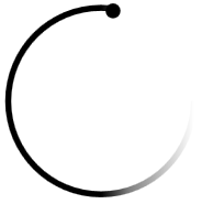
Now it’s time for transformation to step in. All we need to do is rotate this small box to turn it to a triangle, which will look just like an arrow:
现在是进行转换的时候了。我们需要做的就是旋转这个小盒子,将其变成一个三角形,看起来就像箭头:
.box::before {
  // ...
  transform: rotate(45deg);
}
Here’s a screenshot from the developer console (the box is highlighted with blue so you can see how it’s actually positioned):
这是开发人员控制台中的屏幕截图(该框以蓝色突出显示,因此您可以看到其实际位置):
Then, just move the arrow a bit to the top using negative margin so that it’s positioned precisely at the middle of the box:
然后,只需使用负边距将箭头稍微移到顶部,以使其准确定位在框的中间:
.box::before {
  // ...
  margin-top: -0.5rem;
}
That’s it! Now, even if you need to adjust font size on the page, your box and the arrow are going to be scaled properly! Here’s the final result:
而已! 现在,即使您需要调整页面上的字体大小,您的方框和箭头也将正确缩放! 这是最终结果:
See the Pen CSS Transformations: Arrows by SitePoint (@SitePoint) on CodePen.
请参见CodePen上的Pen CSS转换: SitePoint( @SitePoint )的箭头 。
创建一个“跳球”装载机 (Creating a “Jumping Ball” Loader)
Unfortunately, things on the web don’t happen instantly. Users often have to wait for an action to complete, be it sending an email, posting their comment, or uploading photos. Therefore, it’s a good idea to display a “loading” indicator so that users understand they’ll have to wait for a few seconds.
不幸的是,网络上的事情不会立即发生。 用户通常必须等待动作完成,例如发送电子邮件,发表评论或上传照片。 因此,最好显示一个“正在加载”指示器,以便用户理解他们将不得不等待几秒钟。
Previously, when there were no CSS animations and transformations, we would probably use a graphical editor to create an animated GIF loader image. This is no longer necessary because CSS3 offers powerful options. So, let’s see how transformations can be utilized in conjunction with animations to create a nice-looking jumping ball.
以前,当没有CSS动画和转换时,我们可能会使用图形编辑器来创建动画GIF加载程序图像。 因为CSS3提供了强大的选项,所以这不再是必需的。 因此,让我们看看如何将变换与动画结合使用以创建外观漂亮的跳跃球。
To start, create an empty div:
首先,创建一个空的div :
<div class="loader"></div>Balls are usually round (Captain Obvious to the rescue!), so let’s give it width, height, and border radius:
球通常是圆形的(船长对救援来说是显而易见的!),所以我们给它指定宽度,高度和边界半径:
.loader {
  border-radius: 50%;
  width: 50px;
  height: 50px;
}
Let’s also use a CSS background gradient editor to generate some gradient:
我们还使用CSS背景渐变编辑器生成一些渐变:
.loader {
  border-radius: 50%;
  width: 50px;
  height: 50px;
  background: linear-gradient(to bottom, #cb60b3 0%,#c146a1 50%,#a80077 51%,#db36a4 100%);
}
Here’s our shiny purple ball that resembles pokeball:
这是我们类似波克球的闪亮紫色球:

How do we make it jump? Well, with a help of CSS animations! Specifically, I’m going to define an infinite animation called jump that takes 1.5 seconds to complete and performs the listed actions back and forth:
我们如何使其跳跃? 好吧,借助CSS动画 ! 具体来说,我将定义一个名为jump的无限动画,该动画需要1.5秒才能完成并来回执行列出的动作:
.loader {
  // ...
  animation: jump 1.5s ease-out infinite alternate;
}
Next, let’s ask ourselves: what does it mean when we say “to jump”? In the simplest case, it means moving up and down on the Y axis (vertically). So, let’s use the translateY function again and define keyframes:
接下来,让我们问自己:当我们说“跳”时,这意味着什么? 在最简单的情况下,这意味着在Y轴上上下移动(垂直)。 因此,让我们再次使用translateY函数并定义关键帧:
@keyframes jump {
  from {
    transform: translateY(0px)
  }
  to {
    transform: translateY(-50px)
  }
}
So, initially the ball is at coordinates (0,0), but then we move it up to (0,-50). However, currently we might not have enough space for the ball to actually jump, so let’s give it some margin:
因此,最初,球的坐标为(0,0) ,但随后将其向上移动到(0,-50) 。 但是,目前我们可能没有足够的空间来实际跳跃,所以让我们留出一些余地:
.loader {
  margin-top: 50px;
}
Of course, we can do more. For instance, let’s rotate this ball while it jumps:
当然,我们可以做更多。 例如,让我们在跳球时旋转它:
@keyframes jump {
  from {
    transform: translateY(0px) rotate(0deg)
  }
  to {
    transform: translateY(-50px) rotate(360deg)
  }
}
Also, why don’t we make it smaller? For that, let’s utilize a scale function that changes the element’s width and height using the given multipliers:
另外,为什么不缩小尺寸呢? 为此,让我们利用scale函数,使用给定的乘数来更改元素的宽度和高度:
@keyframes jump {
  from {
    transform: translateY(0px) rotate(0deg) scale(1,1);
  }
  to {
    transform: translateY(-50px) rotate(360deg) scale(0.8,0.8);
  }
}
Note, by the way, that all functions should be listed for the transform property in both from and to sections, because otherwise the animation won’t work properly!
请注意,顺便说一下,应该在from和to部分中为transform属性列出所有函数,因为否则动画将无法正常工作!
Lastly, let’s add some opacity for the ball:
最后,让我们为球添加一些不透明度:
@keyframes jump {
  from {
    transform: translateY(0px) rotate(0deg) scale(1,1);
    opacity: 1;
  }
  to {
    transform: translateY(-50px) rotate(360deg) scale(0.8,0.8);
    opacity: 0.8;
  }
}
That’s it! Our loader element is ready, and here’s the final result:
而已! 我们的加载器元素已经准备就绪,这是最终结果:
See the Pen CSS Transformations: Loader Ball by SitePoint (@SitePoint) on CodePen.
见笔CSS转换:装载机球由SitePoint( @SitePoint上) CodePen 。
使用SVG创建“旋转器”加载器 (Creating a “Spinner” Loader with SVG)
We’ve already seen how to create a simple “jumping ball” loader with just a few lines of code. For a more complex effect, however, you can utilize SVGs which are defined with a set of special tags.
我们已经看到了如何仅用几行代码创建一个简单的“跳球”加载器。 但是,要获得更复杂的效果,可以使用通过一组特殊标签定义的SVG。
This article isn’t aimed at explaining how SVG images work and how to create them, but Sitepoint has a couple of articles on the topic.
本文的目的不是解释SVG图像的工作方式以及如何创建它们,但是Sitepoint上有 几篇关于该主题的文章 。
As an example, let’s create a spinner loader. Here’s the corresponding SVG:
例如,让我们创建一个微调加载器。 这是相应的SVG:
<svg class="spinner" viewBox="0 0 66 66" xmlns="https://www.w3.org/2000/svg"> <!-- 1 -->

  <circle class="path spinner-border" cx="33" cy="33" r="31" stroke="url(#gradient)"></circle> <!-- 2 -->

  <linearGradient id="gradient"> <!-- 3 -->
    <stop offset="50%" stop-color="#000" stop-opacity="1"></stop>
    <stop offset="65%" stop-color="#000" stop-opacity=".5"></stop>
    <stop offset="100%" stop-color="#000" stop-opacity="0"></stop>
  </linearGradient>

  <circle class="path spinner-dot" cx="37" cy="3" r="2"></circle> <!-- 4 -->

</svg>
Main things to note here:
这里要注意的主要事情:
- Our canvas has a viewport of 66×66. 我们的画布的视口为66×66。
This defines the actual circle that’s going to spin. Its center is located at
(33,33)and the radius is 31px. We’ll also have a stroke of 2px, which means31 * 2 + 2 * 2 = 66.stroke="url(#gradient)means that the color of the stroke is defined by an element with an ID of#gradient.这定义了要旋转的实际圆。 其中心位于
(33,33),半径为31px。 我们还将有一个2px的笔触,这意味着31 * 2 + 2 * 2 = 66。stroke="url(#gradient)表示笔触的颜色由ID为#gradient的元素定义。- That’s our gradient for the spinner’s stroke. It has three breakpoints that set different opacity values, which is going to result in a pretty cool effect. 这就是旋转器行程的渐变。 它具有三个设置不同不透明度值的断点,这将产生非常酷的效果。
- That’s a dot that’s going to be displayed on the spinner’s stroke. It will look like a small “head”. 那是一个点,将显示在微调器的笔划上。 它看起来像个小“头”。
Now let’s define some styling for the canvas and scale it up to 180×180:
现在让我们为画布定义一些样式,并将其缩放到180×180:
.spinner {
  margin: 10px;
  width: 180px;
  height: 180px;
}
Now the .spinner-border, .spinner-dot, and some common styles for them:
现在, .spinner-border , .spinner-dot和它们的一些常见样式:
.spinner-dot {
  stroke: #000;
  stroke-width: 1;
  fill: #000;
}

.spinner-border {
  fill: transparent;
  stroke-width: 2;
  width: 100%;
  height: 100%;
}

.path {
  stroke-dasharray: 170;
  stroke-dashoffset: 20;
}
Here’s how our spinner looks at this stage. For now it doesn’t spin, of course:
这是我们的微调器在此阶段的外观。 现在,它当然不会旋转:
Now let’s make it spin, which effectively means rotating it by 360 degrees:
现在让它旋转,这实际上意味着将其旋转360度:
.spinner {
  // ...
  animation: rotate 2s linear infinite;
}

@keyframes rotate {
  to {
    transform: rotate(360deg);
  }
}
This is an infinite animation that takes 2 seconds to complete.
这是一个无限的动画,需要2秒钟才能完成。
Also, we can achieve an interesting effect of a “snake trying to bite its tail” with a skew function. Remember that I’ve called that small dot a “head”? Why don’t we pretend that it is a snake’s head then? In order to make it look more realistic, we’ll skew it on the X axis:
此外,我们还可以通过偏斜功能获得“ 蛇试图咬尾巴 ”的有趣效果。 还记得我曾把那个小圆点称为“头”吗? 那我们为什么不假装它是蛇的头呢? 为了使它看起来更逼真,我们将其在X轴上倾斜:
.spinner-dot {
  // ...
  animation: skew 2s linear infinite alternate;
}

@keyframes skew {
  from {
    transform: skewX(10deg)
  }
  to {
    transform: skewX(40deg)
  }
}
Now it seems like the snake is really trying to drag to its tail:
现在看来,这条蛇真的在试图拖尾:
Here’s the final result of our spinner:
这是我们微调器的最终结果:
See the Pen CSS Transformations: Loaders with SVGs by SitePoint (@SitePoint) on CodePen.
请参阅CodePen上的Pen CSS转换:由SitePoint( @SitePoint )提供的SVG加载程序 。
创建翻转动画 (Creating a Flip Animation)
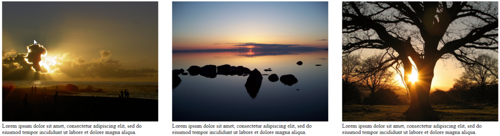
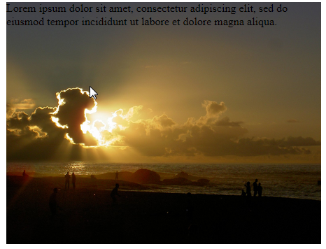
The last example is a photo with a flip animation. When you hover over a photo, it flips and its description is shown. It can be useful for Instagram-like websites.
最后一个示例是带有翻转动画的照片。 将鼠标悬停在照片上时,它将翻转并显示其描述。 它对于类似Instagram网站很有用。
So, first of all, let’s create a layout:
因此,首先,让我们创建一个布局:
<section class="container">

  <figure class="photo">
    <img src="https://images.freeimages.com/images/large-previews/535/natural-wonders-1400924.jpg" class="front side">

    <figcaption class="back side">
      Lorem ipsum dolor sit amet, consectetur adipiscing elit, sed do eiusmod tempor incididunt ut labore et dolore magna aliqua.
    </figcaption>
  </figure>

  <figure class="photo">
    <img src="https://images.freeimages.com/images/large-previews/6d5/lake-at-the-cottage-1372381.jpg" class="front side">

    <figcaption class="back side">
      Lorem ipsum dolor sit amet, consectetur adipiscing elit, sed do eiusmod tempor incididunt ut labore et dolore magna aliqua.
    </figcaption>
  </figure>

  <figure class="photo">
    <img src="https://images.freeimages.com/images/large-previews/a0d/autumn-tree-1382832.jpg" class="front side">

    <figcaption class="back side">
      Lorem ipsum dolor sit amet, consectetur adipiscing elit, sed do eiusmod tempor incididunt ut labore et dolore magna aliqua.
    </figcaption>
  </figure>

</section>
Here we have a container with three photos. These photos are going to actually have two sides: front and back, just like a coin has heads and tails. The front contains the actual image, whereas the back (which is not visible initially) contains the description.
在这里,我们有一个装有三张照片的容器。 这些照片实际上将具有两个侧面:正面和背面,就像硬币的正面和反面一样。 正面包含实际图像,而背面(最初不可见)包含描述。
Style the container by giving it some margin:
通过给容器留一些边距来样式化容器:
.container {
  margin: 10px auto;
}
Each photo adjusts according to the viewport’s width and floats to the left:
每张照片都会根据视口的宽度进行调整,并向左浮动:
.photo {
  width: 22vw;
  height: 20vw;
  min-width: 130px;
  min-height: 100px;
  float: left;
  margin: 0 20px;
}
The images themselves should maintain the aspect ratio and try to fill the parent:
图片本身应保持宽高比并尝试填充父级:
.photo img {
  object-fit: cover;
}
Each side should occupy 100% of the parent’s width and height:
每边应占父母宽度和高度的100%:
.side {
  width: 100%;
  height: 100%;
}
Now we have images with descriptions below which looks pretty generic:
现在我们有下面描述的图像,看起来很普通:
Next, what I’d like to do is place the description right above the image (on the Z axis). For that, let’s adjust some position rules:
接下来,我想做的就是将描述放在图像上方(在Z轴上)。 为此,让我们调整一些position规则:
.photo {
  // ...
  position: relative;
}

.side {
  // ...
  position: absolute;
}
The text is now displayed right over the image:
文本现在显示在图像的正上方:
Now it’s time for some magic. I’d like children of the .photo block to be positioned in 3D with the help of transform-style property. This will allow us to achieve a feeling of perspective:
现在是时候进行一些魔术了。 我希望.photo块的.photo在transform-style属性的帮助下以3D定位。 这将使我们获得一种透视感:
.photo {
  // ...
  transform-style: preserve-3d;
}
The backface should not be visible initially:
背面最初不应该可见:
.side {
  // ...
  backface-visibility: hidden;
}
As for the .back itself, rotate it 180 degrees on the Y axis:
至于.back本身,请将其在Y轴上旋转180度:
.back {
  transform: rotateY(180deg);
  text-align: center;
  background-color: #e0e0e0;
}
This will result in the description being hidden.
这将导致描述被隐藏。
Next, define the hover animation:
接下来,定义悬停动画:
.photo:hover {
  transform: rotateY(180deg);
}
Now when you hover over the container, the .photo will rotate and you’ll be able to see its back with the description. You’ll probably want this to happen more smoothly, so add a simple CSS transition:
现在,当您将鼠标悬停在容器上时, .photo将旋转,您将可以看到其背面及其说明。 您可能希望此过程更顺利,所以添加一个简单CSS过渡:
.photo {
  // ...
  transition: transform 1s ease-in-out;
}
Here’s the final result:
这是最终结果:
See the Pen CSS Transformations: 3D and flip by SitePoint (@SitePoint) on CodePen.
请参阅CodePen上的Pen CSS转换:3D和 SitePoint( @SitePoint )的翻转 。
告诫 (A Word of Caution)
Without any doubts, CSS transformations and animations are very powerful tools that can be used to create interesting and beautiful effects. However, it’s important to be reasonable about their usage and not abuse them. Remember that you’re creating websites for users and not for yourself (in most cases, anyway). Therefore, CSS should be utilized to introduce better user experience, rather than to show all the cool tricks you’ve learned so far.
毫无疑问,CSS转换和动画是非常强大的工具,可用于创建有趣而美丽的效果。 但是,重要的是要合理使用它们,而不要滥用它们。 请记住,您是在为用户而非自己创建网站(在大多数情况下,无论如何)。 因此,应该利用CSS来引入更好的用户体验,而不是展示到目前为止学到的所有绝妙技巧。
For one thing, too many effects on the page distracts the users. Some visitors may have motion sickness or vestibular disorders, so they’ll find it very hard to use a website with fast animations. On top of that, you should make sure that the page works with older browsers, because it may happen that some important element is hidden or inaccessible when the animations don’t work.
一方面,页面上的太多影响分散了用户的注意力。 有些访问者可能有晕车或前庭疾病 ,因此他们很难使用带有快速动画的网站。 最重要的是,您应确保该页面可与旧版浏览器一起使用,因为当动画不起作用时,某些重要元素可能会被隐藏或无法访问。
结论 (Conclusion)
In this article, we have seen how CSS transformations in conjunction with other techniques can be used to solve various design tasks. We’ve seen how to vertically align elements on the page, create scalable arrows, bouncing and spinning loaders, and how to implement flip animation. Of course, you’ve learned only some techniques, but the only limit is your imagination.
在本文中,我们已经了解了CSS转换如何与其他技术一起用于解决各种设计任务。 我们已经看到了如何在页面上垂直对齐元素,创建可缩放的箭头,弹跳和旋转加载程序,以及如何实现翻转动画。 当然,您仅学习了一些技巧,但唯一的限制是您的想象力。
If you have additional questions, don’t hesitate to post them in the comments.
如果您还有其他问题,请随时在评论中发表。
vs中css样式转换


 扫一扫
扫一扫
 411
411

 被折叠的 条评论
为什么被折叠?
被折叠的 条评论
为什么被折叠?
 到【灌水乐园】发言


