


css 层叠上下文
A Block Formatting Context is part of the visual CSS rendering of a web page in which block boxes are laid out. The positioning scheme to which it belongs is normal flow. According to W3C:
块格式设置上下文是网页的可视CSS渲染的一部分,在该页面中布局了块框。 它所属的定位方案是正常流 。 根据W3C :
Floats, absolutely positioned elements, inline-blocks, table-cells, table-captions, and elements with ‘overflow’ other than ‘visible’ (except when that value has been propagated to the viewport) establish new block formatting contexts.
浮点数,绝对定位的元素,内联块,表单元格,表标题以及具有“可见”之外的“溢出”的元素(当该值已传播到视口时除外)会建立新的块格式化上下文。
The above quote pretty much sums up how a block formatting context is formed. But lets redefine it in a way that is easier to understand. A block formatting context is an HTML box that satisfies at least one of the following conditions:
上面的引用几乎总结了如何形成块格式化上下文。 但是,让我们以一种更易于理解的方式重新定义它。 块格式设置上下文是至少满足以下条件之一HTML框:
The value of
floatis notnonefloat的值不为noneThe value of
positionis neitherstaticnorrelativeposition值既不是static也不是relativeThe value of
displayistable-cell,table-caption,inline-block,flex, orinline-flexdisplay的值是table-cell,table-caption,inline-block,flex或inline-flexThe value of
overflowis notvisible.overflow的值不visible。
创建块格式化上下文 (Creating a Block Formatting Context)
A block formatting context can be explicitly triggered. So if we want to create a new block formatting context, we just need to add any one of the above mentioned CSS conditions to it.
可以明确触发块格式化上下文。 因此,如果我们想创建一个新的块格式上下文,我们只需要向其中添加任何上述CSS条件即可。
For example, look at the following HTML:
例如,查看以下HTML:
<div class="container">
  Some Content here
</div>
A new block formatting context can be created by adding any one of the necessary CSS conditions like overflow: scroll, overflow: hidden, display: flex, float: left, or display: table to the container. Though any of the above mentioned conditions can create a block formatting context, there will also be some other effects like:
可以通过在容器中添加以下任何一种CSS条件来创建新的块格式上下文overflow: scroll CSS overflow: scroll , overflow: hidden , display: flex , float: left或display: table 。 尽管上述任何条件都可以创建块格式化上下文,但是还会有其他一些效果,例如:
display: tablemay create problems in responsivenessdisplay: table可能会在响应能力方面造成问题overflow: scrollmay show unwanted scrollbarsoverflow: scroll可能显示不需要的滚动条float: leftwill push the element to the left, with other elements wrapping around itfloat: left将元素float: left推,其他元素环绕overflow: hiddenwill clip elements that overflowoverflow: hidden将剪辑溢出的元素
So whenever we are creating a new block formatting context, we choose the best condition based on our requirements. For uniformity, I have used overflow: hidden in all the examples given in this article.
因此,无论何时创建新的块格式化上下文,我们都会根据需求选择最佳条件。 为了统一起见,我在本文提供的所有示例中都使用了overflow: hidden 。
.container {
  overflow: hidden;
}
You are free to play with declarations other than overflow: hidden.
您可以随意使用除overflow: hidden以外的声明。
块格式上下文中的框对齐 (Alignment of Boxes in a Block Formatting Context)
The W3C spec states:
W3C规范指出:
In a block formatting context, each box’s left outer edge touches the left edge of the containing block (for right-to-left formatting, right edges touch). This is true even in the presence of floats (although a box’s line boxes may shrink due to the floats), unless the box establishes a new block formatting context (in which case the box itself may become narrower due to the floats).
在块格式化上下文中,每个框的左外边缘都与包含块的左边缘相接触(对于从右到左的格式化,右边缘相接触)。 即使存在浮点数也是如此(尽管框的行框可能由于浮点数而缩小),除非框建立了新的块格式化上下文(在这种情况下,框本身可能会由于浮点数而变窄 )。
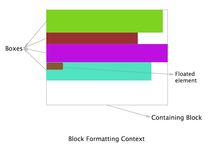
In simpler words, as we can see in the above diagram, all the boxes that belong to a block formatting context are aligned left (for left-to-right formatting) and their left outer edge touches the left edge of the containing block. In the last box we can see that even though there is a floated element (brown) on the left, the other element (green) still touches the left margin of the containing block. The principles about why this happens will be discussed below in the section on text wrapping.
用更简单的话来说,如我们在上图中所看到的,属于块格式上下文的所有框都左对齐(用于从左到右格式),并且它们的左外边缘接触包含块的左边缘。 在最后一个框中,我们可以看到,即使左侧有一个浮动的元素(棕色),另一个元素(绿色)仍然触及包含块的左侧边距。 为何发生这种情况的原理将在下面的文本换行部分中讨论。
块格式上下文会导致边距崩溃 (A Block Formatting Context Causes Collapsing Margins)
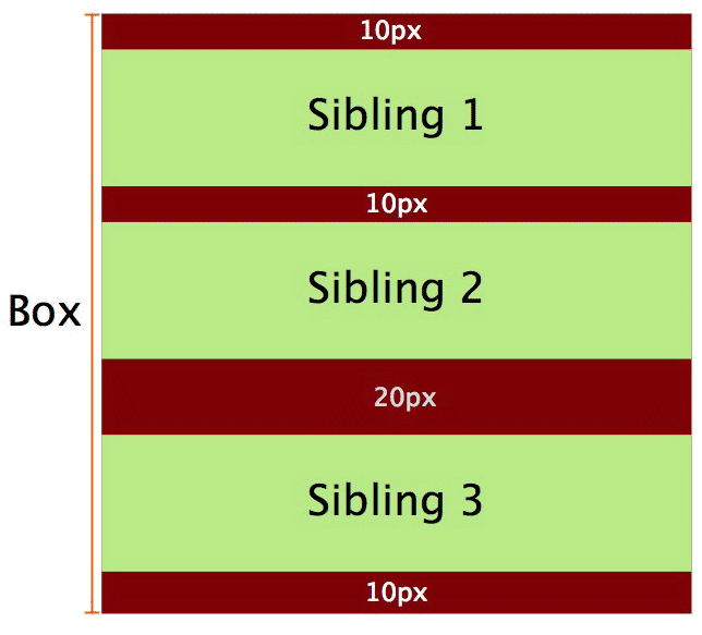
In normal flow, the boxes are laid vertically one after another starting from the top of the containing block. The vertical distance between two sibling boxes is determined by the individual margins of both siblings, but it’s not the sum of the two margins.
在正常流动中,盒子从容纳块的顶部开始一个接一个地垂直放置。 两个兄弟箱之间的垂直距离由两个兄弟的各个边距确定,但不是两个边距的总和。
Lets consider an example, in order to understand this.
为了理解这一点,让我们考虑一个例子。

In the above diagram we consider a block formatting context having been created where the red box (a div) contains the two green siblings (p elements).
在上图中,我们考虑已经创建了块格式化上下文,其中红色框( div )包含两个绿色兄弟姐妹( p元素)。
<div class="container">
  <p>Sibling 1</p>
  <p>Sibling 2</p>
</div>
And the corresponding CSS is:
相应CSS是:
.container {
  background-color: red;
  overflow: hidden; /* creates a block formatting context */
}

p {
  background-color: lightgreen;
  margin: 10px 0;
}
Ideally the margin between the two siblings should have been the sum of the margins of both elements (20px) but it’s actually 10px. This is known as collapsing margins. In a case where the margins of the siblings are different, then the higher margin will prevail.
理想情况下,两个兄弟姐妹之间的边距应为两个元素的边距之和(20像素),但实际上为10像素。 这被称为利润率下降 。 如果兄弟姐妹的边距不同,则以较高的边距为准。
See the Pen OVzrer by SitePoint (@SitePoint) on CodePen.
请参阅CodePen上的SitePoint( @SitePoint )提供的Pen OVzrer 。
使用块格式化上下文防止边距崩溃 (Using a Block Formatting Context to Prevent Margin Collapse)
This may sound a bit confusing at first since we discussed above that block formatting contexts cause margin collapse. But one thing that we must keep in mind is that vertical margins between adjacent block boxes (siblings) collapse only if they are in the same block formatting context. If they belong to different block formatting contexts then the margins between them won’t collapse. So by creating a new block formatting context we can prevent margin collapse.
首先,这听起来可能有点令人困惑,因为我们在上面讨论了块格式化上下文会导致边距崩溃。 但是我们必须记住的一件事是,相邻块框(兄弟姐妹)之间的垂直边距仅在它们处于相同块格式上下文中时才折叠。 如果它们属于不同的块格式上下文,则它们之间的边距不会折叠。 因此,通过创建新的块格式化上下文,我们可以防止边距崩溃。
Lets add a third sibling in the earlier example, so the HTML becomes:
让我们在前面的示例中添加第三个同级,因此HTML变为:
<div class="container">
  <p>Sibling 1</p>
  <p>Sibling 2</p>
  <p>Sibling 3</p>
</div>
With the corresponding CSS being:
对应CSS为:
.container {
  background-color: red;
  overflow: hidden; /* creates a block formatting context */
}

p {
  background-color: lightgreen;
  margin: 10px 0;
}
The result will be same as above, i.e. there will be a collapse and the three siblings will be separated by a vertical distance of 10px. This happens because all three p tags are the part of the same block formatting context.
结果将与上面相同,即将出现崩溃,并且三个同级将以10px的垂直距离分开。 发生这种情况是因为所有三个p标签都是同一块格式上下文的一部分。
Now lets modify the third sibling so that it’s part of a new block formatting context. Then the HTML becomes:
现在,让我们修改第三个兄弟,使其成为新块格式化上下文的一部分。 然后,HTML变为:
<div class="container">
  <p>Sibling 1</p>
  <p>Sibling 2</p>
  <div class="newBFC">
    <p>Sibling 3</p>
  </div>
</div>
And the CSS:
和CSS:
.container {
  background-color: red;
  overflow: hidden; /* creates a block formatting context */
}

p {
  margin: 10px 0;
  background-color: lightgreen;
}

.newBFC {
  overflow: hidden;  /* creates new block formatting context */
}
Now there will be a difference in the output:
现在输出将有所不同:
Since the second and third siblings belong to different formatting contexts, there won’t be any margin collapse between them, as evident in the following demo.
由于第二个和第三个同级兄弟属于不同的格式设置上下文,因此它们之间不会出现任何边距崩溃,如下面的演示所示。
See the Pen XbVOXp by SitePoint (@SitePoint) on CodePen.
请参阅CodePen上的SitePoint( @SitePoint )提供的Pen XbVOXp 。
使用块格式化上下文包含浮点数 (Using a Block Formatting Context to Contain Floats)
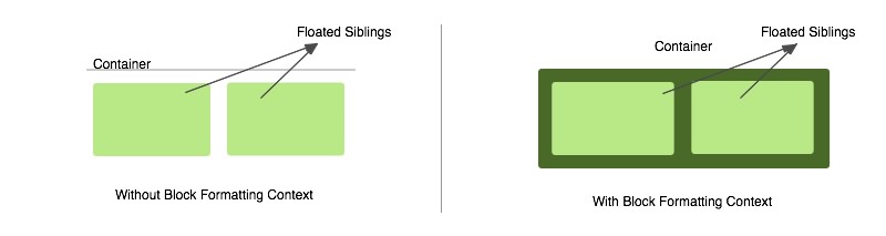
A block formatting context can contain floats. Many times we will encounter a situation where a container has floated elements. In that case the container element has no height and its floated children are outside of the normal flow of the page. We generally use a clear fix to solve this problem, with the most popular method being the use of a “cleared” pseudo-element. But we can also accomplish this by defining a block formatting context.
块格式化上下文可以包含浮点数。 很多时候,我们会遇到容器中有元素浮动的情况。 在这种情况下,容器元素没有高度,并且其浮动子元素不在页面的正常流程范围内。 我们通常使用明确的解决方案来解决此问题,最流行的方法是使用“ 明确的 ”伪元素。 但是我们也可以通过定义块格式化上下文来完成此操作。
Lets look at an example:
让我们看一个例子:
<div class="container">
  <div>Sibling</div>
  <div>Sibling</div>
</div>
With the CSS:
使用CSS:
.container {
  background-color: green;
}

.container div {
  float: left;
  background-color: lightgreen;
  margin: 10px;
}
In the above case the container won’t have any height and it won’t contain the floated children. To solve this problem we establish a new block formatting context inside the container by adding overflow: hidden. The modified CSS becomes:
在上述情况下,容器没有任何高度,也不会包含漂浮的子代。 为了解决这个问题,我们通过添加overflow: hidden在容器内部建立一个新的块格式化上下文。 修改后CSS变为:
.container {
  overflow: hidden; /* creates block formatting context */
  background-color: green;
}

.container div {
  float: left;
  background-color: lightgreen;
  margin: 10px;
}
Now the container will contain the floated siblings and its height will expand to contain its children, with the elements back in the normal flow of the page within this formatting context.
现在,容器将包含浮动的兄弟姐妹,并且容器的高度将扩展为包含其子元素,并且元素在此格式设置上下文内返回页面的常规流中。
See the Pen Floats With and Without a Block Formatting Context by SitePoint (@SitePoint) on CodePen.
请参阅CodePen上的SitePoint ( @SitePoint ) 带有或不带有块格式设置上下文的笔式浮动 控件 。
使用块格式化上下文来防止文本换行 (Using Block Formatting Contexts to Prevent Text Wrapping)
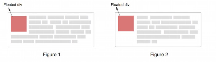
Sometimes the text around a floated div wraps around it (as in Figure 1 in the image below) but in some cases this is not desirable and we want an appearance like in Figure 2. To solve this, we might use margins, but we can also solve this with a block formatting context.
有时,浮动div周围的文本会环绕在文本周围(如下图的图1所示),但是在某些情况下,这是不希望的,我们希望具有如图2所示的外观。要解决此问题,我们可以使用页边距,但是我们可以还可以通过块格式化上下文解决此问题。
First let us understand why the text wraps. For this we have to understand how the box model works when an element is floated. This is the part I left earlier while discussing the alignment in a block formatting context. Let us understand what is happening in Figure 1 in the diagram below:
首先让我们了解为什么文本会自动换行。 为此,我们必须了解浮动元素时盒子模型的工作方式。 这是我之前在块格式化上下文中讨论对齐方式时剩下的部分。 让我们了解下图中的图1中发生的情况:

The HTML for the diagram could be assumed as:
该图HTML可以假定为:
<div class="container">
  <div class="floated">
    Floated div
  </div>
  <p>
    Quae hic ut ab perferendis sit quod architecto,
    dolor debitis quam rem provident aspernatur tempora
    expedita.
  </p>
</div>
The whole black area in the above diagram denotes the p element. As we can see, the p element doesn’t shift but it goes under the floated element. The line boxes of the p element (referring to the lines of text) undergo a shift. Hence the line boxes narrow horizontally to make space for the floated element.
上图中的整个黑色区域表示p元素。 如我们所见, p元素不会移动,但会在float元素下方。 p元素的行框(指文本行)会发生移位。 因此,线框水平变窄以为浮动元素留出空间。
As the text increases, it will eventually wrap under the floated element because the line boxes no longer need to shift and hence a condition like Figure 1 appears. This explains how the paragraphs touch the left edge of the containing box even when a floated element is present and how the line boxes narrow to accommodate the floated element.
随着文本的增加,它最终将包裹在浮动元素下,因为行框不再需要移动,因此出现了如图1所示的情况。 这解释了即使存在浮动元素,段落也如何触及容纳框的左边缘,以及线框如何变窄以容纳浮动元素。
If we are able to shift the entire p element, then this wrapping problem will be solved.
如果我们能够移动整个p元素,那么将解决该包装问题。
Before going to the solution, let us recall again what the W3C spec says:
在开始解决方案之前,让我们再次回顾一下W3C规范所说的内容:
In a block formatting context, each box’s left outer edge touches the left edge of the containing block (for right-to-left formatting, right edges touch). This is true even in the presence of floats (although a box’s line boxes may shrink due to the floats), unless the box establishes a new block formatting context (in which case the box itself may become narrower due to the floats).
在块格式化上下文中,每个框的左外边缘都与包含块的左边缘相接触(对于从右到左的格式化,右边缘相接触)。 即使存在浮点数也是如此(尽管框的行框可能由于浮点数而缩小),除非框建立了新的块格式化上下文(在这种情况下,框本身可能会由于浮点数而变窄 )。
According to this, if the p element establishes a new block formatting context then it will no longer touch the left edge of the container block. This can be achieved by simply adding overflow: hidden to the p element. This way creating a new block formatting context solves the problem of text wrapping around a floated object.
据此,如果p元素建立了新的块格式化上下文,则它将不再接触容器块的左边缘。 这可以通过简单地向p元素添加overflow: hidden来实现。 通过这种方式创建新的块格式设置上下文,解决了围绕浮动对象环绕文本的问题。
See the Pen A Block Formatting Context Preventing Text Wrap by SitePoint (@SitePoint) on CodePen.
请参阅在CodePen上使用Pen Point 阻止文本由SitePoint( @SitePoint ) 换行的块格式化上下文 。
在多列布局中使用块格式上下文 (Using Block Formatting Contexts in Multi-column Layouts)
If we are creating a multi-column layout spanning the full width of the container, the last column will sometimes drop to the next line in some browsers. This might happen because the browser is rounding off the column’s width and the total width becomes more than that of the container. If, however, we establish a new block formatting context in a column of the layout, it will always take the remaining space left after the previous columns have filled.
如果我们要创建跨容器整个宽度的多列布局,则在某些浏览器中,最后一列有时会移至下一行。 发生这种情况是因为浏览器四舍五入了列的宽度,并且总宽度变得大于容器的宽度。 但是,如果我们在布局的一列中建立了新的块格式设置上下文,则它将始终占用前几列之后剩余的剩余空间。
Let’s use an example of a multi-column layout with 3 columns:
让我们使用一个包含3列的多列布局示例:
Here’s the HTML:
这是HTML:
<div class="container">
  <div class="column">column 1</div>
  <div class="column">column 2</div>
  <div class="column">column 3</div>
</div>
And the CSS:
和CSS:
.column {
  width: 31.33%;
  background-color: green;
  float: left;
  margin: 0 1%;
}

/* Establishing a new block formatting
   context in the last column */
.column:last-child {
  float: none;
  overflow: hidden;
}
The result is in the CodePen demo:
结果在CodePen演示中:
See the Pen Using a Block Formatting Context to make a Final Column “fit” by SitePoint (@SitePoint) on CodePen.
请参阅使用Block Formatting上下文的笔在CodePen上由SitePoint( @SitePoint ) 使最后一列“适合” 。
Now even if the width of the container changes slightly, the layout will not break. Of course, this is not necessarily a good option for multi-column layouts, but it is one way to prevent the problem of the final column dropping. Flexbox would likely be a better solution in a case like this, but this should serve to illustrate how elements behave under these circumstances.
现在,即使容器的宽度稍有变化,布局也不会中断。 当然,对于多列布局而言,这不一定是一个好的选择,但这是防止最终列丢失的一种方法。 在这种情况下,Flexbox可能是更好的解决方案,但这应有助于说明在这种情况下元素的行为。
结论 (Conclusion)
I hope this post has shown you the relevance of block formatting contexts and how they affect the visual positioning of elements on a page. The examples showing their use in practical cases should make them a little more clear.
我希望这篇文章向您展示了块格式化上下文的相关性以及它们如何影响页面上元素的视觉位置。 展示它们在实际情况下的用法的示例应该使它们更加清楚。
If you have anything to add, please let us know in the comments. And be sure to review the W3C’s more detailed discussion of the topic if you want to go deeper.
如果您要添加任何内容,请在评论中告知我们。 如果您想更深入,请务必阅读W3C 关于该主题的更详细的讨论 。
翻译自: https://www.sitepoint.com/understanding-block-formatting-contexts-in-css/
css 层叠上下文


 310
310


 被折叠的 条评论
为什么被折叠?
被折叠的 条评论
为什么被折叠?
 到【灌水乐园】发言


