


In this article, we’re going to see CSS Grid in action by creating a responsive multi-column website layout.
在本文中,我们将通过创建一个自适应的多列网站布局来了解CSS Grid的实际应用。
CSS Grid is a new, hot trend in web development these days. Forget about table layouts and floats: a new way to design websites is already here! This technology introduces two-dimensional grids which define multiple areas of layout with a handful of CSS rules.
如今,CSS Grid是Web开发中的新热点。 不用担心表格布局和浮动:设计网站的新方法已经来临! 该技术引入了二维网格,该网格使用少量CSS规则定义了多个布局区域。
Grid can make third-party frameworks such as 960gs or Bootstrap grid redundant, as you may easily do everything yourself! This feature is supported by all major browsers, though Internet Explorer implements an older version of the specification.
网格可以使诸如960gs或Bootstrap网格之类的第三方框架变得多余,因为您自己可以轻松完成所有工作! 尽管Internet Explorer实施了该规范的较旧版本,但所有主流浏览器均支持此功能。
我们将要建立的 (What We’re Going to Build)
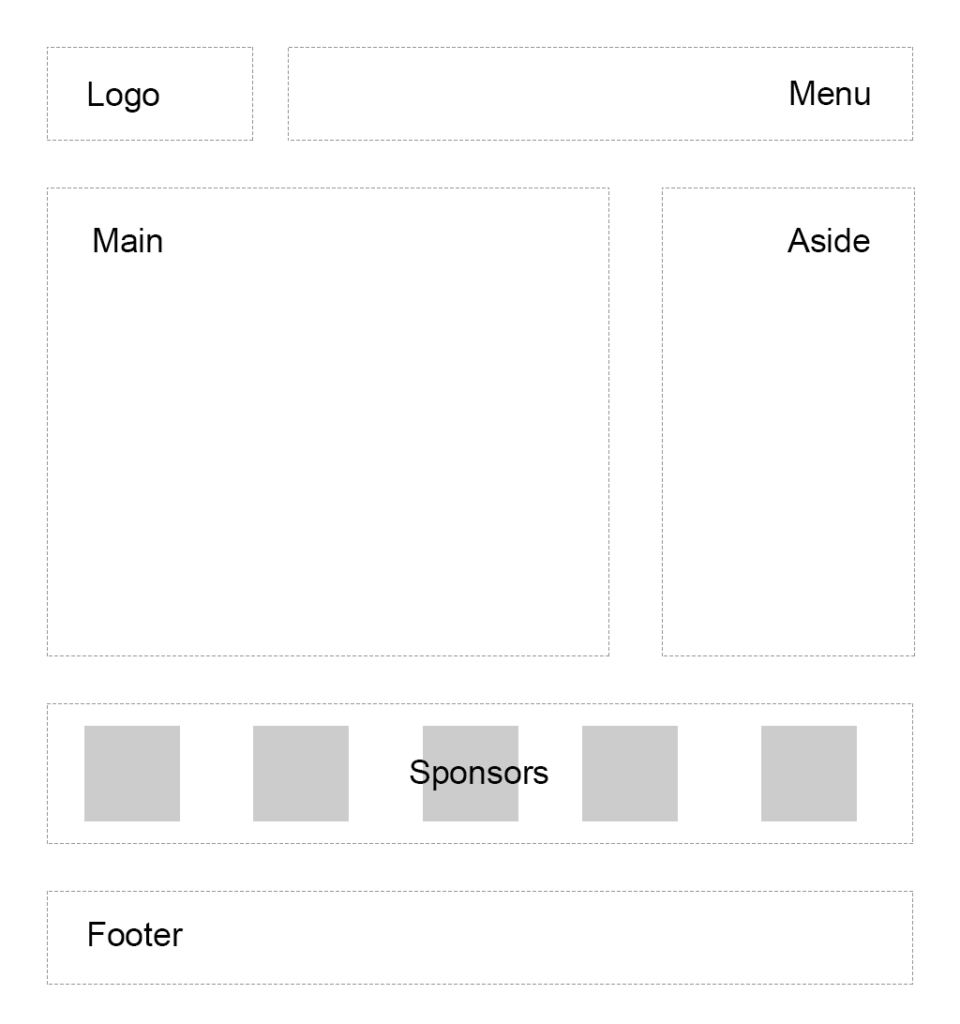
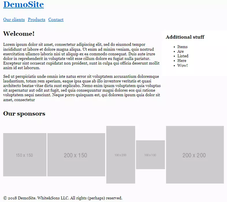
So, we were asked to create a typical website layout with a header, main content area, sidebar to the right, a list of sponsors, and a footer:
因此,我们被要求创建一个典型的网站布局,其中包含标题,主要内容区域,右侧的侧边栏,赞助者列表和页脚:
Another developer has already tried to solve this task and came up with a solution that involves floats, display: table, and some clearfix hacks. We’re going to refer to this existing layout as “initial”:
另一位开发人员已经尝试解决此任务,并提出了一个涉及浮点数, display: table和一些clearfix hack的解决方案。 我们将这种现有布局称为“初始”:
See the Pen SP: Multi-Column Layout With Floats by SitePoint (@SitePoint) on CodePen.
见笔SP:多列布局使用浮标由SitePoint( @SitePoint上) CodePen 。
Until recently, floats were considered to be the best option to create such layouts. Prior to that, we had to utilize HTML tables, but they had a number of downsides. Specifically, such table layout is very rigid, requiring lots of tags (table, tr, td, th etc), and semantically these tags are used to present table data, not to design layouts.
直到最近,浮动元素仍被认为是创建此类布局的最佳选择。 在此之前,我们不得不利用HTML表,但是它们有很多缺点。 具体而言,这种表布局非常严格,需要大量标签( table , tr , td , th等),并且从语义上讲,这些标签用于呈现表数据,而不是用于设计布局。
But CSS continues to evolve, and now we have CSS Grid. Conceptually, it’s similar to an old table layout but can use semantic HTML elements with a more flexible layout.
但是CSS仍在不断发展,现在我们有了CSS Grid。 从概念上讲,它类似于旧表的布局,但可以使用语义HTML元素,布局更灵活。
规划网格 (Planning the Grid)
First things first: we need to define a basic HTML structure for our document. Before that, let’s briefly talk about how the initial example works. It has the following main blocks:
首先,我们需要为文档定义基本HTML结构。 在此之前,让我们简要地谈谈初始示例的工作方式。 它具有以下主要功能块:
.containeris the global wrapper that has small margins to the left and to the right..container是全局包装,其左右两侧的边距很小。.main-headeris the header that contains the.logo(occupying 20% of the space, floating to the left) and the.main-menu(occupying 79% of the space, floating to the right). The header is also assigned a hacky fix to clear the floats..main-header是包含.logo(占据20%的空间,向左浮动)和.main-menu(占据79%的空间,向右浮动)的.main-menu。 标头还被分配了一个hacky修复程序来清除浮点数。.content-area-wrapperwraps the main.content-area(occupying 66.6% of the space minus1remreserved for margin, floating to the left) and the.sidebar(occupying 33.3% of the space, floating to the right). The wrapper itself is also assigned with a clearfix..content-area-wrapper包裹主要的.content-area(占空间的66.6%减去保留给边缘的1rem,向左浮动)和.sidebar(占空间的33.3%,向右浮动)。 包装器本身也分配有clearfix。.sponsors-wrappercontains the logos of the sponsors. Inside, there’s a.sponsorssection with thedisplayproperty set totable. Each sponsor, in turn, is displayed as a table cell..sponsors-wrapper包含赞助商的徽标。 在内部,有一个.sponsors部分,其display属性设置为table。 每个赞助商依次显示为表格单元格。.footeris our footer and spans to 100% of the space..footer是我们的页脚,占地100%。
Our new layout will be very similar to the initial one, but with one exception: we won’t add the .main-header and .content-area-wrapper wrappers because the clearfixes won’t be required anymore. Here is the new version of the HTML:
我们的新布局与初始布局非常相似,但是有一个例外:我们不会添加.main-header和.content-area-wrapper器,因为不再需要clearfix。 这是HTML的新版本:
<div class="container">
<header class="logo">
<h1><a href="#">DemoSite</a></h1>
</header>
<nav class="main-menu">
<ul>
<li class="main-menu__item"><a href="#">Our clients</a></li>
<li class="main-menu__item"><a href="#">Products</a></li>
<li class="main-menu__item"><a href="#">Contact</a></li>
</ul>
</nav>
<main class="content-area">
<h2>Welcome!</h2>
<p>
Content
</p>
</main>
<aside class="sidebar">
<h3>Additional stuff</h3>
<ul>
<li>Items</li>
<li>Are</li>
<li>Listed</li>
<li>Here</li>
<li>Wow!</li>
</ul>
</aside>
<section class="sponsors-wrapper">
<h2>Our sponsors</h2>
<section class="sponsors">
<figure class="sponsor">
<img src="https://via.placeholder.com/150x150">
</figure>
<figure class="sponsor">
<img src="https://via.placeholder.com/200x150">
</figure>
<figure class="sponsor">
<img src="https://via.placeholder.com/100x200">
</figure>
<figure class="sponsor">
<img src="https://via.placeholder.com/100x100">
</figure>
<figure class="sponsor">
<img src="https://via.placeholder.com/200x200">
</figure>
</section>
</section>
<footer class="footer">
<p>
© 2018 DemoSite. White&Sons LLC. All rights (perhaps) reserved.
</p>
</footer>
</div>Note that you may utilize the body as the global .container; that’s just a matter of preference in this case. All in all, we have six main areas:
注意,您可以将body用作全局.container ; 在这种情况下,这只是一个偏好问题。 总而言之,我们有六个主要领域:
- Logo 商标
- Menu 菜单
- Main content 主要内容
- Sidebar 侧边栏
- Sponsors 赞助商
- Footer 页脚
Usually it’s recommended that you implement a mobile-first approach. That is, you start from the mobile layout and then add styles for larger screens. This isn’t necessary in this case, since we’re adapting an initial layout that already falls back to a linearized view on small-screen devices. Therefore, let’s start by focusing on the grid’s implementation, and after that talk about responsiveness and fallback rules. So, return to our scheme and see how the grid columns can be arranged:
通常,建议您实施移动优先方法。 也就是说,您从移动版式开始,然后为更大的屏幕添加样式。 在这种情况下,这是没有必要的,因为我们正在调整的初始布局已经退回到小屏幕设备上的线性视图。 因此,让我们从关注网格的实现开始,然后再讨论响应性和回退规则。 因此,返回我们的方案,看看如何排列网格列:
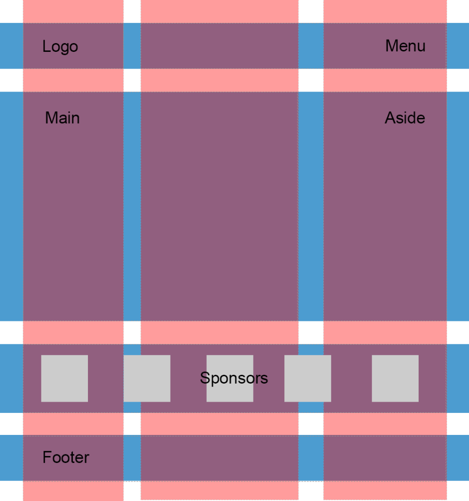
So, I propose having three columns (highlighted in red) and four rows (highlighted in blue). Some areas, like the logo, are going to occupy only one column, whereas others, like main content, are going to span multiple columns. Later we can easily modify the layout, move the areas around, or add new ones.
因此,我建议使用三列(以红色突出显示)和四行(以蓝色突出显示)。 有些区域(例如徽标)将仅占据一列,而其他区域(例如主要内容)将跨越多列。 稍后,我们可以轻松地修改布局,移动区域或添加新区域。
Following the scheme, give each area a unique name. These will be used in the layout defined below:
按照方案,给每个区域一个唯一的名称。 这些将在以下定义的布局中使用:
.logo {
  grid-area: logo;
}

.main-menu {
  grid-area: menu;
}

.content-area {
  grid-area: content;
}

.sidebar {
  grid-area: sidebar;
}

.sponsors-wrapper {
  grid-area: sponsors;
}

.footer {
  grid-area: footer;
}
Now set the display property to grid, define three columns and add small margins to the left and right of the main container:
现在将display属性设置为grid ,定义三列,并在主容器的左侧和右侧添加少量边距:
.container {
  display: grid;
  margin: 0 2rem;
  grid-template-columns: 2fr 6fr 4fr;
}
display: grid defines a grid container and sets a special formatting context for its children. fr is a special unit that means “fraction of the free space of the grid container”. 2 + 6 + 4 gives us 12, and 6 / 12 = 0.5. It means that the middle column is going to occupy 50% of the free space.
display: grid定义一个网格容器,并为其子级设置特殊的格式设置上下文。 fr是一个特殊单位,表示“网格容器的自由空间的一部分”。 2 + 6 + 4给我们12 ,而6 / 12 = 0.5 。 这意味着中间列将占据50%的可用空间。
I would also like to add some spacing between the rows and columns:
我还想在行和列之间添加一些间距:
.container {
  // ...
  grid-gap: 2rem 1rem;
}
Having done this, we can work with individual areas. But before wrapping up this section, let’s quickly add some common styles:
完成此操作后,我们可以处理各个区域。 但是在结束本节之前,让我们快速添加一些常见样式:
* {
  box-sizing: border-box;
}

html {
  font-size: 16px;
  font-family: Georgia, serif;
}

body {
  background-color: #fbfbfb;
}

h1, h2, h3 {
  margin-top: 0;
}

header h1 {
  margin: 0;
}

main p {
  margin-bottom: 0;
}
Good! Now we can proceed to the first target, which is going to be the header.
好! 现在我们可以进入第一个目标,它将是标题。
设计标题 (Designing the Header)
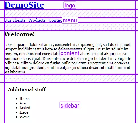
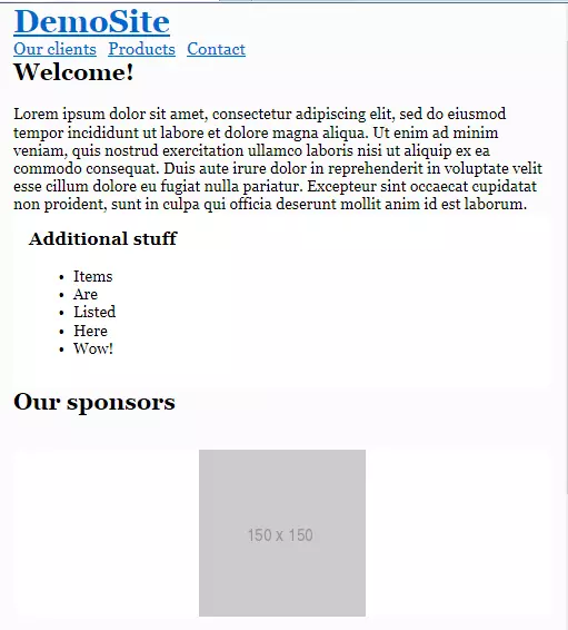
Our header occupies the first row that should have a specific height set to 3rem. In the initial layout this is solved by assigning the height property for the header wrapper:
我们的标题位于第一行,应将特定高度设置为3rem 。 在初始布局中,这可以通过为标题包装器分配height属性来解决:
.main-header {
  height: 3rem;
}
Also note that the logo and the menu are vertically aligned to the middle, which is achieved using the line-height trick:
另请注意,徽标和菜单与中间垂直对齐,这是通过使用line-height技巧实现的:
.logo {
  // ...
  height: 100%;
  line-height: 3rem;
}
With CSS Grid, however, things are going to be simpler: we won’t require any CSS hacks.
但是,有了CSS Grid,事情将会变得更加简单:我们不需要任何CSS hack。
Start by defining the first row:
首先定义第一行:
.container {
  // ...
  grid-template-rows: 3rem;
}
Our logo should occupy only one column, whereas the menu should span two columns. We can express our intent with the help of the grid-template-areas property, which references the grid-area names assigned above:
我们的徽标仅应占据一列,而菜单应跨越两列。 我们可以借助grid-template-areas属性表达我们的意图,该属性引用上面分配的grid-area名称:
.container {
  // ...
  grid-template-areas:
    "logo menu menu";
}
What’s going on here? Well, by saying logo only once, we’re making sure that it occupies only one — the left-most column. menu menu means that the menu occupies two columns: the middle and the right-most one. See how straightforward this rule is!
这里发生了什么? 好吧,只说一次logo ,就可以确保它只占据一个-最左侧的一列。 menu menu表示菜单占据两列:中间一列和最右边一列。 看看这个规则有多简单!
Now align the logo on the Y axis:
现在将徽标沿Y轴对齐:
.logo {
  grid-area: logo;
  align-self: center;
}
The menu should be centered vertically and pulled to the right:
菜单应垂直居中并向右拉:
.main-menu {
  grid-area: menu;
  align-self: center;
  justify-self: end;
}
Our menu is built with the ul and li tags, so let’s also style them a bit by removing markers, nullifying margins/paddings, and setting the menu to a flex container:
我们的菜单是使用ul和li标签构建的,因此,我们还可以通过删除标记,取消空白/边距以及将菜单设置为flex容器来对它们进行一些样式设置:
.main-menu ul {
margin: 0;
padding: 0;
display: flex;
}
.main-menu__item {
list-style-type: none;
padding: 0;
font-size: 1.1rem;
margin-right: 0.5rem;
}
.main-menu .main-menu__item:last-of-type {
margin-right: 0;
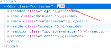
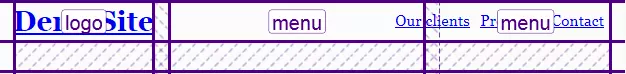
}That’s pretty much it. To observe the result, I’m going to use Firefox with a handy CSS Grid highlighter tool enabled. (There are similar tools for other browsers available: for instance, Gridman for Chrome.) To gain access to this tool, press F12 and select the .container element, which should have a grid label:
就是这样。 为了观察结果,我将使用启用了方便CSS Grid荧光笔工具的Firefox。 (对于其他浏览器,也有类似的工具可用:例如Gridman for Chrome。)要访问此工具,请按F12并选择.container元素,该元素应具有grid标签:
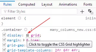
After that, proceed to the CSS rules tab, and find the display: grid property. By pressing on the small icon next to the grid value, you can enable or disable the highlighter:
之后,转到CSS规则标签,然后找到display: grid属性。 通过按grid值旁边的小图标,可以启用或禁用荧光笔:
Here is the result:
结果如下:
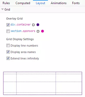
The highlighter displays all your rows and columns, as well as the margins between them and the areas’ names. You can customize the output inside the Layout section, which also lists all the grids on the page:
荧光笔显示所有行和列,以及它们与区域名称之间的边距。 您可以在“布局”部分中自定义输出,该部分还列出了页面上的所有网格:
So, we’ve dealt with the header, so let’s proceed to the main content area and the sidebar.
因此,我们已经处理了标题,因此让我们进入主要内容区域和侧边栏。
主要内容和侧边栏 (Main Content and Sidebar)
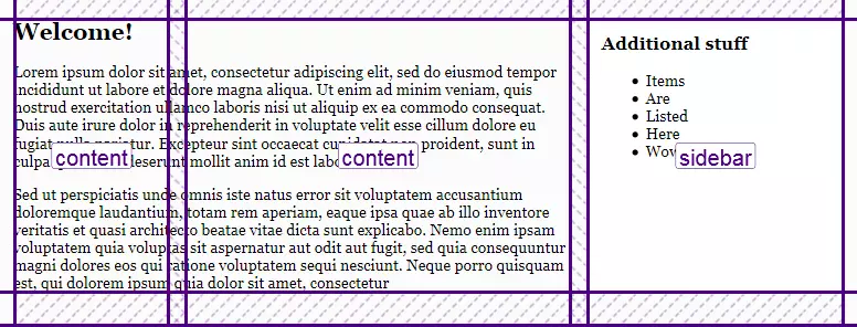
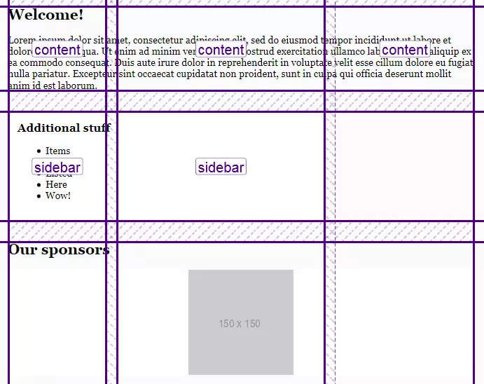
Our main content area should span two columns, whereas the sidebar should occupy only one. As for the row, I’d like its height to be set automatically. We can update the .container grid accordingly:
我们的主要内容区域应跨越两列,而侧边栏应仅占据一列。 至于行,我希望它的高度可以自动设置。 我们可以相应地更新.container网格:
.container {
  //  ...
  grid-template-rows: 3rem auto;
  grid-template-areas:
          "logo menu menu"
          "content content sidebar";
}
I’d like to add some padding for the sidebar to give it some more visual space:
我想为侧边栏添加一些填充以使其具有更多的可视空间:
.sidebar {
  grid-area: sidebar;
  padding: 1rem;
}
Here’s the result, as viewed in Firefox’s Grid tool:
这是在Firefox的Grid工具中查看的结果:
赞助商 (Sponsors)
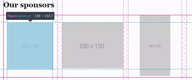
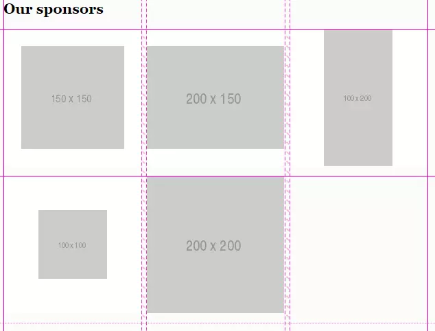
The sponsors section should contain five items with equal widths and heights. Each item, in turn, will have one image.
赞助者部分应包含五个宽度和高度相等的项目。 每个项目依次具有一个图像。
In the initial layout, this block is styled with display: table, but we won’t rely on it. Actually, the sponsors section may be a great candidate for applying CSS grid as well!
在初始布局中,此块的样式为display: table ,但我们不会依赖它。 实际上,发起人部分也可能是应用CSS网格的理想人选!
First of all, tweak the grid-template-areas to include the sponsors area:
首先,调整grid-template-areas以包括sponsors区域:
.container {
  // ...
  grid-template-areas:
          "logo menu menu"
          "content content sidebar"
          "sponsors sponsors sponsors"
}
Now turn the .sponsors section into a grid as well:
现在也将.sponsors部分也变成网格:
.sponsors {
  display: grid;
}
As long as we need five items with equal widths, a repeat function can be utilized to define the columns:
只要我们需要五个宽度相等的项目,就可以使用repeat函数来定义列:
.sponsors {
  display: grid;
  grid-template-columns: repeat(5, 1fr);
}
As for the row, its height should be set automatically. The gap between the columns should be equal to 1rem:
至于行,其高度应自动设置。 列之间的间隔应等于1rem :
.sponsors {
  display: grid;
  grid-template-columns: repeat(5, 1fr);
  grid-template-rows: auto;
  grid-column-gap: 1rem;
}
Style each item:
设置每个项目的样式:
.sponsor {
  margin-left: 0;
  margin-right: 0;
  background-color: #fff;
  border-radius: 0.625rem;
}
Here’s the intermediate result:
这是中间结果:
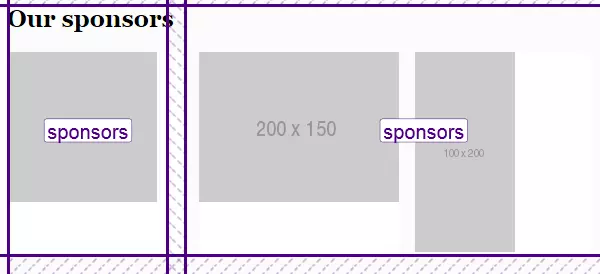
This example illustrates that you can nest grids without any problems. Another solution might be using Flexbox, but in this case the sponsors may wrap if there’s not enough width for them.
此示例说明您可以嵌套网格而没有任何问题。 另一个解决方案可能是使用Flexbox,但在这种情况下,如果赞助商没有足够的宽度,则可以包装赞助商。
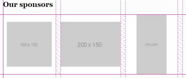
Now I would like to center the images both vertically and horizontally. We might try doing the following:
现在,我想将图像垂直和水平居中。 我们可以尝试执行以下操作:
.sponsor {
  place-self: center;
}
place-self aligns the element on the X and Y axes. It’s a shorthand property to align-self and justify-self.
place-self将元素在X和Y轴上对齐。 align-self justify-self是一种简写属性。
The images will indeed be aligned, but unfortunately the white background is gone. This is because each .sponsor now has width and height equal to the image’s dimensions:
图像确实会对齐,但是不幸的是白色背景消失了。 这是因为现在每个.sponsor宽度和高度都等于图像的尺寸:
It means that we need a different approach here, and one of the possible solutions is to employ Flexbox:
这意味着我们在这里需要一种不同的方法,一种可能的解决方案是采用Flexbox:
.sponsor {
  // ...
  display: inline-flex;
  align-items: center;
  justify-content: center;
}
Now everything is displayed properly, and now we know that Grid plays nicely with Flexbox:
现在一切都可以正确显示,现在我们知道Grid在Flexbox中可以很好地发挥作用:
页脚 (Footer)
Our last section is the footer, and it’s actually the simplest section. All we have to do is span it to all three columns:
我们的最后一个部分是页脚,它实际上是最简单的部分。 我们要做的就是将其扩展到所有三列:
.container {
  // ...
  grid-template-areas:
          "logo menu menu"
          "content content sidebar"
          "sponsors sponsors sponsors"
          "footer footer footer";
}
Basically, the layout is finished! However, we’re not done yet: the site also has to be responsive. So, let’s take care of this task in the next section.
基本上,布局完成了! 但是,我们尚未完成:该网站还必须具有响应能力。 因此,让我们在下一部分中处理此任务。
使布局具有响应性 (Making the Layout Responsive)
Having CSS Grid in place, it’s actually very easy to introduce responsiveness, because we can quickly reposition the areas.
有了CSS Grid之后,引入响应性实际上非常容易,因为我们可以快速地重新放置区域。
大屏幕 (Large Screens)
Let’s start with large screens (in this article I’ll be sticking to the same breakpoints as defined in Bootstrap 4). I’d like to decrease the horizontal margin of the main container and the gap between individual sponsors:
让我们从大屏幕开始(在本文中,我将坚持与Bootstrap 4中定义的相同的断点 )。 我想减少主容器的水平边距和各个赞助商之间的距离:
@media all and (max-width: 992px) {
  .container {
    margin: 0 1rem;
  }

  .sponsors {
    grid-column-gap: 0.5rem;
  }
}
中型屏幕 (Medium Screens)
On the medium screens, I’d like the main content area and the sidebar to occupy all three columns:
在中等屏幕上,我希望主要内容区域和侧边栏占据所有三列:
@media all and (max-width: 768px) {
  .container {
    grid-template-areas:
            "logo menu menu"
            "content content content"
            "sidebar sidebar sidebar"
            "sponsors sponsors sponsors"
            "footer footer footer";
  }
}
Let’s also decrease font size and stack the sponsors so they’re displayed one beneath another. The gap between the columns should be zero (because actually there will be only one column). Instead, I’ll set a gap between the rows:
我们还要减小字体大小并堆叠赞助者,以便将它们显示在另一个之下。 列之间的间隔应为零(因为实际上只有一列)。 相反,我将在行之间设置一个间隙:
@media all and (max-width: 768px) {
  // ...
  html {
    font-size: 14px;
  }

  .sponsors {
    grid-template-columns: 1fr;
    grid-column-gap: 0;
    grid-row-gap: 1rem;
  }
}
This is how the layout looks on medium screens now:
这是现在在中等屏幕上的布局外观:
小屏幕 (Small Screens)
On small screens, we’re going to display each area on a separate row, which means that there will be only one column now:
在小屏幕上,我们将在单独的行上显示每个区域,这意味着现在只有一列:
@media all and (max-width: 540px) {
  .container {
    grid-template-columns: 1fr;
    grid-template-rows: auto;
    grid-template-areas:
            "logo"
            "menu"
            "content"
            "sidebar"
            "sponsors"
            "footer";
  }
}
The menu should not be pulled to the right in this case, and we also don’t need the gap between the columns:
在这种情况下,不应将菜单向右拉,并且我们也不需要列之间的间隙:
@media all and (max-width: 540px) {
  .container {
    // ...
    grid-gap: 2rem 0;
  }

  .main-menu {
    justify-self: start;
  }
}
The job is done:
该工作已完成:
Note that you may even rearrange the grid items easily for various screens. Suppose we’d like to put the menu at the bottom on small screens (so that the visitors don’t have to scroll up after they’ve finished reading material on the page). To do that, simply tweak the grid-template-areas:
请注意,您甚至可以轻松地为各种屏幕重新排列网格项目。 假设我们想将菜单放在小屏幕的底部(这样,访问者在阅读完页面上的资料后就不必向上滚动)。 为此,只需调整grid-template-areas :
@media all and (max-width: 540px) {
  .container {
    // ...
    grid-template-areas:
            "logo"
            "content"
            "sidebar"
            "sponsors"
            "footer"
            "menu";
  }
}
不进行媒体查询 (Doing Without Media Queries)
It’s worth mentioning that we can make the sponsors block responsive without any media queries at all. This is possible with the help of auto-fit property and minmax function. To see them in action, tweak the styles for the .sponsors like this:
值得一提的是,我们可以使赞助者块响应完全,而无需任何媒体查询。 这可以借助auto-fit属性和minmax函数来实现。 要查看它们的实际效果,请调整.sponsors的样式,如下所示:
.sponsors {
  // ...
  grid-template-columns: repeat(auto-fill, minmax(200px, 1fr));
}
The repeat function, as you already know, repeats the columns as many times as necessary.
如您所知, repeat功能会根据需要重复多次列。
auto-fill means “fill the row with as many columns as possible”. If there’s not enough space for the column, it will be placed to the next line.
auto-fill是指“用尽可能多的列填充行”。 如果该列没有足够的空间,它将被放置到下一行。
minmax allows us to specify the minimum and maximum value for the columns’ widths. In this case, each column should span 1 fraction of free space, but no less than 200 pixels.
minmax允许我们指定列宽的最小值和最大值。 在这种情况下,每列应跨越1分之一的可用空间,但不少于200个像素。
All this means that on smaller screens the columns may be shrunk down to at most 200px each. If there’s still not enough space, one or multiple columns will be moved to a separate line. Here’s the result of applying the above CSS rules:
所有这些意味着在较小的屏幕上,各列可能会缩小到每个像素最多200px 。 如果仍然没有足够的空间,则一列或多列将被移至另一行。 这是应用上述CSS规则的结果:
后备 (Fallbacks)
Unfortunately, CSS Grid is not yet fully supported by all browsers, and you may guess which one is still implementing an older version of the specification. Yeah, it’s Internet Explorer 10 and 11. If you open the demo in those browsers, you’ll see that the grid doesn’t work at all, and the areas are simply stacked:
不幸的是,并非所有浏览器都完全支持CSS Grid,您可能会猜测哪个仍在实现该规范的较早版本。 是的,它是Internet Explorer 10和11。如果在这些浏览器中打开演示,您将看到网格根本不起作用,并且这些区域只是堆叠在一起:
Of course, this isn’t the end of the world, as the site is still usable, but let’s add at least some fallback rules. The good news is that if the element is floated and also has grid assigned, the grid takes precedence. Also, the display, vertical-align, and some other properties also have no effect on grid items, so let’s take advantage of that fact.
当然,这不是世界末日,因为该站点仍然可用,但让我们至少添加一些后备规则。 好消息是,如果元素处于浮动状态并且还分配了网格, 则网格优先 。 另外, display , vertical-align和其他一些属性也对网格项没有影响 ,因此让我们利用这一事实。
The stacked menu looks nice as is, but the sidebar should probably be placed next to the main content, not below it. We can achieve this by using display: inline-block:
堆叠的菜单看起来很不错,但是侧栏可能应该放在主要内容旁边,而不是下面。 我们可以使用display: inline-block来实现:
.content-area {
  display: inline-block;
  vertical-align: top;
}

.sidebar {
  display: inline-block;
  vertical-align: top;
}
In all browsers that support grid, these properties will have no effect, but in IE they’ll be applied as expected. One more property we need to tweak is the width:
在所有支持网格的浏览器中,这些属性均无效,但在IE中,它们将按预期应用。 我们需要调整的另一个属性是width :
.content-area {
  width: 69%;
  display: inline-block;
  vertical-align: top;
}

.sidebar {
  width: 30%;
  display: inline-block;
  vertical-align: top;
}
But having added these styles, our grid layout will now look much worse, because the width property isn’t ignored by grid items. This can be fixed with the help of the @supports CSS query. IE doesn’t understand these queries, but it doesn’t need to: we’ll use it to fix the grid!
但是添加了这些样式后,我们的网格布局现在看起来会更糟,因为grid项不会忽略width属性。 可以在@supports CSS查询的帮助下解决此@supports 。 IE不理解这些查询 ,但是不需要:我们将使用它来修复网格!
@supports (display: grid) {
  .content-area, .sidebar  {
    width: auto;
  }
}
Now let’s take care of the sponsor items and add some top margin for each block:
现在让我们来处理赞助商项目,并为每个区块添加一些最高利润:
.sponsor {
  vertical-align: middle;
}

.main-menu, .content-area, .sidebar, .sponsors-wrapper, .footer  {
  margin-top: 2rem;
}
We don’t need any top margin when the grid is supported, so nullify it inside the @supports query:
当支持网格时,我们不需要任何上边距,因此请在@supports查询@supports其无效:
@supports (display: grid) {
  // ...
  .main-menu, .content-area, .sidebar, .sponsors-wrapper, .footer, .sponsor {
    margin-top: 0;
  }
}
Lastly, let’s add some responsiveness for IE. We’ll simply stretch the main content, sidebar, and each sponsor to full width on smaller screens:
最后,让我们为IE添加一些响应能力。 我们只需要在较小的屏幕上将主要内容,侧边栏和每个赞助者拉伸到完整宽度:
@media all and (max-width: 760px) {
  .content-area, .sidebar {
    display: block;
    width: 100%;
  }

  .sponsor {
    width: 100%;
    margin-top: 1rem;
  }
}
Don’t forget to fix the sponsor’s width for the browsers that support grid:
不要忘记为支持网格的浏览器固定赞助商的宽度:
@supports (display: grid) {
  // ..

  .sponsor {
    width: auto;
  }
}
Here’s how the layout looks in Internet Explorer now:
现在,这是Internet Explorer中布局的外观:
You can view the final result on CodePen:
您可以在CodePen上查看最终结果:
See the Pen SP: Multi-Column Layout With Grid by SitePoint (@SitePoint) on CodePen.
见笔SP:多列布局使用网格由SitePoint( @SitePoint上) CodePen 。
结论 (Conclusion)
In this article, we’ve seen CSS Grid in action and utilized it to redesign an existing float-based layout. Comparing these two solutions, we can see that the HTML and CSS code of the “grid” solution is smaller (not counting the fallbacks, of course), simpler, and more expressive. With the help of the grid-template-areas property, it’s easy to understand how individual areas are laid out, and we can quickly reposition them or adjust their sizes. On top of that, we don’t need to rely on various hacky tricks like clearfix.
在本文中,我们已经看到了CSS Grid的实际应用,并利用它重新设计了现有的基于float的布局。 比较这两种解决方案,我们可以看到“网格”解决方案HTML和CSS代码更小(当然,不包括后备情况),更简单,更具表现力。 借助grid-template-areas属性,可以轻松了解各个区域的布局方式,并且我们可以快速重新放置它们或调整其大小。 最重要的是,我们不需要依靠各种clearfix之类的技巧。
So, as you see, CSS Grid is a great alternative to floats, and it’s very much production-ready. You may need to provide some fallback rules for Internet Explorer (that implements an older version of the specification), but as you’ve seen, they’re not very complex, and in general the site is still usable even without any backwards compatibility at all.
因此,正如您所看到的,CSS Grid是浮动元素的绝佳替代品,并且已经可以投入生产了。 您可能需要为Internet Explorer(实现该规范的较旧版本)提供一些后备规则,但是如您所见,它们并不是很复杂,并且即使没有任何向后兼容性,该站点仍然可以使用。所有。
Have you already tried creating websites with CSS Grid? What are your impressions? Share your thoughts in the comments!
您是否已经尝试过使用CSS Grid创建网站? 您的印象如何? 在评论区分享你的观点!


 扫一扫
扫一扫
 340
340

 被折叠的 条评论
为什么被折叠?
被折叠的 条评论
为什么被折叠?
 到【灌水乐园】发言


