


css 排版
Web typography has the advantage of drawing on the wealth of knowledge belonging to the centuries-old tradition of print typography. By the same token, that tradition carries with it standards of best practices and excellence that web typography is called on to live up to.
网络印刷术的优点是可以利用属于印刷术印刷术已有数百年历史的丰富知识。 出于同样的原因,这种传统也伴随着最佳实践和卓越标准,这是网络印刷术必须遵守的标准。
However, the web as a medium of communication comes with its own peculiarities. So much so that we’re led to think that a seamless move from print to web typography is a tough call. In his book On Web Typography, p.110, Jason Santa Maria explains:
但是,网络作为通信媒介具有其自身的特点。 如此之多,以至于我们被认为从印刷术到网络印刷术的无缝过渡是一个艰难的选择。 杰森·圣玛丽亚(Jason Santa Maria)在他的《 网络印刷术 》( On Web Typography )第110页中解释:
Printed books are a static format. From the designer’s initial layout of the book to its trip to the press bed, the warehouse, the bookshelf, and your hands, the output of that book doesn’t change. It’s delivered exactly as the designer conceived it.
印刷书籍是静态格式。 从设计师的初始书籍布局到到印刷机床,仓库,书架和您的双手的行程,这本书的输出都不会改变。 它的交付完全符合设计师的构想。
When it comes to the web, the very same site can be experienced very differently according to a number of factors, e.g., various kinds of devices, screen resolutions, personalized browser settings, etc. Some of these factors, as Jason further explains …
当涉及到网络时,根据多种因素(例如,各种设备,屏幕分辨率,个性化的浏览器设置等),可以对完全相同的网站进行不同的体验。其中一些因素,如Jason进一步解释的…
… may give us the impression that the type is too small, others may cause us to miss something important just off screen, and still others may make it nearly impossible to view the web page at all.
……可能给我们的印象是类型太小,其他人可能使我们在屏幕外错过一些重要的东西,还有其他人可能几乎根本无法查看网页。
That said, it’s also true that “The web is the best place for text.”, as Tim Brown claims in his talk on Universal Typography. Text on the Internet can be “searched, copied, translated, linked to other documents, it can be printed, it’s convenient, it’s accessible”.
话虽如此,正如蒂姆·布朗(Tim Brown)在关于“ 通用印刷术”的演讲中所说,“网络是文本的最佳选择。” 互联网上的文本可以“搜索,复制,翻译,链接到其他文档,可以打印,方便,可访问”。
The flexibility of the web doesn’t mean relinquishing control. On the contrary, as web designers, we’re still expected to make informed choices about anything we put into our work, and text is no exception. The way text elements are laid out, their color, size, typeface, all this and more communicate a website’s core message and brand.
网络的灵活性并不意味着放弃控制。 相反,作为网页设计师,我们仍然希望对我们投入到工作中的所有内容做出明智的选择,文字也不例外。 文本元素的布局方式,颜色,大小,字体,所有这些以及更多内容传达了网站的核心信息和品牌。
To manipulate the appearance of text on the web, our primary tool of choice is CSS.
要操纵网络上文本的外观,我们选择的主要工具是CSS。
The CSS properties I’m going to present in this post can be found in the CSS Text Module specification.
我将在本文中介绍CSS属性可以在CSS Text Module规范中找到。
This module describes the typesetting controls of CSS; that is, the features of CSS that control the translation of source text to formatted, line-wrapped text.
本模块描述CSS的排版控件; 也就是说,CSS的功能可控制将源文本转换为带格式的换行文本。
In other words, The CSS Text Module deals with the display of characters and words in the browser, and how they’re spaced, aligned, hyphenated, etc., using CSS.
换句话说,CSS文本模块使用CSS来处理浏览器中字符和单词的显示,以及它们之间的间隔,对齐,连字符等。
What constitutes a basic unit of text or word, as well as where exactly a word is allowed to break in a given piece of text, significantly depends on the rules of the language being used in a website. For this reason, it’s important to declare this information in the HTML document (usually in the lang attribute of the <html> element).
构成文本或单词的基本单位以及在给定的一段文本中允许一个单词精确插入的基本位置,在很大程度上取决于网站所用语言的规则。 因此,在HTML文档中声明此信息非常重要(通常在<html>元素的lang属性中)。
Here, I won’t be discussing the following two topics:
在这里,我将不讨论以下两个主题:
fonts, that is, the visual representations of characters, i.e. glyphs, and their properties;
- features of CSS related to text decoration, such as underlines, text shadows, and emphasis marks. 与文本修饰相关CSS功能,例如下划线,文本阴影和强调标记。
If you’re curious, you’ll find the latest documentation on fonts and text decoration properties in the CSS Fonts Module Level 3 and the CSS Text Decoration Module Level 3 respectively.
如果您感到好奇,可以分别在CSS字体模块3级和CSS文本装饰模块3 级中找到有关字体和文本修饰属性的最新文档。
操纵字母盒 (Manipulating Letter Case)
There can be times when text elements need to be displayed in capital letters, for instance first and last name. CSS gives us control on letter case with the text-transform property.
有时可能需要用大写字母显示文本元素,例如名字和姓氏。 CSS通过text-transform属性使我们可以控制字母大小写。
The default value of the text-transform property is none, that is, no effect on letter case is applied.
text-transform属性的默认值为none ,即不影响字母大小写。
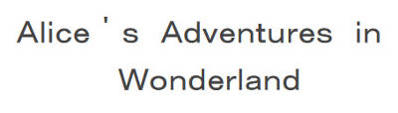
capitalize价值 (The capitalize Value)
If you’d like the first letter of each word to be displayed in uppercase while leaving the appearance of all other letters unaffected (whatever their case in the HTML document), using the value capitalize will achieve this:
如果您希望每个单词的第一个字母以大写形式显示,而所有其他字母的外观不受影响(无论HTML文档中capitalize如何),则使用capitalize值将实现以下目的:
The HTML:
HTML:
<h2>alice's adventures in wonderland</h2>The CSS:
CSS:
h2 {
  text-transform: capitalize;
}
Notice how capitalize doesn’t follow title case conventions: in fact, all first letters in the above example appear capitalized, including the word “in”. Authors who intend to follow a literary convention concerning titles will need to manipulate the letters manually in the source text.
请注意capitalize如何不遵循标题大小写约定:实际上,以上示例中的所有首字母都大写,包括单词“ in”。 打算遵循有关标题的文学惯例的作者将需要在源文本中手动操作字母。
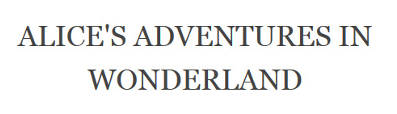
uppercase值 (The uppercase Value)
If your goal is to have all letters displayed in uppercase, no matter their case in the HTML document, uppercase is the appropriate value to use:
如果您的目标是使所有字母都以大写字母显示,则无论它们在HTML文档中的大小写如何,均应使用uppercase :
The HTML:
HTML:
<h2>alice's adventures in wonderland</h2>The CSS:
CSS:
h2 {
  text-transform: uppercase;
}
lowercase值 (The lowercase Value)
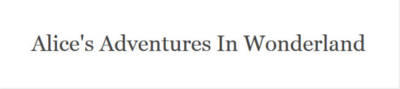
Using the value lowercase will cause all letters to be displayed in lowercase. Naturally, this won’t affect the appearance of letters that are already lowercase in the original source document.
使用lowercase值将导致所有字母均以小写形式显示。 自然,这不会影响原始源文档中已经小写的字母的外观。
The HTML:
HTML:
<h2>Alice's Adventures in Wonderland</h2>The CSS:
CSS:
h2 {
  text-transform: lowercase;
}
full-width值 (The full-width Value)
The specification has added a new value, full-width. This value constrains the character to appear inside a square as if it were an ideographic character, e.g., Japanese, Chinese, etc. This facilitates aligning Latin characters with ideographic characters.
该规范添加了一个新值full-width 。 此值限制字符出现在正方形内,就像它是表意字符一样,例如日语,中文等。这有助于将拉丁字符与表意字符对齐。
Not all characters have a corresponding full-width form, in which case characters will not be affected by the full-width value.
并非所有字符都具有相应的全角形式,在这种情况下,字符将不受full-width值的影响。
The HTML:
HTML:
<h2>Alice's Adventures in Wonderland</h2>The CSS:
CSS:
h2 {
  text-transform: full-width;
}
Here’s what characters look like in Firefox when full-width is applied:
这是应用full-width字符后在Firefox中的外观:
进一步说明 (Further Remarks)
Browser support for the text-transform property is excellent. In fact, all major browsers support it.
浏览器对text-transform属性的支持非常好。 实际上,所有主要的浏览器都支持它。
The only exception is the full-width value, which at present works only in Firefox. Perhaps understandably so, given the probability that full-width is at risk of being dropped at the Candidate Recommendation stage of the spec.
唯一的例外是full-width值,目前仅在Firefox中有效。 也许是可以理解的,因为概率full-width是在规范的候选推荐阶段,被丢弃的风险。
Further, I’ve noticed a small inconsistency between Firefox (v.39) and other major browsers in rendering the capitalize value on a hyphenated word.
此外,我注意到Firefox(v.39)与其他主要浏览器之间在用连字词呈现capitalize值方面存在一些细微的不一致。
Here’s what it looks like in Firefox:
这是Firefox中的外观:
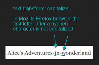
Notice how the first letter after a hyphen is not being capitalized. On the other hand, below is the same text displayed in Chrome:
请注意连字符后的第一个字母如何不大写。 另一方面,以下是在Chrome中显示的相同文字:
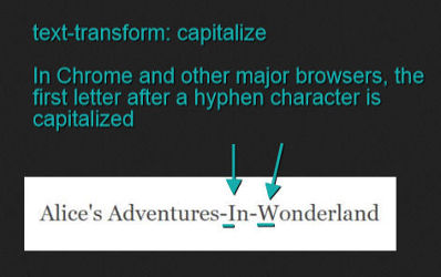
In this instance, letters following a hyphen character are no exception; they are also being displayed with a capital letter. I’ve observed this same behavior in the latest release of all other major browsers except, as noted above, Firefox.
在这种情况下,连字符后面的字母也不例外。 它们还以大写字母显示。 除了上面提到的Firefox,我在所有其他主要浏览器的最新版本中都观察到了相同的行为。
Finally, mind the cascade! If you set the text-transform property on a container element, its value is inherited by all its child elements. To avoid undesired results, reset the child elements’ text-transform property value to none.
最后,请注意级联! 如果在容器元素上设置text-transform属性,则其值将由其所有子元素继承。 为避免出现不希望的结果,请将子元素的text-transform属性值重置为none 。
View a demo for the text-transform property values.
如何处理空白 (How to Handle White Space)
When you press the Tab key, the space key, or force some text to break to the next line (using the ENTER key or the <br> tag), you create white space in your source document.
当您按Tab键,空格键或强制某些文本中断到下一行时(使用ENTER键或<br>标记),您将在源文档中创建空白。
By default, browsers collapse sequences of white space into a single space, line breaks are removed, and lines of text wrap to fit their container. This is convenient for us because it allows us to indent and separate chunks of text to keep our source document readable and maintainable without impacting how content is displayed in the browser.
默认情况下,浏览器将空白序列折叠为一个空格,删除换行符,并自动换行以适应其容器。 这对我们来说很方便,因为它允许我们缩进和分隔文本块,以使源文档易于阅读和维护,而不会影响浏览器中内容的显示方式。
However, what if this isn’t your goal? Let’s say, for instance, that you’d like to preserve the white space you create in the HTML document. A common scenario is when you write some text designed to be displayed as a properly indented code snippet. Or, you’d like some text to be displayed all on one line, without breaking.
但是,如果这不是您的目标怎么办? 例如,假设您要保留在HTML文档中创建的空白。 一种常见的情况是,您编写了一些设计为显示为适当缩进的代码段的文本。 或者,您希望某些文本全部显示在一行上,而不会中断。
On such occasions, when you intend to override the browser’s default behavior, the white-space property offers some interesting options.
在这种情况下,当您打算覆盖浏览器的默认行为时, white-space属性提供了一些有趣的选项。
The normal keyword resets the browser to its default behavior: all extra white space is collapsed into one character and lines wrap when they reach the edge of their container.
normal关键字将浏览器重置为其默认行为:所有多余的空格都折叠为一个字符,并且当行到达其容器的边缘时换行。
pre值 (The pre Value)
The pre keyword allows you to display text by preserving all the white spaces and forced new lines present in the source document. Text will not wrap into a new line when overflowing its container.
pre关键字允许您通过保留源文档中所有空白和强制换行来显示文本。 溢出容器时,文本不会换行。
element {
  white-space: pre;
}
If you use tabs to create white space, you can control their size with the tab-size property by setting it to an integer value.
如果使用制表符创建空白,则可以通过将tab-size属性设置为整数值来控制其大小。
element {
  white-space: pre;
  -moz-tab-size: 4;
  -o-tab-size: 4;
  tab-size: 4;
}
tab-size is a property with inconsistent browser support, but if you really can’t stand the default tab’s character length, here’s a polyfill to cover all your bases.
tab-size是一个具有不一致的浏览器支持的属性,但是如果您真的不能忍受默认选项卡的字符长度,则可以使用polyfill来覆盖所有基础。
pre-wrap价值 (The pre-wrap Value)
Let’s say you’d like white space in the source document to be preserved in the browser display. However, you’d also like to let lines wrap as they reach the edge of their container.
假设您希望将源文档中的空白保留在浏览器显示中。 但是,您还想让线在到达容器边缘时自动换行。
The pre-wrap keyword will help you achieve the desired result.
pre-wrap关键字将帮助您获得所需的结果。
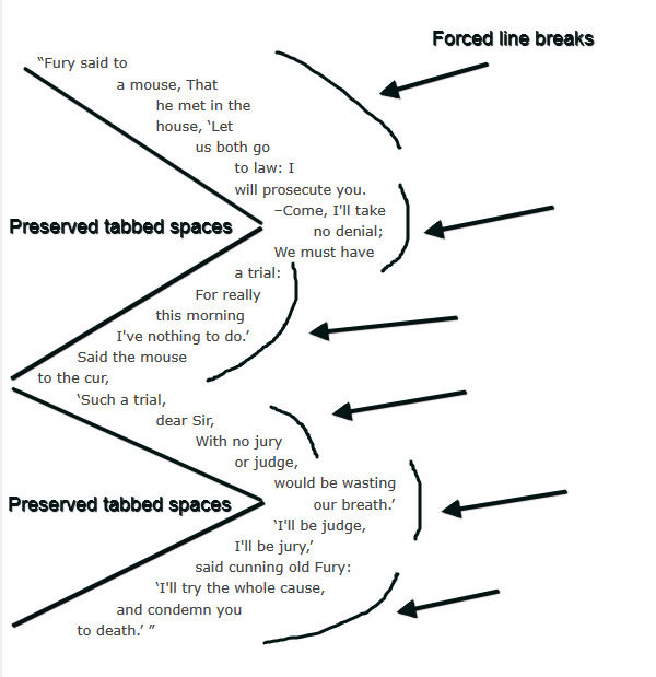
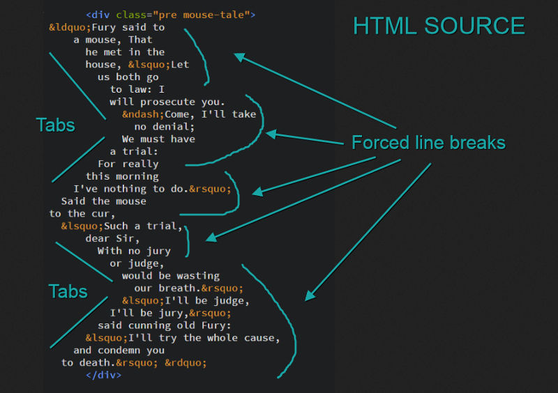
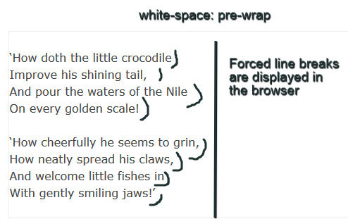
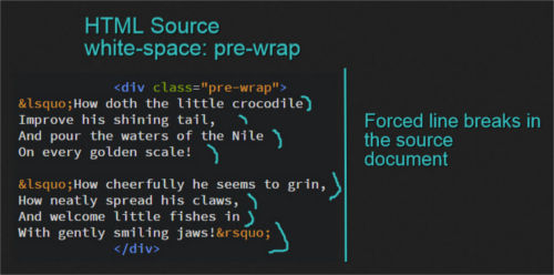
element {
  white-space: pre-wrap;
}
Notice how each line displayed in the browser reflects the forced breaks in the source code, although the container has plenty of room to fit more text:
请注意,尽管容器有足够的空间容纳更多文本,但浏览器中显示的每一行如何反映源代码中的强制中断:
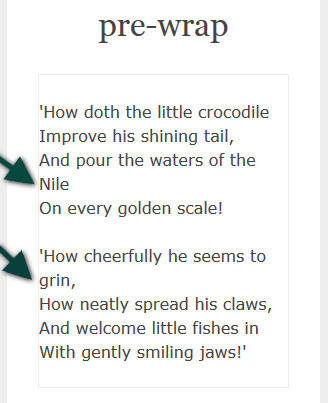
However, shrink your browser screen and you’ll notice the lines wrapping to fit their container.
但是,缩小浏览器屏幕,您会发现所有行换行以适应它们的容器。
pre-line价值 (The pre-line Value)
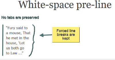
A final interesting value for the white-space property is pre-line. To the extent it collapses sequences of space into one space and allows wrapping, it behaves like normal. However, where a new line character or a <br> tag is present in the HTML document, these are preserved in the browser display.
white-space属性的最后一个有趣的值是pre-line 。 在某种程度上,它将空间序列折叠成一个空间并允许包装,它的行为类似于normal 。 但是,如果HTML文档中出现换行符或<br>标记,则这些字符将保留在浏览器显示中。
element {
  white-space: pre-line;
}
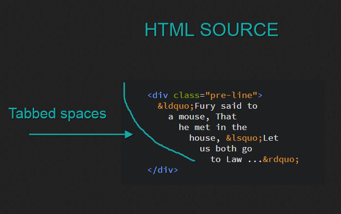
Try out the CodePen demo for the pre, pre-wrap and pre-line keywords.
试用CodePen演示中的pre , pre-wrap和pre-line关键字。
nowrap价值 (The nowrap Value)
nowrap is perhaps the best known white-space value. Does your design require that a piece of inline content should never wrap? Using white-space: nowrap; on your element does the trick.
nowrap也许是最著名white-space值。 您的设计是否要求不要插入任何内联内容? 使用white-space: nowrap; 在您的元素上就可以了。
Louis Lazaris points to the following use case for this value.
Louis Lazaris指向此值的以下用例。
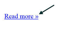
Above is a link followed by the » symbol. Having this character drop to the next line, for example in fluid web layouts, wouldn’t be desirable.
上面是一个链接,后跟»符号。 将此字符放到下一行,例如在流畅的Web布局中,是不希望的。
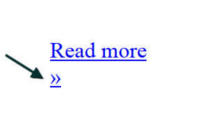
In this and similar circumstances (think of icons, for instance), the nowrap value is quite handy.
在这种和类似情况下(例如,考虑图标), nowrap值非常方便。
Another interesting use case is brought to us by Sara Soueidan in the Codrops CSS reference. Sara points out that the white-space property can be applied to any inline content, including images.
Sara Soueidan 在Codrops CSS参考中为我们带来了另一个有趣的用例。 Sara指出, white-space属性可以应用于任何内联内容,包括图像。
It is used with the value
nowrapsometimes to create a horizontal list of images in a scrollable element, by preventing the images from wrapping and forcing them to be displayed on one single line inside their container.它有时与值
nowrap一起使用,以通过防止图像包装并强制将它们显示在其容器内的一行上,从而在可滚动元素中创建图像的水平列表。
I’ve enlarged on this suggestion by creating a basic jQuery carousel using white-space: nowrap. Here’s the demo:
通过使用white-space: nowrap创建一个基本的jQuery轮播,我扩大了这一建议white-space: nowrap 。 这是演示:
See the Pen Using the word-wrap Property on an Image Carousel by SitePoint (@SitePoint) on CodePen.
使用 CodePen上SitePoint ( @SitePoint )在图像轮播上使用word-wrap属性查看钢笔。
控制单词内的换行符 (Taking Control of Line Breaks Inside Words)
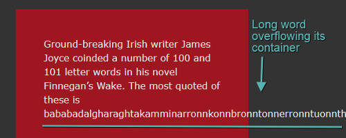
Sometimes it happens that a design looks off because a long word fails to wrap to the next line, thereby overflowing its container. Long URLs or some user-generated long words in blog comments are common scenarios.
有时,由于长字未能绕到下一行而导致其外观溢出,导致设计看起来不对劲。 长URL或博客评论中一些用户生成的长词是常见的情况。
The following CSS properties are designed to give us some measure of control on handling long words on the web.
下列CSS属性旨在为我们提供一些控制措施,以处理Web上的长单词。
word-wrap/overflow-wrap属性 (The word-wrap/overflow-wrap Property)
The overflow-wrap property (previously called word-wrap, fully supported and working in all major browsers for legacy reasons) takes effect if the white-space property allows for text wrapping. It can have one of two values: normal and break-word.
如果white-space属性允许文本换行,则overflow-wrap属性(以前称为word-wrap ,完全受支持,并且出于传统原因在所有主流浏览器中均可使用 )生效。 它可以具有两个值之一: normal和break-word 。
By using the normal value, words break at allowed break points, e.g., spaces, hyphens, etc.
通过使用normal ,单词会在允许的断点处中断,例如空格,连字符等。
The break-word value permits arbitrary breaking points inside a word if the line can’t otherwise be broken at some other acceptable point.
如果行不能在其他可接受的点断开,则断break-word值允许break-word内的任意断点。
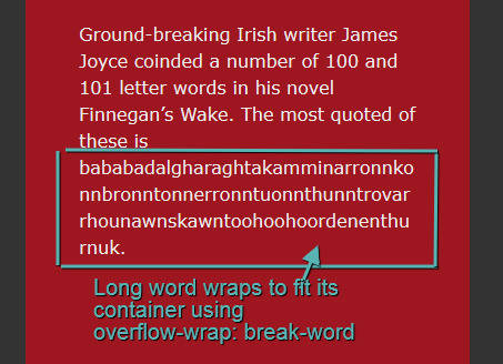
The image below shows the display of a long word that overflows its container:
下图显示了一个长字溢出其容器的显示:
Let’s set the overflow-wrap property, and also, for legacy purposes, the word-wrap property, to the break-word value:
让我们将overflow-wrap属性以及(出于传统目的)将word-wrap属性设置为break-word值:
element {
  word-wrap: break-word;
  overflow-wrap: break-word;
}
… and the long word’s display is now broken into multiple lines to fit the available space.
…并且长字的显示现在分成多行以适应可用空间。
hyphens属性 (The hyphens Property)
Breaking up long words is all well and good. However, the resulting text could be confusing to readers. A better option is to hyphenate the word as it breaks to the next line. This way, it’s immediately clear to readers they’re looking at one word wrapping onto multiple lines. To achieve this, CSS offers the hyphens property, which you can use in conjunction with word-wrap: break-word.
打破长篇大论都是好事。 但是,结果文本可能会使读者感到困惑。 更好的选择是在断行时将其连字符。 这样一来,读者就可以立即清楚地看到一个单词包装在多行上。 为此,CSS提供了hyphens属性,您可以将其与word-wrap: break-word结合使用。
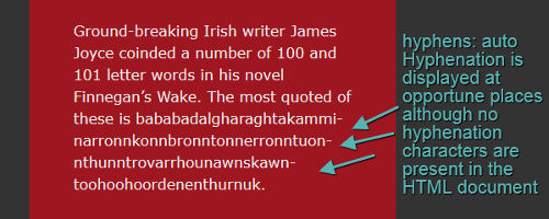
More specifically, the auto value of the hyphens property enables you to display a hyphen at the point where words break to the next line, if the document’s language rules allow it or hyphenation is present in the HTML source. For this to work, make sure you set the lang attribute to your desired language in the HTML document:
更具体地说,如果文档的语言规则允许或HTML源中存在连字符,则可以通过hyphens属性的auto值在单词到下一行的断点处显示连字符。 为此,请确保在HTML文档中将lang属性设置为所需的语言:
.break-word.hyphens-auto {
  -moz-hyphens: auto;
  -webkit-hyphens: auto;
  -ms-hyphens: auto;
  hyphens: auto;
}
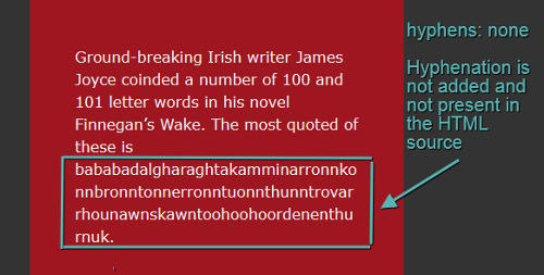
You can also prevent the display of hyphen characters. In this case, set the hyphens property to none:
您也可以防止显示连字符。 在这种情况下,请将hyphens属性设置为none :
.break-word.hyphens-none {
  -moz-hyphens: none;
  -webkit-hyphens: none;
  -ms-hyphens: none;
  hyphens: none;
}
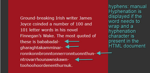
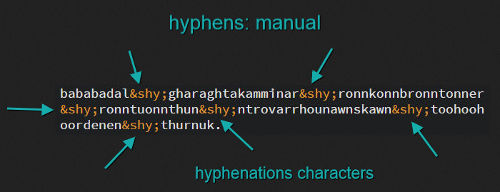
Additionally, you can display hyphen characters on line breaks within words, if words are hyphenated in the markup and the text wraps to the next line. This is done with a value of manual:
此外,如果单词在标记中带有连字符,并且文本自动换行到下一行,则可以在单词内的换行符上显示连字符。 这是通过manual值完成的:
.break-word.hyphens-manual {
  -moz-hyphens: manual;
  -webkit-hyphens: manual;
  -ms-hyphens: manual;
  hyphens: manual;
}
Aided by vendor prefixes, browser support for the hyphens property is good on all major browsers, although not without some slight inconsistencies. The latest versions of Chrome (v.44) and Opera (v.30) at the time of writing don’t support the property value auto.
在厂商前缀的辅助下, 浏览器对hyphens属性的支持在所有主流浏览器上都很好,尽管并非没有一些细微的不一致。 撰写本文时,Chrome(v.44)和Opera(v.30)的最新版本不支持属性值auto 。
View the above examples on CodePen
操纵单词和字母之间的空间 (Manipulating space between Words and Letters)
What makes a piece of text more or less readable often depends on a number of factors. In some cases, increasing or decreasing the space between each word or each single letter, i.e. tracking, brings about huge improvements.
使一段文本或多或少具有可读性的原因通常取决于许多因素。 在某些情况下,增加或减少每个单词或每个字母之间的间距(即跟踪 )会带来巨大的改进。
CSS offers the word-spacing and letter-spacing properties to control the appearance of spacing between words and letters respectively.
CSS提供了word-spacing和letter-spacing属性,以分别控制单词和字母之间的间距外观。
word-spacing属性 (The word-spacing Property)
Below are the values for the word-spacing property:
下面是word-spacing属性的值:
normalnormal<length><length>percentagepercentage
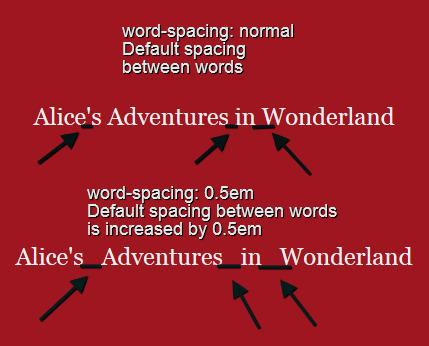
normal displays the default space between letters. The amount of space depends on the font used or the browser.
normal显示字母之间的默认空格。 空间大小取决于所使用的字体或浏览器。
.normal {
  word-spacing: normal;
}
<length> lets you add inter-word spacing in addition to the default spacing defined by the font or the browser.
<length>让您添加字间除默认间隔由字体或浏览器间距限定。
.length {
  word-spacing: 0.5em;
}
percentage works the same way as <length> but using percentage values. I haven’t found any browser implementation for it and percentages are at risk of being removed from future drafts of the specification.
percentage使用与<length>相同的方式,但是使用百分比值。 我还没有找到任何针对它的浏览器实现,并且有百分比风险有可能从规范的未来草案中删除。
.percentage {
  word-spacing: 1%;
}
letter-spacing属性 (The letter-spacing Property)
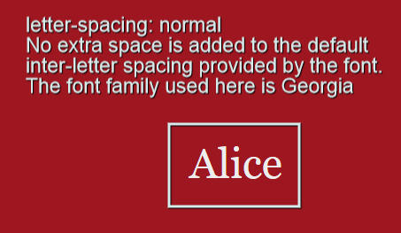
You can set the letter-spacing property to one of two values: normal or <length>.
您可以将letter-spacing属性设置为以下两个值之一: normal或<length> 。
Using normal leaves the default font spacing between letters. It also resets any letter-spacing length previously specified to its default value. For instance, if you specify a letter-spacing value of 1em on a parent element but wish to display the default value on child elements, normal is your friend.
使用normal保留字母之间的默认字体间距。 它还会将先前指定的所有letter-spacing长度重置为其默认值。 例如,如果您在父元素上指定letter-spacing值为1em ,但希望在子元素上显示默认值,那么normal是您的朋友。
element {
  letter-spacing: normal;
}
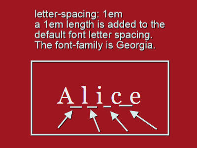
The <length> value is a unit of measurement, e.g. px or ems, whereby you can increase the spacing between letters in addition to the default spacing already provided by the font.
<length>值是一个度量单位,例如px或ems,通过它可以增加字体之间已经提供的默认间距(除字母间距之外)之间的间距。
element {
  letter-spacing: 1em;
}
更多详细信息 (Further Details)
word-spacing is not only applicable to words. You can use it on any kind of inline or inline-block content.
word-spacing不仅适用于单词。 您可以在任何类型的内联或内联阻止内容上使用它。
Also, you can animate both word-spacing and letter-spacing. However, using CSS transitions on letter-spacing shows that the normal value is not recognized by the current version of Firefox (v.39). To overcome this, simply replace normal with 0em.
另外,您可以设置word-spacing和letter-spacing动画。 然而,在使用上CSS过渡letter-spacing显示, normal价值不是由火狐(V.39)的当前版本的认可。 为了克服这个问题,只需将normal替换为0em 。
Here’s a demo with animated text using word-spacing and letter-spacing:
这是一个使用word-spacing和letter-spacing动画文本演示:
See the Pen Animating the CSS letter-spacing and word-spacing Properties by SitePoint (@SitePoint) on CodePen.
请参见在CodePen上使用SitePoint ( @SitePoint )通过Pen 对CSS字母间距和单词间距属性进行动画处理 。
文本对齐的最新CSS选项 (Latest CSS Options for Text Alignment)
The text-align property has been around for some time. It controls how inline content like text and images are aligned inside a block container. The kewords left and right align inline content to the left and right respectively. Setting text-align to center aligns the content to the center of its container. Finally, the justify keyword justifies content so that each line is of the same length (except for the last line, if it’s not sufficiently long to reach the edge of its container).
text-align属性已经存在了一段时间。 它控制文本内容和图像之类的内联内容如何在块容器内对齐。 该kewords left和right对齐联内容到左,右分别。 将text-align设置为center将内容与其容器的center对齐。 最后, justify关键字对内容进行对齐,以使每一行的长度相同(如果最后一行的长度不足以到达其容器的边缘,则最后一行除外)。
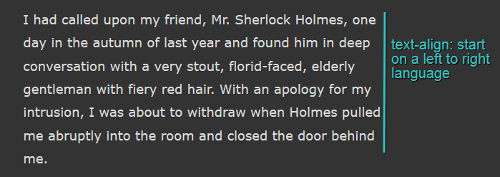
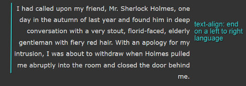
The spec adds two new values that could be quite useful on internationalized websites using right-to-left (RTL) language systems: start and end.
该规范添加了两个新的值: start和end ,这两个新值在使用从右到左(RTL)语言系统的国际化网站上非常有用。
For left-to-right (LTR) readers, they correspond to left and right respectively. When a website uses a RTL language, start corresponds to right and end corresponds to left.
对于从左到右(LTR)的阅读器,它们分别对应于left和right 。 当网站使用RTL语言时, start对应于right , end对应于left 。
element {
  text-align: start;
}
element {
  text-align: end;
}
Applying text-align: match-parent to an inline child element ensures that the child inherits the same alignment as the parent. The inherited start or end value is calculated against the parent’s language direction resulting in an output of either left or right.
将text-align: match-parent应用于内联子元素可确保子代继承与父代相同的对齐方式。 继承的start或end值是根据父级的语言方向计算得出的,结果为left或right 。
text-align-last属性 (The text-align-last Property)
New to CSS is also the text-align-last property. This property controls the alignment of the last line of justified text before the end of a paragraph or before a <br> tag. It has the same keyword values as text-align, except for auto, which is the default value. The auto value allows you to align the last line of text according to the value of the element’s text-align property, if set. If no text-align property is applied, the text defaults to a value of start.
CSS的新特性也是text-align-last属性。 此属性控制段落末尾之前或<br>标记之前对齐文本的最后一行的对齐方式 。 它具有与text-align相同的关键字值,除了auto是默认值。 auto值允许您根据元素的text-align属性(如果设置)的值来对齐文本的最后一行。 如果未应用text-align属性,则文本默认值为start 。
At the time of writing, browser support for text-align-last is rather poor. Therefore, it’s my view that it should be used sparingly, if at all.
在撰写本文时, 浏览器对text-align-last的支持还很差。 因此,我认为应该尽量少使用它。
View a CodePen demo showing these features in action
缩进文字 (Indenting Text)
Indenting a line of text, usually the first line in a paragraph, is not something you often come across on websites. Instead, an empty line is placed as a common visual mark of separation between paragraphs.
缩进一行文本(通常是段落的第一行)并不是您在网站上经常遇到的问题。 而是将空行放置为段落之间常见的可视标记。
Nonetheless, indenting the first line of a paragraph is sometimes used to create a classic look suitable to specific designs.
尽管如此,缩进段落的第一行有时还是用来创建适合特定设计的经典外观。
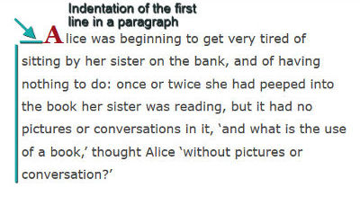
If your design is enhanced by this technique, CSS offers the text-indent property. Let’s consider the possible values.
如果通过此技术增强了设计,则CSS提供了text-indent属性。 让我们考虑可能的值。
A value of length is commonly set using px or em units:
length值通常使用px或em单位设置:
element {
  text-indent: 2em;
}
A percentage is set using a percentage value:
使用百分比值设置百分比:
element {
  text-indent: 6%;
}
A value of each-line indents the appearance of the first line inside a block container as well as each line after a forced line break, that is, a line break caused by hitting the enter key or inserting a <br> tag in the HTML source. However, the display of the first line after a soft wrap break, that is, text that wraps to the next line to fit its container, is not affected.
each-line值会缩进块容器内第一行的外观,以及在强制换行(即,按Enter键或在HTML中插入<br>标签引起的换行)后的each-line缩进资源。 但是,换行符中断后第一行的显示(即,包装到下一行以适合其容器的文本)不受影响。
A value of hanging causes all lines except the first line to be displayed as indented.
hanging值将导致除第一行外的所有行都显示为缩进。
The each-line and hanging values are experimental values, not yet implemented in any browser at the time of writing.
each-line和hanging值均为实验值,在撰写本文时尚未在任何浏览器中实现。
View this demo to see text-indent in action
结论 (Conclusion)
CSS has been making huge progress towards web text manipulation, although more is expected to be done. Besides sketchy browser support for some of the newest properties, it would be nice, for example, if CSS offered kerning capabilities, i.e., the opportunity to manipulate the distance between two letters in a given word.
CSS已经在Web文本操作方面取得了巨大的进步,尽管有望做得更多。 除了对某些最新属性的粗略浏览器支持之外,例如CSS是否提供字距调整功能(即,有机会操纵给定单词中两个字母之间的距离),也将是不错的选择。
In this post I delved into a number of CSS properties that control formatting, line wrapping, and alignment of text on the web. Feel free to experiment with these using the demos.
在这篇文章中,我研究了许多CSS属性,这些属性控制格式,换行和Web上文本的对齐。 随意使用演示进行试验。
I look forward to your feedback!
期待您的反馈!
翻译自: https://www.sitepoint.com/css-properties-to-control-web-typography/
css 排版


 3250
3250

 被折叠的 条评论
为什么被折叠?
被折叠的 条评论
为什么被折叠?
 到【灌水乐园】发言


