


Bootstrap comes packed with tons of ready-to-use jQuery-powered plugins. The beauty of Bootstrap plugins is that you can slot them into your project, write the appropriate markup using data- attributes, and the JavaScript kicks in automatically. No need to write any JavaScript code.
Bootstrap随附了许多现成的jQuery支持的插件。 Bootstrap插件的优点在于,您可以将它们放入项目中,使用data- attribute编写适当的标记,然后JavaScript自动启动。 无需编写任何JavaScript代码。
There may be times when you’d like to add your own customizations to Bootstrap’s plugins to fit your project’s requirements.
有时您可能想将自己的自定义项添加到Bootstrap的插件中,以符合项目的要求。
If this is you, read on. I’m going to show you one way in which you can do just that.
如果是您,请继续阅读。 我将向您展示一种可以做到这一点的方法。
如何自定义Bootstrap插件的外观 (How to Customize the Appearance of Bootstrap Plugins)
You can customize Bootstrap plugins’ look and feel by working with CSS. On the other hand, if you’d like to modify the plugin’s functionality, you’ll need to write some JavaScript code.
您可以通过使用CSS来自定义Bootstrap插件的外观。 另一方面,如果您想修改插件的功能 ,则需要编写一些JavaScript代码。
Customizing Bootstrap CSS should be done in your own custom file, whether you’re working with the Sass source code or with the compiled version.
自定义Bootstrap CSS应该在您自己的自定义文件中完成,无论您使用的是Sass源代码还是编译版本。
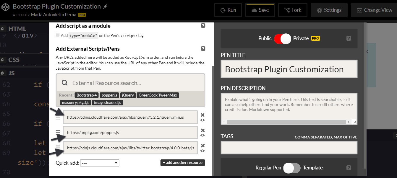
To keep things simple and CodePen-friendly, pull the precompiled Bootstrap package from the CDN.
为了使事情简单和对CodePen友好,请从CDN中提取预编译的Bootstrap软件包。
This includes both the stylesheet …
这包括样式表...
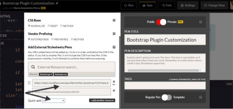
… and the JavaScript file. Also, don’t forget to include jQuery and, if you plan to use dropdowns, Popper.js too:
…以及JavaScript文件。 另外,别忘了包括jQuery ,如果您打算使用下拉菜单, 也要包括Popper.js :
To make it even easier to modify CSS code, the developers behind Bootstrap have included a list of CSS variables for colors and breakpoints inside the :root element at the top of the stylesheet.
为了使修改CSS代码更加容易,Bootstrap背后的开发人员在样式表顶部的:root元素内包含了一系列用于颜色和断点CSS变量。
For example, the variable for the green success color is --success: #28a745;
例如,绿色成功颜色的变量为--success: #28a745;
To change this into a different shade of green, replace the variable’s color value in your own stylesheet and add this code to your chosen selector:
要将其更改为其他绿色阴影,请在您自己的样式表中替换变量的颜色值,并将此代码添加到所选的选择器中:
selector {
  background-color: var(--success);
}
To change the look and feel of a specific plugin, the easiest way is to find the Bootstrap styles using your browser’s devtools and overriding them with your own styles.
要更改特定插件的外观,最简单的方法是使用浏览器的devtool查找Bootstrap样式,并用您自己的样式覆盖它们。
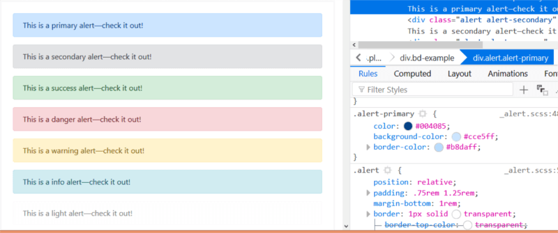
Let’s focus on the simple alert component in this article.
让我们集中讨论本文中的简单警报组件 。
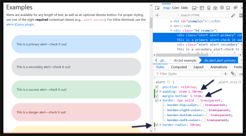
For instance, try changing the alert’s original values for the padding, margin-bottom, and border-radius in your custom CSS document:
例如,尝试更改自定义CSS文档中padding , margin-bottom和border-radius的警报原始值:
.alert {
  padding: 2rem 1.50rem;
  margin-bottom: 1.5rem;
  border-radius: 50rem;
}
Now, all elements with the .alert class will look like this:
现在,所有带有.alert类的元素将如下所示:
Next, let’s move on to extending the Bootstrap alert’s functionality.
接下来,让我们继续扩展Bootstrap警报的功能。
自定义Bootstrap插件的功能 (Customizing a Bootstrap Plugin’s Functionality)
Modifying Bootstrap plugins’ functionality often involves working both with the CSS and JavaScript document.
修改Bootstrap插件的功能通常涉及使用CSS和JavaScript文档。
Most dynamic effects are produced by adding and removing CSS classes, and overall the functionality is quite simple.
大多数动态效果是通过添加和删除CSS类产生的,并且总体而言功能非常简单。
In this article, I’m going to add some extra functionality to the Alert component.
在本文中,我将向Alert组件添加一些额外的功能。
Alerts display a piece of information and users can remove them from the page at the click of a button.
警报显示一条信息,用户可以单击按钮将其从页面中删除。
I’m going to add zoom in and zoom out buttons to the alert, which enable users to make the alert bigger or smaller respectively. I’m also going to include a high contrast button to allow users to view the alert contents in high contrast mode, i.e., inverting the background color and the text color.
我将在警报中添加放大和缩小按钮,这使用户可以分别使警报更大或更小。 我还将包括一个高对比度按钮,以允许用户以高对比度模式查看警报内容,即反转背景颜色和文本颜色。
Let’s get to work!
让我们开始工作吧!
警报的结构 (The Alert’s Structure)
To follow along, start by adding the markup for the alert:
要继续进行操作,请先添加警报的标记:
<div class="alert alert-info alert-zoom-in-out">
  <a href="#" class="close" data-dismiss="alert" aria-label="close">×</a>
  <a href="alert" class="close zoomIn" data-zoomIn="alert" aria-label="zoom in">+</a>
  <a href="alert" class="close zoomOut" data-zoomOut="alert" aria-label="zoom out">-</a>
  <a href="alert" class="close high-contrast" data-highContrast="alert" aria-label="high contrast mode"><i class="fa fa-adjust"></i></a>
  <p><strong>New Bootstrap Alert</strong></p>
  <p>Zoom in and out, or enable contrast mode.</p>
</div>
Above is a simple alert box with three links: the first one is a native Bootstrap dismiss alert link. This serves as template for the custom three links you’re going to create. The – link lets users shrink the size and contents of the alert box, while the + link does the exact opposite — that is, enlarge the alert box and the text inside it.
上面是带有三个链接的简单警报框:第一个是本机Bootstrap 关闭警报链接。 这用作您要创建的自定义三个链接的模板。 –链接使用户可以缩小警报框的大小和内容,而+链接则恰好相反-即放大警报框和其中的文本。
The contrast link enables high contrast mode on the alert.
对比链接可在警报上启用高对比模式。
Notice the data-zoomIn, data-zoomOut, and data-highContrast on each custom link’s markup. These are our hooks for the click event: a button with those custom data types will be responsible for triggering the actions on the alert box.
注意data-zoomIn , data-zoomOut和data-highContrast每个自定义链接的标记。 这些是我们单击事件的钩子:具有这些自定义数据类型的按钮将负责触发警报框上的操作。
修改CSS (Modifying the CSS)
The next step is to create your own custom CSS file for the alert plugin and add the following code:
下一步是为警报插件创建您自己的自定义CSS文件,并添加以下代码:
.alert-zoom-in-out {
  font-size: 16px;
  height: auto;
  top: 20px;
  color: rgb(12, 84, 96);
  background-color: rgb(209, 236, 241);
}

.high-contrast-on,
.high-contrast-on a,
.high-contrast-on i {
  background-color: rgb(12, 84, 96);
  color: rgb(209, 236, 241);
}
alert-zoom-in-out is the class I’ve chosen for the alert box. Because the functionality you’re building includes modifying the size and color combination of the alert box, you need to set those for the alert-zoom-in-out class.
alert-zoom-in-out是我为警报框选择的类。 因为您要构建的功能包括修改警报框的大小和颜色组合,所以您需要为alert-zoom-in-out类设置这些功能。
The high-contrast-on class on the alert box will be added and removed dynamically using JavaScript. When added, color and background-color values are inverted. When removed, the alert box will get back to its default appearance.
警报框中的high-contrast-on类将使用JavaScript动态添加和删除。 添加后, color和background-color值将反转。 删除后,警报框将恢复为其默认外观。
添加放大功能 (Adding Zoom-in Functionality)
There’s usually more than one way of achieving the same result in programming. My approach owes a lot to Benjamin Jakobus and Jason Marah. For this simple customization, I’ve chosen to take the public close() method on the Bootstrap alert.js file as my reference point.
在编程中通常有不止一种方法来获得相同的结果。 我的方法应归功于本杰明·雅各布斯 ( Benjamin Jakobus)和杰森·马拉 ( Jason Marah) 。 对于此简单的自定义,我选择将Bootstrap alert.js文件上的public close()方法作为参考点。
Start by wrapping the code inside an immediately invoked function expression (IIFE), which avoids polluting the global scope with the plugin’s code. Also, add the function to the jQuery object:
首先将代码包装在立即调用的函数表达式 (IIFE)中,这样可以避免使用插件的代码污染全局范围。 另外,将函数添加到jQuery对象:
(function ($) {
  'use strict';
})(jQuery);
The Bootstrap JavaScript docs state that each plugin exposes its raw constructor on a Constructor property, which you can access in your code to add custom functionality:
Bootstrap JavaScript文档指出,每个插件都将其原始构造函数公开在Constructor属性上,您可以在代码中访问该属性以添加自定义功能:
(function ($) {
  'use strict';

  const Alert = $.fn.alert.Constructor;

})(jQuery);
At this point, the constant Alert contains a reference to the alert plugin’s constructor. This lets you access the plugin’s prototype so you can now add a custom method to it:
此时,常量Alert包含对Alert插件的构造函数的引用。 这使您可以访问插件的原型,以便现在可以向其添加自定义方法:
Alert.prototype.zoomIn = function(e) {
  // zoom-in code here
};
Now you’re all set to add your custom method. Here’s Bootstrap close() method, which will work as template for zoomIn():
现在,您已经准备好添加自定义方法。 这是Bootstrap close()方法,它将用作zoomIn()模板:
close(element) {
  element = element || this._element

  const rootElement = this._getRootElement(element)
  const customEvent = this._triggerCloseEvent(rootElement)

  if (customEvent.isDefaultPrevented()) {
    return
  }

  this._removeElement(rootElement)
}
Below is the code for the zoomIn() method:
以下是zoomIn()方法的代码:
// prevent default action on the link
if (e) e.preventDefault();

// cache the element which has been clicked
const $this = $(this);

// find the parent of the element that has
// been clicked, which is the Alert
const $parent = $this.closest('.alert');

// trigger the custom event on the element
$this.trigger(e = $.Event('zoomIn.bs.alert'));

// grab the alert's current width and font-size
let $parentWidth = parseInt($parent.css('width'));
let $parentFontSize = parseInt($parent.css('font-size'));

// allow devs to run their own custom functionality
if (e.isDefaultPrevented()) return;

// increment alert's width by 20px on each click
// and the font-size by 2px
$parent.css({
  width: $parentWidth += 20,
  fontSize: $parentFontSize += 2
});
The code above is self-explanatory. The bit that could be somewhat confusing is e.isDefaultPrevented(). I found a great explanation oo this Stack Overflow thread.
上面的代码是不言自明的。 可能有点令人困惑的是e.isDefaultPrevented() 。 我发现这个Stack Overflow线程有一个很好的解释。
The way the code is supposed to work is that each time you click on the + link, the alert box and its text content get bigger.
该代码应该起作用的方式是,每次单击+链接时,警报框及其文本内容都会变大。
The code for the zoom out functionality is the same as the code above, but instead of increasing the pixel values of width and font-size, it makes it smaller:
缩小功能的代码与上面的代码相同,但是并未增加width和font-size的像素值,而是使其变小了:
$parent.css({
  width: $parentWidth -= 20,
  fontSize: $parentFontSize -= 2
});
增加高对比度功能 (Adding High Contrast Functionality)
The highContrast() function follows the same pattern as zoomIn() and zoomOut(), but instead of using inline CSS styles to dynamically modify the alert’s appearance, it adds and removes the high-contrast-on class:
在highContrast()函数遵循相同的模式为zoomIn()和zoomOut()但不是使用内联CSS样式动态修改警报的外观,它添加和删除的high-contrast-on类:
Alert.prototype.highContrast = function(e) {
  if (e) e.preventDefault();

  const $this = $(this);

  const $parent = $this.closest('.alert');

  $this.trigger(e =
  $.Event('highContrast.bs.alert'));

  if (e.isDefaultPrevented()) return;

  $parent.toggleClass('high-contrast-on');
};
设置事件监听器 (Setting Up the Event Listeners)
The last piece of the puzzle consists of hooking up the actions to the DOM element with a specified data attribute. The Bootstrap alert.js file gives some indications as to how you could do this.
难题的最后一部分是将动作与具有指定data属性的DOM元素挂钩。 Bootstrap alert.js文件提供了有关如何执行此操作的指示。
In the Data API implementation section, you’ll find:
在“数据API实现”部分中,您将找到:
$(document).on(
  Event.CLICK_DATA_API,
  Selector.DISMISS,
  Alert._handleDismiss(new Alert())
)
The document listens to a click event on any element with a data-dismiss attribute and its value. In fact, Selector.DISMISS is defined at the top of the file, as well as the EVENT_KEY and DATA_API_KEY:
该文档在具有data-dismiss属性及其值的任何元素上侦听click事件。 实际上, Selector.DISMISS以及文件EVENT_KEY和DATA_API_KEY都定义在文件的顶部:
const Selector = {
  DISMISS : '[data-dismiss="alert"]'
}

const DATA_KEY       = 'bs.alert'
const EVENT_KEY      = `.${DATA_KEY}`
const DATA_API_KEY   = '.data-api'
Therefore, you can hook up the zoomIn(), zoomOut(), and highContrast() methods to the DOM elements with data-zoomIn, data-zoomOut, and data-highContrast attributes as follows:
因此,你可以挂钩的zoomIn() zoomOut()和highContrast()方法以与DOM元素data-zoomIn , data-zoomOut和data-highContrast属性如下:
// hook up zoomIn()
$(document).on('click.bs.alert.data-api', '[data-zoomIn="alert"]', Alert.prototype.zoomIn);

// hook up zoomOut()
$(document).on('click.bs.alert.data-api', '[data-zoomOut="alert"]', Alert.prototype.zoomOut);

// hook up highContrast()
$(document).on('click.bs.alert.data-api', '[data-highContrast="alert"]', Alert.prototype.highContrast);
And that’s it!
就是这样!
See the Pen Customizing Bootstrap Alert by SitePoint (@SitePoint) on CodePen.
请参阅CodePen上的SitePoint ( @SitePoint )的笔自定义引导警报 。
结论 (Conclusion)
As you can see, Bootstrap has made it convenient to add customizations to all its modules, including its JavaScript-powered components.
如您所见,Bootstrap使向其所有模块(包括其JavaScript驱动的组件)添加自定义设置变得很方便。
What’s your customization technique for Bootstrap jQuery plugins? Let me know in the comments!
Bootstrap jQuery插件的自定义技术是什么? 在评论中让我知道!
翻译自: https://www.sitepoint.com/customizing-bootstrap-jquery-plugins/


 扫一扫
扫一扫
 2万+
2万+

 被折叠的 条评论
为什么被折叠?
被折叠的 条评论
为什么被折叠?
 到【灌水乐园】发言


