


图像压缩感知
This article is part of a series on building a sample application — a multi-image gallery blog — for performance benchmarking and optimizations. (View the repo here.)
本文是构建用于性能基准测试和优化的示例应用程序(一个多图像画廊博客)系列文章的一部分。 (在此处查看回购 。)
We’ve been building a sample application — a multi-image gallery blog — for performance benchmarking and optimizations. At this point, our application serves the same image regardless of the resolution and screen size it’s being served in. In this image resizing tutorial, we’ll modify it to serve a resized version depending on display size.
我们一直在构建一个示例应用程序-一个多图像画廊博客-用于性能基准测试和优化。 此时,我们的应用程序将提供相同的图像,而不管其提供的分辨率和屏幕尺寸如何。在此图像大小调整教程中,我们将对其进行修改以根据显示尺寸来提供调整大小的版本。
目的 (Objective)
There are two stages to this improvement.
此改进有两个阶段。
- We need to make all images responsive wherever this might be useful. One place is the thumbnails on the home page and in the gallery pages, and another is the full-size image when an individual image is clicked in the gallery. 我们需要在可能有用的地方使所有图像响应。 一个地方是主页和图库页面上的缩略图,另一个地方是单击图库中的单个图像时的全尺寸图像。
We need to add resizing-logic to our app. The point is to generate a resized image on the fly as it’s demanded. This will keep non-popular images from polluting our hard drive, and it’ll make sure the popular ones are, on subsequent requests, served in optimal sizes.
我们需要将resizing-logic添加到我们的应用程序中。 关键是根据需要动态生成调整大小的图像。 这样可以防止非热门图片污染我们的硬盘,并确保在随后的请求中以最佳尺寸投放热门图片。
响应式图像? (Responsive Images?)
As this post explains, images in the modern web are incredibly complex. Instead of just <img src="mypic.jpg"> from the olden days, we now have something crazy like this:
正如这篇文章所解释的那样,现代网络中的图像非常复杂。 现在,我们<img src="mypic.jpg">只是<img src="mypic.jpg"> ,而是一些疯狂的东西:
<picture>
<source media="(max-width: 700px)" sizes="(max-width: 500px) 50vw, 10vw"
srcset="stick-figure-narrow.png 138w, stick-figure-hd-narrow.png 138w">

<source media="(max-width: 1400px)" sizes="(max-width: 1000px) 100vw, 50vw"
srcset="stick-figure.png 416w, stick-figure-hd.png 416w">

<img src="stick-original.png" alt="Human">
</picture>
A combination of srcset, picture and sizes is necessary in a scenario where you’re doubtful that if you use the same image for a smaller screen size, the primary subject of the image may become too small in size. You want to display a different image (more focused on the primary subject) in a different screen size, but still want to display separate assets of the same image based on device-pixel ratio, and want to customize height and width of the image based on viewport.
如果您怀疑是否将相同的图像用于较小的屏幕尺寸,则图像的主要对象可能会变得过小,因此需要将srcset , picture和sizes组合在一起。 您想要以不同的屏幕尺寸显示不同的图像(更侧重于主要主题),但仍要基于设备像素比率显示同一图像的单独资产,并希望根据图像的高度和宽度自定义在视口上。
Since our images are photos and we always want them to be in their default DOM-specified position filling up the maximum of their parent container, we have no need for picture (which lets us define an alternative source for a different resolution or browser support — like trying to render SVG, then PNG if SVG is unsupported) or sizes (which lets us define which viewport portion an image should occupy). We can get away with just using srcset, which loads a different size version of the same image depending on the screen size.
由于我们的图片是照片,并且我们始终希望它们位于默认的DOM指定位置,从而填满其父容器的最大值,因此我们不需要picture (这使我们可以为其他分辨率或浏览器支持定义替代来源-例如尝试渲染SVG,如果不支持SVG,则渲染PNG)或sizes (这可以让我们定义图像应占据的视口部分)。 我们只需要使用srcset就可以了,它根据屏幕大小加载同一图像的不同大小版本。
添加srcset (Adding srcset)
The first location where we encounter images is in home-galleries-lazy-load.html.twig, the partial template that renders the home screen’s galleries list.
我们遇到图像的第一个位置在home-galleries-lazy-load.html.twig ,这是呈现主屏幕画廊列表的部分模板。
<a class="gallery__link" href="{{ url('gallery.single-gallery', {id: gallery.id}) }}">
  <img src="{{ gallery.images.first|getImageUrl }}" alt="{{ gallery.name }}"
    class="gallery__leading-image card-img-top">
</a>
We can see here that the image’s link is fetched from a Twig filter, which can be found in the src/Twig/ImageRendererExtension.php file. It takes the image’s ID and the route’s name (defined in the annotation in ImageController‘s serveImageAction route) and generates a URL based on that formula: /image/{id}/raw -> replacing {id} with the ID given:
我们在这里可以看到图像的链接是从Twig过滤器获取的,该过滤器可以在src/Twig/ImageRendererExtension.php文件中找到。 它获取图像的ID和路由的名称(在ImageController的serveImageAction路由的注释中定义),并基于以下公式生成URL: /image/{id}/raw serveImageAction >用给定的ID替换{id} :
public function getImageUrl(Image $image)
{
  return $this->router->generate('image.serve', [
      'id' => $image->getId(),
  ], RouterInterface::ABSOLUTE_URL);
}
Let’s change that to the following:
让我们将其更改为以下内容:
public function getImageUrl(Image $image, $size = null)
{
  return $this->router->generate('image.serve', [
      'id' => $image->getId() . (($size) ? '--' . $size : ''),
  ], RouterInterface::ABSOLUTE_URL);
}
Now, all our image URLs will have --x as a suffix, where x is their size. This is the change we’ll apply to our img tag as well, in the form of srcset. Let’s change it to:
现在,我们所有的图像URL都将带有--x后缀,其中x是其大小。 这也是我们将以srcset形式应用于img标签的srcset 。 让我们将其更改为:
<a class="gallery__link" href="{{ url('gallery.single-gallery', {id: gallery.id}) }}">
  <img src="{{ gallery.images.first|getImageUrl }}"
       alt="{{ gallery.name }}"
       srcset="
           {{ gallery.images.first|getImageUrl('1120') }}  1120w,
           {{ gallery.images.first|getImageUrl('720') }} 720w,
           {{ gallery.images.first|getImageUrl('400') }}  400w"
       class="gallery__leading-image card-img-top">
</a>
If we refresh the home page now, we’ll notice the srcset’s new sizes listed:
如果现在刷新主页,则会注意到srcset的新大小列出:
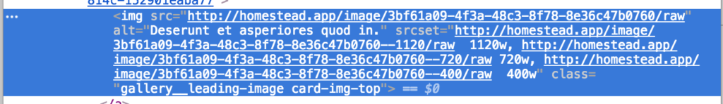
This isn’t going to help us much, though. If our viewport is wide, this will request full-size images, despite them being thumbnails. So instead of srcset, it’s better to use a fixed small thumbnail size here:
不过,这对我们没有太大帮助。 如果我们的视口很宽,则尽管它们是缩略图,但仍将请求全尺寸图像。 因此,最好使用固定的小缩略图代替srcset :
<a class="gallery__link" href="{{ url('gallery.single-gallery', {id: gallery.id}) }}">
  <img src="{{ gallery.images.first|getImageUrl('250') }}"
       alt="{{ gallery.name }}"
       class="gallery__leading-image card-img-top">
</a>
We now have thumbnails-on-demand, but which get cached and fetched when they’re already generated.
现在,我们提供了按需缩略图,但是当它们已经生成时便会被缓存并提取。
Let’s hunt down other srcset locations now.
现在让我们寻找其他srcset位置。
In templates/gallery/single-gallery.html.twig, we apply the same fix as before. We’re dealing with thumbnails, so let’s just shrink the file by adding the size parameter into our getImageUrl filter:
在templates/gallery/single-gallery.html.twig ,我们应用了与以前相同的修复程序。 我们正在处理缩略图,因此让我们通过在我们的getImageUrl过滤器中添加size参数来缩小文件:
<img src="{{ image|getImageUrl(250) }}" alt="{{ image.originalFilename }}"
    class="single-gallery__item-image card-img-top">
And now for the srcset implementation, finally!
现在终于srcset实现srcset !
The individual image views are rendered with a JavaScript modal window at the bottom of the same single-gallery view:
单个图像视图在同一单画廊视图底部JavaScript模式窗口中呈现:
{% block javascripts %}
    {{ parent() }}

    <script>
        $(function () {
            $('.single-gallery__item-image').on('click', function () {
                var src = $(this).attr('src');
                var $modal = $('.single-gallery__modal');
                var $modalBody = $modal.find('.modal-body');

                $modalBody.html('');
                $modalBody.append($('<img src="' + src + '" class="single-gallery__modal-image">'));
                $modal.modal({});
            });
        })
    </script>
{% endblock %}
There’s an append call which adds the img element into the modal’s body, so that’s where our srcset attribute must go. But since our image URLs are dynamically generated, we can’t really call the Twig filter from within the script. One alternative is to add the srcset into the thumbnails and then use it in the JS by copying it from the thumb elements, but this would not only make the full-sized images load in the background of the thumbnails (because our viewport is wide), but it would also call the filter 4 times for each thumbnail, slowing things down. Instead, let’s create a new Twig filter in src/Twig/ImageRendererExtension.php which will generate the full srcset attribute for each image.
有一个append调用将img元素添加到模态的主体中,因此这是我们的srcset属性必须去的地方。 但是由于我们的图片网址是动态生成的,因此我们无法真正从script调用Twig过滤器。 一种替代方法是将srcset添加到缩略图中,然后通过从thumb元素复制它来在JS中使用它,但这不仅会使完整尺寸的图像加载到缩略图的背景中(因为我们的视口很宽) ,但每个缩略图也会调用过滤器4次,从而降低了速度。 相反,让我们在src/Twig/ImageRendererExtension.php创建一个新的Twig过滤器,该过滤器将为每个图像生成完整的srcset属性。
public function getImageSrcset(Image $image)
{
    $id = $image->getId();
    $sizes = [1120, 720, 400];
    $string = '';
    foreach ($sizes as $size) {
        $string .= $this->router->generate('image.serve', [
            'id' => $image->getId() . '--' . $size,
        ], RouterInterface::ABSOLUTE_URL).' '.$size.'w, ';
    }
    $string = trim($string, ', ');
    return html_entity_decode($string);
}
We mustn’t forget to register this filter:
我们一定不要忘记注册此过滤器:
public function getFilters()
{
return [
new Twig_SimpleFilter('getImageUrl', [$this, 'getImageUrl']),
new Twig_SimpleFilter('getImageSrcset', [$this, 'getImageSrcset']),
];
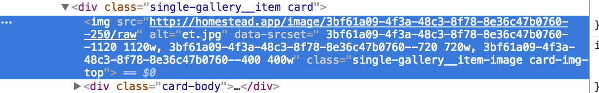
}We have to add these values into a custom attribute, which we’ll call data-srcset on each individual thumbnail:
我们必须将这些值添加到自定义属性中,在每个缩略图data-srcset其称为data-srcset :
<img src="{{ image|getImageUrl(250) }}"
      alt="{{ image.originalFilename }}"
      data-srcset=" {{ image|getImageSrcset }}"
      class="single-gallery__item-image card-img-top">
Now each individual thumbnail has a data-srcset attribute with the required srcset values, but this doesn’t trigger because it’s in a custom attribute, data to be used later.
现在,每个单独的缩略图都有一个data-srcset属性,该属性具有所需的srcset值,但这不会触发,因为它位于自定义属性中,供以后使用。
The final step is updating the JS to take advantage of this:
最后一步是更新JS以利用此优势:
{% block javascripts %}
    {{ parent() }}

    <script>
        $(function () {
            $('.single-gallery__item-image').on('click', function () {
                var src = $(this).attr('src');
                var srcset = $(this).attr('data-srcset');
                var $modal = $('.single-gallery__modal');
                var $modalBody = $modal.find('.modal-body');

                $modalBody.html('');
                $modalBody.append($('<img src="' + src + '" srcset="' + srcset + '" class="single-gallery__modal-image">'));
                $modal.modal({});
            });
        })
    </script>
{% endblock %}
添加滑翔 (Adding Glide)
Glide is a library which does what we want — on-demand image resizing. Let’s install it.
Glide是一个可以满足我们需要的库-按需调整图像大小。 让我们安装它。
composer require league/glideNext, let’s register it in the app. We do this by adding a new service into src/Services with the following content:
接下来,让我们在应用程序中注册它。 为此,我们将新服务添加到src/Services ,内容如下:
<?php
namespace App\Service;

use League\Glide;

class GlideServer
{
    private $server;

    public function __construct(FileManager $fm)
    {
        $this->server = $server = Glide\ServerFactory::create([
            'source' => $fm->getUploadsDirectory(),
            'cache' => $fm->getUploadsDirectory().'/cache',
        ]);
    }

    public function getGlide()
    {
        return $this->server;
    }
}
The service consumes the already declared FileManager service which is auto-injected because of Symfony’s new auto-wiring approach. We declare both the input and output path as the uploadsdir, give the output dir a cache suffix, and add a method for returning the server. The server is basically the instance of Glide which does the resizing and serves back a resized image.
该服务使用已经声明的FileManager服务,该服务由于Symfony的新自动装配方法而自动注入。 我们将输入路径和输出路径都声明为上uploads目录,为输出目录提供一个cache后缀,并添加一种用于返回服务器的方法。 服务器基本上是Glide的实例,该实例进行大小调整并提供调整大小的图像。
We need to make the getUploadsDirectory method in FileManager public, as it’s currently private:
我们需要在FileManager中将getUploadsDirectory方法getUploadsDirectory公开,因为它目前是private :
public function getUploadsDirectory()
{
    return $this->path;
}
Finally, let’s modify the ImageController’s serveImageAction method so that it looks like this:
最后,让我们修改ImageController的serveImageAction方法,使其看起来像这样:
/**
 * @Route("/image/{id}/raw", name="image.serve")
 */
public function serveImageAction(Request $request, $id, GlideServer $glide)
{
    $idFragments = explode('--', $id);
    $id          = $idFragments[0];
    $size        = $idFragments[1] ?? null;

    $image = $this->em->getRepository(Image::class)->find($id);

    if (empty($image)) {
        throw new NotFoundHttpException('Image not found');
    }

    $fullPath = $this->fileManager->getFilePath($image->getFilename());

    if ($size) {

        $info        = pathinfo($fullPath);
        $file        = $info['filename'] . '.' . $info['extension'];
        $newfile     = $info['filename'] . '-' . $size . '.' . $info['extension'];
        $fullPathNew = str_replace($file, $newfile, $fullPath);

        if (file_exists($fullPath) && ! file_exists($fullPathNew)) {

            $fullPath = $fullPathNew;
            $img      = $glide->getGlide()->getImageAsBase64($file,
                ['w' => $size]);

            $ifp = fopen($fullPath, 'wb');

            $data = explode(',', $img);
            fwrite($ifp, base64_decode($data[1]));
            fclose($ifp);
        }
    }

    $response = new BinaryFileResponse($fullPath);
    $response->headers->set('Content-type',
        mime_content_type($fullPath));
    $response->headers->set('Content-Disposition',
        'attachment; filename="' . $image->getOriginalFilename() . '";');

    return $response;
}
This method now explodes the image ID by double-dash, separating size from the image ID. Once Doctrine fetches the image’s filepath from the database, the size is re-attached to the filename if one was passed in, otherwise the original image is used. If this image doesn’t exist, one is generated from the original path and saved for later use.
现在,此方法通过双破折号爆炸图像ID,从而将大小与图像ID分开。 一旦Doctrine从数据库中获取了图像的文件路径,如果传入了文件名,则大小会重新附加到文件名,否则将使用原始图像。 如果该图像不存在,则会从原始路径生成一个并保存以备后用。
For demonstration purposes, we’re taking a longer way around here and generating files manually by appending the size to them and saving them into the uploads folder. It should be noted that you can also use the outputImage method from Glide to directly output the image, and it’ll be served straight from the cache subfolder, not saving it with a suffix in the main upload folder. You can also use the makeImage method to just create the image and let the old logic of fetching the image take over. That’s the approach we picked below:
为了演示起见,我们在这里花了更长的时间,并通过将大小附加到文件并保存到uploads文件夹中来手动生成文件。 请注意,您还可以使用Glide的outputImage方法直接输出图像,它将直接从cache子文件夹提供,而不是将其后缀保存在主upload文件夹中。 您也可以使用makeImage方法创建图像,并让获取图像的旧逻辑接管。 这就是我们下面选择的方法:
/**
 * @Route("/image/{id}/raw", name="image.serve")
 */
public function serveImageAction(Request $request, $id, GlideServer $glide)
{
    $idFragments = explode('--', $id);
    $id          = $idFragments[0];
    $size        = $idFragments[1] ?? null;

    $image = $this->em->getRepository(Image::class)->find($id);

    if (empty($image)) {
        throw new NotFoundHttpException('Image not found');
    }

    $fullPath = $this->fileManager->getFilePath($image->getFilename());

    if ($size) {

        $info        = pathinfo($fullPath);
        $file        = $info['filename'] . '.' . $info['extension'];

        $cachePath = $glide->getGlide()->makeImage($file, ['w' => $size]);
        $fullPath = str_replace($file, '/cache/' . $cachePath, $fullPath);
    }

    $response = new BinaryFileResponse($fullPath);
    $response->headers->set('Content-type',
        mime_content_type($fullPath));
    $response->headers->set('Content-Disposition',
        'attachment; filename="' . $image->getOriginalFilename() . '";');

    return $response;
}
Our on-demand-image-resizing business is operational. Now all we have to do is test things.
我们的按需缩放图像业务正在运营。 现在我们要做的就是测试。
测试中 (Testing)
As soon as we refresh the home page, which will be a little slower now, the images will start being generated in the var/uploads folder. Let’s check it out, without scrolling to the second page.
刷新主页(现在会慢一点)后,图像就会开始在var/uploads文件夹中生成。 让我们检查一下,而无需滚动到第二页。
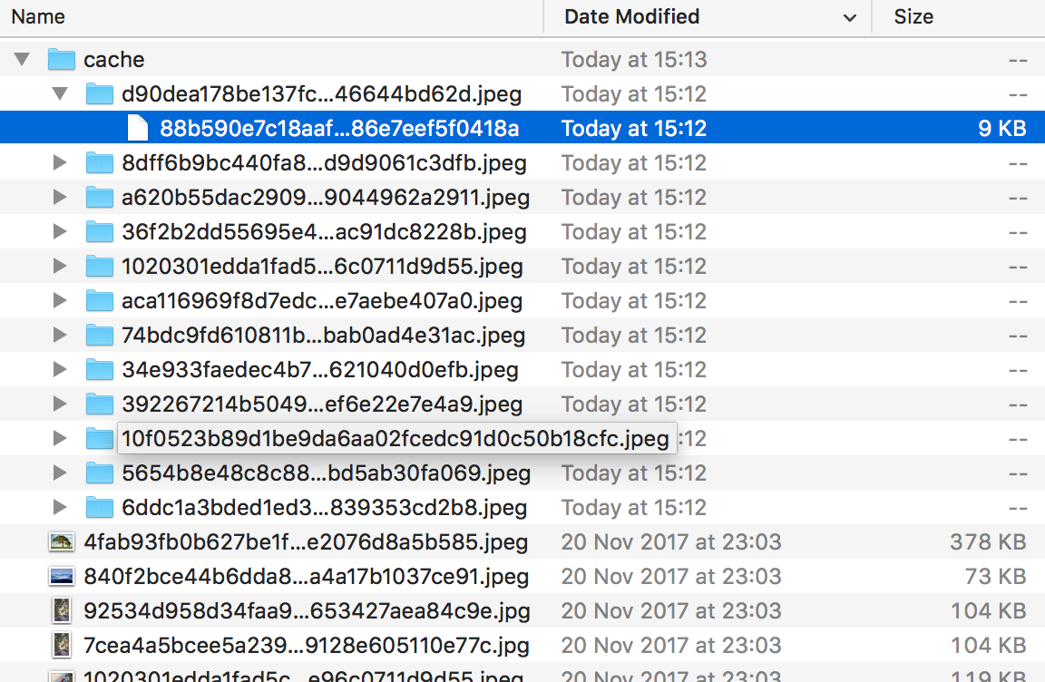
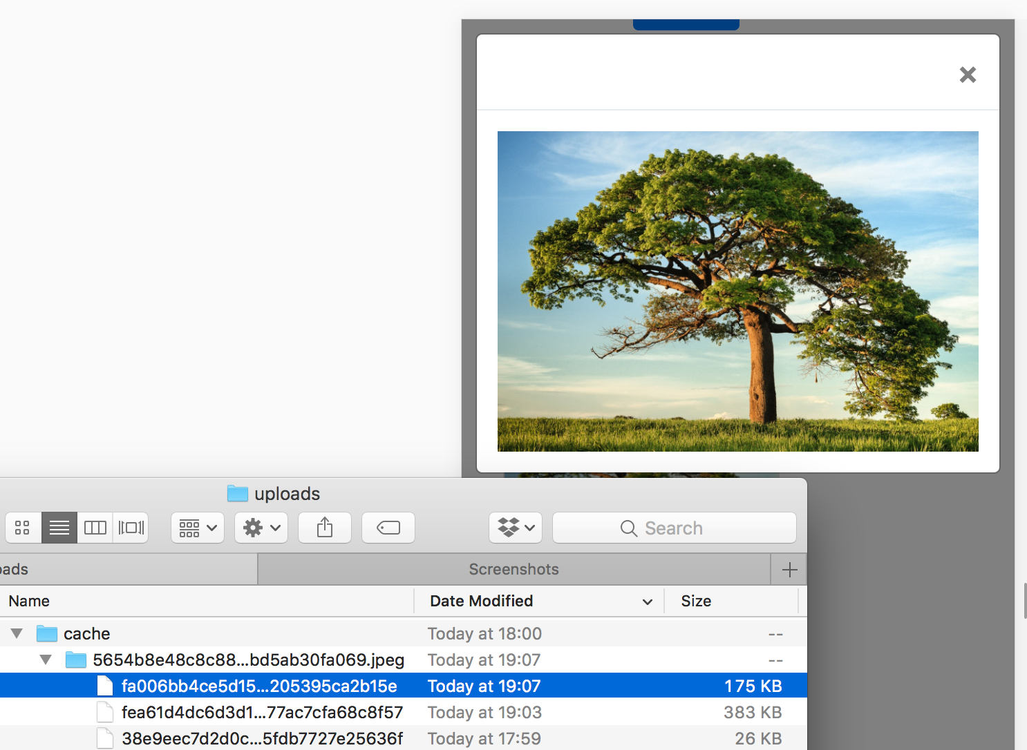
Sure enough, we now have a tiny thumbnail version of every image in the home page, and that’s the image that’s getting served. Notice the small file sizes. Now let’s access a gallery and click on an image to get a big version of it.
可以肯定的是,我们现在在主页中的每个图像都有一个缩略图版本,这就是要提供的图像。 请注意文件较小。 现在,让我们访问图库,然后单击图像以获取它的大版本。
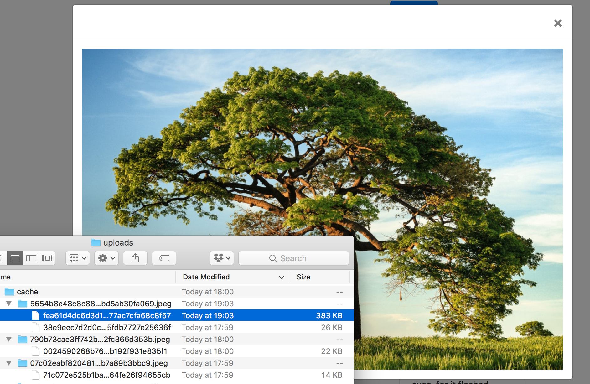
Yep, our image got generated from the original.
是的,我们的图像是从原始图像生成的。
But what about mobile? In modern browsers, it’s easy enough to turn on mobile mode. Let’s try opening a gallery image in mobile view and check the image folder afterwards.
但是手机呢? 在现代浏览器中,打开移动模式非常容易。 让我们尝试在移动视图中打开图库图像,然后再检查图像文件夹。
What if we change orientation and check the folder then?
如果我们更改方向并检查文件夹怎么办?
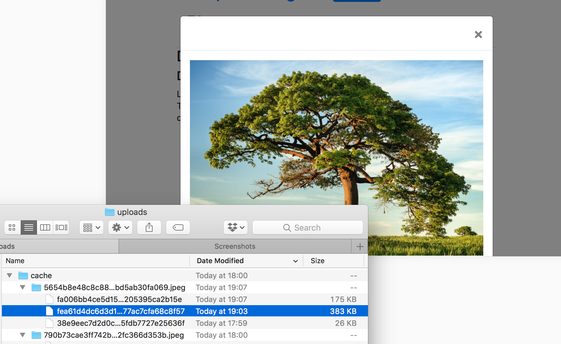
Success, our image’s mobile size has been successfully generated, and the full screen image from before has been reused because that’s how big our “mobile’s” screen is in landscape mode. On-demand srcset was successfully implemented!
成功,我们的图像的移动尺寸已成功生成,并且以前的全屏图像已被重用,因为这就是我们的“移动”屏幕处于横向模式的大小。 按需srcset已成功实现!
The app with these upgrades in place has been tagged as this release.
已完成这些升级的应用程序已标记为此版本 。
结论 (Conclusion)
In this post, we went through the process of optimizing images for delivery in a photo-oriented site. We kept the thumbnails at a fixed size for best results, and with full screen images we focused on implementing srcset — a simple addition to any modern website — in tandem with Glide, an on-demand image resizing package that can do the heavy lifting for us.
在这篇文章中,我们经历了优化图像以在面向照片的站点中交付的过程。 我们将缩略图保持为固定大小以获得最佳效果,并通过全屏图像专注于实现srcset (对任何现代网站的简单添加)与Glide配合使用,Glide是一种按需调整图像大小的软件包,可以为我们。
But while we’re resizing images, wouldn’t it be smart to also auto-optimize them for quality and size by removing metadata? And is it really the best option to be resizing them on demand while the user is waiting or is there another, more practical approach? Find out in the next part.
但是,当我们调整图像大小时,通过删除元数据来自动优化它们的质量和大小是否明智? 是否真的是在用户等待时按需调整大小的最佳选择,还是有另一种更实用的方法? 在下一部分中查找。
翻译自: https://www.sitepoint.com/improving-performance-perception-on-demand-image-resizing/
图像压缩感知


 883
883

 被折叠的 条评论
为什么被折叠?
被折叠的 条评论
为什么被折叠?
 到【灌水乐园】发言


