


 本文介绍了如何在移动应用中正确使用CSS3动画以达到每秒60帧的流畅效果。关键在于避免影响布局的属性,利用`transform`进行动画处理,并通过GPU加速以提高性能。避免在动画过程中重新计算样式和布局,以减少性能瓶颈,确保动画平滑无卡顿。
css3动画实现上下移动
This article was originally published on OutSystems. Thank you for supporting the partners who make SitePoint possible.
本文最初在OutSystems上发布 。 感谢您支持使SitePoint成为可能的合作伙伴。
Animating elements in your mobile application is easy. And animating elements in your mobile applications properly is easy, too… if you follow our tips here.
移动应用程序中的动画元素很容易。 而且,在移动应用程序中正确设置元素动画也很容易……如果您按照此处的提示进行操作。
While everyone uses CSS3 animations in mobile these days, many do so incorrectly. Developers often disregard best practices. This happens because people don’t understand the reasons why those practices exist and why they are so vigorously endorsed.
尽管如今每个人都在移动设备上使用CSS3动画,但许多人还是错误地这样做。 开发人员经常无视最佳做法。 发生这种情况是因为人们不了解这些做法存在的原因以及得到如此大力支持的原因。
The spectrum of device specifications is wide. So if you don’t optimize your code, you will deliver a sub-par experience to the highest share.
设备规格的范围很广。 因此,如果您不优化代码,则将获得最高标准的体验。
Remember: some high-end flagship devices push the envelope, but most of the world uses the type of device that, when compared to those spec monsters, looks like an abacus with an LCD screen.
请记住:一些高端旗舰设备推动了发展,但是世界上大多数国家使用的设备类型与那些规格怪兽相比,看起来就像是带有LCD屏幕的算盘。
We want to give you a hand in harnessing the power of CSS3 correctly. To do that, we need to understand a few things first. t
我们希望帮助您正确利用CSS3的功能。 为此,我们需要首先了解一些事情。 Ť
了解时间表 (Understand the Timeline)
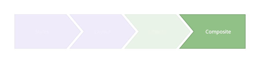
What does the browser do while rendering and playing around with elements? This timeline is called the Critical Rendering Path:
浏览器在渲染和播放元素时会做什么? 此时间轴称为“ 关键渲染路径”:
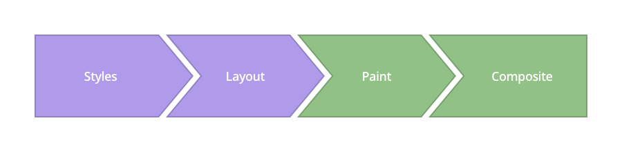
Image Source: www.csstriggers.com
图片来源: www.csstriggers.com
To achieve smooth animations we need to focus on changing properties that affect the Composite step, instead of adding this stress to previous layers.
为了获得平滑的动画,我们需要专注于更改影响“ 合成”步骤的属性,而不是将这种压力添加到先前的图层中。
1. Styles
1.样式
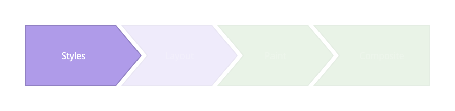
The browser starts calculating the styles to apply to elements — recalculate Style.
浏览器开始计算要应用于元素的样式-重新计算Style 。
2. Layout
2.布局
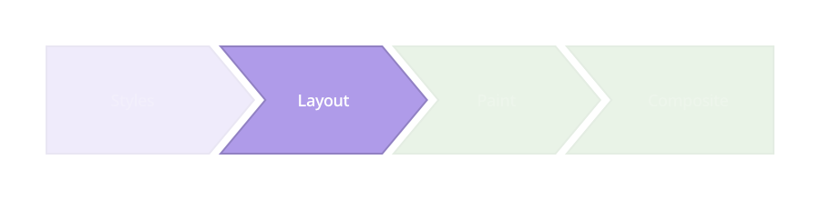
In the following layer, the browser generates the shape and position of each of those elements — Layout. This is where the browser sets the page properties such as width and height , as well as its margin or left/top/right/bottom, for instance.
在下面的层中,浏览器生成每个元素Layout的形状和位置。 浏览器在此处设置页面属性,例如width和height ,以及其页margin或left/top/right/bottom 。
3. Paint
3.油漆
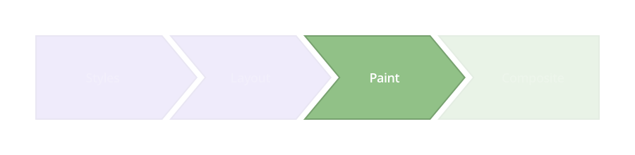
The browser fills in the pixels for each element into layers. It refers to these properties: box-shadow, border-radius, color, background-color, and others.
浏览器将每个元素的像素填充到图层中。 它指的是以下属性: box-shadow , border-radius , color , background-color和其他。
4. Composite
4.复合
This is where you want to perform your animation, as this is when the browser draws all the layers to the screen.
这是您要执行动画的位置,因为这是浏览器将所有图层绘制到屏幕上时的位置。
Modern browsers can animate four style attributes pretty well, making use of the transform and opacity properties.
现代浏览器可以利用transform和opacity属性很好地为四个样式属性设置动画。
Position — transform: translateX(n) translateY(n) translateZ(n);
位置 -变换:translateX(n),translateY(n),translateZ(n);
Scale — transform: scale(n);
比例尺 —变换:scale(n);
Rotation — transform: rotate(ndeg);
旋转 -变换:rotate(ndeg);
Opacity — opacity: n;
不透明度 -不透明度:n;
如何每秒获得60帧 (How to Achieve 60 Frames Per Second)
With this in mind, it’s time to roll up our sleeves and get to work.
考虑到这一点,是时候卷起袖子开始工作了。
Let’s start with the HTML. We’re going to create a very simple structure and put our app-menu inside a layout class.
让我们从HTML开始。 我们将创建一个非常简单的结构,并将我们的应用程序菜单放入布局类中。
<div class="layout">
  <div class="app-menu"></div>
  <div class="header">
    <div class="menu-icon"></div>
  </div>
</div>
走错路 (Going About It the Wrong Way)
.app-menu {
  left: -300px;
  transition: left 300ms linear;
}

.app-menu-open .app-menu {
  left: 0px;
  transition: left 300ms linear;
}
See the properties we changed? You should avoid using transitions with the left/top/right/bottom properties. Those don’t create fluid animations because they force the browser to perform a layout pass each time, which affects all of the element’s children.
看到我们更改的属性了吗? 您应该避免使用带有left/top/right/bottom属性的过渡。 那些不会创建流畅的动画,因为它们会强制浏览器每次执行一次布局传递,这会影响元素的所有子元素。
The result is something like this:
结果是这样的:

That animation is not too smooth. We checked with the DevTools Timeline to see what was happening under the hood, and this was the result:
那个动画不太流畅。 我们检查了DevTools时间轴,以了解幕后情况,结果是:
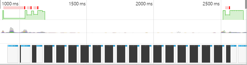
Green areas represent the time spent rendering an animation.
绿色区域代表渲染动画所花费的时间。
This data presents irregular frame-rates and slow performance.
此数据表示不规则的帧速率和较慢的性能。
“The green bar indicates FPS. A high bar indicates that the animation is rendering at 60 FPS. A low bar indicates sub-60 FPS. So, ideally, you want the green bar to be consistently high across the Timeline. Those red bars also indicate jank, so, alternatively, another way to gauge your progress is by eliminating those red bars.” Thank you, Kayce Basques!
“绿色条表示FPS。 高条表示动画以60 FPS渲染。 低条表示低于60 FPS。 因此,理想情况下,您希望整个时间轴上的绿色条始终保持较高。 这些红色的条形也表明是垃圾,因此,另一种评估进度的方法是消除这些红色的条形。” 谢谢Kayce Basques !
使用变换 (Using Transform)
.app-menu {
  -webkit-transform: translateX(-100%);
  transform: translateX(-100%);
  transition: transform 300ms linear;
}
.app-menu-open .app-menu {
  -webkit-transform: none;
  transform: none;
  transition: transform 300ms linear;
}
The transform properties affect the Composite step, rather than the Layout. Here, we inform the browser that our layers are stable before the animation begins, so we experience fewer hiccups when rendering the animation.
transform属性影响Composite步骤,而不是Layout 。 在这里,我们在动画开始之前通知浏览器我们的图层是稳定的,因此在渲染动画时我们会遇到较少的打ic。

That’s exactly what Timeline reflects:
这就是时间轴所反映的:
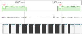
The results start getting better, frame-rate appears to have stabilized and, therefore, the animation runs smoother.
结果开始变得更好,帧速率似乎已经稳定,因此动画运行更加流畅。
在GPU中运行动画 (Running Animations in GPU)
Let’s take it up a notch, then. To really get it running smooth, we’re going to use the GPU to render the animation.
那么,让我们提高一个档次。 为了使它真正流畅运行,我们将使用GPU渲染动画。
.app-menu {
  -webkit-transform: translateX(-100%);
  transform: translateX(-100%);
  transition: transform 300ms linear;
  will-change: transform;
}
Though some browsers still need translateZ() or translate3d() as fallbacks, the will-change property is the future. This property promotes the elements to another layer, so the browser doesn’t have to consider the layout render or painting.
尽管某些浏览器仍然需要translateZ()或translate3d()作为后备,但will-change属性是未来。 此属性将元素提升到另一层,因此浏览器不必考虑布局的渲染或绘画。

See how smooth that is? Timeline substantiates that:
看到那有多光滑吗? 时间轴证明:
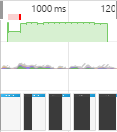
The animation’s frame-rate is more constant and the animation renders quicker. But there’s still a long frame running there at the beginning: a little bit of a bottleneck at the beginning.
动画的帧速率更恒定,并且动画渲染更快。 但是开始时仍然有一个漫长的框架:开始时有点瓶颈。
Remember the HTML structure we created at the beginning? Let’s take a look at how we controlled the app-menu div in JavaScript:
还记得我们一开始创建HTML结构吗? 让我们看一下我们如何在JavaScript中控制app-menu div:
function toggleClassMenu() {
  var layout = document.querySelector(".layout");
  if(!layout.classList.contains("app-menu-open")) {
    layout.classList.add("app-menu-open");
  } else {
    layout.classList.remove("app-menu-open");
  }
}
var oppMenu = document.querySelector(".menu-icon");
oppMenu.addEventListener("click", toggleClassMenu, false);
Aha! We caused a problem here by adding the class to the layout div. This forced the browser to regenerate our style tree — and that affected the rendering performance.
啊哈! 通过将类添加到layout div中,我们在这里引起了问题。 这迫使浏览器重新生成样式树,从而影响了渲染性能。
60 FPS平滑黄油解决方案 (The 60 FPS Smooth as Butter Solution)
What if we create the menu outside of the viewport area? Having the menu in an isolated area will ensure that we only affect the element that we wish to animate.
如果我们在视口区域之外创建菜单怎么办? 将菜单放在孤立的区域将确保我们仅影响我们希望设置动画的元素。
So, we propose the following HTML structure:
因此,我们提出以下HTML结构:
<div class="menu">
  <div class="app-menu"></div>
</div>
<div class="layout">
  <div class="header">
    <div class="menu-icon"></div>
  </div>
</div>
And now we must control the state of the menu in a slightly different way. We’re going to manipulate animations in a class that we remove when the animation ends, by using the transitionend function in JavaScript.
现在,我们必须以稍微不同的方式控制菜单的状态。 我们将通过使用JavaScript中的transitionend函数来处理动画结束时要删除的类中的动画。
function toggleClassMenu() {
  myMenu.classList.add("menu--animatable");
  if(!myMenu.classList.contains("menu--visible")) {
    myMenu.classList.add("menu--visible");
  } else {
    myMenu.classList.remove("menu--visible");
  }
}

function OnTransitionEnd() {
  myMenu.classList.remove("menu--animatable");
}

var myMenu = document.querySelector(".menu");
var oppMenu = document.querySelector(".menu-icon");
myMenu.addEventListener("transitionend", OnTransitionEnd, false);
oppMenu.addEventListener("click", toggleClassMenu, false);
myMenu.addEventListener("click", toggleClassMenu, false);
Let’s put it all together and check the results. Here’s a complete fully-enabled CSS3 example, with everything in the right place:
让我们将它们放在一起并检查结果。 这是一个完整的,完全启用CSS3示例,所有内容都放置在正确的位置:
.menu {
  position: fixed;
  left: 0;
  top: 0;
  width: 100%;
  height: 100%;
  overflow: hidden;
  pointer-events: none;
  z-index: 150;
}

.menu--visible {
  pointer-events: auto;
}

.app-menu {
  background-color: #fff;
  color: #fff;
  position: relative;
  max-width: 400px;
  width: 90%;
  height: 100%;
  box-shadow: 0 2px 6px rgba(0, 0, 0, 0.5);
  -webkit-transform: translateX(-103%);
  transform: translateX(-103%);
  display: flex;
  flex-direction: column;
  will-change: transform;
  z-index: 160;
  pointer-events: auto;
}

.menu--visible .app-menu {
  -webkit-transform: none;
  transform: none;
}

.menu--animatable .app-menu {
  transition: all 130ms ease-in;
}

.menu--visible.menu--animatable  .app-menu {
  transition: all 330ms ease-out;
}

.menu:after {
  content: '';
  display: block;
  position: absolute;
  left: 0;
  top: 0;
  width: 100%;
  height: 100%;
  background: rgba(0,0,0,0.4);
  opacity: 0;
  will-change: opacity;
  pointer-events: none;
  transition: opacity 0.3s cubic-bezier(0,0,0.3,1);
}

.menu--visible.menu:after {
  opacity: 1;
  pointer-events: auto;
}
And what does Timeline show us?
时间轴向我们展示什么?
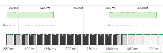
Green bars for days, baby. Want to see a live example? Click here.
几天,孩子们,绿色的酒吧。 想看一个真实的例子吗? 请点击这里 。
翻译自: https://www.sitepoint.com/achieve-60-fps-mobile-animations-with-css3/
css3动画实现上下移动


 扫一扫
扫一扫
 456
456

 被折叠的 条评论
为什么被折叠?
被折叠的 条评论
为什么被折叠?
 到【灌水乐园】发言


