


引入css 路径
The web is predominantly rectangular. On the other hand, print media tends to be more varied in shape. Among the many reasons for this difference is a lack of appropriate tools to achieve what we have in print media.
该网主要是矩形的。 另一方面,打印介质的形状趋于变化更多。 造成这种差异的许多原因之一是缺乏适当的工具来实现我们在印刷媒体中的功能。
This tutorial will introduce you to clip-path, a property which allows you to prevent a portion of an element from being displayed. The region that is visible is governed by the values you provide. We will begin with the basics, then cover the syntax and later on move to more advanced concepts.
本教程将向您介绍clip-path ,该属性使您可以防止显示元素的一部分。 可见区域由您提供的值控制。 我们将从基础知识开始,然后介绍语法,然后再转向更高级的概念。
基础 (The Basics)
Clipping is when we trim a piece from something. In our case, it is an operation which allows us to completely or partially hide elements on a web page. Two other concepts that relate to clipping which we will use in this article are clipping path and clipping region.
裁剪是指从某物上修剪一块。 在我们的情况下,这是一种操作,它使我们可以完全或部分隐藏网页上的元素。 我们将在本文中使用的与裁剪有关的另外两个概念是裁剪路径和裁剪区域 。
Clipping path is the path we use to clip an element, it marks out our clipping region. It can be a basic shape or a complex polygonal path. The clipping region then includes all the area enclosed within the clipping path.
剪切路径是我们用来剪切元素的路径,它标记了我们的剪切区域。 它可以是基本形状,也可以是复杂的多边形路径。 然后,裁剪区域包括裁剪路径内包含的所有区域。
Anything outside the clipping region is clipped by the browsers. This not only includes backgrounds and other such content but also borders, text-shadows and so on. Moreover, browsers won’t capture any events like hover or click outside an element’s clipping region.
剪切区域之外的所有内容都会被浏览器剪切。 这不仅包括背景和其他此类内容,还包括边框,文本阴影等。 此外,浏览器不会捕获任何事件,例如hover或在元素的剪切区域之外click 。
Even though our specific element is now non-rectangular, the content around the elements flows exactly the way it would have if the element had its original shape. To make the surrounding elements flow according to the shape of the clipped element, you will have to use the shape-outside property. This has been covered in detail in this SitePoint tutorial.
即使我们现在的特定元素是非矩形的,元素周围的内容也仍然按照元素具有其原始形状的方式流动。 要使周围的元素根据修剪的元素的形状流动,您将不得不使用shape-outside属性。 在此SitePoint教程中已对此进行了详细介绍。
Also, keep in mind that you do not want to confuse this property with the deprecated clip property which was very restrictive and only supported rectangular clipping.
另外,请记住,您不希望将此属性与已弃用的clip属性混淆,后者是非常严格的限制,仅支持矩形裁剪。
语法和用法 (Syntax and Usage)
The correct syntax for using this property is:
使用此属性的正确语法是:
clip-path: <clip-source> | [ <basic-shape> || <geometry-box> ] | noneThe syntax values above include:
上面的语法值包括:
clip-sourcewill be a URL referencing an internal or external SVG<clipPath>element.clip-source将是一个引用内部或外部SVG<clipPath>元素的URL。basic-shapeaccepts the basic shape function defined in the CSS Shapes specification.basic-shape接受CSS Shapes规范中定义的基本shape函数。geometry-boxis optional. When you provide it along with thebasic-shapefunction, it acts like a reference box for the clipping done bybasic-shape. Ifgeometry-boxis specified by itself, then it uses the shape of specified box, including any corner shaping (provided by theborder-radiusproperty) as the clipping path. We will explore this further soon.geometry-box是可选的。 当您将其与basic-shape函数一起提供时,它就像basic-shape进行裁剪的参考框一样。 如果geometry-box是由其自身指定的,则它将使用指定的框的形状,包括任何拐角形状(由border-radius属性提供)作为剪切路径。 我们将尽快对此进行进一步探讨。
Now, consider the following CSS code which uses the basic shape function:
现在,考虑以下使用基本形状函数CSS代码:
img {
  clip-path: polygon(50% 0%, 100% 50%, 50% 100%, 0% 50%);
}
It will clip all the images in the shape of a rhombus. But why are the images being clipped in shape of a rhombus and not a trapezium or parallelogram? It all depends on the value of your vertices. The following diagram illustrates the conventions to be used when you are creating your own polygon shapes for clipping:
它将以菱形形状剪切所有图像。 但是,为什么将图像剪切成菱形而不是梯形或平行四边形? 这完全取决于顶点的值。 下图说明了在创建自己的多边形进行裁剪时要使用的约定:
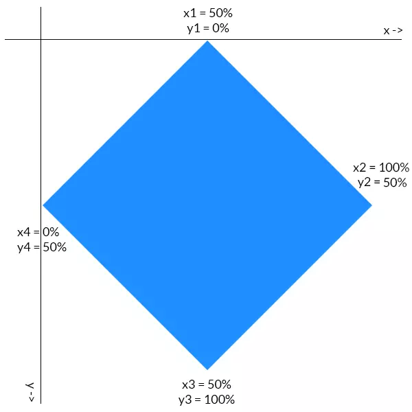
The first coordinate of each point determines its location on the x-axis. Similarly, the second point specifies its location on the y-axis. The points are all plotted in a clockwise direction. Consider the rightmost point of our rhombus. It is located half way down the y-axis, so its y coordinate is 50%. It is also located at the extreme right position on the x-axis, so its x coordinate is 100%. Values of all other points can be deduced similarly.
每个点的第一个坐标确定其在x轴上的位置。 同样,第二点指定其在y轴上的位置。 这些点均按顺时针方向绘制。 考虑一下菱形的最右边。 它位于y轴的一半,因此其y坐标为50%。 它也位于x轴的最右端,因此其x坐标为100%。 所有其他点的值可以类似地推导。
剪切具有geometry-box值的元素 (Clipping Elements With geometry-box Values)
When you are clipping a HTML element the geometry-box (or reference box) can be any one of the following — margin-box, border-box, padding-box or content-box. The geometry-box value should be used in following manner:
裁剪HTML元素时, geometry-box (或参考框)可以是以下任意一种margin-box , border-box , padding-box或content-box 。 geometry-box值应按以下方式使用:
.clip-me {
  clip-path: polygon(10% 20%, 20% 30%, 50% 80%) margin-box;
  margin: 10%;
}
In the case above, the margin-box of our element will be used as a reference to determine the exact location of clipping points. The point (10%, 10%) is the top-left corner of our margin-box and thus our clip-path would be positioned in relation to that point.
在上述情况下,我们元素的margin-box将用作确定剪切点确切位置的参考。 点(10%, 10%)是我们的margin-box左上角,因此我们的clip-path将相对于该点定位。
In case of SVG elements, it can be fill-box, stroke-box and view-box. The value view-box will use the nearest SVG viewport as a reference box if no view-box is specified.
对于SVG元素,它可以是fill-box , stroke-box和view-box 。 如果未指定任何view-box则值view-box将使用最近的SVG视口作为参考框。
clip-path (Uses of clip-path)
This property has a lot of interesting uses. Firstly, it can improve our text content. Take a look at the image below. The background behind the headline and the second paragraph was created using clip-path property:
此属性有很多有趣的用途。 首先,它可以改善我们的文字内容。 看看下面的图片。 标题和第二段后面的背景是使用clip-path属性创建的:
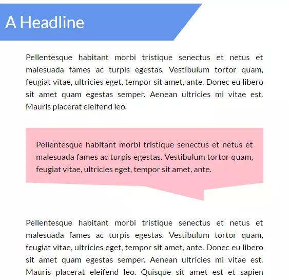
You can easily create the first background using gradients and other such techniques. However, it would be a lot harder to create the second one without the help of clip-path. Note that the line at the bottom of that message-like background is not perfectly horizontal, it is a bit oblique. To achieve this result with clip-path you need only a single line of CSS:
您可以使用渐变和其他类似技术轻松创建第一个背景。 但是,如果没有clip-path的帮助,创建第二个要困难得多。 请注意,类似消息的背景底部的线不是完美的水平线,有点斜。 要使用clip-path实现此结果,您只需要一行CSS:
.p-msg {
  clip-path: polygon(0% 0%, 100% 0%, 100% 75%, 75% 85%, 75% 100%, 50% 80%, 0% 75%);
}
The background has seven vertices and it is reflected in our polygon’s clip-path. How did I come up with those co-ordinates you ask? I’ll leave that to the reader to figure out — doing so will help you have a better understanding of the concepts. Play around with the CodePen below to get the hang of it:
背景有七个顶点,并反映在多边形的clip-path 。 我是如何提出您要求的那些座标的? 我让读者自己弄清楚-这样做将帮助您更好地理解这些概念。 玩下面的CodePen来抓住它:
See the Pen Text with clip-path by SitePoint (@SitePoint) on CodePen.
见笔与剪辑路径文本由SitePoint( @SitePoint上) CodePen 。
You can also clip images into different shapes with this property and arrange them together in cool ways with the help of a little CSS. The image thumbnails in your galleries no longer need to be rectangular and the user avatars can have any shape that you wish. In this tutorial, we will arrange images in the shape of a rhombus. Since all images have the same basic rhomboid shape they will use the same clip-path value. Here is the CSS for rightmost image:
您还可以使用此属性将图像裁剪为不同的形状,并借助一些CSS轻松地将它们排列在一起。 画廊中的图像缩略图不再需要是矩形的,用户头像可以具有您想要的任何形状。 在本教程中,我们将以菱形排列图像。 由于所有图像都具有相同的基本菱形形状,因此它们将使用相同的clip-path值。 这是最右边图像CSS:
.right {
  clip-path: polygon(50% 0%, 100% 50%, 50% 100%, 0% 50%);
  position: relative;
  top: -352px;
  left: 256px;
}
Here is an example of clip-path images in action:
这是实际中的clip-path图像的示例:
See the Pen Images with clip-path by SitePoint (@SitePoint) on CodePen.
在CodePen上查看 SitePoint( @SitePoint ) 带有剪切路径的钢笔图像 。
There is a lot more that you can do with clip-path — you can create buttons with fancy shapes or add nice hover effects to your navigation menu. You are limited only by your own creativity!
clip-path还可以做更多的事情-您可以创建带有精美形状的按钮或向导航菜单添加漂亮的悬停效果。 您仅受自己的创造力限制!
添加动画 (Adding Animation)
This property is also able to be animated. The only thing that you have to keep in mind is that the number of vertices in the final and initial shape must be the same. This makes sense because otherwise the browser won’t know where to add that extra vertex (or where to remove it from). Here is some CSS to animate a trapezium:
此属性也可以进行动画处理。 您唯一需要记住的是,最终形状和初始形状中的顶点数量必须相同。 这是有道理的,因为否则浏览器将不知道在何处添加该额外的顶点(或在何处删除该顶点)。 这是一些动画以梯形动画:
@keyframes polygons {
  25% {
    clip-path: polygon(20% 0%, 100% 38%, 70% 90%, 0% 100%);
  }
  50% {
    clip-path: polygon(0 46%, 100% 15%, 55% 74%, 0 100%);
  }
  70% {
    clip-path: polygon(100% 38%, 100% 38%, 66% 100%, 0 53%);
  }
}
In the final phase of the animation, the trapezium changes into a triangle. As I mentioned earlier, we can’t change the number of vertices and expect the animation to be smooth. Changing the number of vertices will make the transition abrupt. To resolve this issue, I have set the first two vertices in the last polygon in such a way that they coincide. This way our quadrilateral transforms nicely into a triangle.
在动画的最后阶段,梯形变为三角形。 如前所述,我们无法更改顶点数量并期望动画是平滑的。 更改顶点数量会使过渡突然。 要解决此问题,我以最后一个多边形的前两个顶点重合的方式设置了它们。 这样,我们的四边形可以很好地转换为三角形。
See the Pen A clip-path animation by SitePoint (@SitePoint) on CodePen.
请参阅CodePen上的SitePoint ( @SitePoint )的Pen A剪辑路径动画 。
浏览器支持 (Browser Support)
This property is not supported by IE and Edge. Firefox only supports clip-path partially (it only supports the url() syntax). However, from version 47 onward, Firefox supports this property with the layout.css.clip-path-shapes.enabled flag enabled.
IE和Edge不支持此属性。 Firefox仅部分支持clip-path (仅支持url()语法) 。 但是,从版本47开始,Firefox在启用layout.css.clip-path-shapes.enabled标志的情况下支持此属性。
Chrome, Safari and Opera require the prefix -webkit- in order to work properly. Unfortunately, even they don’t support shapes in external SVGs. You can read more about browser support on Can I Use.
Chrome,Safari和Opera需要前缀-webkit-才能正常工作。 不幸的是,即使它们不支持外部SVG中的形状。 您可以在“我可以使用”上阅读有关浏览器支持的更多信息。
结论 (Conclusion)
This tutorial covered the basics of clip-path to help you get started. While it did not take much time to learn how to use this property, using it creatively will take a little practice. By the time browser support is decent enough, you will be ready to create stunning effects with clip-path.
本教程介绍了clip-path的基础知识,以帮助您入门。 虽然不需要花费很多时间来学习如何使用此属性,但是创造性地使用它需要一些实践。 当浏览器支持足够不错时,您便可以使用clip-path创建令人惊叹的效果。
I would also like to mention two tools — clippy by Bennett Feely and clip path generator by CSS Plant — to make it easier for you to create complex polygonal paths.
我还想提到两个工具-Bennett Feely的clippy和CSS Plant的剪切路径生成器 -使您可以更轻松地创建复杂的多边形路径。
Have you created something awesome with clip-path? Please provide a link to it in the comments.
您是否使用剪切路径创建了很棒的东西? 请在评论中提供指向它的链接。
翻译自: https://www.sitepoint.com/introducing-css-clip-path-property/
引入css 路径


 5938
5938

 被折叠的 条评论
为什么被折叠?
被折叠的 条评论
为什么被折叠?
 到【灌水乐园】发言


