


语义化布局
In 2016, there’s no doubt the ‘card-based’ design pattern is an important instrument in a modern web developer’s toolbelt.
在2016年,毫无疑问,“基于卡片”的设计模式是现代Web开发人员工具带中的重要工具。
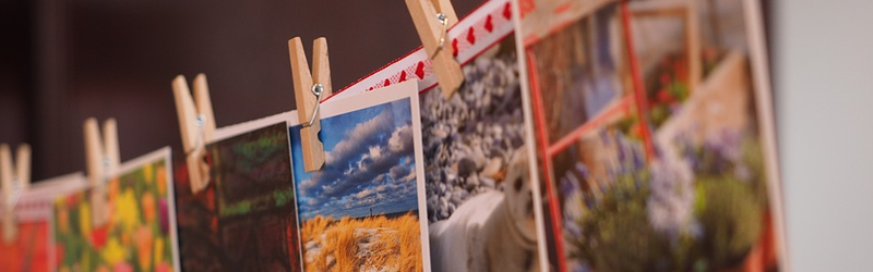
Cards have been used with great success in most social and sharing websites and applications (Dribbble, Twitter, Facebook, Pinterest, Trello, etc.), and especially in mobile design. Their compactness, portability, and high flexibility give developers a convenient way to build responsive layouts and easily adapt the content to different contexts.
卡已在大多数社交和共享网站和应用程序(Dribbble,Twitter,Facebook,Pinterest,Trello等)中获得了巨大成功,尤其是在移动设计中。 它们的紧凑性,可移植性和高度灵活性为开发人员提供了一种方便的方法来构建响应式布局,并轻松地使内容适应不同的上下文。
You can employ cards in a wide variety of scenarios such as listing blog posts, recipe articles, product overviews, features highlights, making self-contained widgets, etc. For a more in detail overview of what cards are and why you should use them see this article.
您可以在各种情况下使用名片,例如列出博客文章,食谱文章,产品概述,功能要点,制作独立的小部件等。有关什么是名片以及为什么要使用它们的详细信息, 请参见这篇文章 。
Today we’ll explore two examples of the card-based design pattern implemented
今天,我们将探讨两个实施的基于卡的设计模式的示例
- an image album 相册
- and a recipe widget 和一个食谱小部件
We’re going to use Semantic UI, which is one of the most popular and easy-to-use CSS frameworks and provides a ready-to-use Card component out-of-the-box. Any designer with some familiarity with HTML/CSS should have no problem following this tutorial.
我们将使用Semantic UI ,它是最流行和易于使用CSS框架之一,并提供了现成的现成的Card组件。 任何熟悉HTML / CSS的设计人员都可以在本教程之后学习。
Before we get started with the examples make sure you have prepared two empty HTML files, each one with references to jQuery (jquery.js) and Semantic UI (semantic.css, semantic.js). You can link them from a CDN if you don’t want to download them.
在开始使用示例之前,请确保您已经准备了两个空HTML文件,每个文件都引用了jQuery( jquery.js )和Semantic UI(semantic.css,semantic.js)。 如果您不想下载它们,可以从CDN链接它们。
<!DOCTYPE HTML>
<html>
<head>
    <meta charset="utf-8" />
    <title>Semantic UI CDN</title>
    <link rel="stylesheet" href="https://cdnjs.cloudflare.com/ajax/libs/semantic-ui/1.11.8/semantic.min.css"/>
    <script src="https://cdnjs.cloudflare.com/ajax/libs/jquery/2.1.3/jquery.min.js"></script>
    <script src="https://cdnjs.cloudflare.com/ajax/libs/semantic-ui/1.11.8/semantic.min.js"></script>
</head>
<body>
      <!-- Your Semantic UI Code -->
</body>
</html>
示例1:一个简单的相册 ( Example 1: A Simple Image Album)
For the first example, let’s suppose we need an application to store and manage our images grouped in separate albums. We also want each album to looks like a stack of images. To achieve that effect, add the following code in your first HTML file:
对于第一个示例,假设我们需要一个应用程序来存储和管理分组在不同相册中的图像。 我们还希望每个专辑看起来像一堆图像。 为此,请在您的第一个HTML文件中添加以下代码:
<div id="album">
  <div class="ui piled compact segment">
  <div class="floating ui red label">9</div>
    <div class="ui card">

       <!-- Album Card Content -->

    </div>
  </div>
</div>
We wrap the album with a <div id="album"> tag. Then, we use a Segment component, which makes the album to appear as a stack of images. We also put a label at top-right corner displaying how many images the album contains. And finally, we add an empty Card component.
我们用<div id="album">标签包装相册。 然后,我们使用一个Segment组件,该组件使相册显示为一堆图像。 我们还在右上角放置了一个标签,显示该相册包含多少张图像。 最后,我们添加一个空的Card组件。
At this stage, we need some CSS to give a little breathing space around the album and to distinguish it from the background:
在此阶段,我们需要一些CSS,以便在专辑周围留出一些喘息的空间,并将其与背景区分开:
body {
  margin: 30px;
  background-color: whitesmoke;
}
Right now, the album looks a bit strange. But don’t worry, we’ll get it into a shape in a minute.
现在,这张专辑看起来有些奇怪。 但请放心,我们将在一分钟内将其定型。
We want to have a front image showing the first image from the album. When we hover over that image, it will be dimmed and a button will appear in the center. When we click the button we’ll go inside the album. We do all this by adding the following code inside the empty Card component.
我们想要一个正面图片,显示相册中的第一张图片。 当我们将鼠标悬停在该图像上时,该图像将变暗,并且按钮将出现在中间。 当我们单击按钮时,我们将进入相册。 我们通过在空Card组件内添加以下代码来完成所有这些工作。
<div class="blurring dimmable image">
  <div class="ui inverted dimmer">
   <div class="content">
     <div class="center">
       <div class="ui red button view">VIEW</div>
     </div>
   </div>
  </div>
  <img src="http://mrg.bz/IxQIgC">
</div>
To activate the Dimmer component, which we use above, we need to add the following jQuery code:
要激活上面使用的Dimmer组件,我们需要添加以下jQuery代码:
$( document ).ready(function() {
  $('.ui.card .image').dimmer({on: 'hover'});
});
The album looks better now, but the VIEW button does nothing. For now, just leave it as it is, we’ll activate it a bit later.
专辑现在看起来更好了,但是“ VIEW按钮什么也没做。 现在,将其保持原样,我们稍后将其激活。
Let’s continue building the album “face” by adding the following code:
让我们通过添加以下代码来继续构建专辑“ face”:
<div class="content">
  <div id="rate" class="ui star rating right floated" data-rating="3"></div>
  <div class="header">Animals</div>
  <div class="meta">
    <span class="date"><i class="calendar icon"></i>Created 7/27/2014</span>
    <span class="right floated date"><i class="history icon"></i> Modified 8/4/2014</span>
  </div>
  <div class="description">
  Different animals from around the world
  </div>
</div>
Here, we use the content class to group a header, meta, and description elements, which represent the title of the album, album details such as when the album is created and when is modified, and a short description of the album content. Also, we add a Rating component aligned to the right of the title. To activate it and make it visible, we use jQuery again:
在这里,我们使用content类对标题,元数据和描述元素进行分组,这些元素表示专辑的标题,专辑详细信息(例如创建专辑和修改专辑的时间)以及专辑内容的简短描述。 此外,我们在标题的右侧添加了一个Rating组件。 要激活它并使它可见,我们再次使用jQuery:
$('.ui.rating').rating({maxRating: 5});You may notice that the album details are too big and don’t fit on one line. We’ll fix this at the end when all cards are created.
您可能会注意到,相册的详细信息太大,无法排成一排。 创建完所有卡后,我们将在最后解决此问题。
We continue by adding two buttons at the bottom of the album card:
我们继续在相册卡片底部添加两个按钮:
<div  class="extra content" >
  <div class="ui right labeled button" data-content="Like it!" data-variation="tiny">
    <div class="ui red icon tiny button">
      <i class="thumbs outline up large icon"></i>
    </div>
    <a class="ui basic red left pointing label">365</a>
  </div>
  <div class="ui left labeled right floated button" data-content="Share it!" data-variation="tiny">
    <a class="ui basic red right pointing label">183</a>
    <div class="ui red icon tiny button">
      <i class="external share large icon"></i>
    </div>
  </div>
</div>
Here, we use two complex buttons, wrapped in an extra content class – one to like the album and one to share it. Also, we need a tooltip for each button, so we add a data-content attribute containing the tooltip’s message. And again, to activate the Popup component we use this jQuery code:
在这里,我们使用两个复杂的按钮,包裹在一个extra content类中–一个按钮喜欢相册,另一个按钮则共享相册。 另外,每个按钮都需要一个工具提示,因此我们添加了一个data-content属性,其中包含工具提示的消息。 再一次,要激活Popup组件,我们使用以下jQuery代码:
$('.ui.button').popup(); Now, the “face” of the album is ready and it’s time to build the inner view for the album images. We add the following code, but this time after (outside) the <div id="album"> tag:
现在,相册的“面部”已准备就绪,是时候为相册图像构建内部视图了。 我们添加以下代码,但是这次是在<div id="album">标记( 外部 )之后:
<div id="album_items">
  <button class="ui labeled icon button back">
    <i class="arrow lircle left icon"></i>Back
  </button>
  <div class="ui cards">

    <!-- Album Images Cards -->

  </div>
</div>
Here, we wrap the album images with a <div id="album_items"> tag, and we add a button to get back to the album “face”. Then, we add <div class="ui cards"> tag whose purpose is to hold the individual image cards. We also put the following CSS to hide initially the album images and to give some space around them:
在这里,我们用<div id="album_items">标签包装相册图像,并添加一个按钮以返回相册“ face”。 然后,我们添加<div class="ui cards">标签,其目的是保存单个图像卡。 我们还放置了以下CSS,以最初隐藏相册图像并在其周围留出一些空间:
#album_items {
  display: none;
}

#album_items .ui.cards {
  margin: 10px;
}
Now, it’s time to make the VIEW button working. We add the following code:
现在,该使“ VIEW按钮起作用了。 我们添加以下代码:
$('.button.view').on('click', (function() {
  $('#album').fadeOut('slow', function () {
    $('#album_items').fadeIn('slow');
  });
}));

$('.button.back').on('click', (function() {
  $('#album_items').fadeOut('slow', function () {
    $('#album').fadeIn('slow');
  });
}));
Good. If you try it now you’ll see it is working. But there is nothing to show in the album yet. So, let’s start adding the image cards. Here is the code for the first card:
好。 如果现在尝试,您会发现它正在工作。 但是专辑中没有任何内容。 因此,让我们开始添加图像卡。 这是第一张卡的代码:
<div class="card">
  <div class="image">
    <img src="http://mrg.bz/IxQIgC">
  </div>
  <div class="content">
    <div class="header">giraffes.jpg</div>
    <div class="meta">263 KB</div>
  </div>
  <div class="ui bottom attached basic buttons">
    <button class="ui button"><i class="pencil icon"></i></button>
    <button class="ui button"><i class="trash icon"></i></button>
  </div>
</div>
For each image card, we add the image itself, a content section with image’s title and size, and two buttons for image editing and deleting. We do this eight more times until we have 9 card images in the album, as this is denoted in the album label at the top-right corner. (See the final result below for reference about the other eight cards)
对于每个图像卡,我们添加图像本身,带有图像标题和大小的内容部分以及两个用于图像编辑和删除的按钮。 我们将进行八次以上的操作,直到相册中有9张卡片图像为止,这在右上角的相册标签中表示出来。 (有关其他八张卡的参考,请参见下面的最终结果)
The last thing we need to do is to tweak a bit the appearance of the image cards. To do that, we use the following CSS:
我们需要做的最后一件事是调整图像卡的外观。 为此,我们使用以下CSS:
.ui.cards > .card  {
  width: 210px;
}

.ui.cards > .card > .content > .header:not(.ui) {
  font-size: 1.1em;
  font-weight: normal;
}

.ui.cards > .card .meta,
.ui.card .meta {
  font-size: 0.8em;
}
Now everything should work and display correctly. You can see the final result here JS Bin
现在,所有内容都可以正常工作并正确显示。 您可以在此处查看最终结果JS Bin
示例2:配方小部件 ( Example 2: The Recipe Widget)
NOTE: The content for the recipe is taken from here.
注意:配方内容取自此处 。
For the second example, let’s suppose we want to create a recipe widget containing the recipe image, name, description, and some details (preparation time, the number of servings, and difficulty level) on its front card. When we hover over the card, the main content will hide revealing another card with two lists: one for the recipe’s ingredients, and one for the recipe’s directions.
对于第二个示例,假设我们要在其正面卡片上创建一个包含食谱图像,名称,描述和一些详细信息(准备时间,份数和难度级别)的食谱小部件。 当我们将鼠标悬停在卡片上时,主要内容将隐藏起来,显示出另一张卡片,其中包含两个列表:一个用于配方的成分,另一个用于配方的方向。
Use your second HTML file and add this starting code:
使用第二个HTML文件并添加以下起始代码:
<div class="ui move reveal">
  <div class="visible content">
    <div class="ui card">

    </div>
  </div>
  <div class="hidden content">
    <div class="ui card">

    </div>
  </div>
</div>
Here, we use a Reveal component, which have two sections: for visible and for hidden content. For each section, we put an empty Card component. We also add some CSS – we give some space around the recipe card and we use a lightgrey color to distinguish the cards. We override the style for the Reveal to have a width of 290px to match the default width of the Card component, and we set white-space property to normal in order to wrap the long lines inside the card. Also, we give a card a height of 420px.
在这里,我们使用Reveal组件,该组件有两个部分:用于可见内容和用于隐藏内容。 对于每个部分,我们放置一个空的Card组件。 我们还添加了一些CSS –在食谱卡片的周围lightgrey出一些空间,并使用浅灰色区分卡片。 我们覆盖的风格为显示具有的宽度290px相匹配的卡组件的默认宽度,我们设置white-space属性normal ,以包住卡内排长队。 另外,我们给卡片设置了420px的高度。
body {
  margin: 30px;
  background-color: lightgrey;
}

.ui.move.reveal {
  width: 290px;
  white-space: normal;
}

.ui.card {
  height: 420px;
}
Now, let’s add the code for the visible card:
现在,让我们添加可见卡的代码:
<img class="ui image" src="http://mrg.bz/TRRrQJ">
<div class="content">
  <div class="header">Pizza Margherita</div>
  <div class="description">Invented in Naples in honor of the first queen of Italy, the Margherita pizza is the triumph of Italian cuisine in the world.</div>
</div>
<div  class="extra content" >
  <div class="ui labeled icon menu">
    <a class="item"><i class="wait icon"></i>2h 16min</a>
    <a class="item"><i class="food icon"></i>6 servings</a>
    <a class="item"><i class="signal icon"></i>Easy</a>
  </div>
</div>
First, we put the image for the recipe. Next, we use a content section to show the title and description for the recipe. And finally, we use a Menu component inside the extra content section, to display details for the recipe – preparation time, the number of servings, and difficulty level. The only thing left to do about this front card is to tweak the appearance of the menu to display evenly its three parts.
首先,我们将图像放入配方中。 接下来,我们使用内容部分显示食谱的标题和描述。 最后,我们在额外内容部分内使用菜单组件,以显示食谱的详细信息-准备时间,份数和难度。 剩下的唯一要做的就是调整菜单的外观以均匀显示其三个部分。
Also we lower the font size a bit and adjust the padding to have more space at right and left and less at top and bottom.
此外,我们稍微降低了字体大小,并调整了填充以使左右空间更大,而上下空间更少。
.ui.labeled.icon.menu .item{
  min-width: 33.3333%;
  max-width: 33.3333%;
  font-size: 0.8em;
  padding: 6px 2px;
}
Great. Now you can test it. It works fine, but we need to add the content for the hidden card:
大。 现在您可以对其进行测试。 效果很好,但是我们需要为隐藏卡添加内容:
<div class="content">
  <div class="ui pointing secondary menu">
    <div class="item active" data-tab="ingredients">Ingredients</div>
    <div class="item" data-tab="directions">Directions</div>
  </div>
  <div class="ui tab active" data-tab="ingredients">

  </div>
  <div class="ui tab" data-tab="directions">

  </div>
</div>
Here, we use a Tab component, with conjunction with Menu component, to create tabs for the Ingredients and Directions lists.
在这里,我们使用“ 选项卡”组件以及“ 菜单”组件来为“ 成分和方向”列表创建选项卡。
To activate the Tab component we need to use the following jQuery code:
要激活Tab组件,我们需要使用以下jQuery代码:
$( document ).ready(function() {
  $('.menu .item').tab();
});
Now the tabs are working, but the content is missing. Let’s add the content of the first tab:
现在选项卡可以使用,但是内容丢失了。 让我们添加第一个选项卡的内容:
<h3>For pasta</h3>
<div class="ui list">
  <div class="item"><i class="check circle red icon"></i>2 lb Italian "00" flour or all-purpose flour</div>
  <div class="item"><i class="check circle red icon"></i>1 oz fresh yeast</div>
  <div class="item"><i class="check circle red icon"></i>2 cups water</div>
  <div class="item"><i class="check circle red icon"></i>⅜ oz salt</div>
</div>
<h3>For dressing</h3>
<div class="ui small list">
  <div class="item"><i class="check circle red icon"></i>½ cup extra virgin olive oil</div>
  <div class="item"><i class="check circle red icon"></i>1 lb mozzarella cheese</div>
  <div class="item"><i class="check circle red icon"></i>basil leaves to taste</div>
  <div class="item"><i class="check circle red icon"></i>1 lb canned tomatoes</div>
  <div class="item"><i class="check circle red icon"></i>salt to taste</div>
</div>
And now, let’s add the content for the second tab:
现在,让我们添加第二个选项卡的内容:
<div class="ui small list">
  <div class="item"><span class="ui red circular label">1</span> On a wooden...</div>
  <div class="item"><span class="ui red circular label">2</span> Knead the dough...</div>
  ...
  <div class="item"><span class="ui red circular label">8</span> Once ready...</div>
</div>
Here, for brevity, I don’t give the full list of directions. See the final result below for the full version.
为简洁起见,在这里,我没有提供完整的路线清单。 有关完整版本,请参见下面的最终结果。
The last thing we need to do is to add some CSS to display the things correctly. First, we set the cursor to pointer when we hover over the tabs. Next, we set the height of the tabs to 320px and overflow-y property to auto in order to show a scrollbar when the list gets too long as this happens with the Directions list.
我们需要做的最后一件事是添加一些CSS以正确显示这些内容。 首先,当我们将鼠标悬停在选项卡上时,将光标设置为pointer 。 接下来,我们将选项卡的高度设置为320px并将overflow-y属性设置为auto ,以便在列表变得太长时显示滚动条,因为这种情况发生在“ 方向”列表中。
.ui.pointing.menu {
  cursor: pointer;
}

.ui.tab {
  height: 320px;
  overflow-y: auto;
}
Perfect. Now everything should work correctly. You can see the final result here JS Bin
完善。 现在一切都应该正常工作。 您可以在此处查看最终结果JS Bin
摘要 ( Summary)
So far we’ve seen two examples showing the practical implementation of the card-based design pattern. Along the way, we explored Semantic UI’s card components and how we can use it to implement different kinds of cards-based design. Now you can continue experimenting with your own ideas.
到目前为止,我们已经看到了两个示例,这些示例显示了基于卡的设计模式的实际实现。 在此过程中,我们探索了语义UI的卡片组件以及如何使用它来实现各种基于卡片的设计。 现在,您可以继续尝试自己的想法。
And for those of you who are fans of Bootstrap, the good news is their next major release will provide a built-in card component too.
对于喜欢Bootstrap的人来说,好消息是他们的下一个主要版本也将提供内置卡组件。
翻译自: https://www.sitepoint.com/how-to-design-rich-card-based-layouts-with-semantic-ui/
语义化布局


 146
146

 被折叠的 条评论
为什么被折叠?
被折叠的 条评论
为什么被折叠?
 到【灌水乐园】发言


