


excel中双纵轴图表
Creating a professional looking chart for Excel presentations is extremely easy in Excel 2007. Making charts is a more interesting way to present data than just going through the rows and columns on a spreadsheet.
在Excel 2007中,为Excel演示文稿创建具有专业外观的图表非常容易。制作图表是显示数据的一种更有趣的方法,而不仅仅是浏览电子表格中的行和列。
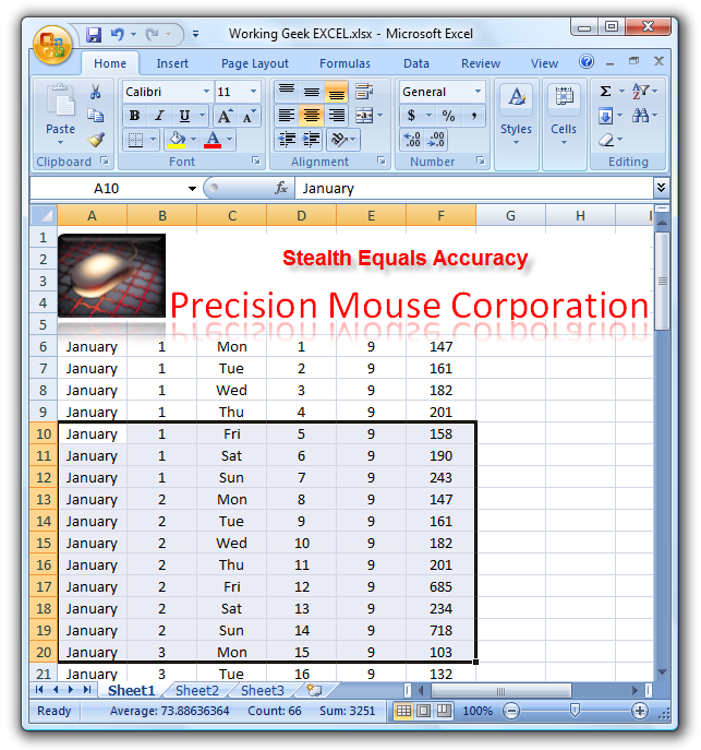
First highlight the data you want to chart on your Excel spreadsheet.
首先,突出显示要在Excel电子表格上绘制图表的数据。
Now that we have the correct data selected we need to click Insert on The Ribbon. Now select Charts and decide what type of chart you want to represent the data. I usually experiment at this point because you can always undo a certain selection.
现在我们选择了正确的数据,我们需要单击功能区上的“插入”。 现在,选择“图表”并确定要代表数据的图表类型。 我通常会在此时进行试验,因为您总是可以撤消某些选择。
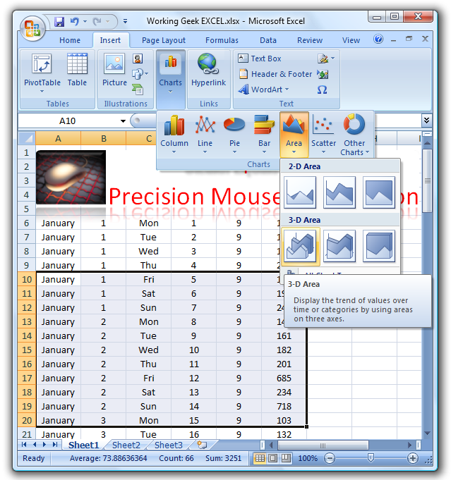
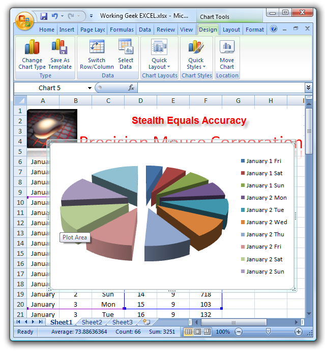
In this example I used the Exploding Pie Chart. After you make your selection you will get a nice preview of how it looks. Now we can take this chart and move it anywhere on the Excel document.
在此示例中,我使用了爆炸饼图。 选择之后,您将获得有关其外观的漂亮预览。 现在,我们可以获取此图表并将其移动到Excel文档上的任何位置。
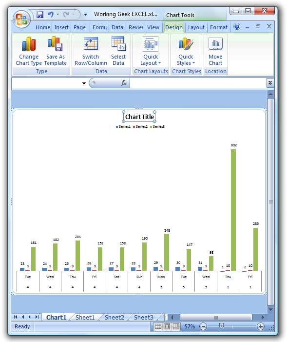
Next we want to tweak it a bit more by going to the Design tab in The Ribbon and clicking on Quick Layout. Here we can choose from different types of layouts for the chart. Again here you can experiment until you get the right fit.
接下来,我们要通过单击功能区中的“设计”选项卡并单击“快速布局”来对其进行更多调整。 在这里,我们可以从图表的不同布局类型中进行选择。 同样,您可以在这里进行实验,直到找到合适的位置。
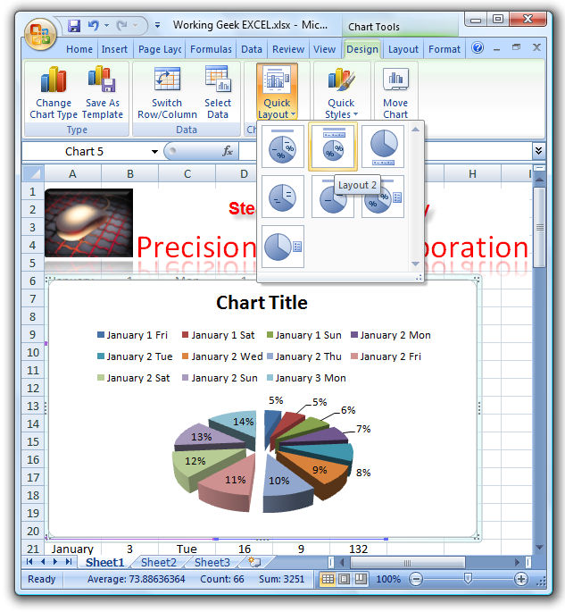
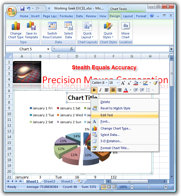
This is the layout I ended up with. Now lets individualize the chart title by right clicking “Chart Title” and selecting Edit Text.
这是我最终得到的布局。 现在,通过右键单击“图表标题”并选择“编辑文本”来个性化图表标题。
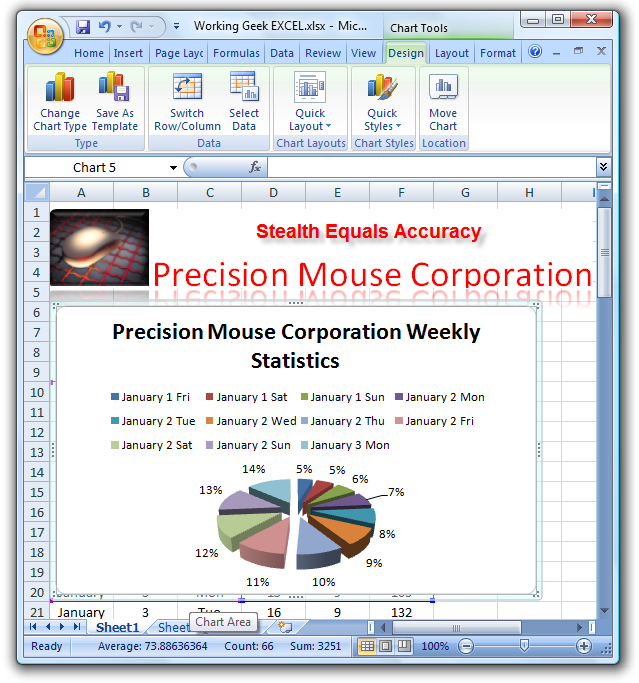
That is all there is to it! As you can see we have a nice looking chart to help everyone at the meeting understand the data and statistic easier. Later this week I will go over adding details to the chart.
这就是全部! 如您所见,我们有一个漂亮的图表,可帮助会议中的每个人更轻松地了解数据和统计信息。 本周晚些时候,我将继续向图表添加详细信息。
**Also, for you Keyboard Ninja’s a quicker way to execute this process is to highlight the data on your spreadsheet and hit the F11 key. This will bring up a separate “Chart Tab” where you can then manipulate the appearance and add details.
**此外,对于您来说,Keyboard Ninja更快地执行此过程的方法是突出显示电子表格中的数据,然后按F11键。 这将弹出一个单独的“图表选项卡”,您可以在其中操纵外观并添加细节。
翻译自: https://www.howtogeek.com/79942/create-appealing-charts-in-excel-2007/
excel中双纵轴图表


 6291
6291


 被折叠的 条评论
为什么被折叠?
被折叠的 条评论
为什么被折叠?
 到【灌水乐园】发言


