


sql表格模型获取记录内容
介绍 (Introduction)
A few weeks back I had been working on an interesting proof of concept for a client within the food / grocery industry. The objectives were to be able to provide the client with information on sales patterns, seasonal trends and location profitability. The client was an accountant and was therefore comfortable utilizing spreadsheets. This said, I felt that this was a super opportunity to build our proof of concept utilizing a SQL Server Tabular Solution and by exploiting the capabilities of Excel and Power Reporting for the front end.
几周前,我一直在为食品/杂货行业的客户提供有趣的概念证明。 目标是能够向客户提供有关销售模式,季节性趋势和地区盈利能力的信息。 客户是会计师,因此可以轻松使用电子表格。 这就是说,我觉得这是利用SQL Server表格解决方案并通过利用Excel和Power Reporting的前端功能来建立概念验证的绝佳机会。
In today’s “fire side chat” we shall be examining how this proof of concept was created and we shall get a flavour of the report types that may be generated, simply by utilizing Excel.
在今天的“旁白”中,我们将研究如何创建此概念证明,并且将简单地通过使用Excel来了解可能生成的报告类型。
In the second and final part of this article, we shall be examining the power of utilizing SQL Server Reporting Services 2016 to generate user reports.
在本文的第二部分也是最后一部分,我们将研究利用SQL Server Reporting Services 2016生成用户报告的功能。
However, before getting carried away with Reporting Services, let us look at the task at hand, that being to work with the tabular model and Excel Power Reporting.
但是,在不使用Reporting Services之前,让我们看一下手头的任务,即与表格模型和Excel Power Reporting一起使用。
Thus, let’s get started.
因此,让我们开始吧。
入门 (Getting Started)
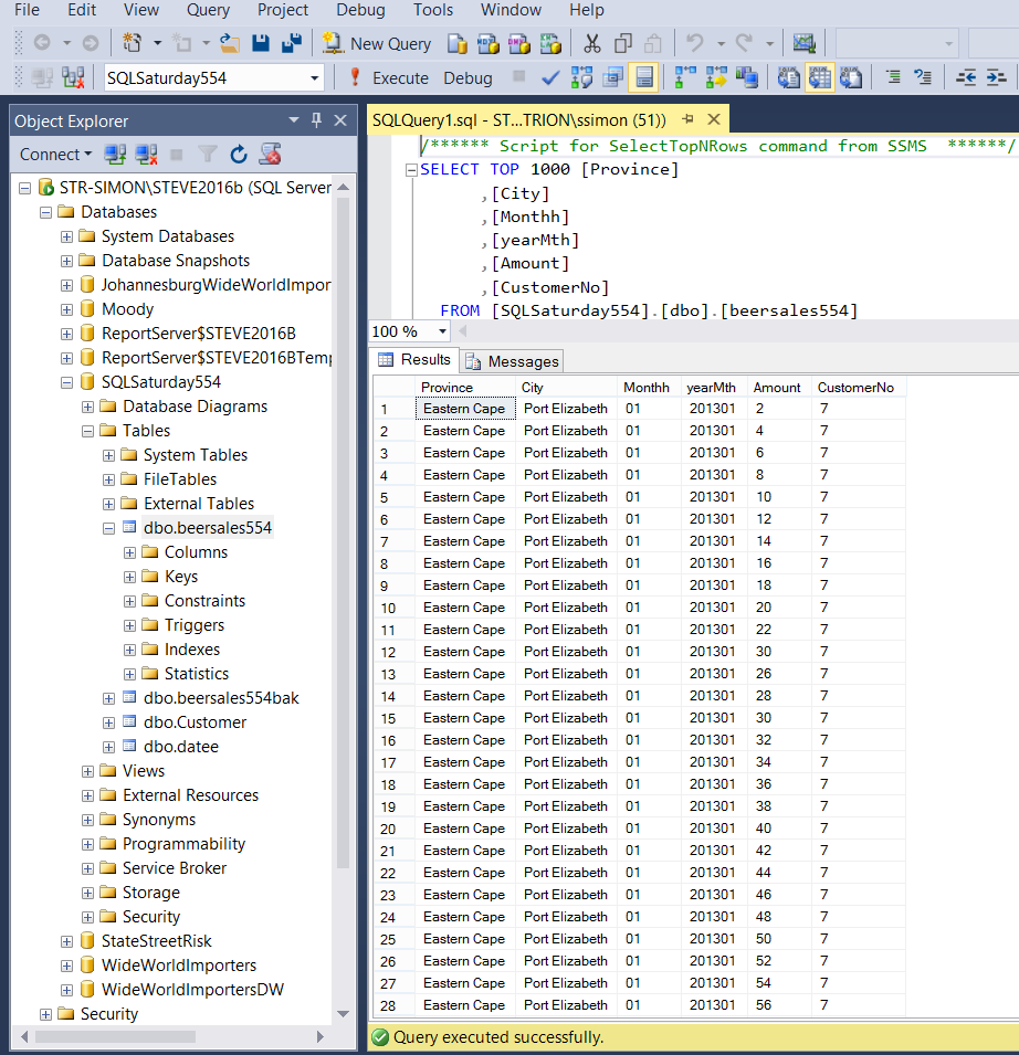
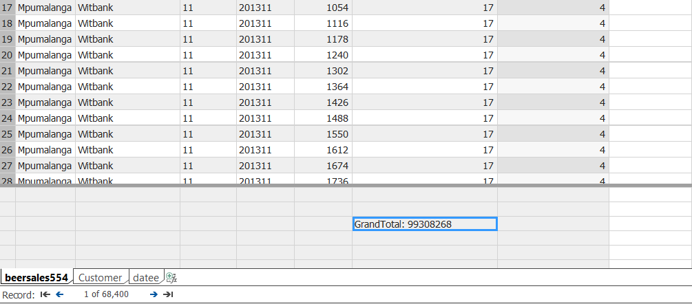
Our journey begins with the raw data. Opening SQL Server Management Studio 2016, we locate a database which I have called SQLSaturday554. In the screenshot below, the reader will note that we have the beer sales from major South Africa cities for several years.
我们的旅程始于原始数据。 打开SQL Server Management Studio 2016,我们找到一个名为SQLSaturday554的数据库。 在下面的屏幕截图中,读者会注意到,几年来我们在南非主要城市都有啤酒销售。
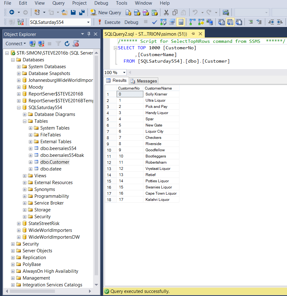
We also have customer data within our “Customer” table (see below).
我们的“客户”表中也有客户数据(见下文)。
Last but not least, we have a “year month calendar table” (to add a time dimension) to our exercise (see below).
最后但并非最不重要的一点是,我们在练习中有一个“年月日历表”(添加时间维度)(请参见下文)。
For our exercise, we shall be working with these three tables.
对于我们的练习,我们将使用这三个表。
创建表格模型 (Creating our tabular model)
Should you not have a tabular instance installed upon your work server, you may want to install one from the media supplied from Microsoft. One merely adds another instance and select ONLY the Analysis Services option and then the “Tabular” option. The install is fairly quick.
如果您没有在工作服务器上安装表格形式的实例,则可能要从Microsoft提供的媒体中安装一个表格形式的实例。 一个人仅添加另一个实例,然后仅选择Analysis Services选项,然后选择“ Tabular”选项。 安装相当快。
Should you be unfamiliar with the Tabular Model itself, fear not as we shall be working our way through the whole process, step by step.
如果您不熟悉表格模型本身,请不要担心,因为我们将逐步逐步完成整个过程。
From this point on I shall assume that we all have a tabular instance installed upon our work servers.
从这一点开始,我将假定我们所有人都在工作服务器上安装了表格实例。
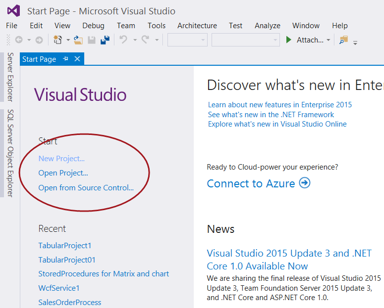
Opening Visual Studio 2015 or SQL Server Data Tools (2010 and above) we create a new project by selecting “New Project” under the Start banner as shown below.
打开Visual Studio 2015或SQL Server数据工具(2010及更高版本),我们通过在“开始”横幅下选择“新建项目”来创建一个新项目,如下所示。
The “Project Type” menu is brought up (see below).
出现“项目类型”菜单(请参见下文)。
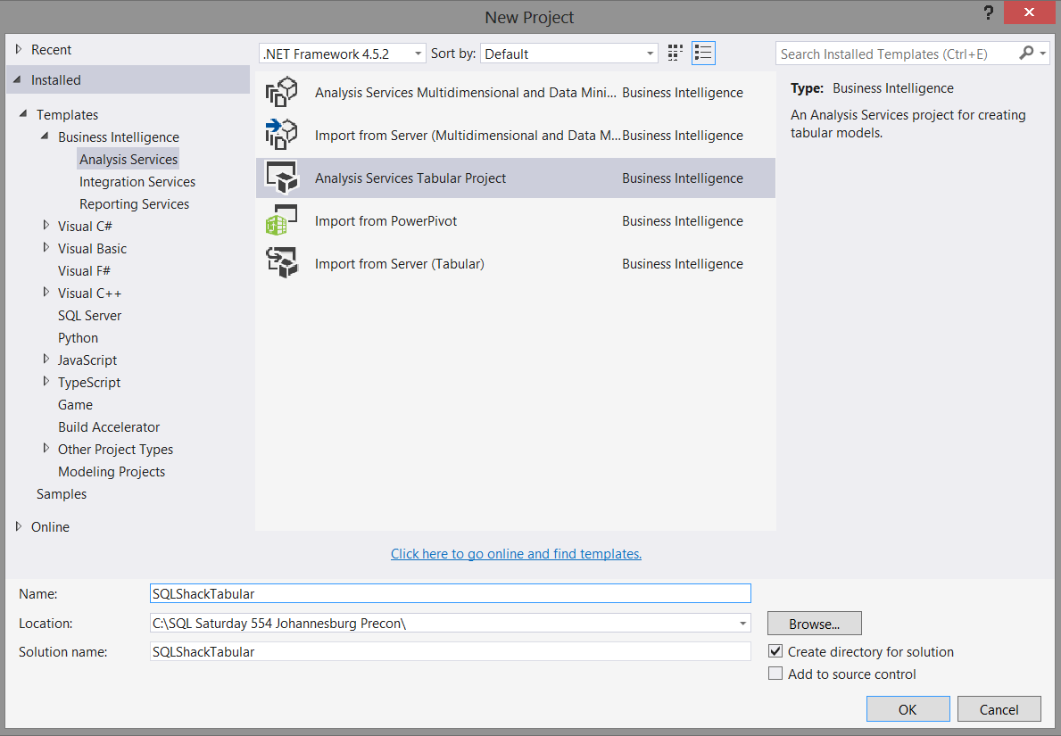
We select an “Analysis Services Tabular Project” project (as shown above) and give our project an appropriate name. We click “OK” to create our project.
我们选择一个“ Analysis Services表格项目”项目(如上所示),并给我们的项目起一个适当的名称。 我们单击“确定”创建我们的项目。
The “Tabular Model Designer” now appears (see below).
现在将出现“表格模型设计器”(见下文)。
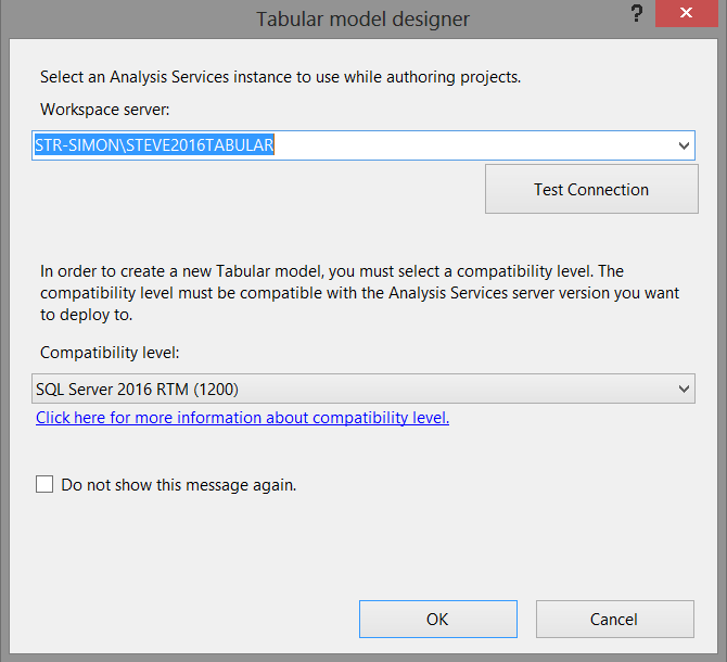
What the project wishes to know is to which TABULAR server and workspace we wish to deploy our model. We must remember that whilst our source data originates from standard relational database tables (for our current exercise), the project itself and the reporting will be based off data within Analysis Services.
项目希望知道的是我们希望将模型部署到哪个TABULAR服务器和工作空间。 我们必须记住,尽管我们的源数据来自标准关系数据库表(对于我们当前的工作),但是项目本身和报告将基于Analysis Services中的数据。
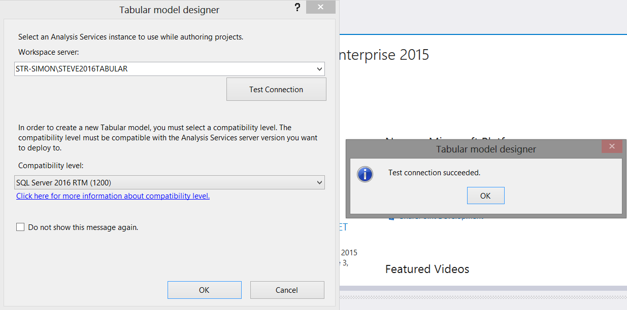
We set the “Workspace Server” and test the connection as shown above. We click OK to create the model and we are then brought to our design and work surface (see below).
我们设置“工作区服务器”并测试连接,如上所述。 我们单击“确定”创建模型,然后将其带入设计和工作界面(见下文)。
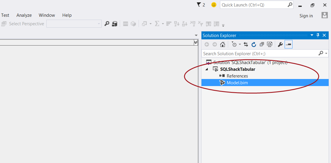
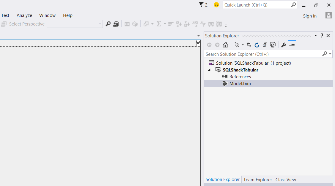
We now double click on the “Model.bim” icon, shown in the screen shot below.
现在,我们双击“ Model.bim”图标,如下图所示。
The model designer opens (see below).
将打开模型设计器(请参见下文)。
将数据添加到我们的模型 (Adding data to our model)
Clicking upon the “Model” tab on the menu ribbon (see below) we select “Import from Data Source”.
单击菜单功能区上的“模型”选项卡(见下文),我们选择“从数据源导入”。

The “Table Import Wizard” appears (see below).
出现“表导入向导”(见下文)。
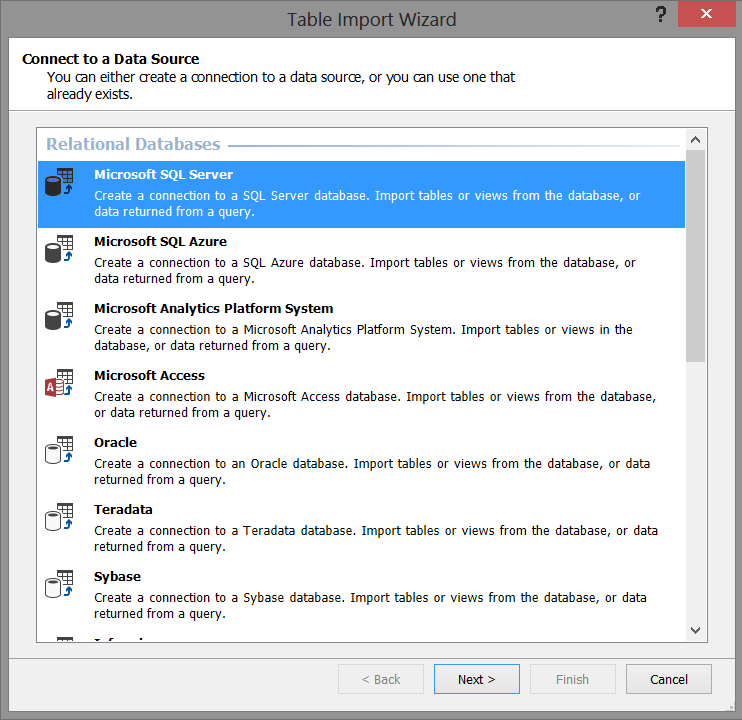
We select “Microsoft SQL Server” as shown above because our source data is from the relational database tables that we saw above. We then click “Next”.
我们如上所述选择“ Microsoft SQL Server”,因为我们的源数据来自我们在上面看到的关系数据库表。 然后,我们单击“下一步”。
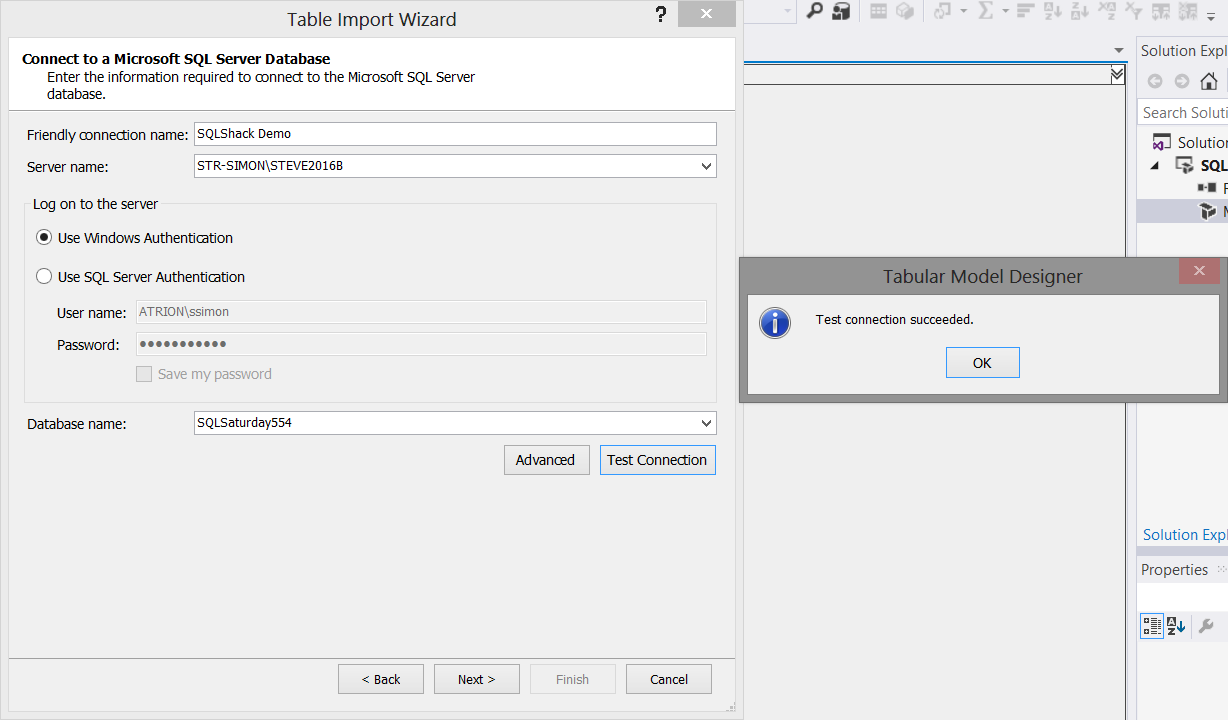
We now select our “source” database server, our database and test our connection (see above). Once again, we click “Next”.
现在,我们选择“源”数据库服务器,数据库并测试我们的连接(请参见上文)。 再次单击“下一步”。
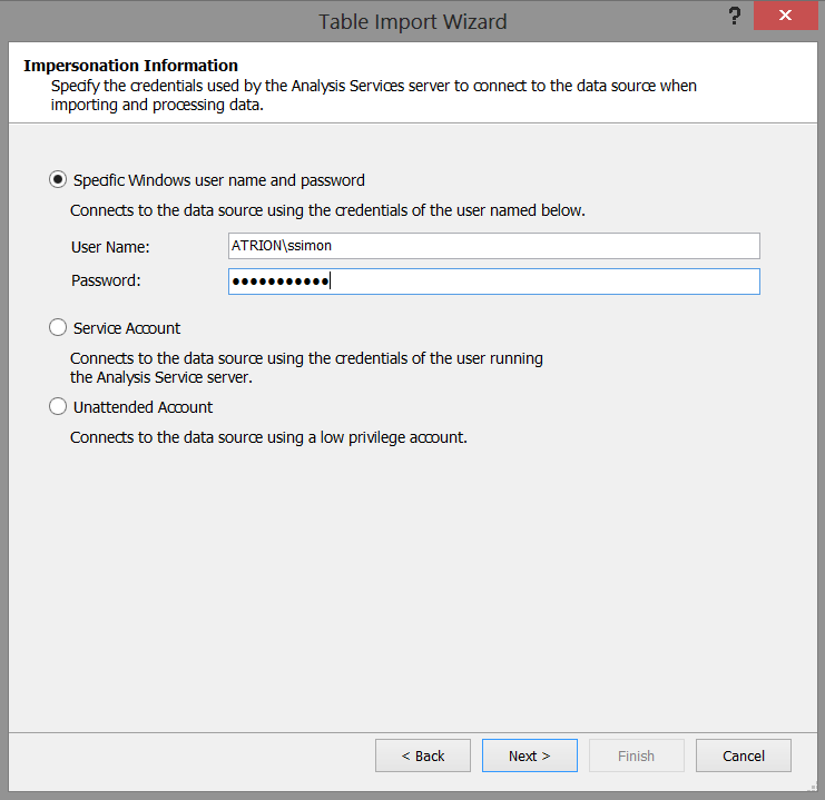
We must now set out “Impersonation Information” (see the screenshot above). In our case I have chosen to utilize a specific Windows user name and password. Once set, we click “Next”.
现在,我们必须列出“假冒信息”(请参见上面的屏幕截图)。 在我们的情况下,我选择使用特定的Windows用户名和密码。 设置完成后,我们单击“下一步”。
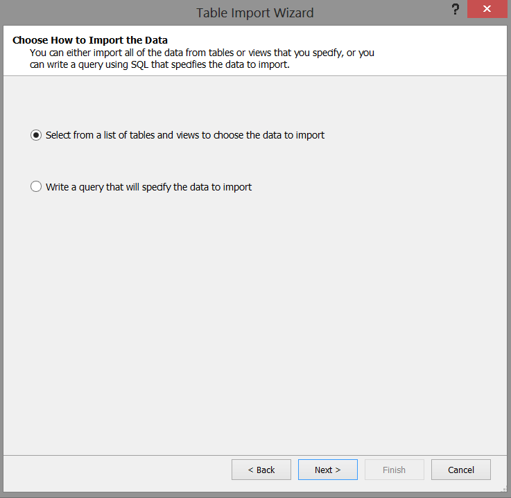
The system now wants us to select the relational tables that we wish to import into our model. We select the “Select from a list of tables and views to choose the data to import” option (see above). We then click “Next”.
系统现在希望我们选择要导入到模型中的关系表。 我们选择“从表和视图列表中选择以选择要导入的数据”选项(见上文)。 然后,我们单击“下一步”。
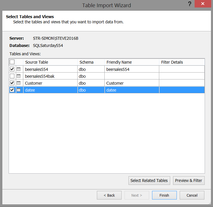
We select the “beersales554” (Our sales figures), “Customer” (our list of clients), and “datee” (our time dimension) tables (see above) and then click “Finish”. The project will then begin the import into our model (see below).
我们选择“ beersales554”(我们的销售数据),“客户”(我们的客户列表)和“ datee”(我们的时间维度)表(见上文),然后单击“完成”。 然后,该项目将开始导入到我们的模型中(见下文)。
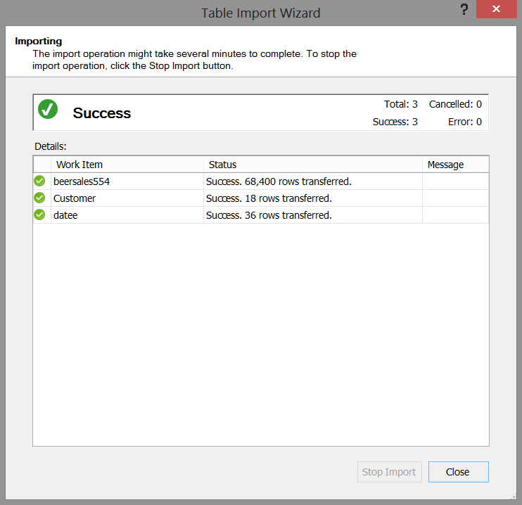
Should our load was successful, then we receive the message shown above. We now click “Close”.
如果加载成功,我们将收到上面显示的消息。 现在,我们单击“关闭”。
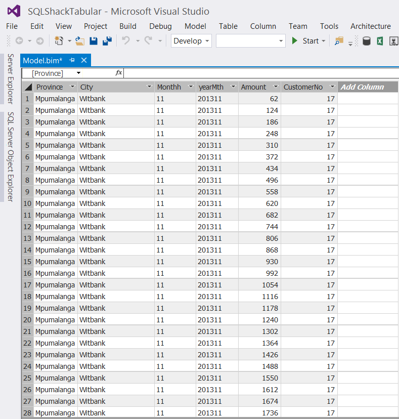
Our data will now appear within our design window (see the screenshot above). WOW, it looks like a spreadsheet. Those finance folks are going to love this!
现在,我们的数据将出现在我们的设计窗口中(请参见上面的屏幕截图)。 哇,看起来像电子表格。 那些财务人员会喜欢这个!
让乐趣开始!! (Let the fun begin!!)
The astute reader will note that in addition to the “Province”, “City” and “CustomerNo”, we also have a “yearmth” field and a field containing the Rand value of beer sales.
精明的读者会注意到,除了“省”,“城市”和“客户编号”之外,我们还有一个“年份”字段和一个包含兰德啤酒销售额的字段。
This breakdown is on a monthly basis and oft times folks wish to see results by quarter. GOTCHA!!!!
这种细分是每月一次,而且人们经常希望按季度查看结果。 GOTCHA !!!
The one thing that we must remember is that now that we are working with the tabular model, calculations or defined fields cannot be created utilizing standard T-SQL. We must utilize DAX (data analysis expressions).
我们必须记住的一件事是,由于我们正在使用表格模型,因此无法使用标准T-SQL创建计算或定义的字段。 我们必须利用DAX(数据分析表达式)。
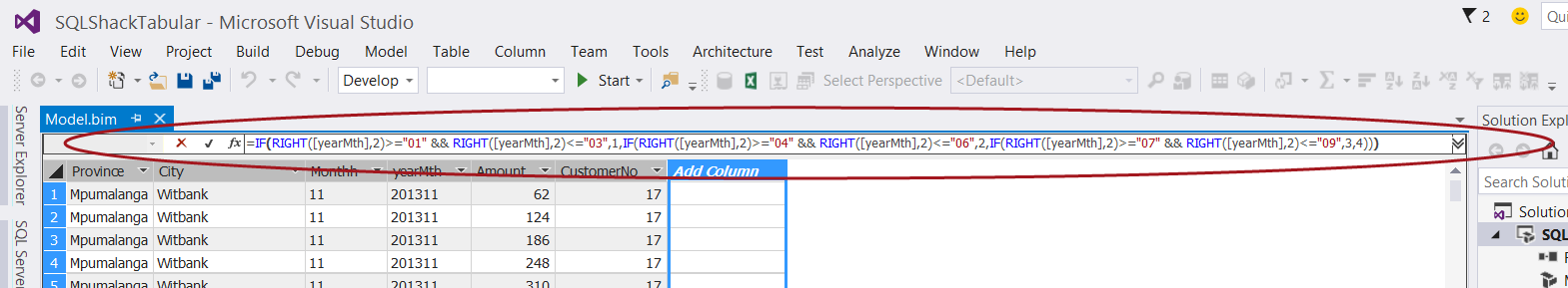
We select “Add Columns” (as shown above) and add our DAX expression
我们选择“添加列”(如上所示)并添加DAX表达式
=IF(RIGHT([yearMth],2)>="01" &&
RIGHT([yearMth],2)<="03",1,IF(RIGHT([yearMth],2)>="04" &&
RIGHT([yearMth],2)<="06",2,IF(RIGHT([yearMth],2)>="07" &&
RIGHT([yearMth],2)<="09",3,4)))
to the “function box” below the menu ribbon (see above).
进入菜单功能区下方的“功能框”(请参见上文)。
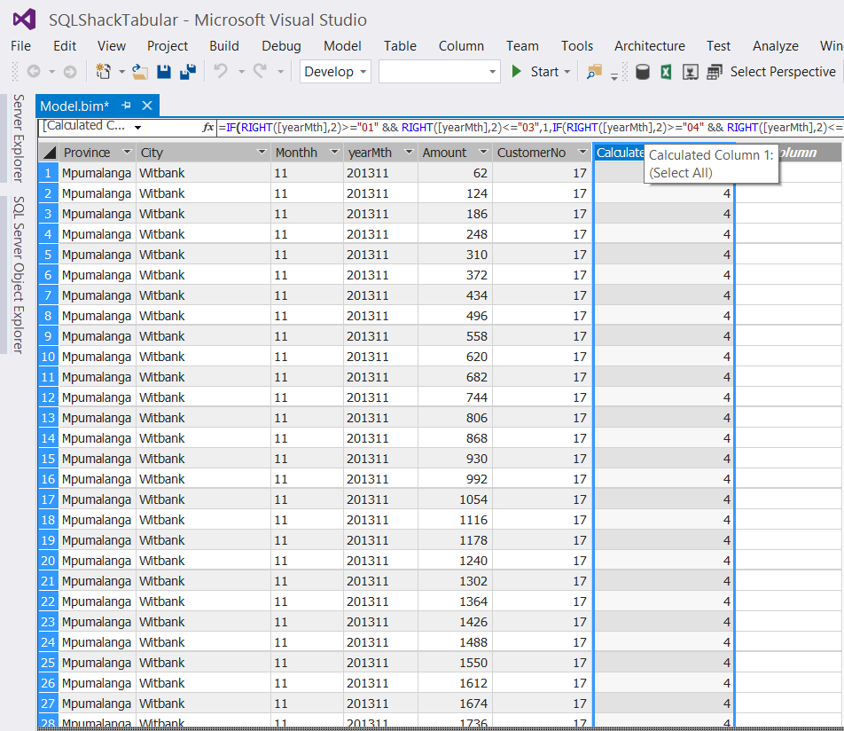
The “Quarter” has now been created (see below).
现在已经创建了“ Quarter”(请参见下文)。
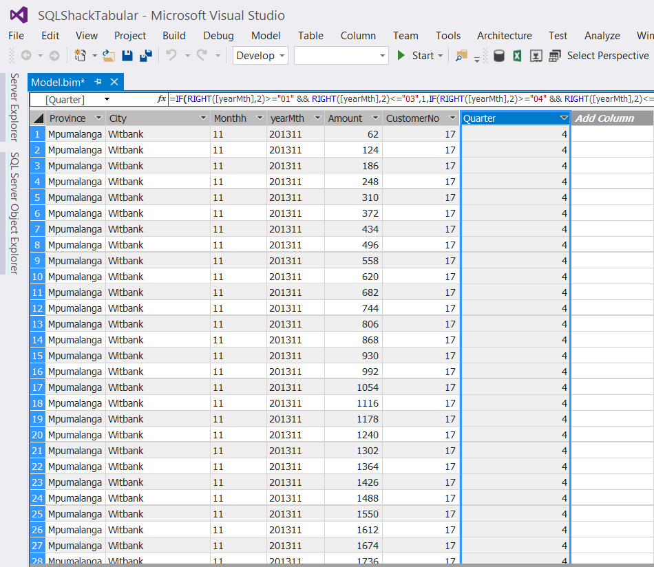
Once again, the eagle – eyed reader will question the financial year calendar. Fear not, the same DAX expression may be used for a fiscal year starting July 1 and ending June 30th. Such is the beauty of the DAX language.
目光敏锐的读者将再次质疑财政年度日历。 不用担心,从7月1日到6月30 日结束的会计年度可以使用相同的DAX表达式。 这就是DAX语言的美。
We now rename the column to “Quarter” (See below).
现在,我们将该列重命名为“ Quarter”(如下所示)。
汇总我们的“金额” (Aggregating our “Amounts”)
As “champions of reporting”, we all know that the decision makers will want to view reports which have aggregated results, by region and by time. This said we now aggregate our “Amount” field so that when we report from our tabular “cube”, the results will be aggregated at the appropriate level.
作为“报告冠军”,我们都知道决策者将希望按地区和时间查看汇总结果的报告。 也就是说,我们现在汇总“金额”字段,以便当我们从表格“多维数据集”报告时,结果将在适当的级别汇总。
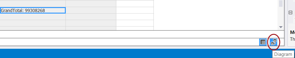
We place our cursor in any cell below our data display (see the blue highlighted cell in screen shot below). It should be understood that “any cell below the data is adequate”.
我们将光标放置在数据显示下方的任何单元格中(请参见下面的屏幕截图中蓝色突出显示的单元格)。 应该理解,“数据下方的任何单元格都足够”。
We now create the DAX formula to aggregate the data.
现在,我们创建DAX公式以汇总数据。
GrandTotal := Sum([Amount])
The DAX formula is created in the same function box that we utilized for the “Quarter”, and a grand total will display in the blue cell (shown below).
DAX公式是在与“季度”相同的功能框中创建的,总计将显示在蓝色单元格中(如下所示)。
It should be remembered that at this point in time that the result is meaningless as we have not linked “Amount” to our date and customer dimensions 🙂
应当记住,由于我们还没有将“金额”链接到我们的日期和客户维度,因此在这一点上结果是没有意义的🙂
We shall now create these linkages by clicking on the “Diagram” box located at the bottom right of the screen shot below (see the red circle).
现在,我们将通过单击下面屏幕快照右下方的“图”框来创建这些链接(请参见红色圆圈)。
Having clicked upon the “Diagram /Relationship” icon (discussed imediately above), we are brought to the “Relationship” work surface.
单击“图/关系”图标(上面已直接讨论),我们进入“关系”工作界面。
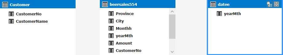
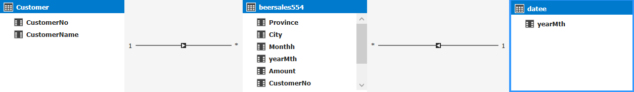
We note that our three tables /entities are displayed (see above). We now create the necessary relationship links by dragging the corresponding fields within the Customer entity to the customer number within the BeerSales entity. We do the same for the “Datee” entity (see below).
我们注意到显示了我们的三个表/实体(见上文)。 现在,我们通过将“客户”实体中的相应字段拖到BeerSales实体中的客户编号来创建必要的关系链接。 我们对“ Datee”实体执行相同操作(请参见下文)。
This completes the development portion of our exercise. The only thing remaining is to deploy our model.
这完成了我们练习的发展部分。 剩下的唯一事情就是部署我们的模型。
部署模型 (Deploying our model)
To begin the deployment process we must set a few properties.
要开始部署过程,我们必须设置一些属性。
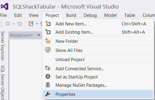
We click on the “Project” tab on the menu ribbon and select “Properties” (see above).
我们单击功能区上的“项目”选项卡,然后选择“属性”(请参见上文)。
The “Properties” dialog box is now displayed (see below).
现在将显示“属性”对话框(请参见下文)。
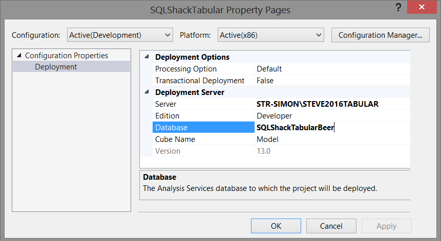
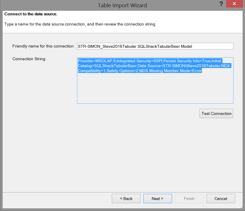
We set the TABULAR Analysis Server name and set a name for the target database that will reside on the Tabular Analysis Services server. In our case the server is “STR-SIMON\STEVE2016TABULAR” and the database name will be “SQLShackTabularBeer” (see above). We then click “OK”.
我们设置了TABULAR Analysis Server的名称,并为将位于Tabular Analysis Services服务器上的目标数据库设置了名称。 在我们的例子中,服务器为“ STR-SIMON \ STEVE2016TABULAR”,数据库名称为“ SQLShackTabularBeer”(请参见上文)。 然后,我们单击“确定”。
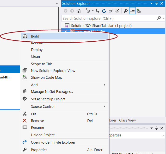
Our next step is to “Build” our solution prior to deploying it. This step will help detect any errors or other issues. We simply right click the project name and select “Build” (see below).
我们的下一步是在部署解决方案之前先“构建”我们的解决方案。 此步骤将帮助检测任何错误或其他问题。 我们只需右键单击项目名称,然后选择“ Build”(见下文)。
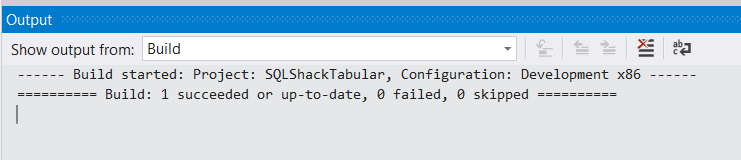
We are notified our the status of our “build” as may be seen in the screen shot below:
如以下屏幕截图所示,我们将收到“构建”状态的通知:
Having “Built” the solution, we are now in a position to deploy our solution and create our Analysis Services tabular database.
有了“构建”解决方案后,我们现在可以部署我们的解决方案并创建我们的Analysis Services表格数据库。
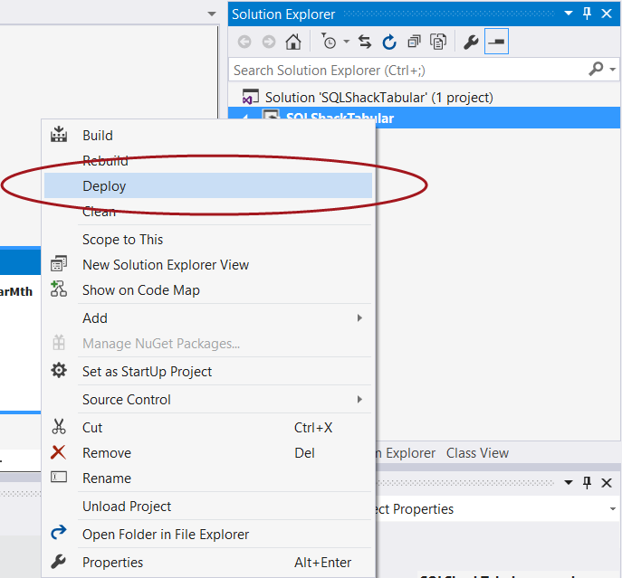
Once again we “right click” on the project name and select “Deploy” (see below).
我们再次“右键单击”项目名称,然后选择“部署”(见下文)。
The “Impersonation” dialog box is displayed as may be seen below:
显示“模拟”对话框,如下所示:
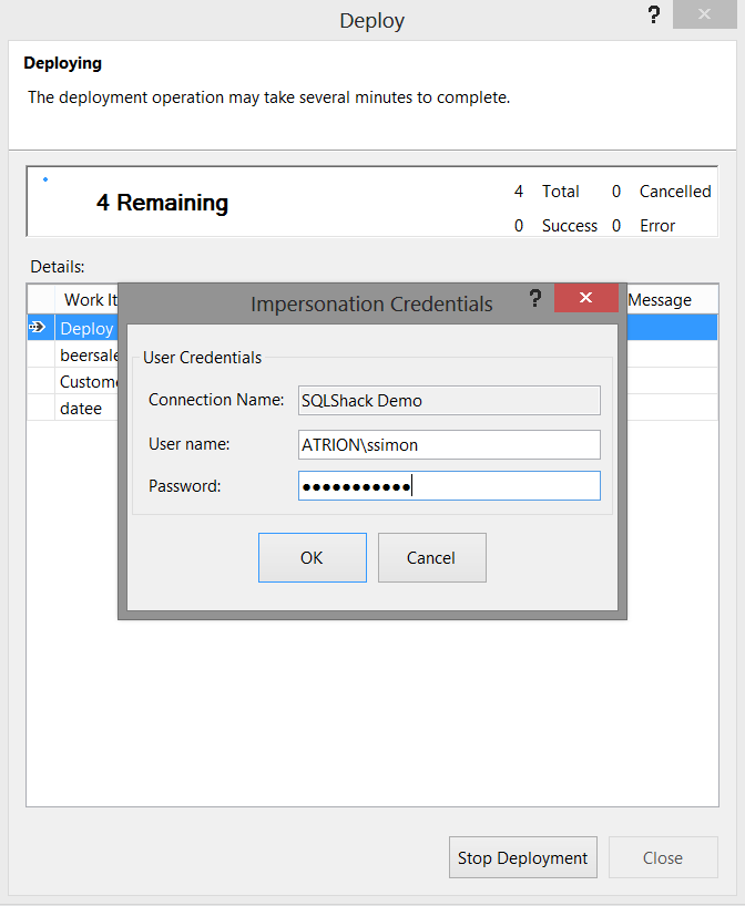
We pass the necessary credentials to the system (as we have done above) and deployment commences.
我们将必要的凭据传递给系统(如上所述),然后开始部署。
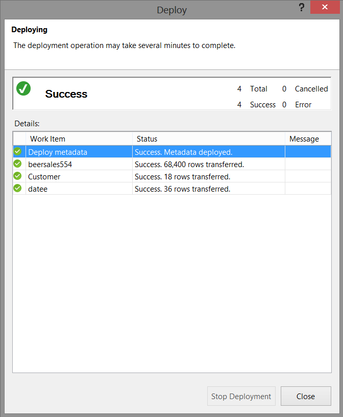
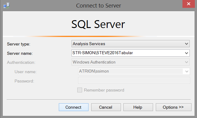
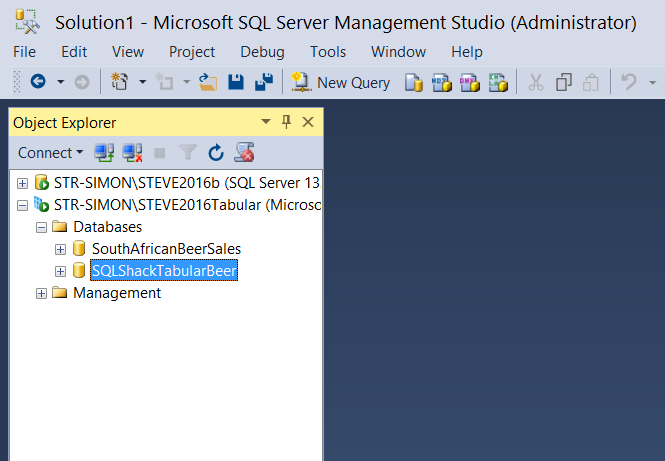
With deployment successful, we now closed Visual Studio or SQL Server Data Tools 2010 and we shall go back into SQL Server Management Studio, however this time into our Analysis Services tabular instance.
成功部署后,我们现在关闭了Visual Studio或SQL Server Data Tools 2010,然后将回到SQL Server Management Studio,但是这次是进入Analysis Services表格实例。
验证我们的数据库已创建 (Verifying that our database has been created)
Opening SQL Server Management Studio we select our Analysis Services tabular instance.
打开SQL Server Management Studio,我们选择Analysis Services表格实例。
Expanding the database tab, we note that our database has been created (see below).
展开数据库选项卡,我们注意到我们的数据库已经创建(见下文)。
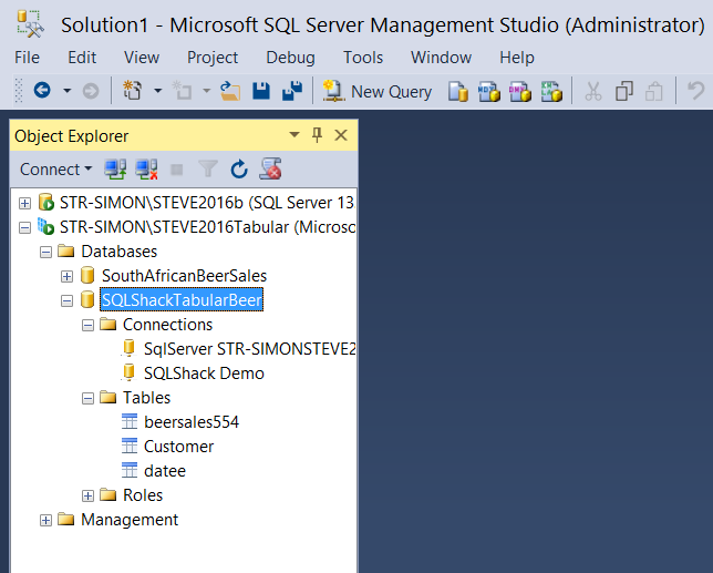
Expanding the SQLShackTabular database tab we find our three tables.
展开SQLShackTabular数据库选项卡,我们找到了三个表。
We can now run a few simple DAX queries to ascertain if our results look reasonable. DAX is an amazingly powerful “beast”. It is complex to learn and understand, and this is beyond the scope of this article. Enough said, let us get busy with those small test queries!
现在,我们可以运行一些简单的DAX查询来确定我们的结果是否合理。 DAX是一种功能强大的“野兽”。 学习和理解很复杂,这超出了本文的范围。 够了,让我们忙于那些小的测试查询!
We simply open a new query by selecting the “New Query” button on the banner. The query editor now opens (see below).
我们只需选择横幅上的“新查询”按钮即可打开一个新查询。 查询编辑器现在打开(见下文)。
Using a very elementary DAX statement, we shall calculate the total beer sales by our client base,
使用非常基本的DAX语句,我们将按客户群计算啤酒总销量,
The DAX statement is
DAX语句是
DEFINE

//We define a TOTAL FIELD
MEASURE beersales554[Total] =
CALCULATE( SUM( Beersales554[Amount] ), ALL( Beersales554[CustomerNo] ) )
EVALUATE
ADDCOLUMNS(
ALL(
 Beersales554[CustomerNO]
 ),
 "Total for Customer",sum(Beersales554[Amount])
 )
 Order by BeerSales554[CustomerNo]
When we execute this query we obtain the following results (see below).
当我们执行此查询时,我们获得以下结果(请参见下文)。
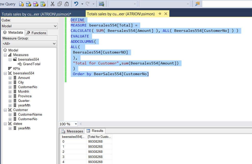
The eagle – eyed reader will have noted that the values for all customers appear the same and that is because we requested the “GrandTotal” be displayed with each customer (which is really not that informative, to say the least!).
老鹰眼的读者会注意到,所有客户的价值似乎都相同,这是因为我们要求向每位客户显示“ GrandTotal”(至少可以这样说,实际上并没有那么多信息!)。
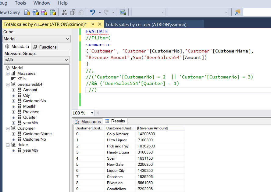
Changing the query slightly by adding the Customer Name and utilizing the “Amount” field instead of the “GrandTotal”, we can now see the total sales for the whole period for all customers (customer by customer).
通过添加客户名称并利用“金额”字段而不是“总计”来稍微更改查询,现在我们可以看到所有客户(按客户)的整个期间的总销售额。
The code to achieve this is below as is the result set.
下面是实现此目的的代码以及结果集。
EVALUATE
//Filter(
summarize
('Customer', 'Customer'[CustomerNo],'Customer'[CustomerName],
"Revenue Amount",Sum('BeerSales554'[Amount])
//)
//,
//('Customer'[CustomerNo] = 2  || 'Customer'[CustomerNo] = 3)
  )
In short, working with DAX is similar to working with MDX. It has its rules and ways of traversing the data tree and is frankly not for the faint of heart.
简而言之,使用DAX类似于使用MDX。 它具有遍历数据树的规则和方式,坦率地说,这并不是出于胆小。
This said, let us have a look at reporting based upon our tabular model.
这就是说,让我们看看基于表格模型的报告。
报告中 (Reporting )
For today’s reporting exercise, we shall be utilizing Excel. In part two of this article, we shall be utilizing SQL Server Reporting Services.
对于今天的报告活动,我们将使用Excel。 在本文的第二部分中,我们将利用SQL Server Reporting Services。
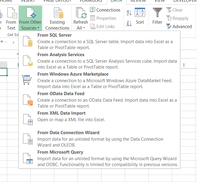
Opening a new workbook, we click upon the “Data” tab and select “From Other Sources” (see below).
打开一个新的工作簿,我们单击“数据”选项卡,然后选择“来自其他来源”(见下文)。
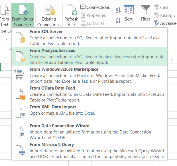
We select “From Analysis Services” (see below)
我们选择“来自Analysis Services”(见下文)
The “Data Connection Wizard” now appears. We configure this to point to our Tabular Analysis Database (see below).
现在出现“数据连接向导”。 我们将其配置为指向表格分析数据库(见下文)。

We click “Next”.
我们点击“下一步”。
The next screen shows our Model that we created in Visual Studio or SQL Server Data Tools (see below).
下一个屏幕显示了我们在Visual Studio或SQL Server数据工具中创建的模型(请参见下文)。
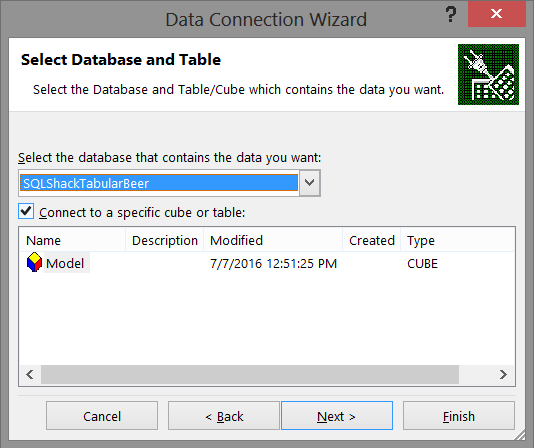
Having selected our database, we click “Next”.
选择我们的数据库后,我们单击“下一步”。
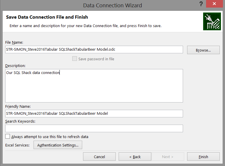
We now save our data connection and click “Finish” to complete the connection process (see below).
现在,我们保存数据连接,然后单击“完成”以完成连接过程(请参见下文)。
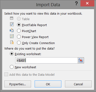
Having achieved all of this, we are now at the stage where we can import all the data that we have assembled (see below). We shall accept to create a “PowerTable” report for this exercise and click “OK” (see below).
完成所有这些工作之后,我们现在可以导入所有已收集的数据(见下文)。 我们将接受为此练习创建“ PowerTable”报告,然后单击“确定”(见下文)。
Having completed this we find our work area looks similar to my view shown below:
完成此操作后,我们发现我们的工作区域类似于下面显示的视图:

This is where we are going to work our magic!!
这就是我们要发挥魔力的地方!!
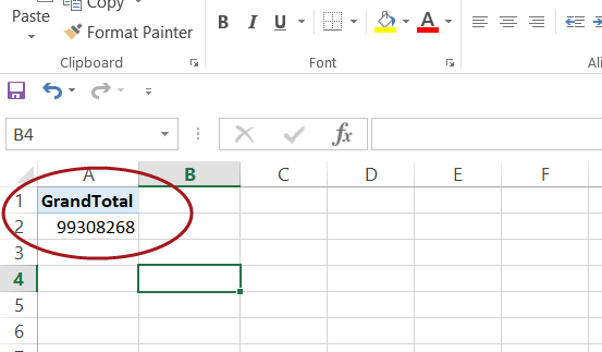
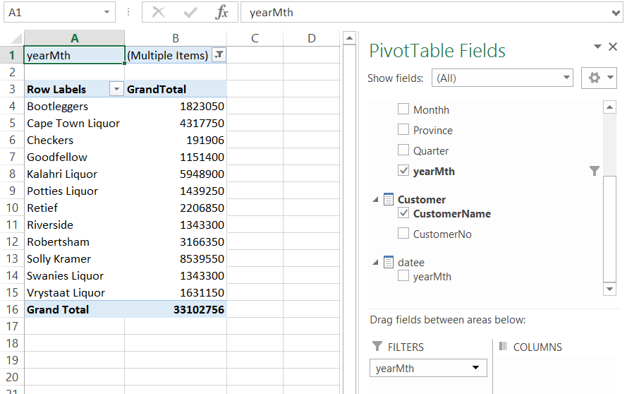
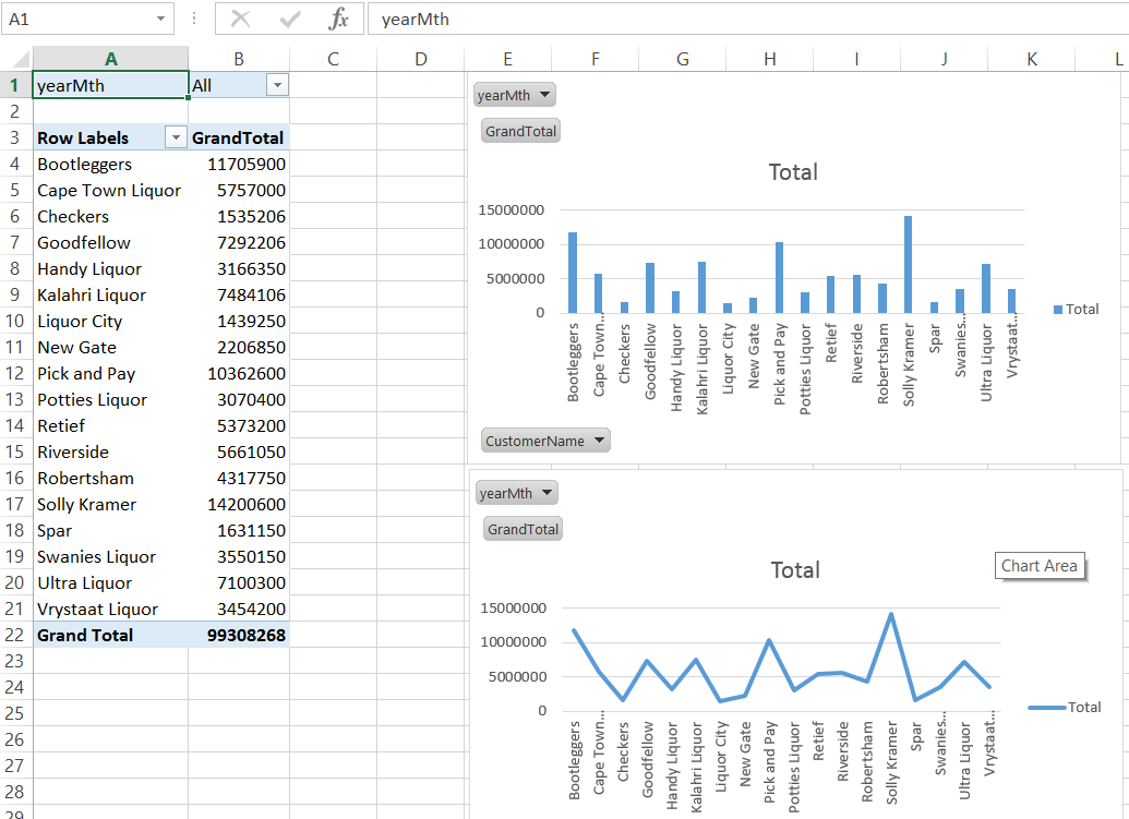
We shall drag the measure “GrandTotal” (see above) which now appears among the Pivot Table Fields and which originates from our Visual Studio / SQL Server Data Tools project; onto the Pivot Table (occupies cells A1 to C18) (see below).
我们将拖动“ GrandTotal”度量(见上文),该度量现在出现在“数据透视表”字段中,并且源自我们的Visual Studio / SQL Server数据工具项目; 到数据透视表上(占据单元格A1至C18)(请参见下文)。
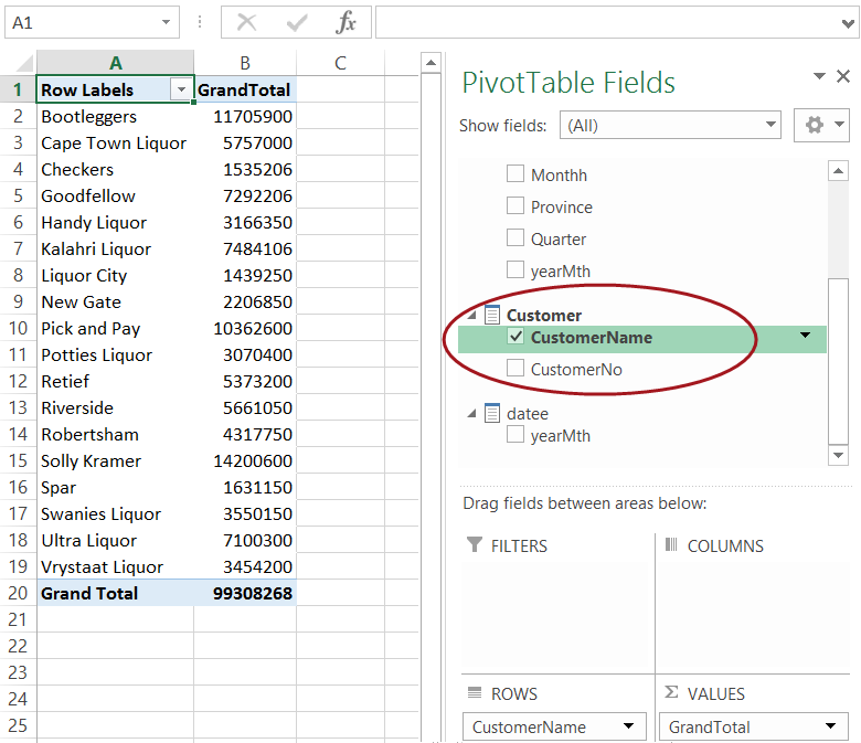
To this we now add our “CustomerName” from the customer table. Our canvas appears as follows:
为此,我们现在从客户表中添加“ CustomerName”。 我们的画布如下所示:
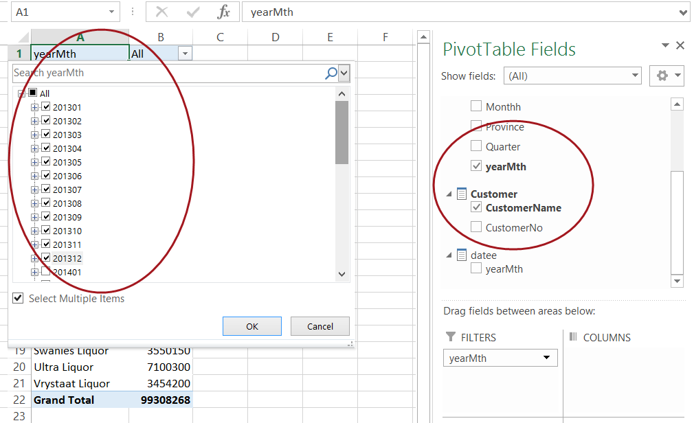
Now let us look at the financial year 2013 solely to see the results for those clients listed above. To achieve this, we add a filter to the “Filters” box seen above and enclosed within the circle.
现在,让我们看一下2013财政年度,仅查看上面列出的那些客户的结果。 为此,我们将过滤器添加到上方的“过滤器”框中,并将其包含在圆圈内。
The change in the values may be seen in the following two screen shots.
在以下两个屏幕快照中可以看到值的变化。
and
和
Now naturally we could have chosen any year, the point being do note that because the values are aggregated by a “date time”, changing the “what if” scenario is fairly easy and rapid.
现在自然可以选择任何年份,但要注意的是,由于这些值是按“日期时间”汇总的,因此更改“假设条件”场景相当容易且Swift。
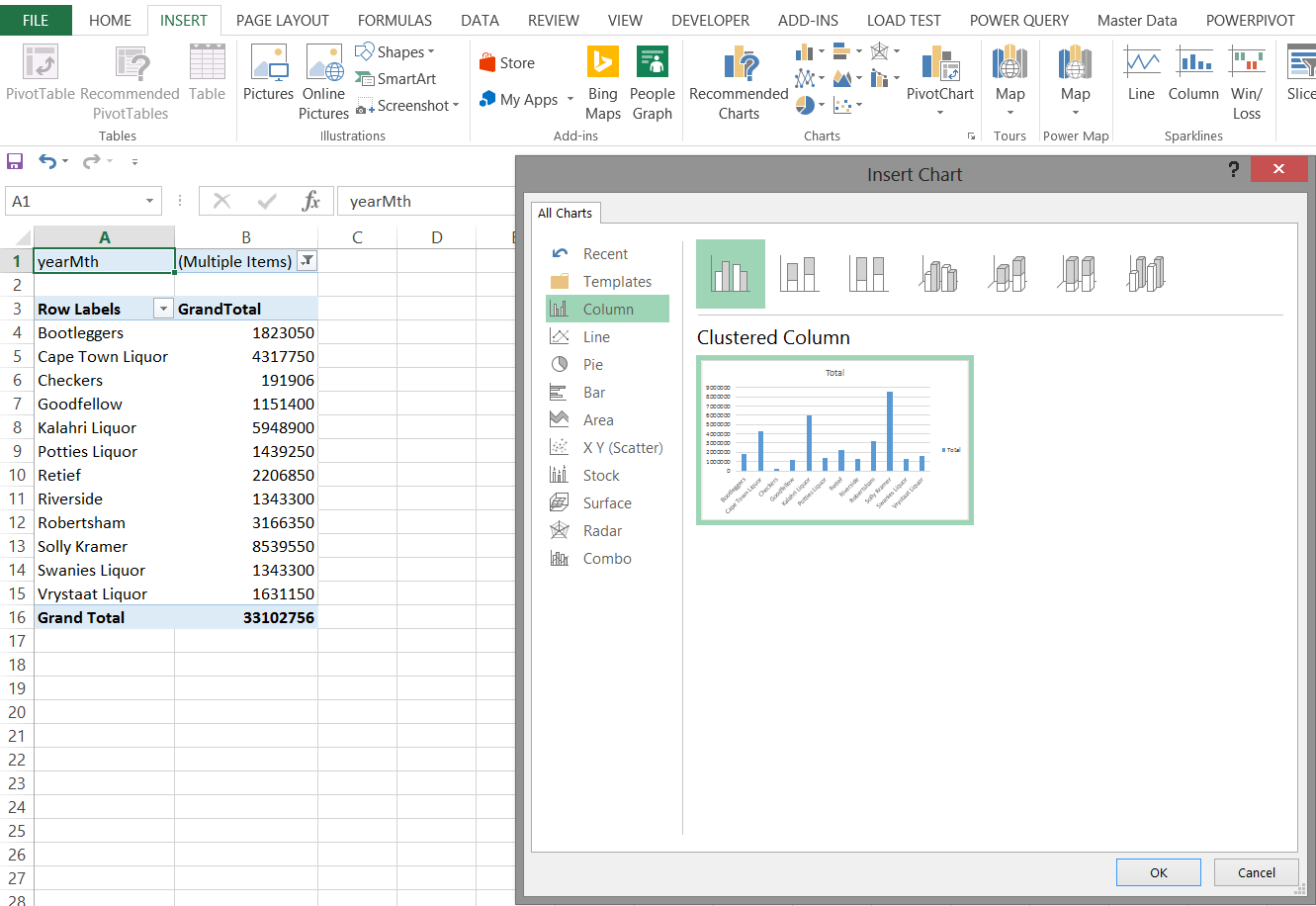
We take our exercise one step further by inserting a Pivot Chart. This is achieved by selecting “Insert“ from the main menu ribbon. We select a “Pivot Chart” (see below).
通过插入数据透视图,我们将练习进一步向前迈进了一步。 这是通过从主菜单功能区中选择“插入”来实现的。 我们选择一个“数据透视图”(见下文)。
The results may be seen in the following screen shot.
在以下屏幕截图中可以看到结果。
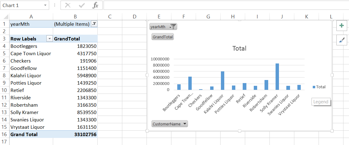
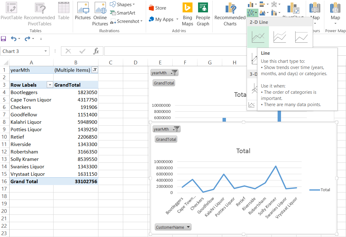
The screenshot above shows a bar chart and the following screenshot as simple line graph
上面的屏幕截图显示了条形图,下面的屏幕截图显示为简单的折线图
Our final report appear below and is quite comprehensive.
我们的最终报告显示在下面,并且非常全面。
It should be noted that once the filters are removed or altered (within the matrix), that both the chart and the line graphs will reflect the changes as may be seen below.
应该注意的是,一旦移除或更改了过滤器( 在矩阵内 ),图表和折线图都将反映变化,如下所示。
人口消费 (Demographic Consumption)
Now what would be interesting is to view the sales relative to geography.
现在,有趣的是查看相对于地理位置的销售情况。
To do so we shall utilize “Power Map”. Before we can do this though we must add these tables to our data model within our Excel Workbook.
为此,我们将使用“功率图”。 在执行此操作之前,我们必须将这些表添加到Excel工作簿中的数据模型中。
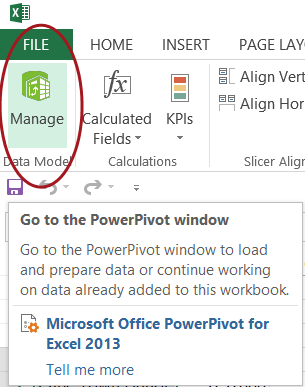
We click upon the PowerPivot tab and select “Manage Data Model” as may be seen below:
我们单击PowerPivot选项卡,然后选择“管理数据模型”,如下所示:
The blank “Manage Model” worksheet appears (see below).
出现空白的“管理模型”工作表(请参见下文)。
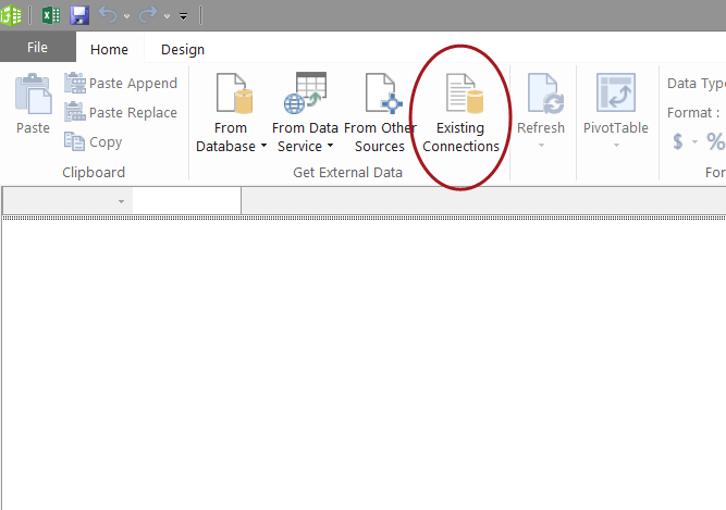
We click the existing connection to create a “View” from the tables in the Tabular Model that we created (see below).
我们单击现有连接以从我们创建的表格模型的表中创建一个“视图”(见下文)。
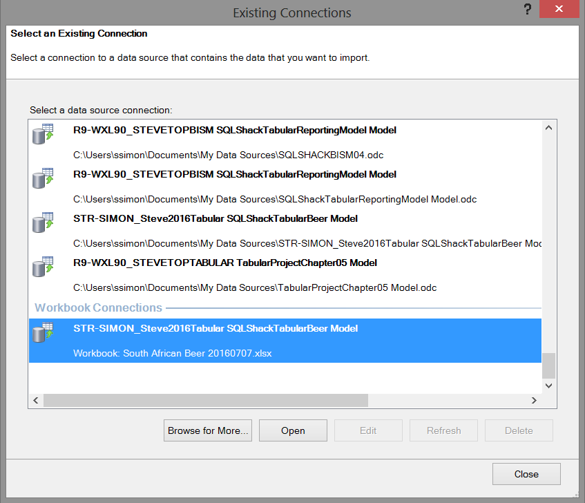
We click “Open” and note that Excel shows us the necessary connection string which will enable us to “communicate” with our Analysis Services database.
我们单击“打开”,并注意Excel向我们显示了必要的连接字符串,这将使我们能够与Analysis Services数据库进行“通信”。
The next step in the process is a real GOTCHA and the author has been caught on this one numerous times. The following screen appears asking for a MDX expression with which to work. “What the heck!!!”
该过程的下一步是真正的GOTCHA,作者已经被这一过程吸引了无数次。 出现以下屏幕,询问要使用的MDX表达式。 “有没有搞错!!!”
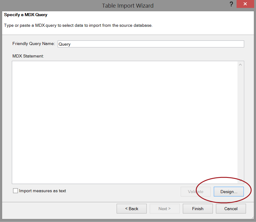
We simply click the design button and the contents of our cube automatically appear (see below).
我们只需单击设计按钮,多维数据集的内容就会自动出现(见下文)。
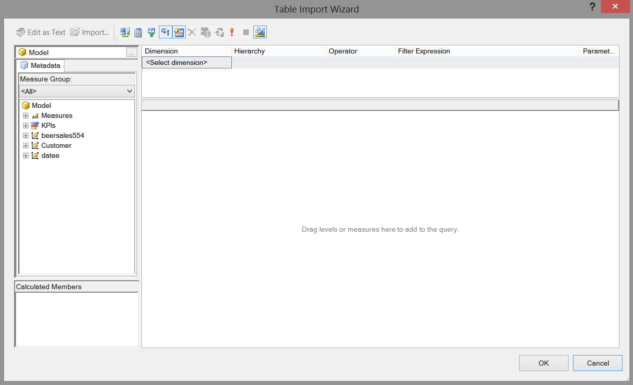
Dragging our “Grand Total” field, the province, the city, the quarter onto our work surface we now have the following view.
将我们的“总计”字段,省,城市,季度拖到工作界面上,现在我们具有以下视图。
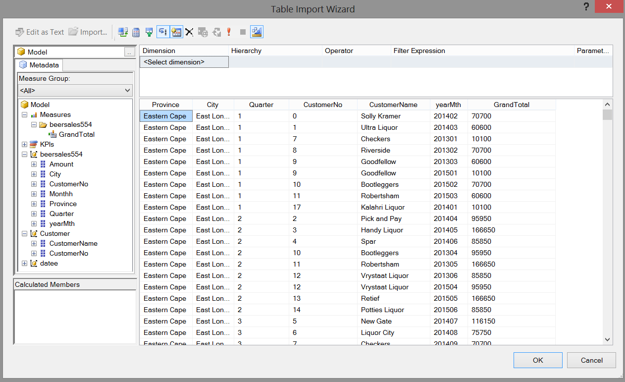
We click OK to accept our data choices whose data originates from the BeerSales554 and customer tables. The wonderful thing is that the MDX expression from our field selection is now displayed in that blank MDX expression box, as may be seen below:
我们单击确定以接受数据选择,这些数据的数据来源于BeerSales554和客户表。 奇妙的是,从我们的领域选择MDX表达式现在显示在空白 MDX表达中,可以看出如下:
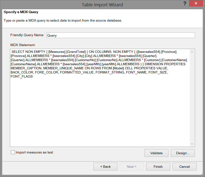
The MDX expression is also shown below.
MDX表达式也显示在下面。
SELECT NON EMPTY { [Measures].[GrandTotal] } ON COLUMNS, NON EMPTY {
([beersales554].[Province].[Province].ALLMEMBERS *
[beersales554].[City].[City].ALLMEMBERS *
[beersales554].[Quarter].[Quarter].ALLMEMBERS *
[beersales554].[CustomerNo].[CustomerNo].ALLMEMBERS * [Customer].[CustomerName].[CustomerName].ALLMEMBERS *
[beersales554].[yearMth].[yearMth].ALLMEMBERS ) } DIMENSION PROPERTIES MEMBER_CAPTION, MEMBER_UNIQUE_NAME ON ROWS FROM [Model] CELL PROPERTIES VALUE, BACK_COLOR, FORE_COLOR, FORMATTED_VALUE, FORMAT_STRING, FONT_NAME, FONT_SIZE, FONT_FLAGS
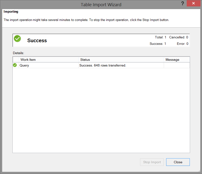
We click “Finish” and the system imports the necessary raw data (see below).
我们单击“完成”,系统将导入必要的原始数据(请参见下文)。
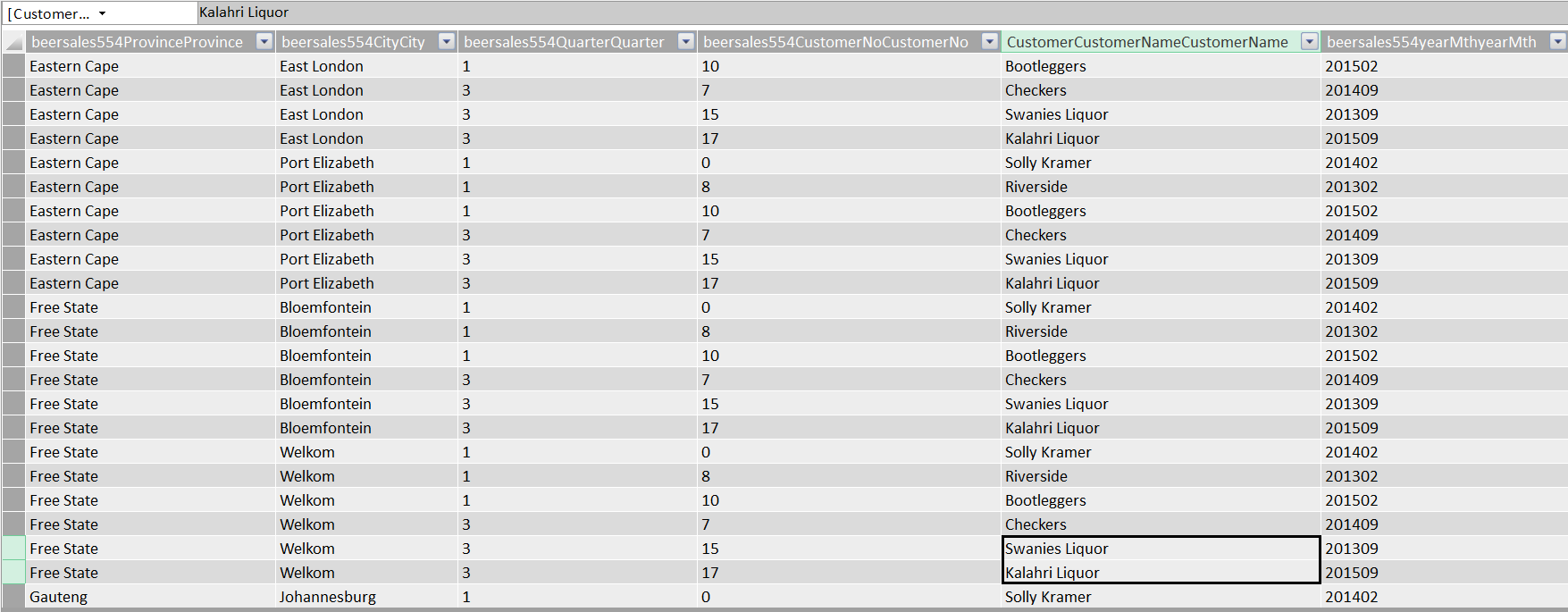
We close the “Table Import Wizard” and ascertain that our data has been imported as may be seen below:
我们关闭“表导入向导”,并确定我们的数据已被导入,如下所示:
We “Save”, “Close” and “Exit” (see below).
我们“保存”,“关闭”和“退出”(见下文)。
We are now in a position to create our “Power Map”!
我们现在可以创建我们的“功率图”!
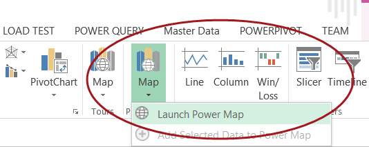
We select “Insert” from the main menu ribbon and click “Map” and “Launch Power Map”.
我们从主菜单功能区中选择“ Insert”,然后单击“ Map”和“ Launch Power Map”。
Opening Power Map we are greeted with our drawing surface (see below).
打开功率图,我们会看到我们的绘图表面(见下文)。

We now set the “Geography” by clicking on the City field within the “Choose Geography” box (see above).
现在,我们通过单击“选择地理”框中的“城市”字段来设置“地理”(请参见上文)。
We note that upon doing so that the map changes to show southern Africa.
我们注意到,这样做后,地图将更改为显示南部非洲。

We click the “Beersales554CityCity check box and the cities for which we have data are now visible on the map.
我们单击“ Beersales554CityCity”复选框,现在可以在地图上看到我们拥有数据的城市。
Our next task is to plot the amount of sales that were recorded. We click “Next”.
我们的下一个任务是绘制记录的销售额。 我们点击“下一步”。

By checking the “MeasureGrandTotal” box we see the value of the total sales (see above) and by adding a time dimension, we can gage beer sales for the period of time under consideration (see below).
通过选中“ MeasureGrandTotal”框,我们可以看到总销售额的值(请参见上文),并添加时间维度,可以对所考虑的时间段内的啤酒销售额进行衡量(请参见下文)。

These types of charts are extremely useful to the decision maker who really wants to understand seasonal fluctuations and their effect on the bottom line.
对于真正想了解季节性波动及其对底线的影响的决策者而言,这些类型的图表非常有用。
Once again we have come to the end of our “get together” and I sincerely hope that this project has stimulated you, the reader, to try some topics that we have discussed. I honestly believe that you will be surprised.
我们再次走到了“聚在一起”的结尾,我衷心希望这个项目能激发您(读者)尝试一些我们已经讨论过的主题。 老实说,我相信您会感到惊讶。
结论 (Conclusions)
Decision makers oft times are faced with difficult decisions with regards to corporate strategy and the direction and correction that must be made in order for the enterprise to achieve its mission and objectives. Many of today’s decision-makers have had extensive experience utilizing Microsoft Excel and it often gives them a “feeling of comfort”. The SQL Server Tabular project projects the “spreadsheet” image and often installs confidence in those that take advantage of its capabilities. While Excel is merely one manner in which data may be turned into information, SQL Reporting Services may achieve the same results, and in the second and last part of this series, we shall be utilizing this same project however our reporting will come from our Reporting Server.
决策者经常面对有关公司战略以及为使企业实现其使命和目标而必须做出的方向和更正的艰难决策。 当今许多决策者在使用Microsoft Excel方面都有丰富的经验,这常常使他们“感到舒适”。 SQL Server表格项目投影“电子表格”图像,并且常常使人们对利用其功能的图像充满信心。 尽管Excel只是将数据转化为信息的一种方式,但是SQL Reporting Services可能会达到相同的结果,在本系列的第二部分和最后一部分中,我们将利用同一项目,但是我们的报告将来自于Reporting服务器。
In the interim, happy programming.
在此期间,编程愉快。
看更多 (See more)
For SQL Server and BI documentation, consider ApexSQL Doc, a tool that documents reports (*.rdl), shared datasets (*.rsd), shared data sources (*.rds) and projects (*.rptproj) from the file system and web services (native and SharePoint) in different output formats.
对于SQL Server和BI文档,请考虑ApexSQL Doc ,该工具可记录文件系统中的报告(* .rdl),共享数据集(* .rsd),共享数据源(* .rds)和项目(* .rptproj)。不同输出格式的Web服务(本机和SharePoint)。
参考文献: (References:)
- Microsoft Power BI BlogMicrosoft Power BI博客
- Automated administration across Multi-server environment跨多服务器环境的自动化管理
- Event forwarding between target and master servers目标服务器和主服务器之间的事件转发
翻译自: https://www.sqlshack.com/sql-server-and-bi-document-tabular-model-with-excel/
sql表格模型获取记录内容


 被折叠的 条评论
为什么被折叠?
被折叠的 条评论
为什么被折叠?
 到【灌水乐园】发言


