


One of the most powerful reporting tools is Microsoft is SQL Server Reporting Service, also known as SSRS. SSRS offers various, impressive features including reports subscriptions, custom code, paginated reports etc. In this article, we are going to review some key features in SSRS, with a highlight on Bollinger Bands
Microsoft最强大的报告工具之一是SQL Server Reporting Service,也称为SSRS。 SSRS提供了各种令人印象深刻的功能,包括报告订阅,自定义代码,分页报告等。在本文中,我们将回顾SSRS的一些关键功能,并着重介绍Bollinger Bands
计算系列 (Calculated series)
A little-known feature known as a calculated series is very handy for financial and statistical analysis when working with SSRS. Calculated series lets us add statistical analyses to SQL Server Reporting Service report charts. The advantage of this calculated series is that we don’t need to create any complex expressions or calculations. We can add this statistical analysis to SSRS reports very easily.
使用SSRS时,一项鲜为人知的功能(称为计算序列)对于财务和统计分析非常方便。 计算系列使我们可以向SQL Server Reporting Service报告图表添加统计分析。 此计算系列的优点是我们不需要创建任何复杂的表达式或计算。 我们可以很容易地将此统计分析添加到SSRS报告中。
You can find these calculated series in SSRS
您可以在SSRS中找到这些计算的序列
- Mean 意思
- Median 中位数
- Bollinger bands 布林乐队
- Moving average 移动平均
- Exponential moving average 指数移动平均线
- Triangular moving average 三角移动平均线
- Weighted moving average 加权移动平均线
- MACD MACD
- De trended price oscillator 趋势价格振荡器
- Envelopes 信封
- Performance 性能
- Rate of change 变化率
- Relative strength index 相对强度指数
- Standard deviation 标准偏差
- TRIX 特里克斯
After this, calculated series shield SSRS charts are more useful because these type of charts do not only illustrate data, because statistical methods convert pure data into more meaningful than before and let us make estimations.
此后,计算出的系列屏蔽SSRS图表将更加有用,因为这些类型的图表不仅可以说明数据,因为统计方法可以将纯数据转换为比以前更有意义的数据,并让我们进行估算。
The intent of this article is to highlight how to create a calculated series in SSRS reports and usage details. Because this feature can be useful in advanced analyses, for example, you can find several types of moving average calculations and these methods can help to determine the trend of a data series.
本文的目的是强调如何在SSRS报告和用法详细信息中创建计算所得的序列。 例如,由于此功能在高级分析中很有用,因此您可以找到几种类型的移动平均值计算,并且这些方法可以帮助确定数据序列的趋势。
布林乐队 (Bollinger Bands)
As client requirements increase day by day and they want to see more and more details in their reports. Especially in the financial trading and investing ecosystem, traders and investors need to make proper decisions in a timely manner and they require statistics reports to take these decisions. In this article, we will mention about Bollinger Bands technique and how to apply this method in Reporting Service reports.
随着客户需求的日益增加,他们希望在报告中看到越来越多的详细信息。 特别是在金融交易和投资生态系统中,交易者和投资者需要及时做出适当的决策,并且他们需要统计报告才能做出这些决策。 在本文中,我们将提到布林带技术 以及如何在Reporting Service报表中应用此方法。
In financial market analysis, the Bollinger Band method has very common usage. Bollinger Bands were first used by the famous analyst and trader by John Bollinger in 1980. This technique is designed to measure price changes in the market. The essential usage of Bollinger Bands include estimating the future price of the investment instrument, seeing the market volatilities and assisting in determining buy and sell signals. The Bollinger Band technique can determine
在金融市场分析中,布林带法非常普遍。 Bollinger Bands最初由John Bollinger于1980年由著名的分析师和交易员使用。该技术旨在测量市场价格变化。 布林带的基本用法包括估算投资工具的未来价格,了解市场波动以及协助确定买入和卖出信号。 布林带技术可以确定
- the investment instrument direction of the trend 趋势的投资工具方向
- the price movements of volatility 波动的价格变动
- top and bottom levels of price 价格的最高和最低水平
- the price targets 价格目标
When we look at the Bollinger Bands calculation details; it uses two main statistical methods, one of which is a standard deviation and the other one is moving average. Standard deviation is a statistical formula which measures volatility. Bollinger Bands measure price volatility and adjust themselves to market conditions. Bollinger Bands include three different curves; lower, center and upper. The center curve is based on a 20-day simple moving average. The lower and upper bands are formed by shifting the 20-day moving average by 2 standard deviation values in the up and down direction.
当我们查看布林带的计算细节时; 它使用两种主要的统计方法,一种是标准偏差,另一种是移动平均值。 标准差是衡量波动率的统计公式。 布林频带测量价格波动并根据市场情况进行调整。 布林带包括三种不同的曲线; 下,中和上。 中心曲线基于20天的简单移动平均线。 上下波段是通过将20天移动平均线在上下方向上移动2个标准偏差值而形成的。
Calculation Formula of Bollinger Bands:
布林带的计算公式:
Center Bollinger Band: 20 days of moving average
中心布林带:20天移动平均线
Lower Bollinger Band: 20 days of moving average – (2 x 20 days standard deviation)
下布林带:20天移动平均线–(2 x 20天标准差)
Upper Bollinger Band: 20 days of moving average + (2 x 20 days standard deviation)
上布林带:20天移动平均线+(2 x 20天标准差)
如何在SQL Server Reporting Services报表图表上创建布林带 (How to create Bollinger Bands on SQL Server Reporting Services reports charts)
After this brief introduction about Bollinger Bands, we can focus how to create calculated series of Bollinger Bands in SQL Server Reporting Service reports. First of all; we need a dataset like this because this structure of data is the default for financial analyses.
在对布林带进行了简要介绍之后,我们可以重点介绍如何在SQL Server Reporting Service报表中创建计算的布林带系列。 首先; 我们需要这样的数据集,因为这种数据结构是财务分析的默认设置。
The following SQL script enables to create synthetic demo data or you can import this data from any financial websites to SQL Server.
使用以下SQL脚本可以创建综合演示数据,也可以将这些数据从任何金融网站导入SQL Server。
DROP TABLE IF EXISTS BollingerBandSample

CREATE TABLE BollingerBandSample
([OPEN]  FLOAT,
HIGH  FLOAT,
LOW  FLOAT,
[CLOSE]  FLOAT,
VOLUME  FLOAT,
[DATE]  DATETIME)


DECLARE @J AS INT=0
DECLARE @Dt AS DATETIME ='20120101'
WHILE @J<=100
BEGIN
SET @J= @J+1
INSERT INTO BollingerBandSample ([OPEN],HIGH,LOW,[CLOSE],VOLUME,[DATE])
VALUES(round(RAND()*1,2) + 167,round(RAND()*1,2) + 168,round(RAND()*1,2) + 167,round(RAND()*1,2) + 167,TRY_CAST(RAND()*10000 AS INT)
,DATEADD(DAY,@J*+1,@Dt))
END

SELECT * FROM BollingerBandSample
In this step, we will create a SQL Server Reporting Service report with Microsoft SQL Server Report Builder.
在此步骤中,我们将使用Microsoft SQL Server Report Builder创建一个SQL Server Reporting Service报告。
We will open a blank report.
我们将打开一个空白报告。
Right click Data Sources and click Add Data Source
右键单击“数据源”,然后单击“添加数据源”
Chose Use a connection embedded in my report and define SQL Server connection settings.
选择使用我报表中嵌入的连接并定义SQL Server连接设置。
Right click datasets and click Add Dataset
右键单击数据集,然后单击添加数据集
Chose Use a dataset embedded in my report and select data source which created the previous step. Select Query type as text and paste the query.
选择使用嵌入在我的报表中的数据集,然后选择创建上一步的数据源。 选择“ 查询类型”作为文本并粘贴查询。
Click Insert Chart and select line chart.
单击插入图表,然后选择折线图。
Set the Values and Category Groups fields like this.
像这样设置“值”和“类别组”字段。
Right click the Vertical Axis Properties and change the axis maximum and minimum range values with these expressions.
右键单击“ 垂直轴属性” ,然后使用这些表达式更改轴的最大和最小范围值。
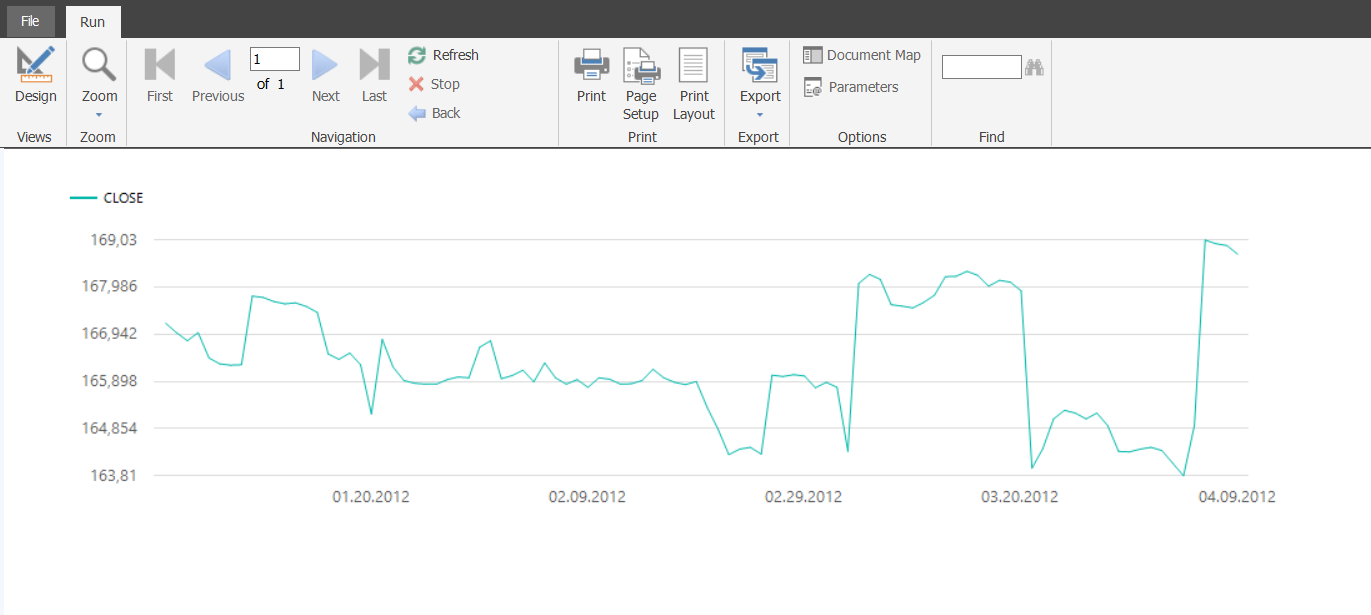
After completing all these steps; we will run the report and our report will look like this.
完成所有这些步骤后; 我们将运行该报告,并且我们的报告将如下所示。
And we will return design panel and add Bollinger Bands to this chart. Right click on the chart design and select Add Calculated Series.
然后,我们将返回设计面板,并在此图表中添加布林带。 右键单击图表设计,然后选择“添加计算的序列”。
Select Bollinger bands.
选择布林带。
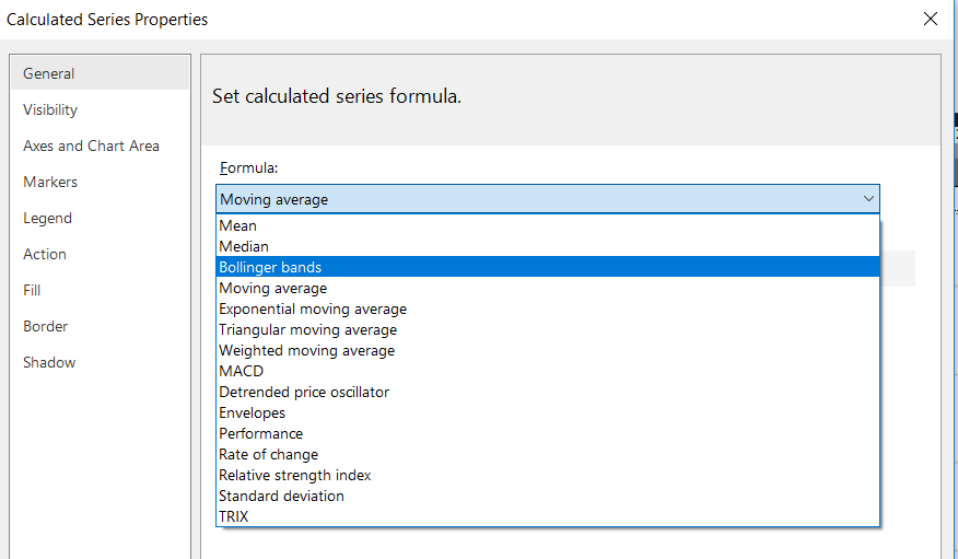
In this step we have to set two parameters. These parameters directly affect the Bollinger Bands calculation.
在这一步中,我们必须设置两个参数。 这些参数直接影响布林带的计算。
Period parameter defines the day number of moving average period. We will set this parameter 20 as in general usage.
期间参数定义移动平均期间的天数。 一般情况下,我们将此参数设置为20。
No of std. devastations parameter can be defined as standard deviation multiplier or coefficient in the upper and lower bands. When we increase this parameter there will be more data between the upper and lower band. In the standard formula of Bollinger this parameter is 2 and we will also set this parameter as 2.
没有性病。 破坏参数可以定义为上下频段的标准偏差乘数或系数。 当我们增加此参数时,上限和下限之间将有更多数据。 在Bollinger的标准公式中,此参数为2,我们还将将此参数设置为2。
I want to add this note at this point that if you want to add Bollinger Bands in the Yahoo Finance you can see the default parameter of Bollinger Band as
我现在想添加此注释,如果您想在Yahoo Finance中添加Bollinger Band,您可以看到Bollinger Band的默认参数为
Period: 20
期间:20
Standard Deviations: 2
标准偏差:2
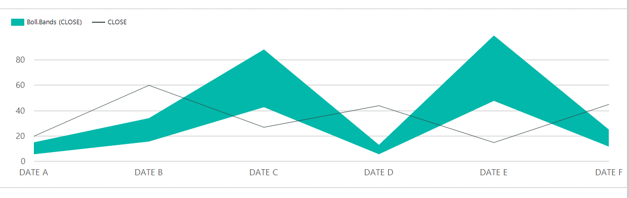
After this setting our chart design will look like this.
完成此设置后,我们的图表设计将如下所示。
Now, we need to add central Bollinger band to our report. The central band illustrates the moving average and for this reason we will add new calculated series and select moving average.
现在,我们需要在报告中添加中央布林带。 中心带说明了移动平均线,因此,我们将添加新的计算序列并选择移动平均线。
And finally, we will run the report and it will appear like this.
最后,我们将运行该报告,该报告将如下所示。
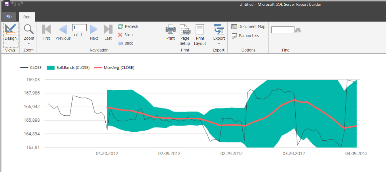
The above image shows a non-green area. This area defines the first 20 days because upper and lower Bollinger bands do not calculate these first 20 days.
上图显示了非绿色区域。 该区域定义了前20天,因为上布林带和下布林带不计算前20天。
摘要 (Summary )
In this article, we discussed Bollinger Bands and how to apply this method to SQL Server Reporting Service reports charts. But I want to add this major advice to report authors: don’t use these statistical functions in a production environment unless you have enough experience.
在本文中,我们讨论了布林带以及如何将此方法应用于SQL Server Reporting Service报表图表。 但我想向报告作者添加这一主要建议:除非您有足够的经验,否则请勿在生产环境中使用这些统计功能。
翻译自: https://www.sqlshack.com/creating-bollinger-bands-with-sql-server-reporting-service-reports/


 69
69


 被折叠的 条评论
为什么被折叠?
被折叠的 条评论
为什么被折叠?
 到【灌水乐园】发言


