


 本文介绍了如何在SQL Server中创建一个自定义报表,该报表结合了条形图和折线图,以显示销售数据的实际收入与目标对比。通过更改条形图颜色以反映实际与目标的比例,从而直观展示业绩表现。文章详细讲解了从创建数据源、报表项目,到设置图表类型、数据标签和颜色填充的过程。
sql自定义报表软件
介绍 (Introduction)
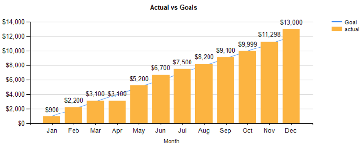
As we are nearing the end of the North American summer, I thought that we would take a lighter look at nifty ways of reporting information. In today’s “fireside chat” we have a look at a unique way of displaying our information using charts and line graphs all in one single chart (see below). We shall take things one step further and work with the color fill of the vertical bars to reflect the values that they represent.
在我们即将接近北美夏季末期时,我认为我们将更轻松地了解报告信息的巧妙方法。 在今天的“炉边聊天”中,我们将探讨一种独特的方式,即使用所有图表和折线图将我们的信息显示在一个图表中 (请参见下文)。 我们将更进一步,并使用垂直条的颜色填充来反映它们代表的值。
让我们开始吧! (Let us begin!)
We are going to look at some sales data from one of my South African clients. Obviously, the numbers have been altered for confidentiality reasons. The client had requested a series of reports in bar chart format showing actual revenue while having the monthly goals display in line graph format. Moreover, the vertical bar color fill would reflect the ratio of the “actual” to the “goal”. Red being definitely under target, yellow as near target and green above target.
我们将查看我的一位南非客户的一些销售数据。 显然,出于保密原因,数字已更改。 客户要求以条形图格式显示一系列报告,以显示实际收入,同时以折线图格式显示每月目标。 此外,竖线颜色填充将反映“实际”与“目标”的比率。 红色肯定在目标之下,黄色在目标附近,绿色在目标之上。
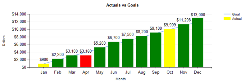
Our finished chart may be seen below:
我们完成的图表如下所示:
Let’s see how we can produce this chart.
让我们看看如何生成此图表。
We begin by open “SQL Server Management Studio” and opening the SQLShack database (which we have worked with in past “get togethers”).
我们首先打开“ SQL Server Management Studio”,然后打开SQLShack数据库(在过去的“聚在一起”中我们一直在使用它)。

We look at the “MonthlyGoalvsActual” table which contains sales and goal data for the financial year 2015.
我们查看“ MonthlyGoalvsActual”表,其中包含2015财政年度的销售和目标数据。
We note that there are three columns. The first, the year and month measured, the second being “monthly goals” and the third actual month’s sales.
我们注意到有三列。 第一个是测量的年份和月份,第二个是“每月目标”,第三个是实际月份的销售额。
In addition to these three fields, we also require the three character month name, which is obtained by through passing the year and month combination to a function (dbo.Monthee) which I created. Our code for this function may be found in Addenda 1.
除了这三个字段外,我们还需要三个字符的月份名称,该名称是通过将年份和月份的组合传递给我创建的函数(dbo.Monthee)来获得的。 我们有关此功能的代码可以在附录1中找到。

We begin by creating a stored procedure to pull this data (above).
我们首先创建一个存储过程来提取此数据(上)。
编制报告 (Developing a report)
Using SQL Server Data Tools 2010 or a higher version, we create a new “Reporting Services” project. Should you not feel at ease designing such a project, then do have a glance at my SQL Shack article entitled “Now you see it, now you don’t”, where I describe the process in great detail.
使用SQL Server Data Tools 2010或更高版本,我们创建了一个新的“ Reporting Services”项目。 如果您不满意设计这样的项目,那么请浏览一下我SQL Shack文章,标题为“现在您看到了,现在您不知道了”,在此我将详细描述该过程。
At this point, we shall assume that you feel comfortable working with a Reporting Services project.
在这一点上,我们将假定您对使用Reporting Services项目感到满意。

Opening SQL Server Data Tools, we create a new Reporting Services Project (above).
打开SQL Server数据工具,我们创建一个新的Reporting Services项目(如上所述)。
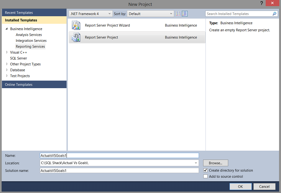
We give our project a name (above). We accept and return to the report design surface.
我们给我们的项目起一个名字(上面)。 我们接受并返回报告设计界面。

We must now add a new ‘Shared Data Source’(above). As I have mentioned many times before, a data source is similar to a garden hose. This garden hose connects to the tap on the house (the database) and the other end of the data source empties into a watering can (the dataset).
现在,我们必须添加一个新的“共享数据源”(上面)。 正如我之前多次提到的,数据源类似于花园软管。 该花园软管连接到房屋上的水龙头(数据库),数据源的另一端倒入喷壶(数据集)中。

We enter the name of the server and connect our new ‘Shared Data Source’ to the “SQLShack” database (above). We click ‘OK’ and ‘OK’ again to leave the “Shared Data Sources” dialogue box and we are returned to our report.
我们输入服务器的名称,然后将新的“共享数据源”连接到“ SQLShack”数据库(上方)。 我们单击“确定”并再次单击“确定”以离开“共享数据源”对话框,然后返回到我们的报告。
Our next task is to develop a report.
我们的下一个任务是编写报告。

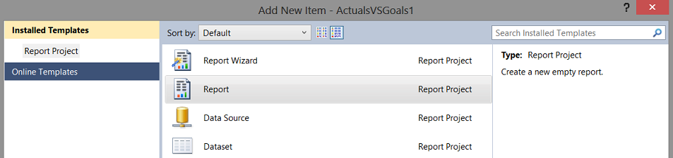
We now right click upon the “Reports” tab (above) and select ‘Add’ and then ‘New Item’ (as above).
现在,我们右键单击“报告”选项卡(上方),然后选择“添加”,然后选择“新建项目”(如上所述)。
We create a new report called “SalesVSGoals”. We accept and return to the report.
我们创建一个名为“ SalesVSGoals”的新报告。 我们接受并返回报告。

Our next task is to add a dataset. We right-click upon the ‘Datasets’ tab and select “Add Dataset” (above).
我们的下一个任务是添加数据集。 我们右键单击“数据集”选项卡,然后选择“添加数据集”(上方)。
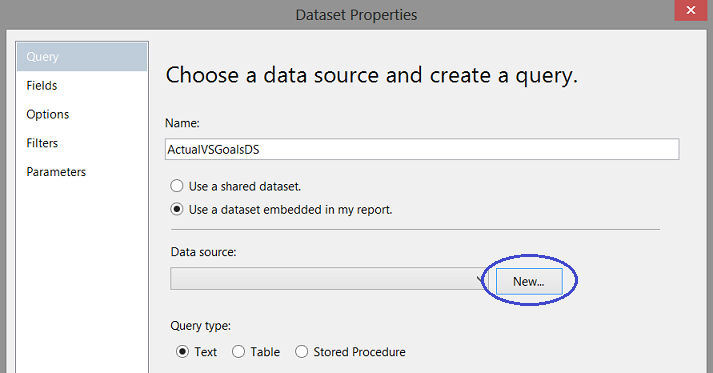
The ‘Dataset Properties” dialogue box opens. We give our dataset the name “ActualVSGoalsDS”. We now click the ’New” button to create a new local ‘Data source’ (above).
“数据集属性”对话框打开。 我们将数据集命名为“ ActualVSGoalsDS”。 现在,我们单击“新建”按钮以创建新的本地“数据源”(上方)。
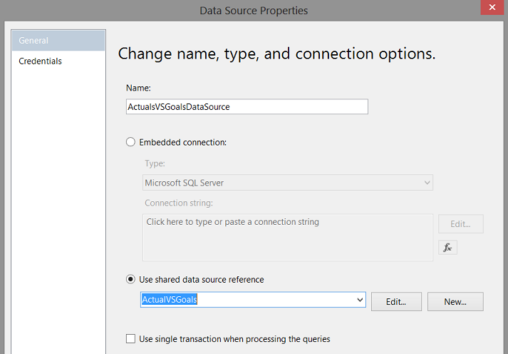
The local ‘Data Source Properties’ box appears. We give our local “Data Source” a name and point it to our ‘Shared Data Source’ that we created a few moments ago (above).
出现本地“数据源属性”框。 我们给本地“数据源”起一个名字,并将其指向我们刚才创建的“共享数据源”。
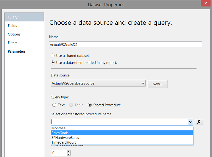
After having created our local “Data Source”, we find ourselves back on the “Dataset Properties” screen. We select “Stored Procedure” as the “Query type” and select the “SalesGoal” stored procedure that we just created above (screen above). We choose ’OK’ to leave the “Dataset Properties” dialog box.
创建本地“数据源”后,我们将回到“数据集属性”屏幕。 我们选择“存储过程”作为“查询类型”,然后选择我们上面刚刚创建的“ SalesGoal”存储过程(上面的屏幕)。 我们选择“确定”离开“数据集属性”对话框。

We return to our report and we also find that the system has created the dataset (screen above).
我们返回报告,还发现系统已创建数据集(上面的屏幕)。

We drag a “Chart” from our “Toolbox” onto our report (above).
我们将“图表”从“工具箱”拖到报告中(上图)。
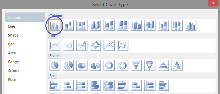
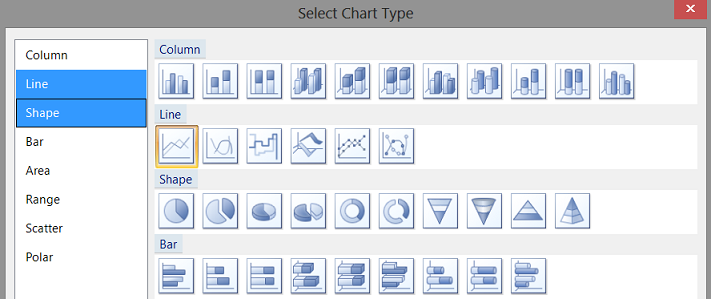
The “Select Chart Type” dialogue box opens. We select a “Column” chart (above).
“选择图表类型”对话框打开。 我们选择一个“柱形图”(上方)。
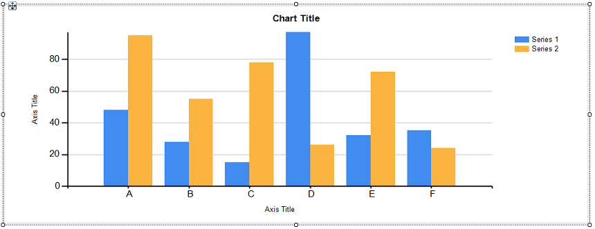
Our “Column” chart is placed upon our report surface (above).
我们的“柱状图”位于报告表面(上方)。
Clicking on the chart and opening the “Properties Window”, we are able to link the dataset which we just created to the “DataSetName” property of the chart (see below).
单击图表并打开“属性窗口”,我们可以将刚刚创建的数据集链接到图表的“ DataSetName”属性(请参见下文)。

Having set the “DataSetName” (above), we click on the chart surface to bring up the “Chart Data” dialog box (see below).
设置好“ DataSetName”(上方)后,我们在图表表面上单击以打开“图表数据”对话框(如下所示)。

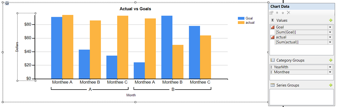
We select our “Goal” and “Actual” fields for the ∑ values (above) and set the “Category Groups” to “YearMth” and “Monthee”. Whilst we shall not be utilizing the “YearMth” combination per se, it will, however, be utilized to ensure that the months are correctly sorted according to chronology and not via the actual month name as alphabetical sorting would place the months in the wrong order (above).
我们为∑值选择“目标”和“实际”字段(上方),并将“类别组”设置为“年月”和“月经”。 虽然我们本身不会使用“年月”组合,但是将使用它来确保根据时间顺序正确地对月份进行排序,而不是通过实际的月份名称进行,因为按字母顺序排序会把月份排错顺序(以上)。

As “YearMth” is our primary sort field and as we do not want it to be visible on our final report, we right click upon “YearMth” and select the ‘Category Group Properties’ to open the “Category Group Properties” dialog box (see below).
由于“ YearMth”是我们的主要排序字段,并且我们不希望在最终报告中看到它,因此我们右键单击“ YearMth”并选择“ Category Group Properties”以打开“ Category Group Properties”对话框(见下文)。
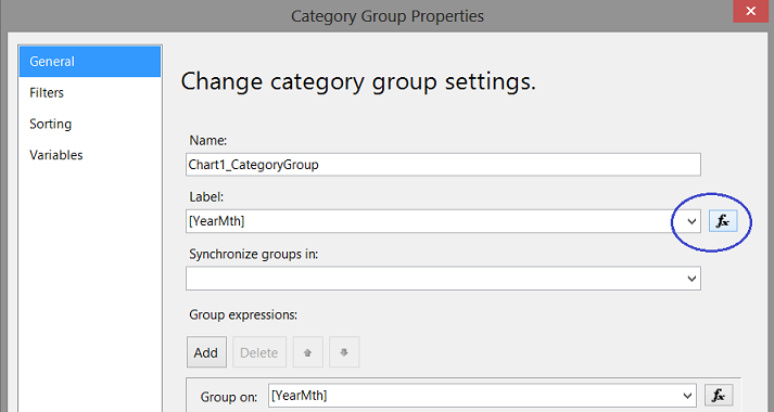
We click on the button as may be seen above. The “Label” function dialog box opens (see below).
我们点击上面可以看到的按钮。 “标签”功能对话框打开(见下文)。

We alter the expression “=Fields!YearMth.Value” to
我们将表达式“ = Fields!YearMth.Value”更改为

We accept and the dialogue box closes, returning us to our report.
我们接受并关闭对话框,将我们返回到报告中。
We give our chart the title “Actual vs Goals” and set the name of the “X” axis to “Month” and the “Y” axis to “Dollars” (above).
我们为图表提供标题“实际与目标”,并将“ X”轴的名称设置为“月”,将“ Y”轴的名称设置为“美元”(上图)。
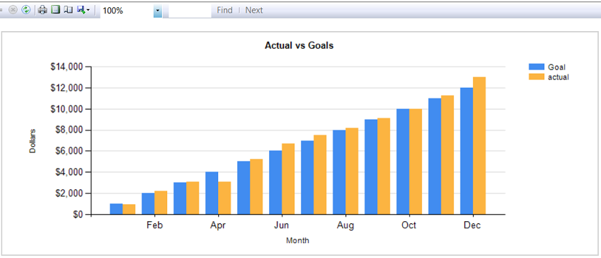
Running our report we find that our “Goals” and “Actuals” are shown. One issue is that only every second “Month” name is displayed. We wish to change this so that every month name appears on the “X” axis.
运行报告,我们发现显示了“目标”和“实际”。 一个问题是仅显示第二个“月”名称。 我们希望对此进行更改,以便每个月的名称都出现在“ X”轴上。

By right-clicking upon the “X” axis, we select the ‘Horizontal Axis Properties’ option. The ‘Horizontal Axis Properties’ dialog box opens.
通过右键单击“ X”轴,我们选择“水平轴属性”选项。 “水平轴属性”对话框打开。

We alter the “Interval” property from ’Auto” to 1 (above) and accept the change and leave the dialogue box.
我们将“时间间隔”属性从“自动”更改为1(以上),并接受更改并退出对话框。
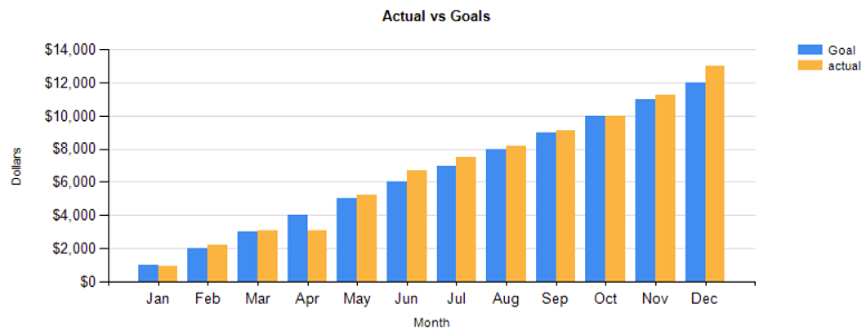
Having a look at our modified report, we see that every month is now displayed.
查看修改后的报告,我们看到现在每个月都会显示。
将图表的目标部分更改为折线图 (Altering the GOAL portion of the chart to be a line graph)
As a part of the original specifications, the portrayal of monthly goals was to be a line chart. Now, most Excel folks would tell you that this is a “snap” to do! In Reporting Services creating the line graph (whilst simple) requires knowing where the change must be made.
作为原始规格的一部分,每月目标的描述是折线图。 现在,大多数Excel专家都会告诉您这是一个“小事”! 在Reporting Services中,创建折线图(最简单)需要知道必须在哪里进行更改。

Within the “Chart Data” dialogue box, we right click upon the “Goal” field and select “Change Chart Type” (above).
在“图表数据”对话框中,我们右键单击“目标”字段,然后选择“更改图表类型”(上方)。
Once again the “Select Chart Type” dialog box opens. This time, however, we shall select “Line” (above). We accept the change.
再次打开“选择图表类型”对话框。 但是,这一次,我们将选择“行”(上方)。 我们接受更改。
We are returned to our report surface. We note that the “Goal” vertical bars are no longer there but rather a line graph in its place (above).
我们返回到报告表。 我们注意到,“目标”竖线不再存在,而是一个折线图(上方)。
Running our report, we note the following.
在运行我们的报告时,我们注意以下几点。

Let us now add the data values to the bar chart.
现在让我们将数据值添加到条形图中。
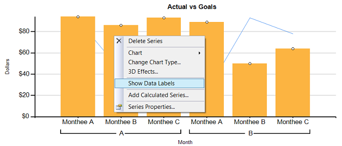
We right-click upon one of the “Orange” bars (above) and select “Show Data Labels”.
我们右键单击上方的“橙色”栏之一,然后选择“显示数据标签”。

Sample label values appear in design view (above). These must be formatted to appear as Dollars.
样本标签值显示在设计视图中(上方)。 这些必须格式化为美元。

Right-clicking on one of the labels, we select “Series Label Properties” (above). The “Series Label Properties” dialogue box opens.
右键单击标签之一,我们选择“系列标签属性”(上方)。 “系列标签属性”对话框打开。
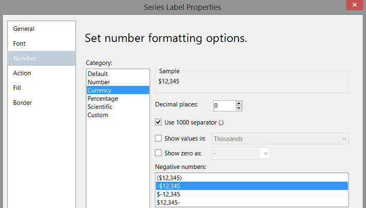
We configure the display to “Number”, “Currency” and set the “Decimal places” to 0. We also set the format for any “Negative numbers” (above). Our chart looks as follows in design view (see below).
我们将显示配置为“数字”,“货币”,并将“小数位数”设置为0。我们还为任何“负数”(上面)设置了格式。 我们的图表在设计视图中如下所示(请参见下文)。

Running our report we note the following (see below)
运行我们的报告时,请注意以下几点(见下文)
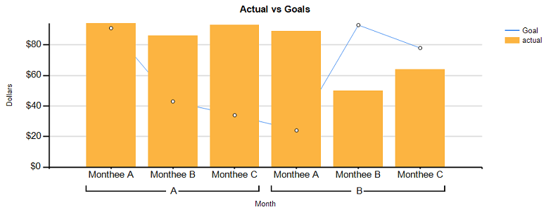
Our last task is to compare the ratio of the “actuals” to the “goals”
我们的最后一项任务是比较“实际”与“目标”的比率
The business rules are as follows.
业务规则如下。
- If Actual to Goal is less than .7999 make the fill of the vertical bar “Red”. 如果“实际目标”小于.7999,则在垂直栏中填充“红色”。
- If Actual to Goal is between .800 and .9999 then the fill is to be “Yellow” 如果实际到目标介于.800和.9999之间,则填充应为“黄色”
- If Actual to Goal is greater than .9999 then the fill is “Green” 如果实际到目标大于.9999,则填充为“绿色”
The code to achieve this is shown below:
实现此目的的代码如下所示:
=Switch (isnothing(Fields!actual.Value) , "LightGrey",
        Fields!actual.Value /Fields!Goal.Value  <= .799, "Red" ,
        Fields!actual.Value /Fields!Goal.Value >=.80 and Fields!Actual.Value /Fields!Goal.Value <=.999, "Yellow",
        Fields!Actual.value /Fields!Goal.value >=1, "Green")
更改“条形图”的“填充”颜色 (Changing the “Fill” colour of the “Bar chart”)

We right-click upon any one of the orange bars and select “Series Properties” (above). The “Series Properties” dialog box opens.
右键单击任一橙色条,然后选择“系列属性”(上方)。 “系列属性”对话框打开。
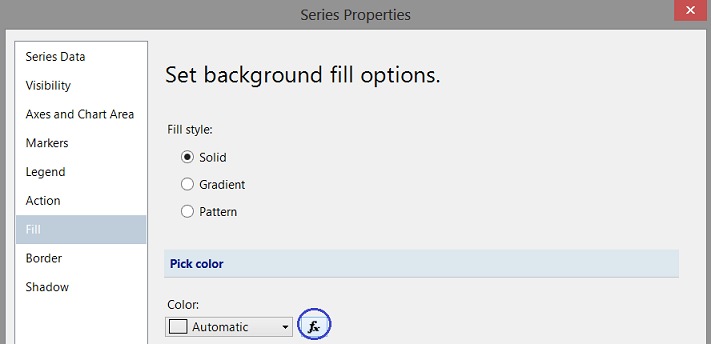
We select the “Fill” option and click the x button (above).
我们选择“填充”选项,然后单击x按钮(上方)。

We place our “Colour Code” into the “expression box” and click “OK” and
我们将“颜色代码”放入“表达式”框中,然后单击“确定”,然后
“OK” to accept. We return to our report (see below).
“确定”接受。 我们返回我们的报告(见下文)。

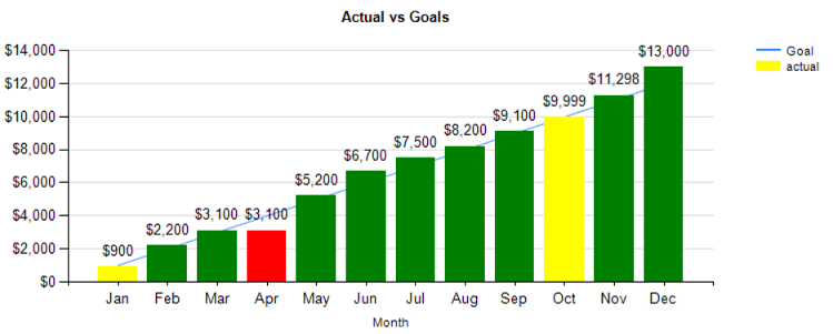
Clicking on the “Preview” tab, we find that color fill of our vertical bar “now represents the “actual to goal ratio” and that the line graph connecting the monthly goals is also present (above).
单击“预览”选项卡,我们发现竖线的颜色填充“现在代表”实际与目标的比率”,并且还存在连接每月目标的折线图(上方)。
Thus our chart and report are now complete.
至此,我们的图表和报告现已完成。
结论 (Conclusions)
When it comes to “charting”, our first thoughts are to “throw” all the data into a spreadsheet and work with it from there. The issue becomes what to do when dealing with large amounts of data and complex joining of data sources. SQL Server Reporting Services provides virtually the same functionality as an Excel spreadsheet, however, it has the underlying power to process large amounts of data in an efficient and effective manner.
当涉及“图表”时,我们的第一个想法是将所有数据“扔”到电子表格中,然后从那里进行处理。 问题变成了在处理大量数据和复杂的数据源联接时该怎么办。 SQL Server Reporting Services实际上提供了与Excel电子表格相同的功能,但是它具有以高效有效的方式处理大量数据的潜在功能。
So we finish another “fireside chat”. I trust that I have left you with a few interesting ideas.
因此,我们完成了另一个“炉边聊天”。 我相信我给您留下了一些有趣的想法。
As in past, if you do have questions, please do feel free to contact me.
与过去一样,如果您有任何疑问,请随时与我联系。
In the interim, happy programming!
在此期间,编程愉快!
附录1 (Addenda 1)
USE [SQLShack]
GO

/****** Object:  UserDefinedFunction [dbo].[Monthee]    Script Date: 8/15/2016 3:06:09 PM ******/
SET ANSI_NULLS ON
GO

SET QUOTED_IDENTIFIER ON
GO

create function [dbo].[Monthee]
(
@YearMth as varchar(6)
)

  RETURNS Varchar(6)
  AS
  BEGIN
  declare @Return  varchar(6)

Begin
Set @return =
case when right(@YearMth,2) = '01' then 'Jan'
     when right(@YearMth,2) = '02' then 'Feb'
     when right(@YearMth,2) = '03' then 'Mar'
     when right(@YearMth,2) = '04' then 'Apr'
     when right(@YearMth,2) = '05' then 'May'
     when right(@YearMth,2) = '06' then 'Jun'
     when right(@YearMth,2) = '07' then 'Jul'
     when right(@YearMth,2) = '08' then 'Aug'
     when right(@YearMth,2) = '09' then 'Sep'
     when right(@YearMth,2) = '10' then 'Oct'
     when right(@YearMth,2) = '11' then 'Nov'
     when right(@YearMth,2) = '12' then 'Dec' else 'XXX' end
	 end
	 RETURN(@return)
end
GO
参考资料 (References)
- Expression Examples (Report Builder and SSRS)表达式示例(报表生成器和SSRS)
- Background Color Formatting by expression in SSRS Report通过SSRS报告中的表达式来设置背景颜色格式
- Charts (Report Builder and SSRS)图表(报表生成器和SSRS)
翻译自: https://www.sqlshack.com/reporting-sql-server-customize-visual-appearance-of-your-reports/
sql自定义报表软件


 392
392

 被折叠的 条评论
为什么被折叠?
被折叠的 条评论
为什么被折叠?
 到【灌水乐园】发言


