


CSS and JavaScript, believe it or not, are starting to overlap as CSS adds more functionality. When I wrote 5 Ways that CSS and JavaScript Interact That You May Not Know About, people were surprised at how CSS and JavaScript have come to overlap. Today I will highlight seven tasks you can accomplish with CSS -- no JavaScript or imagery required!
信不信由你,随着CSS增加更多功能,CSS和JavaScript开始重叠。 当我写了您可能不知道CSS和JavaScript交互的5种方式时 ,人们对CSS和JavaScript如何重叠感到惊讶。 今天,我将重点介绍使用CSS可以完成的七个任务-无需JavaScript或图像!
CSS @支持 (CSS @supports)
Every good front-end developer feature-tests before using features which a browser may not have. Feature testing has always done with JavaScript, and many people use Modernizr, an impressive utility packed with loads of well-tested routines, to do that feature testing. A new API, however, has come along to let you do feature tests with CSS: @supports. Here are a few samples of how @supports works:
每个好的前端开发人员功能都在使用浏览器可能没有的功能之前进行了测试。 功能测试始终使用JavaScript进行,并且许多人使用Modernizr(该功能令人印象深刻的实用程序包含大量经过测试的例程)来进行功能测试。 但是,新的API可以让您使用CSS进行功能测试: @supports 。 以下是@supports如何工作的一些示例:
/* basic usage */
@supports(prop:value) {
	/* more styles */
}

/* real usage */
@supports (display: flex) {
	div { display: flex; }
}

/* testing prefixes too */
@supports (display: -webkit-flex) or
          (display: -moz-flex) or
          (display: flex) {

    section {
      display: -webkit-flex;
      display: -moz-flex;
    	display: flex;
    	float: none;
    }
}
This new @supports feature, which also has a JavaScript counterpart, is well overdue and we can look forward to using it soon!
这项新的@supports功能(还有JavaScript对应功能)已经过期,我们可以期待很快使用它!
CSS过滤器 (CSS Filters)
Write a service to modify an image's color shades and you can sell it to Facebook for a billion dollars! Of course that's an over-simplification but writing image filters isn't exactly a science. I wrote a tiny app my first week at Mozilla (which won a contest, BTW...just sayin') which used some JS-based math to create image filters with canvas, but today we can create image filters with just CSS!
编写一项服务来修改图像的色调,您可以将其以十亿美元的价格卖给Facebook! 当然,这过于简单了,但是编写图像滤镜并不是一门科学。 我在Mozilla的第一周就写了一个小应用程序 (赢得了比赛,BTW ...只是说了算),它使用了一些基于JS的数学方法来使用画布创建图像过滤器,但是今天我们可以仅使用CSS来创建图像过滤器 !
/* simple filter */
.myElement {
	-webkit-filter: blur(2px);
}

/* advanced filter */
.myElement {
	-webkit-filter: blur(2px) grayscale (.5) opacity(0.8) hue-rotate(120deg);
}
This type of filtering only masks an image's original view and doesn't save or export the image with said filter, but it's great for photo galleries or anywhere else you'd like to add flare to an image!
这种类型的过滤器仅会掩盖图像的原始视图,而不会使用所述过滤器保存或导出图像,但是它对于照相馆或您想向图像添加光晕的任何地方都非常有用!
指针事件和阻塞点击 (Pointer Events and Bricking Clicks)
The CSS pointer-events property provides a method to effectively disable an element, so much so that clicks on a link don't trigger a click event through JavaScript:
CSS pointer-events属性提供了一种有效禁用元素的方法,以至于不能使链接的点击不会通过JavaScript触发点击事件:
/* do nothing when clicked or activated */
.disabled { pointer-events: none; }
/* this will _not_ fire because of the pointer-events: none application */
document.getElementById("disabled-element").addEventListener("click", function(e) {
	alert("Clicked!");
});
In the example above, the click event wont even fire due to the CSS pointer-events value. I find this of massive utility as you don't need to do className or attribute checks everywhere to see if something is disabled.
在上面的示例中,由于CSS pointer-events值,click事件甚至不会触发。 我发现这是一个庞大的实用程序,因为您无需到处进行className或属性检查来查看是否已禁用某些功能。
向下滑动和向上滑动 (Slide Down & Slide Up)
CSS affords us the ability to create transitions and animations but oftentimes we need JavaScript libraries to give us a hand in modifying a few things and controlling the animation. One such popular animation is the slide up and slide down effect, which most people don't know can be accomplished with only CSS!
CSS使我们能够创建过渡和动画,但是通常我们需要JavaScript库来帮助我们修改一些东西并控制动画。 其中一种流行的动画是“ 向上滑动”和“向下滑动”效果 ,大多数人不知道只有CSS才能实现!
/* slider in open state */
.slider {
	overflow-y: hidden;
	max-height: 500px; /* approximate max height */

	transition-property: all;
	transition-duration: .5s;
	transition-timing-function: cubic-bezier(0, 1, 0.5, 1);
}

/* close it with the "closed" class */
.slider.closed {
	max-height: 0;
}
A clever use of max-height allows the element to grow and shrink as needed.
巧妙地使用max-height可以使元素根据需要增长和收缩。
CSS计数器 (CSS Counters)
We'll always have a giggle at what the term "counter" means on the internet, but CSS counters are another thing entirely. CSS counters allow developers to increment a counter and display it via :before or :after for a given element:
对于Internet上“计数器”一词的含义,我们总是会有些傻笑,但是CSS计数器完全是另一回事。 CSS计数器允许开发人员增加计数器并通过:before或:after给定元素显示它:
/* initialize the counter */
ol.slides {
	counter-reset: slideNum;
}

/* increment the counter */
ol.slides > li {
	counter-increment: slideNum;
}

/* display the counter value */
ol.slides li:after {
	content: "[" counter(slideNum) "]";
}
You often see CSS counters used in slideshows at conferences and even in lists like a table of contents.
您经常会在会议的幻灯片放映中甚至在目录等列表中看到CSS计数器。
Unicode CSS类 (Unicode CSS Classes)
There are loads of CSS best practice documents out there, and they'll all start with how to name your CSS classes. What you'll never see is one of those documents telling you to use unicode symbols to name your classes:
那里有很多CSS最佳实践文档,它们都以如何命名CSS类开始。 您将永远不会看到的是那些告诉您使用unicode符号来命名您的类的文档之一:
.ಠ_ಠ {
	border: 1px solid #f00;
	background: pink;
}

.❤ {
	background: lightgreen;
	border: 1px solid green;
}
Please don't use these. Please. BUT YOU CAN!
请不要使用这些。 请。 但是你可以!
CSS圈子 (CSS Circles)
CSS triangles are a neat trick but so are CSS circles. By abusing CSS border-radius, you can create flawless circles!
CSS三角形是一个巧妙的技巧, CSS圈子也是如此。 通过滥用CSS border-radius ,您可以创建完美的圆圈!
.circle {
	border-radius: 50%;
	width: 200px;
	height: 200px;
	/* width and height can be anything, as long as they're equal */
}
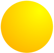
You can add gradients to your circles and you can even use CSS animations to spin them around! CSS has a more uniform API for Shapes coming but you can create circles with this hack now!
您可以为圈子添加渐变,甚至可以使用CSS动画来旋转它们! CSS 为Shapes推出了更加统一的API,但是您现在可以使用此技巧创建圈子!
There you have it: seven things you can do with CSS that you may be surprised at. A few are quite useful, a few are more edge cases. Let me know if I've missed an awesome CSS task that you use frequently!
有了它,您可能会对CSS可以做的七件事感到惊讶。 一些是非常有用的,一些是更多的边缘情况。 让我知道我是否错过了您经常使用的出色CSS任务!


 4万+
4万+

 被折叠的 条评论
为什么被折叠?
被折叠的 条评论
为什么被折叠?
 到【灌水乐园】发言


