


pow python
由盖尔·弗赖森| 2017年3月21日 (by Geir Freysson | March 21, 2017)
About Geir: Geir is the co-founder and CEO of Datasmoothie, a tech company that brings the joy back into statistical analysis. Geir is also a caffeine enthusiast and Internet addict.
关于盖尔(Geir) :盖尔(Geir)是Datasmoothie的联合创始人兼首席执行官,该公司将科技带回了统计分析领域。 盖尔(Geir)还是咖啡因爱好者和互联网成瘾者。
介绍 (Introduction)
How is the President doing in the latest polls? Are your employees happy? Is this medicine working? Do people think machines will replace humans in the next 50 years?
总统在最近的民意调查中表现如何? 您的员工高兴吗? 这种药有效吗? 人们是否认为机器将在未来50年内取代人类?
Quantipy is an open source Python library developed in collaboration between the opinion polling company YouGov and us, Datasmoothie. Quantipy focuses on making life easier for researchers in the people data industry who work on gathering answers to questions like the ones above.
Quantipy是一个由民意测验公司YouGov与我们( Datasmoothie)合作开发的开源Python库。 Quantipy致力于为人们数据行业的研究人员简化生活,他们致力于收集上述问题的答案。
In this blog post we are going to show you how to take raw survey data and automatically generate a PowerPoint slideshow, which can be themed according to your brand. You’ll end up with 28 automatically generated slides that show people’s opinions on various questions on machine automation, as surveyed by PEW Research centre.
在此博客文章中,我们将向您展示如何获取原始调查数据并自动生成PowerPoint幻灯片,可以根据您的品牌设置主题。 您将最终得到28张自动生成的幻灯片,这些幻灯片显示了人们对机器自动化的各种问题的看法,这是由PEW Research center调查得出的 。
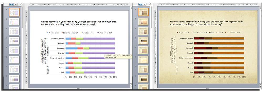
Quantipy creates slides that use native PowerPoint/Excel charts so they can be branded with different PowerPoint themes. On the left is a basic chart and on the right the user has chosen one of the standard PowerPoint themes.
Quantipy会创建使用本机PowerPoint / Excel图表的幻灯片,以便可以使用不同的PowerPoint主题进行品牌标记。 左侧是基本图表,右侧是用户选择了标准PowerPoint主题之一。
使用Quantipy将调查数据读取到python中 (Reading survey data into python with Quantipy)
We start by reading the data into Quantipy, straight from SPSS (a common file-type in the people data industries).
我们首先从SPSS(人员数据行业中的常见文件类型)直接将数据读入Quantipy。
dataset = qp.DataSet(‘pew-dataset’) dataset.read_spss(‘./gaming-jobs-broadband.sav’)dataset = qp.DataSet(‘pew-dataset’) dataset.read_spss(‘./gaming-jobs-broadband.sav’)
We start by exploring what variables are in the dataset.
我们首先研究数据集中的变量。
and we can have a look at the meta data to see what answers were available for specific questions (variables) as well.
我们可以看一下元数据,以了解针对特定问题(变量)也有哪些答案。
dataset.describe(‘marital’) single codes texts marital: MARITAL. Are you currently married ... 1 1 Married 2 2 Living with a partner 3 3 Divorced 4 4 Separated 5 5 Widowed 6 6 Never been married 7 8 Don’t know 8 9 Refused Nonedataset.describe(‘marital’) single codes texts marital: MARITAL. Are you currently married ... 1 1 Married 2 2 Living with a partner 3 3 Divorced 4 4 Separated 5 5 Widowed 6 6 Never been married 7 8 Don’t know 8 9 Refused None
确定要包括哪些问题和答案 (Decide what questions and answers to include)
Once we’ve decided what variables we want in our PowerPoint presentation we add them to the appropriate arrays. We are going to build a slide deck that shows answers to questions on machine automation and we are going to analyse how people of different genders, with different levels of education, different marital statuses and in different regions responded.
一旦在PowerPoint演示文稿中确定了所需的变量后,便将它们添加到适当的数组中。 我们将构建一个幻灯片平台,以显示有关机器自动化问题的答案,并且我们将分析具有不同文化程度,不同婚姻状况和不同地区的不同性别的人的React。
资料汇整 (Data aggregation)
We then create a so-called Quantipy Stack which stores all of our aggregations and also gives us access to pulling them out in convenient ways.
然后,我们创建一个所谓的Quantipy堆栈,该堆栈存储所有聚合,还使我们能够以方便的方式将其拉出。
stack = qp.Stack(add_data={'pew': {'data': dataset.data(), 'meta': dataset.meta()}}) #this is where the aggregations happen stack.add_link(x=xvars,y=yvars,views=['cbase','c%'])stack = qp.Stack(add_data={'pew': {'data': dataset.data(), 'meta': dataset.meta()}}) #this is where the aggregations happen stack.add_link(x=xvars,y=yvars,views=['cbase','c%'])
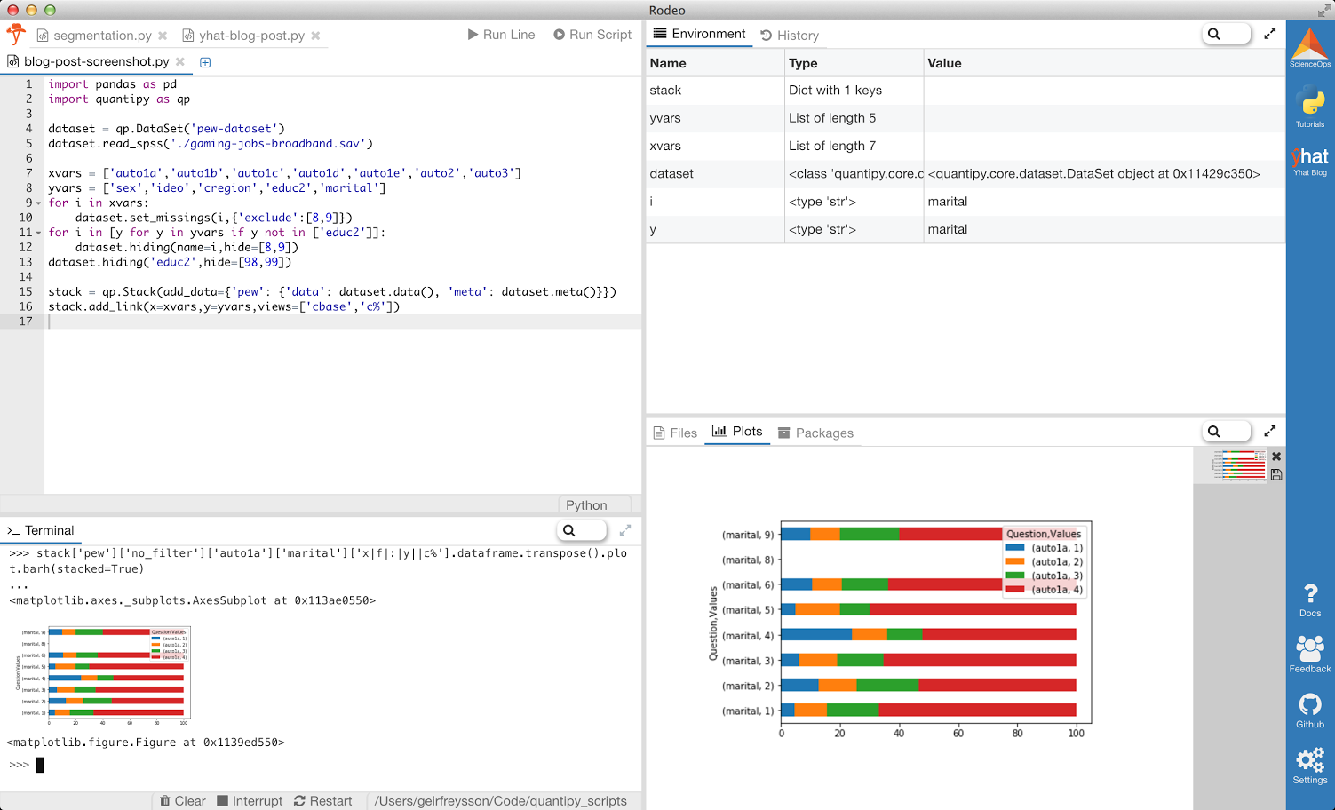
We can explore the stack directly, for a sanity check. We use a Python IDE specifically designed for data-science made by Yhat, called Rodeo, and in it we use the console to plot the result of how people answered the variable “auto1a” according to their marital status. Don’t worry about how the chart looks for now.
我们可以直接浏览堆栈,以进行完整性检查。 我们使用专门为Yhat制造的数据科学而设计的Python IDE(称为Rodeo) ,并在其中使用控制台根据人们的婚姻状况绘制人们回答变量“ auto1a”的结果。 不必担心现在的图表外观。
导出到PowerPoint (Export to PowerPoint)
Now that we’ve aggregated our results we want to present them in PowerPoint. We use the python-pptx library to generate our PowerPoint files and some handy Quantipy helper methods to create slides from pandas dataframes. We’re also ready for the data to be consumer friendly, so we replace codes with actual labels with paint_dataframe.
现在,我们已经汇总了结果,我们希望将其显示在PowerPoint中。 我们使用python-pptx库生成我们的PowerPoint文件,并使用一些方便的Quantipy帮助器方法从熊猫数据帧创建幻灯片。 我们也准备好使数据对消费者友好,因此我们用paint_dataframe用实际标签替换代码。
from pptx import Presentation import quantipy.core.builds.powerpoint.helpers as hp from quantipy.core.helpers.functions import paint_dataframe prs = Presentation() # we want to group some background varialbes onto the same slide, # e.g. gender and marital status slide_vars = [[‘sex’,’marital’],[‘cregion’],[‘educ2’],[‘ideo’]] for question in xvars: for slide in slide_vars: chains = stack.get_chain(x=question,y=slide,views= [‘x|f|:|y||c%’],orient_on=’x’,rules=True) df = paint_dataframe(dataset.meta(), chains[0].concat().transpose()) chartData = hp.ChartData_from_DataFrame(df) question_label = df.columns.levels[0][0] hp.add_slide_with_chart(prs, chartData, question_label,legend=True, normalized=True) prs.save(‘my-report.pptx’)from pptx import Presentation import quantipy.core.builds.powerpoint.helpers as hp from quantipy.core.helpers.functions import paint_dataframe prs = Presentation() # we want to group some background varialbes onto the same slide, # e.g. gender and marital status slide_vars = [[‘sex’,’marital’],[‘cregion’],[‘educ2’],[‘ideo’]] for question in xvars: for slide in slide_vars: chains = stack.get_chain(x=question,y=slide,views= [‘x|f|:|y||c%’],orient_on=’x’,rules=True) df = paint_dataframe(dataset.meta(), chains[0].concat().transpose()) chartData = hp.ChartData_from_DataFrame(df) question_label = df.columns.levels[0][0] hp.add_slide_with_chart(prs, chartData, question_label,legend=True, normalized=True) prs.save(‘my-report.pptx’)
That’s all there is to it. You now have a PowerPoint Document with 28 slides, seven questions compared across five background variables. Because the charts are exported to native PowerPoint/Excel charts they respond to changes in the theme, so the slides can be branded according to your theme with the click of a mouse.
这里的所有都是它的。 您现在有了一个包含28张幻灯片的PowerPoint文档,在五个背景变量中比较了七个问题。 由于图表已导出到本机PowerPoint / Excel图表,因此它们可以响应主题的更改,因此可以通过单击鼠标来根据主题对幻灯片进行标记。
You can also export directly to an online dashboard or report with Datasmoothie (like this one), which will be covered in another post.
您还可以直接导出到在线仪表板或使用Datasmoothie进行报告( 像这样 ),这将在另一篇文章中介绍。
pow python


 1315
1315

 被折叠的 条评论
为什么被折叠?
被折叠的 条评论
为什么被折叠?
 到【灌水乐园】发言


