


CSS | 对象拟合属性 (CSS | object-fit Property)
Introduction:
介绍:
Videos and Images are sure to make any website or web page attractive to the users. It is very smart to include images and videos on your website or web page as it makes your website or web page very responsive and user-interactive. Although, it is a good practice to indulge your users with the videos and images to deal with those images and videos is equally important.
视频和图像确保使任何网站或网页都对用户具有吸引力。 在您的网站或网页上包含图像和视频非常聪明,因为它可以使您的网站或网页具有快速响应能力并且与用户互动。 虽然,让您的用户沉迷于视频和图像来处理这些图像和视频同样重要。
So, to deal with those images and videos, there are certain properties and one should keep learning about such new properties, therefore this article is also about one such property known as object-fit Property in CSS. Let us have a look at the explanation below for better understanding.
因此,要处理这些图像和视频,有一些属性,应该不断学习这些新属性,因此本文也将介绍一种这样的属性,称为CSS中的对象适合属性 。 让我们看一下下面的解释以更好地理解。
Definition:
定义:
The CSS object-fit property is used to declare how an image or video is resized to fit its required area. Very simple and easy to use the property but should be used very wisely as well.
CSS object-fit属性用于声明如何调整图像或视频的大小以适合其所需区域。 该属性非常简单易用,但也应非常明智地使用。
Syntax:
句法:
    Element{
        object-fit : fill|contain|cover|scale-down|none;
    }
There are following object-fit property's values in CSS,
CSS中有以下object-fit属性的值,
fill
填
contain
包含
cover
盖
scale-down
缩小
none
没有
Let's look at each property one by one....
让我们逐一查看每个属性。
对象适合:填充 (object-fit : fill)
It is also the default value. The replaced image or video is stretched or squashed to fit the required area if necessary. The replaced image will fill the area heedless of its aspect ratio.
也是默认值。 如有必要,拉伸或压缩替换后的图像或视频以适合所需区域。 替换的图像将不考虑其宽高比而填充该区域。
Syntax:
句法:
    Element{
        object-fit : fill;
    }
Example:
例:
<!DOCTYPE html>

<html>

<head>
    <style>
        img {
            width: 200px;
            height: 400px;
            object-fit: fill;
        }
    </style>
</head>

<body>
    <h1>Object-fit Property</h1>
    <img src="img_forest.jpg" width="667" height="184">
</body>

</html>
Output
输出量
In the above example, the replaced image is stretched in order to fit the content box.
在上面的示例中,替换后的图像被拉伸以适合内容框。
对象适合:包含 (object-fit : contain)
The contain value of the object-fit property is used to scale the replaced content to maintain its aspect ratio while fitting in a elements content-box. The entire object is made to fill the content box.
object-fit属性的contains值用于缩放替换的内容,以保持其宽高比,同时适合元素content-box。 整个对象将填充内容框。
Syntax:
句法:
    Element{
        object-fit : contain;
    }
Example:
例:
<!DOCTYPE html>

<html>

<head>
    <style>
        img {
            width: 200px;
            height: 400px;
            object-fit: contain;
        }
    </style>
</head>

<body>
    <h1>Object-fit Property</h1>
    <img src="img_forest.jpg" width="667" height="184">
</body>

</html>
Output
输出量
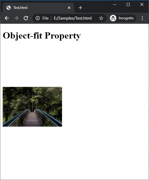
In the above example, the replaced image is scaled to maintain its aspect ratio.
在以上示例中,替换后的图像按比例缩放以保持其宽高比。
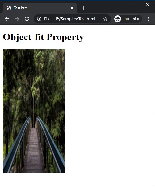
适合对象:封面 (object-fit : cover)
The cover value of the object-fit property is used to resize the replaced content to maintain its aspect ratio while filling the content box.
object-fit属性的cover值用于调整替换内容的大小,以在填充内容框时保持其长宽比。
If the object aspect ratio does not match the aspect ratio of its box the object is cropped to fit.
如果对象的宽高比与其框的宽高比不匹配,则会裁切对象以适合对象。
Syntax:
句法:
    Element{
        object-fit : cover;
    }
Example:
例:
<!DOCTYPE html>

<html>

<head>
    <style>
        img {
            width: 200px;
            height: 400px;
            object-fit: cover;
        }
    </style>
</head>

<body>
    <h1>Object-fit Property</h1>
    <img src="img_forest.jpg" width="667" height="184">
</body>

</html>
Output
输出量

In the above example, the replaced image fits the content-box perfectly hence it is not cropped.
在上面的示例中,替换后的图像非常适合内容框,因此不会被裁剪。
对象拟合:按比例缩小 (object-fit : scale-down)
As its name suggests in the scale-down value of the object-fit property the replaced content is resized as if the none or contain were specified and results to the smallest object size.
顾名思义,在object-fit属性的缩小值中,替换后的内容将重新调整大小,就像指定了none或contains一样,并导致最小的对象大小。
Syntax:
句法:
    Element{
        object-fit : scale-down;
    }
Example:
例:
<!DOCTYPE html>

<html>

<head>
    <style>
        img {
            width: 200px;
            height: 400px;
            object-fit: scale-down;
        }
    </style>
</head>

<body>
    <h1>Object-fit Property</h1>
    <img src="img_forest.jpg" width="667" height="184">
</body>

</html>
Output
输出量

In the above example, the replaced image is scaled as if none.
在上面的示例中,替换后的图像就像没有缩放一样缩放。
对象适合:无 (object-fit : none)
As its name suggests in the none value of the object-fit property the replaced content will ignore aspect ratio of the actual image. Hence, it is not resized.
顾名思义,在object-fit属性的none值中,替换的内容将忽略实际图像的纵横比。 因此,它不会调整大小。
Syntax:
句法:
    Element{
        object-fit : none;
    }
Example:
例:
<!DOCTYPE html>

<html>

<head>
    <style>
        img {
            width: 200px;
            height: 400px;
            object-fit: none;
        }
    </style>
</head>

<body>
    <h1>Object-fit Property</h1>
    <img src="img_forest.jpg" width="667" height="184">
</body>

</html>
Output
输出量

In the above example, the replaced image has ignored all the aspects ratio.
在上面的示例中,替换的图像忽略了所有长宽比。
翻译自: https://www.includehelp.com/code-snippets/the-object-fit-property-in-css.aspx


 扫一扫
扫一扫
 564
564

 被折叠的 条评论
为什么被折叠?
被折叠的 条评论
为什么被折叠?
 到【灌水乐园】发言


