


bootstrap网格系统
In the last article, we learned how to create a simple page of Bootstrap? Now, we will learn what is "Grid System" in Bootstrap and how we can use or implement it in our bootstrap page? As you know bootstrap is a mobile-friendly framework. So, we design our responsive page for 'mobile first fluid grid system' and it automatically, adjust its view in every system. Now, we move further and know more about this. If you have any doubt, ask in the comment section.
在上一篇文章中,我们学习了如何创建Bootstrap的简单页面 ? 现在,我们将学习Bootstrap中的“网格系统”以及如何在Bootstrap页面中使用或实现它 ? 如您所知,bootstrap是一个对移动设备友好的框架。 因此,我们为“移动优先流体网格系统”设计了响应页面,并自动在每个系统中调整其视图。 现在,我们将进一步了解这一点。 如有任何疑问,请在评论部分提出。
Now, first we will see what is Grid?
现在,首先我们将看到什么是网格?
A grid is a 2-D structure where rows and columns are used to structure the content. It is widely used to create a structure and for layout use HTML and CSS which make it easy to use, scan and to reduce the comprehension load on users.
网格是一种二维结构,其中使用行和列来构造内容。 它被广泛用于创建结构并使用HTML和CSS进行布局,从而使其易于使用,扫描并减少用户的理解负担。
网格系统 (Grid System)
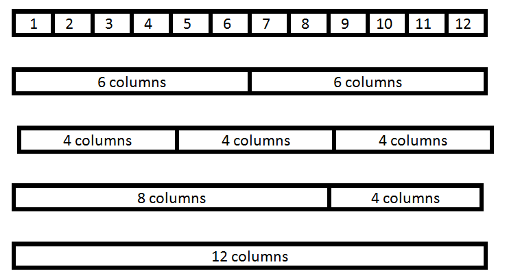
In Bootstrap Grid System it scales up to 12 columns as the device or viewport size increases. It includes predefined classes for easy layout. Basically, Grid systems are used for creating page layouts through a series of rows and columns. It’s up to you how many columns individually you want to use in your page and how many columns group you want.
在Bootstrap Grid System中 ,随着设备或视口大小的增加,它最多可扩展至 12列。 它包括预定义的类,以简化布局。 基本上,网格系统用于通过一系列行和列来创建页面布局。 由您决定要在页面中分别使用多少列以及要多少列组。
Example:
例:
网格系统的工作 (Working of Grid System)
We use .container class (for fixed width) and .container-fluid class (for full width: 100%) to place the rows.
我们使用.container类(用于固定宽度)和.container-fluid类(用于全宽度:100%)放置行。
There are .row and col-*-* pre-defined classes are available for layout. It will automatically set the width from the small breakpoint.
有.row和col-*-*个预定义的类可用于布局。 它将自动从小断点开始设置宽度。
Note: Here, Astric ( * ) is for xs (for extra small device phone, <576px) , sm (for small device tablet, >= 768px), md (for desktop, >= 992px) , lg (for larger desktops, >= 1200px) and for the number of columns you want like: col-sm-4.
注意:此处,Astric( * )用于xs (对于超小型设备电话,<576px), sm (对于小型设备平板电脑,> = 768px), md (对于台式机,> = 992px), lg (对于大型台式机, > = 1200px),并指定所需的列数: col-sm-4 。
Use row for a group of columns because .row is a pre-defined wrapper class for col-*-*.
将row用于一组列,因为.row是col-*-*的预定义包装器类。
Each .row and .col-*-* has horizontal padding for controlling the space between them called Gutters. That padding is offset in rows for the first and the last column via negative margin on .rows.
每个.row和.col-*-*都有水平填充,用于控制它们之间的间隔,称为Gutters 。 该填充通过.rows上的负边距在第一列和最后一列的行中偏移。
网格选项 (Grid Options)

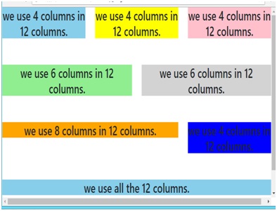
Example (Code):
示例(代码):
<body>
	<!---------- First type of grid ---------->
	<div class="container">
		<div class="row">
			<div class="col-sm-4">
				<h3 style="background-color:skyblue;text-align:center;">we use 4 columns in 12 columns.</h3>
			</div>

			<div class="col-sm-4">
				<h3 style="background-color:yellow;text-align:center;">we use 4 columns in 12 columns.</h3>
			</div>

			<div class="col-sm-4">
				<h3 style="background-color:pink;text-align:center;">we use 4 columns in 12 columns.</h3>
			</div>
		</div>
	</div>
	<br /><br />

	<!----------- Second grid type --------------->
	<div class="container">
		<div class="row">
			<div class="col-sm-6">
				<h3 style="background-color:lightgreen; text-align:center;">we use 6 columns in 12 columns.</h3>
			</div>

			<div class="col-sm-6">
				<h3 style="background-color:lightgrey;text-align:center;">we use 6 columns in 12 columns.</h3>
			</div>
		</div>
	</div>
	<br /><br />

	<!----------- Third grid type --------------->
	<div class="container">
		<div class="row">
			<div class="col-sm-8">
				<h3 style="background-color:orange;text-align:center;">we use 8 columns in 12 columns.</h3>
			</div>

			<div class="col-sm-4">
				<h3 style="background-color:blue;text-align:center;">we use 4 columns in 12 columns.</h3>
			</div>
		</div>
	</div>
	<br /><br />

	<!----------- Fourth grid type --------------->
	<div class="container">
		<div class="row">
			<div class="col-sm-12">
				<h3 style="background-color:skyblue;text-align:center;">we use all the 12 columns.</h3>
			</div>
		</div>
	</div>
	<br /><br />

</body>
Mobile View
流动检视

Tablet View
平板电脑视图
Desktop View
桌面检视

翻译自: https://www.includehelp.com/html/how-to-use-bootstrap-grid-system.aspx
bootstrap网格系统


 666
666

 被折叠的 条评论
为什么被折叠?
被折叠的 条评论
为什么被折叠?
 到【灌水乐园】发言


