


css圆角三角形3个圆角
CSS | 圆角 (CSS | Rounded Corners)
border-radius property is commonly used to convert box elements into circles. We can convert box elements into the circle element by setting the border-radius to half of the length of a square element.
border-radius属性通常用于将框元素转换为圆形。 通过将边框半径设置为正方形元素长度的一半,我们可以将框元素转换为圆形元素。
Basic syntax:
基本语法:
Element {
    width: 150px;
    height: 150px;
    border-radius: 50%;
}
Example:
例:
<!DOCTYPE html>
<html>

<head>
    <style>
        p {
            background: #73AD21;
            width: 200px;
            height: 150px;
            border-radius: 50%
        }
    </style>
</head>

<body>
    <h1>CSS Rounded Corners</h1>
    <p></p>
</body>

</html>
Output
输出量
In the above example, 50% border-radius is applied to all the corners.
在上面的示例中,将50%的边界半径应用于所有角。
圆角属性 (Rounded Corner properties)
border-radius
边界半径
border-top-left-radius
边界左上角半径
border-top-right-radius
边界右上半径
border-bottom-left-radius
左下半径半径
border-bottom-right-radius
右下边界半径
1)边界半径 (1) border-radius)
This CSS property specifies the radius of the corners of the element. border-radius property can have values between one to four.
此CSS属性指定元素的角的半径。 border-radius属性的值可以在1-4之间。
1) One value
1)一个值
The property takes a single value to the border-radius and that value is applied to all the four corners and the corners are rounded equally.
该属性对边界半径采用单个值,并且该值应用于所有四个角,并且这些角均等地舍入。
Syntax:
句法:
Element {
    border-radius: 15px;
}
2) Two values
2)两个值
This property takes two values to the border-radius. The first value is applied to top-left and bottom-right corners, the second value is applied to top-right and bottom-left corners.
此属性将两个值用作边框半径。 第一个值应用于左上角和右下角,第二个值应用于右上角和左下角。
Syntax:
句法:
Element {
    border-radius: 15px 10px;
}
3) Three values
3)三个值
This property takes three values to the border-radius.The first value is applied to the top-left corner and the second value is applied to top-right and bottom-left corners, and the third value is applied to the bottom-right corner.
此属性将三个值用于边框半径。第一个值应用于左上角,第二个值应用于右上角和左下角,第三个值应用于右下角。
Syntax:
句法:
Element {
    border-radius: 15px 10px 30px;
}
4) Four values
4)四个值
This property takes four values to the border-radius and applies four different values to each of the corners.The first value is applied to the top-left corner, the second value is applied to the top-right corner, the third value is applied to the bottom-right corner and the fourth value is applied to the bottom-left corner.
此属性将四个值应用于边界半径,并将四个不同的值应用于每个角。第一个值应用于左上角,第二个值应用于右上角,第三个值被应用设置为右下角,第四个值应用于左下角。
Syntax:
句法:
Element {
    border-radius: 15px 10px 20px 5px;
}
边界左上角半径 (border-top-left-radius)
This property specifies the radius of the top left corner. This property takes value in length and in % where % defines the shape of the top-left corner in %.
此属性指定左上角的半径。 此属性的长度和%取值其中%定义以%表示的左上角的形状。
Syntax:
句法:
Element {
    border-top-left-radius: 50%
}
Example:
例:
<!DOCTYPE html>
<html>

<head>
    <style>
        p {
            background: #a44170;
            width: 200px;
            height: 150px;
            border-top-left-radius: 15px;
        }
    </style>
</head>

<body>
    <h1>CSS Rounded Corners</h1>
    <p></p>
</body>

</html>
Output
输出量
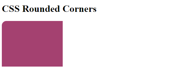
In the above example, the top-left corner is rounded.
在上面的示例中, 左上角是圆形的。
边界右上半径 (border-top-right-radius)
This property specifies the radius of the top right corner. This property takes values in length and in % where % defines the shape of the top-right corner in %.
此属性指定右上角的半径。 此属性的长度和%,其中%定义以%计的右上角的形状花费值。
Syntax:
句法:
Element {
    border-top-right-radius: 50%;
}
Example:
例:
<!DOCTYPE html>
<html>

<head>
    <style>
        p {
            background: #a44170;
            width: 200px;
            height: 150px;
            border-top-right-radius: 15px;
        }
    </style>
</head>

<body>
    <h1>CSS Rounded Corners</h1>
    <p></p>
</body>

</html>
Output
输出量
In the above example, the top right corner is rounded.
在上面的示例中,右上角是圆形的。
左下半径半径 (border-bottom-left-radius)
This property specifies the radius of the bottom left corner. This property takes values in length and in % where % defines the shape of the bottom-left corner in %.
此属性指定左下角的半径。 此属性的长度和%,其中%定义以%表示的左下角的形状花费值。
Syntax:
句法:
Element {
    border-bottom-left-radius: 50%;
}
Example:
例:
<!DOCTYPE html>
<html>

<head>
    <style>
        p {
            background: #a44170;
            width: 200px;
            height: 150px;
            border-bottom-left-radius: 15px;
        }
    </style>
</head>

<body>
    <h1>CSS Rounded Corners</h1>
    <p></p>
</body>

</html>
Output
输出量
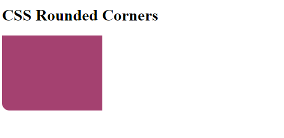
In the above example, the bottom left corner is rounded.
在上面的示例中,左下角是圆形的。
右下边界半径 (border-bottom-right-radius)
This property specifies the radius of the bottom right corner. This property takes values in length and in % where % defines the shape of the bottom-right corner in %.
此属性指定右下角的半径。 此属性的长度和%,其中%定义以%表示的右下角的形状花费值。
Syntax:
句法:
Element {
    border-bottom-right-radius: 50%;
}
Example:
例:
<!DOCTYPE html>
<html>

<head>
    <style>
        p {
            background: #a44170;
            width: 200px;
            height: 150px;
            border-bottom-right-radius: 15px;
        }
    </style>
</head>

<body>
    <h1>CSS Rounded Corners</h1>
    <p></p>
</body>

</html>
Output
输出量
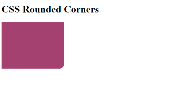
In the above example, the bottom right corner is rounded.
在上面的示例中,右下角是圆形的。
翻译自: https://www.includehelp.com/code-snippets/rounded-corners-in-css.aspx
css圆角三角形3个圆角


 1892
1892


 被折叠的 条评论
为什么被折叠?
被折叠的 条评论
为什么被折叠?
 到【灌水乐园】发言


