


在网站中使用粘性 标题导航有很多原因。 它提供了对高优先级链接的轻松访问,以及从网站上任何位置返回首页的方式 。 但是,当您使用导航栏阻止某些页面内容时,可能会出现问题。
在本教程中,我想演示如何构建一个锁定的标题栏,该标题栏在向下滚动页面后会自动隐藏。 同样,当滚动到最底部时,我们将显示一个小的页脚,其中包括许多相同的导航链接。
几乎任何网站界面都可以使用此技术,以提高可读性和一般用户体验 。
建立框架
我们需要从使用固定标头和基本内容区域的基本HTML5模板开始。 在此演示中,我包括了一系列从Google CDN托管的外部第三方脚本。 其中包括一些Web字体以及jQuery和jQuery UI库。
<!doctype html>
<html lang="en-US">
<head>
  <meta http-equiv="Content-Type" content="text/html;charset=utf-8">
  <title>Auto-Hiding Header Demo Page</title>
  <meta name="author" content="Jake Rocheleau">
  <link rel="shortcut icon" href="https://www.hongkiat.com/favicon.ico">
  <link rel="icon" href="https://www.hongkiat.com/favicon.ico">
  <link rel="stylesheet" type="text/css" media="all" href="styles.css">
  <link rel="stylesheet" type="text/css" media="all" href="http://fonts.googleapis.com/css?family=Courgette|Leckerli+One">
  <script type="text/javascript" src="https://ajax.googleapis.com/ajax/libs/jquery/1.9.1/jquery.min.js"></script>
  <script type="text/javascript" src="https://ajax.googleapis.com/ajax/libs/jqueryui/1.10.1/jquery-ui.js"></script>
  <script type="text/javascript" language="javascript" charset="utf-8" src="autohide.js"></script>
</head>
您可能会注意到,我们还需要一个名为autohide.js的第三个本地JavaScript文件。 这将提供我们动画和隐藏/显示标题块所需的所有JS代码。
让我们简要看一下内容结构,以了解我如何布置各个div块。
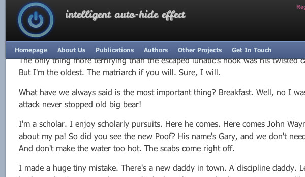
<div id="headwrapper">
  <div id="fixedheader">
    <header id="top">
      <div id="logo">
        <!-- Logo Source: http://www.psdgraphics.com/psd/psd-power-button/ -->
        <h1><a href="index.html"><img src="https://assets.hongkiat.com/uploads/smart-header-footers-jquery/power-logo.png" alt="AutoHide Header"></a></h1>
        <h2>intelligent auto-hide effect</h2>

        <ul id="rightlinks">
          <li><a href="javascript:void(0)">Register</a></li> -
          <li><a href="javascript:void(0)">Login</a></li> -
          <li><a href="javascript:void(0)">FAQ/Wiki</a></li> -
          <li><a href="javascript:void(0)">Support</a></li>
        </ul>
      </div>

      <nav id="topnav">
        <ul>
          <li><a href="javascript:void(0)">Homepage</a></li>
          <li><a href="javascript:void(0)">About Us</a></li>
          <li><a href="javascript:void(0)">Publications</a></li>
          <li><a href="javascript:void(0)">Authors</a></li>
          <li><a href="javascript:void(0)">Other Projects</a></li>
          <li><a href="javascript:void(0)">Get In Touch</a></li>
        </ul>
      </nav>
    </header>
  </div> <!-- /end #fixedheader -->
</div> <!-- /end #headwrapper -->
标头区域中有大量嵌套的div,因此我将首先解释该结构。 Ť
最外部的容器#headwrapper的宽度限制为780px,裕度为0:自动; CSS中的属性。 这将使整个标题在页面上居中。 内部是一个div #fixedheader ,它实际上是主要的固定项目。
此容器需要使用灰色背景,并使用负向定位将其推入页面顶部。 当页眉向上动画时,它将首先向下拉一点,没有该容器,我们只会看到它后面的背景。
内部的<header>元素是同时包含徽标和导航栏的“官方”容器。 您可以在实时演示页面中看到这种简短的下拉效果。
基本CSS样式
除了内部内容之外,我们不需要了解其他有关HTML的其他知识。 将所有内部内容区域恰好推入足够的像素,以与标题边到边相遇。 从一些CSS重置开始,更容易解释我们如何设置布局样式。
html, body, div, span, applet, object, iframe, h1, h2, h3, h4, h5, h6, p, blockquote, pre, a, abbr, acronym, address, big, cite, code, del, dfn, em, img, ins, kbd, q, s, samp, small, strike, strong, sub, sup, tt, var, b, u, i, center, dl, dt, dd, ol, ul, li, fieldset, form, label, legend, table, caption, tbody, tfoot, thead, tr, th, td, article, aside, canvas, details, embed, figure, figcaption, footer, header, hgroup, menu, nav, output, ruby, section, summary, time, mark, audio, video {
  margin: 0;
  padding: 0;
  border: 0;
  font-size: 100%;
  font: inherit;
  vertical-align: baseline;
  outline: none;
  -webkit-font-smoothing: antialiased;
  -webkit-text-size-adjust: 100%;
  -webkit-box-sizing: border-box;
  -moz-box-sizing: border-box;
  box-sizing: border-box;
}
html { height: 101%; }
body {background: #a4b1c2; font-family: Tahoma, Arial, sans-serif; font-size: 62.5%; line-height: 1; }

::selection { background: #f2c6dc; color: #111; }
::-moz-selection { background: #f2c6dc; color: #111; }
::-webkit-selection { background: #f2c6dc; color: #111; }

br { line-height: 1.95em; }

article, aside, details, figcaption, figure, footer, header, hgroup, menu, nav, section { display: block; }
ol, ul { list-style: none; }

blockquote, q { quotes: none; }
blockquote:before, blockquote:after, q:before, q:after { content: ''; content: none; }
strong { font-weight: bold; }

table { border-collapse: collapse; border-spacing: 0; }
img { border: 0; max-width: 100%; }

a { color: #7091c7; }
a:hover { color: #4e72ad; }
我们最上面的代码是我在本教程中汇总的混合模板,其中包括一些有用的样式重置。 我们添加了<br>标记选择器以增加换行符的大小,并且还在渲染的文本和各种突出显示的文本效果上使用CSS3抗锯齿。 另一个要点是我们如何构建整个页面以使其在布局中居中。
我正在使用2个不同的包装器包含标头和正文。 这提供了一种更容易的解决方案,用于分离内容,甚至将构思合并为全角布局。 即使特定的布局是固定宽度的,徽标部分和顶部导航栏也可以放在一起作为流畅的设计工作。
/* page structure */
#fixedheader {
  display: block;
  position: fixed;
  top: -35px;
  padding-top: 25px;
  margin: 0;
  height: auto;
  width: 780px;
  background: #303030;
  z-index: 9999;
  -webkit-box-shadow:  0 -3px 4px 0px #222;
  -moz-box-shadow:  0 -3px 4px 0px #222;
  box-shadow: 0 -3px 4px 0px #222;
}

#pagewrapper {
  display: block;
  position: relative;
  width: 780px;
  background: #fff;
  padding: 0;
  margin: 0 auto;
  margin-top: 117px;
  -webkit-box-shadow:  0 3px 7px -1px #222;
  -moz-box-shadow:  0 3px 7px -1px #222;
  box-shadow: 0 3px 7px -1px #222;
}

#headwrapper {
  display: block;
  width: 780px;
  background: #fff;
  padding: 0;
  margin: 0 auto;
}

/* top header */
#top {
  display: block;
  position: relative;
  width: 780px;
  padding: 0;
  margin: 0;
  top: 0;
  z-index: 9999;
  background: #303030;
  border-bottom: 3px solid #414d65;
}

#logo {
  display: block;
  width: 100%;
  height: 82px;
  top: 0;
  padding: 0 12px;
  background-color: #111;
  background-image: -webkit-gradient(linear, left top, left bottom, from(#303030), to(#111));
  background-image: -webkit-linear-gradient(top, #303030, #111);
  background-image: -moz-linear-gradient(top, #303030, #111);
  background-image: -ms-linear-gradient(top, #303030, #111);
  background-image: -o-linear-gradient(top, #303030, #111);
  background-image: linear-gradient(top, #303030, #111);
}

/* navigation bar */
#topnav {
  display: block;
  border-top: 1px solid #839aca;
  background: #485c86;
  background-image: -webkit-gradient(linear, left top, left bottom, from(#5f739d), to(#485c86));
  background-image: -webkit-linear-gradient(top, #5f739d, #485c86);
  background-image: -moz-linear-gradient(top, #5f739d, #485c86);
  background-image: -ms-linear-gradient(top, #5f739d, #485c86);
  background-image: -o-linear-gradient(top, #5f739d, #485c86);
  background-image: linear-gradient(top, #5f739d, #485c86);
  height: 32px;
}

#topnav ul {
  padding: 0 10px;
}

#topnav ul li { display: inline; font-size: 1.2em; }

#topnav ul li a {
  display: block;
  float: left;
  line-height: 31px;
  padding: 0 7px;
  margin-right: 6px;
  color: #d1dfeb;
  font-weight: bold;
  text-decoration: none;
  -webkit-transition: all 0.4s linear;
  -moz-transition: all 0.4s linear;
  transition: all 0.4s linear;
}
#topnav ul li a:hover {
  background: rgba(255,255,255,0.2);
  text-shadow: 1px 1px 0 rgba(0,0,0,0.2);
}
请注意,其中许多代码都将CSS3属性用于渐变和过渡效果。 这些功能有助于进一步努力,使您的设计更加有趣。 大多数浏览器都可以处理这些属性,而后备解决方案只是本机呈现的属性,因此降级程度不大。
#toparrow {
  display: none;
  width: 130px;
  height: 130px;
  position: fixed;
  bottom: 45px;
  right: 45px;
  cursor: pointer;
  background: url('https://assets.hongkiat.com/uploads/smart-header-footers-jquery/scrolltop-arrow.png') 0 0 no-repeat;
  z-index: 9999;
}
最后一块代码针对我添加到页面中的顶部箭头图标。 该div固定在右侧,仅在隐藏标题后才会显示。 该解决方案允许用户单击以立即跳转到页面顶部。 在大多数情况下,这比滚动更容易。
动画页眉和页脚
在JS文件中,我们将大量逻辑语句组合在一起。 它正在监听窗口滚动事件并根据情况触发各种功能。 我在每个if{}语句中都包含了源注释,以帮助阐明我们要检查的内容。 让我们将其分为三个主要部分。
$(document).ready(function(){
  var timer;

  $(window).scroll(function() {

    var topdisplay  = $('#fixedheader').css('top');
    var footdisplay = $('#fixedfooter ul').css('display');
    var scrolltoppx = $(this).scrollTop();
这是包含事件侦听器和一些新变量定义的第一部分。 topdisplay将在CSS中检查标题的top属性的当前状态。 我们将默认位置值设置为-35px,因此在这种情况下标题是可见的。 否则我们将其隐藏起来,需要通过动画重新调整为-35px。
第二个变量footdisplay将检查页脚的显示属性。 这对于检查是否显示或隐藏底部页脚元素的逻辑是必需的。 另外,我们将需要scrolltoppx ,它包含一个数值,以像素为单位,该值表示距屏幕顶部的总距离。 它将随着每个用户滚动事件而更新。
if(scrolltoppx < 10 && topdisplay != "-35px") {
      // if we scroll up anywhere from 9px-0px and the header is hidden,
      // immediately display the header smoothly into the scroll
        clearTimeout(timer);
        autoDisplayHeader();
        $('#toparrow').fadeOut(350);
    }


    if(scrolltoppx > 130 && topdisplay == "-35px") {
      // if we scroll beyond 130px and the header is still displaying,
      // hide the header after 700ms pause
      clearTimeout(timer);
      timer = setTimeout(function() {
        autoHideHeader();
        $('#toparrow').fadeIn(450);
      }, 600);
    }
现在,这是用于调用预定义函数的第一批逻辑语句。
第一条语句检查标题是否不位于-35px处,然后向后滚动到顶部; 我们需要显示标题。 我们可以通过调用函数autoDisplayHeader() ,该函数稍后会写入JavaScript文件中。
同样,如果滚动到130px以上,并且标题仍显示,则需要将其隐藏。 这使用了另一个名为autoHideHeader()函数。 但是请注意,此代码包含在JavaScript函数setTimeout() 。 用户停止滚动后,我们暂停600ms,然后隐藏标题,同时显示“返回顶部”箭头。
if(scrolltoppx + $(window).height() == getDocHeight()) {
      // if the current window position + the above space equals the total window height
      // then the user is at the bottom of the page.
      // in this case we quickly display the small fixed footer
      if(footdisplay == 'none') {
        $('#fixedfooter ul').fadeIn(300);
      }
    }

    if(scrolltoppx + $(window).height() != getDocHeight() && footdisplay == 'block') {
      // if the user is not at the bottom and our footer is being displayed
      // we need to hide it until we re-enter the bottom again
      $('#fixedfooter ul').fadeOut(300);
    }


  });

  $('#toparrow').on('click', function() {
    // when clicking the arrow we are animated immediately to the top
    $("html, body").animate({ scrollTop: "0px" });
  });
});
最后几条语句引用了页脚块。
我们将用户当前在屏幕上的位置加在一起,添加到页面的其余高度。 这应等于通过自定义函数getDocHeight()提供的整个窗口高度。 这不是我自己的功能,而是最初由James Padolsey编写的,目的是支持更多旧版浏览器。
另一个逻辑语句是检查反向,并在我们从底部滚动离开时自动隐藏页脚。
最后,最后一个子句在用户单击#toparrow div时进行监听。 注意,我们现在不在滚动事件处理程序的范围内。 因此,这是触发页面上某种响应的仅有的两个事件侦听器。
通过一些学习,所有自定义功能都非常容易理解。 但如果您有兴趣,请在下面将其复制。
/**
 * functions to hide and display the header
 */
function autoHideHeader(){
  $('#fixedheader').animate({
    top: '-149px',
  }, 450, 'easeInBack');

  $('#pagewrapper').animate({
    'margin-top': '3px',
  }, 450, 'easeInBack');
}

function autoDisplayHeader(){
  $('#fixedheader').animate({
    top: '-35px',
  }, 400, 'easeOutBack');

  $('#pagewrapper').animate({
    'margin-top': '117px',
  }, 400, 'easeOutBack');
}

/**
 * cross-browser function to determine full browser height
 * needed to check when user hits the bottom of the webpage
 * source: http://james.padolsey.com/javascript/get-document-height-cross-browser/
 */
function getDocHeight() {
  var D = document;

  return Math.max(
    Math.max(D.body.scrollHeight, D.documentElement.scrollHeight),
    Math.max(D.body.offsetHeight, D.documentElement.offsetHeight),
    Math.max(D.body.clientHeight, D.documentElement.clientHeight)
  );
}
在禁用了JavaScript的旧版浏览器中,不会给用户带来太多损失。 标题导航将始终保持固定,无论滚动距离如何。 因此,这项额外的技巧只会为您的网站界面提供一些技巧。 对于用户而言,具有整洁的浏览体验也是一种便利。
确保并查看我的现场演示,以获取整个Web应用程序的全景。
最后的想法
我希望本教程可以为Web开发人员提供一些有用的想法。 只需对CSS进行一些自定义,即可重复使用其中许多代码。 但是您应该下载我的演示项目代码的副本,以将此工作模板另存为资源。
翻译自: https://www.hongkiat.com/blog/smart-header-footers-jquery/


 扫一扫
扫一扫
 5361
5361

 被折叠的 条评论
为什么被折叠?
被折叠的 条评论
为什么被折叠?
 到【灌水乐园】发言


