


 了解HTML5<picture>元素如何帮助网站在不同设备上显示最佳图像,包括艺术指导、分辨率和尺寸切换。
After a long, long period of debate and competition, web development finally has the markup and syntax it needs for responsive bitmap images: the <picture> element, together with the srcset and sizes attributes. And, as of today, we have fully implemented support for <picture> in two browsers – Chrome and Firefox – together with an excellent, well-tested polyfill for others.
经过很长很长的辩论和竞争的时期,网络的发展终于有了它需要响应位图图像标记和语法:在<picture>与元素,一起srcset和sizes属性。 并且,到目前为止,我们已经在两种浏览器(Chrome和Firefox)中完全实现了对<picture>支持,以及为其他浏览器提供了经过良好测试的出色填充。
There is a fair amount of confusion regarding these new features. Type HTML5 picture into Google and it will likely suggest HTML5 picture vs. srcset, implying that they are competing standards. That’s not true: <picture>, srcset and sizes are most effective when used together. If you need to distinguish them, a decent summary is:
关于这些新功能存在很多困惑。 在Google中输入HTML5图片 ,它可能会建议HTML5图片与srcset ,这暗示它们是竞争标准。 这是不正确的: <picture> , srcset和sizes 一起使用时是最有效的。 如果您需要区分它们,那么不错的总结是:
<picture>is used for art direction<picture>用于美术指导srcsetdetermines resolution and pixel density in imagessrcset确定图像的分辨率和像素密度from this variety of options,
sizesis used to set the optimum image for the current area从各种选项中,使用
sizes来设置当前区域的最佳图像
While they work great together, these components are easiest to learn separately; so, in the spirit of my Flexbox for Designers series, I’ll tackle <picture> first, followed by srcset and sizes in subsequent articles.
虽然它们可以很好地协同工作,但是最容易分别学习这些组件。 所以,在我的精神Flexbox的为设计师系列,我会解决<picture>第一,其次是srcset和sizes在后续文章。
图片:因为并非所有流体图像都相等 (picture: Because Not All Fluid Images Are Created Equal)
The fluid images concept has been around a long time, but comes with a price: not all images look equally good scaled down. This is particularly true of larger illustrations that have a strong central focus:
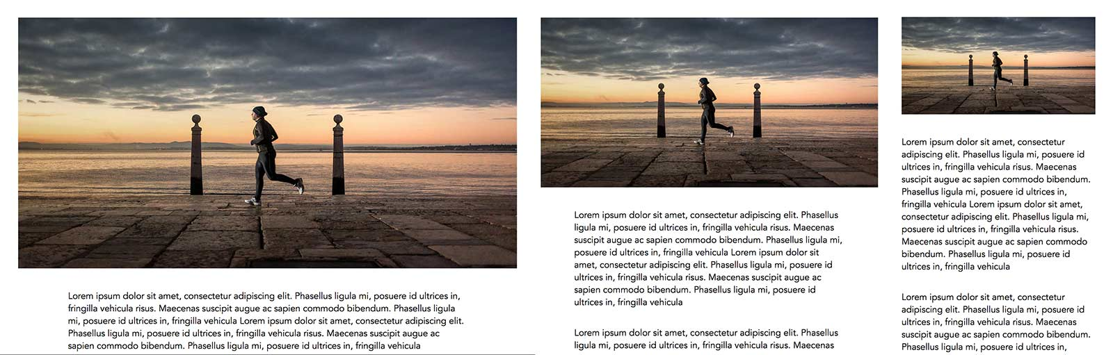
流畅的图像概念已经存在了很长时间,但是要付出一定的代价:并不是所有的图像都按比例缩小。 对于重点突出的大型插图尤其如此:
Below a certain viewport size, the runner photograph in the example above looks out of proportion next to body text, with important details lost. Ideally, we want an easy way to use different versions of the image at different viewport widths.
在某个视口大小以下,上面示例中的跑步者照片在正文旁边看起来不成比例,但丢失了重要的细节。 理想情况下,我们需要一种简单的方法来以不同的视口宽度使用不同版本的图像。
There have been a number of solutions to achieve this over the years, from my own SVG technique to Estelle Weyl’s related “clown car” option. Most use some degree of JavaScript hackery. With <picture>, we have a built-in, native, browser-supported solution:
多年来,从我自己的SVG技术到Estelle Weyl的相关“小丑车”选项 ,已经有许多解决方案来实现这一目标。 大多数使用某种程度JavaScript黑客。 使用<picture> ,我们有一个内置的,本机的,受浏览器支持的解决方案:
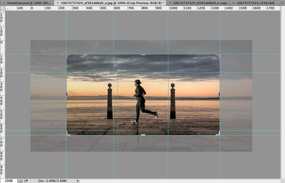
<picture>
	<source srcset="runner-wide.jpg" media="(min-width: 1000px)">
	<source srcset="runner-narrow.jpg" media="(min-width: 500px)">
	<img src="runner-square.jpg" alt="Photograph of a man running along a pier at sunrise, with a harbour in the background">
</picture>
There are a few things to notice immediately:
有几件事要立即注意:
The
<picture>element is very similar in concept to the<audio>and<video>elements: it is a tag that surrounds alternative media sources.Each of these media sources points to an image with an associated inline media query that contains the conditions under which it will appear.*
A standard
<img>tag is the last required element. It functions as a proxy for the<source>elements to display their content; it also acts as a fallback for browsers that don’t understand<picture>and don’t run the polyfill described below.标准的
<img>标签是最后一个必需的元素。 它充当<source>元素显示其内容的代理; 对于不了解<picture>并且不运行下面描述的polyfill的浏览器,它也充当后备。The
altvalue of the image acts as a description for the entire set.图像的
alt值用作整个集合的描述 。Source order matters. The inline media query in the
<source>element immediately above the smallest square image in the example translates to “the viewport must no wider than 500 pixels before it can displayrunner-square.jpg”, with wide-aspect photos taking commiseratively greater values.源顺序很重要 。 在示例中最小正方形图像上方的
<source>元素中的内联媒体查询转换为“视口必须不超过500像素才能显示runner-square.jpg”,而宽幅照片的取值要大得多。 。The example takes a mobile-first approach, with
runner-square.jpgloaded and displayed by default if the polyfill is not applied.该示例采用移动优先方法 ,如果未应用
runner-square.jpg,则默认情况下会加载并显示runner-square.jpg。
You can see the result of <picture> in the header image for this article: resize the browser to see the art-switching process.
您可以在本文的标题图像中看到<picture>的结果:调整浏览器的大小以查看艺术切换过程。
图片Polyfill (picture Polyfill)
The best solution for browsers that don’t yet support <picture>, sizes or srcset is Scott Jehl’s excellent picturefill, which has been in development during the entire protracted debate. It is open source, framework-free, has automatic support detection, and is easy to add to the <head> of any document:
对于还不支持浏览器的最佳解决方案<picture> , sizes或srcset是斯科特Jehl的优秀picturefill ,整个旷日持久的争论,在此期间一直在发展。 它是开源的,无框架的,具有自动支持检测功能,并且易于添加到任何文档的<head>中:
<script src="picturefill.js" async></script>The async attribute makes the script non-blocking, allowing the rest of the page to load while it works. There’s one addition required: like <main> and other elements in older browsers (particularly IE), the client needs to be informed of the very existence of the picture element via JavaScript:
async属性使脚本无阻塞,从而允许页面其余部分在工作时加载。 需要添加一个:与<main>和旧版浏览器(尤其是IE)中的其他元素一样,需要通过JavaScript通知客户端图片元素的存在:
<script>document.createElement( "picture" ); </script>
<script src="picturefill.js" async></script>
Note that you may need to add a copy of the base image's src value with an added srcset attribute for the polyfill to recognise that the image is part of the <picture> group: <img src="runner-square.jpg" srcset="runner-square.jpg" alt="Photograph of a man running along a pier at sunrise, with a harbour in the background">
请注意,您可能需要添加带有添加的srcset属性的基本图像的src值的副本,以使srcset识别出该图像是<picture>组的一部分:<img src =“ runner-square.jpg” srcset = “ runner-square.jpg” alt =“一个人在日出时沿着码头奔跑,背景为港口的照片”>
It should also be noted that including src means that browsers that do not natively support <picture> will inevitably download the base image, with or without the polyfill: that's just what browsers do by default, and <picture> support is the only thing that can turn that behaviour off. There's been some suggestion that developers do not set src on the base image for this reason, and rely completely on srcset and the polyfill to do the work of selecting the one correct image. Of course, this means that users who block JavaScript will only see the alt text for the image set, and your page will refuse to validate. That’s not a behaviour I’m comfortable with, but your tastes may differ.
还应该注意的是,包含src意味着本机不支持<picture>浏览器将不可避免地下载基础图像,无论是否使用了polyfill:这都是浏览器默认情况下所做的,并且<picture>支持是唯一要做的可以关闭该行为。 还有的是一些建议,开发商不要设置src就因为这个原因在基本图像上,并依靠完全srcset和填充工具做选择一个正确的图像的工作。 当然,这意味着阻止JavaScript的用户将仅看到图像集的alt文本,并且您的页面将拒绝验证。 我不习惯这种行为,但是您的口味可能有所不同。
处理IE9 (Dealing With IE9)
With the polyfill in place, you can use <picture> on your page as shown above, with or without srcset and sizes. However, IE9 needs a little more work, by fooling it with a pseudo-<video> element with a conditional comment:
随着地方填充工具,你可以使用<picture>您的网页上,如上图所示,有或没有srcset和sizes 。 但是,通过使用带有条件注释的伪<video>元素欺骗IE9,IE9需要做更多的工作:
<picture>
	<!--[if IE 9]><video style="display: none;"><![endif]-->
	<source srcset="runner-wide.jpg" media="(min-width: 1000px)">
	<source srcset="runner-narrow.jpg" media="(min-width: 500px)">
	<!--[if IE 9]></video><![endif]-->
	<img src="runner-square.jpg" srcset="runner-square.jpg" alt="Photograph of a man running along a pier at night, with a harbour in the background">
</picture>
That’s it: between the polyfill and native support in Chrome and Firefox, you now have art-directed images in all modern browsers.
就是这样:在Chrome和Firefox中的polyfill和本机支持之间,您现在在所有现代浏览器中都具有艺术导向的图像。
CSS和正确的上下文 (CSS & Correct Context)
As with the <figure> element, it’s important to understand that you shouldn’t use <picture> around every image on your site. Early estimates suggest that less than 25% of images require art direction: if a photograph just needs resolution and size switching, you should use srcset and sizes inside a single <img> element. I suspect that the majority of images to benefit from <picture> will be “hero” banner images, making the associated CSS very easy:
与<figure>元素一样 ,了解不要在站点上的每个图像周围使用<picture>至关重要。 早期估计表明, 只有不到25%的图像需要艺术指导 : 如果照片仅需要分辨率和尺寸切换,则应在单个<img>元素内使用srcset和sizes 。 我怀疑大多数受益于<picture>将是“英雄”横幅图像,从而使关联CSS非常容易:
picture img {
	width: 100%; height: auto;
}
Note that there is no need to style the <source> elements, as they are set to display: none; by default.
注意,不必设置<source>元素的样式,因为它们设置为display: none; 默认。
应用支持 (Application Support)
The demand for multiple versions of image assets will place more stress on image editors and their tools. While the requirements of srcset and sizes has decent support in Adobe’s recent Generator offering, as well as Sketch, I haven’t found good application support for the new demands of <picture>. For now, creating art-directed alternatives will likely continue to be a process of establishing guides and cropping out different versions of the same image.
对多种版本图像资源的需求将使图像编辑器及其工具面临更多压力。 虽然要求srcset和sizes在Adobe公司最近发电机提供体面的支持,以及素描 ,我还没有找到新的需求良好的应用支持<picture> 。 就目前而言,创建艺术指导的替代品可能将继续是建立指导并裁剪同一图像的不同版本的过程。
However, Generator and other tools are increasingly based on open technologies such as Node, so the possibility exists for a plugin to be developed that will streamline this process: when I have the opportunity, I’ll see what I can hack together. (And if you’re aware of other options, please let the community know in the comments below!)
但是,Generator和其他工具越来越多地基于诸如Node之类的开放技术,因此有可能开发出可以简化此过程的插件:如果有机会,我将看到可以共同攻克的东西。 (如果您知道其他选择,请在下面的评论中告知社区!)
* While it’s not widely appreciated (and sadly, removed from the spec, at least for now) the <video> element also supported inline media queries.
*虽然尚未得到广泛的赞赏(并且至少从现在开始很遗憾地从规范中删除了它), 但<video>元素还支持嵌入式媒体查询 。
翻译自: https://thenewcode.com/936/Responsive-Images-For-Designers-The-HTML5-picture-element


 扫一扫
扫一扫


 被折叠的 条评论
为什么被折叠?
被折叠的 条评论
为什么被折叠?
 到【灌水乐园】发言


