


Python-图表属性 (Python - Chart Properties)
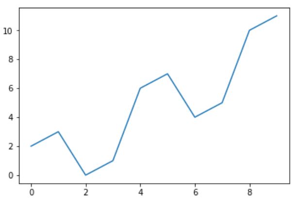
Python has excellent libraries for data visualization. A combination of Pandas, numpy and matplotlib can help in creating in nearly all types of visualizations charts. In this chapter we will get started with looking at some simple chart and the various properties of the chart.
Python具有出色的数据可视化库。 Pandas , numpy和matplotlib的组合可以帮助创建几乎所有类型的可视化图表。 在本章中,我们将开始研究一些简单的图表以及图表的各种属性。
创建图表 (Creating a Chart)
We use numpy library to create the required numbers to be mapped for creating the chart and the pyplot method in matplotlib to draws the actual chart.
我们使用numpy库创建所需的数字以进行映射以创建图表,并使用matplotlib中的pyplot方法绘制实际图表。
import numpy as np
import matplotlib.pyplot as plt

x = np.arange(0,10)
y = x ^ 2
#Simple Plot
plt.plot(x,y)
Its output is as follows −
其输出如下-
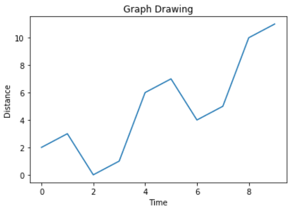
斧子 (Labling the Axes)
We can apply labels to the axes as well as a title for the chart using appropriate methods from the library as shown below.
我们可以使用库中的适当方法将标签应用于图表的轴以及标题,如下所示。
import numpy as np
import matplotlib.pyplot as plt

x = np.arange(0,10)
y = x ^ 2
#Labeling the Axes and Title
plt.title("Graph Drawing")
plt.xlabel("Time")
plt.ylabel("Distance")
#Simple Plot
plt.plot(x,y)
Its output is as follows −
其输出如下-
格式化线型和颜色 (Formatting Line type and Colour)
The style as well as colour for the line in the chart can be specified using appropriate methods from the library as shown below.
可以使用库中的适当方法来指定图表中线条的样式和颜色,如下所示。
import numpy as np
import matplotlib.pyplot as plt

x = np.arange(0,10)
y = x ^ 2
#Labeling the Axes and Title
plt.title("Graph Drawing")
plt.xlabel("Time")
plt.ylabel("Distance")

# Formatting the line colors
plt.plot(x,y,'r')

# Formatting the line type
plt.plot(x,y,'>')
Its output is as follows −
其输出如下-

保存图表文件 (Saving the Chart File)
The chart can be saved in different image file formats using appropriate methods from the library as shown below.
可以使用库中的适当方法将图表保存为不同的图像文件格式,如下所示。
import numpy as np
import matplotlib.pyplot as plt

x = np.arange(0,10)
y = x ^ 2
#Labeling the Axes and Title
plt.title("Graph Drawing")
plt.xlabel("Time")
plt.ylabel("Distance")

# Formatting the line colors
plt.plot(x,y,'r')

# Formatting the line type
plt.plot(x,y,'>')

# save in pdf formats
plt.savefig('timevsdist.pdf', format='pdf')
The above code creates the pdf file in the default path of the python environment.
上面的代码在python环境的默认路径中创建pdf文件。
翻译自: https://www.tutorialspoint.com/python_data_science/python_chart_properties.htm


 1382
1382


 被折叠的 条评论
为什么被折叠?
被折叠的 条评论
为什么被折叠?
 到【灌水乐园】发言


