


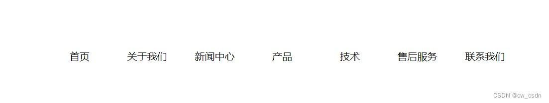
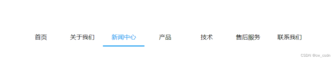
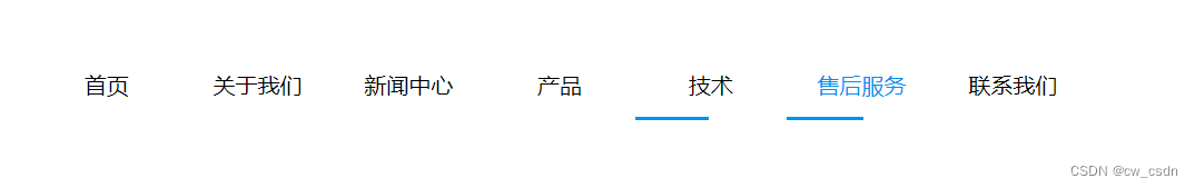
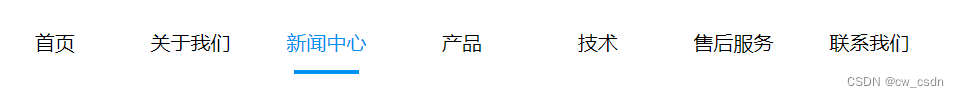
1.冰冻效果
<head>
  <meta charset="UTF-8">
  <meta name="viewport" content="width=device-width, initial-scale=1.0">
  <title>Document</title>
  <style>
    .wrap {
      width: 100%;
    }
    .top {
      width: 50%;
      display: flex;
      justify-content: space-between;
      margin: 100px auto 0;
    }
    .top > div {
      position: relative;
      flex: 1;
      height: 50px;
      line-height: 50px;
      text-align: center;
    }
    .top > div:hover {
      cursor: pointer;
      color: #0092ef;
    }
    .top > div::after {
      content: "";
      height: 2px;
      width: 0;
      background: #0092ef;
      position: absolute;
      bottom: 0;
      left: 0;
      transition: all 0.5s ease 0s;
      -webkit-transition: all 0.5s ease 0s;
    }
    .top > div:hover::after {
      width: 100%;
    }
  </style>
</head>
<body>
  <div class="wrap">
    <div class="top">
      <div>首页</div>
      <div>关于我们</div>
      <div>新闻中心</div>
      <div>产品</div>
      <div>技术</div>
      <div>售后服务</div>
      <div>联系我们</div>
    </div>
  </div>
</body>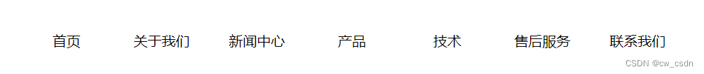

<head>
<meta charset="UTF-8">
<meta name="viewport" content="width=device-width, initial-scale=1.0">
<title>Document</title>
<style>
.wrap {
width: 100%;
}
.top {
width: 50%;
display: flex;
justify-content: space-between;
margin: 100px auto 0;
}
.top > div {
position: relative;
flex: 1;
height: 50px;
line-height: 50px;
text-align: center;
}
.top > div:hover {
cursor: pointer;
color: #0092ef;
}
.top > div::after, .top > div::before {
content: "";
height: 3px;
width: 0;
background: #0092ef;
position: absolute;
bottom: 0;
left: 50%;
transition: all 1s ease;
-webkit-transition: all 1s ease;
}
/* .top > div::after {
background: linear-gradient(to right, rgb(0, 146, 239, .6) 25%,rgb(0, 146, 239, .4) 50%,rgb(0, 146, 239, .3) 75%,rgb(0, 146, 239, .1) 100%)
}
.top > div::before {
background: linear-gradient(to left, rgb(0, 146, 239, .6) 25%,rgb(0, 146, 239, .4) 50%,rgb(0, 146, 239, .3) 75%,rgb(0, 146, 239, .1) 100%)
} */
.top > div:hover::after, .top > div:hover::before {
width: 50%;
}
.top > div:hover::before {
left: 0;
}
</style>
</head>
<body>
<div class="wrap">
<div class="top">
<div>首页</div>
<div>关于我们</div>
<div>新闻中心</div>
<div>产品</div>
<div>技术</div>
<div>售后服务</div>
<div>联系我们</div>
</div>
</div>
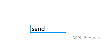
</body>2.发送效果
<!DOCTYPE html>
<html lang="en">
<head>
<meta charset="UTF-8">
<meta name="viewport" content="width=device-width, initial-scale=1.0">
<title>Document</title>
<style>
.top {
width: 100px;
display: flex;
justify-content: space-between;
margin: 100px auto 0;
border: 1px #0092ef solid;
box-sizing: border-box;
}
.send {
width: 40px;
text-align: right;
}
.send:hover{
animation: fly 1s ease;
}
@keyframes fly {
0% {
transform: translateX(0);
}
50% {
transform: translateX(calc(100% + 20px));
}
100% {
transform: translateX(0);
}
}
</style>
</head>
<body>
<div class="top">
<div class="send">send</div>
</div>
</body>
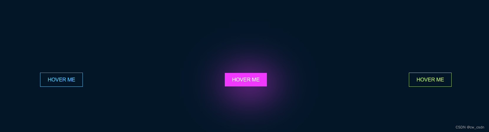
</html>3.霓虹效果
<!DOCTYPE html>
<html lang="en">
  <head>
    <meta charset="UTF-8" />
    <meta name="viewport" content="width=device-width, initial-scale=1.0" />
    <title>Document</title>
    <style>
      #neon-btn {
        display: flex;
        align-items: center;
        justify-content: space-around;
        height: 100vh;
        background: #031628;
      }

      .btn {
        border: 1px solid;
        background-color: transparent;
        text-transform: uppercase;
        font-size: 14px;
        padding: 10px 20px;
        font-weight: 300;
      }

      .one {
        color: #4cc9f0;
      }

      .two {
        color: #f038ff;
      }

      .three {
        color: #b9e769;
      }

      .btn:hover {
        color: white;
        border: 0;
      }

      .one:hover {
        background-color: #4cc9f0;
        box-shadow: 10px 10px 99px 6px rgba(76, 201, 240, 1);
      }

      .two:hover {
        background-color: #f038ff;
        box-shadow: 10px 10px 99px 6px rgba(240, 56, 255, 1);
      }

      .three:hover {
        background-color: #b9e769;
        box-shadow: 10px 10px 99px 6px rgba(185, 231, 105, 1);
      }
    </style>
  </head>
  <body>
    <div id="neon-btn">
      <button class="btn one">Hover me</button>
      <button class="btn two">Hover me</button>
      <button class="btn three">Hover me</button>
    </div>
  </body>
</html>
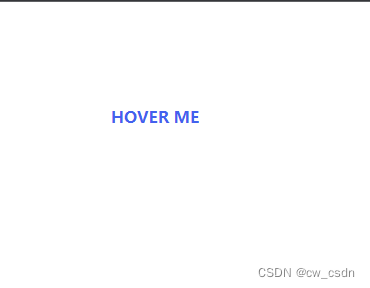
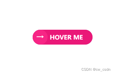
4.边框效果
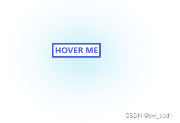
<head>
    <meta charset="UTF-8" />
    <meta name="viewport" content="width=device-width, initial-scale=1.0" />
    <title>Document</title>
    <style>
      .wrap {
        position: relative;
        width: 100px;
        height: 30px;
        line-height: 30px;
        font-size: 16px;
        font-weight: 700;
        text-align: center;
        color: #4361ee;
        margin: 100px;
        box-sizing: border-box;
      }
      .wrap::before,
      .wrap::after {
        box-sizing: inherit;
        content: '';
        position: absolute;
        border: 3px transparent solid;
        height: 0;
        width: 0;
      }
      .wrap::before {
        top: 0;
        left: 0;
      }
      .wrap::after {
        bottom: 0;
        right: 0;
      }
      .wrap:hover::before,
      .wrap:hover::after {
        height: 100%;
        width: 100%;
      }
      .wrap:hover::before {
        border-top-color: #4361ee;
        border-right-color: #4361ee;
        transition: height 0.3s ease-out 0.3s, width  0.3s ease-out;
      }
      .wrap:hover::after {
        border-bottom-color: #4361ee;
        border-left-color: #4361ee;
        transition: border-color 0s ease-out 0.6s, width 0.3s ease-out 0.6s,
          height 0.3s ease-out 0.9s;
      }
      .wrap:hover {
        box-shadow: 10px 10px 99px 6px rgba(76, 201, 240, 1);
      }
    </style>
  </head>
  <body>
    <div class="wrap">HOVER ME</div>
  </body>
5.边框圆角效果
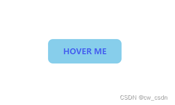
<head>
<meta charset="UTF-8" />
<meta name="viewport" content="width=device-width, initial-scale=1.0" />
<title>Document</title>
<style>
.wrap {
width: 150px;
height: 50px;
line-height: 50px;
font-size: 16px;
font-weight: 700;
text-align: center;
color: #4361ee;
margin: 100px;
background-color: skyblue;
box-sizing: border-box;
/* 主要 */
border-radius: 10px;
transition: all .5s ease;
}
/* 主要 */
.wrap:hover {
border-top-left-radius: 40px;
border-bottom-right-radius: 40px;
}
</style>
</head>
<body>
<div class="wrap">HOVER ME</div>
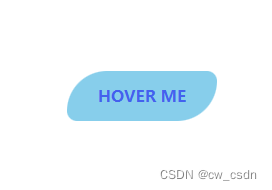
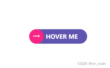
</body>6.背景伸缩
<!DOCTYPE html>
<html lang="en">
  <head>
    <meta charset="UTF-8" />
    <meta name="viewport" content="width=device-width, initial-scale=1.0" />
    <title>Document</title>
    <style>
      .wrap {
        position: relative;
        width: 160px;
        height: 40px;
        line-height: 40px;
        font-size: 16px;
        font-weight: 700;
        text-align: center;
        color: #fff;
        margin: 100px;
        padding: 0 20px 0 40px;
        box-sizing: border-box;
        border-radius: 40px;
        /* 精髓所在 */
        background: linear-gradient(to left, #5f55af 50%, #f72585 50%);
        background-size: 200% 100%;
        background-position: right bottom;
        transition: all .5s ease;
      }
      .wrap > div {
        position: absolute;
        left: 0;
        top: 0;
        font-size: 20px;
        width: 40px;
        height: 40px;
        line-height: 40px;
        text-align: center;
        background-color: #f72585;
        border-radius: 50%;
      }
      .wrap:hover {
        cursor: pointer;
        /* 精髓所在 */
        background-position: left bottom;
      }
    </style>
  </head>
  <body>
    <div class="wrap">
      <div>→</div>
      HOVER ME</div>
  </body>
</html>
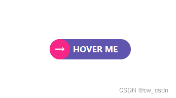
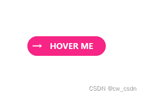
7.背景混合
mix-blend-mode: color;
<!DOCTYPE html>
<html lang="en">
  <head>
    <meta charset="UTF-8" />
    <meta name="viewport" content="width=device-width, initial-scale=1.0" />
    <title>Document</title>
    <style>
      .wrap {
        position: relative;
        width: 160px;
        height: 40px;
        line-height: 40px;
        font-size: 16px;
        font-weight: 700;
        text-align: center;
        color: #fff;
        margin: 100px;
        padding: 0 20px 0 40px;
        box-sizing: border-box;
        border-radius: 40px;
        background: linear-gradient(to right, #5f55af 50%, #f72585 50%);
        background-size: 200% 100%;
        transition: all .5s ease;
      }
      .wrap > div {
        position: absolute;
        left: 0;
        top: 0;
        font-size: 20px;
        width: 40px;
        height: 40px;
        line-height: 40px;
        text-align: center;
        background: #f72585;
        border-radius: 20px;
      }
      .wrap::after {
        transition: all .5s ease;
        content: '';
        position: absolute;
        top: 0;
        bottom: 0;
        left: 0;
        width: 40px;
        border-radius: 50%;
        background: #f72585;
        /* 精髓所在 */
        /* 背景混合 */
        mix-blend-mode: color;
      }
      .wrap:hover::after {
        border-radius: 20px;
        cursor: pointer;
        width: 100%;
      }
    </style>
  </head>
  <body>
    <div class="wrap">
      <div>→</div>
      HOVER ME</div>
  </body>
</html>


 扫一扫
扫一扫


 被折叠的 条评论
为什么被折叠?
被折叠的 条评论
为什么被折叠?
 到【灌水乐园】发言


