


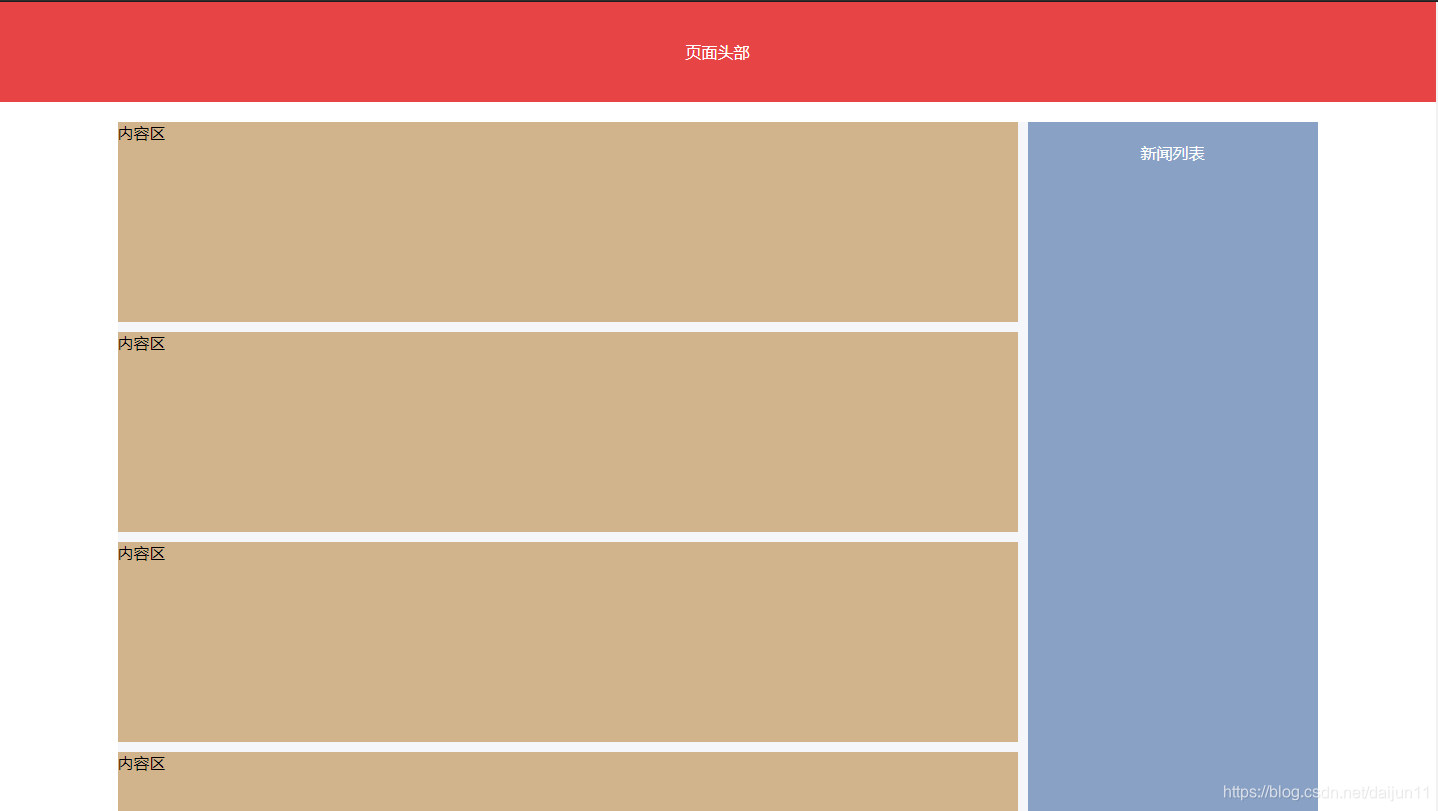
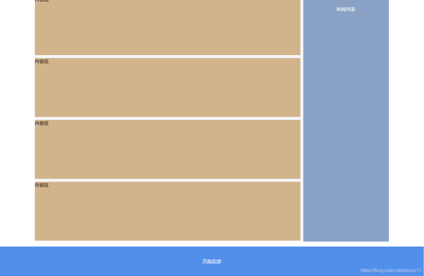
背景
现在有很多网页的布局都分为头部、内容、尾部三部分,其中内容模块又是左侧比较多,右侧内容比较少。在页面滚动时,内容右侧在滚动到看不见头部的时候就固定住,继续滚动时位置也不再发生改变。
效果图
这种布局看上去很酷,其实实现起来也很简单,下面我就用jq来实现这种布局。
上代码
先把html和css布局代码直接给出来
<!-- 头部 -->
<header class="header">页面头部</header>
<!-- 内容 -->
<section class="sec-wrapper">
    <section class="main-section">
        <div class="div-wrapper clearfix">
            <div class="cont-left">
                <div class="cont-item">内容区</div>
                <div class="cont-item">内容区</div>
                <div class="cont-item">内容区</div>
                <div class="cont-item">内容区</div>
                <div class="cont-item">内容区</div>
                <div class="cont-item">内容区</div>
                <div class="cont-item">内容区</div>
                <div class="cont-item">内容区</div>
                <div class="cont-item">内容区</div>
                <div class="cont-item">内容区</div>
                <div class="cont-item">内容区</div>
                <div class="cont-item">内容区</div>
                <div class="cont-item">内容区</div>
                <div class="cont-item">内容区</div>
            </div>
            <div class="list-right">
                <div class="box-fixed">新闻列表</div>
            </div>
        </div>
    </section>
</section>
<!-- 尾部 -->
<footer class="footer">页面底部</footer>
/* common */
html,
 body {
     width: 100%;
     height: 100%;
 }

 html,
 body,
 header,
 footer,
 div,
 section {
     padding: 0;
     margin: 0;
 }

 .clearfix:after {
     content: '';
     display: block;
     clear: both;
     height: 0;
     visibility: hidden;
 }

 .clearfix {
     zoom: 1;
 }

 /* layout */
 .header {
     width: 100%;
     height: 100px;
     line-height: 100px;
     text-align: center;
     font-size: 16px;
     color: #fff;
     background: #E74445;
 }

 .sec-wrapper {
     min-height: 100%;
 }

 .main-section {
     padding-bottom: 100px;
     margin: 20px auto;
 }

 .footer {
     width: 100%;
     height: 100px;
     line-height: 100px;
     text-align: center;
     font-size: 16px;
     color: #fff;
     background: #528FEA;
     margin-top: -100px;
 }

 .div-wrapper {
     width: 1200px;
     margin: 0 auto;
     background: #F4F6F9;
     position: relative;
 }

 .cont-left {
     width: 900px;
     float: left;
     margin-right: 10px;
 }

 .list-right {
     float: left;
 }

 .cont-item {
     width: 100%;
     height: 200px;
     background: tan;
     margin-top: 10px;
 }

 .cont-item:first-child {
     margin-top: 0;
 }

 .box-fixed {
     width: 290px;
     height: 800px;
     padding-top: 20px;
     background-color: #89A1C5;
     position: relative;
     top: 0px;
     text-align: center;
     color: #fff;
 }

 .tab_fix_bottom {
     position: absolute;
     bottom: 0px;
     top: auto;
 }
最后给一下js代码,js为这种布局的灵魂,我这里使用了jq来实现。
<script src="http://cdn.static.runoob.com/libs/jquery/2.1.1/jquery.min.js"></script>
<script>
    $(function () {
        // 获取底部及底部上方边距的总高度
        var fheight = $('.footer').height() + 30;
        // 获取固定容器的 dom 对象
        var boxfixed = $('.box-fixed');
        // 监听页面的滚动
        $(window).scroll(function () {
            // 获取滚动条滚动的高度
            var scrollTop = $(window).scrollTop();
            // 右侧列表相对于文档的高度
            var contLeftTop = $('.cont-left').offset().top + 20;
            // 滚动条距离底部的距离
            var scrollBottom = $(document).height() - scrollTop - boxfixed.height();
            // 滚动条的高度大于右侧列表相对于文档的高度时进入,否则添加tab_fix_bottom样式
            if (scrollTop >= contLeftTop) {
                // 滚动条距离底部的距离大于fheight,添加tab_fix样式,否则添加tab_fix_bottom样式
                if (scrollBottom > fheight) {
                    boxfixed.removeClass("tab_fix_bottom").addClass('tab_fix');
                } else {
                    boxfixed.removeClass('tab_fix').addClass("tab_fix_bottom");
                }
            } else {
                boxfixed.removeClass('tab_fix').removeClass("tab_fix_bottom");
            }
        });
    });
</script>


 扫一扫
扫一扫


 425
425

 被折叠的 条评论
为什么被折叠?
被折叠的 条评论
为什么被折叠?
 到【灌水乐园】发言


