


c:target标签的使用
定价表是显示信息并帮助用户区分可用选项的一种非常有效的方法。 最终,价格表可以将过往访问者转化为有价值的客户,因此,重要的是我们考虑他们在不同的屏幕和设备上的工作方式。
我们将制作一个可变的定价表,然后使用媒体查询来更改其在不同视口大小下的显示方式。 让我们开始吧!
选择响应式CSS框架
我们将依靠现有的框架来整理网格度量和媒体查询。 这不是至关重要的,但是可以节省我们一些时间。
我们在这里有两个选择,最根本的是在自适应和响应式布局之间。
- 自适应布局:使用媒体查询,我们将在一系列固定布局之间切换,(原则上)完美地适用于每种设备窗口大小。 但这是不灵活的,有时可能会导致布局在不同的窗口大小之间显示不正确。
- 响应式布局:使用流体基础,将以百分比指定元素宽度,而不是固定的像素(或em)值。 这为我们提供了更大的灵活性,可以在可能会出现的任何设备尺寸上进行显示,并使将来的工作变得更加友好。
我更喜欢使用Skeleton框架来创建响应式设计,但是默认的Skeleton框架使用了一系列固定布局。 相反,在整个教程中,我将使用Ian Yates的流畅版本的Skeleton 。
第1步:标记桌面屏幕
传统上,在为台式机或笔记本电脑设计时,我们将960px作为标准宽度。 为了简便起见,这就是我们要跳到这里的方式-因此,让我们看看如何为更大的屏幕设计定价表。
<!DOCTYPE html>
<!--[if lt IE 7 ]><html class="ie ie6" lang="en"><![endif]-->
<!--[if IE 7 ]><html class="ie ie7" lang="en"><![endif]-->
<!--[if IE 8 ]><html class="ie ie8" lang="en"><![endif]-->
<!--[if (gte IE 9)|!(IE)]><!--><html lang="en"><!--<![endif]-->
    <head>
       <meta charset="utf-8">
       <title>Responsive Pricing Table</title>

       <meta name="viewport" content="width=device-width, initial-scale=1, maximum-scale=1">


       <link rel="stylesheet" type="text/css"  href="css/base.css">
       <link rel="stylesheet" type="text/css"  href="css/layout.css">
       <link rel="stylesheet" type="text/css"  href="css/fluid_skeleton.css">

       <link rel="stylesheet" type="text/css"  href="css/pricing_table.css">
    </head>
    <body>
       <div class="container">
           <div id='pricing_plan1' class="four columns">
               <dl class='plans' >
                   <dd class="plan_title">
                       Basic
                   </dd>
                   <dd class="plan_price">
                       $9.99
                   </dd>
               </dl>
               <dl class='plan' id="one">
                   <dt class='plan_more'>View<a href="#one" class="more_icon"></a><a href="#" class="less_icon"></a></dt>
                   <dd class="plan_features">
                       <div class="feature_desc"><span class="highlight">1GB</span> Storage</div>
                   </dd>
                   <dd class="plan_features">
                       <div class="feature_desc"><span class="highlight">5GB</span> Bandwidth</div>
                   </dd>
                   <dd class="plan_features">
                       <div class="feature_desc"><span class="highlight">2</span> Domains</div>
                   </dd>
                   <dd class="plan_features">

                       <div class="feature_desc"><span class="highlight">3</span> Databases</div>
                   </dd>
                   <dd class="plan_features">

                       <div class="feature_desc"><span class="highlight">1</span> FTP Account</div>
                   </dd>
                   <dd class="plan_features">

                       <div class="feature_desc"><span class="highlight">25</span> Email Accounts</div>
                   </dd>

                   <dd class="plan_buy">
                       <a href='' class='buy' >Buy Now</a>
                   </dd>
               </dl>
           </div>
       </div>
    </body>
</html>
最初,我们必须为Skeleton Framework提供所有必需CSS文件,为定价表提供自定义样式。
在此模型中,我仅将HTML包含在定价表的一部分中(所有其他相似)。 您必须为您的元素创建一个容器。 在Skeleton中,您可以将类container分配给所有主要容器。 所有列都应放在该元素内。
Skeleton将主容器分为16列。 我已经为4个定价包分别使用了4列-使用类为four columns的div进行检查。
对于数据,我使用了一个简单的描述列表来显示定价包功能。
第2步:大屏幕CSS
让我们添加一些基本样式来改善定价表的外观:
.plan_features:nth-child(odd){
    background: none repeat scroll 0 0 #F7F7F7;
    font-size: 13px;
    font-weight: bold;
    padding: 10px 5px;


}
.plan_features:nth-child(even){
    background: none repeat scroll 0 0 #fff;
    font-size: 13px;
    font-weight: bold;
    padding: 10px 5px;
}
.plan_price{

    color: #FFFFFF;
    font-size: 35px;
    font-weight: bold;
    padding: 30px;
    text-align: center;
}
#pricing_plan1 .plan_price,#pricing_plan1 .buy{
    background: none repeat scroll 0 0 #B71A1A;
    border-top: 1px solid #F83333;
}
#pricing_plan2 .plan_price,#pricing_plan2 .buy{
    background: none repeat scroll 0 0 #1A7BB7;
    border-top: 1px solid #4BA3FF;
}
#pricing_plan3 .plan_price,#pricing_plan3 .buy{
    background: none repeat scroll 0 0 #2D964B;
    border-top: 1px solid #5AD540;
}
#pricing_plan4 .plan_price,#pricing_plan4 .buy{
    background: none repeat scroll 0 0 #909092;
    border-top: 1px solid #B1ACAC;
}
第一个块为数据行设置交替的斑马条纹样式,为每个包装提供独特的配色方案并设置一些印刷规则。
.plan_title{
    background: none repeat scroll 0 0 #000000;
    border-radius: 3px 3px 0 0;
    color: #FFFFFF;
    font-family: helvetica;
    font-size: 20px;
    font-weight: bold;
    padding: 20px;
    text-align: center;
    text-shadow: 1px 1px 1px #5E5858;
}
.plan{
    border:1px solid #eee;
    margin-bottom: 15px;
}
.plan_buy{
    background: none repeat scroll 0 0 #000000;
    border-radius: 0 0 3px 3px;
    padding: 20px;
}
.plan_buy a{

    border-radius: 4px 4px 4px 4px;
    color: #FFFFFF;
    display: block;
    font-size: 15px;
    font-weight: bold;
    margin: auto;
    padding: 10px 5px;
    text-align: center;
    text-decoration: none;
    width: 90px;
}
.plan_more{
    background: none repeat scroll 0 0 #fff;
    font-size: 13px;
    font-weight: bold;
    padding: 10px 5px;
    display: none;
    border-left: 2px solid #302C2C;
    border-right: 2px solid #302C2C;
    border-bottom: 2px solid #302C2C;
}
.more_icon{
    background-image: url("../plus_minus_icons.png");
    background-position: 25px -3px;
    float: right;
    height: 25px;
    width: 25px;
}

.more_icon:hover{
    cursor: pointer;
}
.less_icon{
    background-image: url("../plus_minus_icons.png");
    background-position: 0px -3px;
    float: right;
    height: 25px;
    width: 25px;
}
.less_icon:hover{
    cursor: pointer;
}


.plan_features img{
    float:left;
}
.feature_desc{
    color: #4E4E4E;
    font-family: arial;
    text-align: center;
}

.highlight{
    color: #333233;
    font-family: helvetica;
    font-size: 15px;
    font-weight: bold;
}
剩下的样式很漂亮,但是还处理了一些我们将在较小的屏幕上使用的图标。 如您所见, .plan_more display: none; 设置,因此即使我们在其中设置了图标的样式,它也不会在较大的屏幕尺寸上显示。
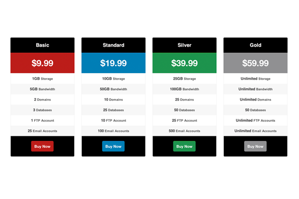
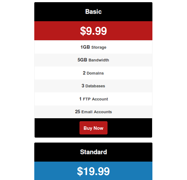
下图显示了定价表在大屏幕上的显示方式。
步骤3:为平板电脑设计
开始根据设备定义屏幕尺寸是很危险的(事实是,我们永远无法确定要使用哪种设备来查看我们的页面),但是通常情况下,平板电脑的屏幕宽度在768像素至959像素之间。 为了适应这个假设,我们将编写一个媒体查询来处理必要的样式。
在当前状态下,演示将在宽度减小的平板电脑屏幕上完美显示。 因此,我不会为平板电脑编写任何自定义样式。 在我们的Skeleton框架中,平板电脑的媒体查询部分将如下所示(有点空白):
/* #Tablet (Portrait)
================================================== */
/* Note: Design for a width of 768px */
@media only screen and (min-width: 768px) and (max-width: 959px) {
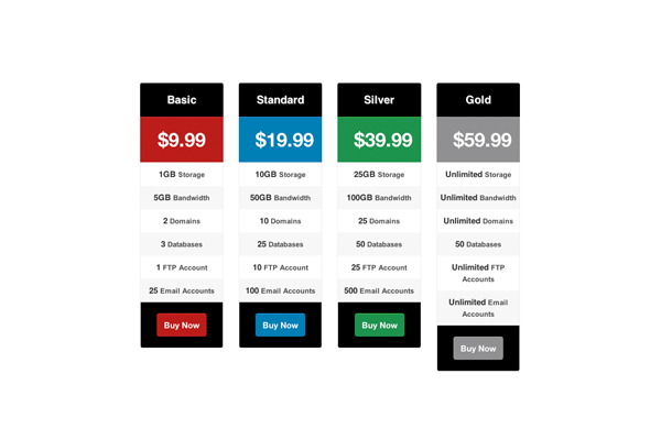
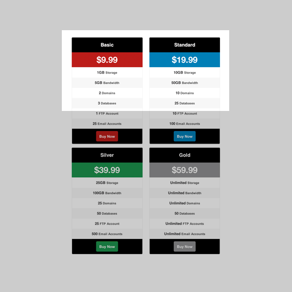
}下图显示了定价表在“平板电脑”屏幕上的显示方式:
第4步:人像移动屏幕
好的,因此我们为较大的屏幕设计了价格表。 现在,我们来看看纵向移动屏幕,它的大小与本教程中要担心的一样小。 由于宽度约为320像素,因此即使屏幕上只有一个包装,我们也无法完全显示。 我们将必须根据以下内容为小屏幕规划不同的布局:
- 将定价包的价格和标题转换为一行,而不是两行。
- 隐藏所有功能并显示“查看功能”导航面板。
- 单击“查看功能”按钮后,使用CSS技术显示功能列表。
首先,让我们看一下我们在步骤1中列出的价格表的初始HTML结构。还记得在默认的宽屏视图中隐藏有类plan_more的部分吗? 我们将其用作“视图特征”导航。
查看宽度介于320像素至767像素之间的屏幕样式:
@media only screen and (min-width: 320px) and (max-width: 767px) {
    .plan_title{
       width:45%;
       float:left;
       border-radius:3px 0 0 0;
    }
    .plan_price{
       width:55%;
       padding:20px 2%;
       border-top:none !important;
       float:left;

    }

    .plan_more{
       display: block;
       clear: both;
    }
    .plan_buy{
       padding: 10px;
    }

    .plan > dd {
       height: 0;
       overflow: hidden;
       padding:0 !important;

       opacity: 0;
       filter: alpha(opacity=0); /* IE6-IE8 */
       -webkit-transition: opacity 0.9s ease-in-out;
       -moz-transition: opacity 0.9s ease-in-out;
       -o-transition: opacity 0.9s ease-in-out;
       -ms-transition: opacity 0.9s ease-in-out;
       transition: opacity 0.9s ease-in-out;
    }
    .plan:target > dd{
       padding: 10px 5px !important;
       height: auto;
       opacity: 1;
       filter: alpha(opacity=100); /* IE6-IE8 */
    }


} 我们为标题和价格元素分配自定义宽度,并设置float: left以便将两个部分都转换为单行。 然后,通过将display:block分配给plan_more类来显示“视图要素”部分。 它将包含用于打开和关闭功能的加号和减号图标。
一旦用户单击加号图标,我们就必须滑动功能列表并显示在屏幕上。 即使使用jQuery可以轻松完成,我们仍将寻找基于CSS的解决方案来避免脚本。
我将使用Ian Yates在快速提示:Orman's Navigation中的:target Treatment演示CSS技术。 首先,我们将所有要素的高度设置为0以隐藏它们。 然后,我们分配一些特定于浏览器CSS过渡代码来获得滑动效果。
单击加号按钮后,我们可以使用URL中的片段标识符获取目标元素。 通过设置高度,我们在单击的包装上显示特征。 简单。
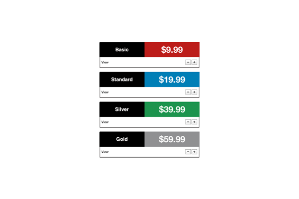
现在,当您切换到较小的移动屏幕时,将获得带有每个包装的标题和价格的布局。 使用加号和减号按钮显示和隐藏功能。
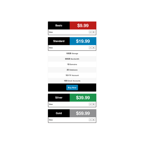
下图显示了使用导航按钮展开功能时如何显示它们:
步骤5:横向移动
再次说明一下,但假设移动设备的横向布局在480px和767px之间指定。 由于我们使用的是基于列的布局,因此我们的定价表可以在移动横向屏幕上正确显示,而无需执行任何更改。 看一看:
如您所见,一个包裹以全角显示。 我们真的不需要单个软件包有这么大的空间。 这是响应式设计中需要考虑的另一重要事项。 首先,我们要确保可以浏览所有内容而无需滚动。 然后,我们需要优化布局以提供扎实的用户体验。
原则上,此横向移动宽度可以包含我们定价表的两个软件包。 因此,让我们在用于横向移动版式的媒体查询部分中使用一些CSS
@media only screen and (min-width: 480px) and (max-width: 767px) {
    #pricing_plan4,#pricing_plan3,#pricing_plan2,#pricing_plan1{
       width: 50%;

    }

    .plan_title{
       width:auto;
       float:none;
       border-radius: 3px 3px 0 0;

    }
    .plan_price{
       width:auto;
       float:none;
       border-top: 1px solid #F83333;

    }
    .plan_more{
       display: none;
    }


    .plan > dd {
       padding: 10px 5px !important;
       height:auto;

       opacity: 1;
       filter: alpha(opacity=1); /* IE6-IE8 */
       -webkit-transition: opacity 0.9s ease-in-out;
       -moz-transition: opacity 0.9s ease-in-out;
       -o-transition: opacity 0.9s ease-in-out;
       -ms-transition: opacity 0.9s ease-in-out;
       transition: opacity 0.9s ease-in-out;
    }
} 我们为定价包提供了50%的宽度,因此我们将能够查看两个包,而不是默认布局中的一个包。
我为计划价格和计划标题使用了一些自定义样式,但要注意的重要一点是浮点数设置为none。 最初,我们没有任何浮动元素,但是在Portrait Mobile移动版式中,我们需要对其进行设置。 这用于清除横向移动屏幕上的那些浮动。
我们不希望此布局中的“查看功能”部分。 因此,在plan_more类上使用display:none隐藏该部分。
然后,我们需要自动显示功能。 使用上一节中介绍CSS技术,为所有功能提供自动高度。
那就这样! 我们已经为具有不同屏幕尺寸的不同设备完成了布局设计。 您应该具有如下所示的内容:
<div>与<table>
在您当中,最精明的人会注意到,即使我们正在处理表格数据,我们也使用了基于div的布局和描述列表。 我们可以用一个响应表设计在本教程中,如克里斯Coyier在演示很容易地走了这篇文章 。
当然,我们应该考虑使设计具有响应性,但是我们也应该考虑设计中使用的数据类型。 通常,相关数据显示在表行中; 我们通过读取一行来获取有关实体的信息。 但是,在我们的方案中,相关数据显示在单个列中 。 如果我们要使用一张桌子,然后使用克里斯的响应技术来显示它,我们将得到如下所示的布局:

所有价格都显示在包装名称的顶部。 然后,显示每个包装的存储容量以及包装名称。 因此,要获取有关任何单个软件包的信息,您必须滚动到末尾。 考虑到这种情况,我选择不进行基于表的设计。
结语
在整个教程中,我们学习了如何创建适合所有设备的自适应定价表。 感谢您的阅读,并通过自适应价格表祝您好运!
c:target标签的使用


 1万+
1万+


 被折叠的 条评论
为什么被折叠?
被折叠的 条评论
为什么被折叠?
 到【灌水乐园】发言


